Matt Helbig: We have some Fitbit emails to look at today that you picked. So I thought this episode could be about using data for personalization. I know Fitbit is a cool brand to look at when it comes to stuff like that. What are your thoughts on these first couple of emails?
Mike Nelson: I used to own a Fitbit a long time ago. Then I lost it in a river, kayaking.
What I thought grabbed my attention on this one was the very top it's like, Hey, 2020, what a year it was. Who can say that with me? 2020 was crazy. But I do like that.

They say like, here are some things that we've accomplished over the year. This is more of a roll-up using all the data from all their customers, and it's a typical end-of-year review. You'll see this somewhere around the end of December or January timeframe. If you scroll down, there's just a lot of stats about certain things.
You go through the dates, numbers. I mean, 9 trillion is a pretty big number, 22 billion’s a pretty big number. It makes me think, okay, what do these numbers represent? So it actually makes you read the right column. And then you get into a different design mode where it goes from green to this nice orange coral, orange color, and peachy background. Is that what the colors you would say those are?
Matt Helbig: Something like that, that sounds good.
Mike Nelson: Yeah. Hierarchy is really good. You’ve got your typical H1 paragraph leading to supporting in that section. Scrolling down a little bit more, you keep your columns and then they go back to a 2:1 column. I love just the back and forth.
Then it looks like from a mobile perspective too, there's just so many good design elements in this email and how it gets broken up, but still kind of keeps you scrolling through for just different color elements to keep things separated, but engaged. Different icons. Different buttons.
The only thing that when I was clicking through these, a lot of these areas are filled out with pill buttons, right there on the screen. 8:03 AM is almost like a ghost pill button. And when I first got to it, there's spots at the very top or at least looking like a button. I tried clicking into them and nothing happened from a visual perspective. It looks cool. But from a UX perspective, I was thinking that these are actually things you can click on.
This is just a ton of stuff. Maybe if I was to do it again and to give some critique I already think this is a really good email. So nothing really on my side to make it worse. It's just long.
Matt Helbig: I was going to say, when does it end? Are we going to get to the end?
Mike Nelson: Eventually, when you die. It'll be 2021 when you'll get to the end.
I mean, they could have chopped this up probably into two different emails. One was more related to your fitness goals or people in your area or things like that. Maybe different kinds of products and how it related to end of the year, like top recipe posts, all that kind of stuff.
I mean, that's more along the lines of how the company did, but it's not really tracking your fitness. So there are things there that I would have changed, but from a design perspective, I think it's one of the better ones I've seen in a long time.
Matt Helbig: I think they do a really good job of pulling in a lot of data about you and not making it feel too creepy.
I'm sure they have so much information about you that I think they have to pick and choose exactly what they want to show in their recaps. Overall, I think this one was really a smart, great use of live text, great use of GIFs, just great use of data personalization, especially in a year-end email. And I believe these are communities stats.
Mike Nelson: Yep.
Matt Helbig: It is cool for them to bring in metrics about you as well.
Mike Nelson: Yeah. These are all community, cause I don't have a Fitbit anymore. So this is all community. My guess is that they probably have something they sent out if you'd been using Fitbit for a while to show how you had done in these areas.
But since they don't have the data on me, they went to the general population, which makes me think, Oh, that's cool. There's enough people here that if I had one, I could compare myself to how well people are sleeping or whatever. One of the things I've got is my new Apple Watch. I can't track sleep with it plugged in at night. One of those things is kind of calling out some features that competitors don't track that well.
Matt Helbig: It was interesting that this main CTA is Share on Facebook. Usually, we don't see too many people pushing the social shares, but I think when the information is so personalized or data-heavy, people are more willing to share that with their social media.
I think that's maybe a callout - If you're going to ask for the social shares, make it interesting enough to share with your community rather than just asking someone to share a newsletter.
Mike Nelson: When I look at that, I don't know if I would have shared just how the community was doing. But if those were my own stats, similar to my Spotify list, like what I've listened to the most during the year, I think that’s something that would be compelling for me to share.
So again, if I’d been using my Fitbit and they had been tracking those numbers, and they probably have a way to using dynamic content here that says, Oh, pull in Mike's data that it would say the most active day was June 3rd for me, and I took a hundred steps, and stuff like that, then I could share that data on Facebook.
So generally I like where this went, but I don't think from a total community perspective, the intent was probably high enough to get that CTA button clicked on. But the rest of it's really just brand-building to give me a sense of what Fitbit is good for and to remind me why I use it or should use it.
Matt Helbig: Yeah, a very good year-end email. Looking at 2019, this is a similar one that they did for the previous year.
And are you a fan of this one a bit more than the other one? Or are you about the same?
Mike Nelson: I'm a little less. I mean, there's some elements here that I think are cool. It's already starting to show its date. You can already tell that it's a little bit older design with some hard corners. They've elevated their brand a little bit more since this came out. I do like that average sleep score.

I think that's a bigger kind of tie-up than the one that they had in the previous one. But if you go to the top, I feel like this area is not as strong. It's the one we just read mostly because the text is pretty small to understand what that is. And so I think I liked the other layout a little bit, just slightly, a little bit better.
Matt Helbig: I do like this party GIF, this confetti GIF. That's a cool touch. And I noticed too, they asked for those social shares, but you know, this previous year they had just done Facebook. I think this one is pretty nice too, to pull in a lot of those metrics, again, using stuff like live text to really make it look good on both desktop and mobile.
I tend to agree with you that the other email, even if it was a really long scroll, it had some cool features in it to bring you back into the product. I know they kind of have that section here, but the other one visually was more impressive.
Mike Nelson: Yeah. How do you feel about all those colors to the very top as well, when you go through everything?
Matt Helbig: I'm going to guess there’s some match-up to the colors in the app talking about these different sorts of metrics. I think aesthetically, this looks pretty good, but I do agree that maybe the text is a little small and it could be a little bit busy versus the 2020 email where they had spaced it out a little bit more and gave these sort of metrics a little bit more weight.
Mike Nelson: Yeah. I think when I look at it, I just think about all the color changes and I'm like, it makes me just read every single one of them a little bit more, but not in a good way. I'm almost like, why is this one different? That's one thing that I think I would change.
But other than that, it's still a great one. Again, your call to action is to get more people involved in having another great year. Is that Cheers to the Year all live text above that GIF too?
Matt Helbig: Ooh. Yeah.
Mike Nelson: So that's a nice touch. I like that.
Matt Helbig: So for this birthday one, they're also using a lot of data, reminding you how old you are and how Fitbit users at your age are doing. Is this a little too creepy to you? Or do you think this is a good use of data in something like this for your birthday?
Mike Nelson: No, I like it. It reminds me of my goals. You usually set goals at the beginning of the year and around your birthday.
So if your birthday is at the beginning of year, I feel bad for those people who are only getting a few days before they have to reset their goal because their birthday. Mine falls near the end of the year, but not too close to January. And so it allows me to look back and think, okay, what have I accomplished this year so far compared to the last year?
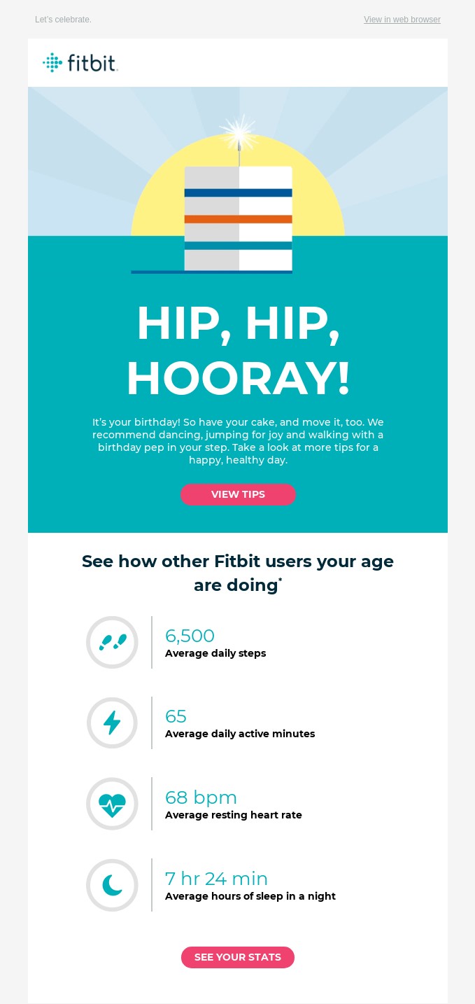
What I would have loved is the comparison to what I was at last birthday. Did that increase or decrease? How much more fit have I gotten? Or made myself...gotten? Is that the right word? I’ve gotten fit.
Matt Helbig: It’s an interesting level of personalization, I think, of using these community stats, especially at your age, with that CTA See Your Stats.
But I do think you have to be a little careful about what kind of metrics are showing. Like you just said, maybe you got a lot less fit over the year and that could be a little depressing. They can try to set up those business roles and think of these different scenarios where trying to spin as much data positively as you can when you have so much data on a person and even like a whole group, a subset of a community.
Mike Nelson: Now that Google owns them as well, they probably have so much data on their hands. Understanding what data to use can probably be overbearing to that team. Do we show steps? Do we show flights climbed? Do we show the number of days in a row that you've been active? Do we show awards that you've earned within the app, ‘cause it's gamified a little bit?
All those things are probably inputs to the marketing team to say, is this going to drive a little bit more loyalty or less loyalty? Like you said, if it's worse than what they're expecting, does that have a negative effect on the usage of the product? Data can be good and it can be bad in the sense, but I do like how it says, how are you comparing to others?
I just would've liked my comparison either here to other people or to last year presented within the email without me actually going to see my stats completely, but maybe that's a security thing. Maybe they do that for personal privacy reasons.
Matt Helbig: And this last one is a little bit of an older one, but I think one of our favorites when it comes to this sort of data report style email pulling in a ton of metrics. This is probably when you were hitting the gym every day, Mike.
Mike Nelson: Yeah, I was. I think that was back in 2016ish, 2017, which makes me feel like we're getting old to do all these. But I do like the graphical elements of them pulling in those circles to show that you still want to fill a circle in or fill a ring, get your steps in, complete the day. So that's kind of a visually compelling graphic right there.
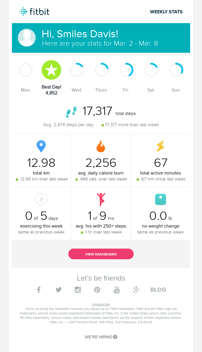
The icons are a little confusing. Calories burned is a fire, but I had to read that it meant calories burned. And then the lightning bolt for active minutes, I don't really associate activeness with lightning. So there's probably some iconography that they probably fixed since then.
I do think that from a user data perspective, this is a really strong email ‘cause it’s telling me exactly how I did.
Matt Helbig: It's pretty dense, but I think it is cool how it sort of fits all in one view on mobile. So, if you want to just screenshot the whole email and send it to someone, that's kind of another cool way to think about how to share metrics.
Sometimes people do just screenshot an email and send it out over social. So maybe even thinking about if someone might do that for you or email outside of a social share.
Great job, Fitbit. It’s a good showcase of how to use personal data and community data in your emails to really build that one-to-one relationship with your audience and bring people back into your product.
Mike Nelson: Totally agree. Good job, guys.
Matt Helbig: Good job. Thanks a bunch, Mike, for jumping on. I hope we can do another episode real soon.
Mike Nelson: Well, thanks.
Matt Helbig: Okay. Happy Friday.
Mike Nelson: You too, man. Peace.
