Matt Helbig: These are some emails that you made from Fundrise. I had a chance to look at some of the live emails they're sending, but these are the templates you made.
Anne Tomlin: So the client gave me a Figma file with every single mockup of a module that they would need. Every single one. And they were all in five different files. What I ended up doing was creating those five files with all the modules in them. Those five emails contain all the modules that Fundrise will ever need.
They put them into their ESP and can switch around whatever order they need. For whatever modules to be in whatever order. It was just easier to create them, to code them all together at one time with each email.
Matt Helbig: Were they starting from scratch, or do they have something in place already, or they hand over these Figma files, and this is a newer brand?
Anne Tomlin: Yeah. They handed over the files and said go. They provided their mockups and their font and pretty much said go for it. Do as much as you can.
Matt Helbig: When they handed over those files, were there any limitations that you didn't think could work with email, or were they pretty straightforward with how they laid everything out?
Anne Tomlin: They gave me the files and said, is there anything in these that can't be done or that would take a ridiculous amount of time, something like that. And I looked at it, it said no, but sometimes when clients hand over stuff, they do have a couple of things that may not work in email or take a little too much time to create. That was not the case with Fundrise
Matt Helbig: These are pretty in-depth, pretty extensive. I think how everything is scaling is looking nice. How do you get started with this? Before, you mentioned maybe like a base template that you're maybe starting with and then try and code out these individual sections.
Anne Tomlin: Yep. That's exactly right. So I started with my base template. My base template has every structure that I have built ever. I can quickly start with that and then take out any structures that I don't need and create each of these modules, one on top of each other.
So it doesn't take me too horribly long to code something like this because it's kind of already all coded. It just needs to be changed a little bit to fit their branding like this one at the top right here. It says new apartment development. I didn't have those three columns right next to each other.
So I had to create that for them. The big parts of the email, the modules themselves are already done. That's always just a copy paste and then put in whatever is missing specific to the brand.
Matt Helbig: So did you have to do any ESP work or any integration stuff with them, or was it just handing off the HTML?
Anne Tomlin: I handed off the HTML. Usually, I like to put the code in the ESP. This client just decided they wanted to do it themselves. From the emails that I've got from them that use this modular system, they are doing a great job.
Matt Helbig: We've been using Figma a lot too internally, and I wonder if that better than Photoshop or something for you? Did you find it a little easier to use?
Anne Tomlin: I like that it provides the hex colors. You don't have to interact with it as much as a PSD or a Sketch file. With those, you have to find the exact hex number and measure the distances between elements, but with Figma, that information is already available. It's in a design type of pane that shows you there are 25 pixels between these two segments that I think is helpful. I would say that Figma has a little bit of a learning curve, though.
Matt Helbig: This is another template. How did you guys split this up?
Anne Tomlin: I think what they did was gather the modules that would be the most often with each other. That's how I created five of them so that the modules are already with the modules that they will most often appear with. That way, the client can pull up one of the five and then use that as a basis to pull in or out any modules.
Matt Helbig: Are you seeing that more and more with clients with a design system or idea of how their emails might work down the road? Or is it dependent on each one?
Anne Tomlin: So kind of a mix, but I will say that I enjoy this kind of work a little more. The modular system is making it so that the client can use it in multiple different ways. I like the satisfaction that I get after building something like that.
Matt Helbig: It's great to see all this use of live text. A lot of times on this show, we don't always get live text.
Anne Tomlin: I'd say it is a very important thing to me to have live text.
Matt Helbig: This is an excellent case to see sort of the skeleton template that you can populate content with and test different things, pull things in dynamically when you're not having to worry about slicing paragraphs or something like that. I think it frees up the design template to take a lot of different types of content.
Anne Tomlin: I will also say that the design of this is very clean, which is helpful when creating something that's as modular as this. There are not too many background images or background colors that need to be right up against another image to match the background colors. Those are hard to do in dark mode. With these modules, they don't have any of that. So it's very, really clean.
Matt Helbig: I like the constraint with these templates in their branding. I feel like they're trying only to use a couple of colors, and I think it focuses their message on the main content and the CTAs they want you to click. Cool to see that they had a vision going into this rather than some financial brands bogged down by legalese, but this still feels pretty clean. Even though you do have a big chunk of legal, I still think it does an excellent job balancing design and function.
Anne Tomlin: I think I even probably said to them at one point, wow, this is pretty. This is a nice modular system you've got here. I can't wait to build it.
Matt Helbig: Speaking of dark mode, this is what dark mode looks like on these emails. How much more time did you have to spend optimizing these for dark mode? I know this is a newer topic. People are a little scared of it.
Anne Tomlin: I would say maybe an additional 15 to 20 minutes. It doesn't take very long to get all the colors right and put in the actual code. What you see on screen is what Apple mail and iOS mail look like that respect the dark styles declared in the head tag. I took the background color that is already in the light mode and darkened it by 90%.
Then put the style in to change that background color to keep the same feel of the light mode, but just darker. I will say that Fundraise did not give me any instruction on the dark mode. I just basically said, do you want dark mode styles? They said yes. I went ahead and did what I thought looked best.
Matt Helbig: Dark mode, I don't think, is something that's going to go away super soon, and more people are opting in on it, depending on newer devices. I think it makes sense to think about that going in when you start email design, to be aware that some email clients will try to force things into dark mode if you have that option turned on. It's better to understand a little bit about how the emails are laid out so you can better respond to that.
Anne Tomlin: I think that the best way to treat dark moon is to design for it. Before the design is completely done, possibly get in there beforehand, and see what it looks like. If, what Outlook or whatever changes the colors, inverts them fully, what does that look like?
Then you can go from there and change a few things about the email design itself that would make it a little better in the dark mode clients that invert your colors. That doesn't respect any styles that you've put in.
Matt Helbig: I do think it is a little bit still complicated on exactly the support everywhere. So I don't think you're going to get it a hundred percent perfect. I know that it may be hard for brands that have to approve a specific design, but if you are approving every single email client exactly how it's going to look, that will take a while. If you follow some good email coding best practices, once you turn that dark on, there's hopefully isn't tons that you'll have to tweak.
Anne Tomlin: Yeah. What you've pulled up here is an interesting one of what they had me do. They had all different mockups of this particular module. Of what it's going to look like with various buttons and button colors and such. When I'm creating this stuff, it seems strange.
It looks kind of weird with the same thing, one on top of each other. I think that it's helpful for the client to be able to have this stuff done and pull in the module that they want that looks best with whatever design they have chosen for whatever email they're doing at that moment.
Matt Helbig: Are there any recommendations that you did for them or extra enhancements. I know you said the dark mode styling, but did they give you desktop and mobile layouts?
Anne Tomlin: I'm not sure if they gave me mobile layouts. I would probably say they did because they were really on the ball with everything. Even if any client does not give me a mobile mockup, I use my best judgment. I've been doing this for ten years now or a little more.
I generally know what the best mobile layout is going to be when I see a desktop design. I think that most of my clients trust that it'll look right. If they don't like it, when I send them the Litmis links, they'll tell me they want it changed. I will gladly change it.
Matt Helbig: That's good. Some people I've worked with are print designers, and they only understand one specific layout. I tried to inform them that most people on our list are opening on a mobile device. We should spend some extra time to optimize for that view.
Anne Tomlin: Totally. Sometimes some clients will come back and say, Hey, we don't want this to be responsive for some reason. I'll coach as much as I can as to why I think it should be responsive or, in any circumstance, why I believe that this way is better than that way, but if they don't want it, then I'm not going to force them to do it.
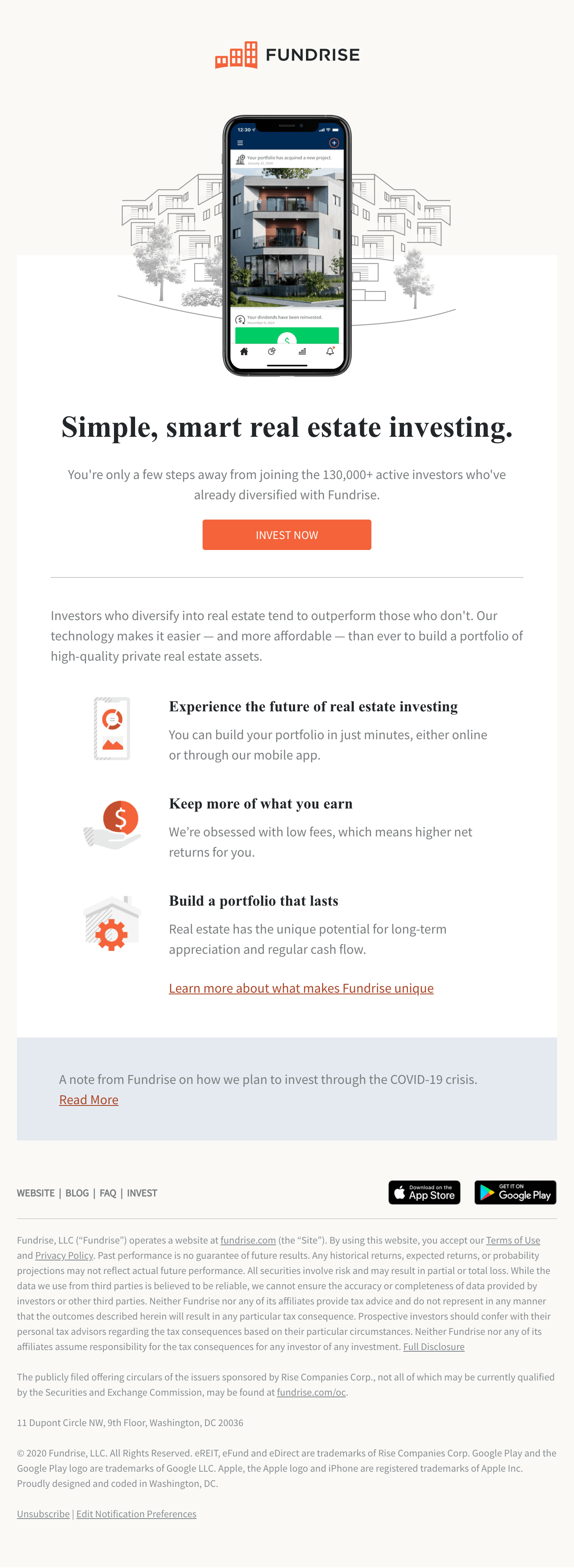
Matt Helbig: I had some of the live emails thought we could take a quick look at. So this first one is a nice looking welcome email. The first one that I got, and it was pretty inviting for a welcome email. It's nice to see how they're using those different sections in the building, this communication, but it doesn't look that much different than the template that you laid out for them.
Anne Tomlin: When I build things, I try to keep it as simple as possible with a lot of code notes so that if the client is going into the code to make these changes, it helps them navigate. They can build the email a little faster if you have some documentation. Suppose they have some guidelines, even in the code. I think that that helps them.
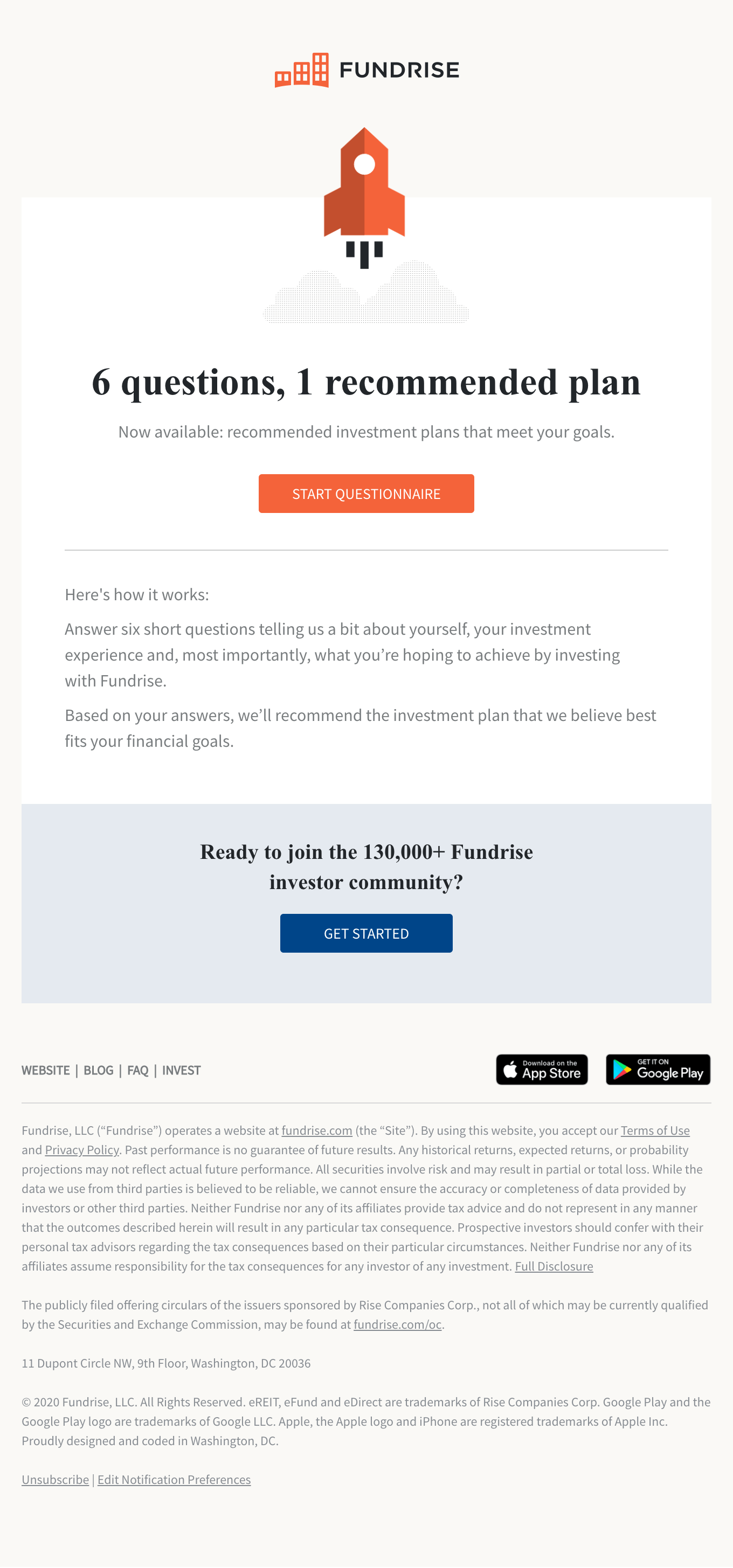
Matt Helbig: I like all of their emails. I feel, as you said, that they're pretty simple and straightforward. Do you tend to point people towards these more simple text designs? I feel like sometimes people would try to over-complicate email.
Anne Tomlin: I don't necessarily push in one direction or another for the design, but I try and educate. I kind of pride myself on code most, anything in email, but I also will be like, yes; I can create this; however, these are the reasons you shouldn't want me to make it this way. Let's think about accessibility, image sizes—that gently pushing to maybe a little cleaner of a layout.
Matt Helbig: You're more on the development side, but were there any design parts of these that you may be wanting to experiment with something new or are tweak a bit?
Anne Tomlin: Not in this one. With the layout, this clean and nice that I didn't have anything to experiment on. It all pretty much was in nicely coded modules. Anything new that a design that has got some layovers and stuff like that, I will try new techniques and always make my code a little bit better. With these guys, they were already on point. I didn't have very much to counsel them on.
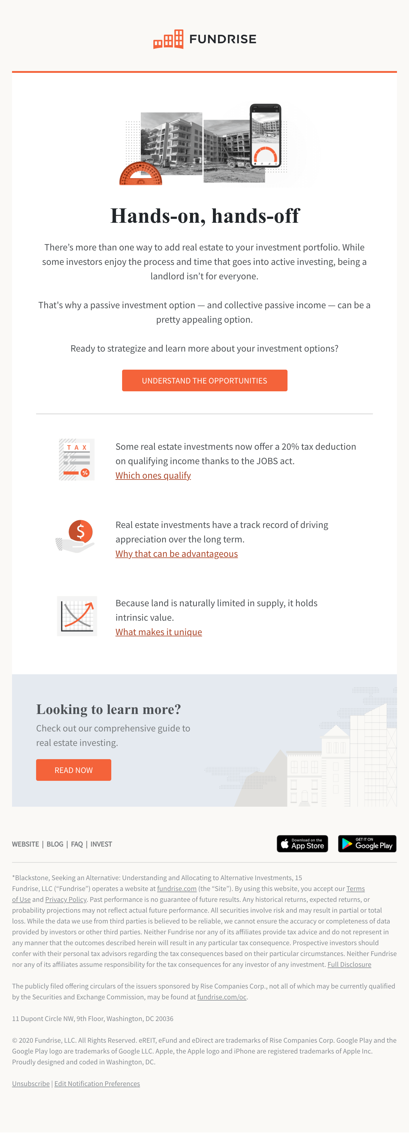
Matt Helbig: I am impressed, especially with this bottom section. I feel most people would cheat on this one. They would maybe make the rest of this live text, but this one would be like a bottom cover image. So it is nice to see that this stuff has live text as we saw it with the dark mode. If those styles are there, this does look much better than having a single banner there.
Anne Tomlin: Live text is the hill I will die on. It is the most important thing to me when I'm coding is making sure that everybody can get the message of the email. I want the message to get to everyone and for there to be no blocks in the way.
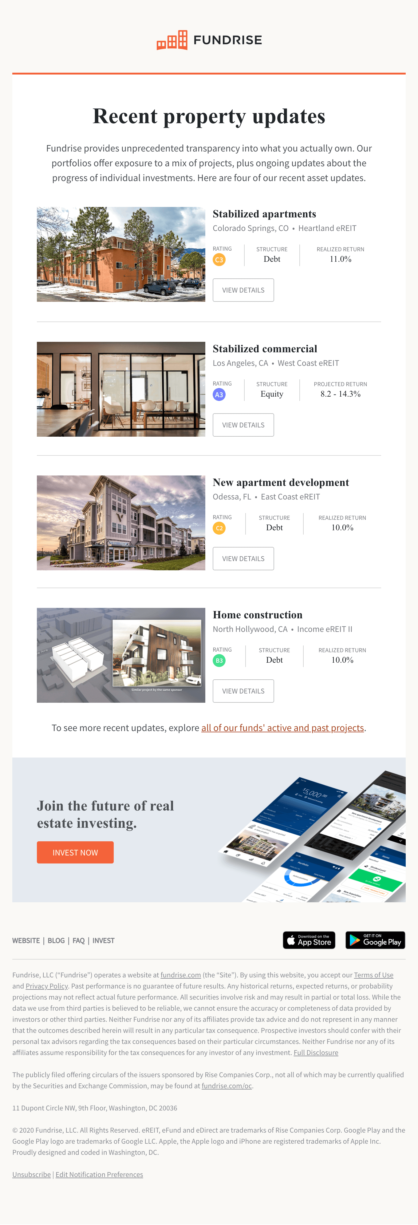
Matt Helbig: This one's even more dynamic, which I think is cool to see, just because of how much time you probably save with that live text, being able to populate this entire module with dynamic content. So you do not ever have to lay this out if you do it right. This email can just trigger pulling in all this information.
Anne Tomlin: I didn't have access to the ESP, but I get these emails as well. I can tell you for sure that I did not get the same four of these examples in this particular order. So it must be dynamic content. If they set it up to where there are only so many possibilities for each of the three columns next to each other, they must be super easy to bang out and send for however often send this email. I would love to see it in the ESP, but from what I can tell, it seems like they've done an excellent job of taking the modules and using them to their full potential.
Matt Helbig: So, do you have any resources for people like starting coding? I feel like some people in our audience might be stuck in a small ESP where they're more familiar with just messing around with a WYSIWYG editor. Is it best to let a professional do some of this, or are there some small things that you can learn to help you out with coding?
Anne Tomlin: I think that maybe not the modules we're looking at now, since that required many nested tables. These were pretty difficult to make and get them looking right. Some of the other ones that are a little easier, maybe the 50/50 that would have an image and a block of text, those sorts of less complicated modules, the way that I learned it, go through other people's code. The more exposure you get to it, the more you'll learn how to use it correctly and then change it to whatever you need for any circumstance. I would invite anybody to look at the code for these. Please feel free to learn from them.
Matt Helbig: Here's the time you can plug all your stuff. Is there anything you want to plug?
Anne Tomlin: I guess I would like to plug my website. It's emailsyall.com. It shows you what I can do, and if you want to hire me, you can contact me through there.
Matt Helbig: So wait, you're going to code my emails too and make them look this good?
Anne Tomlin: If you would like, yes, if you want me to do it, I can. I enjoy it.
Matt Helbig: Well, thanks for coming on. It's always a pleasure to have you on.
Anne Tomlin: Totally. I love to be here.
