Things like product registrations from their website and things. This was in conjunction with Amazon. So this was going to be sold via Amazon. So they were driving traffic to Amazon via using Seagate's contacts.
Matt Helbig: So how did you land on this? This is kind of an advanced thing, but I enjoy that it's taking over the entire color of each of these sections. It's really impressive to see.
Chris Barnett: We're big believers that an email is about driving a message, fundamentally one message with, additional messaging around there, but fundamentally it needs to drive one message.
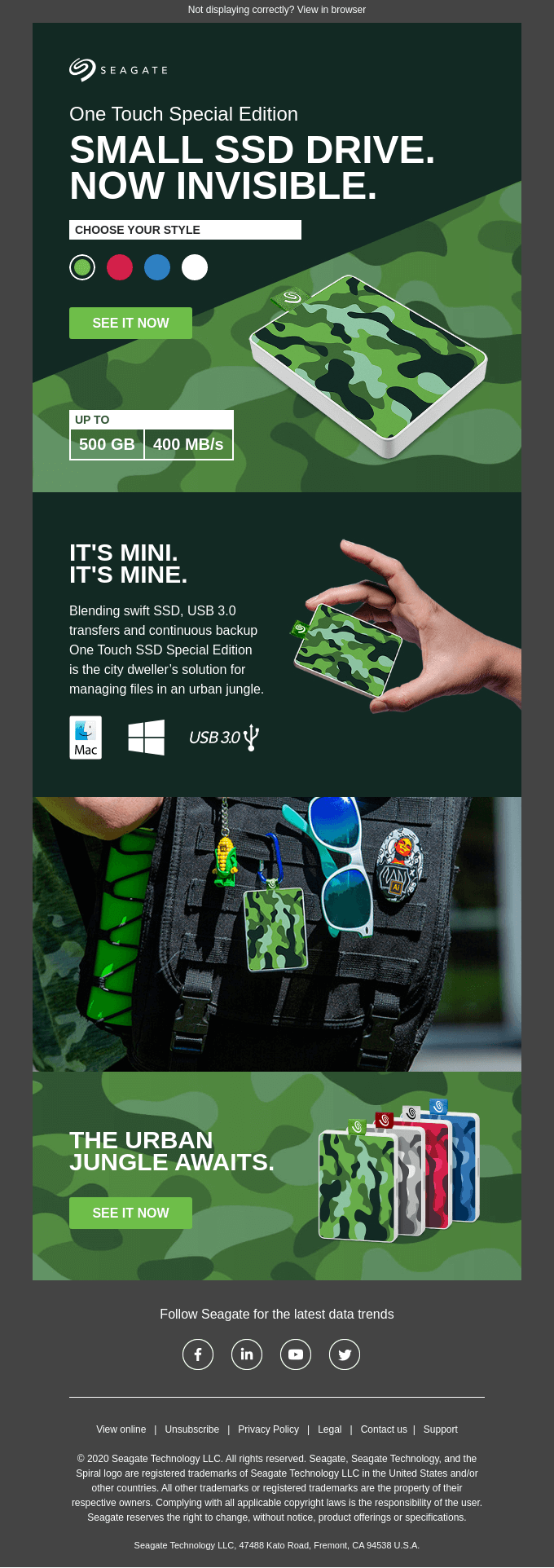
This is a product email that we liked the look of the product. We took inspiration from the landing page. So the product page on seagate.com, which had a similar sort of color picker. You can buy this drive in these four colors. It's important to get the size across, hence you get an image of how big that is in somebody's hand.
One thing that's interesting when this has come about. And is it again, the way we think about things is that we don't just like doing things for the sake of them. So interactivity, we don't want to just do it for the sake of it. We want to do it so it adds value to what we're doing. We could do that with this one, being a B2C audience. We use Litmus stats and Email on Acid stats.
They have very precise client device stats. So we looked at the potential audience for this, and this went out to 250,000. We looked at the audience from previous sends, which weren't interactive, still a similar product and we looked at what we felt was a good interactive audience. What was a good fit there?
We worked out probably right around 30, 40% of our audience would be able to render an interactive experience. So we felt that justified more looking at an interactive email than not for this one. So it's a B2C send. It's very heavily mobile. The mobile stats were around about the same probably 30, 40% were opening on mobile. So we felt we could go down that route and have some fun and do something a little bit different. When you're B2B it's desktop. Less so of an interactive client there, whereas this one we felt fit.
Matt Helbig: I think holidays may be a good time to maybe try something like this, if you have the time, just because maybe you can stand out in the inbox a little bit more. It's kind of a fun time to maybe try something new.
This one stood out to me. How do you start with something like this? Use of live text, interactive elements, hover effects. How do you sort of markdown each of the different things that you guys want to tackle?
Chris Barnett: We shoot for the sky initially. All our emails are responsive, so that is a given. It's a marriage between design and what's achievable technically. So we look at those two things together and we'll have a discussion around what we can do from a visual point of view and how we can have some interactivity or something that adds value on top of that.
From a design side, we try to keep all our text within that's editable. We do a lot of work that's translated, so it's easier to translate. It's less of a payload. It renders quicker. There's no images coming down or less images. If images are turned off, you still get an experience rather than very little. That's our philosophies as well. We have to use imagery. There's no question on this type of email.
We were briefed that these drives are going to be sold on Amazon. There are quite some unique drives. They've got a different look and feel to the traditional sort of portable drive and these different colors. So we wanted to get that feeling. We added the picker very early on to try and get some intrigue in there. We try and keep our buttons high up. So one at the top, one at the bottom, if it's quite a long email.
Matt Helbig: It looks great on both desktop and mobile. I think you nailed it there. I did have a peek at how the fallback looks. I think that also is executed well. So I think overall, you guys are covering your bases when it comes to some of these concerns with using interactive in an email.
Chris Barnett: Some of our other interactive emails, which I'm happy to share. We had a philosophy of, we're almost designing three emails in one. We would have their interactive first. Then we fall back on sort of a Gmail experience. Then we had an Outlook catchall experience. Having to code for three different experiences within one email. Which obviously as you know adds time and testing time.
That's probably one of the challenges of doing such a thing. But we felt it was justified in doing that because we found the audience was going to see our work.
Matt Helbig: Was a client like Seagate really on board with something like this? Or did you have to concept something and show them before you guys went all in putting the dev time and testing time on this?
Chris Barnett: We have a very good relationship with them. We're trusted as their email team and they like us to add value and not just to be told what to do. We just want to push things and see what happens and see where things go. I believe that if you just stand still, nothing moves forward.
So we're very lucky we have a client there that they are open to us doing interesting work that we see as technically challenging, visually challenging, and message challenging as well. So they were on board with it.
Matt Helbig: I know you said there was a little bump in engagement with the email. So do you think interactive can help with that? When is the right time to use an interactive email?
Chris Barnett: My feeling on that is that if you can, look at who's opening and look closely at device stats. If the sort of audience, your sweet spot of who you want this message to be delivered to is likely to respond to something interactive, then I think there's more justification for it. If you can add some sort of mechanism within the email that adds value. That is more than just visual. I think that those two sorts of boundaries are worth taking into account.
So for example, we might be looking to work with a very big pizza company. You may know who they might be. One of their challenges in getting pizzas to your door. They need as few steps that stop that journey as possible. They want that journey to be as easy and as quick as possible for you to order that product.
What we're looking to do is from the data that we know about previous orders, we're looking to produce a limited interactive email. You have to build all the logic within the email. It's not super clever. It's just lots of IF THIS display that IF THAT display this, but you can build up quite complicated logic as well if you use some sort of automated sort of logic building that brings out a lot of HTML that covers all those options.
For those pizza guys, if we can bring in, if you traditionally have pepperoni and ham or whatever, if we loaded that into an interactive email, and this is a discussion we're having, and then allowing you to choose a couple of options, not too many, and then bang, you've customized it within your email client.
That goes straight through. You hit purchase and then it's coming through. It's reducing those times. The reason for mentioning that is there is a justification. I believe in helping that journey happen easier by offloading some of that poorer experience. When you go from an email into a landing page and go wait for it to load, wait for everything to come down, you've downloaded all the stuff that you need already in the email Why am I having to download it again?
I can then click and off we go again. So that's our thinking. We're not just wanting to do interactive just because you can. We want to see if it's worth it. We do that from the stats that we get. We look at the audience and see. There is a time commitment. There's a financial commitment there in terms of development.
So we want to be able to say, look, we think this is a good idea. The reason why is because this audience is on this device and they looking for that type of product, that's the way we like to think. It doesn't always happen like that, but that's where we try and set off.
Matt Helbig: I agree. Do you have any tips or tricks for people that want to build an interactive email like this? I feel like when people see these in their inbox, they get impressed, but then they look at the code and it becomes a daunting task for some people, especially, teams of one or something.
Chris Barnett: We haven't found any sort of like libraries that help us. We tend to take what we've done before and build upon that, but strip it down. We don't have a framework for building these. They are very much bespoke. So we will take a previous one that we've done and reduce it right down to its parts, and then build it back up again.
That's the way we approach things. So hopefully some of our work is already done with the previous email and we're just adding to it or embellishing it and changing the imagery, changing the layout. We're trying to save a bit more time in that respect.
Matt Helbig: So, is there anything that after it went out that you'd maybe change or improve on?
Chris Barnett: Yeah, one thing I would say is that we didn't do an A/B test. Now what we could have done, we could have maybe stripped out the interactivity and made a B version of the email. Do a 50 50 send and the 250,000, see which one generated more revenue. If you're doing an interactive email, you can change the link where you're going. So you can identify out of those four selectors, which one they chose.
So then you can start to report them. In the intro to the email, option three was clicked more than option one. In hindsight, if we'd just done that as one email and then we'd done one that wasn't interactive again, split the database, and then we'd know for sure whether they interactivity had a bigger impact or not.
What I can say is this email performed much better than the previous two emails we'd sent out to the various similar products were that 27% unique open rate on 250,000, which was pretty good. 2.1% unique click-through rate. Before that, we were 0.7% 0.8% rates on very similar emails that weren't interactive.
Bear in mind the time of year when it was sent. That's what we love about emails. It's fascinating. It's about when you send it, who you're sending it to, how often you've sent it to them, what it is you're sending, what do they think of you as a brand?
We find that an email is like a little ecosystem just in itself. This one here was sent in December. The previous one we had was a few months earlier. I don't know if that gives you some insight, but if you're looking to do more of these, I think you've got to put the justification in place to say, look, we split the database in half, and there's no point in doing this with a small database.
I don't think if you're talking 5,000, 4,000. where you normally get in a 10% open rate. I don't think you'd get big enough numbers there to make a really good call if the value is there. The bigger the numbers, the more you've got to go through in your reporting.
Matt Helbig: One last question to end on is, what's the one thing about email that you thought you knew that is different now?
Chris Barnett: I always worried that email might be going away. The older I get, I just don't think it's going away. I was worried as a business, we got into email 10 years ago and I always used to think maybe it'll go away. People hate it, spammy and stuff. I don't think it's going anywhere.
Matt Helbig: Awesome. Thank you so much for taking the time. I appreciate it. I love this interactive email.
Chris Barnett: Yeah. We want to do more of them. Thank you Really Good Emails. We love the stuff you're pushing out. We love this community as well. We want to help and do as much as we can as well.
It was an honor to us that when you first chose one of our emails to go on the website. Wow. That was lovely. So thank you very much and keep up your good work as well.
Thanks to all the other #emailgeeks out there as well. I know we're often overlooked, but keep up the good work.


