This FF episode was sponsored by emfluence. Get paired with a marketer to see how your strategy will work in the emfluence Marketing Platform.
📋 TL;DR key takeaways from this episode:
1. Make the CTA color and focus unique to the rest of your design - not the same color - to make CTAs easily distinguishable.
2. Build hype in a teaser email using short text and a simple graphic. Reuse this content across multiple channels (ex: social media, website) for a consistent experience.
3. If you're using an image-only email template, keep the branding consistent and make the content accessible with the proper alt text, contrast, and descriptive text for links.
Matthew Smith: Hey, it's Feedback Friday once again, everybody. How's it going, Matt Helbig?
Matt Helbig: I'm doing fantastic this Friday. How about you, Matthew Smith?
Matthew Smith: I'm good. My man, I'm good. This Friday, my girlfriend moves in after 18 months of being apart. So I'm psyched about that. I'm also psyched about these Youth To The People emails here on Feedback Friday, where we discuss brands and their emails, and what's working well and sometimes a few thoughts or tips.
I'm into this Youth To The People. I think you sent this over, man, this is yours. So why don't you kick us off?
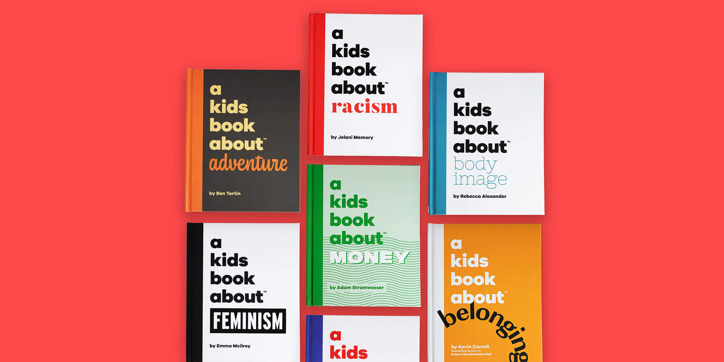
Matt Helbig: This one is on the line for me. This is similar to some of the other more experimental designed emails that we've looked at in the past. It's doing some more modern stuff in the inbox. It is one of those examples where it is mostly all images.

Maybe this is just an image, not an email, but I think they are trying out some interesting new stuff with color and layout and things like that. This is one of those that I thought would be interesting to talk about, but I don't know if it would ever be featured on our site fully.
Matthew Smith: Right, right, right. Interesting. I think a lot of these decisions seem to be around the brand. Can you push something like this where there's a lot of different typography styles? It's a busy email in some ways, but it seems like this is part of the brand. It's so hard. To me, so many people try and do this and don't execute well.
Whereas I feel like this gets into that category of they are executing well. It's busy. It's fast. It's got many lines. It got many shapes, but it keeps you moving. If they're going to be all images, they've made the text large enough to read on a mobile device. I'm able to see that easily.
The email is set up from the get-go to be something that feels readable. Now, I've got some things like this as a CTA, look at all these other big, even rounded corner things that feel like CTAs to me. And, by looking at my mouse here, I can tell that they are, in some ways, CTAs.
I'm curious where they're all leading—hitting me then with this "BOOK NOW." I know that it's a CTA. So I think other people will, but it would be hard to say scan quickly and understand that. So, as a rule, I tend to feel like your CTA color, your CTA focus should be something unique to the rest of your design, not the same color, but here it works.
But like you said, it's sort of on the line. Let's look at some of the others. They change up colors.
Matt Helbig: This is another green on black example that I think we've covered before as a general design trend. It has many exciting elements that I think people could borrow to make their live text emails a little bit more interesting.

Playing with the layout and using images and things like that. Maybe something a little bit more locked up that email designers could try to make into live text. Even with this list, like having a different font and color. I think that is something that you could try to do in live text, and it still might sort of work out for many email clients.
So taking some of those elements and maybe trying them in a well-coded email. It could be interesting to see.
Matthew Smith: It's interesting seeing how they take the brand, and they take the aesthetic and continue to push it through. It's working. It's a little bit hectic for my taste, but I think it's consistent. And that's one of the things that I think I value about it.
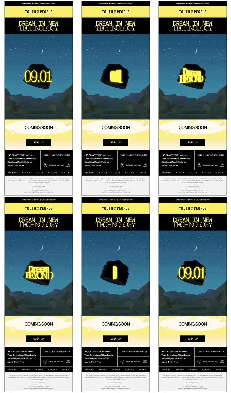
So let's pop over and look at another one and see that consistency again. So in this one, now we've got yellow, and in this case, we've got this very odd GIF here that a is telling me to dream beyond it. This doesn't feel as on-brand to me. I think that maybe they're just pushing some things and seeing what's out there.
I'm not exactly sure what sort of studio this is. It's interesting. It almost looks like mountains, and then you realize, Oh, those are pillows. So there's just kind of an interesting vibe going on here, but I'm curious. And I think that's at least what they're trying to get me to be. Is curious to see what is coming soon. I want to find out.
This is a design trend where you kind of lock things up in these boxes like this. It's a throwback to some mid-century and older design with a sort of punch cards and things like that. But I think it works well here. And it is a nice change to see how people sign off on things.
Like why not do the whole footer in that aesthetic? The footer is the weakest part of these emails. I think as it is in most emails. It's sort of like the dirty rest. The dirty rest is what my friend Nate used to call the milk after you were finished with the cereal. That's what's going on in footers often.
Anyway, what do you think of this one?
Matt Helbig: This shorter teaser email. I think it does a job pretty effectively to build a little bit of hype. I noticed as well that they're using this graphic on social media and things like that. So it's nice to see them reusing a graphic across multiple channels.

The majority of skincare brands that we've covered tend to use all images. I guess it's just to see the differences between these brands on innovating on the style. So I think that's what we've seen a lot with different fashion and beauty stuff. A lot of the emails they're delivering will be all images.
I think it's a challenging thing with a brand that is so focused on branding and imagery and appearance online on social to spend the time to work on a well-established email template that is accessible. I know we would both love to see more brands take that step and still balance pleasing aesthetics with a more accessible email.
Matthew Smith: Good job, Youth To The People. By the way, this little white YTTP down here at the bottom. That's like one of my favorites. That's a tight little lockup right there. I just wanted to point that out. I'm into the name. I'm into the brand. It's interesting. Not my style, but they pull it off. Good work. I hope everybody enjoys this. Leave your questions in the comments. Subscribe. Please share it with your friends and your parents.
Your parents need to see these videos. It's great to have everybody here. Thanks for being such a cool community. See you next Friday.
Matt Helbig: See you.


