Knak sponsored this FF episode. Schedule a demo to build your own really good emails and get them to market in minutes.
📋 TL;DR key takeaways from this episode:
1. Show how to use a website or product with simple images and text in an onboarding email. Follow a simple hierarchy, such as using one heading, then a slightly smaller heading style to talk about the product contents, and then readable, less contrasting paragraph text with more info.
2. Be careful in using too much contrasting text and colored boxes all in one email. If there’s too much going on at once, this can be difficult to read and even distracting for your audience.
3. Driving your audience toward one simple CTA can help keep a giveaway email focused. Try using one headline, one image, and one CTA.
Matthew Smith: Hey, happy Friday, Matt Helbig. It's another feedback Friday where we can talk about some sick little emails from Honey. How you doing?
Matt Helbig: I'm doing great. I'm excited to jump in and look at these Honey emails.
Matthew Smith: Thanks, Honey.
Yeah, man, I'm pretty interested in what they're doing here.
Honey is a tiny little company worth...not very much money. Not true, but they've done a nice job of showing me how I can use Honey, how it can be effective, and what I can do here.
I'm not often a fan of the zigzag approach. It can get overused because it's hard to do right. But they've done a really nice job here.

One of the things that makes this work is they also have live text - nice job folks. They use this same heading style for one, two, three, and then a slightly smaller heading style to talk about the contents. And then there’s a nice kind of gray readable, but less contrasting text.
So, I get to go, Oh, shop like normal on my laptop > add items > price drop alert. I get to see the flow of how this works, and if I really want to read in, I can. And then these circular image types work really well to not feel too heavy and blocky. The whole focus here is to add a droplist. Right. So, if I want to start shopping for specific things, I can create a droplist so that I can get those updates. It makes a lot of sense.
I really liked the way that they move through this email and then that's it. Just, “create a droplist.” Okay. You want to know how that works? Cool. You think this one’s working?
Matt Helbig: Yeah, I've been using Honey for a long time and I feel earlier on, they didn't have emails like this. There were more plain text emails. So, it was interesting to me to see them now invest more and try out more of this content and email that they have that channel to promote, rather than just this being a plain text email.
They're really smart with the notifications they send when you add things to your droplist. So, I think they have a pretty robust email program and it probably drives a lot of sales for them.
Matthew Smith: Yeah, I think you're probably right. This is another good example where they use a not uncomplex layout. It has some complexity to it, but they do a nice job of keeping it pretty simple, straightforward, and using a two-column grid to make it readable and easy to digest.

So, they start out with this big header image. Notice little things like this gold that shimmers every now and then. It's just really fun the way that that happens. That little GIF can add a lot of detail. Same with a little image like this where this number is shifting. That's pretty powerful and interesting.
They do a nice job with their type of graphic hierarchy. Headings that are nice and dark. And then your subtexts, that's a lighter-weight font. And on other emails, they had the gray text here. So, this may be an older one or a newer one.
The only thing that happens here is I get a little overwhelmed by these big colors and imagery. I feel like I need to read each of these things. I wonder how much actual readability they get from it.
Matt Helbig: Yeah. This is a popular category of these recap report emails on our site. So, it's interesting to see their take on it. I think the mobile view is probably a little bit better for me, having a little bit more white space and letting those big blocky images breathe a little bit. But I think as a scannable report, I think it works pretty well.
I guess they could really decide which of these metrics are the most important because they are throwing a lot of information at you and maybe you only care about one specific thing.
I would love personalization, like how much money you saved. I think that would be really cool if they could do that for each user. I know they're bringing in your Honey Gold, but if this was personalized to you rather than the community of their members, I think that could be a little bit more personal for sure.
Matthew Smith: I agree. Here's an interesting holiday one where they just get people into “giftway.” These are tough. Giveaway type of things, you have to have a lot of legalese or people do a lot of legalese, whether you have to have it or not is per company, probably.
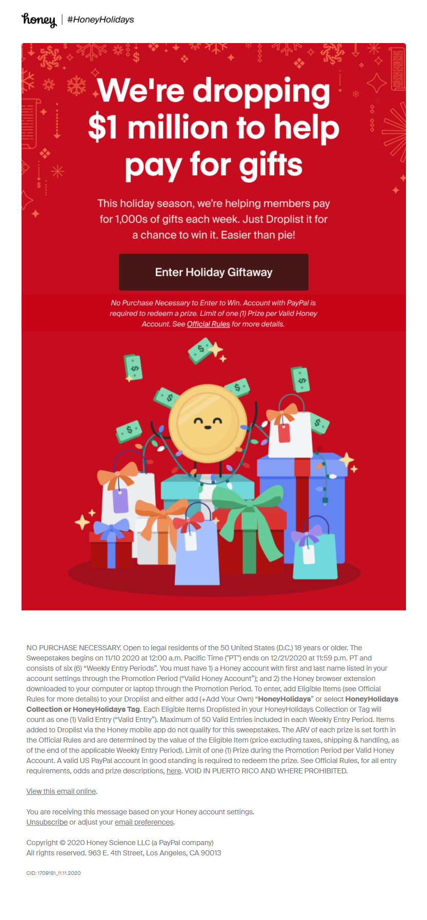
But I think that they did a pretty nice job of giving as much attention to a simple thing as possible and driving toward that one simple “Enter holiday giftaway” where a lot of people end up adding much more to this than they really need. I think they did a nice, nice job. Have you seen anything different done well in this kind of category?
Matt Helbig: Yeah, these contest ones are kind of hard because sometimes they feel a little spammy or it feels like they're just partnering with someone to get some more information about you. So maybe just that caveat of when you're doing some of these giveaways, or giftaway in this case, try to make them feel a little bit more natural and less salesy or scammy.
I think this one does a pretty good job of it being short and to the point, but seeing this in my inbox, I always kind of feel like, Why am I getting this? Or something like that.
Matthew Smith: Good, good. Got a couple of more here. Look at these really nice views of almost a receipt-oriented way of thinking.
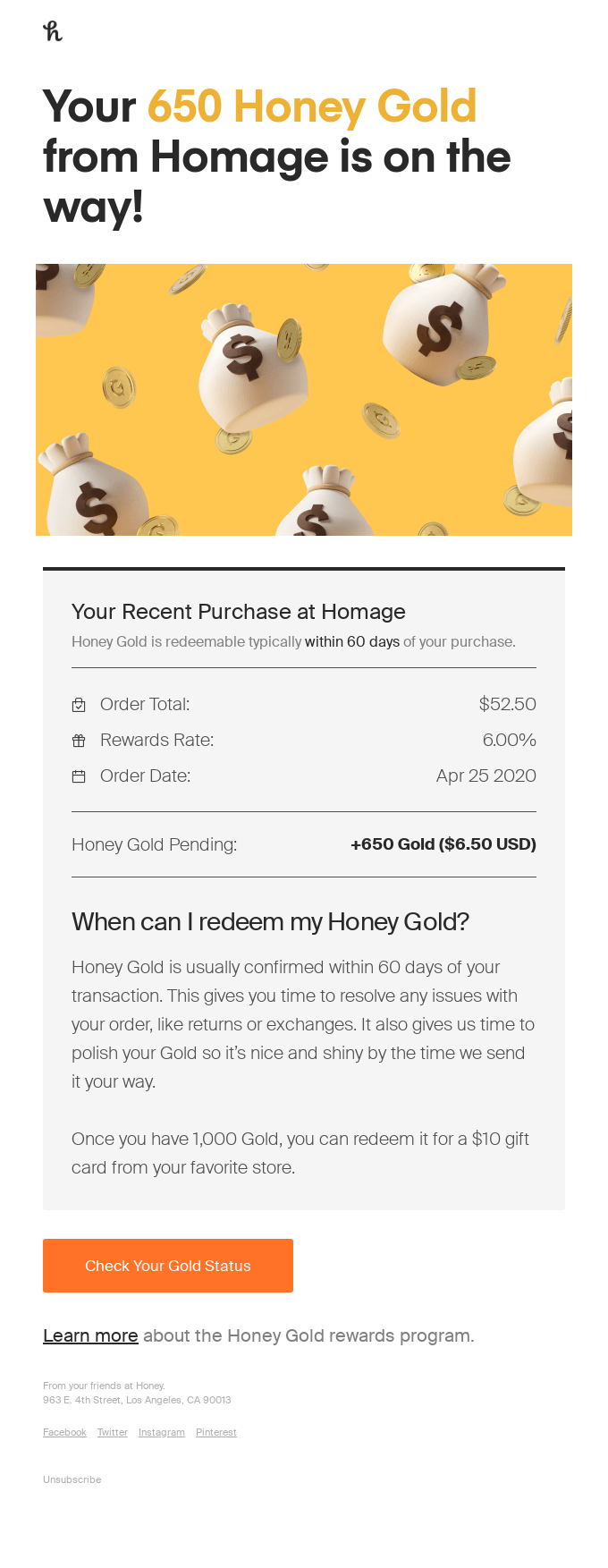
I'm really impressed with how easy to read this is on mobile and on desktop. And then there’s more of this consistent content. This is more of a newsletter with some content that they've got going on. Really impressed.

Well done, Honey. I think you all are really killing it. If you want to sponsor us with some of that special money, feel free. We're just happy to be here.
Happy to have some good emails going on here. Thanks for being here, everybody. Happy Friday. Hope you have a great one.
Matt Helbig: See ya.
