Matthew Smith: I think you're right, Matt Helbig, that somebody had a meeting and there's a lot more entertainment.
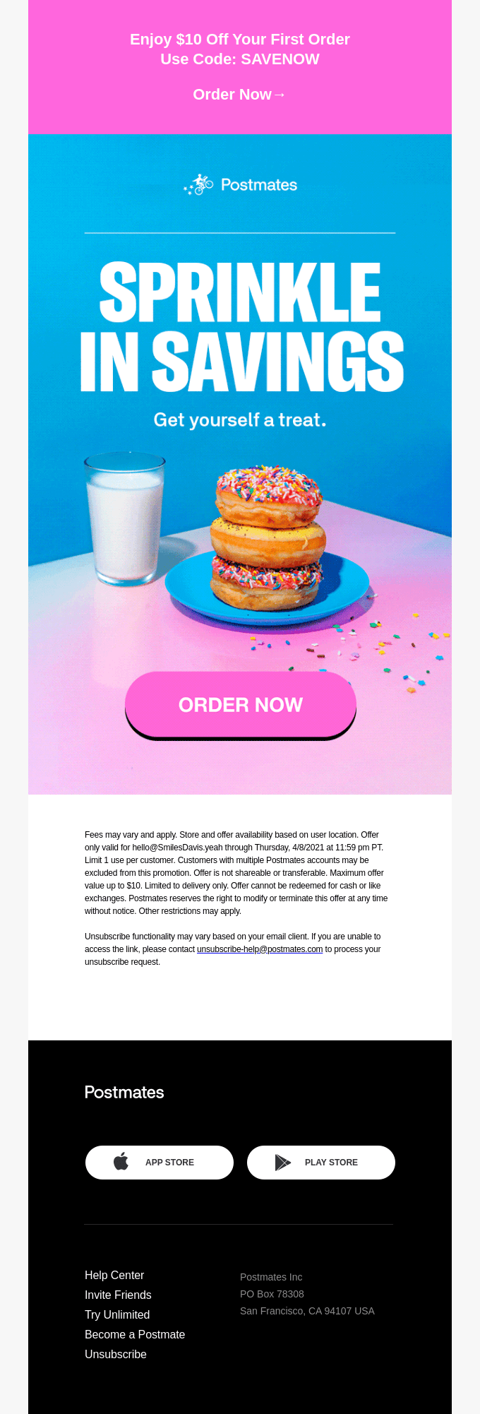
This photography - I'm going to be a dad here - it's out of this world. It's just really interesting to see what's happening. There's a lot of art direction in each of these emails that is really unique.
The last time I've seen something at this level was in MailChimp. They were doing some really sick stuff with photography and product photography that I think takes things to a whole new level and just makes it really interesting. This is just fun, some kind of wild, mesmerizing GIF. They also have this very different…it leans on what's almost a brutalist style.

There's this thing that brutalism did recently in the last, I dunno, let's call it three or four years that brought up big, bold colors, flashy content. This is not brutalist design, but I'd say it's influenced by that. It's pretty interesting. So you can see overall it’s a completely different aesthetic with different sort of ideas happening here.
What do you think? What's their motivation behind it?

Matt Helbig: I think it's maybe trying to do something new. Food delivery is pretty competitive. I think Postmates is on the lower end. I'm actually a Caviar user. I'm not trying to be a food delivery elitist, but I think they’re trying to make it more like a fun experience.
You know, food delivery is an automatic sort of thing. And I think this may add some fun and gamification to this, to let you discover new foods and things like that. So other than the push notifications that they send you probably every day around a specific time letting you know you should place an order, I think they're using email to bring you back into the product or open up the app again. And I think that it's just a successful way to do that.
I really think they're focusing on that mobile user having really big CTAs on some of these, and it's trying to drive people back into the app and make it a fun experience of ordering food rather than just a horrible waiting delivery.
Matthew Smith: I think you're probably right. I like all your comments. One of the thoughts for me is just that their previous brand was pretty utilitarian, really easy to understand. And they've maintained some of that with really clear hierarchy.
This is one of the things that most of the people that submit emails to Really Good Emails I think get wrong, which is not clear enough hierarchy. Hierarchy being really clear, bold headings, nice subheadings that are easy to read, clear CTA, and then more information again, really big, bold heading, and then a nice, easy-to-read paragraph and a CTA.
Just let your email get done quickly. And you can see in each of these, they're doing the same thing over and over, and that kind of consistent experience throughout these, I'm pretty impressed by it.

I am really into this little lockup here. You know, it's a bummer. These are mostly image emails. They're not entire image, but they're mostly image emails, which is a bummer for all the reasons I've ever talked about before. But it is interesting to engage somebody in something like this, which is sort of a decision matrix tree.
I would say most people can probably relate to pizza, tacos, and burgers being kind of a strong American delivery food, but it's fun. This is a fun way to go about it. Fun way to think through it.
One of the things I think is interesting is that they're doing different typography for several of these emails. This is a unique piece of typography compared to this one. Is that the same? It might be of the same family, but this is a condensed version. And that is probably the same version, but they've really done something unique here, but it still feels within the family.

And they've just done a nice job with their content, getting people excited. It's pretty interesting too, leading with these coupons on getting people into that order now fast, instead of putting it down here, which is what most people would do.
What do you think about that as a strategy?
Matt Helbig: Yeah. I wonder if that's dynamic based on if you've shared recently or haven't shared recently, but I think referral is a great lead-in to a lot of these emails and a reminder that you can share this product. It’s almost a better way than something like a social share.
But I think a lot of these ideas are not super new. It's just really cool to see them all put together in a nice consumable package and then really throwing a lot of different types of content and colors and ideas at you and not really repeating a lot of stuff. So that's cool to see.
And I think it was a really interesting shift. I think this newsletter is a little bit of a new one. I've seen a lot of brands trying to have a more curated newsletter feel that brings a unique personality to the brand, other than just having a promotional email once a week.
Matthew Smith: One of the ways that I think that people can do that, and they're doing it here, that I just think is brilliant…my friend, Tina from Tattly, she does this really well. She curates links. You think about curation as a service, right? That's what they're doing here is they're curating these things that are not necessarily all about food, right? It actually covers a lot of ground. It's a service people get to enjoy. Oh man, actually, the Postmates links are pretty sick.
You know, it's a fun thing to go check out new stuff. All of this just feels like a brand I want to be a part of. It's interesting. It's fun. It involves food. I can even get into a food cookbook. I'm assuming something about this is ways to put to-go orders or takeout orders with maybe stuff you have at home.
I don't know exactly, but I like the idea of don't cook. They're really going after it. They were just making it work. I think one of these things that I get kind of funny about is this sort of legal text. They've done an interesting thing here where they're bringing their legal text up in the email further.
It's not quite hardcore legal, but you can see on several of these emails, they're doing that. Most people would put it down here below the footer or in the footer in really low contrast. And they've not done that here.
What do you think that's about? Do you have any thoughts about it?
Matt Helbig: I think I liked that placement. I kind of like the universal footer. It's a pretty clean well-thought-out outfitter. I think it's similar to almost an Uber footer, in my opinion, where they're putting some of these helpful links. These aren't a navigation bar, but they kind of have this group of links at the bottom that could help you, be a referral link or upsell, or unsubscribe in this group of text.
And I think putting illegal under that would kind of break the flow of people wanting to click those bottom links if they need to. So I think this placement is right. I think maybe we would hope that they could link out to some sort of page and it was maybe a few lines that are right underneath the CTA potentially.
But I think these are enough out of their way to let you know that they have to be there, and they're not the best, but I think the placement is alright. I kind of liked that they had this bottom footer that's universal across every email and is really out of the way and clean.
Matthew Smith: I think if this text got to be too much longer, it would be pretty weird. But the fact that it's not absurd, it probably works. I always feel like a lot of this stuff can be pushed further down the line, like put into a webpage or things like that. But it sounds like something about their legal, they felt that it needed to be up here.
So if you have to show legal, get a copywriter to work on stuff and try and make it as readable as possible, which I think they've done. I'm pretty impressed with these. It wouldn't be too much of a stretch to get these to be live text, and I think that's definitely something that they could look at.
You can see in some of these that the text gets quite small. I think this is live text, and they haven't done anything with mobile styles down here, at least that we're seeing. Some of those kinds of things would be good to update and make it a really good email.
But overall, this is killer. And I think this photography shows that if you're willing to invest in it at a brand level, it can just really stick out and make something special. It's cool.
Anything you would change about these?
Matt Helbig: Maybe they could take a note from Uber or even Lyft and try to pull in some more personalization when it comes to what your previous orders are or where you live.
I think including city in the subject line is a really cool way to do some level of personalization that's beyond just first name and it really brings you in. I think even Yelp has done a lot where it's like, here are some trending restaurants in your city. And I think that personalization really grabs people's attention and wants to click in.
So if they could try to create some one-off emails like that and experiment and see if those are a little bit better than these overall promotional ones. I think that’d be a cool thing to see.
Matthew Smith: I think that it's hard to know if we're just not in this funnel or in this grouping, but it sure would be cool to also say, Oh, it looks like you ordered pizza from Geraldi's this last time. Have you tried Sidewall? They've got a 10% sale. Or some of those kinds of things where it looks like you might be a pizza person, and giving me a little bit of opportunity to say, not pizza tonight, taco…give me some sushi, and be able to change it up and begin to identify my food tastes or things like that.
And the other thing too would be being able to start to specify. I want to see if I'm a vegan, this kind of email is going to come across as no bueno. With something as sensitive as food, I think sometimes food is as sensitive as religion or politics to some people, and so you gotta be careful.

It could be interesting to get a little bit more personalized there. I think that's a good call, man. But overall, these are killer. So, hey Postmates team, good work. Reach out and let us know what you're learning about it. We would love to hear from you.
If you have emails like this, that you want to celebrate with us and push toward us, we would love to see them. You can upload your own emails for submission to Really Good Emails or upload submissions of other people's and rock and roll on the site. So let us know how we can help.
Good week ahead for everybody. Matt Helbig, you doing anything fun this weekend?
Matt Helbig: I'm going to order something from Postmates, have a little staycation. I think tacos are sounding pretty good.
Matthew Smith: I'm looking forward to some dim sum. We've got them some coming into Greenville and I'm thinking, that's what I'm talking about.
Matt Helbig: Nice. Have a great Friday, Matthew.
Matthew Smith: Yeah. You too. Ciao, ciao, ciao!
Matt Helbig: See ya!


