Matthew Smith: Hey, everybody. We're going to look at Public Rec. I'm super psyched about this brand. They're doing cool stuff. Look at it. Does everybody see that? That's live text. What's up, live text?

Look how simple this is. Look at this typographic hierarchy. Look at how good it looks on mobile. Oh, my God. They're killing it. I'm like super, super stoked on this. Look at that green, clear CTA all the way through. They make this black, white, green plus photograph so, so hot. And then look at this nice footer down here.
Everything's very clear. It just gets it done. I am psyched about that. In this one, they're showing off some of their products. I'm signed up for Public Rec. I get to see some comfort meeting style, some of these different things that they're offering, and I can jump in.
Now, let's look at the other kinds of emails that they're serving up. All right. So what are we wearing? Look at the layout differences here. So we went from an all-white background email with a zigzag pattern. It keeps me going. To keep things fresh, to keep things a little different, they went to a card layout. So now they've got this hero image, then a centered set of text here.

This is not live text, by the way, I'm noticing, but they get this nice lockup going to show me more about this Politan hoodie, which by the way, I think I need to get one of those. I love some sweater hoodies. They're doing a great job of showing people actually wearing the gear. I like this too.
These are like normal feeling, normal-looking people, not like model-oriented folks. So it's like photos for the rest of us. Then they get these quotes going with them, and I can then shop. I think that's a cool way to show off a fashion brand or show off a product. Show people using it.
We did an episode; I think it was Supergoop! That was where people were using the sunscreen product, and it was a real woman, and it was like a GIF of her putting it on her body or a face or something and some quotes, and I was very connected to it. So I thought that worked well.
I think this looks super tight. I'm interested in it. Who's not been in that situation where you're sitting in a yurt or some shit you can go on your computer with a sweater? They did four of these. I think they work well.
Let's jump over and see a few more. So this is the same sort of basic lockup, but now look, they've changed it up. So they have this Tetris set up of these different visualizations of these shorts, and those look comfortable. They're able to finish it all off with a "shop all shorts."

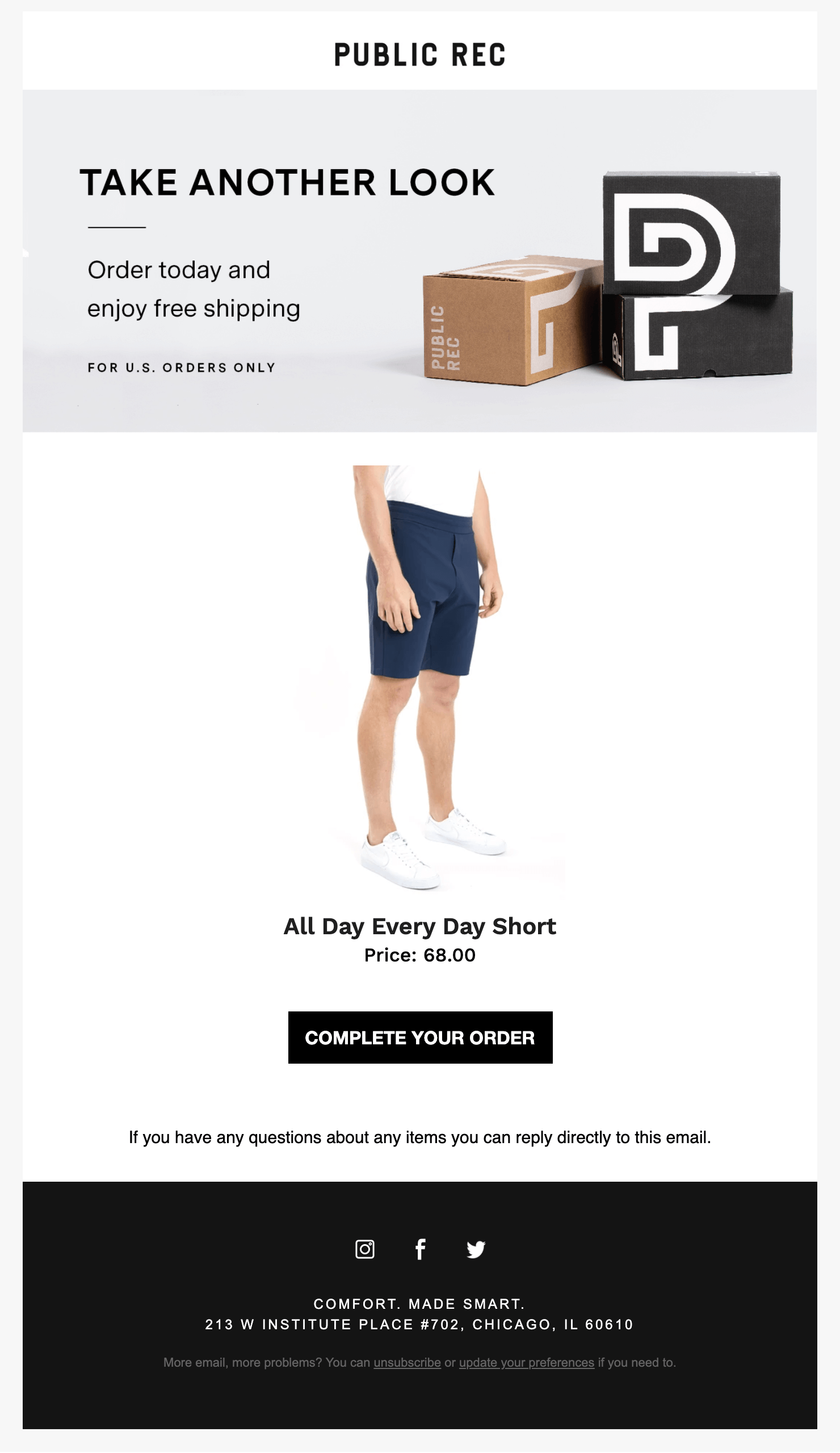
Finally, I thought this was just a good, smart, transactional email on the e-commerce side. I also got an email to know when these shorts were back in stock. I always love to have that brand interaction and not have to rethink it. I don't understand why every brand doesn't do that.

I put these in my cart and then like a good email geek. I walked away cause I wanted to see if they would send me an email, and sure enough, they did. So I think this continues to stay on brand. It feels a little bit empty. But I think that it's also simple and does its job. It gets out of the way.
I appreciate that they lead in with this hero image and then dive me into this both strategically in terms of showing off products and getting the right CTAs. In there in terms of using strategy for showing off how actual real people are using products and getting them into those products. And in terms of creating unique layouts, I think they're just doing a fantastic job.
They're very consistent. I would love to see some more live text in some of those other examples. Maybe this is one of the newer examples using live text, but other than that, I think this is a fantastic example of an email in an e-commerce setup that is focused and simple—getting the job done and being brand forward.
It checks all the boxes for me. What about you, Matt Helbig? Do you think this is working?
Matt Helbig: I think this is a seven or eight out of 10 for me. I feel like this hero is a little outdated or old. It doesn't grab my attention as much, but I liked the zigzag design and the use of live text, and the CTAs. That's smart.
I feel like I almost like some of the other template styles a little more where they're talking about individual products. With this one, I feel like they definitely could try to use a little bit more live text. I think that would help some of the mobile stylings.
I think it is getting a little small on that side. The CTAs still look good, but the text is a bit hard to read. In this one, it would be cool if one of these pictures was GIF or an animation. I think that would catch your eye a little bit.
Matthew Smith: They probably didn't do that because a GIF that was this large would be huge. But if they had done this live text, they could have had a nice small GIF.
Matt Helbig: I think the footer is pretty simplistic, but I almost want just a little bit more. Maybe bringing in that social stuff would be cool. I know there are many images in this already, but they could add some additional modules to capture a few more people in some of the other campaigns.
But overall, I think this one is probably one of my favorite out of their templates, just cause I liked the comparison product shot to a person wearing the product.
Matthew Smith: I do too. And you think this hero's working better?
Matt Helbig: I think the hero is all right.
Matthew Smith: What would you change about these two headers?
Matt Helbig: I pass over this text. It doesn't add any value to me. I think something like best-sellers is the keyword here. So maybe highlight that a little bit more. This, in general, is a hard problem to solve sometimes. Rereading this, these are our favorites. So some information about why these are the best selling or some icons around, like these are our top styles, could bring me in just a little more.
To me, this almost looks more like a sales promotional email showing me some new product. Reading a little bit more like it is a best-selling pant and everything like that, but maybe that could catch my eye a little bit more. For some reason, I think for heroes, it doesn't add too much to the rest of the email when the meat of the email is this content.
Matthew Smith: I get what you're saying. I think for me, it fits the brand. It's a very no-nonsense brand, very much out of the way. What I was thinking about is, "what's the problem that this product is solving?"
Generally, there is either very comfortable clothing that looks like shit and makes you look like shit, or there's very nice clothing that makes you look terrific but is super uncomfortable. They're trying to say: this is this middle ground; we're meeting it. That's what our product is about. So I think that the "comfort meets style" headline does do that.
I think they could do something unique here if they broke the frame, this a blocky frame. If there was a way that either text or some icon, or if you had the head of somebody like popping out, that kind of thing can make this feel much more unique and less blocky. I think it's the blockiness that is probably an issue. Imagine, for instance, if the top of this popped out of that and Public Rec was higher up, or something like that can be a very effective visual solution.
Matt Helbig: Do you feel like they should add a CTA to these hero images?
Matthew Smith: I think it draws people in. If you add a CTA too early, sometimes I think that people will miss the email. Do you know what I mean? Like you should test it. That's what I would recommend. But I think it's early enough that I see this CTA. This one draws me in. This is a little bit lower down the page. One of the biggest things I would change is either you have to make this text larger to work better in mobile if you're going to do images.
Use live text. Emails can be coded these days very affordably by some great people who code them out there. Once you have them coded, you've got an email design system if you do it right. Then you don't have to have it coded again until you get a new series. They're very flexible. Yeah, I could talk about that all day.
Well, great job Public Rec. I love what you're doing. Feel free to send us some awesome swag. I love your stuff.
Looking forward to seeing more in my inbox from Public Rec and looking forward to seeing more of just great emails come in.
I never thought I would look forward to emails, but I do. It's crazy. I hope everybody has a wonderful weekend. It's going to be a good one here. I'm going to stay grateful, do some meditation, remain mindful, and stay focused on being really good. So love you all and talk to you soon.
Matt Helbig: See ya. Peace.


