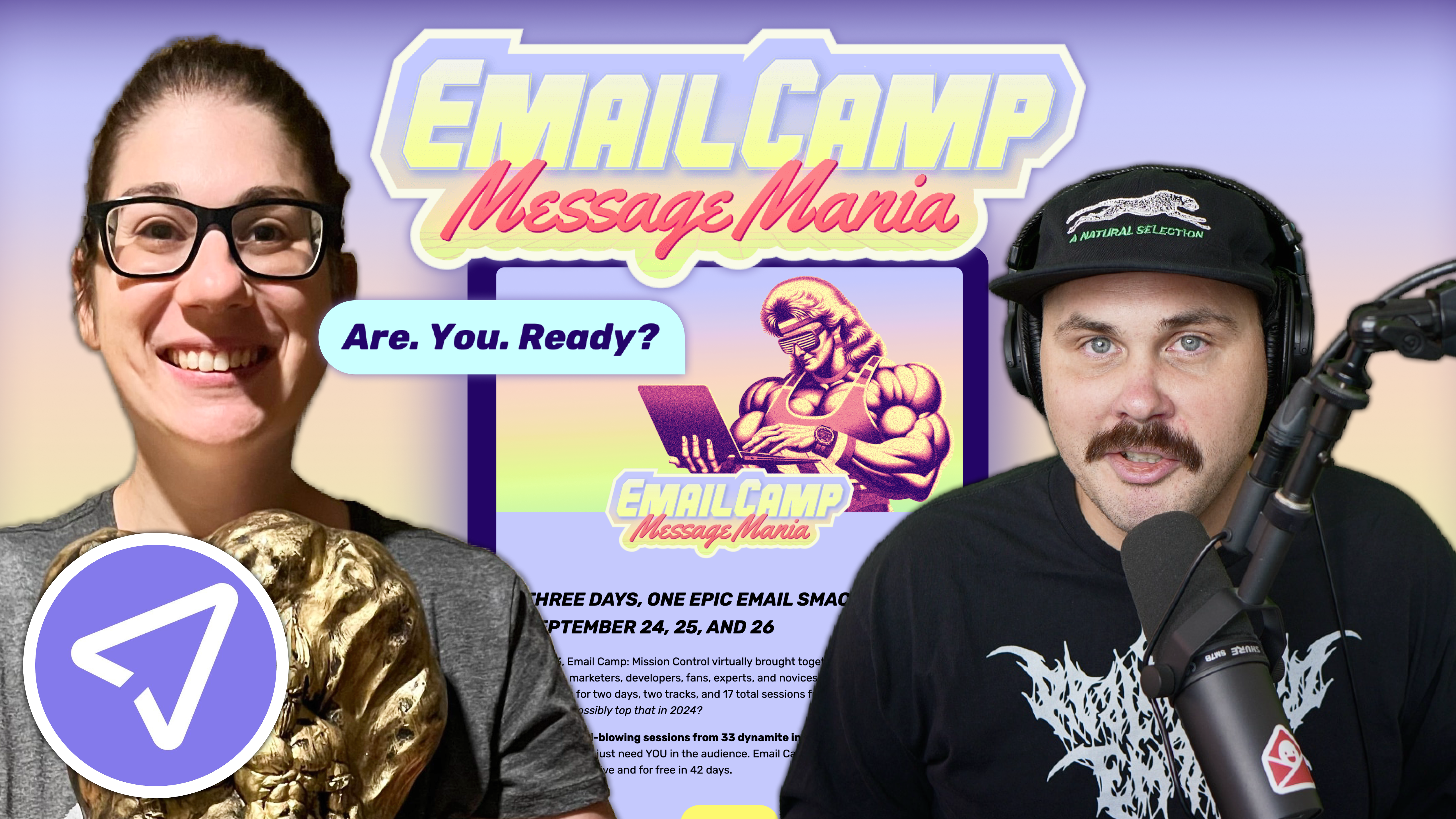
Email marketing deep dive with Megan Boshuyzen
Matt Helbig and Mailgun’s Megan Boshuyzen unpack Email Camp, showing how accessibility, live text, and smart CTAs turn event emails into signups.
April 3rd, 2026
Profoto email design breakdown: George Pettigrew analyzes a campaign email, explaining visual hierarchy, spacing systems, and modular layout decisions.
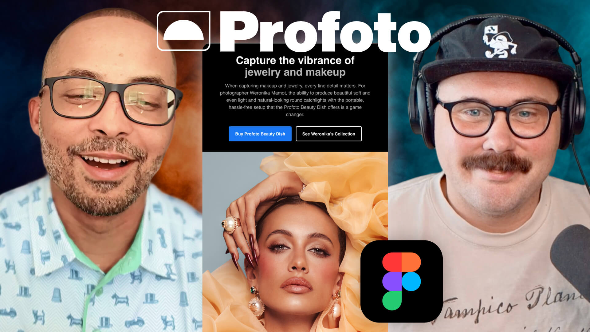
In this edition of Feedback Friday, Matt Helbig sits down with email designer and creative director George Pettigrew to review an email from Profoto.
If you’re not familiar with the brand, Profoto builds tools for photographers, so visual quality is a big deal. That makes their emails an interesting case study in how design systems and brand rules translate into email.
During the session, George walks through the structure of the email and explains the thinking behind several design decisions, from visual hierarchy to spacing systems and modular layouts.
👇 Let’s break it down.
One of the first things George points out is that Profoto has a clear rule for call-to-action buttons. If the email encourages readers to buy a product, the CTA is blue. If the action is something else, the button appears white or black.
At first glance, this might look inconsistent, but it is actually part of the brand logic. Once you know the rule, the color changes make sense and reinforce the action the brand wants readers to take.
The email also does a strong job of guiding the reader’s attention through visual hierarchy. The headline stands out for two simple reasons:
White creates a strong contrast, so the headline immediately pops. The paragraph below it is light gray, which lowers the contrast and pushes it slightly into the background. That contrast difference helps readers scan quickly and move straight toward the call to action.
Another interesting detail: Profoto sometimes uses subheadlines that are the same size as the main headline but in light gray. This creates a secondary level in the hierarchy while maintaining visual consistency.
On the mobile version, the call-to-action buttons stack vertically and stretch across the width of the screen.
That choice is deliberate. People scroll emails with their thumbs, and full-width buttons are easier to tap regardless of whether someone is left or right-handed.
George also points out that designers should avoid thinking strictly in terms of mobile versus desktop. Emails are opened on phones, laptops, and desktops, so the goal is to ensure the experience works well across all of them.
Designing with both contexts in mind leads to more resilient layouts.
Even though you cannot see it directly in the final email, the layout is built on a grid system.
Each element uses the same 32-pixel padding on the left and right, so headlines, body copy, and buttons all align along the same vertical edges. Email design comes with many constraints, but alignment is one thing designers can fully control. A consistent grid immediately makes the layout feel more precise.
The template also follows an eight-point spacing system, where spacing increases in increments of eight pixels. This helps maintain visual consistency across the entire layout. George also emphasizes pattern recognition in spacing. Once a spacing rule is defined, repeating it across sections helps the design feel intentional and structured.
Spacing can also create optical illusions. Sometimes the space above and below an element needs to be slightly different to appear visually balanced. For example, a section might use 40 pixels above and 48 pixels below. The extra spacing compensates for the visual weight created by typography and line height.
Profoto’s visual style is intentionally minimal. George describes his approach as trimming the fat. If something does not clearly support the message, it probably does not belong in the email.
That might mean condensing multiple paragraphs into one or moving supporting information into a headline or call to action. Keeping the layout simple helps prevent the design from feeling crowded and makes the message easier to scan.
Because Profoto works closely with photographers, image composition matters.
Instead of choosing random image sizes, George prefers using fixed aspect ratios. That means deciding whether an image should be square, landscape, or portrait before placing it in the layout. Maintaining the original proportions helps preserve the photographer's composition.
George also approaches layouts using simple fractions. For example, a section might split the space 50 percent image and 50 percent text. If the content grows, the layout might shift to one-third image and two-thirds text. Thinking in fractions helps designers adjust layouts without breaking the overall balance.
Throughout the discussion, George emphasizes intentional design. Instead of adjusting elements based on vague feedback like “make the logo bigger,” he evaluates each component in relation to the others.
For example:
Understanding these relationships helps designers explain and justify their choices. Testing different variations can also help remove guesswork and confirm that the layout works across devices.
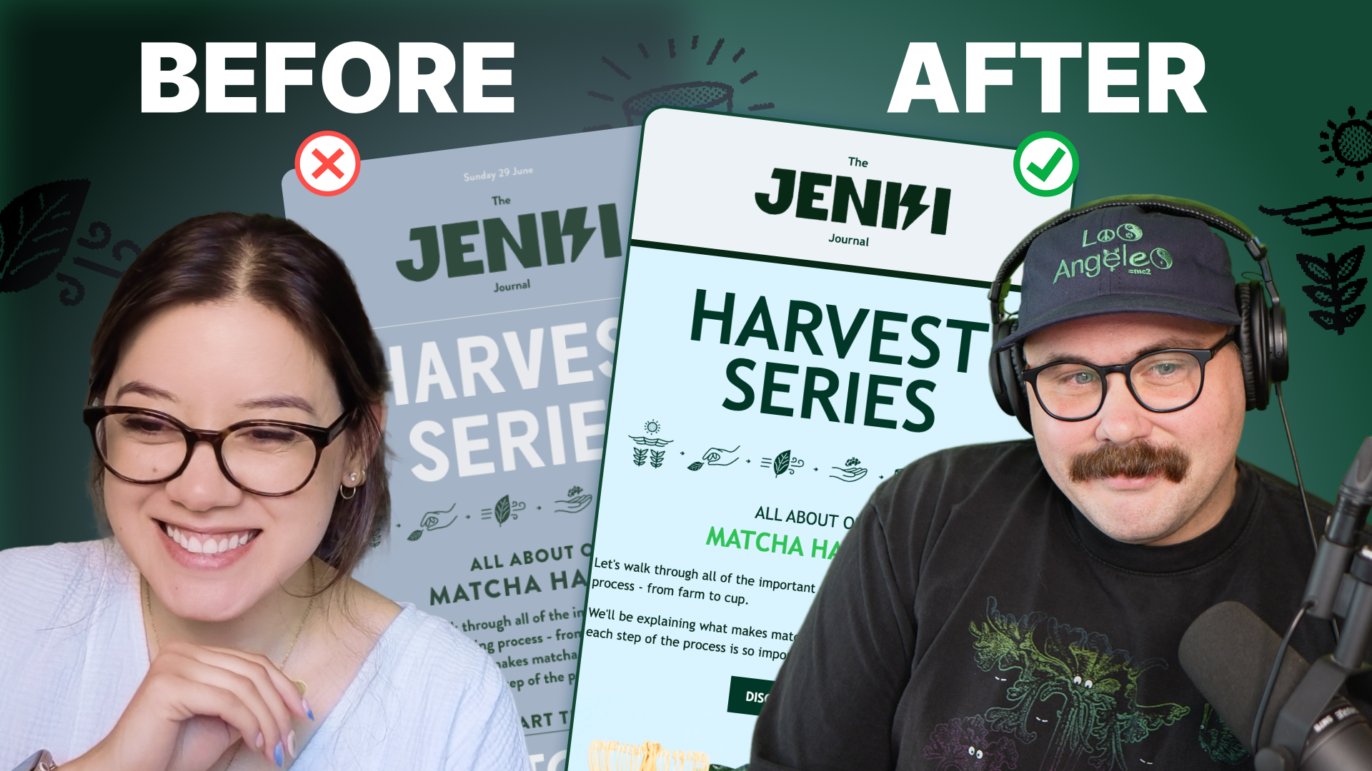
Typography and modular design
Typography in this email follows simple guidelines. For headlines, George starts with a line height equal to 110 percent of the font size. For body text, he uses about 150% of the font size, which improves readability because paragraph text is smaller and denser.
Line height does more than control the space between lines. It also defines the vertical space of the text container itself. That means typography choices influence how spacing behaves inside the layout. Understanding this relationship helps designers avoid sections that feel visually too tight or too loose. Another important idea is modular design.
Each section of the email can be reused or rearranged without breaking the layout. This flexibility allows teams to combine sections from different campaigns while maintaining a consistent overall design.
Without a modular system, emails can easily start to look like unrelated pieces stitched together.
One practice George strongly dislikes is image-based emails.
While they may look visually impressive, they often ignore important email best practices. Using live text instead of images improves accessibility and ensures the email renders properly across different email clients.
Accessibility also plays a role in many of the decisions discussed here, especially regarding contrast and readability. Higher contrast helps people using screen readers or assistive technology, but it also benefits anyone reading emails in real-world conditions, like on a phone screen with glare.
George explains that educating clients about accessibility often helps them understand why certain design choices matter. In some cases, those conversations even lead brands to update their design guidelines. When looking for inspiration, George frequently turns to Really Good Emails, where he studies patterns that can be recreated using email-friendly techniques such as live text and accessible layouts.
Other sources include Milled, which helps track what brands are sending, and Dribbble for broader design inspiration.
Looking at this Profoto email makes one thing clear: good email design rarely happens by accident. From contrast and spacing to layout fractions and modular systems, every element in this template is intentional. Small decisions such as consistent padding, clear hierarchy, and mobile-friendly buttons work together to create an experience that feels simple and polished.
That is also the biggest takeaway from this Feedback Friday session. Great email design is not about adding more elements. It is about understanding the fundamentals and applying them consistently. And when those fundamentals are in place, the result is exactly what we see here: an email that is easy to scan, visually balanced, and built to work across devices.
Matt Helbig and Mailgun’s Megan Boshuyzen unpack Email Camp, showing how accessibility, live text, and smart CTAs turn event emails into signups.
Accessibility, applied: Matt Helbig and Kelsey Yen reveal how inclusive design turns real emails into better user experiences.
Dive into the world of unmatched copywriting mastery, handpicked articles, and insider tips & tricks that elevate your writing game. Subscribe now for your weekly dose of inspiration and expertise.