This FF episode was sponsored by emfluence. Get paired with a marketer to see how your strategy will work in the emfluence Marketing Platform.
Matt Helbig: What’s up, Email Geeks. Welcome back to another episode of Feedback Friday, this week with Kelly Lamano, content master of Really Good Emails, writer of newsletters. How's it going, Kelly?
Kelly Lamano: Hey Matt, it’s going pretty great. That was quite the intro. Thank you.
Matt Helbig: Do you have a better title for yourself?
Kelly Lamano: No. I mean, that set the bar right there.
https://www.youtube.com/embed/iK_MNbgr6ls
Matt Helbig: These are some Disney+ emails. These are Matthew's picks, and I thought we could walk through them and talk about what we like.
So, this first one looks like an onboarding email, trying to get you to try this GroupWatch feature. And I really liked this layout. It's pretty unique from what we usually see. They're using live text here, which is really awesome to see.

Kelly Lamano: Yeah. I really liked that. They use a mix of live text and images. They could have just placed blocks of images for everything, but it's kind of unique how they have the CTA right at the top of the email. So it's kind of like, Hey, try GroupWatch…if you're not ready to try it, you can scroll down and see how it works.
And then they have that consistent CTA at the bottom with Start GroupWatch. So, it's the same button at the top and the bottom, keeping it very consistent, but also walking you through the steps of how to use it.
Matt Helbig: It looks like this is almost a mobile-first email in general, keeping everything pretty optimized for mobile, not having too long of a text leading people into that CTA.
I think that they use a nice balance of colors to sort of break up the sections as well. Overall, I’m a fan of this one.
Moving on to the next one, another Mandalorian GroupWatch email.
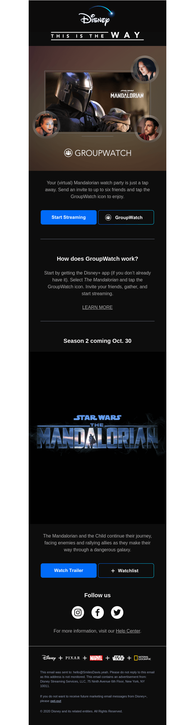
Kelly Lamano: The Mandalorian was the reason why I tried Disney+. It was my intro to Star Wars, never watched the series until then, but I think it's really cool that they highlight that throughout the entire email.
So, it's kind of like they're pushing Disney+ as a product, but they're also pushing The Mandalorian as a show. So, it's like double advertisement and it's kind of cool how they draw you into the email, even at the top with This is the Way, the motto of the Mandalorian.
It's cool how they show you, you can watch the show together. I'm kind of curious to know the reasoning behind the side-by-side CTAs. That's kind of unique. So, the Start Streaming and the GroupWatch. I'd be interested to know what the results were behind that.
Did they have more people click Start Streaming or did they have more for the GroupWatch? I’m definitely interested in the science behind that.
Matt Helbig: I think we usually see these, what we call ghost buttons that are just an outline perform a little less when they're the main CTA, but as a secondary CTA, it works well if you really wanted to have these next together.
I think the Start Streaming being that very clear CTA, that blue color stands out, and then the secondary GroupWatch matches the UI of the product, and it's more like a secondary CTA.
I'm a fan of the gradient on the CTA. I'm sure this might just be an image and kind of hard to do with actual CSS, but I think this is a good solution to this problem of showing them next to each other, versus stacking them, they might look a little awkward.
I liked this GIF. I think it is just the right amount of time. It's a little bit flashy, but it draws your eye in, very optimized for this mobile view. Again, pointing you toward that double CTA with the main CTA watching the trailer and that secondary, adding it to a Watchlist.
It would be cool to see if they had a play button here that might make you want to watch this trailer, a little bit clearer if that's the main CTA they want to use.
Kelly Lamano: I am curious about the Follow Us buttons. I noticed that on a lot of their emails toward the footer, they just have Follow Us and then the three buttons there.
Like what you and Matthew have said before, I'd like to see more of why should we follow them? Continuing the conversation, or interacting with other viewers - why should we follow them? I’d want to see that in the future.
Matt Helbig: These are sort of paired down. There aren't a hundred icons and they're pretty big, so they're pretty clickable on mobile. And then on desktop, it might be fun to add some hover effects on some of these CTAs, an opacity hover effect might be a cool little touch for those desktop users.
Moving on to this next one, it’s more of an upsell email. They want you to buy into this package, upgrading your subscription.
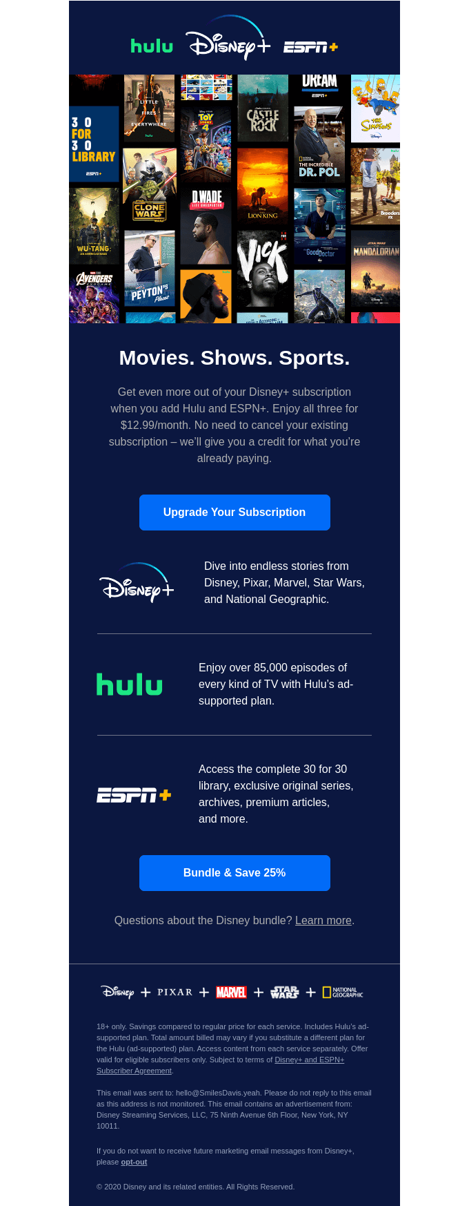
Kelly Lamano: I really like how they opened the email with a bunch of different titles, showcasing that in a visual way and that covers a wide variety of audiences.
So, if you like sports, you might want to watch the Dwyane Wade documentary. If you like comedy or Disney films, you might want to watch Toy Story 4 or The Simpsons. I think it's cool how they kind of open that up, so they reach a broad audience.
I like how, again, they use a lot of live text here and highlighting the logos of the companies that are partnering together, and then using that consistent CTA again. It seems like a lot of the time they have that blue button, and they keep it very consistent. So, it's teaching the reader what to look for.
Matt Helbig: I also liked the very descriptive CTA copy and not repeating it here as well. I think that it's smart rather than a Buy Now. I think this Bundle and Save 25%, and Upgrade Your Subscription early are powerful CTAs.
They are so close together that even if they're leading to the same page, updating the copy and targeting toward that section really supports that message.
This next one has a very good use of GIFs. Some WandaVision.
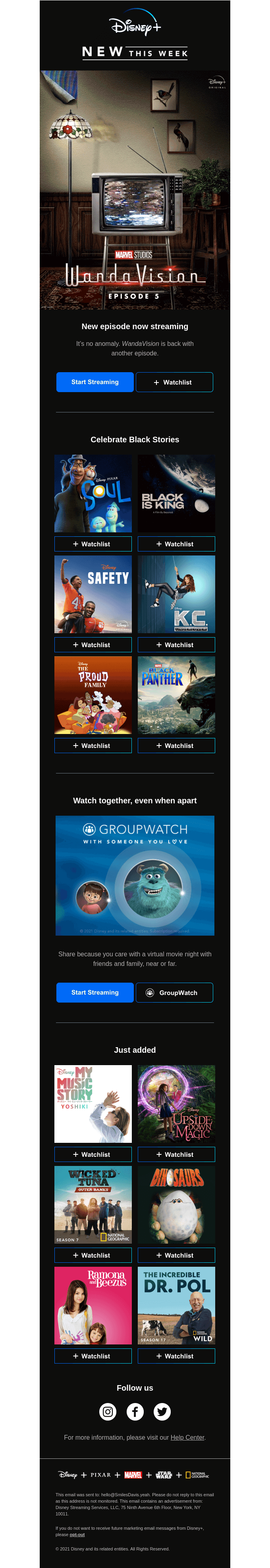
Kelly Lamano: Yeah, that one's a really cool GIF. I like how everything is kind of moving in that picture. It definitely catches your eye.
I think that Disney really touches on how they can reach such a wide range of people, showing all the different movies, all the different TV shows, all the different ages that they reach. It's good to highlight different options. I think even in the future if they don't already do this, it'd be cool to see some sort of personalization.
So, instead of seeing a bunch of different titles, maybe personalizing it to what's already on your Watchlist and then a follow-up to that would be cool to see.
Matt Helbig: I think they really have to compete with some of these other streaming services like Netflix and Hulu who seem to do a lot of personalization when it comes to their emails, HBO Max as well.
They've stood out to me on bringing a more simplistic, very friendly communication about focusing on these titles, having these nice, actionable Watchlist CTAs.
I think they're trying to cater to a wide audience with their product and maybe even a younger audience. Hopefully, they can learn a little bit about your streaming preferences and try to personalize this when they can, but they do have a lot of content to serve you, and how they do that in these emails is cool.
This last one really stood out to me. I really liked all the colors working together, leading down into this section with this GIF CTA. This one really caught my eye in the inbox. I think it stands out, and we don't really get to see a GIF CTA very often that's not totally crazy or annoying.
Kelly Lamano: Yeah. I love that GIF CTA. That definitely drew me in. I don't see a lot of that. It's really cool to see that moving, and I feel like that pushes the audience to click even more because it’s like, Oh, this is nice.
And it's really cool how everything is centered. I think it works well here because they don't have a ton of text on each line. They keep it simple, and I think it really works just drawing your eyes all the way down.
Matt Helbig: Cool. Well, nice work Disney+, definitely a brand to follow. I'm going to have to watch some of these. Thanks for coming on, Kelly. Have a happy Friday.
Kelly Lamano: Thanks, Matt. Happy Friday.
Matt Helbig: See ya.