Email marketing deep dive with Megan Boshuyzen
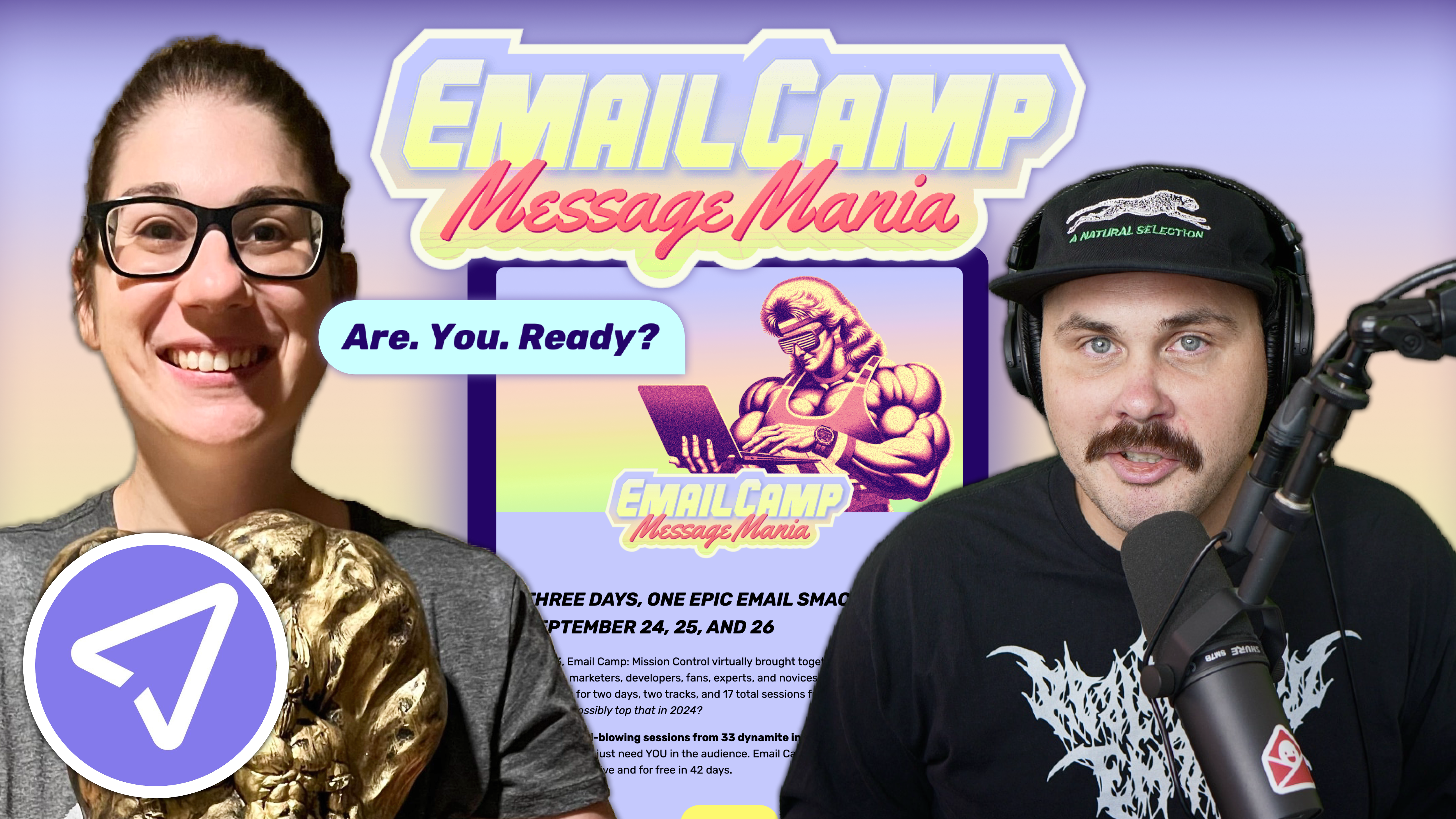
Matt Helbig and Mailgun’s Megan Boshuyzen unpack Email Camp, showing how accessibility, live text, and smart CTAs turn event emails into signups.
January 24th, 2020
emfluence is a full-service digital marketing agency and marketing automation platform that specializes in driving website traffic through multiple platforms.

📋 TL;DR key takeaways from this episode:
1. Make your B2B emails stand out. Don't just add a header image with lines of text like every other B2B email, and don’t default to a standard text-only email. Break the design mold.
2. Think about what type of content you're serving and how you're serving it to your audience. Creating an email experience that’s fun, educational and experiential can help you integrate website and email strategy.
3. Know your audience and be yourself. How does your brand want to sound different from other brands in your space? Don't always play it safe. Embrace your weirdness.
Matt: What's up, Email Geeks? We're back with another episode of Feedback Friday. This week we have a fantastic guest from emfluence.
Natalie: Hi.
Matt: Would you like to introduce yourself?
Natalie: Sure. My name is Natalie Jackson, and I am the marketing director for emfluence. We are one part digital marketing agency and one part marketing automation platform. I get to have the fun of playing in both worlds. We talk a lot about email strategy, and we talk a lot about marketing automation software. The other fun topic that I love to talk about is CRM.
Matt: Well, you sent over this email, and it's like an email within an email. It's a very meta email. This is an excellent B2B example. I think it kind of breaks the mold a little bit. Could you talk more about what you like about it?
Natalie: So, what I like to do in my capacity as the marketing director is to think about how do you make digital marketing an experience? So it's something like when you look at B2C brands, and you're like, oh, it's so easy for them to make an experiential kind of campaign where people get to play around with something, have fun, or push the envelope. I've been in B2B marketing for the better part of 10 years, and one of the things that you always look at is, how do you make B2B not be too dull. We put this campaign together because we thought it would be fun to attract awareness around integrating your e-commerce solution and your e-commerce strategy with your marketing automation software.
What we do on our website is that we built a fake t-shirt shop with some of our email pun t-shirts (the site is just emfluence.com/shop). Then, when you put something into your cart, you get a modal that pops up which says, would you like to play along with our pretend abandoned cart campaign? The purpose of this was to be educational but also to be experiential. We wanted it to be like, "Hey, I'm going to sign up for this thing," and when I receive this email, it will walk me through the anatomy of an e-commerce abandoned cart email campaign. It helps people decide what I should put where. Where's my pre-header, my header with my header image, and my call to action? That was the idea behind this campaign - how can we be fun, educational, and experiential.
Matt: I love the little tooltips throughout this email. I think it's a cool way to sort of break down an email and show each part. For a B2B email, this stands out. I'm surprised that all this stuff is live text and works very well. This is an actual email in the inbox, so it's just a bonus point. You would have to send it to yourself, right? Through the landing page?
Natalie: Oh no, so we built an e-commerce shop on our agency website, and you can buy one of these t-shirts from the shop. We make a new shirt every year for our conference anyway, but they're usually some geeky email shirt. The most recent one we have is "electronic mail is the future," and it has a super, super retro kind of look. People love our shirts, and they're always asking - how do I get a shirt from you? Finally, I was like, you know what, you can buy it from me off of my website, and I'm going to use it to showcase something that we do well, which is integrating website and email strategies.
Matt: Very nice. Well, I'm a big fan.
Natalie: It was a fun email to put together. It goes through like a couple of iterations, and it gets progressively more meta as you go through.
Matt: Do you think this is a good abandoned cart email in general?
Natalie: Yeah, you know if it were an abandoned cart email, you know I would recommend pulling the actual product that you have left in your cart, but for us, because it was a B2B sample, we thought it would probably be more fun to do something that's animated and really speaks to the fact that it isn't an abandoned cart email. Also, you know you probably wouldn't want to put quite that many calls to action in an actual abandoned cart email, but we wanted to have more fun with it. We were thinking about it in terms of a B2B strategy rather than a true e-commerce strategy. So for me, as a B2B marketer who's sent out a lot of B2B emails over time, is trying to think about how do you break out of the two types of email that you see everywhere? There's the first type where you sent a single image header with a bunch of lines of text about how fantastic your brand is, which of course, is always one of three points, right. You're talking about how good your services are, how much value you bring in, and how supportive you are as the people who buy your things. That's fine, but all B2B brands do that, and then inevitably, all the B2B emails you get tend to look the same. You can even spot one right away. There's my single image header. It probably has some imagery in it. Here's the block of text, and then here's my call to action button, which serves a purpose, although it doesn't always work, and it's just not very exciting. Then there's the other one, a text-only email, which is also fine and serves its purpose, but it's not super fun.
I guess for me, as a B2B marketer, the biggest challenge is always, how do you do something different than those two things? If that's what every B2B brand is doing, how will you stand out in the inbox, just in terms of what kind of content you're serving up and how you're serving it?
Matt: Yeah, I agree with that. It might be different at emfluence, but I can see many people saying this will never work for my audience or something along those lines. How do you try to push those boundaries? How do you explain to your boss why something like this might be good? Is it just testing it, or would you say it's more the culture of your company?
Natalie: I guess it’s a combination of both. We're kind of lucky that we're an agency, so people expect us to do something fun and different. There's a level of expectation and creativity. When I look at the kinds of content we put in here, we can make a silly text line in the unsubscribe. If you look at how we're talking to our audience about a subscription, we know that we're talking to people familiar with email so that we can be a little bit more fun.
That would be a tough sell at, for example, a massive, fast, product company that talks specifically to accounting professionals, like that, might not resonate with them. I think part of it is knowing your audience, and part of it is just being yourself. This is kind of outside the parameter of email, but it touches email strategy. That is thinking about how your brand wants to sound different from any other brand in your space. I think that's the trap because B2B wants to be safe and want to be non-confrontational and doesn't want to rock the boat. What that means is that all B2B brands kind of sound the same because nobody's trying to rock the boat. So I think part of it is just embracing your weirdness. What's the thing that makes you weird? Embrace your weirdness. For us at emfluence, it is easy; we embrace our weirdness every day. I mean, I could see how that would be hard for people to have that conversation, but I do think that it opens up that opportunity to be different, to stand out, and to let your true self shine in a way that your copy is never going to be able to do as an experience can.
Matt: There has to be a balance with B2B between having fun and knowing your audience, and also, I guess serving those people that want the very serious plain text emails as you said. I think this is an excellent way of thinking that email doesn't always have to be so serious. If something doesn't work out, there's probably a chance for you to send another one in the future. I think this is an excellent way to show there are all these sections you have to think about and everything, but they could be fun, or you could use email in a different way that's not just sending someone a white paper. There's this interactive element, and knowing your audience is part of that too.
Natalie: Yeah, that's an excellent point, Matt. We have white papers that outline email templates right, like that is a white paper download that emfluence offers, but this is way more fun than downloading a white paper. You have to think that you have the content and knowledge. I believe in B2B there's a certain level of expectation that learning is part of the sales process, but there are many different ways to showcase that knowledge. It doesn't have to be a content download. It can be something that's more fun.
Matt: Who is emfluence for? Who should be reaching out to you?
Natalie: emfluence does a lot of different digital marketing services: web development, SEO, paid search, paid media, and email strategy is one of our big things too. So, if that sounds like something you're looking for, we work with many different types of brands. We are headquartered in Kansas City but definitely can do work wherever.
Then, we have emfluence's marketing automation platform, which is excellent for people who maybe have a CRM in place or is also great for people who are looking at personalization. We have a lot of really cool personalization options. This email is actually sent through the emfluence marketing platform. We try to support what Really Good Emails is always recommending: how can you send out personalized, timely, and fun emails that get good results? We also want them to be easy to use, right? We ask, is the platform easy to use? How can we create a good experience for the email marketers out there?
Matt: Great, well, thank you so much for taking the time today. I'll have to look through the rest of the examples and check them out.
Categories:
Feedback Friday
Matt Helbig and Mailgun’s Megan Boshuyzen unpack Email Camp, showing how accessibility, live text, and smart CTAs turn event emails into signups.

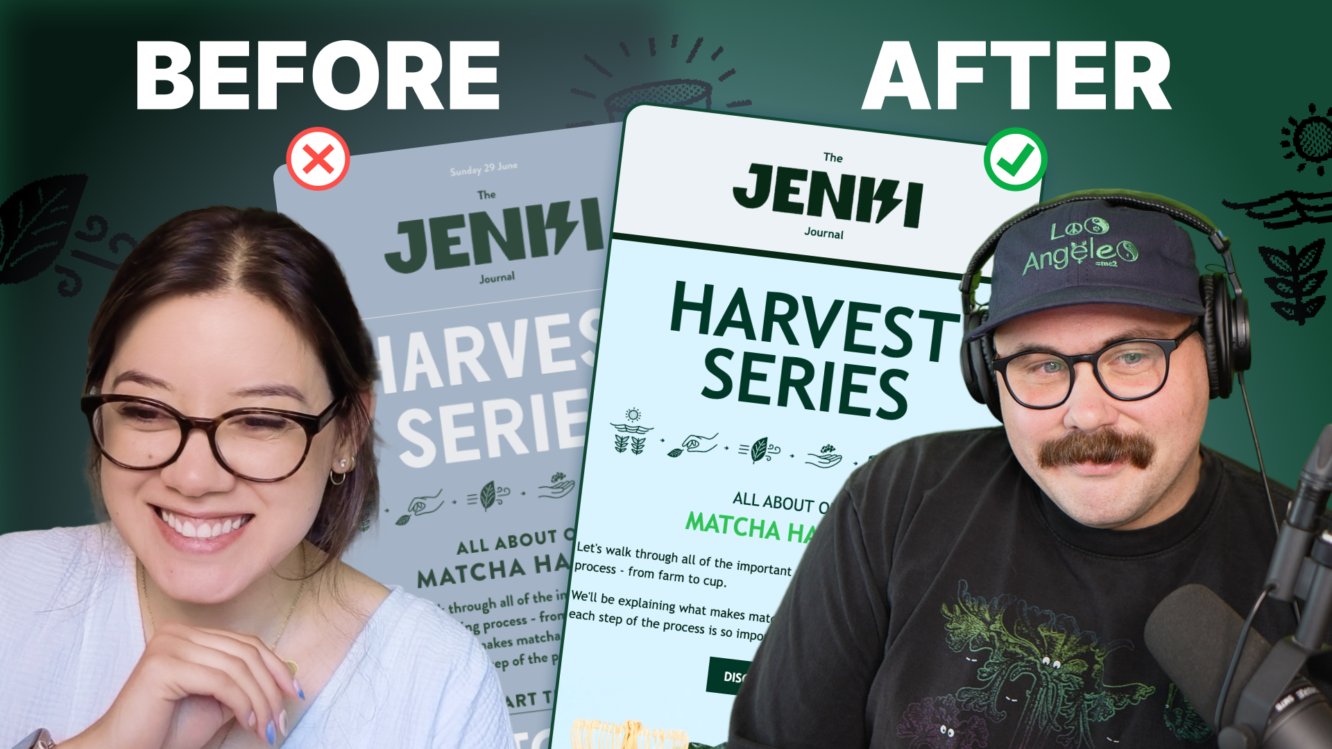
Accessibility, applied: Matt Helbig and Kelsey Yen reveal how inclusive design turns real emails into better user experiences.
Dive into the world of unmatched copywriting mastery, handpicked articles, and insider tips & tricks that elevate your writing game. Subscribe now for your weekly dose of inspiration and expertise.