
Visual storytelling using consistent, contextual variety with Filmsupply
Filmsupply is a full-service licensing agency with a premium catalogue of stock video footage from leading filmmakers.

This FF episode was sponsored by emfluence. Get paired with a marketer to see how your strategy will work in the emfluence Marketing Platform.
📋 TL;DR key takeaways from this episode:
1. A looping GIF with a play button is a clear CTA that shows people what they're going to get.
2. Find the balance in centering text. Too much centered text can be overwhelming for the audience.
3. Not all divider lines are necessary and add to the total message size (which might get clipped in Gmail).
*BONUS*: Email is web delivered. Email is landing pages delivered. Email is relationships designed. Design accordingly.
Matthew Smith: Yo, yo, yo. It's Feedback Friday. What's up, everybody? It's Matthew Smith. I'm here on another fine Friday, ready to give you some email action - this time from Filmsupply. What are Feedback Fridays? Well, this is when somebody on the Really Good Emails team has taken you through what makes this particular brand, this specific set of emails really good. That's what we're here to do. Hope you all are having a fine Friday and surviving a crazy season of life.
https://www.youtube.com/embed/taXnGy2zK5o
So let's check out Filmsupply. I'm going to walk through several different emails. These folks are blowing my mind. I'm so impressed by what they're doing. Let's start out just a great example here of using some fantastic graphics. I mean, they've got some really strong design folks in the house, but are creating these beautiful, like what are essentially landing pages?
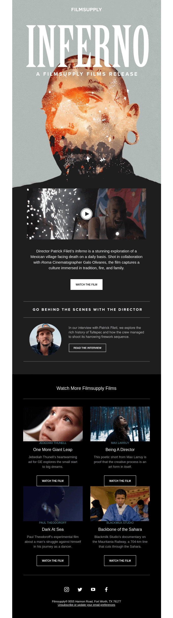
https://reallygoodemails.com/emails/a-culture-immersed-in-fire-and-family
Using Visual Storytelling to Showcase Video Content
Here's something I've been thinking about a lot. Email is web delivered. Email is a landing page delivered. Email is relationship designed. These are the things I keep coming back to. What they're doing here is they're giving me a deep feeling of what Filmsupply is all about. Like what I can get after and look at all the available stock footage, all the stuff that can be done to be able to understand what's happening and also just to get saturated in film and understand it. But look at this, this is just a beautiful looping GIF, but it just feels film quality. And they've just done this incredible job of pulling that together.
Using Looping GIFs as Clear Calls to Action
Wow. Now what they do as they lead down through from an email perspective is they give me a very clear call to action with this play button. So I want to go and click through and see what that's all about, but also I have a very clear call to action with this film. Nothing crazy, nothing too fancy, but just show me, watch the film.
I get this opportunity to go behind the scenes with the director and understand a little more. They pull this small lockup together into a nice, clean, sparse little area. I think they've done an excellent job with that. If you're going to play design golf, the only sort of small critique I would have for any of the Filmsupply stuff is not all of these dividers, these rules are necessary.
Practicing “Design Golf” by Reducing Elements
What is Matthew talking about with design golf? When you're playing golf, which I have never done, but I have played Frisbee golf... it's the same thing, right? You try and get the lowest score possible. So with design, try and get the lowest score possible, use as few elements as possible. Every single different element that you use is another point.
Are all these lines required? I would say at least this bottom one is not necessary. Possibly even like this middle one might not be necessary. So, just some interesting things that you can get away with.
There's already a horizontal rule happening here with these lines. Is that divider necessary? I would say no. If I'm having to critique little things like that, they're killing it. So this is great. It's just beautiful to see, watch more Filmsupply films, see what they're creating, see these different things that are coming through. It's just beautiful work.
They're a company that is showing off the best of these different videos and films, and they're doing it in such a gorgeous way. Being able to give me. Who was the director? What this is about, a little bit more detail, and then watch the film. Could they customize the CTA? Probably. Although with this much information, I think "watch the film" is just fine as a possibility here.
Let's jump over to some other ones and see what they're doing—breaking it up differently. Making it work. Now, this is interesting. They're left aligning or breaking the grid in something like this. And here's the thing, it's working. The reason this works is because of these two little lines.
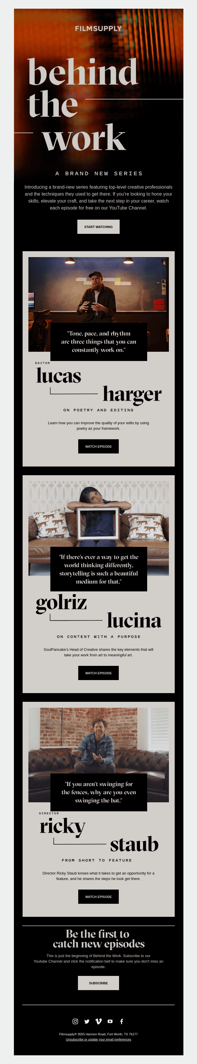
https://reallygoodemails.com/emails/a-brand-new-series-to-hone-your-skills
If those lines were missing, this would look like a broken email. Like, imagine this is not there. This is not there. It completely loses its horizontal stability and it looks broken. Cause it's like, why did you F this “behind the work” thing up? But they make it work because of that line. You can see, also, they make that work, the text over imagery, because this is essentially blurred.
Now, I like how they're using an actual blurred photograph here, which leaves some of the image not blurred. So this is not blurred using only Photoshop. It might be using Photoshop or Figma or one of your preferred tools. It is aesthetically gorgeous. It looks great. They then get into this new series, "start watching," that same lockup as we saw before.
And then they have these cards that they're pulling together that are playing on this “behind the work theme.” That's one of the things in their brand, getting people to talk about the films that they've created, watch the episode. Next, watch the episode. Nice cards, locking these up in a really clever way.
Notice that this sort of line is an element. It is a part of the sub-brand of “behind the work.” So, Filmsupply has its brand, and then this is something within the family of that brand that works well. This little line. And they continue to use it, and they're able to create these different groupings very quickly.
Once you already have that and just plop in the content, boom, boom, boom, you're ready to go, and then follow it up and be the first to catch new episodes. Cool. An opportunity to subscribe. If these things are interesting to me, don't just worry about getting them here in this email, but make sure you're subscribing.
I'm assuming that's probably leading to maybe some of the work on YouTube. But that's pretty cool. It is leading people to follow up. So, that's an excellent tactic to draw people in and then show them how they can get more of that information.
Designing Layouts That Guide the Reader
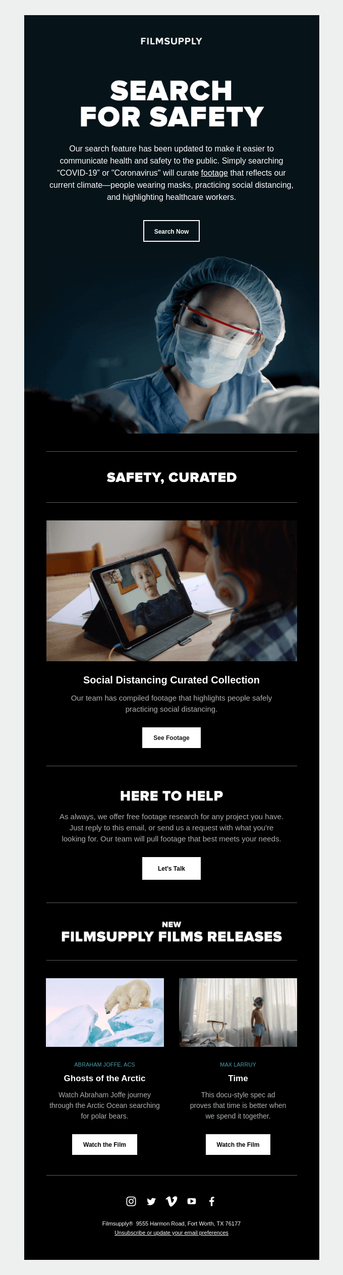
Digging into another version. All right. Now we are, we're searching for safety.
https://reallygoodemails.com/emails/find-footage-fast-in-trying-times
Finding the Right Balance With Centered Text
So they've got a little bit different header lockup here. They're using centered text in a lot of this. Here's why this works. Centered text can be tough, but they're doing a couple of things that make it work. One: it's not all that long. Two is the text size means that the number of characters in that line, which is called the measure, typographically is not that long.
They only do it in certain parts, and they keep it simple. Reducing the amount of information around the center text helps. Do it here. They do it here, and it just continues to work.
Be careful with centered text. Too much centered text can be overwhelming. Find that right balance. So, search for safety.
So, they've been updating their search feature. They want to help people understand. So, if I'm looking for video around safety, then they're wanting to promote that. This is a great way of helping people sort of feel connected to what's happening right now and getting people to see the search. And then, further, they're being able to look at opportunities for looking at social distancing, which is within the safety category.
Hey, looking for something that you aren't finding? We're here to help. That's a great little component to add to an email like this. As we saw in some of the other stuff I reviewed, here's a great way to continue to use that lockup. I think it was over here on the first one, this same lockup, now we're using here, but just with two. So, this is a nice variation on that same theme.
Let's keep going. You can see that they continue to use this hero setting, hero area, in some unique ways. Notice that the Filmsupply logo sets the tone for each header, and they keep that pretty consistent. This is a little bit different size than the others, but that's what sets the tone for where am I? Who is this? What is this? But then, they just tell these beautiful stories with these wild visuals and get people into it, watch the film, license the footage. So, watch it, or go ahead and grab some of that interesting footage and start licensing it for whatever you want to use it for.
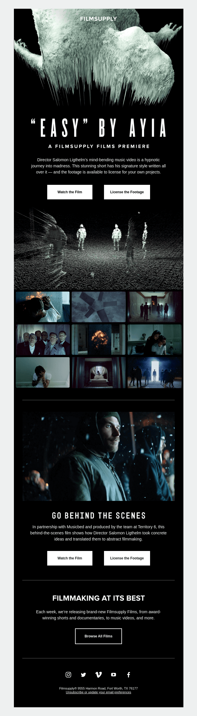
https://reallygoodemails.com/emails/this-music-video-is-mind-blowing
What a great way, also, to show a variety of the pieces of the footage. You could do a GIF, but this is another really nice way of showing some of the stills within that footage. Interesting. Wow.
Look at these beautiful photos. Go behind the scenes. Again, watch the film, license the footage. They’re focusing here on "Easy" by Ayia and giving me a lot of indication about what I can do with it. I can watch it. Or I can license the footage, and then they're a little bit digging into a broader category here by saying, “filmmaking at its best.” Sweet. Alright, let's go browse all the films.
One thing that they're doing here that I think that a lot of other people can do is they are showing these places where they're online. If I want to go discover that, at least they're showing me. Now that said, one thing that I would love to see more people do, and there are some good tools out there that do it, is be able to see what exactly on Instagram? Show me some photos. In other words, don't tell me you're funny. Tell me a joke. There are some cool ways to be able to do that if we wanted to, but obviously, we don't want to distract from the main content either.
Creating a Consistent Email Design System
So, continuing down the journey with Filmsupply, look at the ways that they show off travel and destinations. These different destinations. Films that cover these destinations.
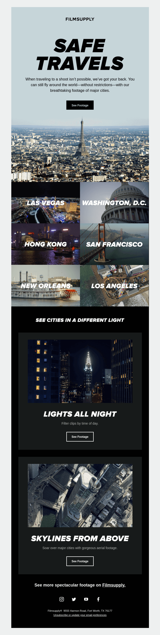
https://reallygoodemails.com/emails/travel-without-restriction
Just a really nice category lockup, and giving me these ways to dive into different places, see cities in a different light. Okay, cool. Oh, interesting. Like, night shots, sick. Skylines, sick. So, not just locations, but how to see them. So, overall, this is about location, but then they give me these filters. So it's contextual. It makes sense. Even, like, “see more spectacular footage on Filmsupply.” They're able to test a lot of variety of how people are digging in, but it's consistent. Notice how all of these feel like the same family of emails.
We can jump into another aesthetic and they do this great feeling. Let’s look at that background image here. Let me see if there are some others. So, they’re doing it here on easy, where this background bleeds into that black. That is so nice. And then here, boom, bleed into the rest of the email. So, they're using that main photo, they're bleeding it down to a color, and then they choose the color of the background for the rest of the photo.
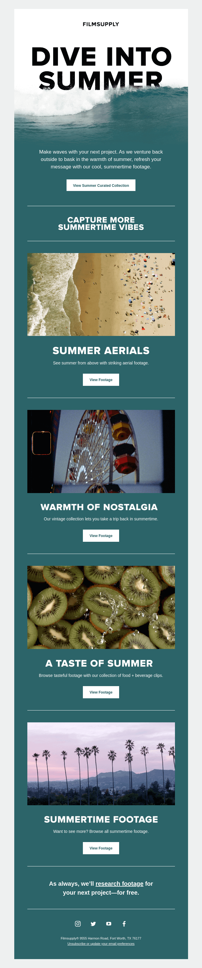
https://reallygoodemails.com/emails/refresh-your-project-with-our-summertime-footage
That is so nice. Look how they're beginning to lead me into more of this beach time stuff. So this is the theme giving me some access to these different images. This is a clever way of pushing me into these different categories.
You know, one thing to note is I'm noticing there's a little bit of blur on some of these visuals here on the headings, and just with a little bit more work, they could make those headings live text. There's no reason why they couldn't be. Now that said, they may be just really wanting those headings to work in all email clients, which of course font face does not work in all email clients currently. So, just a little push for live text.
Once again, you can see the family, the way that they treat the brand. Just another little lockup, another way to show off these pieces of content. And then once you have these lockups developed in your email, then you can continue to use them systematically.
Reusing Design Modules Across Campaigns
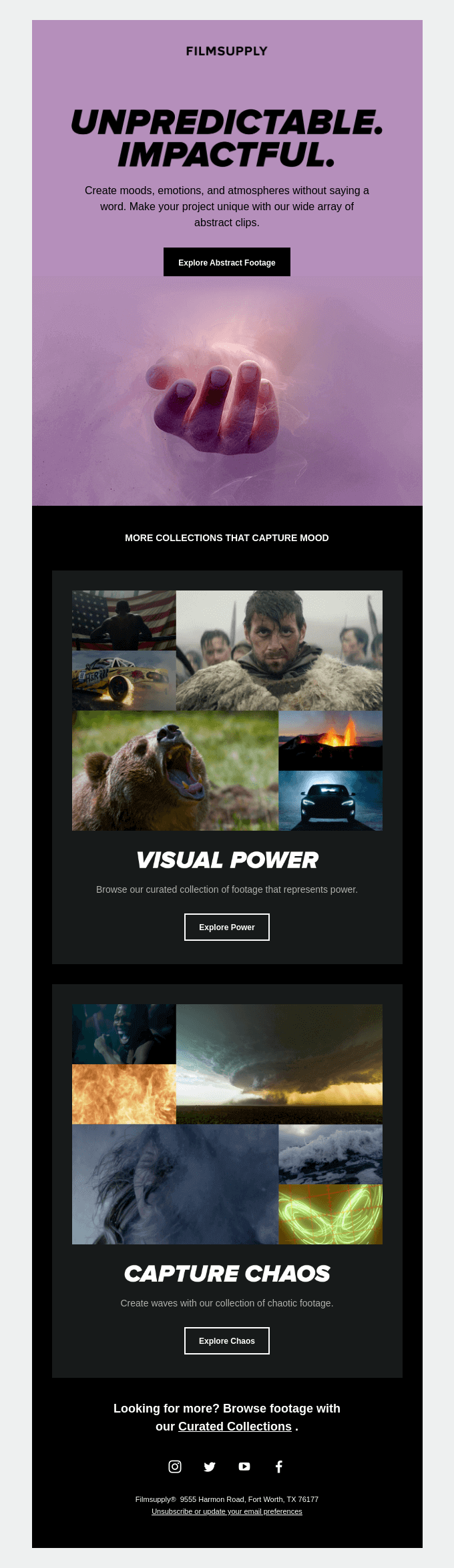
See how they're using visual power here, “capture chaos.”
https://reallygoodemails.com/emails/bring-emotion-and-mood-to-your-project
So they're showing off these visuals, locking it up in the same kind of grouping, and then being able to apply it to a different image. Now, I'm assuming that this is just one big image that they're developing in Figma or something else like that, but they've done a nice job of showing off, you know, some of this contrast.
Now that said, here's an interesting thing. They could have taken this lilac imagery and drawn it down through. Now, why didn't they? My guess is that by cutting that off there, they're able to tell a better story about visual power and capture the chaos. Notice that in this one, this works. But the teal here with some of these other images, it could be rough.
If you were trying to tell a story like that, teal is dominating, right? It works okay. But here, black really helps these images come forward in a powerful way. Look at all this consistency between these emails. See how they're doing the same thing over and over, just with slight variation, and I'm just super impressed with how they send out this information.
I'm always wanting to see what's next. Every time I get a Filmsupply email, I'm super happy. If you have any questions about Filmsupply, or about doing things like this, please hit us up. Love to answer those questions. Love to support you in your own email journey. Keep coming back, my friends. I'm really glad you're out there.
Thank you for supporting us. I hope everybody has a great weekend. Talk soon.
Subscribe to our newsletter.
Dive into the world of unmatched copywriting mastery, handpicked articles, and insider tips & tricks that elevate your writing game. Subscribe now for your weekly dose of inspiration and expertise.