
Diving into a bowl of inverted pyramids and striking 3D imagery with Magic Spoon
Magic Spoon is a keto-friendly cereal company based in the U.S., creating sweet and healthy breakfasts for champs.

This FF episode was sponsored by emfluence. Get paired with a marketer to see how your strategy will work in the emfluence Marketing Platform.
📋 TL;DR key takeaways from this episode:
1. Product photography and animations can help images stand out with a 3D effect.
2. Grab your audience’s attention with a theme and stick to it throughout your design.
3. Social media showcases - with images from social media users - can be a creative way to show your audience what people are saying and how they’re using your products.
Matt Helbig: What's up, email geeks? Welcome back to another Feedback Friday this week with our amazing guests, Lily from Litmus. How's it going, Lily? How are you?
Lily Worth: Thanks. How are you?
Matt Helbig: Very good. Could you tell us a little bit about yourself?
Lily Worth: Yeah, yeah, of course. So I work for Litmus as an email design and production specialist, which means that I design many of the emails that we send out to our customers and prospects based in the UK, in Nottingham.
And I'm happy to be here on this sunny, your side Friday.
Matt Helbig: Yeah. Yeah. I'm excited to look at these Magic Spoon emails.
https://www.youtube.com/embed/elG1L1nzHOA
So you sent over a few Magic Spoon examples at the site, and they inspired me. Could you talk maybe a little bit about the brand and maybe why you liked their email?
Why Magic Spoon Stands Out
Lily Worth: I'm not sure how it came into contact with Magic Spoon because they're based in the US. I'm not entirely sure whether there are UK suppliers, but definitely came across one of the emails and just loved the creativity.
They have this great way of using color and things that just really stood out to me. I had to have a look and see who they are, and it turns out that they are a cereal brand and they create cereals that are keto-friendly and much healthier, but have that real kind of childhood feel about them, all those exciting cereals that we loved as children then, but they were just really packed with sugar and not very good for us.
Matt Helbig: Keto cereal. I feel like it was a trending search term. I have seen many of their ads on Instagram and then signing up for their emails, they bring that same sort of branding and feel into these messages. But I agree.
It's that fun, childlike, delightful illustrations, bright colors. It catches your eye when you're looking for a fun cereal.
Lily Worth: Yes. Absolutely.
Welcome Email: Cohesive Branding and Clear First Action
Matt Helbig: Sweet. This first one looks like a welcome email. So I think I got this when I signed up for their emails, and I think it does a pretty good job.
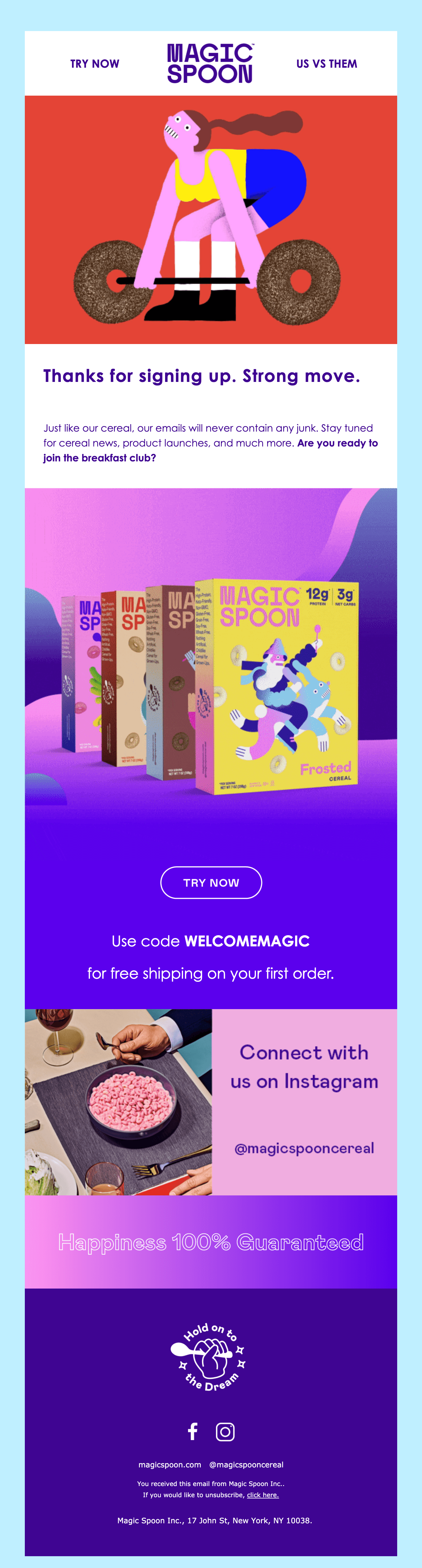
It gives you a little bit of information. Thanks you for signing up. They show some of their trending products. It gives you that free shipping on your first order. Then they plug their Instagram, and that's pretty much it. They have like a little rotating GIF here. Overall. I think this one's pretty good.
Is there anything that stands out to you on this welcome email?
Lily Worth: I love the mix of things that they have here in terms of visual assets. I mean, they're using the bold colors. You can't miss those and gradients as well, but they've got illustration, and they got product photography, and then further down, they've got some stylized photography that has got a bit of a retro feel, which I like with that bright pink cereal that when you look at it, you think you probably shouldn't eat because it's packed with sugar, but no, that's the difference with Magic Spoon.
Navigation Links and the “Try Now” CTA
Matt Helbig: Yeah. I like this little navigation up here. These quick links up here are a fun play on a more navigation bar. I'm not sure how many people would click these, but I think it adds to the design.
Lily Worth: It makes a bit of a cohesive experience with the website because I think it's very similar when you land on their web page, there are limited links. So I think that's probably very much in line with what they have on their site.
Matt Helbig: I liked that the "Try now" versus "Buy now" or something like that. I think that's kind of an interesting choice to maybe try something like that with a CTA. This perhaps is a little low. On your first order, you might miss that code, but I think they at least bold it and maybe make it a little bit larger in all caps to make it stand out.
So maybe you'll use that on your first order. I think this is an image, and it is a little blurry on my end. So perhaps they could try to slice it a little bit differently so that this quality image matches the rest of the live text that they're using in the email. But overall, I think it's a cohesive email bringing everything together.
Lily Worth: Do you know when you received this? Was it this year? Last year?
Matt Helbig: Earlier this year, so maybe they have made some strides to try to have some more live text or clean up some of those issues. We'll have to sign up and see if they send a different welcome email. It could have changed since then.
So this next one is a trendy one on the site. I think it catches people's eyes when they see something like this graphic.
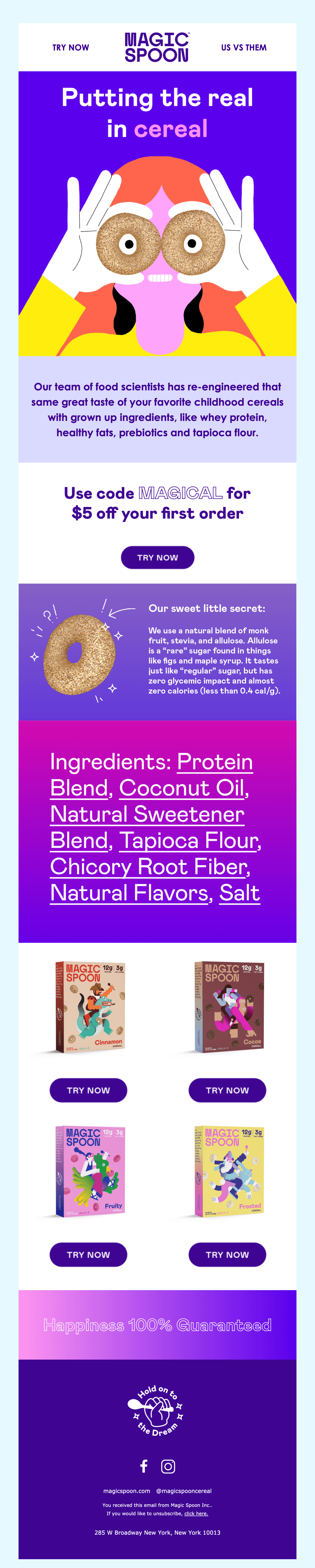
Lily Worth: Yeah. It's enjoyable. The fact that she's looking through a couple of cereal hoops and I love the way that the animation over the headline pulls you in and makes you want to read it.
Subtle Animation That Keeps Email Weight Low
Matt Helbig: I like this little thing that they're doing. This is only five frames rotating with the different colors, but I think the timing and everything else brings your eyes in. This subtle animation adds a little bit of something to the email.
Lily Worth: Yeah. They're good at using subtle animation. That is great for keeping down the email's weight if it's only really using five frames, but it still has an impactful way.
Matt Helbig: I was surprised by this use of live text here for this little subhead copy, and it's nice to see. They're bringing it together with that inverse pyramid, bringing your eye right into that CTA to "Try now."
Lily Worth: They're great with their typography. In some cases, I know that to get some of the typographical effects, they have to use images, but I think typography can be very creative.
Matt Helbig: That's great to see when they can, they use that live text, but for some of these more advanced brand fonts, they use an image. Overall, they do an excellent job on desktop and mobile, making them feel like the fonts sort of match. It makes sense going down throughout this. I think they try some new exciting ways to layout product information that feels slightly different, but I still think it is easy to scan and maybe consume if you're looking for more information.
Lily Worth: Sure. They want to push their ingredients. They're showing that it's healthy stuff.
Matt Helbig: I think this is potentially boring information to show, but they do this with the gradient in it. It makes it stand out. So maybe a little bit more interesting than just seeing individual ingredients.
This goes down to more of like an e-commerce sort of layout right here with the different product shots. Is there anything you think that maybe you'd want to see in this email that isn't there?
Lily Worth: I think on occasion there are issues with colors, not in every instance, but I've noticed in some of their emails, perhaps the contrast isn't quite there.
In terms of content, I think it's pretty packed full, maybe a bit heavier on the copy in this email than I've seen in many of their emails. I sometimes think they kind of cut back on the amount of copy and give you more of a scrolling experience where you've got more imagery to tell the story.
But I think overall it's, it's an excellent design.
Matt Helbig: They could add some interactivity in this section to make it bounce a little bit. Maybe if they add some hover effects, it might bring a little bit more attention once you hit the bottom of these individual products.
Lily Worth: Not sure if this is a conscious decision, but those products at the bottom, that kind of eCommerce section doesn't tell you what any of those are.
I mean, if you've got to look closely and tell what they are and what flavors they are, I wonder if that's conscious and they want you to explore to know more about it.
Matt Helbig: Yeah. I guess some product details and information or something like here, just providing you a little more context about some of these flavors. They lay it out a little differently on mobile, but it might be hard to find out exactly what kind of flavor these are.
Creative Campaigns: Animation, Themes, and Social Proof
This is another fun, cool design bringing in a lot of that color and a little bit of that animation.
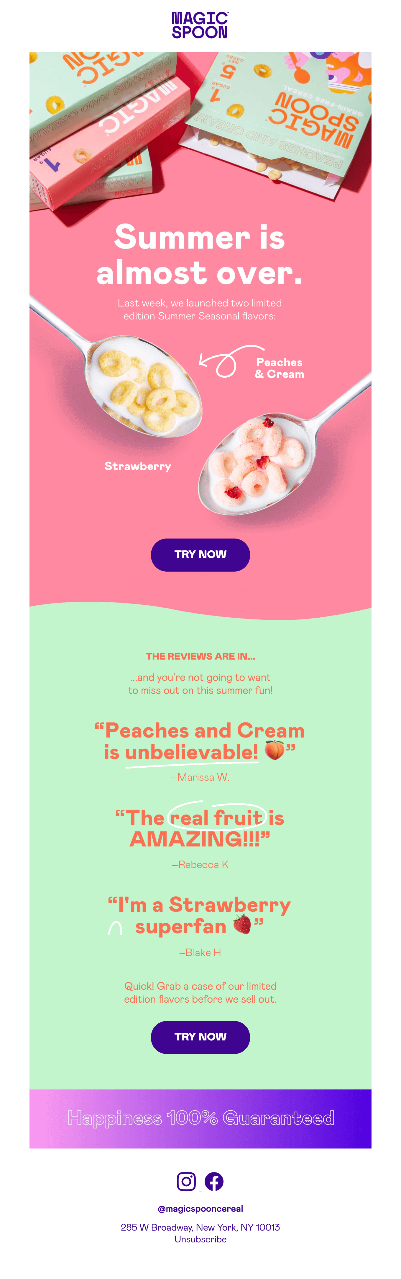
Lily Worth: Yeah, this is great. This is something that they sent out reasonably recently over the summertime. They do a lot with this one. They're bringing in subtle animation. I love the way that they're not using hard edges between sections.
The typography is excellent. It's appealing. I think the way they use the product photography gives it that little bit of 3D. It makes it kind of standoff the screen.
Matt Helbig: The imagery is an eye-catcher for me. This 3D effect it feels like everything's sort of floaty. To pull in some of this animation, they have to
make this one mostly images.
I liked this line separating the sections. It's not just a solid line.
Lily Worth: Something that they're doing more now, and I can see it further down. I think there is the use of the emojis. I'm assuming there are emojis. It could be just an image.
Matt Helbig: I think these are images. Some of the emails that we've seen where we're highlighting social proof like this with quotes feel sort of static or something. Adding these emojis is a brilliant idea. Adding some of these annotations almost with the GIFs makes it pop and highlights what they want you to see in these social proof testimonials.
Lily Worth: Absolutely. I love the circling of real fruit and striking on the words they want you to catch.
Matt Helbig: It is nice to see that they are using as much live text as possible while still adding some of this animation. This is almost a similar email to the last one, in my opinion, where they're pulling in some more social proof. I liked this one a little bit more.
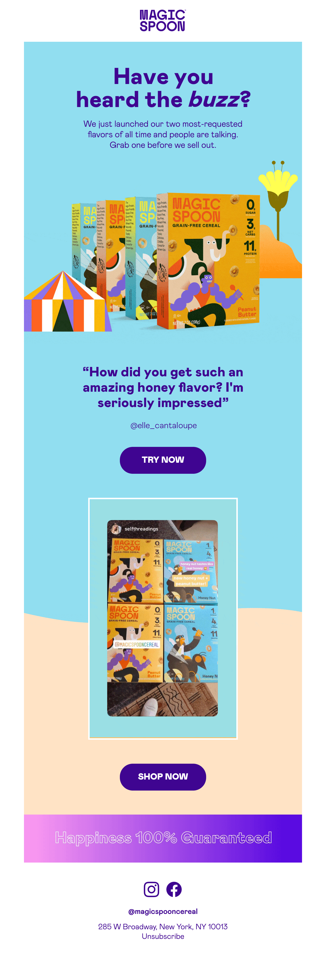
Lily Worth: It's got a bit of a theme to it, and it's kind of circus theme, which I like. Again, it just feels like it's taking you back to sort of childhood things that were fun and exciting. Yeah. I think that's kind of what caught my eye with this one.
They are bringing in some great styles. It's got an off-grid feel on this one. It's light on the copy. It's very easy to get the message. You get a nice visual experience as well.
Social Media Showcases as Proof and Storytelling
Matt Helbig: So this is the section I like with pulling in the user handles. Then there's a social media showcase. This is a very effective way of bringing in some of that social proof and talking about how people are talking about your new product launch. Like the other ones, some bright colors, these repeating CTAs bringing your eye down.
I think this one's a pretty complete one when it comes to showing you this new product. It's focusing on this product launch, offering social proof and ends very cleanly, and just allowing you to click into the CTA to get a little more information.
Lily Worth: Yeah, absolutely.
Plain-Text Emails for Direct, One-to-One Messaging
Matt Helbig: We have one last one. It's a text email.
This is a fascinating use where they're mixing some of their marketing emails and having emails like this that are more personal one-to-one.
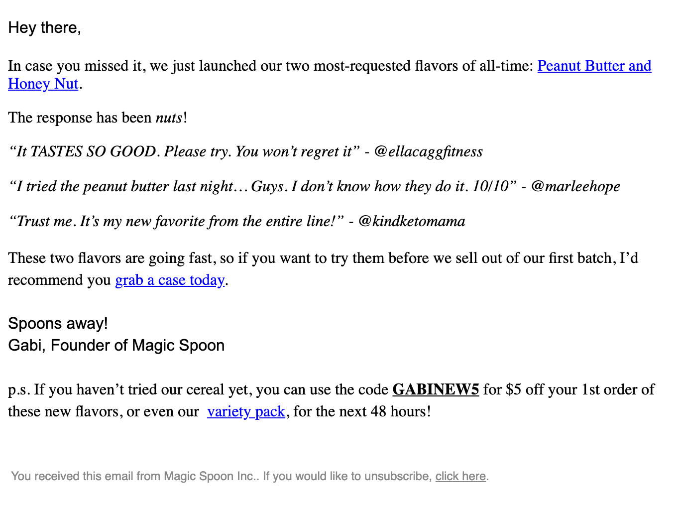
Lily Worth: I like how they're bringing in plain text for specific kinds of direct messaging. They want you to take action here.
So they're taking away any of their distractions that you might get with the lovely designs. They're pushing you towards making that purchase. They use it for other kinds of more personal messaging. They've sent this from the founder of Magic Spoon, and I think when they really want to get a message over, this is the approach they adopt.
Matt Helbig: They're using the polished marketing emails to showcase their product and their imagery and using those bold colors, but then they're also using the power live text to make it feel more personal and direct. In some ways, those two messages that we just saw are the same.
They're bringing in some testimonials showing those handles, but in this one, it feels a little bit different, and it's just an excellent way of contrasting to try them more product marketing focused email, and then something like this. It's a bit more pared down and direct. I think it's a nice balance between those two types of emails that it shows that they are knowledgeable that they can use those two different tools in different ways to get a message across.
Lily Worth: They do influence me in the work that I do. I love it. I've just got to find out whether I can get them here in the UK.
Matt Helbig: Well, we'll have to order some boxes, and they have nice looking bowls too. So we'll have to get some of those. Great. Well, thanks so much for taking the time to record this episode.
Lily Worth: Sure. Any time.
Matt Helbig: Can we find you online?
Lily Worth: I'm on Twitter. You could find me on Really Good Emails. I've got quite a lot of stuff saved in there if you want to take a look at what I enjoy seeing on the site, but yeah, otherwise, Twitter.
Matt Helbig: Thanks so much. Have a great Friday.
Lily Worth: Thank you. You too.
Subscribe to our newsletter.
Dive into the world of unmatched copywriting mastery, handpicked articles, and insider tips & tricks that elevate your writing game. Subscribe now for your weekly dose of inspiration and expertise.