Email marketing deep dive with Megan Boshuyzen
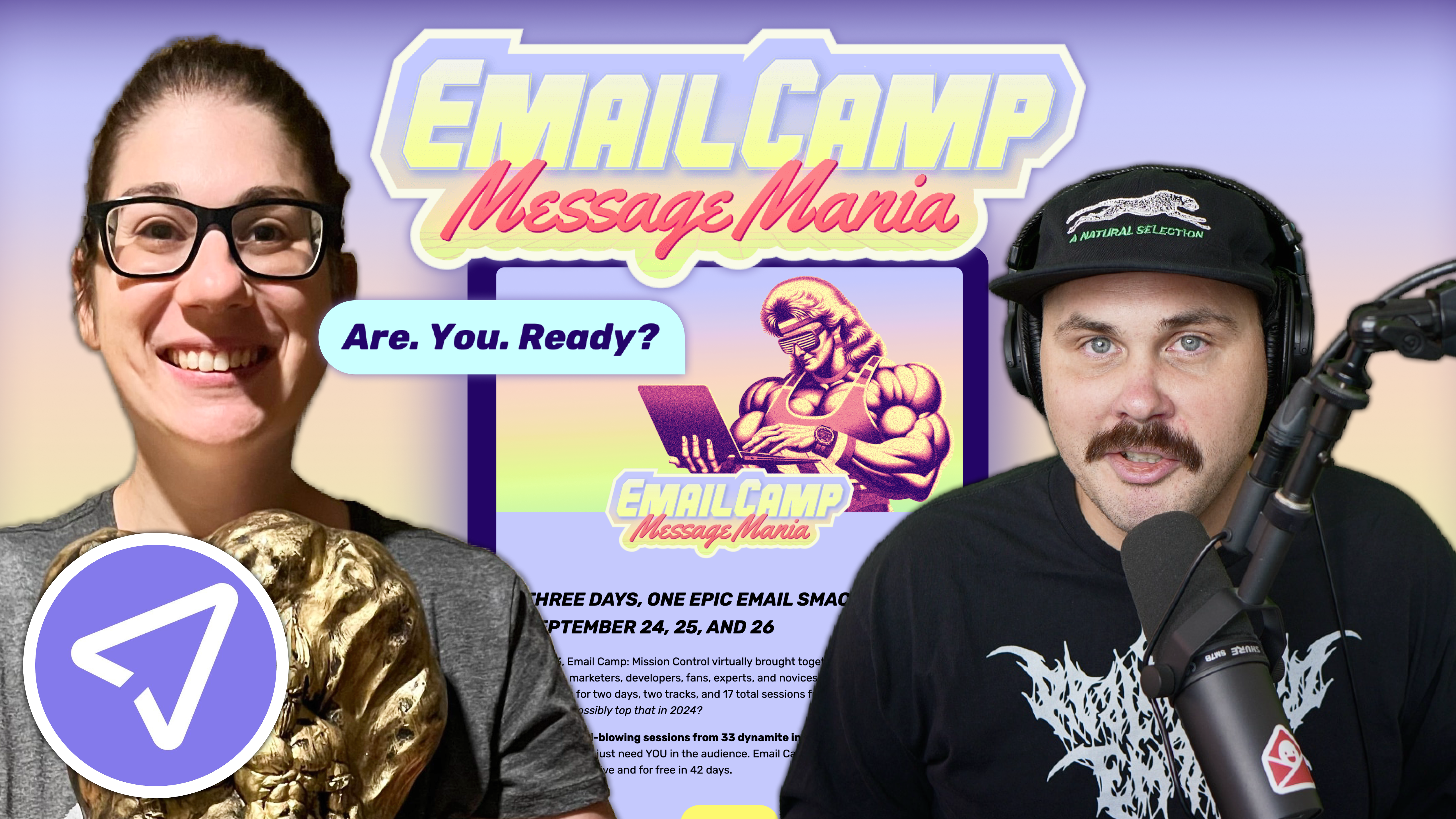
Matt Helbig and Mailgun’s Megan Boshuyzen unpack Email Camp, showing how accessibility, live text, and smart CTAs turn event emails into signups.
May 14th, 2021
If an email is sent and no one added alt text, does it reach the inbox? Descriptive alt text is just one thing to keep in mind to serve up accessible emails. We talk mixtapes and Macintosh with Avi Goldman, founder of Parcel and curator of Email Resources, putting these e-commerce emails to the accessibility test in Parcel’s interface.

This FF episode was sponsored by Netcore. Revolutionize email experiences with the only email delivery platform that leverages AI to power deliverability and increased customer engagement.
Matt Helbig: What's up Email Geeks? Welcome back to another episode of Feedback Friday, this week with a special guest. How's it going?
Avi Goldman: I'm doing alright. How are you doing?
Matt Helbig: Good. We've been a big fan of Parcel, so I was interested a little bit about this tool and your background Avi.
Avi Goldman: For sure. I’m an Email Geek, first and foremost, that's kind of where I've been for the past five years. I've done some software engineering, marketing, product management, and everything that I do, I love to tie back into email. That's kind of who I am at this point.
Matt Helbig: We have some Poolside FM emails today, a very nice chill vacation vibe for the summer. I'm excited to walk through these and get your opinions on them.
Avi Goldman: These are gorgeous.
Matt Helbig: We're actually in Parcel right now. It's a pretty interesting, cool text editor for HTML, email development. I’m digging the scalable windows here and the different viewports. I think we can go to the desktop view, and we can walk through this one.
Avi Goldman: Let's do it.
Matt Helbig: Sweet. What stood out to you on some of these?
Avi Goldman: The thing that first struck me was just the colors, they fit so well with what I expect from the brand. They feel calming, that blue, and think about the colors, we'll see, they just feel like a vacation to me. That was the biggest thing for me, was just that it covers the entire screen, they don't have any width of 600, they filled up the entire email. They still have a really good text width, which is really important since they’re using that monospace. It creates a gorgeous feeling when I open the email, that was the biggest thing for me.
Matt Helbig: I'm liking how the colors are working together with this nice, big sort of eye-catching GIF. It’s sort of a one-column email using some live text here, with that custom font for the intro. I like the reverse-pyramid right down into this copy. Yeah, we don't see a lot of mono type space like this.
(Monospace font is a font whose letters and characters each occupy the same amount of horizontal space.)
Matt Helbig: It fits their brand, more like a code-y developer sort of vibe. I'm a fan.
Avi Goldman: Me too. Also, it's the 80’s feel too. The graphic at the top of the 80’s typeface too, like a no-text terminal kind of computer.
Matt Helbig: Yeah, and then right into that “Reserve Yours” CTA. I'm also a fan of how these colors are working together. Scrolling down to the second section, there is a fun little GIF talking about an honorary position at “Vacation Inc.”
Avi Goldman: Amazing. It's fun. They've put a little bit of a game inside the email to engage you. It catches your eye.
Matt Helbig: Going down into this bottom section with the social, I think this is something that we call out a lot, sort of having a preview of these Instagram posts. I think it works pretty well here, just giving you a little teaser about content that they're sharing on Instagram. Then, there are some simple icons on the bottom. I was interested actually in some of these accessibility tools that you've built into Parcel here like we had blurred vision.
Avi Goldman: The goal was to cover a wide range of accessibility issues. The first one that I wanted to tackle was visual impairments. My dad and my brother are both colorblind, I have really bad vision, and my apartment has windows that get glare all the time. There's both the situational disability as well as one that you just have. It's really important to keep that sort of thing in mind and that's kind of what I want to cover here.
My vision tends to be almost black and white, especially when I have a glare on my laptop, so that one was important to me, even though it is probably the least common visual accessibility issue. Personally, the blurred screens, without my glasses, tend to be like that as well. I wanted to make it easy to see what that was like. Then, we can kind of see what that looks like here with blurred vision, that monospace font and at that 14 point font, it does make it difficult to see. Definitely, without my glasses, I wouldn't be reading this email.
Matt Helbig: I know there are some tools out there that simulate this for you, for the web, but it's nice to have something like this built-in with that accessibility in mind.
This is an ad for a mixtape. I like this throwback window here, and again, with that monotype, some interesting background colors, and just being consistent. I guess these GIFs specifically stand out to me.
Avi Goldman: The thing that stood out for me in this email was their brand voice. It fits so well with their website, and with the design of it, it's a very fun, free flow, kind of human voice. It's easy to connect with it, it's easy to see that. If you're listening through to the mixtape, you will probably relate to the way they’re talking to you. They’ve tailored their brand voice to their audience well.
Matt Helbig: I think some of these headlines could be a little larger to break up these sections. I think the bold is an indicator of that, maybe on mobile, it's a little clearer. Overall, I think they could make that a tad bit bigger here to break up these sections. I’m a fan of how this one goes through, and it's a rare strike through which I always like. It's a weird thing to include in email. With the all caps too, they're bringing in that fun tone voice as you said.
I think this one's a pretty fun little newsletter. I guess I might have a problem with all this stuff being centered text, especially on some of these longer sections, it might get a little bit hard to read. I'd be interested in seeing this left-aligned, just on the accessibility side.
Avi Goldman: Actually, can we try toggling the images off to see what their alt text looks like?
Matt Helbig: Sure. Not the best, or at all.
Avi Goldman: Yeah, I think that was something that jumped out at me when I was looking at these emails earlier. A lot of their headings are well designed with the typography, and they’ve used images to keep that, which is a totally valid thing to do, but when you have images off, when you're using a screen reader, and there's nothing there, that makes it hard to use for some folks. I think it's a really important, and pretty straightforward, step especially when the entire image is just a piece of text.
Matt Helbig: Having this text be alt tags, you could even do a fun-styled alt text. You could probably create something a little bit similar to this in the email so that if those images are turned off, or are loading a little slow, you can get something with this before everything loads.
Avi Goldman: I think mixing both an image CTA with a completely coated live text CTA at the bottom there. If you use the second item, over the little crosshairs, and go ahead and click on that, it makes it easy to see that, and the beauty of live text makes it easy to change. It’s really easy to jump in and pull that over. There are a few other tools up there on the right that make it easy to just go ahead and make the changes to your email right there.
Matt Helbig: Even this hover is impressive and useful.
Avi Goldman: Another nice thing that we could do with this email, is this one is most definitely going to get clipped in Gmail with the current size of it. However, there's a lot of whitespace in this email, a lot of bad formatting. If you click on the “zero transformers” at the bottom left, head over to formatting, and go ahead and minify it, then, we can see in the bottom left now that it dropped 38%, from 122 kilobytes to 76.
Now, this email is almost definitely not going to get clipped down. By turning that on, we can save ourselves from potentially not letting our subscribers see our full message. If you want to see the minified version, you can click on “source” next to “preview”. There is all the spacing, any unnecessary new lines, any HTML comments that aren’t MSO comments, all get stripped out. You're good to grab this code and send it off. This email is now safe, and it's going to fall under that Gmail limit.
Matt Helbig: Another 80’s themed image here.
Avi Goldman: Again with that consistency.
Matt Helbig: Nice, they're just going again with these really large headlines with that type. I like how big this App Store button is. Usually, you see it sort of tucked away at the bottom, but I like that being the main CTA. For some reason, it's more fun or on-brand for me, than just a “download now” CTA.
Avi Goldman: It feels integrated with the Apple system, it’s using their CTA as your CTA.
Matt Helbig: Again, a fun little GIF driving into that “App Store” CTA.
Avi Goldman: A small thing that I liked that they did here is near the bottom, when they say, “Follow us on Insta”, they've got the link bolded, there’s a color change, and it’s underlined so it’s really clear that that's a link. We as the industry will sometimes hide links, the unsubscribe link, or something like that, and that can sometimes bleed over into link fatality. Having that small, that secondary CTA, of following them on Instagram, but still making it clear that you can click there, I think is nice.
Matt Helbig: When I try to create links, I always think about if someone clicks this, will they be surprised? When I land on a page, I don't like being surprised. This is very clear that this is a link, it’s going to their Instagram, and this is their handle. Even though it's a small thing, I think it does help you eliminate that confusion of knowing when you click on something exactly where you're going to land. Tell me why I'm clicking this link and where I'm going to go.
Then, you've also launched Email Resources, which is a very comprehensive list of email resources. What made you want to put all this together?
Avi Goldman: With Email Resources, the name kind of explains what it is, right? It's a list of resources focused on email. What it was, is that I had a big spreadsheet myself of email resources that I’ve collected, it was probably 100+ resources, and I have people asking me for recommendations and suggestions all the time. I figured why not share the list directly? I figured it would be a great place for adult people to find the tools that will do the job that they have, and also learn about categories of tools that they might not have known existed. If you don't know that there are minifiers, discovery is a big thing.
Matt Helbig: This is my favorite one right here, I think.
Avi Goldman: I agree that's marked as a favorite. Definitely top three.
Matt Helbig: I know we're always looking to send someone a link with all the resources that we've collected or looked at over the years. This is a lot of work and thank you for putting this together because it's a very comprehensive guide, especially for someone starting with email development or design or copywriting, or marketing. Even when I go through, I'm still finding out cool new things to try out and learn from. Thanks for putting this together.
Avi Goldman: My absolute pleasure.
Matt Helbig: Where can we find you online?
Avi Goldman: You can find me on Twitter at @theavigoldman. You can also check out the Parcel account, which is @useparcel. I'm in the Email Geeks Slack as AGoldman so if you've got any questions or you want to just chat, hit me up on any of those platforms.
Matt Helbig: Thanks for joining us this week. A big fan of these emails and a big fan of this tool.
Avi Goldman: Thanks, Matt.
Categories:
Feedback Friday
Matt Helbig and Mailgun’s Megan Boshuyzen unpack Email Camp, showing how accessibility, live text, and smart CTAs turn event emails into signups.

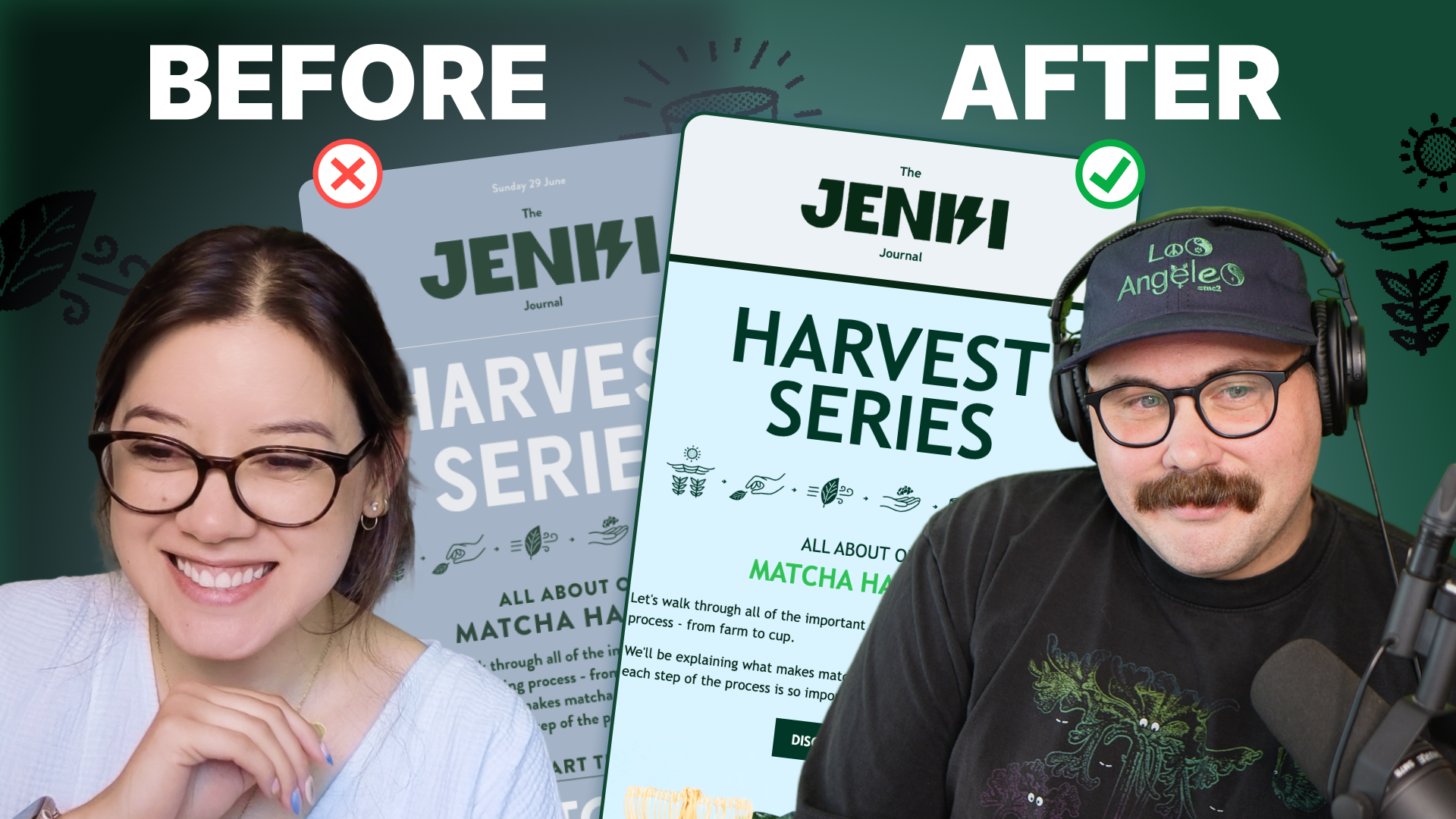
Accessibility, applied: Matt Helbig and Kelsey Yen reveal how inclusive design turns real emails into better user experiences.
Dive into the world of unmatched copywriting mastery, handpicked articles, and insider tips & tricks that elevate your writing game. Subscribe now for your weekly dose of inspiration and expertise.