Email marketing deep dive with Megan Boshuyzen
Matt Helbig and Mailgun’s Megan Boshuyzen unpack Email Camp, showing how accessibility, live text, and smart CTAs turn event emails into signups.
March 6th, 2020
This week we look at some app emails from Resy.

Matthew Smith: Hey, Hey, Hey. Party people. What's going on? Feedback Friday, email geeks. Matthew Smith here. I'm really happy to be here. One of the things I want to do is I want to go through some of my favorites. Things that I pick, and so I'm going to do that a little bit more around here. Hope you like it. Some tasty morsels I've got for us today are from The Resy Hit List from the Resy app.
Man, I've been so impressed just the visual treatment of these emails. Every time I get one, I think, damn, that looks good. That's great. Fucking design design, let alone email, like the email category in general, you have to generally take a lower step down for your design standards. A couple of reasons for that.
One is the industry doesn't have the same exposure to good design, but then two is the tech stack makes it a lot more difficult, but the constraints are there. But that really doesn't have to be an excuse. And I think this team is really showing us that there's so much that can be done. These are some of my favorite emails. Period.
I've been super impressed. So let's walk through that a little bit. Shall we? This is The Resy Hit List, you know, just giving me some exposure right away. Starting with easy to read topography. You can see right from the get go, man, they jump right into these beautiful images of food and they're talking about the summer in this case, or the summer coming to an end.
So this is sort of like getting ready for the fall. They talk about the Bay area, which I visit a lot. I practically live there. Just jumping in right away. I think one of the most interesting things that they do in this email is they utilize typography in this fantastic way of creating something that's unique by creating a different hierarchy out of the number system here that I just think is gorgeous.
And a really fun way to try something a little different here. So I'm a big fan. I'm pretty impressed about how they're doing this. So they talk about the number one being, NARI, and then two, three and four and down the list. But then they like change it up with these big numbers and sort of calling them out as highlights.
What it does for me is that it keeps my interest. And then also notice that there's opportunities to book some now or learn more with others. And of course, that's probably being driven by a choice on their end maybe to also test and see what's happening there. But it's just a fantastic way to showcase the different types of restaurants, what's going on. It's not your standard grid, right? So it tells a story. We sort of start top left here and we begin to zigzag down.
Diagonals in design, signal action, movement, flow, and that kind of thing just makes a huge difference here. The standard of just using design principles to move through this.
Another thing. Look how few colors there are in this email. It's just really remarkable. So starting up top, they just give us this Resy sort of salmon color, and then they lead us down through the way. It's just really clean and clear. This is a link here and then otherwise the link colors are blue.
There may be, could be some refinement there, but I think it's working. The numbers here are links, so they're that salmon red and then blue of course is a link and then whatever else isn't is in this text color. Notice that they have good letting here. Line height. On this text. Easy to read. It's maybe a little small over here on mobile.
I think that could be improved. The email just reads so clean and clear. One thing I would love is maybe just a little photo here, but in some ways I kinda like, it forces me to read the content, get me into that. Maybe that's my ADD that wants a photo. This is good content. They've thought through the language here, so I think it's worth reading.
One of the things that I love here is they start to introduce a little bit more color, but they stay consistent and the topography feels fantastic and gets relaxing and it stays successful. So they give me a little kind of what I would call an internal ad here. One thing that I would throw out is from an accessibility perspective, this contrast probably is too low.
For the white and the yellow. Something to look at. "Click here" if it's a mobile, that's not a click, right? It's a tap. So better to use language, like an action item. "Hey, checkout your hit lists" and then link "hit lists" and make that an underline. So an underline is going to be much, much clearer. And one of my rules on something like that, or a test, it's a really simple test.
Just squint your eyes, and if you can't notice that the word "here" is a link, then it's not working. It should be able to be something you can, you can tell very, very quickly and easily. Another thing here would be that this typography doesn't feel quite in line with what's going on up here and that typography set.
So just a small, a niggle. One thing that I think is great here. That we talk about a lot is a lot of people are saying, Hey, follow Resy, or follow us on Instagram. But they don't show the quality of the content, so it doesn't even matter. But here they do, and I think that makes a big difference.
The edges of the images seem a little bit blurry, so I'd sort of like look at that, see if you can crisp those up. Tiny, tiny little pickiness. But I think things are just looking so good. Look how short and tidy this footer is. Gorgeous. Really impressed. So let's go on and let's look at a few more from Resy.
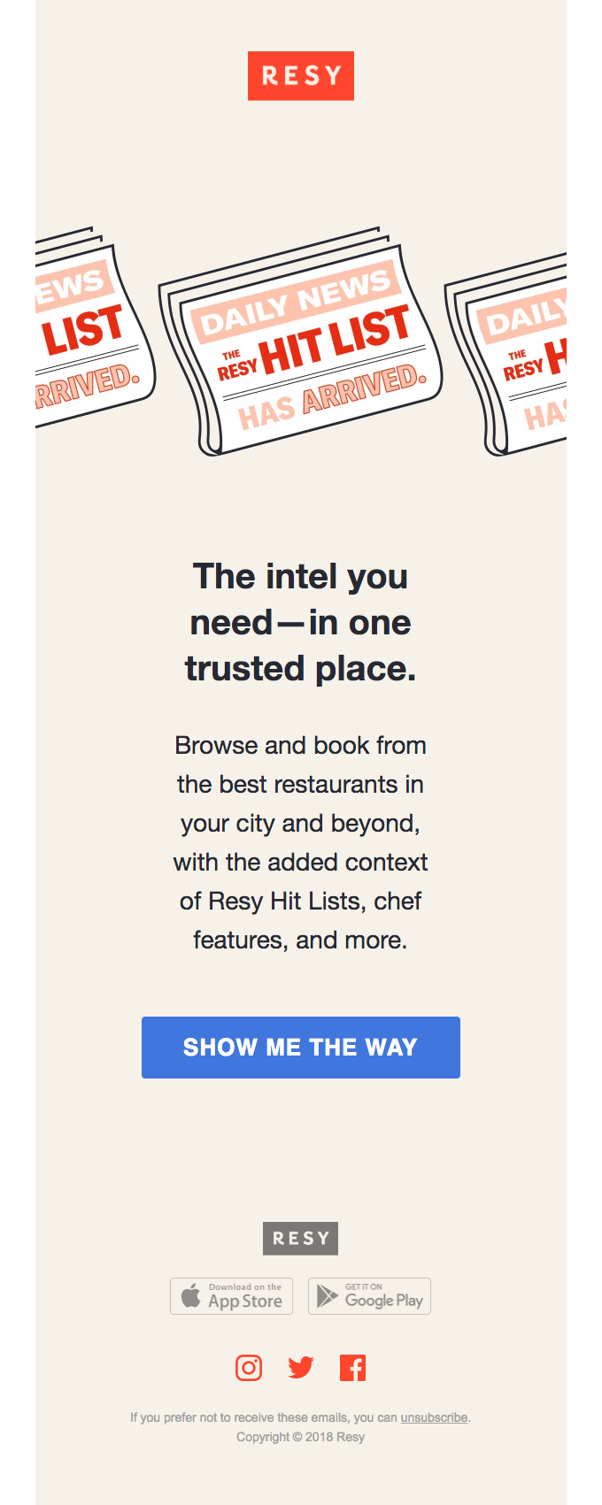
So again, I think there's some accessibility contrast issues here that could be improved. But look how simple this is. Just like, give me a beautiful icon. And this piece about my next great meal is only a few taps away. I know exactly the CTA to go to right away. Right? So this is a great retention or re-engagement email that gets me moving as a customer.
I don't have to think about it. I know exactly what I want to do, right? And then they give me a pro tip so I can figure out, Oh, I can get notifications to see when a table is available for my favorite restaurants. That's a fantastic way to show me how the app works as a feature. Really feel good about that. They use a GIF so that they move through and give you a quick sense of like, Oh yeah. I can glance and get an idea of how it works, and that's enough. That's all I need.

I'm super impressed by the way that they pulled this together as usual. One of the things I would call out is, there's no reason why this can't be live text. If you're like, well, it just costs too much money, does it does it really?
There's no reason why you shouldn't be able to tweak that. And then your emails can be so much more flexible for mobile. And they're future friendly, right? So again, we'd talk about this all the time, but if you do live text, you can use that for SEO value. And you can paste these even as like little landing pages. I mean, the power of all this content getting wasted in somebody's inbox and that's it. That doesn't make any sense.
One more here for Resy. Look at that gorgeous, really fun little GIF title to get you into what's happening and showcase a feature. So they're talking about my hit list, helping me understand my favorites, showing me how it works.
It's so easy to understand and read. It just boggles the mind how so many people create too much content. They make it so hard. Even as I look at this, I think, shoot, how can we adopt some of this for Really Good Emails and how to use this for our collection feature. One tiny thing that I would probably look at shifting is if you look at the majority of the email, it could really benefit from being either center aligned or left aligned.
It feels a little bit like center, left, left, left center, center. left, center, and then left, essentially, but then center. And so like, that's just starts to feel a little bit like, well, which one is it? And your mind doesn't really, unless you're a designer like me, you're not thinking it. But you're feeling it.
It just, it doesn't flow quite as well. So try and be consistent, but notice like how much spacing is used here. Oh, it just feels great. So easy to read. I just, I love this email. Fantastic job Resy. Super impressed. Keep knocking them out of the park. Got a few little tips for you to continue improving.
You'll be seeing more of me doing sort of my favorites and looking forward to it. Alight. Whale out. Bye.
Categories:
Feedback Friday
Matt Helbig and Mailgun’s Megan Boshuyzen unpack Email Camp, showing how accessibility, live text, and smart CTAs turn event emails into signups.
Accessibility, applied: Matt Helbig and Kelsey Yen reveal how inclusive design turns real emails into better user experiences.
Dive into the world of unmatched copywriting mastery, handpicked articles, and insider tips & tricks that elevate your writing game. Subscribe now for your weekly dose of inspiration and expertise.