
How to Incentivize Customers to Return to Your Product with Venmo
Customer retention and relationships are crucial for any business selling products or services. The best way to grow repeat customers is by creating really good retention emails, encouraging customers to come back and use your product again. In this episode, we dive into how Venmo builds loyalty by incentivizing customers and how you can apply this to your retention strategy.

This FF episode is sponsored by Netcore. Revolutionize email experiences with the only email delivery platform that leverages AI to power deliverability and increased customer engagement.
Matt Helbig: What’s up, Email Geeks? Welcome back to another Feedback Friday episode with Mike again. Mike, how’s it going?
Mike Nelson: Hey. Welcome. Welcome. I'm happy to be here again. I can't believe you got me two times in a row.
https://www.youtube.com/embed/2hnvvxxy5vo
Matt Helbig: I know, we pulled it off somehow. This week, we’ve got some exciting emails from Venmo that I'm excited to look at.
Venmo email breakdown

Mike Nelson: Venmo is killing it right now. I haven't used the app for a while, mostly because I never get out of the house, which means I don't need to pay anyone on Venmo.
I recently paid a bill with Venmo because a friend did something for me, some freelance stuff. I was like, shoot, I've got to re-download Venmo because I haven't had it on my phone for a while. I went back and started looking at the Venmo emails and was impressed by the retention the second I started engaging with Venmo.
They just started sending me some excellent content to update me. So, we'll go through those today and some incentives and some other things here.
What kind of stuck out to you first when you were going through some of these emails?
Email #1: Business profile promotion
Matt Helbig: So, for this first one, I know this is sort of a marketing email to get you to create a business profile.
I think this little touch is fantastic to see, and then some of the shadow around the CTA buttons is something we don't usually see. They're just bringing a fun amount of color into this email, using live text to show the benefits of creating a business profile.
It's a descriptive CTA here. I think this one is an excellent example of an onboarding sort of retention email to really describe and show with a lot of space here, the benefits of why you should create a business profile, and keeping it simple with a light amount of text, images that support the message, and then a pretty solid, double CTA at the top and the bottom to get you to decide on the product.
Mike Nelson: This is following the typical pattern, inverted pyramid, strong header text, a byline into a CTA. And then when you get down below that, it's supporting Z pattern where you've got your text on one side, the image that rotates as you go from chunk to chunk.
This is something that any brand can replicate very quickly. Almost all ESPs probably have some WYSIWYG that has a Z pattern built into it, where you do an image on the left, an image on the right, text on the left, text on the right. Blah, blah, blah, blah, blah, and go through.
What made this stand out to me was the imagery also pops out of the photo a little bit. So, they've built in these illustrations, they've done some overlay like that blue text. They've got that nice background pink shadow there. They're using color, they're using some illustration, overlapping that box.
It just makes it stand out a little bit better than usual. So from a design element, that was clear. Each chunk has a very clear-cut title. No fees till April, the one above it is a touch-free transaction.
Even if you're skimming through this and don't want to read the supporting text, you get a sense of what you're getting throughout the whole email, which is a very good way of doing that through images, short titles, clear call to actions. To me, I think this is like, if you go on a promotional email, this is one of the better examples that we've seen in a long time.
Matt Helbig: I noticed on mobile that they're reusing some assets to stack them and doing an excellent job with the left-aligned content. But even an image like this, they're flipping it and including another CTA here on mobile to try and grab your attention. So it's not such a long scroll.
I think little details like that show that they're taking the time to optimize for desktop and mobile.
Mike Nelson: Yeah. That's one thing I didn't even catch, but super cool.
Email #2: Incentive email to drive usage
Matt Helbig: This next one, I believe, is more of an onboarding email to get you to sign up.

Mike Nelson: In my journey, I went back to Venmo. I downloaded it, but I hadn't input all my information yet. This was the email I got right after that that said, Hey since you've downloaded, you might as well get $5 as a way to get me back into the product because I hadn't paid anybody for a while. This was a nice incentive.
I don't know how much $5 is to them in terms of the lifetime value of a customer. So they probably say, Hey, the following year we'll probably make off the typical person, $50 or a hundred dollars. So, five or 10 or 15% of that is not bad to get them back in using the app.
I found that this was a compelling incentive, and I think brands can do this with many different things. It doesn't have to be money. It could be a pretty cheap thing that they offer. So, cosmetics might be a little trial thing. Glasses could be anti-fog mist stuff.
There are lots of things that you probably couple in to incentivize people to come back and use the company over and over again. You're using that inverted pyramid again that we saw through and then some supporting text.
Matt Helbig: Yeah. I'm a fan of how clear the CTA is. Get your $5 is pretty engaging CTA copy.
Then, saying with this button below, they're not letting you be confused, click this button, and get $5. That's an excellent way to be direct with what you want someone to do, rather than "learn more" or something. This is a lot more compelling if you want to get people back into the product.
Mike Nelson: Yeah. There's that time element with urgency is that you have to do it before March 15th. So, I only had, I think, two days, three days in this, when I got the email originally. So, some cool elements there. And then we just saw the dark mode version of this.
Matt Helbig: Yeah. They're doing a great job with optimizing for dark mode.
Having a white outline around the text that doesn't show on the light mode. But when you go to dark mode, you see that. I give them kudos for optimizing for this dark mode.
Email #3: Introducing new features
Moving on to this next one, another sort of welcome, sort of onboarding, maybe even a marketing email if you haven't signed up yet for Venmo.
So, what stood out to you on this one?
Mike Nelson: Their color schemes are so vibrant and fun. They use those illustrations throughout. I hadn't used Venmo for such a long time that I didn't even know that they offered credit cards.
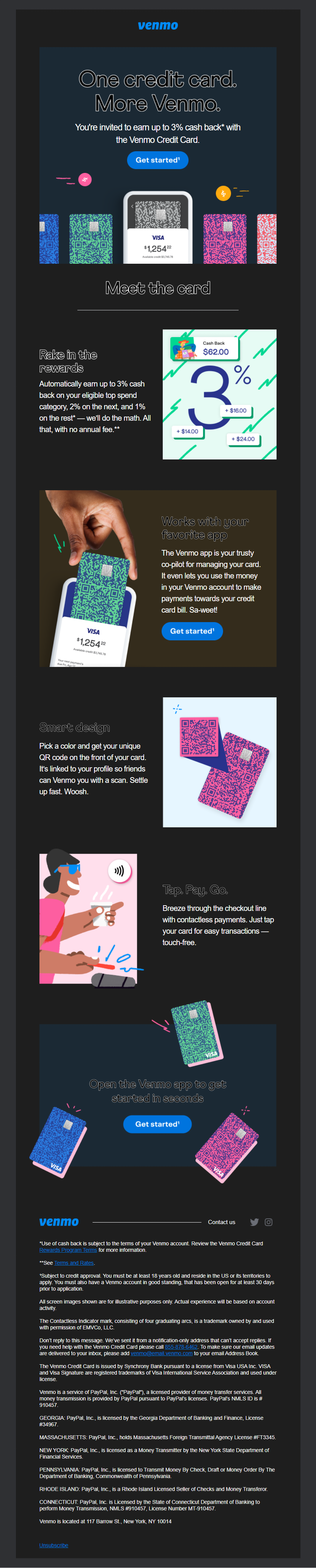
Bringing me back into new features was the one thing that brought this one to mind when I was looking through their emails, thinking, okay, cool. They're hitting all the marks here. They've acquired me. They've incentivized me to keep using it. Now they're introducing things that I hadn't seen in the past or that they've created since I use it in the past. So, they're reinforcing their value to me as a user.
Matt Helbig: Yeah. I'm a fan. Nice use of colors. Again, they're using this sort of Z pattern, but then on mobile optimizing it, really clear CTAs, excellent copywriting keeping these paragraphs short enough so, they kind of live on one line. So, in general, pretty big fan of this one.
Mike Nelson: And throughout all the emails, Venmo is a financial instrument. When we get other finance emails or banking emails, they're typically pretty dull. The complaints we've heard have been something along the lines of, we have regulatory issues, and it has to be cleared through 12 different places, and they strip out all the character.
I see with this that they're using Visa. They're getting you to give them money. It's almost like a banking system, but they continue with illustrations. You still have some excellent copy. They don't make any weird promises. They still have that 3% cashback, but it seems like they understand what their brand should be, and they stick to that and don't allow themselves to get pushed around by the lawyers in the room.
Matt Helbig: I do think we can recognize that this legal section is a bummer, but I know Matthew might have some strong words about how they display this stuff, but I think they get out of the way with it.
It's lower in the email, and it's not the best to see this stuff, but I understand there are maybe some legal requirements about what they would like to include in these emails, especially if they are financial. As you said, I think they found a nice balance of keeping their brand voice in their emails while still trying to be as compliant as they can.
Email #4: Retention email to bring users back
This last one is a retention email since you've been gone sort of email, which we're always a fan of trying to use email to get people back into the product, really show exactly what they've updated since you've been in the app. We love retention emails like this.

Mike Nelson: It's just a good way of reinforcing it. Some things I've missed, bells and whistles. Some Kelly Clarkson references. Using those good shadows. I think those shadows are just so cool. The colored shadows. I wish that was a design element I saw in other places too.
Matt Helbig: I think this one is super clear. It looks great on mobile. I believe they are understanding, making this desktop view scannable but then resizing this content for mobile and making it feel native on both screens. Maybe part of this legal compliance is making sure that their emails are accessible to everyone.
When you design email for everyone, it benefits the whole email experience for even people who may not have any disability.
Final thoughts
Mike Nelson: Since I've re-downloaded this app, I've just been thoroughly impressed by the emails they continue to send to me. And it's not just general newsletter fluff.
I'm definitely in a journey that's retention to get me back up to probably the usage they want to see through new users or recently won back users. I'm continuing to get more retention, more new feature emails. The longer that I go on, and I bet the more I start using the app, I'll get out of this journey into more of a general list.
Matt Helbig: Well, I enjoyed these examples. Thanks for bringing them to the table, Mike. Have a great Friday.
Mike Nelson: Yeah. If you want to pay me on Venmo for this.
Matt Helbig: I'll send you my CashApp.
Mike Nelson: Yeah. Cool. That sounds good. All right, y'all have a good Friday.
Matt Helbig: See you.
Mike Nelson: See you. Bye.
Subscribe to our newsletter.
Dive into the world of unmatched copywriting mastery, handpicked articles, and insider tips & tricks that elevate your writing game. Subscribe now for your weekly dose of inspiration and expertise.