

7 Really Good Unsubscribe Pages + Preference Centers
…and why they work.

Raise your hand if you’ve ever felt a little hurt from an unsubscribe. Or a thousand. Yeah, me too. When you spend weeks working on a brilliant new campaign, it’s tough not to take them personally.
But it’s about time we stopped treating all unsubscribes like bad break-ups. A good email preferences or unsubscribe page gives your subscribers the simple opportunity to get more emails they love and fewer emails they don’t.
It’s like couples counseling for you and thousands of subscribers. It’s a good thing.
As the resident email geek at MakeMusic, I spend a lot of time subscribing (and unsubscribing) to other companies’ emails looking for new ideas. I see a lot of preference centers. Every now and then, I’ll come across one that makes me smile and shows me that the company cares.
Here are some of my favorites.
#1: Spotify

When a preference center gives me a lot of options, I want to know what exactly each of those options actually means. I don’t want a list of vague categories like “Daily Digest” or “Updates”. What the hell is a “Daily Digest” anyway?
Spotify sets my expectations nicely here. First, they separate notifications into two distinct groups: “Spotify Updates” and “Your Music”. Beyond that, they (briefly) explain exactly what you can expect from each type of notification. That makes it easy for me to choose exactly what I want quickly and easily.
(Unsurprisingly, Litmus also does this beautifully.)

While I don’t think SMS works this well for every brand, it is worth noting that Spotify gives me the option to easily select which SMS notifications I receive here, too.

#2: Wistia

I’m all about setting and managing the customer’s expectations. And Wistia nails it with this preferences page. “How much Wistia do you want in your life?” is a great alternative to the standard “Email Preferences” header, especially given that frequency is listed right next to each email type.
Of course, once you set the expectation for email frequency, you have to keep to that schedule. Nobody likes the person who tells subscribers to expect one email a month and sends two a week instead. Set the expectations and stick to them.
#3: Moosejaw

There are a few things I don’t love about this preference center, but two big things that I do: the option to change email type and/or frequency, and Moosejaw’s commitment to their brand voice.
First, I appreciate when brands give me the option to change both the content and the frequency of the emails I’m getting. If a subscriber wants a tidy inbox but still hopes to hear about your best promotions once a month, take advantage of that opportunity. Sometimes asking for fewer emails doesn’t mean they hate your emails — it just means they need a little space.
Though it is easy to get carried away with too many options, I think these limited choices hit the sweet spot.
Second, we have to talk about Moosejaw’s commitment to their voice and tone. From “33% of people that opt out of Moosejaw emails have recurring possum nightmares” to “I can’t get me enough Moosejaw,” they’ve taken the opportunity to delight with silliness.

Brand authenticity is important in every customer touchpoint — especially so on an unsubscribe page. The last thing you want a subscriber to see when they’re thinking of opting out is the boring, sad, corporate version of your brand that comes through on an unloved unsubscribe page.
Would you seriously try to win back the heart of your one true love with a post-it note that says “Are you sure you want to break up with me?”? Definitely not. You’re more authentic than that. Your unsubscribe page should be, too.
#4: eROI
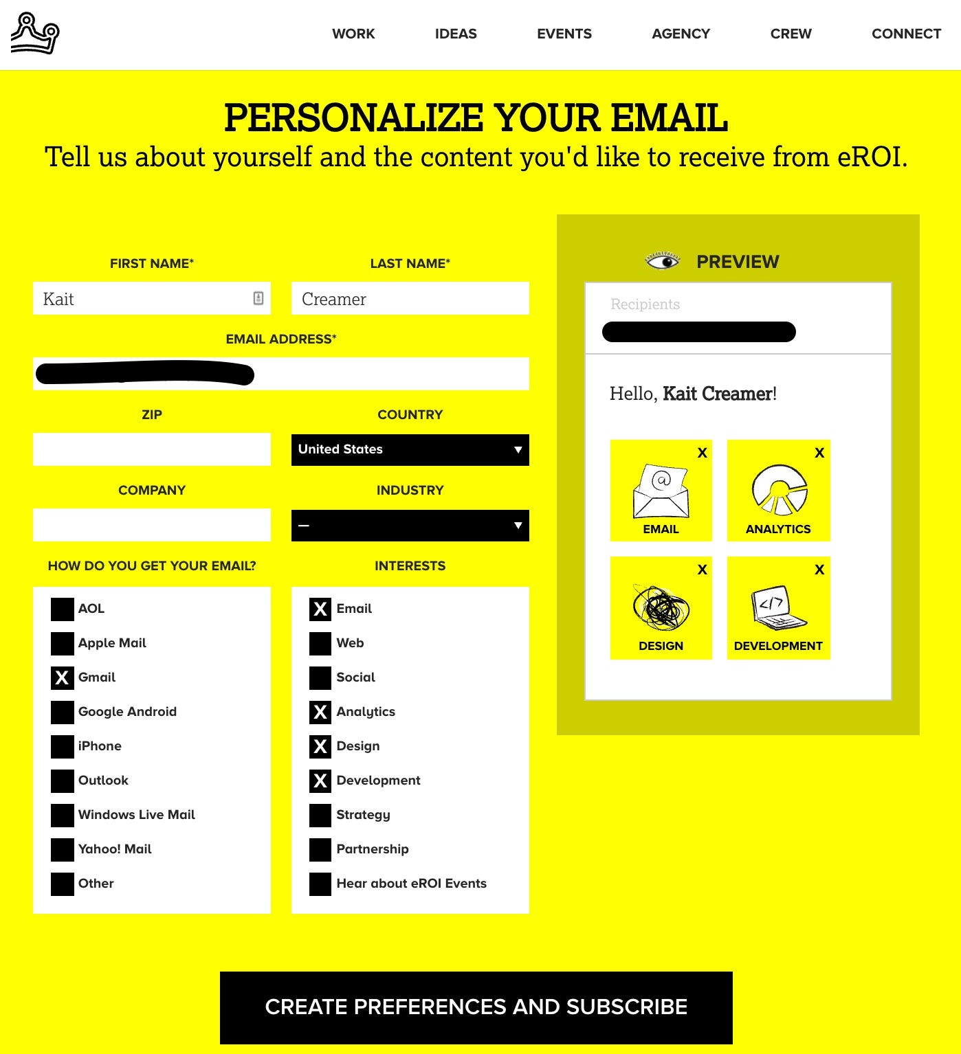
Marketers are always looking for new ways to push the envelope with gamification and interactivity these days. We’re seeing interactive surveys, carousels, and heaps more in emails all the time. But it’s so rare and so totally delightful to see a company that’s made a preference center as awesome as this one from eROI.
The information is relatively simple: contact details, email clients, and interests. But for every detail I enter about myself on the left, the email preview on the right updates to show a personalized email just for me.
It’s not complicated, but it turns an otherwise simple and unassuming subscription page into a fun experience for the user.
#5: Le Creuset

Le Creuset’s email preferences page makes me feel like I’m taking a BuzzFeed quiz that’s about to match me with my perfect cookware.
They don’t ask just which emails I’d like to receive; they take the opportunity to learn what colors I prefer, what kind of chef I am, and what kind of cookware I own. It feels warm and genuine and I’d be lying if I said I didn’t click every one of those little dutch ovens to watch the colors change. What a fun surprise!
We want our marketing to feel authentic and conversational and human. When we ask customers to tell us who they are and what they enjoy, we can tailor the email experience to their preferences.
This page strikes the perfect balance between “tell us about yourself” and “let us tell you about ourselves”.
#6: Hipmunk

With just three simple categories of email campaigns, Hipmunk’s unsubscribe page seems pretty lean. What I love about it, though, is that they’re using only my saved trips to show exactly which fare alerts and deals I’m already getting. This does three important things.
- It limits my choices, making me more confident in the emails I do choose to receive.
- It reinforces the idea that Hipmunk already knows me and my preferences. We’re old pals.
- Assuming my preferences haven’t changed since the last time I saved a trip or updated my home city, it makes it hard for me to unsubscribe. Why wouldn’t I want to save money on my next flight out of Denver or on my way to Queenstown? These are interests Hipmunk already knows are relevant.
#7: Medium
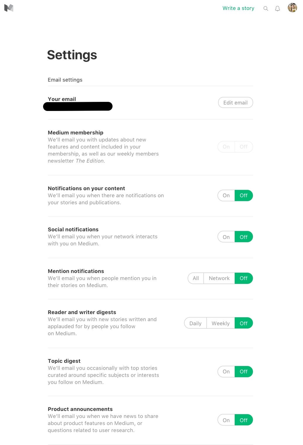
Too many times, I’ve arrived at a preferences page after clicking “unsubscribe” in an email and realized I have no idea what I need to do to actually opt out. Recently, I came across a page that had checkboxes next to the words “daily digest” and “promotions” with nothing else. The only button below said, “apply changes”.
What? Does checking the boxes mean I want to opt in? Do checked boxes mean I want to opt out? Even if the person who designed the page knew what to do, I definitely didn’t. Not a great experience.
On unsubscribe pages and everywhere else, you have to consider the intended user flow. If something feels confusing to you, it’s definitely not going to feel right to your users.
Medium has created a great experience in using “on” and “off” buttons to highlight exactly which email someone’s getting. A couple of the categories even show frequency options this way as well. It’s simple, straightforward, and doesn’t clutter the page a bit.
Looking at these buttons, I’m confident that I’m getting the emails I signed up for and absolutely nothing else. We should all build that kind of trust with our subscribers.
⚡BONUS ROUND⚡: What NOT to Do to Your Preference Center


These are not preferences. This is a nightmare.
Somewhere out there, a really great person created this last email preference center. (I’m making assumptions here — I don’t know who made this but I believe email people are great people.)
I was unlucky enough to find it when I clicked “unsubscribe” in an email from an outdoors brand I trust and respect. That simple unsubscribe button brought me to a page titled, “Update Your Preferences”. But the only preference it asks for (in a mountain of other questions that somehow didn’t include my social security number) is whether I want HTML or Plain Text emails.
Three different fields for my birth date, three more street address fields, an “Age Bracket” open text field, a cryptic “Customer Groups” dropdown and — perhaps the most bizarre and surprising — my IP address!
YIKES.
There was at least a button allowing me to unsubscribe at the very bottom, thank goodness.
For a page titled, “Email Preferences”, I didn’t get the sense that they care very much what I prefer. It felt jarring and a little invasive, especially given the otherwise high quality of this company’s communication.
It’s a valuable reminder that we email geeks are largely responsible for building a trusting and genuine relationship with our subscribers, from the first point of contact to the very last. Even if someone clicks “unsubscribe” at the bottom of an email, we still have the opportunity and the obligation to make that landing page a great experience for them.
Key Takeaways:
- Be clear in what you’re offering. Subscribers should know exactly what emails they can expect from you. Don’t use vague phrases like “daily digest” or “newsletter” without explaining what’s in those emails.
- Give them the opportunity to choose. Not every subscriber wants every email. Let them customize the communication they get and you’ll build better relationships with them.
- Treat subscribers as friends. Be authentic to your brand voice, especially on unsubscribe pages or preference centers. Use what you do know about your subscribers to show them that you know and you care what they’re interested in.
- Surprise and delight. Just because you’re sad they clicked “unsubscribe” doesn’t mean the page they land on has to be. Make your unsubscribe/preferences page awesome and they might just decide to hang around for a little while.
Articles to whet your whistle


Subscribe to our newsletter.
Dive into the world of unmatched copywriting mastery, handpicked articles, and insider tips & tricks that elevate your writing game. Subscribe now for your weekly dose of inspiration and expertise.