

Do Email Subscription Pop-Ups work?
Why do organizations still utilize pop-ups when clearly anyone you ask hates them? This is what we found.

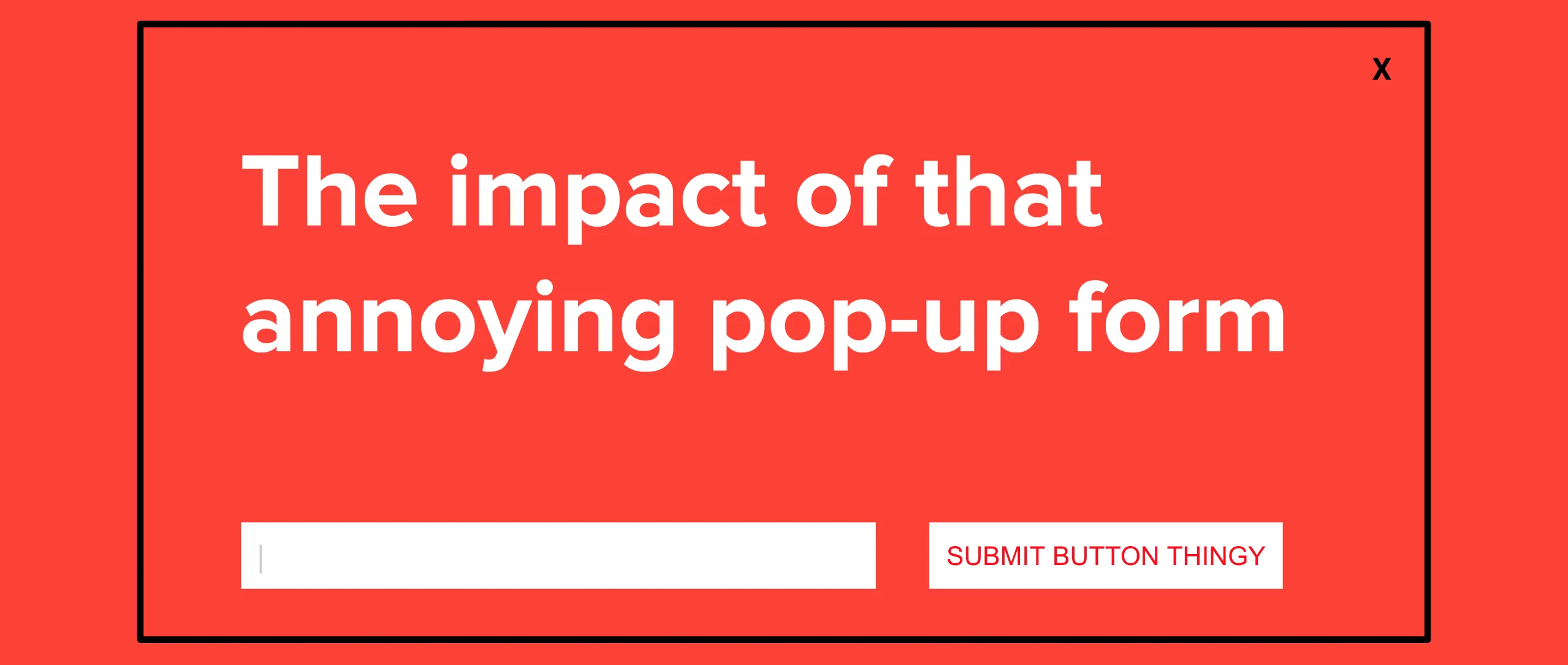
For how annoying they are and how much they go against UX best practices, it seems like you can’t go to a website these days without getting served an unapologetic pop-up.
We all know how we feel when this happens:
- Frustrated
- Insulted
- Tricked
- Instantly unengaged
Pop-Ups Are Annoying. So Why Is Everyone Still Using Them?
The thing that makes me wonder is why every company continues to do this when we know that there’s a collective feeling of disdain for these experiences. So I went digging to find out what I could find about pop-ups.
In the 1990s, Ethan Zuckerman (no relation to Mortimer Zuckerman who owned The Atlantic, Forbes, and Fast Company from what we could find) created the pop-up ad because some advertisers didn't want their banner sitting directly next to some content. The pop-up was a way to get around that - by putting the ad in another small browser which didn't "directly" correlate to the content of the page. But Zuckerman hates what he did. Not only because he thinks that an ad-run model isn't the best for the internet, but because of how rampant the annoying practice became.
And it turns out that there’s a lot of research out there about the annoyance of pop-ups. OptinMonster, a company that is known for creating opt-in pop-up forms, admitted to the negative feedback that they get for the experience. Marketing coalitions have conducted experiments with different sizes and types that show that pop-ups are some of the most loathed things that can be done on a site, such as this one:
And this one, showing that a pop-up is more positively correlated with annoyance, distracting, and creepy and negatively correlated with being “useful” to the user:
Google has even been penalizing websites which use intrusive pop-ups, which they define as:
- A popup that covers the main content, either immediately after the user navigates to the page or while they are looking through the page
- Using a layout where the above-the-fold portion of the page appears to be an interstitial, but the original content has been pushed below the fold
- Forcing the dismissal of a standalone interstitial before accessing the main content
So without asking the question of “do pop-ups work?” it seems like everyone is in agreement that they are definitely annoying.
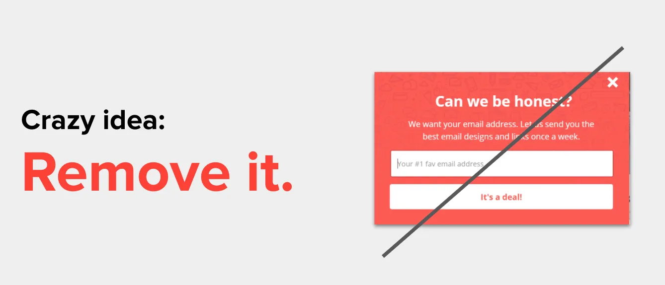
Annoying Doesn’t Mean Ineffective
But here’s the thing: If they are so annoying, why is everyone still doing it? Because annoying doesn’t equal ineffective. And if done right, they can actually have a positive impact on your readers and business.
On an average day, we were converting about 2.3% of our users. It was pretty consistent, so on days where traffic spiked (which is typically Monday and Tuesdays) we’d see a steep bump in sign-up volume and then flatten out (and sometimes dip) over the weekends.
For most people, this is where their alarm bells would be going off. Could you imagine going to your boss and telling them that you were going to stop asking people for their email addresses?
Build Relationships, Not Lists
But we at RGE don’t really care about list size. We often say: “Build relationships. Not lists.” We are okay with people leaving our lists because we’d rather talk to the people who want to hear from us than try to get the attention of those who could hear from us. The importance of list size is based on vanity metrics and billables. Most ESPs and bosses put an emphasis on how many people are on your list, not who is on your list. If anything, this little test reinforced this position that your most engaged readers are the ones you should be serving.
With that perspective, we clearly had a problem with our messaging for a portion of our users who were opting out. And after reaching out to a few we found some common things that we worked towards fixing, which ultimately brought us back to a positive delta for our list.
- grab the most likely people who will engage with your brand in the long run
- People who will buy your stuff
- People who will promote your content and products to others
- People you don’t have to win-over again through paid media spend
- re-emphasize your value propositions
- Products that you sell
- Mission statement or core competencies
- Tailored experiences meant for the visitor
- reach folks you want to retarget
- Show pop-ups to visitors clicking thru from email marketing
- Show pop-ups to visitors clicking thru from paid ads
- alert those who need to know certain kinds of information
- Explain forces such as COVID or high demand that has limited resources
- Prompt them to upgrade for a feature they are trying to access
- Remind them of store hours
Context Changes Everything
Of the list above, really honing in on the users that come from your other marketing efforts seems like the biggest no-brainer. We know how expensive AdWords or Facebook targeting can be, so making sure that you message them based on that profile is important.
While researching, we found that Cocofloss is doing this: They use MuteSix to help target the right kind of audience who may be interested in their hipster floss and then use JustUno’s targeting by referral source to make sure the messaging in the pop-up is written to resonate with that demographic. The result has been a decrease of 25% to their cost per acquisition because they are able to capture the potential buyer quicker with the right kind of messaging to keep them engaged. (Full disclosure that JustUno sponsors RGE, but they aren’t sponsoring this article nor are they compensating us for writing it.)
Nudge, Don’t Nag
Which brings us back to why pop-ups can be so powerful when done right. There are plenty of email capture options out there, but the ones that win with pop-ups are those who understand the context.
You know when a pop-up is beneficial when it isn’t nagging the visitor, but rather nudging them. Here’s how you know the difference between the two. The definition of nag is that it annoys or irritates a person with persistent or continuous urging. On the other hand, nudge is a gentle prod that typically is done to draw attention to something. Would you rather feel nagged or nudged?
When a Pop-Up Is a Nudge (Not a Nag)
Nudging is done best when in context. For example, when someone is about to leave. Or when they’ve made their way far enough into the site to understand the value of being nudged in some way. So when you are thinking of implementing your pop-ups, here’s some research we found on the topic from Sleeknote:
And when it comes to designs, here’s what you should consider:
There’s a lot more to consider about pop-up designs and strategy, but it all comes back to serving the end user. One of our mantras at RGE is to build relationships, not lists. When thinking about why you want people to give you their information, thinking in this context should guide you better than anything else.
RGE co-founder. Speaker. Lame marketing guy. If you found a typo on the site, it was probably my fault.
Articles to whet your whistle
.png)


Subscribe to our newsletter.
Dive into the world of unmatched copywriting mastery, handpicked articles, and insider tips & tricks that elevate your writing game. Subscribe now for your weekly dose of inspiration and expertise.