Email Accessibility: Looks aren’t everything.
Your email looks perfect. But it’s broken…because it’s inaccessible.

When I started developing emails I thought everyone would be looking and experiencing them the same way I was. I could not be more wrong. All the time I spent making sure my designs looked pixel perfect on screen and in the inbox. It never really occurred to me that experience emails differently.
For example, 1 in 10 people in the UK has Dyslexia, which can cause problems with reading, writing and spelling. Another disability to take into consideration would be those who have a visual impairment such as, loss of vision or colour blindness. Did you know that there are over 350,000 people registered with a visual impairment in the UK? In addition to this, there are an estimated 6 million people with sight-threatening conditions. If your list is primarily based in the UK that means at least 10% could have some form of visual impairment.
In recent months I have become more aware of Accessibility within emails as the subject is being talked about more on social media and at conferences, such as Litmus Live and UNSPAM. From this, I have challenged myself to find and implement techniques needed to make the email experience better for those who have impairments.
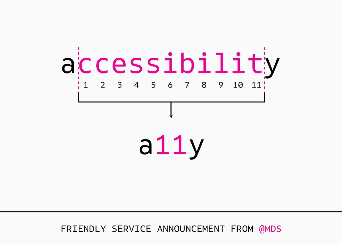
I found that there is a whole project dedicated to accessibility on the internet called a11y. The purpose of this project is to make it easier for everyone to understand various disabilities and how to implement changes to make their whole experience better. This makes it a great foundation to gain an understanding of what we can add to our emails to make them better for everyone.
Currently, there are no email specific accessibility projects on the internet. However, there are a growing number of blog posts and articles about accessibility in email. By combing through these various articles and speaking with fellow Email Geeks I have collected a few tips on how to improve accessibility in your email.
7 Practical Ways to Improve Email Accessibility
1. Add role=“presentation” to your <table> tags
If you have listened to me on the Really Good Email’s Feedback Friday YouTube Series you will know that I’m a big fan of using tables for my email design. This means that it is essential that I add this to my design. Litmus gives a great overview of this in their blog post.
The reasoning behind adding this bit of code is to tell screen readers not to read out the <table> code so your audience doesn’t have to listen to a lot of nonsense.
To hear an example of what an email sounds like with and without this fix check out this post by Email on Acid. You can also test this out this yourself with a screen reader. Popular screen readers are JAWS and Window-eyes. Windows also has its own built-in screen reader called Narrator and MacOS has VoiceOver.
2. Make sure your <img> has an alt attribute!
Sometimes text in images is an unavoidable situation. Whether it be to illustrate a design or because strict brand guidelines call for certain fonts to be used. This means that text as an image or text used in an image is a common occurrence as images are supported everywhere.
As Email developers and designers, it is our duty to make sure that our emails can be enjoyed by as many people as possible. This means that we need to make sure we use alt attributes.

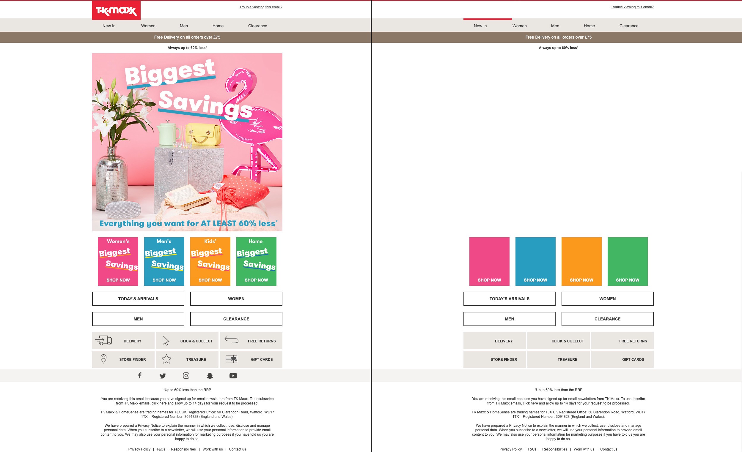
Alt attributes A.K.A alt text is not only important to let listeners know what you are showing, but also to those who have images blocked. This allows us to make sure that readers and listeners still get important information from the email. If the image is purely decorative and does not provide any value to the content it is still advisable that you add an alt attribute but leave it blank. E.g. alt=“”. If you were to completely remove the alt attribute it would make the screen reader read out the link or source of the image, depending on if the image is linked or not.
Otherwise, make sure the alt attribute has context and a good description. A brilliant example can be seen below.

To build upon having good alt text, you can also style your alt text to help make your email look great even with images blocked. The good folks over at Litmus created a great write-up to help you with this.
3. Font-Size matters
Typically when I am creating an email I always aim to make it pixel perfect. This means that everything has specific values assigned to them and if they don’t display correctly in a specific email client, I can spend hours looking for a fix or an alternative way of coding said part.
One of these parts can be making sure columns stay the same height or making sure that text only fills a certain space, a button for example. Here I would use a px (pixel) value to define the font-size and the line-height it takes and define a specific width on a table that I have created as my button. For accessibility, this is a nightmare as px values on font-size and line-heights don’t adjust to the user’s settings which means that they are unable to read the important information and feel excluded or an afterthought.
To remedy this it is recommended you use rem or em as your font-size values. Rem is relative to the font-size set on the root element. Therefore if someone has their default set to 16px, which is common on most devices means that 1rem = 16px. This allows your content to scale with the user’s needs.

Email Text-Size Comparison. Penfield vs PRPS.
4. Scanability
Not only is the legibility of your email important, but the scanability is too. By giving your content a clearly defined structure using a combination of semantic elements e.g. <h1> <h2> <h3> <p> tags and using lists where possible. This allows the user to quickly identify and pick out important information. As an added bonus to using semantic elements, it allows screen readers to put the correct emphasis on important information.
Don’t forget to allow your text to have breathing room. A good starting point to find a suitable line-height is adding 4px onto your font-size, but this can vary depending on your content. Just remember to not be afraid of white space.
Another handy tip is to limit the length of your paragraphs. Being presented with a large body of text does reduce the likelihood of it been read completely. Therefore it is recommended to keep the length of paragraphs at five lines or fewer.
The combination of all these points can be seen in the example below.

Example of good scanability. The Nue co email via Really Good Emails
5. Is that GIF / Motion necessary?
To grab peoples attention it is not uncommon for marketers to use flashing GIFs on buttons or hero content. It certainly does draw attention but can be overwhelming.
It is recommended that you limit the flashing of an animated gif to a maximum of 3 times per second to meet guidelines set by WCAG (Web Content Accessibility Guidelines).
WCAG also recommends that any animation that goes on longer than 5 seconds has the ability to be paused. While this is easier said than done when it comes to email, surprisingly the Outlook 365 desktop app automatically stops gifs after a certain amount of plays. The only other way to implement this across all email clients would be to limit the number of times your gif repeats when exporting it.
6. It’s all about the contrast
When choosing colours for an email template we typically choose what looks and feels good to us and maybe a group of peers/testers. But have you considered those who don’t see colour like you? There are people who have a hard time distinguishing between Reds, Blues and Greens in varying degrees and combinations.
So what can we do to ensure that our emails communicate to those with Colour Blindness or visual impairments? The A11Y project gives a great overview of accessibility in web design in general. But the main point for email would be to ensure good contrast.
Both Litmus and Email on Acid have tools in their respective platforms to test the contrast in your email. Also in a new update to the Google Chrome browser, the native Dev Tool has a contrast ratio added to it.

Footer Contrast Comparison. Converse (Left) The Plum Guide (Right)
7. Do you speak my language?
Often overlooked, but adding in code to define the language of the content is pretty important. This allows email clients to offer translations for those who do not read the language that the email has been sent out in.
The solution to this is simple. You simply have to define the language at the start of your HTML and the email clients will do the rest.
An example is:
<html xmlns=“http://www.w3.org/1999/xhtml” xmlns:v=“urn:schemas-microsoft-com:vml” xmlns:o=“urn:schemas-microsoft-com:office:office” lang=“en” xml:lang=“en”>
The EN can be changed for any other supported language. A full list can be found here. It is worth noting that by adding this into your email doesn’t translate text on an image. This is another argument against full image emails.
Recently it has been noted by Mark Robbins that some email clients may strip out the lang=”en” from the <html> tag. The fix he recommends is wrapping your email with the following:
<div lang=”en” role=”article” aria-label=”%%subject%%”>
<! — email content →
</div>
To break this code down. We define the language of the content with the lang="en" attribute as we do in the <html> tag. By adding the role="article" attribute we add a landmark for screen readers so that they can find the content easier as opposed to the role="presentation" that hides content from screen readers. Finally, the aria-label attribute provides a title for the landmark used by screen readers.
Now it’s up to you…
I hope that these points have helped you gain an understanding of what you can do to make your emails more user-friendly to those with varying abilities and impairments.
The list above is just the tip of an iceberg to help get you started on the path to creating awesome accessible emails. Be sure to check out the a11y website and follow articles from Really Good Emails, Litmus and Email on Acid for more handy tips on how to improve your emails and take them to the next level.
Recommended Articles:
Subscribe to our newsletter.
Dive into the world of unmatched copywriting mastery, handpicked articles, and insider tips & tricks that elevate your writing game. Subscribe now for your weekly dose of inspiration and expertise.


