Email marketing deep dive with Megan Boshuyzen
Matt Helbig and Mailgun’s Megan Boshuyzen unpack Email Camp, showing how accessibility, live text, and smart CTAs turn event emails into signups.
May 1st, 2020
Avocode, a cross-platform tool, centralizes design collaboration to help speed up the feedback process and file hand-off between designers and developers.

This FF episode was sponsored by emfluence. Get paired with a marketer to see how your strategy will work in the emfluence Marketing Platform.
📋 TL;DR key takeaways from this episode:
1. Reduce the number of differences you have in text, design, color, etc. OR make sure the design differences are doing a job.
2. Finding a balance in text styles (ex: heading, followed by smaller paragraph text) can make a big difference on your audience’s cognitive load.
3. Keep an eye on the measure, the number of characters on a line. Avoid orphans, a word at the end of a paragraph that appears by itself, and test the layout on mobile. Use responsive code to tighten up the text.
Matthew Smith: Hey email geeks. It's another episode of Feedback Friday. I hope you are doing fantastic today. It's time to Design Better, Spam never. That's what we're doing here on Feedback Friday. We're introducing email ethics and email design to all our email geeks friends. We are going to review Avocode emails today. These are some of my favorites for their type of graphical prowess. I'm excited. So let's talk about first, what are these emails trying to achieve?
I've got a couple to go through, but Avocode makes the process of taking your designs and going into code a more fluid experience. They want to convey very quickly their unique selling proposition and get that in front of their users, help them understand what the email is for, serving them quickly, and then get them to take an action.
Let's look at this email as an example. This is what I love about Avocode. The content is just really straight and to the point. "Finish your next project faster with the new Avocode app" I want to finish projects faster, right? So they're giving me a promise here that I think is really exciting. It's really interesting.
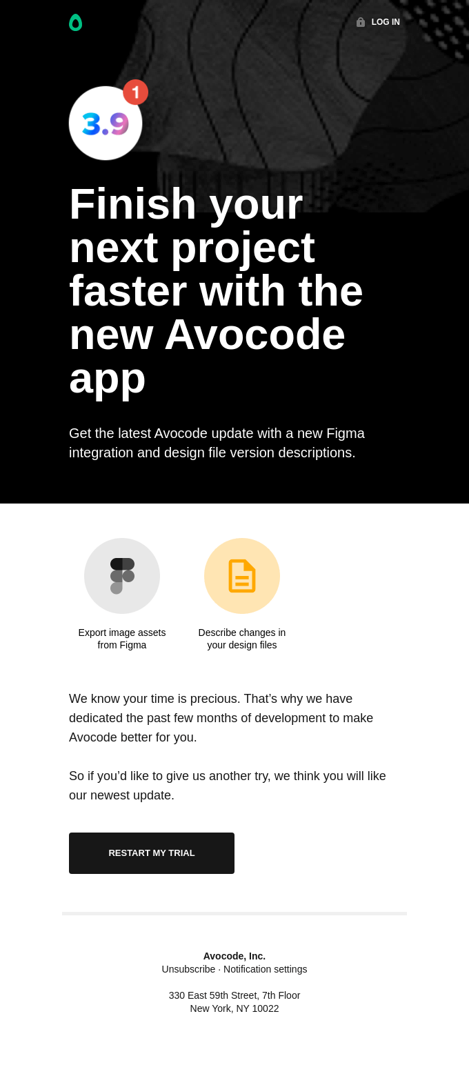
It's not just use Avocode to launch your new app, but it's "Finished it faster". And I think when we have the opportunity to sell that as a proposition, we are able to move things forward for our customers. They understand why they would hire Avocode. I would hire it to be more efficient with my design to launch process, and I think that's pretty cool how they've done that.
They do a fantastic job, I think, of just being really nice and big with their content and getting out of the way. I like to talk about design golf a lot on these episodes, and they've done a fantastic job of staying really simple and reducing down to the lowest common denominator of different available pieces of type.
So you've got your heading here, and then you've got this font size. And in this case it's white, but the same font size is being used down here. And that kind of difference ends up making a big difference in terms of the cognitive load for your users. So anything that you can do to reduce the number of differences you have or make sure that each of the differences you do have are doing a job.
So for instance, we've added icons here. And these little descriptions to the icons. They're doing a job. They have a purpose, right. Using imagery, like my eye comes to these images first, so I really want to know, Oh, okay. I recognize Figma. Cool. It works with Figma and then Oh, neat. Like I can take notes and describe changes in my design files.
Fantastic. Okay. And then I can restart the trial because in my case, this isn't part of what I do as a designer and a director. So I had a trial for a while and haven't continued it, but I do think that they are doing some really nice work just to get me back in and understand what I can do.
Also, look at their mobile. I think they did a nice job here. One of the things I find is that people often go to one column from two column two quickly. Two column is still very readable on mobile, and I think they've done a nice job of maintaining that. One thing I would change is what's called the measure.
This is a typographical term, but the measure from "export" to "from", it's pretty long for centered text and causing some orphans here. So in this case, we've got this "from", and then "Figma" down on its own and "design files" out on its own. You know, you try and avoid that. So test that like in apps, like Litmus or Email on Acid, and maybe make a little bit of a responsive code change so that when it's in a mobile view, you tighten that up a little bit.
Same with center text. I understand why a lot of people do it in mobile, but keep in mind that centered text is much harder to read than left-aligned text. So it works in this case, but I think honestly, they could have kept the same layout as they had in the desktop here in mobile, and it would have worked just fine. But it works okay here because the text is short.
So let's hop over to the next email once again. Really nice. Clean, easy to read and their CTA is like, they have just one beautiful big CTA and it says, "Save 20%" on the Avocode. I like that. It's so clear. One thing I would say is, from a readability or accessibility perspective, this minus 20% is probably going to be a little bit difficult.
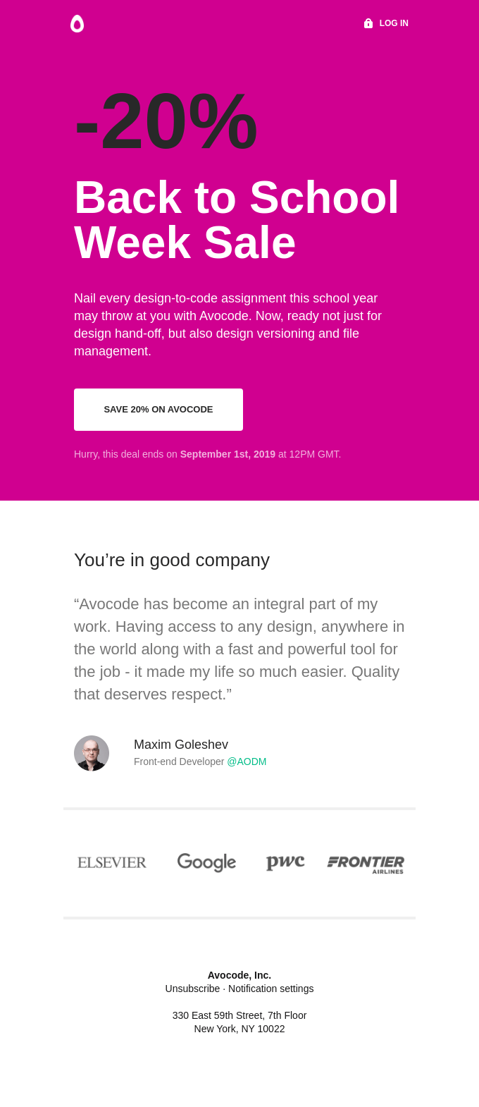
What is this email trying to do first though? We understand that it's trying to let people know that there's something special, there's a sale, and I think they've done a good job of using this pink to really drive that home and to help people understand that it's supposed to be special. It feels more like a sale.
Being able to tell that information, get that information out there, and then move people down into the focus, which is the CTA. I think minus 20% feels good, but again, could be more accessible. Let's me know it's a Back to School Week Sale. Cool. Get that very quick. This is a little bit of supporting copy and then right to the CTA.
This is an interesting tool using time to drive sales. So I've seen that work pretty well, and I think that can actually be dynamic too. I think it's a little bit challenging when that's not consistent between customers, but I think you can personalize it based on some of the actions that they've recently taken.
And as long as you're making that feel it makes sense and it's not gimmicky to the user. I think that it can work really well and help people to take action. I love this little testimonial component that they add here. I think that this type of component is one that could be used in other versions as well, could have been used in that last email as well.
And then they also have this additional component, which is other groups that use Avocode. In this case, you're in good company. And then it says here, I probably would say, and also these companies, so @AODM that's, you know, Maxim here is being represented, but I'd like a little bit more context on these logos down here, but overall, I just feel like another fantastic email.
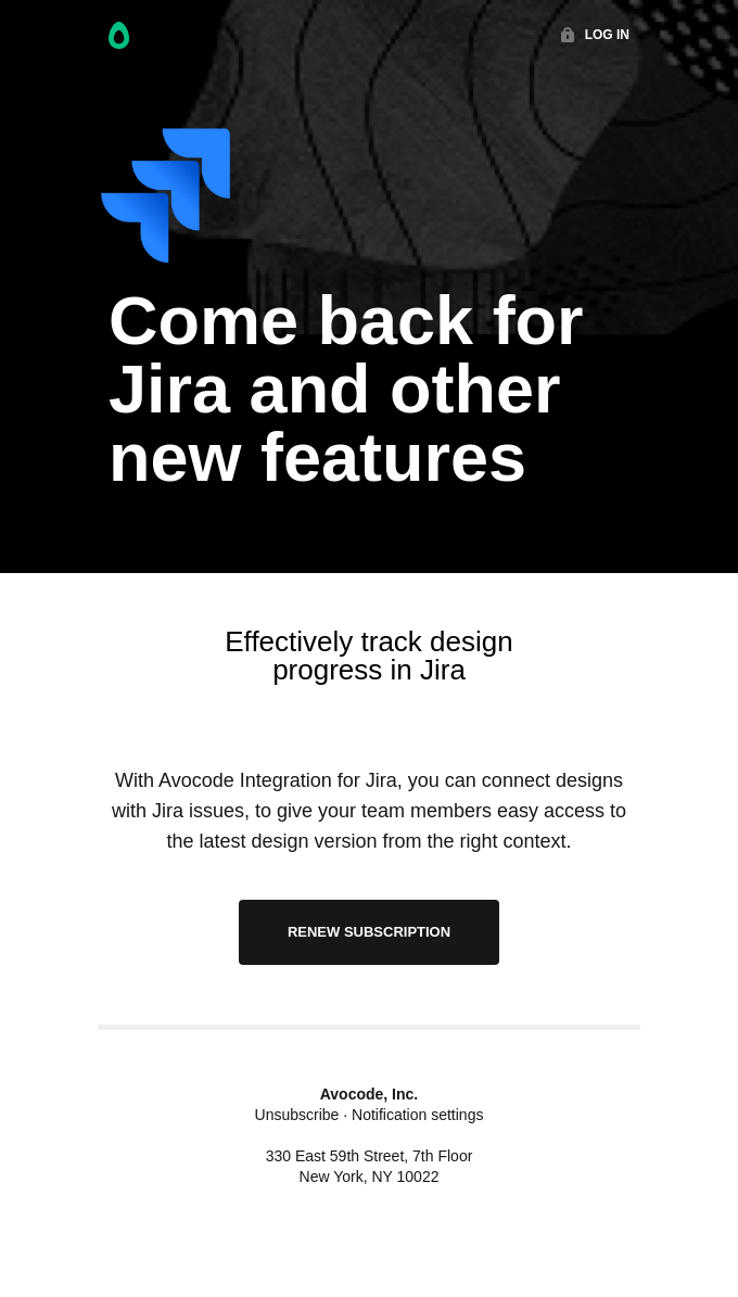
Finally a third one. Let's look at it. "Come back for JIRA and other new features". So this is, another update for them that lets people know that there are new features going on in Avocode that you can check out that maybe this is what makes me interested to come back. Right? So this is trying to reduce churn.
That's what this email is intended for. Come back. And then the new feature is JIRA. I think that's pretty helpful. Seeing a visual image of JIRA here is extremely helpful and lets me know a little bit more about that tool. So I imagine they've segmented me into a situation where I've fallen off and then maybe I'm somebody who might be interested in a tool like JIRA or maybe this is to all people that have fallen off and then trying to get people to reintegrate in this way.
It's smart. I think it works really well. Design wise, this email has some challenges. I think it moves from left aligned to center. Here and then centered again, having this divider, visual divider of the black and the white helps. But if you can, be consistent. So if we go back here, you can see they're doing things in a much more left aligned manner, and that works a lot more consistently and it feels a little bit better.
Whereas this, it starts to feel jagged. Okay, left. Aligned. Oh, centered. And we're switching gears. So just be aware of that. This is a little bit of a nitpick because they have this divider it works, but keep in mind that that's something that you can watch out for. It's just a nice design treatment. But overall, I think they've done a nice job.
Good work Avocode. What are some things that they could improve? What if I have forgotten really what Avocode does or how I can use it. I think that a little teaser in the bottom, "Need a review of what Avocode can do for you and your next project?" And send me to the site to review more, maybe about trial, letting me know a little bit more about what's included in the trial or can I get another 14 days or something like that might be interesting to try. There's some different things.
Let us know @reallygoodemail if you have any ideas about how Avocode could improve what they're doing or if you have any questions and feedback. We'd love to get some insights from the Avocode team as well.
Thanks for being here. I'm looking forward to having my kids over tonight and enjoying a nice long weekend with them. Everybody have a wonderful one. Try and stay sane out there. Love ya, talk soon.
Categories:
Feedback Friday
Matt Helbig and Mailgun’s Megan Boshuyzen unpack Email Camp, showing how accessibility, live text, and smart CTAs turn event emails into signups.
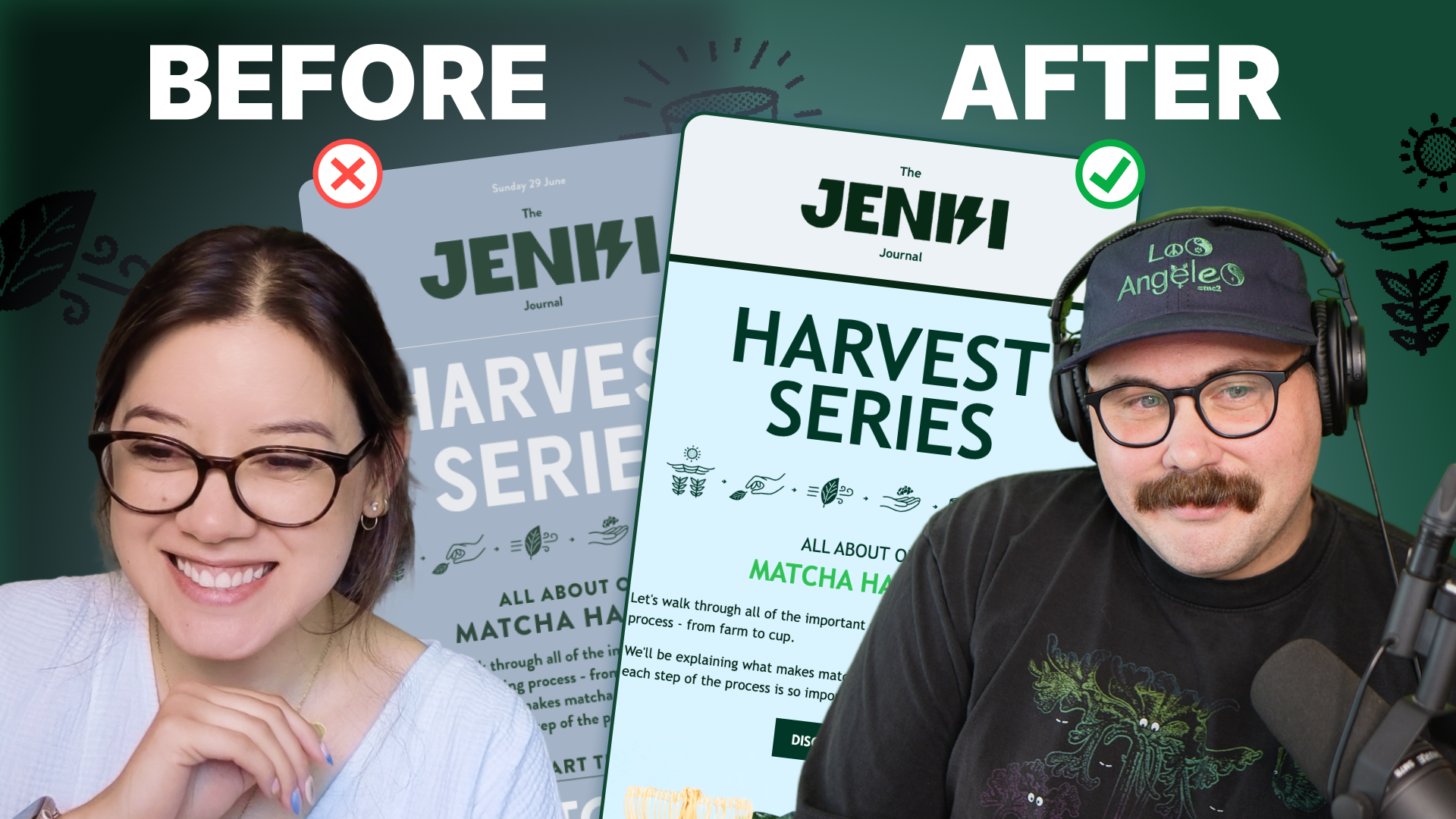
Accessibility, applied: Matt Helbig and Kelsey Yen reveal how inclusive design turns real emails into better user experiences.
Dive into the world of unmatched copywriting mastery, handpicked articles, and insider tips & tricks that elevate your writing game. Subscribe now for your weekly dose of inspiration and expertise.