
Email marketing deep dive with Megan Boshuyzen
Matt Helbig and Mailgun’s Megan Boshuyzen unpack Email Camp, showing how accessibility, live text, and smart CTAs turn event emails into signups.
July 2nd, 2020
Calm, named the #1 app for sleep and meditation, produces guided meditations and supports people in more than 190 countries.
📋 TL;DR key takeaways from this episode:
1. Emulate the feeling you want people to experience when they open your email. Interrupt their inbox. Stop the scroll and make them pause with personalized messaging. Being a human > business goals.
2. Keep an eye on your text hierarchy. The ideal layout for multiple paragraphs of text includes: a scannable headline, easy-to-read body copy, clear CTA. Guide people through the experience with repetition and variation, rearranging content as needed.
3. Know your audience. If your company has an app, what do most people do in the app? What is most important to those people? If you place the most important part of the message at the bottom of the email (which relates to people’s behavior in the app) and you want people to scroll, test this to see how the design performs.
BONUS: If you have a small email team, build constraints around what you know you can consistently produce to maintain quality.
Matthew Smith: Hey, it's Friday. What's up everybody email geeks. It's another episode of Feedback Friday, and I am here with Sue Cho, head of lifecycle marketing at Calm. And also former EDM musician that I just found out. So freaking rad. And I'm really glad to have you here. Thanks for being here.
Sue Cho: Thanks for having me, Matthew.
Matthew Smith: Yeah, this is awesome, we're going to have a great episode today. I'm a big, big fan of Calm. Not only the emotion and the state of being, but also the app and the product. And we're going to walk through some emails here today. And I'm super excited about it. So one of the things Sue I'd love to connect with is I'm gonna walk through sort of my feelings about some of the email, but I would love for you to tell a story around it, like help us understand how you landed here and some of what you're learning.
Does that sound like a good way to move through this?
Sue Cho: Absolutely
Matthew Smith: Sweet. All right. So one of the things that I appreciated about this, this typography up top is not the typical typography for Calm. You broke some of like the typical stuff here, but feels in the family.
This is a thing that a lot of brands don't know how to do. Either they will try everything freaking thing under the moon and it's gross and it's just doesn't make sense cause it's completely not cohesive or they will always stick to the exact perfect little set and it feels rigid. Very few brands know how to do what I think of.
I was taught by Ron Lewis, who is the guy who was responsible for the main movement for the MailChimp brand. And he taught me to think about brand as family. And a family, a group, not one thing, but just, does it feel like it's in the family? Does it feel like it belongs?
Is it a sister? Is it a cousin? Is it a stepbrother? Like, what is it? Well, it's part of the family and this feels like that. And so I love this because it was like a unique moment in time. And it was this quality of like, how can you help people rest? How can you help people think a little differently as we're dealing with some of the COVID stuff?
And it's an uncertain time as the email describes, it just felt like, ah, yeah, this font feels like it connects with this easiness this feeling I want. And I love that. So right off the bat, this tone, this feeling, and then just consistently in your emails, lots of things that work well together.
So first this meditate iconography up here, the same tonality, same gradient as the button, just little details. So that's something I learned in my art days and in the visual language of something called repetition and variation. So repeat something, be consistent, but repeat it, but vary it. And so you create this, your eye goes from the icon down to the button and nobody's sitting there reading this, going, wow, look how it makes my eye move.
You just feel it, right? But I love how relaxed it is. And then also the hierarchy of the text is fantastic. So this quality of being able to move from a scannable headline. Easy to read body copy and then a CTA. The headline, body copy, CTA, and just keep moving down through those. And then these elegant albums for the Calm recordings that I can go and learn more about.
And just leading me through those sort of step-by-step. Lots of breathing room and also the singularity. So this quality of just leading me down one thing at a time. Which if these emails were busy, it would be the exact opposite of what I want to achieve through the application. So everything about the hierarchy and the design to me, feels so in line with the brand ethics that are coming through.
And then to finish it here with these quotes and the sensibility, somebody who looks the way I want to feel, and that just feels fantastic and I love Nayyirah Waheed. I love her poetry and I follow her online and on Instagram and just beautiful stuff.
So I love seeing it repeated here. Then just this little piece of calling out, Hey, we're here too and we'd like you to connect with our community. I just was impressed and then it continues. This is one of the longer emails that Calm has I think, but I think it does a nice job of just staying consistent and giving me a sense of like, okay, sometimes a schedule is helpful when things are kind of crazy and feel a little bit off, give me a schedule, give me something to do. Something that I know I can look forward to and boom we're finished
Beautiful. Look how short, simple this footer is. So many email footers are the worst. It's the trash heap of the internet and this isn't. I'm grateful for that. So tell me a little bit about how you came to some of these conclusions and how this is working, what you've learned along the way.
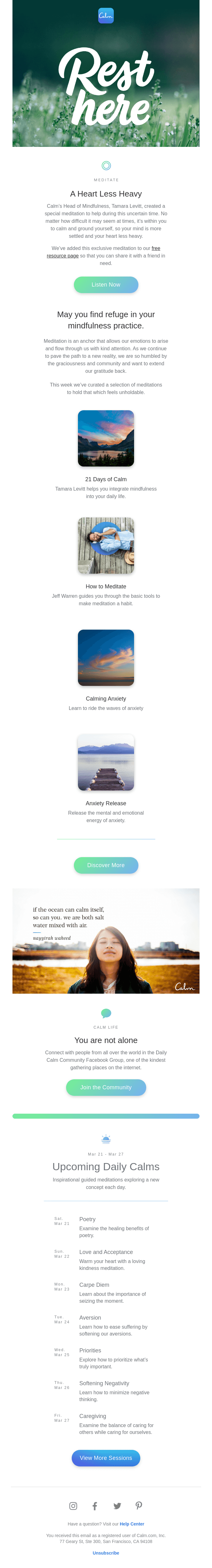
Sue Cho: Well, first of all, thank you, Matthew, for all of the compliments and the deep dive into the work that I and the team do here at Calm. Appreciate that. The first thing I want to start with, I'll just go from top to bottom, is the header. And when I first joined Calm, one of the things that I noticed about our emails was that they did not feel so like our app or our social presence.
If you ever scroll through our Instagram, it's just @Calm. Most of the most engaging content that we have on there is called a quote square, where it's a beautiful image with a quote that relaxes you, that helps you remind you of mindfulness and those get the most shares. Those go viral.
I wanted to emulate that feeling as soon as someone opened up the email and some will argue and say, well, that takes up a big chunk of the top. Well, that's kind of the point. I want to interrupt someone's inbox. One of the lines that we use a lot at Calm is stop scrolling That's almost what we want people to do when they see this email.
We want a pause of, Oh, what's happening here.
Matthew Smith: That's right. The sacred pause.
Sue Cho: Yes. The sacred pause. Take a breath is just so simple. And when the whole COVID thing happened, Calm took about a week to decide very thoughtfully on what our position would be. We knew people were very stressed and anxious and uncertain and we wanted to be a place of refuge.
We did not want to be a place that reminded people of everything that was going on. So that's how the header came to be of "Rest here". I love how deeply you went into the font because that's hand-drawn by our senior visual designer, Jenna.
Matthew Smith: Incredible. She is talented. Hand lettering is difficult and this is wonderfully well done.
Sue Cho: Yeah. This email, I excused a lot of my email best practices for the sake of the message and the marketing materials, because I felt that that was more important. For example, the header, because it was a hand-drawn image, it's all image-based.
One of the things I try to maintain was ensuring that we use as much text and overlay text on top of the background. But for here, we were utilizing this across our blog, across the social posts. It just made sense. So, yeah. Sorry best practices.
Matthew Smith: No, that's a really good example of being able to be flexible. I'm not opening up the ALT text here, but I know that you think of those kinds of things too. So there are ways and times to use images. And there are opportunities when we don't need to. So I appreciate that flexibility. That's cool.
Sue Cho: Yep. That meditate icon. We wanted more consistency across our emails and our apps. We had our product designer do a sweep through our emails to make that experience feel more consistent and cohesive. So she took those little elements like that meditate icon, that's the same thing that you tap on when you go to meditate in the app. So we wanted to reiterate that into people's brains.
This is Feedback Friday, not everything is perfect. And yes, there's a lot of copy in this. As a marketer, we don't want a lot of copy. Being at Calm for about two years now. I've learned that our audience loves copy.
Matthew Smith: Interesting. So see, that's a great example. There's a lot of people want to say, well, what is the best way to do this? How much copy is right. But it's consistently, I keep coming back to, you've got to find out what your audience needs and honestly, your audience isn't one person. It's many people. And a lot of times there's opportunities for personalization, which could include primary copy, secondary copy. Like you can have different lengths. Not a lot of people have personalized at that level, but that's certainly available.
Sue Cho: Yep. Absolutely. We also had to think about like, what are people wanting from us? They're wanting advice. They're wanting our words. But this is Feedback Friday. And one feedback I have for our team and myself is that for legibility, we should have justified this text.
Matthew Smith: Interesting. Yeah. The center stuff is tough. Isn't it? Like this works here. But the length of this copy here makes that a little bit tough. One thing that is helpful. The fact that the length or the number of characters in this line, you probably already know this, but for our guests, it's called the measure typographically.
And because it's so short and overall the width of that is short. This pushes the limits of how far you can go with centered text, but one of the reasons it still works and isn't like a massive violation is that it's so short or tight in width. But that's a good point. It's always going to be much easier to scan and read when you can left justify.
Sue Cho: Yeah, it's just one of the areas that we're trying to hyper-focus on just because our copy is getting longer because that's what our audience likes and that's what our audience wants.
Oh, I also want to talk about the ordering of the content here. If you notice the first piece of content, that big chunk above that is our free resource page. This email went out to our paid members who have full access to our app. And our goal for sending an email is to get people to do a session, but given the coronavirus catastrophe, we put ourselves aside essentially and said, we would rather point people toward this free resource that we put up for them to share and read and be able to utilize without having to pay for their friends and family, which was a debate for me, because I have to think about my goals, but also a human. Being a human trumps, my business goals of, yes, this is more important for our community and our community to spread it to their communities.
So that's why we started with that big chunk of copy pointing to the resource page. And then secondary come our sessions. We rarely do that.
Matthew Smith: That makes sense. Interesting. As we get through some of these other emails, let's talk about any kind of testing that you've done. What about ordering on these? Do you ever try and reorder these and see how they perform differently?
Sue Cho: So the ordering comes at the bottom of the email where it's the list of daily Calms. It's at the very bottom of the email because it's the most important part of the email. Now that may sound bass-ackwards, but I put it at the bottom because I know people will scroll.
I know people will scroll because I put the most important thing on there. And then they go through and read it. I know it's the most important thing on there because we can look at what session do people complete after opening an email. I have that attribution and the number one thing over and over, no matter what I put into this email, it's the daily Calm.
That is our number one product. So that we've experimented placing in different places and realizing, wow, it doesn't matter where we place it. People will scroll to read this thing.
Matthew Smith: That's fascinating. Love it. So you're creating a specific attribution from the email to the daily Calm to find out how well that performs.
Sue Cho: Yep. Yep. That list of daily comms never existed. It didn't exist in the app. It didn't exist anywhere.
Matthew Smith: I love that. The power of email.
Sue Cho: Yeah. So it all started with data. When I first started at Calmn, I said, okay, what do most people do in the app? And like I said, most people do the daily Calm.
Well, our emails should then focus more on the daily Calm instead of focusing on what we think is important, which is whatever new content we're pushing out, we think is important. So that's something that I tested where I zoned in on the daily Calms and put out this listicle, which takes up a big chunk of the email length.
But when I was experimenting with that, there were some weeks where I missed, because I was a team of one, I'm still a team of two, but I was a team of one and I missed something and people wrote in and complained, like, where's my list of daily Calms. Why did I not get it?
Matthew Smith: They want that consistency.
Sue Cho: They needed it. They wanted it. And it didn't exist anywhere else. So this informs our product team. Like, Hey, maybe we should surface this in the product or something. People are asking for it. So actually that piece of daily Calms is now completely automated, where it pulls in from a different source. So it always changes. No matter when we're sending the email.
Matthew Smith: I love it. Have you found, including some of these emoji, like you have here has changed the way that people relate to it at all?
Sue Cho: Oh, Matthew. I wish I could test all the fun, little things. But at the speed and scale that Calm moves in sometimes you just got to get these out the door.
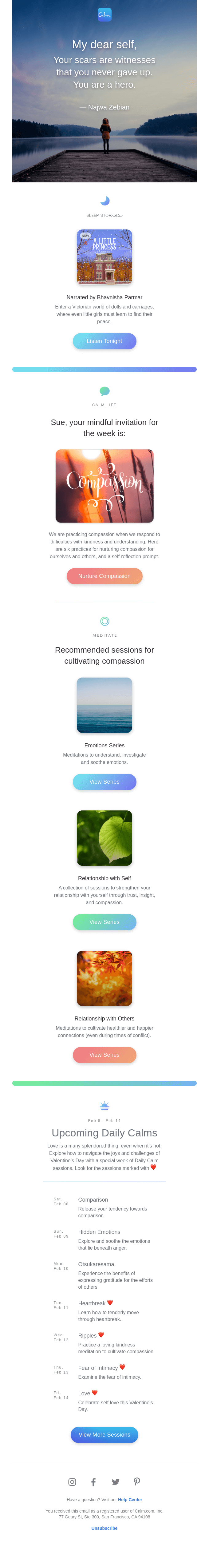
So the reason for those emojis is, again, it's a brand marketing moment that took precedence over what I felt would have been more efficient, but this email was for the Valentine's day time. We had someone custom write this poem. It's cool because we have people screenshotting these and putting it on their Instagram stories like it's some cool meme that they're sharing. So it's cool to see an email being shared like that socially.
Matthew Smith: Was this on Instagram too? Or was this just for the email?
Sue Cho: It was a global campaign. So for Instagram, we collectively chose a poem that felt, it was kind of hard to choose a Valentine's day poem, self poem, that wasn't all like sad and weary, but hopeful.
So really that's what this email was for. Like we knew it was Valentine's day. We don't know what people may or may not be feeling. Some people may not care, so we need to make it generic enough.
Matthew Smith: This is another example of utilizing the iconography from the application. That's fantastic. I love hearing this.
Sue Cho: Because it's for Valentine's day. We wanted people to elicit compassion.
Matthew Smith: Love it. Quick question here, are you choosing a button gradient based on this imagery?
Sue Cho: We are.
Matthew Smith: Very cool. I love that. And do you have a set that like you choose from, or you just sort of use your best judgment? Like, how are you choosing that?
Sue Cho: We have a set. So like I said, we had our product designer, Bree do a sweep through of our emails. And she gave us a swatch of stuff. Like here are the color schemes. Here's the button that correlates with the divider that correlates with this. So that's what happened.
We're actually, I'm doing away with some of these colors because our new senior visual designer is doing another sweep of our email designs and have called out some colors as illegible.
Matthew Smith: Sure. Not enough contrast probably.
Sue Cho: Yeah. So some of these colors are going to go away and become more simpler, which honestly like for me and my one developer, we are fine with that.
Matthew Smith: I'm sure you are. Yeah, that's cool. Well, this is just fantastic. A lot of people are asking these days about how do you do empathy within email? I just think this is a fantastic example of don't be tone-deaf. Be aware that there are a myriad of different experiences.
That doesn't mean that you can't celebrate people being together, but it means also, you can celebrate people being on a solo journey or the reality that some people want to stay solo. Another one was like, some people don't want to have kids and there's so many assumptions out there.
We're learning as a culture to be more diverse and inclusive in our language. Not because we've got to align with the word dictocrats, but just because we love people, we want to be caring, those kinds of things. So I love the way this did that.
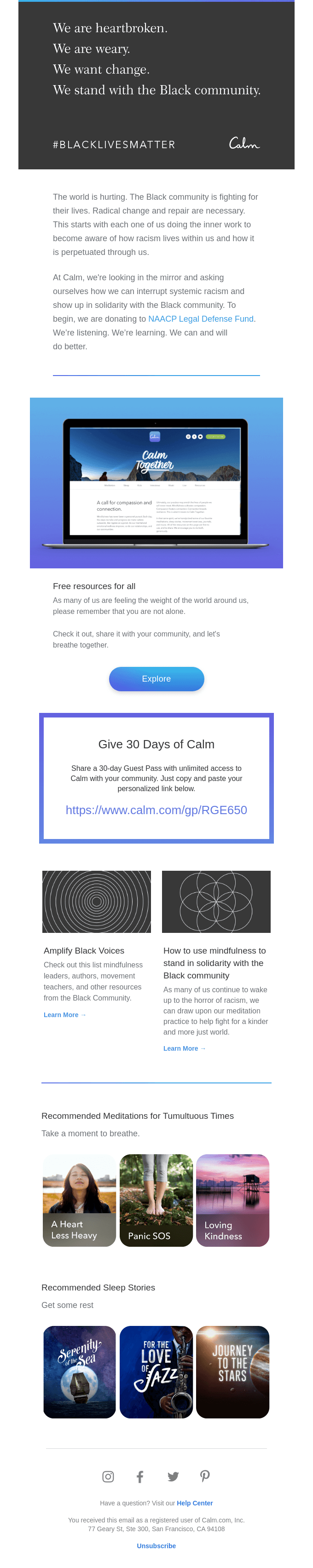
The other one that is very poignant for what we're going through now, of course, is this Black Lives Matter email.
So tell me a little bit about how you concluded how Calm would respond to the very real present need for change from companies, from communities, et cetera. How did you all work through this as a team?
Sue Cho: Yeah, fortunately for us, we had a good leadership team who proactively told us that they were going to make a statement that this was wrong, that they collectively felt that they needed to speak up.
It was an awakening for management and ourselves to all learn and do better. I know that they did a lot of work to craft an official statement, but also give marketing guidance on how we should communicate this to our communities. So I took point from there. This is where my marketing preferences were set aside. My KPIs were set aside and I had to be a human.
This was a moment for us to be human and also be grateful that we're in this position, that we're at a company where we can be helping people through this experience. So we wanted to make a bold statement. So like I said, our headers are supposed to be very beautiful imagery.
That's supposed to be inspiring and we kind of wanted to make it a big splash and we thought it would be very impactful if we just blacked it out. I also want to say that we have an email that goes out every Sunday. That's what our members wait and look for that list of daily Calms. That's usually when we talk about other things that are in the app and happening like that.
For this particular Sunday, we didn't speak about anything else, but the upcoming daily Calms. We wanted to mute the Sunday email in respect for the Black community's blackout period that lasted until the seventh, I believe. But we knew that we would get backlash from our community of not getting their list of daily Calms.
So we did the best that we could and we stripped all the other content and just did the daily Calms. This email followed up the day after the blackout period. If you notice, this kind of interesting, the free resources for all. While this campaign was sending, we had to edit certain things.
Thankfully we send things by time zone and we throttle things because our list is gigantic and Microsoft hates that, but we noticed that this free resource page, if you click on it, one, the link was wrong two it was images all filled with white people.
Matthew Smith: Oh, wow. Isn't that interesting?
Sue Cho: Yeah. And if you scroll down, we had these articles for the black community. "Amplify Black Voices" that led to a blog article that pointed to other resources for mindfulness led by Black people, which we unfortunately don't have in our app. Even though these are competitors, we wanted to highlight them and not make it about us. So as this campaign was going out, I was like, Oh no, the link is wrong, we need to make a redirect, but also, do we want to point people to this is this the first thing we want to point people to?
So we reordered the content pieces to move the two articles up.
Matthew Smith: Up. Yes. Smart.
Sue Cho: And put our stuff at the bottom, because this campaign wasn't about us. It was about the black community and how we want to help them
Matthew Smith: Good lessons learned. I appreciate the insights into the way that you all had to think through that.
It's okay to make mistakes. It's okay to learn from things. This is part of the program. Not just our relationship to our fellow humans, but also our relationship to emails. Mistakes happen. We as a culture, there's a lot of growing about how to make a good mistake and how to own it and then how to grow from it.
I think that's a place of maturity for all of us, but it seems like maybe there's some growth there. So this is just great. I was impressed with it. I felt it was super appropriate. It feels both in brand, but more somber.
So one of the things that we've done in some of my design agency work, I work on like voice and tone, but you can also do it with aesthetics, where it's a quad graph and you look at what is your response to something when it needs to be somber? What is your response to something? When you've made a mistake? What is your response to something when you want to be fun and upbeat? There can be variation in your language because it's not appropriate to have a single voice.
Really Good Emails has a cheeky, kind of silly voice. We can't use that right now. We need to tone it down for a minute and just relax and be the compassionate and caring and empathetic people that we are. Then in time when there's some movement here, we can bring back some of that humor. As usual, we walk a thin line. Humor, so often, it is about comparing or creating contrast or things like that.
We always need to be careful about creating the wrong kind of contrast. So we've been called out many times. It's like, oh shoot. We didn't realize that. Thank you for giving us that insight. We'll keep doing better. So I appreciate the way you all move through this. You all are killing it. You're doing a great job.
One of the things I wanted to call out, a lot of you feel like your teams are tiny and there's nothing you can do and Sue is a great example of two people on this massive, like all these needs, are doing incredible work. One of the ways I think they're doing it and Sue correct me if I'm wrong, but you've created an elegantly simple set of things to send out.
So in other words, I don't see wild new stuff coming out of Calm's emails all the time. They're consistent. They're always helpful. The content is changing, but the content framing is staying essentially the same.
You create kind of a constraint around what you can consistently elegantly produce again and again and again. If anybody feels like their team is too small, then figure out what kind of constraint they need to put on their emails, their output, their scope to maintain quality. Does that line up with the way that you think about this as well?
Sue Cho: Yep absolutely and the Calm organization as a whole believe in running lean. We believe in the power of smart, efficient people. I was a team of one for a good while for my first year. And so what I did was, okay, I need to create all these automations, all these one-offs, I'm one person. I don't have a dedicated design team. We had one designer at that time for the entire Calm organization.
So I worked with the contractor to design modules for me. Predefined modules that fit our product specs so that I can mix and match on my own. Luckily he's a great, talented developer that was able to create clean code for me.
I'm not the best developer. I can read and understand a few things, but he commented out sections that said, this is where daily Calm starts. This is where daily Calm ends. This is where the thick border starts. This is where the thick border ends. So I can copy-paste and create brand new emails on my own.
Matthew Smith: I love it. Learning so much. I enjoy these episodes where I get to learn a lot. This is fantastic. Thanks so much, Sue. It's been another great Feedback Friday episode, and you've helped make it that. As usual, I feel like I need to end it on a low note of a bad joke. So let's see what I can figure out here today.
Do you know why ghosts love elevators? Cause it lifts their spirits. 👻
Sue Cho: That's a cute one!
Matthew Smith: Yeah. I'm a dad. It's just so gross and bad. It's awful. But keep em coming.
All right. Well Sue it's been a really good time having you here. I think you've got some awesome stuff going on this weekend. You're going and hitting the mountains. You want to tell everybody about
that?
Sue Cho: So every weekend I've been training for going up to Mount Whitney, which is the highest peak in the continental US. When things were locked down because of COVID, I had to put on my 40-pound pack and take like a 10-mile walk around the city with my dog. I looked a little crazy there, but I get to go out to the mountains this weekend.
Matthew Smith: Fantastic. Well report back and let us know how it goes. Have a wonderful weekend and everybody else stay safe out there and keep supporting our Black brothers and sisters who are fighting hard for the equality that they deserve. Alright, love yall. Chow chow.
Categories:
Feedback FridayMatt Helbig and Mailgun’s Megan Boshuyzen unpack Email Camp, showing how accessibility, live text, and smart CTAs turn event emails into signups.

Accessibility, applied: Matt Helbig and Kelsey Yen reveal how inclusive design turns real emails into better user experiences.
Dive into the world of unmatched copywriting mastery, handpicked articles, and insider tips & tricks that elevate your writing game. Subscribe now for your weekly dose of inspiration and expertise.