
How to use typography and consistent illustrations to design on-brand emails with FontShop
FontShop is a leading font retailer based in Berlin, Germany, offering 150,000+ font selections for desktop, mobile, and web.
📋 TL;DR key takeaways from this episode:
1. Keeping the email simple and paired down can give your audience just enough information about a product update, leading them to learn more on a landing page.
2. Aim for 45 - 75 characters on a line, especially if you go wide with your paragraph text. This is also known as the "measure."
3. Using large, clear, heavy-weighted titles and illustrations can help balance the design.
Matthew Smith: Hey, it's Friday, everybody. Happy Friday, Matt Helbig. How are you doing? It's Feedback Friday.
Matt Helbig: What's up, Matthew Smith? Welcome back to another episode of Feedback Friday.
How FontShop Uses Typography to Drive Email Design
https://www.youtube.com/embed/J6LhVZgy52Y
Matthew Smith: Here this week, we are here with FontShop. I've been following these folks for a long old time cause I love me some typography.
They've been doing some exciting stuff for a long time, but one of the fascinating things about them is they have gone wide. They're a wide load here, man. They're pushing some boundaries. I think it's working. So let's walk through that. If you're a font brand and you're showing off visuals of how people use typography within different examples, like these albums here, for instance. You want beautiful, powerful imagery. What better way to try and use full-screen design if possible? Making sure that it translates to mobile as well. Nice big fonts.
https://reallygoodemails.com/emails/new-arrivals-have-just-landed-browse-the-latest-on-fontshop
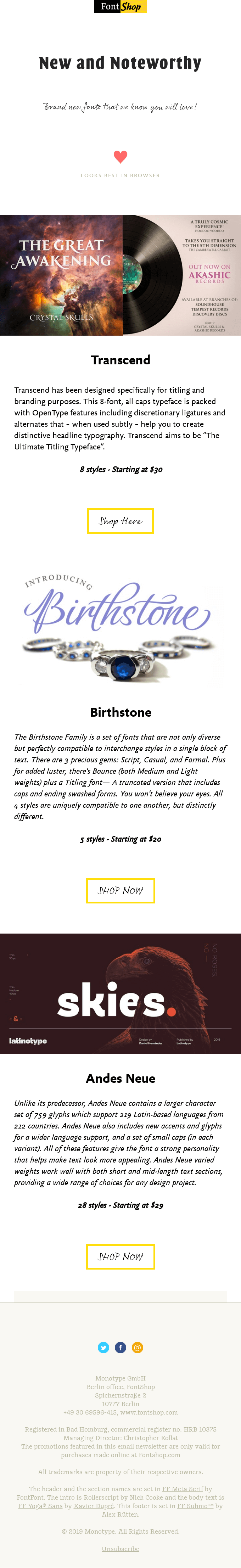
Mixing Centered Headlines With Left-Aligned Text
Now here, they're doing something interesting that I think they're pulling it off. And it's not something I generally recommend, which is a centered headline with left-aligned text. Now, I guess that they're choosing left align text down here because centered aligned with this much text is challenging to read, or it becomes more challenging to read.
Notice that the text is large enough that you can read it. Like this is called the measure typographically. So that measure is such with a size of that type that it works. Now that said, I'm guessing that they're counting on people's email browsers not being like super wide since you usually don't browse an email widescreen.
But maybe they account for that. I don't know. But one of the reasons that it works here is because of how simple it is. They have nice, big titles, real clear, really large, very heavyweight. And then nice big type here that keeps your measure. The measure means the number of characters on a line.
I think that the number of characters on a line is supposed to be less than something like 5. As long as you're in that range, then you're doing well. Some type nerd is going to say it's not 58, it's 62. So we'll see.
I'm into this. I think they're making it work, man. I love seeing how people use typography from a brand perspective. I come through here. Very quickly. I get to see, Oh man, I like how that type works. I could see using that. I could see getting behind that. I'm going to go buy it. There's nothing that shows you the font more than like how somebody else does it. Now, one thing I might change, I guess, that it could get pretty heavyweight, but if you could do a GIF there with three slides of different uses of typography and get the file size down, I think that could be pretty interesting, but they do an excellent job of running through this.
Using Embedded Fonts and Live Text in Email
Matt Helbig: I think the use of embedded fonts is great to see. I think you can poke around their code and maybe see how they're doing some of this. I believe they have a home-court advantage because they own many of these fonts, but it is interesting to see how they're using these wackier fonts in email.
It's pretty unique as well that they are live text. I don't know if I love these hero images. I'm not sure exactly if they're the best showcase of these individual fonts. For me, I think maybe even some animation could be nice. I liked the little pulsating heart at the top of the email.
For some of these fonts, I'd almost like to see them more embedded in the different sections. I think in some other examples, they might use color a little bit more to break up the individual sections to sort of match these styles. So to me, this is just a pretty short newsletter-style focusing on these three or four brand new fonts. In general, I think it does a pretty good job of getting the message across, but I feel like there might even be a better strategy to showcase these individual fonts. Maybe focusing on one and showing multiple styles on different colors and things like that.
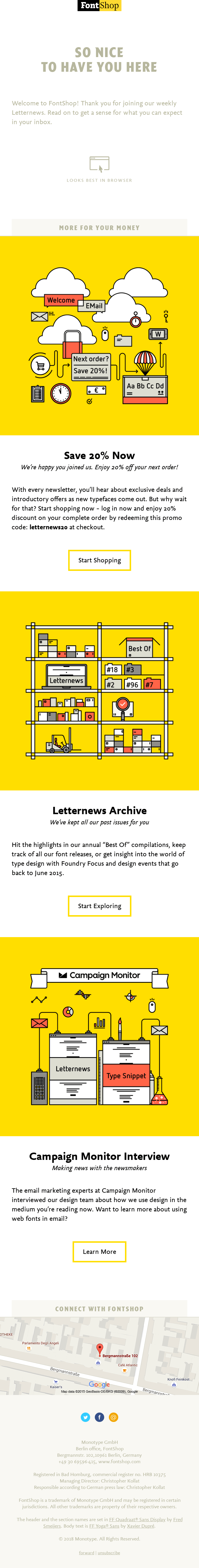
A Simple Newsletter That Lets Typography Shine
Matthew Smith: Look at one of their others in and keep comparing. One of the things you can see here in this email is that this white, black, yellow is a big, big part of their brand. And then what they try and do, I think, is get out of the way visually so that the typography examples can stand alone on their own.
https://reallygoodemails.com/emails/thank-you-for-subscribing-to-our-letternews
So I like the way that they continue to use this, "Looks best in browser" GIF, and this time it's a little different. The low contrast here is interesting. I was a little bit surprised by that, but let's keep going and see what's going on. So they're showcasing a sale, which I think is cool.
They get in here and say the next order is 20% off. That's a neat little illustration. This is more about them, I think, as a shop, rather than the typography that they're showcasing. This feels really on brand. I also like this hover state. That's a nice little touch that they bring in here. This is fascinating to see this coming through. And then finishing with a map to it looks like probably Germany that they are. Yep.
When Simplicity Makes the Email Clearer
One thought here is, this is another one where this is interesting to me. They are almost using this as movie credits, the way that they're like talking about managing directors and things like that. But it's like, is that serving the user?
That's one that I've always asked, and if it's not like, if this isn't critical information to me then maybe it could go, or perhaps it could be buried in the link that I could as a user, go in and read more about—some of those kinds of things. But I do appreciate the consistency of the illustrations, and this one's really on brand. Feels pretty good.
Matt Helbig: Yeah. I liked this one. I feel like pairing down the yellow throughout the rest of the email using those brand colors is smart. So this one, compared to the last one, to me, it feels a little bit more put together as a product update email, and like a discount email, this one's pretty straightforward. I don't have that much feedback.
I think they're effectively using formatting. Using bold and font sizes and things like that. Keeping things pretty simple and pared down. I think these give me enough information, but still, lead me to want to go to a landing page to learn a little more.
So overall, I think this one's pretty straightforward and a pretty clean example.
Matthew Smith: Yeah, I agree, man. I think this is a really basic newsletter. It's just showing me some text, some images, and some CTAs, but they've done it well. One of the things that many people end up doing is they add complexity to their emails that aren't necessary and end up creating a muddy water situation where it's hard to know what to do as a user.
In this case, I'm very clear about what I want to do. I want to start exploring, or I want to shop, or I want to learn more about this interview. So I'm pretty into simplicity. If you're going to have a very simple newsletter, this is a great way to do it. Good work, FontShop. If anybody has any questions about a FontShop or questions directly to FontShop, let us know in the comments.
Always please subscribe. Let us know how you'd like to see it improve or other brands that you'd like to see showcased.
Matt Helbig: See you next week, Email Geeks.
Matthew Smith: See ya.
Subscribe to our newsletter.
Dive into the world of unmatched copywriting mastery, handpicked articles, and insider tips & tricks that elevate your writing game. Subscribe now for your weekly dose of inspiration and expertise.