Email marketing deep dive with Megan Boshuyzen
Matt Helbig and Mailgun’s Megan Boshuyzen unpack Email Camp, showing how accessibility, live text, and smart CTAs turn event emails into signups.
May 15th, 2020
This week we look at hims & hers emails with guest Paige Siebold.
Matt Helbig: What's up, email geeks? Welcome back to another Feedback Friday. This week we're joined by Paige, who is an email developer at hims & hers. We love these emails for the good typography, consistent design elements, and great product imagery. Big fan of these, so let's jump right in.
Tell us a bit about yourself and your background.
Paige Siebold: So my name's Paige. I've been doing email for around five years, started in design, and always had a development background, but not that great, a simple one, and ended up doing emails. I previously worked at VRBO and HomeAway and currently work at hims & hers.
Matt Helbig: Fantastic. Do you want to start with this first email? How did this email come about? What were some challenges on it?

Paige Siebold: So this, in particular, is a launch email. So this was a new product that hadn't been on the site yet.
This email was the first launch email I did working at hims & hers and they gave me a lot of time. There's a lot of small things I did with this one, but in general, it was to launch a product and give more information. I think collagen is a different type of product, not a lot of people know about it. So providing some info on that and driving to the site.
Matt Helbig: We love it. There's so much to see and do in this email. Honestly, it does almost feel like a website in some ways. I mean, using all these live text, hover effects. How does something like this get kicked off? Do you receive a brief or are you given a design or here are some screenshots, here is the copy that we want to include and you get started?
Paige Siebold: It will depend on how big or what kind of emails we're working on, but something like this that is a launch. It's a bigger marketing effort obviously, cause there's a lot of people making assets. So this will have a brief and go to a copywriter first.
I'll work with the design team for assets and see mocks of the site. Our site is very clean and pretty easy to implement into emails. So a lot of the site's blocks are already coded out to match the site. A lot of it is, is matching what we're doing on the site, just implementing it into email.
Matt Helbig: How did you go about all these different, little enhancements, like you said, like this thing has custom web fonts, there are hover effects. How do you pick and choose the ones that you want to do? Or you have a checklist of things that you do in an email?
Paige Siebold: I always like using that little bounce effect and because we have three colors and we wanted to show those, I liked throwing that in every once in a while, I don't think it particularly helps engagement that much.
I think it's fun. I just added it in for the fun of it. Email Geeks, I guess, find it interesting. I don't know if the general user does.
Matt Helbig: How do you explain that to someone, though? So you're like, okay, I'm going to add in this effect. It's not going to work a lot at the time, but it's going to be tight when it does. Is that like what you say?
Paige Siebold: I add it in, and no one knows. And if they see it in their tests, they're like, Oh cool, this is not affecting anything. I did it the other day, and my coworker noticed, and I was like, Yay! You noticed!
Matt Helbig: Yeah. I feel the same way with adding some hover effects once in a while on CTAs. It's a subtle change, but this is pretty drastic, at least. But sometimes, it's like transparency or a color change, and people don't seem to notice.
Paige Siebold: All of our CTAs, I just have set up in our CSS, so all the CTAs always match. There are two different hovers on our site and I will swap in between those two. They do that and turn into a border. So I already have that all coded.
Matt Helbig: I think it is a great thing to sort of add into an email near the end or something like that. It is just a couple of lines of code. It doesn't work everywhere, but I think it is fun for people if they see it.
What other challenges did you have with this email?
Paige Siebold: The whole thing is full width. It was quite challenging to get those boxes on the right and the left to stick to the edges and keep it. I remember I spent a long time doing that, and then they switch on mobile. The images, I have them switching to look nicer.
And there are just a bunch of small things like that in this one.
Matt Helbig: So how long does something like this take you? Are you starting from scratch or using a template?
Paige Siebold: I have the entire site coded out, like all of the modules. So I'll switch in and out. I remember this one, particularly, I was given a lot of time, so I messed around a lot with it. Um, and there were many different iterations, but generally, since we are a startup, things are pretty quick, and I'll make them in a day if we're doing a quick launch. But I think this one I sat and messed around with for a bit cause I had some time.
Matt Helbig: Do you get any insights on how this email performed?
Paige Siebold: We do have some learnings, and we also technically did a test on this one. There was a completely different version that was what we call the short form, and it was testing this long-form that had a lot of information and gave you more ideas of how you could use collagen or why you want to use collagen.
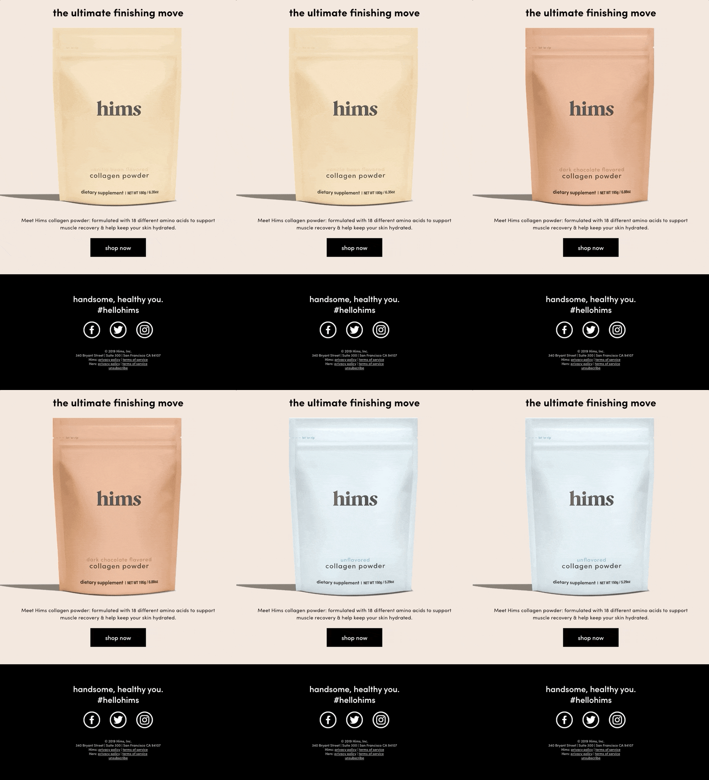
And then the other one was vague and was just like, our packaging and like check it out and some quick points on it. We got some learnings from that in general and sort of applied that to some future things. A lot of our products are very different because we have the RX side and OTC side.
So a lot of our learnings we have to repeat what we're doing again for other stuff. But it was interesting to see if people were interested in learning more. It depends on how complicated our product is.
Matt Helbig: Speaking of other products, I guess. There's this other hers email, which is similar. What's the difference between working on these two brands?

Paige Siebold: Yeah. We recently had updated as well that they're almost identical and like the fonts are the same. The big difference is the colors and a bit different in the tone. Like if you read some of this copy, we have different points.
It's more focused on the ingredients and things like that, which matches how this the her site works. So there are those little like pointy outy things. That matches what the her site looks like. So those are like the subtle differences of that. They also use icons on the her site. Luckily the fonts are the same. The tone tends to be very similar. The packaging is usually just flipping the logo. So you can usually use similar images.
Matt Helbig: Why isn't this like an all image email? I could easily see this being all image email. So why are you taking the extra time to do these design best practices?
Paige Siebold: I've just never made all image emails. So I see the points as to why some people use all image emails, but I think if you have the time and capabilities, it's better to do it in live text when you can. You can't have your fun hover effects, and there is, there are some little downfalls like this heart emoji. I think it had some, it's got a few spacing issues and you just kind of work around it, but it's easier to do that if it was an image. And in the long term, all this is already coded, and so I can reuse it.
Matt Helbig: Yeah, I was going to say, were you able to use that first template for this one a bit?
Paige Siebold: Yeah. I mean, this is the same email, just different colors. I did have to redo the bottom part.
Matt Helbig: So what kind of tools do you use when you build your emails?
Paige Siebold: Because I was a designer, even though I'm a developer, I still mainly use Dreamweaver. If I'm designing something, I'll just design it in code and then we'll use Sketch and Photoshop as well for editing photos. And then, Litmus, of course, for testing and then we send with Braze.
Matt Helbig: This one is a pretty straightforward, shorter form email, just pushing towards downloading the app. I liked these little elements on the side that at least stood out to me.
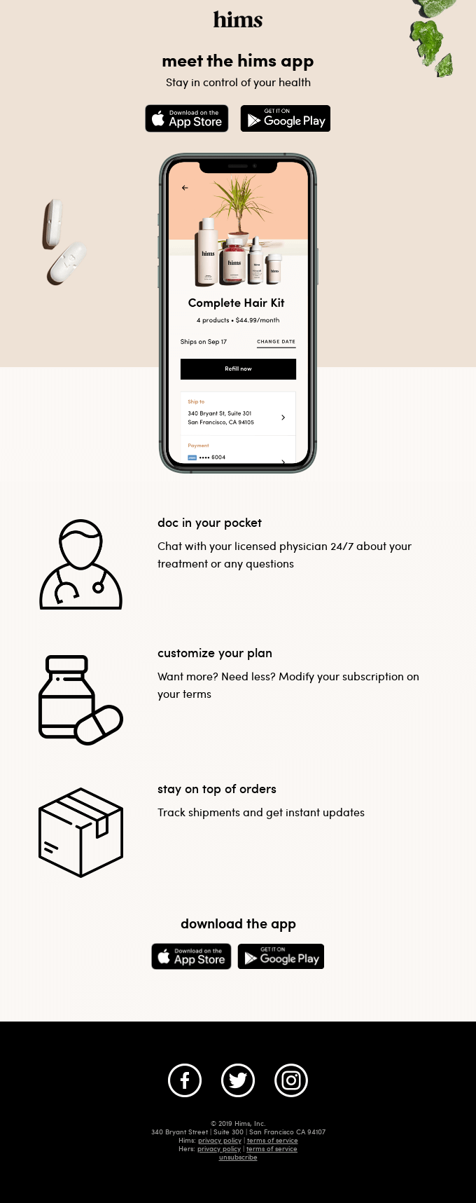
Paige Siebold: When I use background images, I'm always trying to use them as like a, sometimes I use them as the main image, but I'm trying to use them as like a thing that adds something to it and works if it's not there. So, in this case, the pills and the gummies are the background image.
So if they're gone, it still works. And it matches how we marketed it. Our designer had come up with this, like all of the styled out gummies and pills and stuff, and I think it's a subtle thing, but it makes it a little different for an app launch type email, which a lot of them look the same.
You got to show the app and the phone. So I think it adds a little something.
Matt Helbig: I do like these being those badges or something versus a CTA. Because I feel like download, our app is a bummer CTA. So I liked that you split them.
Paige Siebold: Yeah, I remember that was a whole discussion as well. We had multiple different versions of this before we finally did it.
The top one was a button and the bottom where badges and then reverse. I don't remember why we ended up with two badges, but there was a whole discussion about what would be best cause there was a landing page.
Matt Helbig: I think the one note I had on this was some like animation here, but I guess that isn't the focus of this email. So I feel having that focus be on these CTAs and why you should download the app is probably the better way to do that.
Paige Siebold: Yeah. I think they were finishing the app as we were finishing the email. Startup life.
Matt Helbig: Yeah. Things usually tend to happen like that. So I guess this is almost more potentially like an onboarding email or something. So do you have a whole transactional side of your emails, or is it mainly promotional?
Paige Siebold: I would say actually the majority of our emails are transactional or account type things.
Since we are mainly a telemedicine company and it's asynchronous telemedicine. There are so many different notifications and emails and follow-ups that we need to constantly be sending out to a majority of different flows cause we have different medicines that require different things. It's not just a product.
We're selling a product plus a process with it, plus the follow-ups and the return visits. And I think that was like one of the things that excited me about joining hims & hers because I knew how much it would be on the backend technical side of all the different emails and all the things that need to be set up to make this sort of thing run.
Matt Helbig: So when you joined, were some of those things already in place, or did you build a lot of those?
Paige Siebold: A lot of them were in place. We sort of switched the way we did our business as I was joining. So a lot of things needed more advanced notifications. There were a lot of things that got more advanced in our platform, therefore we needed more emails to support.
We're always constantly finding the ones that need to be updated that are older, that could be improved. So a lot of our tests are against old creative cause there's a lot. Yeah. There was some stuff set up, but we had to set up a lot of things as we've created this new process.
Matt Helbig: I think we have one more to check out. A newslettery sort of email. How would you describe this one?
Paige Siebold: A newslettery type email.

Matt Helbig: I mean, it doesn't even almost feel like a newsletter, but you know, I think these different sections calling out articles that you have and new featured products.
I think it's like a smart approach to maybe just like a content dump of information.
Paige Siebold: We have a hims version of this as well. We try and send this out monthly. This I think was the first one we sent out, so it has more of a broader, we tried news articles that have done well in the past, but we tend to focus on specific themes like skin one or whatever is relevant right now.
Then sometimes we'll take out this product module and focus more on just like education. Just trying to, this one is less about being transactional and more just promoting our community and as a resource for health-related or only general information about what hims & hers is about and promoting some of our other ways of interacting with brands, like social.
Matt Helbig: We love this section. I think showcasing a specific channel, even in this big block is you know what many brands should be doing when they're talking about pushing traffic towards one particular social channel. And I know Instagram is probably huge for you, your brand. So I think this is a great module.
Do you have a design system in place or how do you kind of keep track of all these different modules that you're using?
Paige Siebold: So depending on, on the marketing side, I just sort of have like long-form, has all the module templates saved out in HTML. On the transactional side, there's obviously, there's more like robust content blocks saved into our Braze.
Whatever that things called. In Braze. I have like an InVision saved out of all the different modules. So if someone comes to us for something, we can be like, and they all have names, so you can be like, pick these things for this, and just let us know if they want specific modules. That way, it's all sort of set up already.
Matt Helbig: I have always been impressed with the amount of legalese that you guys have here. How is it so small? I thought it would have to be like tons of disclaimers and stuff like that.
Paige Siebold: These four don't have RX in them. We do have a tiny disclaimer that's like two lines. If it is a prescription, but none of these emails are prescription. Yeah. But we do have a very small line of, I used to have way more lines of legal at HomeAway. Yeah. It's nice.
Matt Helbig: So is there a way that you kind of get around that just by pushing people towards these different pages, you know, privacy, terms of service.
Paige Siebold: I think the prescription one has some pretty stronger lines.
That one's obviously a little more specific. If we do things like show before and after, we have a line for that. But this one is just pretty straightforward, so we don't have to have this much on this one.
Matt Helbig: What is one thing you thought you knew about email that you now totally understand differently about email?
Paige Siebold: I think in terms of just like email in general, especially right now, it's interesting to see a lot of focus on email and how important it is and how useful it is as a free resource. I think in general, just as I've worked in email, seeing how much what you do and change, like small minute things, can strongly impact the business and be like a big driver.
There's probably a lot of things I've learned. There's a lot of random things that I know about email code ingrained in my head forever that are just random things.
Matt Helbig: Thank you so much for taking the time today. I loved walking through your emails.
Paige Siebold: Yeah. Thank you for taking the time.
Matt Helbig: So we can find you online on Twitter. Anywhere else we should look?
Paige Siebold: I'm not on Twitter.
Matt Helbig: Okay. We'll look at your Really Good Emails profile.


42 emails. Curated by @psiebold
Paige Siebold: I'm sure if you Google my name. I have a website, but like, that's very old. Don't look at that.
Matt Helbig: Okay. Gotcha. Perfect.
Paige Siebold: Awesome. Thank you for always updating Really Good Emails.
Matt Helbig: I'll keep at it. We'll keep at it.
Categories:
Feedback Friday
Matt Helbig and Mailgun’s Megan Boshuyzen unpack Email Camp, showing how accessibility, live text, and smart CTAs turn event emails into signups.
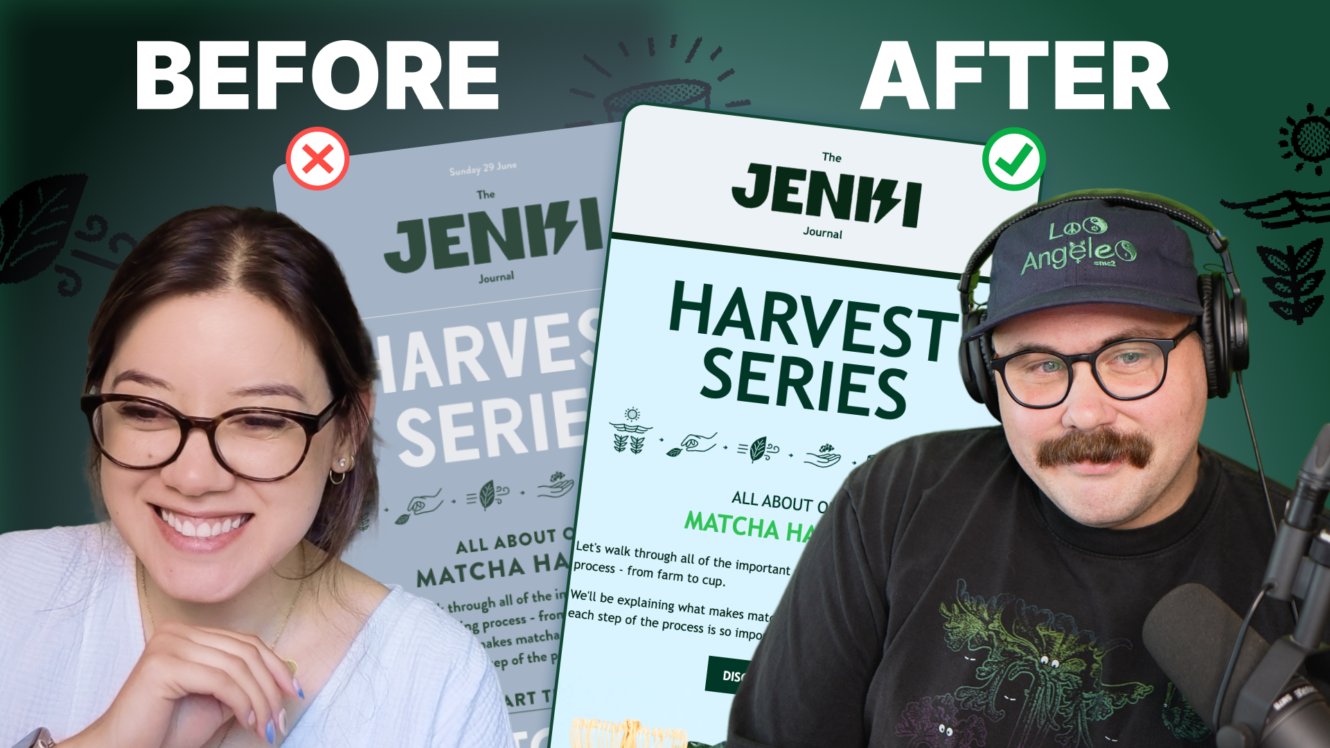
Accessibility, applied: Matt Helbig and Kelsey Yen reveal how inclusive design turns real emails into better user experiences.
Dive into the world of unmatched copywriting mastery, handpicked articles, and insider tips & tricks that elevate your writing game. Subscribe now for your weekly dose of inspiration and expertise.