Email marketing deep dive with Megan Boshuyzen
Matt Helbig and Mailgun’s Megan Boshuyzen unpack Email Camp, showing how accessibility, live text, and smart CTAs turn event emails into signups.
February 28th, 2020
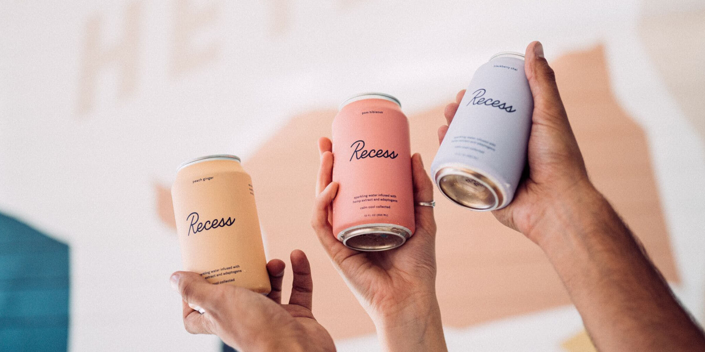
This week we look at a Recess event email.

Matthew Smith: Happy Friday everybody! What's up Matt Helbig and Rob Hope from Email Love. How's everybody doing today?
Matt Helbig: What's up? Happy Friday.
Rob Hope: Hey guys, what's up from South Africa?
Matthew Smith: I love it. Well, it's good to have everybody here, Rob. we've got another email this week from you, Recess. I'd love to hear what's doing it for you on this email and how we can learn something from it.
Rob Hope: So as soon as I saw the first email from these guys, I instantly thought remarkable. I would just want to tell someone about it. There's obviously the side of email when does it relate to the customer? What's the context? Is it delivering what it promised? But these guys, they have a sparkling water.
They want you to be reminded of their brand and they're doing so with events, these little pop ups. I think there's some magic shows and they're trying to keep things exciting. So for them, this design is really interesting. I would almost go as far as saying it's a little bit brutalist. They've got this typography, which is using sharp, grotesque.
They chose just to use images for all the texts to keep that branding. Obviously pros and cons. To go into their tagline, "cool, calm, collected". These guys use white space. They use soft colors, gradients, floating clouds. I think they nailed it on the branding point of view.
But, obviously, lots of images. I was actually checking out the alt tags to see how this email looked. If someone hadn't loaded up the images in it, and I thought it fell short or thought was overlooked, because if you actually see like this event you're on right now, Monday, October 28th.
Even the alt tags don't have the dates in them. You don't really know what's up. Anyway, it's a great looking email. The branding is fun, and like I was saying, it's remarkable. It's an email I want to share with people.
Matthew Smith: I think you've really done a great job of summarizing it.
It's really fantastic to see how brand can make something powerful and interesting and just fascinating. Right? I love seeing how it can evolve the way that somebody feels about a product. From an email perspective, this is essentially a very simple email. It's just text and imagery, right? But they do a nice job of giving it some flavor.

Now that said, there is no reason at all that this has to be all images. I get it. It's easy, it's what's done. But the thing that I get really on about with all images is this content then is very inflexible. So, for instance, with content being locked up like this, they can't do multivariate testing as easily and just change some words to see how that connects with people.
They can't change "view scheduled" to try a different CTA as much. They can change out an image if they want, but it's not nearly as flexible. It's not language flexible, so you're not able to translate it. It's not flexible for SEO. So. I'm a big fan of trying to get emails and post them to the site, like we're actually working on that on our end so that our emails add to our content, add to our SEO value.
This goes nowhere. This is content that gets stuck and lost in the internet. That's not 2020 right? That is 2000. We already went through this on the web. We've grown up. Why are we still doing this? I kind of rally around this soapbox on this a lot, but I think I would love to be a part of changing things through Microsoft Outlook. I know that they have some business needs. I'd never want to dog on them cause I want them to say, Matthew Smith, he keeps talking about this. Let's get him on this team and we're going to fix some things.
That is the broken link, right? If we could change some things in Outlook, we could start seeing email as a tool, as a platform, be extremely dynamic. In the same way that mobile is a unique platform, email could become a unique platform on its own and a huge part of business growth. I think that from this perspective, they could lead the pack. They're leading the pack in some other areas as a brand. Why not, take that next level.
I did notice, it's funny, even though they're like really on and they're doing images, there's still some like artifacts. Like why is this alignment off? There's no reason for that. If you're going to do all the images, you should have everything perfect. So I don't know. A lot of good stuff. The CTA is good. The design pattern, the design language seems sufficient, but that's what I would change is really start using some live text.
But everything else seems really strong. Matt Helbig what do you think, man?
Matt Helbig: I love the branding. I think it's such a fun opportunity to like use email as a medium for some of this stuff, especially if you look at their site, how interesting and responsive it is. I think there's little elements they could definitely do if they had that live text or maybe some different development.
Like maybe those clouds could be a background image. That's a GIF that's sort of like floating or something and really bring you down through the email or some hover effects that change opacity on some of these different images. So I think taking some of those web elements and trying to put them in an email, this amazing branding, I feel like they have so much opportunity and pretty lucky to be able to experiment with email as well.
So I think they've done some really cool and interesting campaigns. But as you said, I think the all image stuff has sorta held us back about trying to feature them more on our site or talk about them more.
Matthew Smith: One thing that I think is interesting is this use of the pointer as a way to kind of grab attention to the CTA.
Rob, what do you think about it?
Rob Hope: Yeah, I think it's cool. I mean, this is a weird word to use, but, I would dare to say this email's almost psychedelic.
Matt Helbig: They do have hemp in their products. So...
Rob Hope: They do. It's like retro. We've got a can eclipse below here. It's like quite an experience here. But yeah, it's actually just trying to be "arty" I guess.
And they've done a good job at trying to break through the norm. It's definitely not boring. I mean, that's gotta be the absolute opposite of this email.
Matthew Smith: Yeah. Agreed, man. Well, good stuff. Good work Recess. Hopefully this is helpful to them and to other email geeks. Don't forget UNSPAM is March 12th through 13th.
We've got that coming up. We may be sold out by now, but, we would love to hear from you. We almost doubled in size this year. Super exciting. And we are actually interested in starting some international UNSPAMs. So for those of you who are interested in championing that, whether in South Africa with Rob or in Australia, with our friends there, or in the UK or who knows, man, if I could get to Japan again through UNSPAM, like that would be the magic. I love Japan so much.
So anyway, it's great to be here. Rob, what are you going to be doing this Friday bud?
Rob Hope: I'm actually working pretty hard. I'm trying to just improve Email Love every day. I'm trying to double down on the discovery section, make newsletter discovery a little bit easier. I feel like it's kind of a mess online right now.
So yeah, just get the submissions cleared up, and just keep improving and adding value the daily.
Matthew Smith: Love that, man. Thanks so much for contributing to the email space. Helbig what you doing in Chicago bud?
Matt Helbig: I'm packing for UNSPAM already. I'm just going to start really early. That's my plan. But yeah, definitely check out Email Love. It's something that we check out all the time and they have a lot of stuff that we don't have on our site, like email templates and more discovery tools.
So definitely check that out.
Rob Hope: Yeah, thanks guys.
Matthew Smith: Enjoy the space. Enjoy making email better for everybody. So there's that quote, "A rising tide raises all ships". You know? I really believe in that.
Rob Hope: Big fan of that saying.
Matthew Smith: Well, appreciate everybody. Have a great Friday, everyone. And Rob, it's been wonderful to have you on the show here and doing this together.
Thank you.
Rob Hope: Awesome. Appreciate it. Thanks guys.
Matthew Smith: Cool. All right, bye.
Categories:
Feedback Friday
Matt Helbig and Mailgun’s Megan Boshuyzen unpack Email Camp, showing how accessibility, live text, and smart CTAs turn event emails into signups.

Accessibility, applied: Matt Helbig and Kelsey Yen reveal how inclusive design turns real emails into better user experiences.
Dive into the world of unmatched copywriting mastery, handpicked articles, and insider tips & tricks that elevate your writing game. Subscribe now for your weekly dose of inspiration and expertise.