
Keeping design systems tight with Reelgood
Reelgood is a free streaming guide in the US and UK where viewers can browse, watch, and get notified about TV shows and movies that are available online.

This FF episode was sponsored by emfluence. Get paired with a marketer to see how your strategy will work in the emfluence Marketing Platform.
📋 TL;DR key takeaways from this episode:
1. Keep the design system tight. Use consistent fonts and layout to clearly communicate what the brand can do for its audience.
2. Use custom, unique symbology to call out a CTA and where you’re taking your reader.
3. Avoid rag right with paragraph text if the heading is center-aligned. If you’re going to center your paragraph text, aim for 3 sentences. Otherwise, make the heading left-aligned, and insert a line dividing the content blocks.
What this episode on YouTube.
Matthew Smith: Happy Feedback Friday, everybody. What's up?
Matt Helbig: Welcome back. email geeks. Another amazing week here on Feedback Friday.
Reelgood email design example
Matthew Smith: Sweet. Really Good Emails in the house. Matt Helbig. I've been using Reelgood to track some shows and see what's out there on the streaming services. I just love these emails. I think for a dark theme email, they're just killing it. It's going across some of these things that I enjoy the most, which is one live text.
This is an image, but they do cover it in a lot. What they are doing well is keeping the design system tight. See how consistent these fonts are, see how consistent the layout is. Giving me this very clear sort of movement about what Realgood does for me.
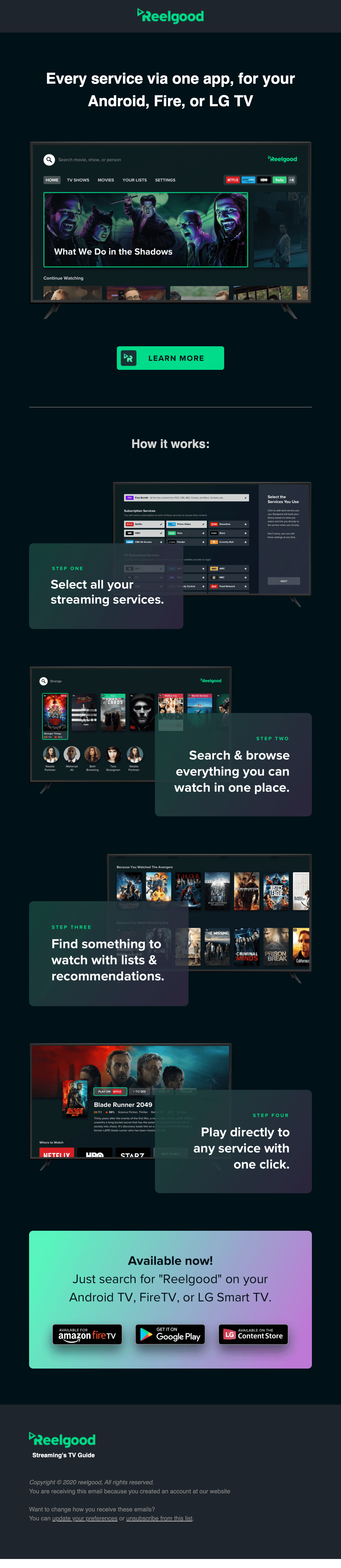
So hey, every service on one app. All right, let's see what this is about. I want to know, and then I can and see what's playing and I can go watch it, want to learn more. They dive me in. They gave me this thing and then they tell me. Okay, sweet. I can add this to my smart TV. So this is a way for an email group to be able to lead and tell a story to an audience and I liked that.
Using icons and visual cues for CTAs
Matt Helbig: I think that the neon green on black kind of gets a bad rap sometimes, but I think it works pretty well here. I like how they're adding an icon to the CTA. I've seen some brands just sort of distinguish by adding an icon on their CTA to give you a heads up of where they're taking you.
So maybe they're trying to do something like that with this. I think my only critique is on that bottom block section. It feels like a little bit too tight and too locked up. When you're displaying these badges, I always expect them to be clickable individually. I'm not sure that they are in this case.
I think I would try to frame that in maybe a different way. The use of a gradient, I like how it brings your eye down to the bottom of the email.
Product update emails in the Reelgood series
Matthew Smith: Yeah. Yeah. Cool. Let's jump into the next one. So now this is partly just saying, Hey, hoopla is on Realgood.

So if you're not familiar with hoopla, it's pretty rad. It's like the ability to watch a video, listen to a book. I think even read some eBooks using your library card. So that's pretty neat that you could then watch it on your TV. Not just your device. Being able to see that.
So they're saying, Hey, hoopla is now on Realgood. We just made this new feature and I can add hoopla or I can discover what's on hoopla. I can see what is hoopla in case people don't know, which is smart. I can get the real good app if you're not already familiar. If you haven't taken the plunge.
Typography and alignment best practices
So I think this is a good way to get it done. There's very little that needs to be in this email and they've covered their grounds here really well. One thing I'll say type of graphically that love that it's a little bit challenging is okay. See a lot of brands doing this right here. It's a hard one to solve for, but it's a centered, heading with left-aligned copy.
Typographically it just doesn't work. What works is centered, aligned, heading with like blocks of content like this, or if you center align and you have a block of content like this. It takes up the full width. What doesn't work is when you have what's called rag right.
When this is over here, it creates an unsettling feeling. So it's a nerdy typographical thing, but I wouldn't do it. So instead, what you can do is make this heading left align, put it over here, and then put a rule like a line, essentially dividing these, or you can change the color of the background between these sections.
The other thing that you could probably do, this is a little long to center the text. If you could shorten it up to just three lines, then you could have just centered that text and it would feel great. Just a small thing.
Card layouts and clickable content
Matt Helbig: I like how they're mirroring what I think the app probably looks like with these cards.
It does feel native. I feel like if I got this in my inbox, it would sort of stand out to me with the different colors. I wonder if that what is hoopla section deserves its own little card. Or if it's better as a subtext. I'm not really sure. I think it is still okay as a subtext. It's not the main focus. It's not clickable. With these cards, I kind of feel like they're almost more like really big CTAs that you can tap on.
Matthew Smith: Yeah. Interesting. Also here's another one discover what's on hoopla. That they show you some of what's there instead of just saying, discover what's on hooplah. So I think that's really a smart play. Oh, Rick and Morty, like, I want to watch that show. That's hilarious and I can watch it for free.
All right. One more on this series, again. Same thing. So peacock this time. Again, we can add peacock. We can discover what's there. We can discover what's on peacock premium. So apparently that's a different level. Then again, they use the same, what is peacock? So same issues as the one before.
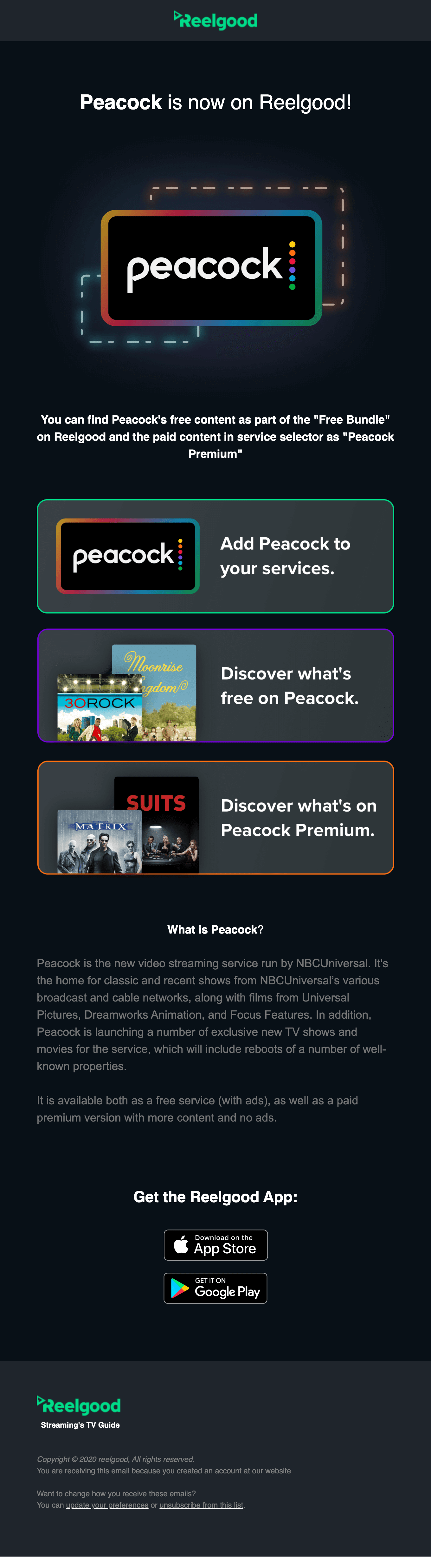
I think that this is working pretty well. You can just see from one set to the other, like how flexible this template set is, or really, I would like to think of it more as a design system.
That is working well, where you have these different blocks that translate well across a grouping. So what would you change about this email? If you could.
Matt Helbig: It almost needs like a solid white CTA somewhere in here. Sometimes I feel like when people expect you to click on something, it's not abundantly clear.
I think these outlines and you know how they look like cards sort of look like they're tappable. Especially on mobile, but I think when you get the desktop, sometimes I just feel like if people don't have a real defined CTA or CTA copy, some people might get lost. So I do see a white CTA or catch-all, and I feel like some of these links, especially in the, what is peacock, I'm not even sure if there are links, but it is getting a little hard to read on this contrast overall.
I think you're right, that the template is pretty flexible and nice. It's a nice little product update and they don't waste any time. They kind of get right into it.
Improving CTA clarity in email design
Matthew Smith: I was going to say that they might be using rounded corners on their CTAs is to like drive hard, this idea of a CTA, but they've got rounded corners on these boxes.
This box is a CTA that you can click, which it's interesting. That was not what I would have expected. Then this one, it looks like the whole thing is clickable. So that's another thing that you can do. I would say are being just slightly confusing here. Like this is the main CTA. Then to your point, they do wrap this in green to maybe make it the focus, but these are wrapped in other colors, but they're using rounded corners, but sometimes what you can do is you can use just some consistent, unique symbology.
To say, this is the CTA, like on Brooks Running that we did last week, it was always blue. Almost every single CTA that I think I remember seeing was blue. So that was the consistent thing. Whereas for Realgood here, it feels like generally, they're trying to say anytime that you see a big rounded block or a green CTA. Those are your clickable spaces. I think that they could drive that home a little bit harder. Learning the design language, learning visual language.
So cool. Well, this was a good set. I'm into what do doing anytime we focus on a brand, Hey, Reelgood team. Let us know how things are performing. What are you learning? We would love to learn from you. We'd love to share that with our audience. Love the product that you're building and hope everybody is having a great time in life, despite the challenges.
I hope everybody's staying safe. We love you all. We hope you're just thriving, despite it all. All right, everybody have a great one out there.
Matt Helbig: See ya. Bye.
Subscribe to our newsletter.
Dive into the world of unmatched copywriting mastery, handpicked articles, and insider tips & tricks that elevate your writing game. Subscribe now for your weekly dose of inspiration and expertise.