
Finding clarity and building brand trust with Ritual
Ritual is a no-B.S. vitamin company that makes multivitamins with clean ingredients, backed by science.

This FF episode was sponsored by emfluence. Get paired with a marketer to see how your strategy will work in the emfluence Marketing Platform.
📋 TL;DR key takeaways from this episode:
1. Show the social proof if you’re selling a product or service. Include customer testimonials in the email to build brand trust and brand relationship with your audience.
2. Use clear buttons for the main CTA and smaller, underlined text - underlined in your brand color - for less important CTAs.
3. If you’re going to use centered text, make sure that’s all that’s going on in the email. Keep it simple and don’t go over 3 lines of centered text.
Matthew Smith: Hey, it's another Feedback Friday, Matt Helbig. How are you doing, buddy?
Matt Helbig: I'm doing great, Matthew Smith. I'm excited to look at some of these Ritual emails.
https://www.youtube.com/embed/QdyovP2Edfs
Ritual email example
Matthew Smith: It's another time of taking a brand and unlocking their email mysteries.
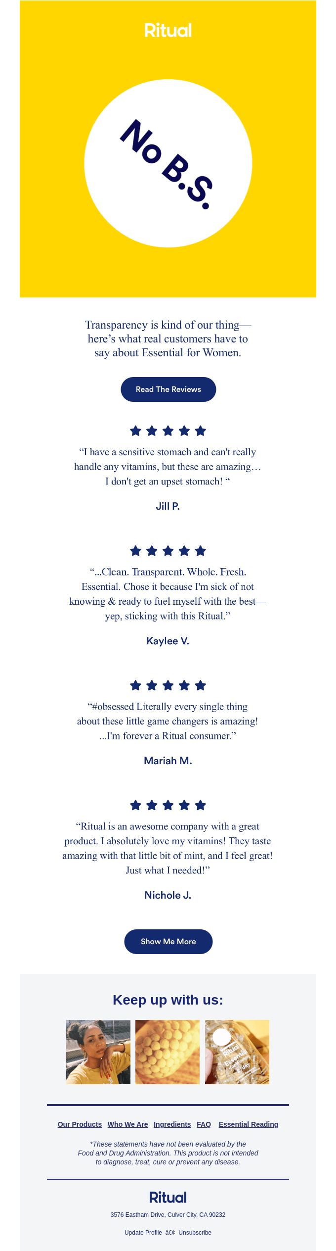
I think you or maybe one of their designers started submitting some Ritual emails recently. And I was thinking, Ooh, what's this pretty little thing—been enjoying it. It's mostly images, not a big fan of that, but they've done it pretty well in this example if you're going to do it.
https://reallygoodemails.com/emails/transparency-is-kind-of-our-thing
Using social proof in email marketing
No BS. Well, what does that mean? Okay. So transparency is a big deal to them. So let's talk about it. Five stars, five stars, five stars, five stars from these different people talking about what they love. So social proof, but really like an email dedicated to social proof. I don't see that very often, and I think it's pretty impressive.
Show me more so I can go and see more about their social proof. See what that's all about. My favorite. I love it when people do this. Don't tell me you're on social. Show me on social. Show me why it matters to follow you on social, right? Like, look at this sick stuff. So they're doing it. I'm not sure what tool they're using. There's a couple that can do that.
Designing a strong email footer
Or if they're grabbing some recent images. That's how some people do it as well, but they're doing it, and I think that's powerful. This generally is what you'd call the footer. We talked about Readymag's footer last week, and I had this like a little crush on it. This is another excellent footer. What the heck. Two weeks in a row, man. I'm super psyched.
Matt Helbig: Having this dedicated customer satisfaction, customer happiness, social proof email is a brilliant idea. They're not even really showing product shots in this, which is interesting. Maybe that is an opportunity for them. I'm not sure.
I think the paired down text first. Showing different stars, talking about products. I guess sometimes I sort of glance over these just because, of course, they're going to include the best of the best talking about their product, but I still think it helps build that brand relationship and brand trust by showing stuff like this.
Matthew Smith: We did an episode with my friends at Biddyco, and we were talking about Supergoop, which is a product that is like a sunscreen and what they were doing is they were showing somebody, shot on an iPhone, not a studio shot using the product and then talking about it, like a testimonial talking about it, and that went even further.
So it wasn't just a bottle of the product. It was showing somebody using it, and that made a nice connection. And then the other thing that I've seen people do here is. Chose it because I'm sick of not knowing and ready to fuel myself with the best or something. Right. Highlight that somehow, call it out, make it bold, put a highlighter yellow behind it, or something like that. That's another way of going the extra step.
When I see all five stars, sometimes I wonder if, like you're saying, that feels like a little bit too much. They almost don't feel real. That's a challenging one. That's going to need some testing. Yeah. So I think the social proof is an interesting one. I am seeing Jill P. Okay. How do I know that these are real? How do I validate those? Sometimes adding like a location can help with that a little bit. Interesting challenges. Overall, I'm impressed with this email.
Content-focused email design
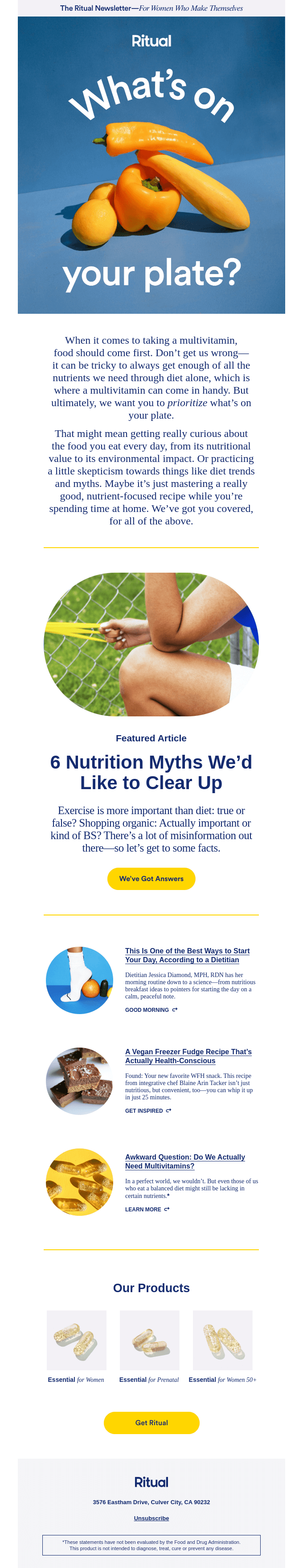
Let's go on to the next one. They're digging in a little bit. What's on your plate? All right. Okay, multivitamins, but this is food, so what's this about? So they dig in a little bit about what they're intending and why their brand is so focused on transparency, clarity, good food, things like that within their multivitamins. One thing to note here is they're using centered text here. Now, generally speaking, this is a big no-no. It's hard to read.
https://reallygoodemails.com/emails/whats-on-your-plate
Now that said, one of the reasons it barely works here is because that's all that's going on. It's very large text. The text has enough line-height or letting, and it's just very simple. There's a brand called Tracksmith that we've done. They do this occasionally, and it works. Just be real careful with it. Technically speaking, you really shouldn't get over about three lines of centered text in terms of graphical rules, whatever those are. There's no typography police. I've applied. I'd like to become one. They haven't admitted me yet, but in the meantime, it's just something to keep an eye out on.
CTA hierarchy and visual emphasis
As you look down through these articles, they're doing a good job. This is a better use of centered text. Notice here that they're using live text within something where they're pulling in probably something either live or maybe where they're split testing some text or more of an article, so I'm glad to see that. I like these big, clear CTAs, yellow being that real clear primary for them.
And then some additional articles here done a little bit smaller. I think that's working pretty well. They're using this as their little CTA. If it were me, I'd put some yellow underline, or if this is your CTA and you're doing both here, why? Is that necessary? Find out in your testing. Now here, you've got the blue underlined text. It's a prominent CTA. So at least there's that.
I often think if there's a way to connect your different CTAs, I think that might be blue in there. So that probably is partly helpful. And then they get down into their products. And this is like an overview that they're doing here with three. It's a little bit out of alignment, something a little bit challenging there to fix.
I like how they handled it over here on mobile, even better actually. I think that's the one that works well. And these articles are stacked well. One of the things that I think they'd get, right, that many people don't is there's enough padding below the one before and above the next one, that this feels like its own little lockup.
Whereas many brands, the space ends up feeling like I don't know where the CTA belongs to what image and things like that. I think they've done an excellent job and man super consistent. The footer isn't quite as happy as the last one, but it's real simple. So I like that. But what about you, man? Do you think this is working?
Mobile-first email design considerations
Matt Helbig: I'm starting to think that like a cheat code for Really Good Emails is just to add rounded corners on your images or something.
We love that. I think this is one of those where they have focused a lot of time on that mobile view. I'm going to guess just based on their branding and their audience, that maybe that is where they get the majority of their opens. Using that full width, it feels on-brand.
Using those brand colors throughout this entire email and all feels very Ritual style. And then desktop, I think it is a little, like you said, lacking maybe. The alignment might be a little off, and I think it still works like the email is somewhat usable. You can click out and things like that, but the hierarchy feels a little different to me.
I think that the mobile view is where it shines. They always try new and exciting stuff with their images and photography and layout. So this is a brand follow, and you can see more examples on our site of some newer emails that they've been sending out that are taking risks on layout and trying out some new stuff. So it's cool to see.
Matthew Smith: As always, you can find the transcribed episode and more examples on our site's Feedback Friday part. Thanks for following along. Subscribe, tell your family and friends. We will see you next Friday, Email Geeks.
Matt Helbig: See ya. Peace.
Matthew Smith: Peace.
Subscribe to our newsletter.
Dive into the world of unmatched copywriting mastery, handpicked articles, and insider tips & tricks that elevate your writing game. Subscribe now for your weekly dose of inspiration and expertise.