
Email marketing deep dive with Megan Boshuyzen
Matt Helbig and Mailgun’s Megan Boshuyzen unpack Email Camp, showing how accessibility, live text, and smart CTAs turn event emails into signups.
May 29th, 2020
While we focus a lot on colors, fonts, and buttons, we can't emphasize the importance of text and email enough. This week, we take a look at some e-commerce emails and how live text and active product photos make us fall in love with the brand - not the other fluffy stuff.
This FF episode was sponsored by emfluence. Get paired with a marketer to see how your strategy will work in the emfluence Marketing Platform.
📋 TL;DR key takeaways from this episode:
1. Show the product line in action at different angles with product photography and GIFs. Walk your audience through the product with active-feeling cutout photos.
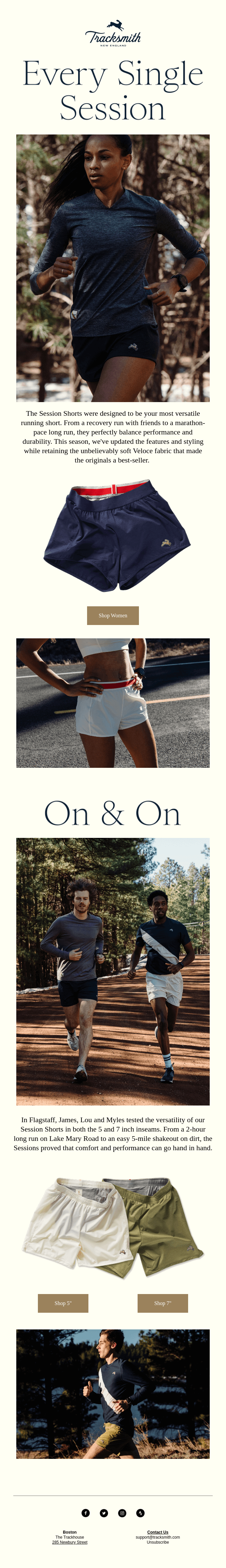
2. No-nonsense, clear CTAs keeps your audience focused on taking action. Segmenting categories in your CTAs can also help your audience feel included (Ex: "Shop Men" button, "Shop Women" button).
3. Layering product photos on top of headlines can customize the design instead of making it look like a template.
BONUS: Tell a story about something, someone, or the history related to your product.
Matthew Smith: What's up. It's Friday. Happy Friday, Matt Helbig and Email Geeks.
Matt Helbig: Welcome back, Email Geeks to Feedback Friday. We're back together again.
Matthew Smith: It's been so long, brother, bro. We are here. What is Feedback Friday again?
Matt Helbig: We look at emails and talk about what's good and not so good about them.
Matthew Smith: Yeah that's right. Yep.
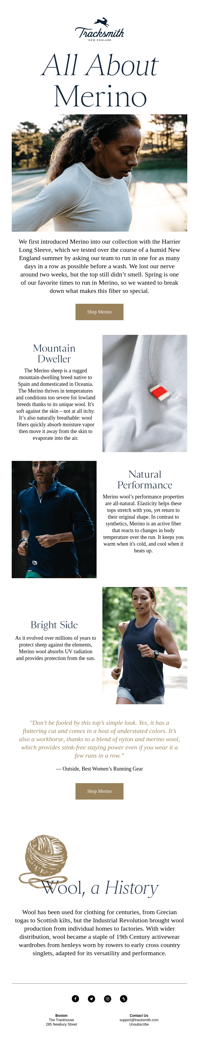
I've been following this brand Tracksmith for a little while. They caught my eye because they're a fashion brand, some sick photography and they care about live text, which, you know, I'm kind of a nut for. They're doing some nice work in their emails. Super elegant, scalable, great on mobile. Can I walk you through them?
Matt Helbig: Sure. Yeah. These are very similar to the On emails we featured in a previous episode, so I'm excited to go through these.
Matthew Smith: I think there's some cool stuff going on. They use GIFs well to walk us through their product line a little bit and give us a sense of how these nice little running undies are going to work for me. Notice live text. Love that. That's pretty hot.
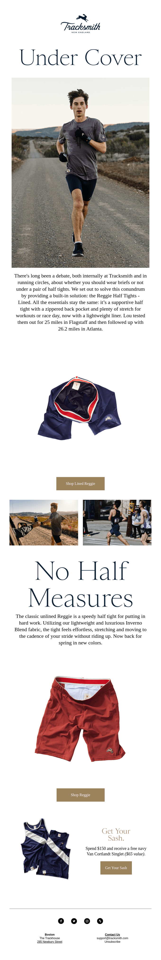
It works great. I'm not a fan of this much, centered text from a design perspective. I talk about this all the time, but it's okay here. Why? I think it works here for a couple of reasons. One is the measure, which is the length of characters from this side to this side. It's not that long and so it's doable.
I can still read it cause the text size is still pretty large. The other thing that makes it work here, is there is so little design treatment that it just gets out of the way. So the only complexity to this layout is just this and that's it. There are no lines, there are no doodads, there are no competing interests.
So it still works. So from a design perspective, but back to like email strategy, I think they're doing a good job of showing me a product line. I get to see it in action. If you are a runner, having a good inseam and a gusset or however you call that thing. Like that's important. You know, like the first time that I bought a pair of Lululemon shorts, I was like, they cost how much? This is absurd. And then I ran in them and it was like. All right. Game over. This is legit. I get it. So I'm kind of into them and if Tracksmith wants to send me some of these to try on, that's cool. I would accept that.
Matt Helbig: It doesn't influence our email score though, right?
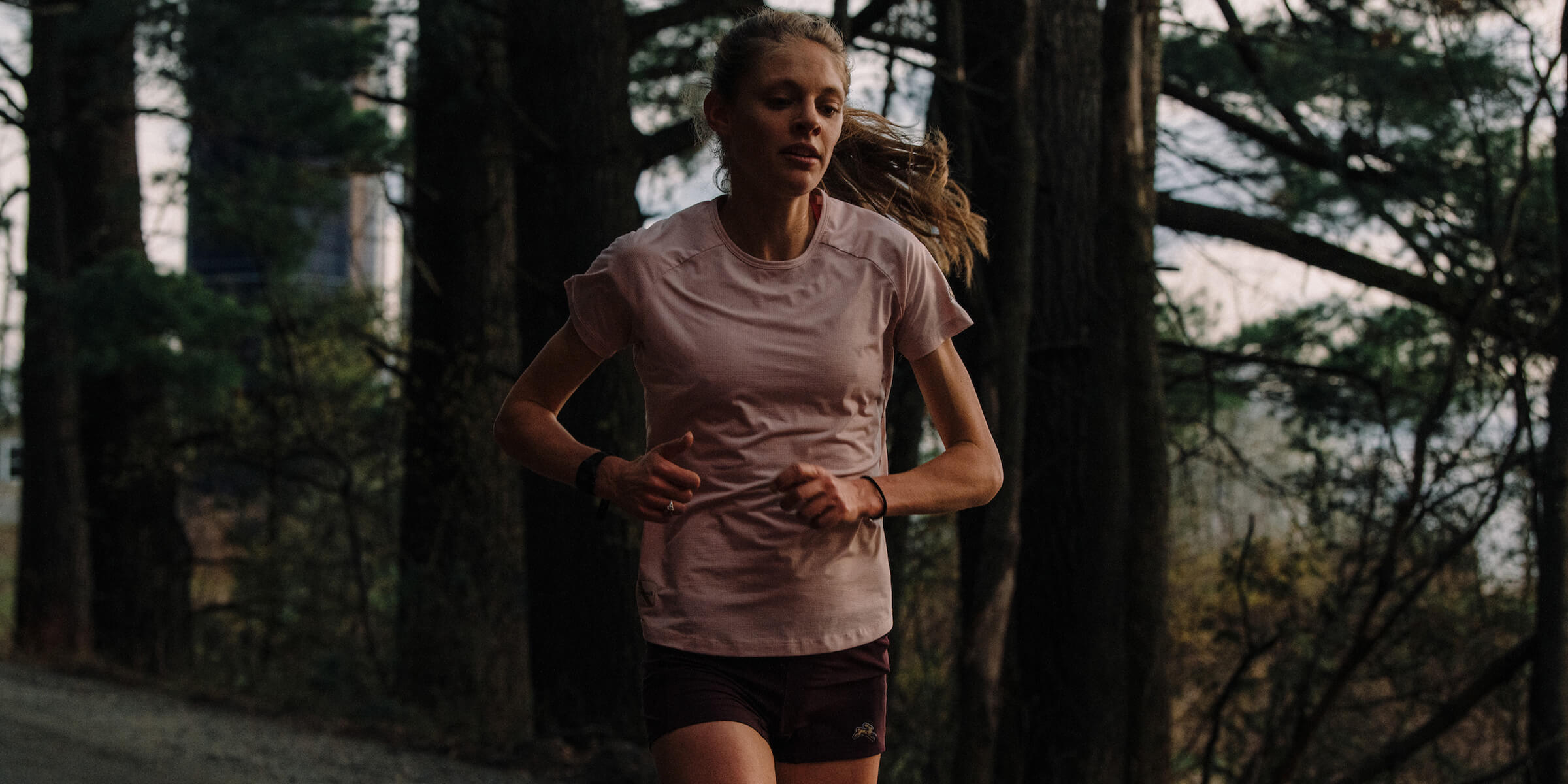
Matthew Smith: No one has ever, ever sent us anything, just to be clear anyway. So like cool photography. They do a great job here, I think of like really getting into the heartbeat of athletics and of running. Just fantastic design. I would love to know who does their design.
They've just really got some good stuff going on here. Again, using GIFs to showcase a product line instead of something like a slider, which honestly, I think the metrics that I've read say that sliders and carousels very rarely get used. You know, like having a showcase like this that just walks you through without any effort. Boom. That's what I'm talking about. It feels sweet.
Real clear CTAs. One of the things I love about these emails is the CTAs are just no-nonsense, but nothing else competes with them. Arguably, you could say like this doesn't feel like a link, but it's this gold color, but it is a link. So even though visually it doesn't look like a link, but at least it's the same color as the CTA.
The only other thing that we harp on and on about, and even I've been known to ship some emails with just these icons, but I often feel like they could put actual social content to give me an idea what's behind those, but it's not hard for me to go and discover those.
Another thing that I think is cool here, you'll notice back here, white and then cream white and white and white and white and white and gray. They have such a simple layout with this setup that they can change background colors and nuance their brand a bit more and I think that's pretty rad.
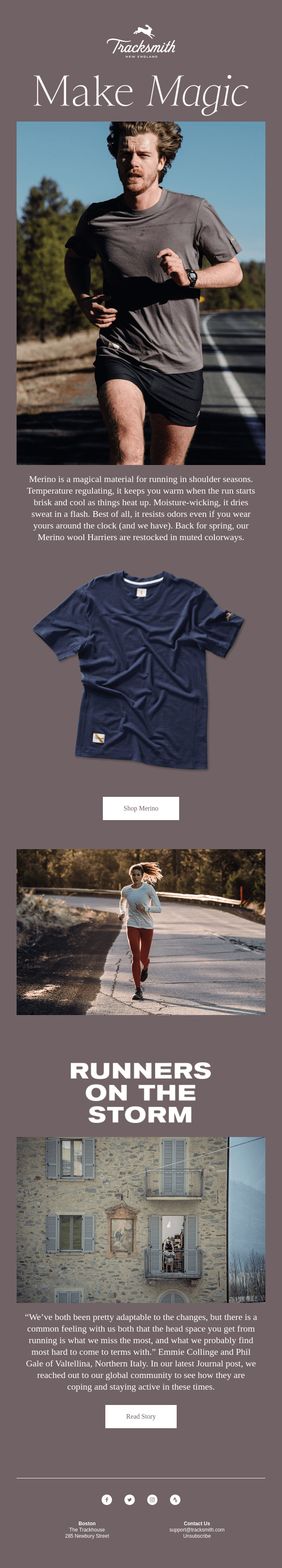
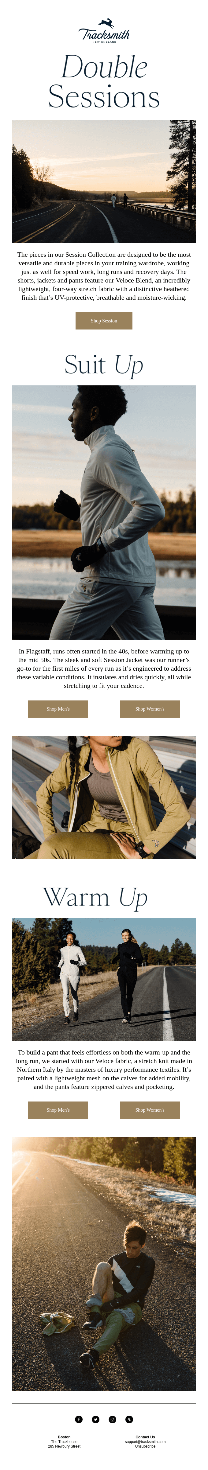
So you see the same thing happening here. They've got just an effective way to use their system. So they use this nice big typeface lead into a photograph. Little bit of text and a GIF and a CTA. Another photograph. Nice big heading. Photograph, paragraph. They perfectly walk through this stuff.
I love these active feeling cutouts. So unlike a lot of photographs where things are cut out on the back, this feels active. Like you feel like these shorts are running themselves, you know? And I like that photography. So if you can spend some money on some product photography or photography like this, you should. It goes so far in communicating the brand.
Look how simple their email template is and it's so effective. I want to shop for these products. I want to feel these products. You don't have to be fancy. You can get out of the way. And I think they're doing that here.
Similar sorts of lockups but slight variations, doing two side by side here and slightly different typography. They're using live text for their description texts and not for their headings. It's better than nothing. They could import that as a heading. It's not hard to do. I think this is working well.
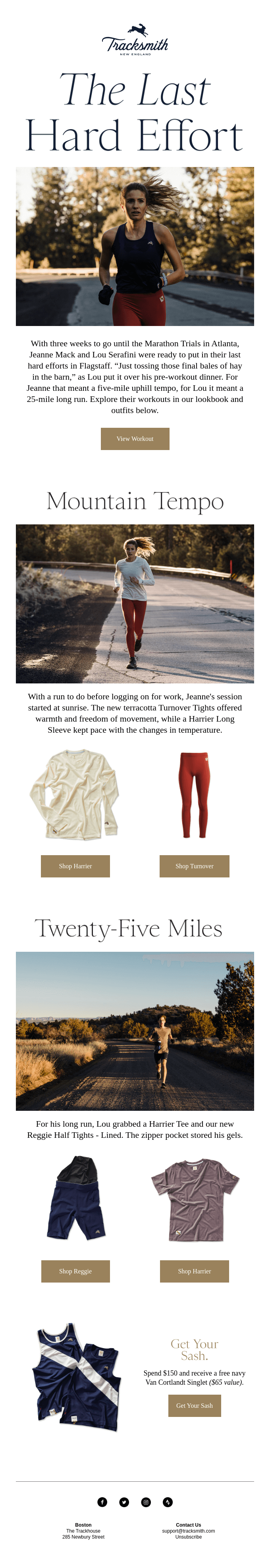
This is a great example of breaking the mold a bit and trying something a little bigger, a little fun, see what's happening here, and they're telling a little bit of a story about a different line that they've got. This copy is fun. It's interesting hearing a bit of history around running. I love it. I think they're doing a great job, great copywriting.
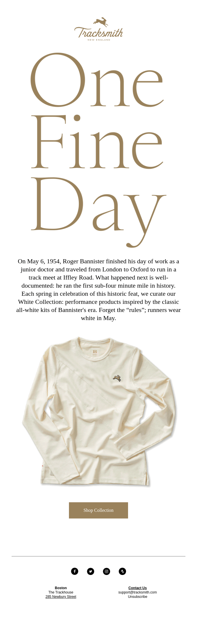
This is a nice touch where they're layering these active products over typography. I think that is a nice way to kind of make something feel custom and not like a template.
There's a feeling that we get as readers that things, they feel like templates, they feel cheaper that way, but if you push the limits a bit, man, it can feel fantastic. So I think they've done a nice job here with this.
Same kind of lockup, but look how much room they're getting out of this. I want to read the stories. It feels like it's about me as a runner and I like that. This clothing line feels like it's made for me as a runner and it has a unique, distinct brand from something like Nike. And I think they've done a great job of really telling that story.
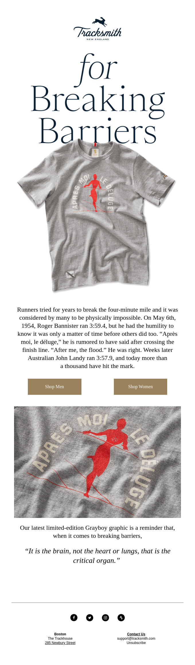
Here's another small variation where they're doing this side-by-side lockup here and I think it works well. I've seen some people kind of blunder this and I think they're making it work here. Telling me more about the product line, giving me some stories, giving me some quotes.
This is a nice way to incorporate a bit of illustration into their story. I would say that because they're not using illustration in other areas, the gold doesn't feel like it should be a link. I kind of want to know what's behind there now, so I'm going to check that out after the episode. But I think a picture of some yarn would have been interesting, but it works.
I think they're doing a great job. They made their own choice and it's a good one. I just love how simple this is. We talk about design golf a bunch. The idea that you drive toward the lowest possible score in your designs. So that you're not introducing any new kind of elements that's not doing a specific job and they've just done that so well here.
You've got one point for this lead heading. One point for photography, one point for paragraph, one point for this CTA and another point here and here, but then everything else is the same. It feels like I'm reading like a book. It just is really elegant. I love it.
All right, so tell me what you think, man. I've dominated with my opinions here, but I want to hear what you're thinking.
Matt Helbig: I feel like all the emails they send feel very honest. They're not selling you these products in some way. They're just kind of telling you little stories about how people are using these products or showcasing them.
I think you're right, the product photography and imagery stands out. I mean, in a lot of cases, the people shown in their photos are sweaty or tired or something like that. I think it's kind of refreshing when you only usually see very cleaned up stock photography. I'm surprised just how consistent it is across all the different sends they're doing.
I do think with their live text, there might be an opportunity to use a custom web font. I feel like this one's a web-safe font and sitting by itself when it's not relating to the bigger headline typography, it feels kind of basic or out of place to me. If you went on their website, you might see that body copy be a different font. There's an opportunity to have that as a web font. And then this sort of be the fallback if possible.
Matthew Smith: One of the things that I think they've done nice here that I was catching is using category oriented CTAs, shop men, shop women. This is a great opportunity for personalization. So in some ways, this is a question, are you interested in men's gear or women's gear?
That's a cool opportunity then to segment that user, right? So you don't necessarily segment them into, Oh, this person must be a man and this person must be a woman, but rather interested in women's clothing, interested in men's. And if they do that again, then you could double down on that.
But that's a really interesting way. So if I start checking out men stuff, then maybe only send me the men's stuff or send me primarily the men's stuff with a little like internal ad for some additional women's stuff if I want to check it out cause I'm shopping for a loved one or something like that.
I think that's a nice little opportunity for personalization. Another thing is the opportunity to capture what types of clothing I'm showing interest in that might indicate where I live. So if I'm always shopping stuff that tends to be warm weather things. That's going to tell you a lot about where I'm at or if I'm shopping at certain times of the year and so on.
I would love to know more about what they're doing. Tracksmith folks, if you're out there, let us know. We would love to have you on for an episode and talk a bit more about what you're doing, why you're doing it, and what you're learning. I'm excited. I want to see what these folks do. I'm staying subscribed man. I'm in.
I hope everybody out there is hanging in there. You all are an amazing community and we value you, but I hope that you as humans are doing well and making it through. If you ever need just a happy word, we're on Twitter @reallygoodemail and would love to just say something nice to you.
So let us know. Alright, love you, friends. Peace.
Matt Helbig: Peace.
Categories:
Feedback FridayMatt Helbig and Mailgun’s Megan Boshuyzen unpack Email Camp, showing how accessibility, live text, and smart CTAs turn event emails into signups.

Accessibility, applied: Matt Helbig and Kelsey Yen reveal how inclusive design turns real emails into better user experiences.
Dive into the world of unmatched copywriting mastery, handpicked articles, and insider tips & tricks that elevate your writing game. Subscribe now for your weekly dose of inspiration and expertise.