
Creating a seamless customer experience with Uber
Uber is a platform that offers delivery and transportation services, including ridesharing, freight transportation, food delivery, and package delivery.

This FF episode was sponsored by emfluence. Get paired with a marketer to see how your strategy will work in the emfluence Marketing Platform.
📋 TL;DR key takeaways from this episode:
1. Incorporate engaging GIFs with live text at the top of your emails to grab your reader's attention while keeping the email accessible.
2. Break down information with a hierarchy of text. Keep it concise, digestible, and personalized by customizing the language for each template.
3. Make the branding consistent throughout the email, app, and landing pages for a seamless customer experience.
Matt Helbig: What's up, email geeks? Welcome back to another Feedback Friday. This week, we have a spooky guest joining us for this Halloween themed episode. How's it going, Kelly?
Kelly Lamano: Hey, Matt! It's good. How are you?
https://www.youtube.com/embed/CNiJHCDOqCQ
Matt Helbig: You're the newest Really Good Emails team member, helping out with content stuff. How about you introduce yourself?
Kelly Lamano: Sure. Pretty excited to be here. So my name is Kelly Lamano. I'm the data and content contributor for RGE. Before RGE, I was a big fan of the website and the email design, just using it for inspiration in my full-time email marketing job.
So it's cool to be part of the team and working with everyone behind the scenes, seeing how it all works. Kind of cool that it's come full circle now to work with the team.
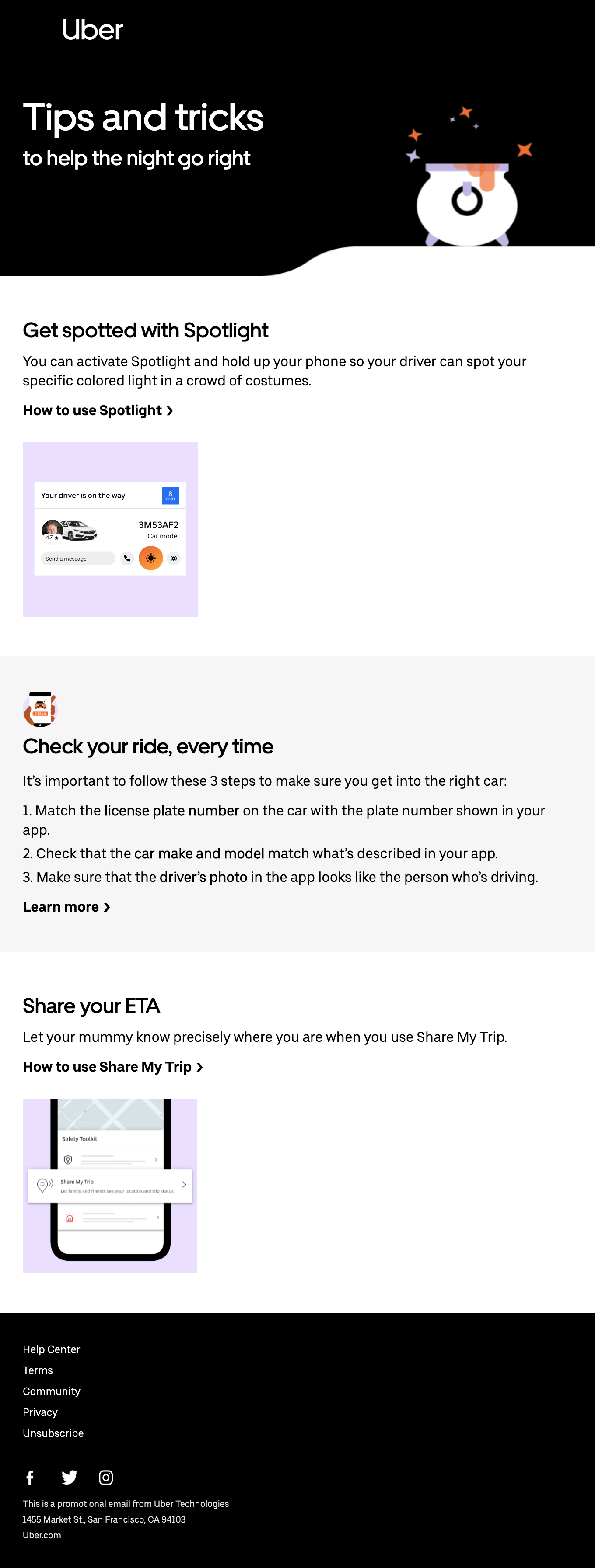
Halloween Campaign Emails from Uber
Matt Helbig: We have some Halloween themed emails from Uber. I've always been hesitant to cover Uber because their emails, I believe, are just so good. They're almost a masterclass of what to do with email. They always feel so polished and thought out. There's not much feedback I honestly have in a lot of these.
https://reallygoodemails.com/emails/tricks-to-help-you-this-halloween
Maybe we can talk about what they're doing well. So other people can improve their emails as well?
Using GIFs and Live Text to Grab Attention
Kelly Lamano: Right off the bat, that GIF at the top is attention-grabbing. I think that draws the reader in right away. It's very subtle, but it goes with that spooky Halloween theme too.
Matt Helbig: I like how it's so just subtle. You don't have to have a fallback for something like this. You can just let this first frame play, and it's going to work pretty much everywhere. I think they do such a great job using live text, restacking on mobile, using numbered lists to get content across.
Kelly Lamano: I like that it's short and concise. Each section has its header and then kind of draws your eye down towards the CTA. I think that's cool. It's really clear. I also really liked the little icon next to "check your ride every time." That's a cool feature that reminds me of what Target is doing in their app where you hold up your phone instead of interacting with a person. So it's kind of cool to see that visually in the email.
Matt Helbig: The icons add to this email. You mentioned CTAs. I don't feel like I'm missing a more defined button here. I think these are fine. I think they match how the app looks.
So to me, these are still actionable. I'm not sure if I would click through these entirely. I guess this is enough information for me within the email. The bold text makes it stand out, and, as you said, it draws your attention down to the different sections.
Kelly Lamano: I liked the use of the pun there at the very end under "Share your ETA." Let your mummy know. I think that's sly. It's very subtle, but it's just enough to draw you in there.
Matt Helbig: I swear this footer is my favorite footer in all of email. It's just the best. Left-aligned on mobile. It just looks so great, and I wish a lot more brands would emulate something like this. Their footer design is one of the best parts of their email, and they give you all these links here, but it doesn't get super crowded or anything like that. It just finishes with a nice little legal piece.
They sent another Halloween themed one over here.

https://reallygoodemails.com/emails/start-the-night-big-with-uberxl
Consistency Across Email, App, and Landing Pages
Kelly Lamano: Yeah, that's a pretty cool one too. They do an excellent job of keeping the branding consistent. It almost looks like it's a spooky series, and it just works well. I also really like how even going outside of the email, clicking those CTAs, and going to those landing pages is also very consistent. So you can see that the email gives us just a snippet of information, and then if you want to learn more, you go to the website, click the CTA, and it gives you more information that is very well laid out and looks like the email too.
Matt Helbig: Yeah. I like how they're using the app screenshots. I think that works well. I also like that it's not actually in a device. It's more like an illustrated device, which is nice—it kind of matches their branding.
As you said, they have concise pieces of copy. They're not bombarding you with everything that you need to know. They're giving you some teaser copy in this Z layout and then just showing you that CTA if you do want to learn more.
Kelly Lamano: I noticed on both of these emails that the images aren't linked. So that would be one minor improvement. I like to click on the images sometimes. So it would be cool to see that linked as well.
Matt Helbig: I could see that being helpful for sure. With that other one, that little icon, this little ghost is just a cool, nice little touch here. I know Halloween will be a bit different this year, but this one still gives me a good Halloween vibe.
I could see other brands maybe doing something like this with the Halloween themed or holiday-themed seasonal, maybe like Christmas or something where they're bringing in some animation to their templates.
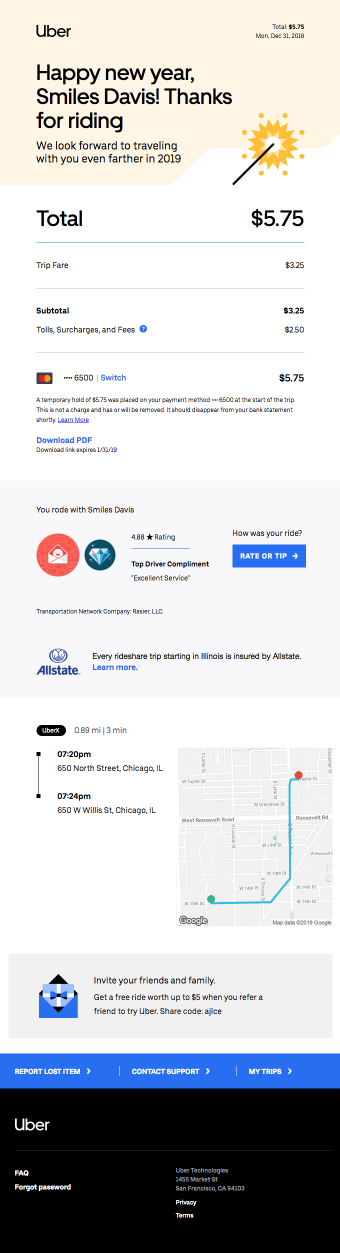
Transactional Email Example: Uber Receipt Design
This one's actually from New Year's Eve. This was a very short ride from a bar on New Year's Eve for me, and this is a little tweak that they did to their receipt design.
https://reallygoodemails.com/emails/personal-your-monday-evening-trip-with-uber
Personalization in Subject Lines and Preview Text
Kelly Lamano: Yeah. I liked the subject line because that right off the bat had something personal in it, kind of like what you mentioned, it goes a little bit further than just first name, but it includes the total of your fare and includes the name. It breaks down everything about that transaction.
It also shows you where you traveled to, which I think is cool if you scroll down. So if you ever wanted to look back on it, or if for whatever reason you were like, oh, I don't know where I went, that would be an excellent way to pinpoint a place that you would want to return to in the future.
Matt Helbig: I think they do a great job with this receipt on giving you a lot of information. As you said, the subject line is optimized to provide you with some information, or maybe it's easier to find in your inbox. They do a brilliant job organizing the email so that the preview text is a little bit smart. So they could use hidden preview text, but they're just pulling in that total, the date, and then this short line here in your inbox.
It gives you a lot of information about the ride you took, even without opening it. So I think that's nice. I think they do an excellent job of organizing it, so it's very scannable. So your total is big, right in front, and then it breaks it down for you. Shows you some information, and then they also, as you said, bring in that map data, and then they even have this little referral module.
I think they do a great job of bringing all these little pieces into a receipt that can help out. I believe some e-commerce brands could try to do something similar where they're giving you updates about your order or something like that, where they can pull in some customized imagery or add some other things to an email that makes it feel a little bit more personal.
Kelly Lamano: It's interesting in this one's footer because they don't include social media links. So it's more focused on serving the customer or customer support.
Matt Helbig: It looks more transactional, and they're just giving you the information you need from this ride.
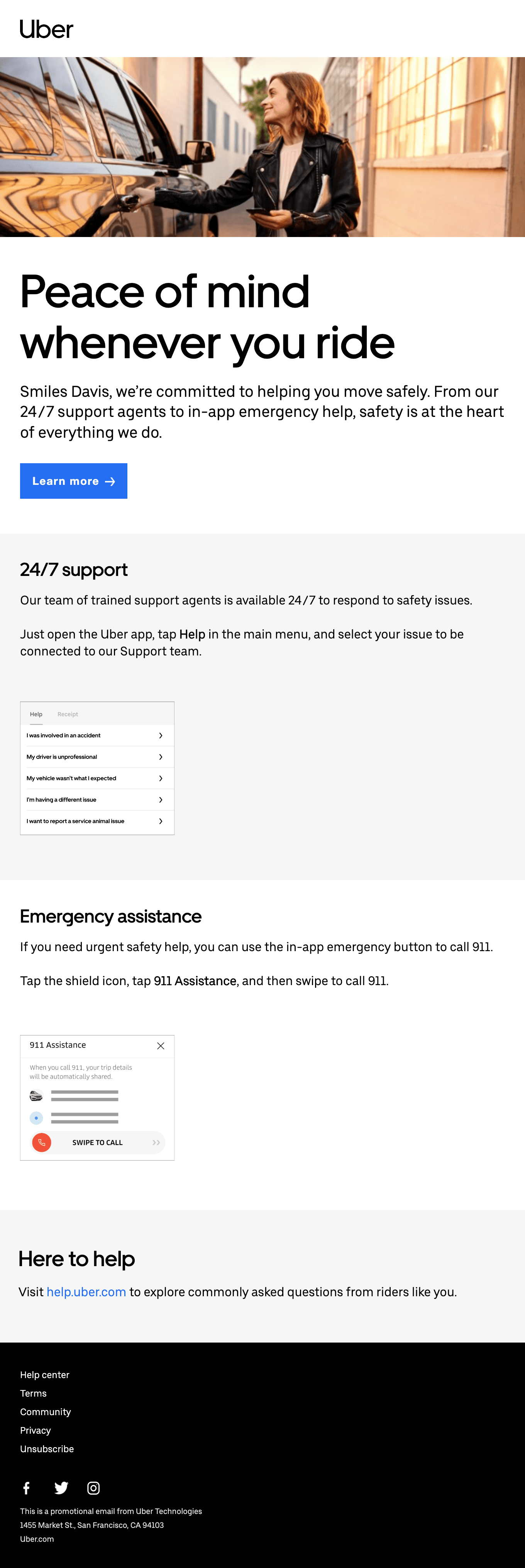
Product Updates and Safety Communications
They did this a little bit of a rebrand around their app's safety and different things like that. This one is more a product update giving you a bit more information about their service and what they're doing to improve their app and make you feel safe in the ride.
https://reallygoodemails.com/emails/safety-support-is-available-24-7
Kelly Lamano: I think this is a very welcoming tone. It's talking about giving people peace of mind. So it's setting that tone of comfort and like what their services entail.
Clear CTAs and a Reassuring Tone
They have a really clear CTA at the beginning to learn more about their safety procedures and then just going even further down in the email, it's nice how they've laid it out with the 24/7 support, emergency assistance, and how, again, they keep it very short and concise. It gives you enough information to learn about the product or learn about their procedures, and then if you want to learn more, you can go on their website.
Matt Helbig: I liked the pared-down use of color too. Instead of using their illustrations, they're pulling in that lifestyle photography and then using that blue to really highlight the CTA and then that link down here. It's pretty clear exactly what they want you to do next.
Kelly Lamano: I love that hero image too.
Matt Helbig: In general, I feel like they have a put together design language for their different templates, where they can pull in other modules, and everything fits together really nice.
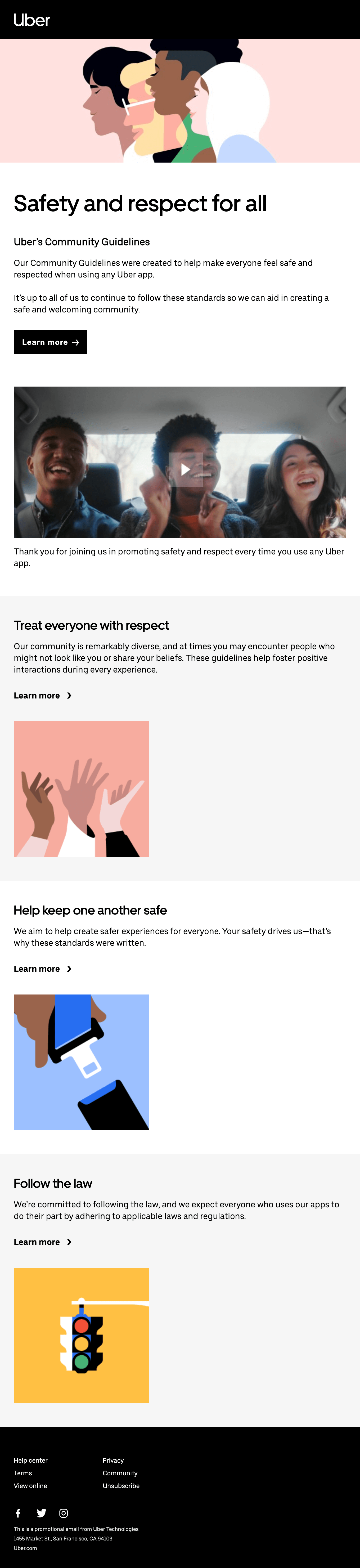
Community Guidelines and Inclusive Branding
Here's another one that they sent about their community guidelines. A little video here.
https://reallygoodemails.com/emails/a-commitment-to-safety-and-respect-for-all
Illustrations Plus Real People to Ground the Message
Kelly Lamano: Yeah, I think they did an excellent job with the illustrations because it's very inclusive and very diverse. I feel like anyone can see themselves in this email. It's cool how they have the illustration at the top, and then as you go further down, there's the video with real people. So it gives you a nice mix of both the illustrations and then an interactive video to click through.
Matt Helbig: It grounds it a little bit to real life. It's a pretty simple email, and it is a more serious tone of voice about what they're about and their community guidelines, but it still feels inclusive, easy to read, and accessible. They always do a great job of it looking great on desktop and mobile.
Kelly Lamano: This is a great example again, where the branding is very consistent. So they're giving us a snippet in the email, and then clicking through to all the different CTAs gives you more information on the website. It's very detailed on the website with a lot more information on their safety procedures and things like that.
They use these same illustrations on the website. So I think that's a fundamental concept just in branding in general, where they email landing page, social media, everything that your marketing should be consistent.
Matt Helbig: Mike sent over this last one. It's a pretty new one from them talking about their new protocols regarding health and safety nowadays.
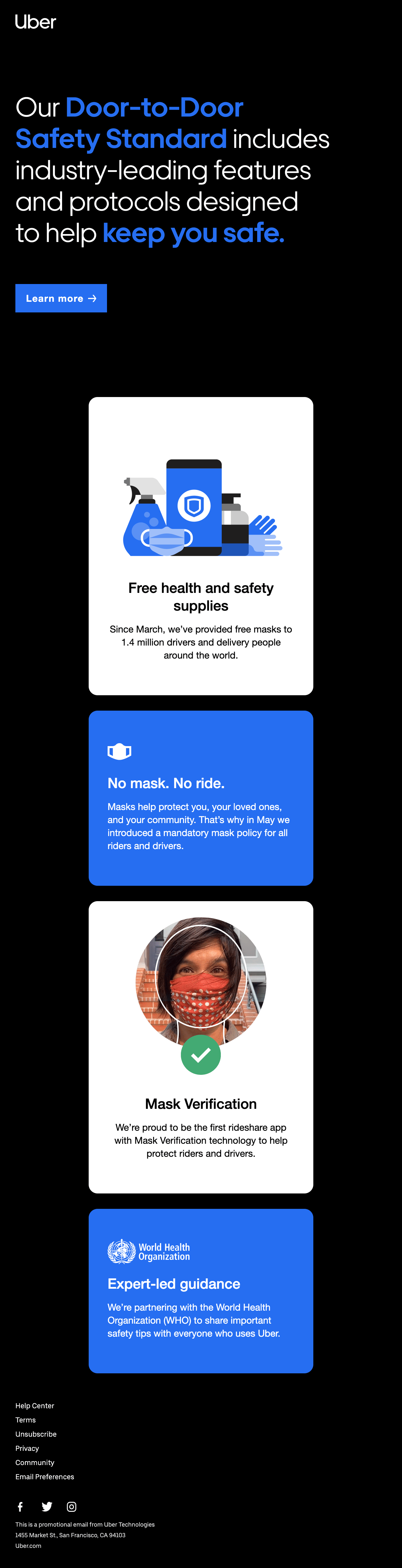
Accessibility Notes and Template Consistency
I was a little bummed to see that this one is an image here. They've done an excellent job with live text, but I'm guessing this could have been a little hard to lay this out in live text. It looks like they use a lot of other live text. This one sort of breaks that mold that we've seen with a lot of their different templates.
It does this off-grid layout here that kind of bounces back and forth. This almost feels like a Pinterest layout or something. It does a pretty good job, especially on desktop, with this card layout, having them stack.
Kelly Lamano: It's very informative. They even have like that little subtle GIF there with the checkmark.
Interesting how they also switch up the colors. So this is more about the white, blue and black, and just keeping that consistent throughout the design. There was one thing that I noticed on that first little square, the "free health and safety supplies." This might be just a personal preference, but I would drop the word "safety" to the next line, just so that "supplies" isn't an orphan hanging out on its own there.
Matt Helbig: It's strange because on these cards, it's left-aligned text, and then on these cards, they switched to center align to match these icons a little better. It does, especially on mobile, take a few more seconds for your eye to adjust from reading centered text to the left-aligned text. I think they could probably get away with just entirely left align text for these.
I always think that they do an excellent job of matching their app to their emails. I feel like these little cards I could see within the app. I imagine a lot of the CTAs might pop open that app. So it is a very consistent experience going from an email right into the Uber app.
Alt Text and Alignment Improvements
Kelly Lamano: Something I would like to see is more alt text. I noticed in the code that the images didn't have alt text for many of them. It was mostly just the logo. From an accessibility standpoint, that would be cool to see in the future.
Overall, they're doing some cool things with that Z layout and using illustrations and lifestyle photography. Those are all cool aspects of it.
Matt Helbig: With many of their emails, they're very concise. It almost feels like they take a couple of passes at that copy to make sure it is on-brand. I'm sure they have a legal team looking at many of these emails, but it's evident to me that they're spending a little more time.
Some of the other brands that they manage, like Uber Eats, have a similar design. I think they do an excellent job of balancing that design across emails to consumers, emails to drivers, and emails for their other apps. It's a lot of different emails that they're managing. I think they do a great job keeping that design language and design system across all those other emails.
Well, thanks so much, Kelly, for coming on. I enjoyed talking through these. Are you doing anything special for Halloween?
Kelly Lamano: Nothing. Right now, I'll have to check out some spooky podcasts or something. That's kind of my thing.
Matt Helbig: Okay. Yeah. I'm just going to throw candy out my window, like down into the streets.
Subscribe. Send us any emails that you find that you'd want us to give feedback on. Go to Really Good Emails, sign up for a free account to start collecting some emails. We don't have a ton of Halloween emails right now, so maybe you could help us by submitting some to the site. Read all of Kelly's fantastic articles on the blog. Thanks again, Kelly, for coming on.
Kelly Lamano: Thanks, Matt. Happy Friday.
Matt Helbig: Happy Friday. See you.
Subscribe to our newsletter.
Dive into the world of unmatched copywriting mastery, handpicked articles, and insider tips & tricks that elevate your writing game. Subscribe now for your weekly dose of inspiration and expertise.