Email marketing deep dive with Megan Boshuyzen
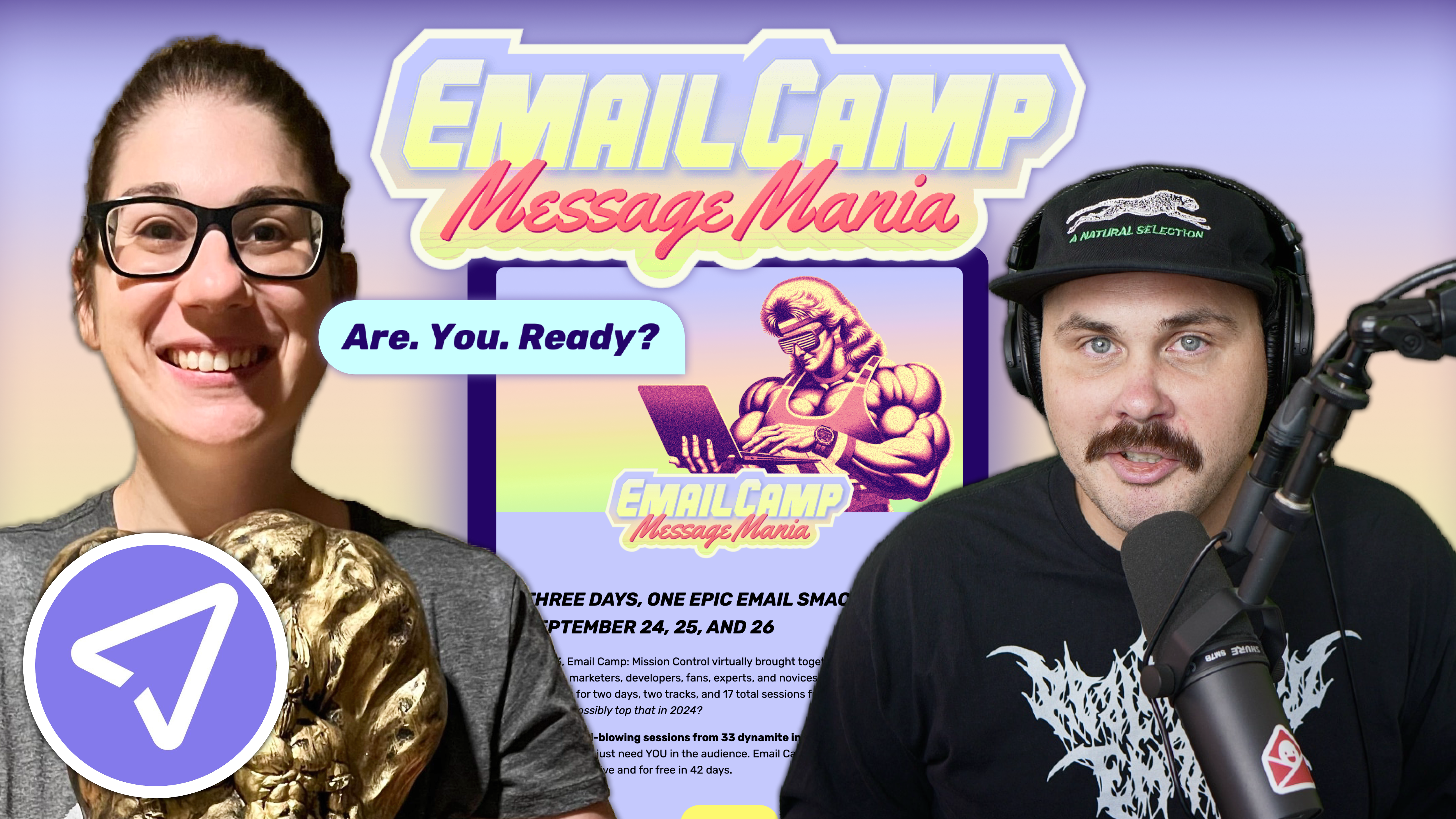
Matt Helbig and Mailgun’s Megan Boshuyzen unpack Email Camp, showing how accessibility, live text, and smart CTAs turn event emails into signups.
December 18th, 2020
How can you make image-only emails work while connecting with your audience? This week we look at how Wildist's emails use a design system to grab the reader's attention and show the reader where to go.

This FF episode was sponsored by Knak. Schedule a demo to build your own really good emails and get them to market in minutes.
📋 TL;DR key takeaways from this episode:
1. Use a consistent color scheme and text hierarchy as actions to grab the reader's attention. Explain the who, what, when, where, why, and how, and show your audience what they should do next.
2. When you create a design system, you’re using your emails in a consistent way where you can still have variation but you don't have to go back to the drawing board for every single email. Build the email, let it sit for a day, and come back to it. You might think of a different way of handling the information, and then you can change up the content.
3. In image-only emails, make sure alt-text connects with the images so assistive devices can read it. Make sure the text on mobile is large enough to be readable. The more that we push the tech of email, the better our industry will get.
Matthew Smith: Happy Friday Feedback Friday, everybody. It's good to be here. I'm back again with my buddy good friend, Rob Hope. Who's hanging tight in South Africa and bringing some incredible new email love to us and sharing our just enjoyment of good design, good web, good customer service, all that stuff. It's fantastic to have you back, man.
Rob Hope: Thanks for having me, Matthew. Wow, a good response on the last few we critiqued, and just excited to dive into these great looking emails.
Matthew Smith: I love what you're doing on Email Love, and of course, One Page Love just while we're kicking this off. If any of you get a chance, you need to make yourself do this.
It was awesome. I signed up and went through a hundred days of digestible tips, a hundred tips for landing pages. Many of you know that I think about emails as landing pages delivered. Man, just getting these tips into my inbox was awesome. So Rob's not paying me for this. I think this is fucking great.
Get your butts over there and check it out. It's so fantastic. Notice this ebook that's coming out with it, but this is free. Just get over there and sign up. You're going to love these tips. I was super impressed.
Let's see how these folks over here on Wildist are using some of those great tips themselves. What is it that pops out here that gets your attention about Wildist?
Rob Hope: When these emails from Wildist pop in my inbox, they always demand my attention. They shine compared to everything else. So let's talk about the pandemic. Everything's a webinar—everything's online. I get so many of these webinar events, and this one arrives in the inbox and looks completely different than the rest.
There are a few things that are noteworthy here. Just a beautiful color scheme. This is the furthest thing from a generic load of text email and white background. This is a chosen color scheme. We've got actual photographs highlighting the maverick color used in the email. Good white space, breathing room, everything about this email screams these guys know how to design.
Matthew Smith: Thinking just now about the process by which they would have come up with this color scheme. Here's another color scheme, and we can compare and notice. Okay. This is one color scheme. Here's another. What's consistent between these? Well, this dark green sort of sea-green background is constant, but the orange is different.
It's a different color in the last one. So it occurred to me that they may have had these two pictures with this standout maverick orange. And huh, how can we use that? They use that as a defining characteristic throughout the email. I thought that's smart. They could have just gone with anything, but in the same way, you've probably heard me talk about this idea of design golf.
Let's call it Frisbee golf because I hate typical sports. So Frisbee golf is a little bit edgier or weird, but the whole point of the game is to get as few points as possible. Same with design golf. So you want to have as few types of fonts as possible. As few colors, as possible as few different white space settings, as possible as few differences and every single difference, you have every point you have needs to do a job.
It needs to be serving something. So in this, they've done a great job of starting out super low design points by utilizing that orange as an action. I can click on these photos if that's drawing my interest. I can see that it's a webinar right away. I can reserve my spot. The orange is what is grabbing my attention, and they use great hierarchy to do this.
Okay. What is this? It's a free webinar. Who is involved? Charlie Savely Alex Stroll, like two photographers photographing the wild. Oh, that's something I want to do. When is it? Okay, cool. I see that I can reserve my spot. Let's learn a little bit more. Mark my calendar, but they do this interesting thing with two different type colors. I rarely think that this works, but they nailed it. It works so well because they use so few colors, so few types within the email. They pull off right-aligned text, which is rare to get right.
A designer has come in here and made this work, and it's just super consistent. It feels relaxing. Their audience is visually oriented people who are paying attention to visuals all day. You could not sell this workshop with a poorly designed email. It would not do nearly as well. They seem like they know their audience.
Rob Hope: Totally. So, I mean, I want to add here that when you open up a webinar email, and it's just another webinar on your whole list of meetings in the week, and this one pops up, and you see these two orange jackets, you see that the CTA matches and you are thinking, wow, these guys have thought this through and they've preplanned this email before even getting to the stage of sending it. There's so much care and attention to detail here that it will translate into this actual webinar, and it's going to be worth my time. So that's it. It's just that little, extra 10% they put in to like finesse this color scheme and design.
Maybe it started with six colors. But there are three colors of type and one color in the background. This is just so well thought out. There's no stone left unturned here.
Matthew Smith: That's a great way to put it. It makes me think of that quote, "I apologize for such a long letter - I didn't have time to write a short one.” It's such a beautiful idea that it takes time to edit something down to that refined picture. When you're working on an email or any design, get the core information you need to get out to people. Figure out what you can trim, especially in an email.
Generally speaking, most emails need to be short and to the point. Get focused. It's about really helping people understand the quintessential thing that you're trying to get across: the minimum viable content and getting that out there and no more. You begin to layout a design and preferably a design system, a pattern, a way of using your emails, that's consistent so that you can have variation, but you don't have to go back to the drawing board, every single email.
Finish it and let it sit for a day and then come back to it. Almost every single time I do that, it's like, Ooh, this would be a much better way of handling this piece of information. Change it up. Now we're ready. Once you get a design system going, you can get things set up where a marketer can leverage this content and get it out there.
That said, there is one drawback to these emails. We'll get into the other one here in a minute as well. But Rob, we already talked about this. What's the main thing that these folks could be doing differently?
Rob Hope: We are talking about four images for this whole email. It's a pity—this such low-hanging fruit here when it comes to coding this up. When you break down all the elements here, it's not like a very complicated design. There's white space around a lot of this text, so it is worth their investment.
We are talking about $149 per conversion. Are you willing to spend $149 to code up this email? Once you get your template in place and get three coded up, maybe that costs you $500 or $1000. You get to reuse that for a whole year. You are just swapping out the content. Your return on investment is there, and it just looks professional. These are outstanding designers, the photos shine. They've also got white space around this JPEG photography, so it downsizes very well on mobile, but we need to bring it up. It's important.
Matthew Smith: To cover it for everybody, if you're going to do all images, a couple of things, make sure your alt text connects so that those who have assistive devices can read the actual content using their assistive device. Also, make sure that your text is large enough on mobile so that it's still visibly readable in the mobile environment.
Think about the web 10, 15, 20 years ago. This is how people constructed the web. Can you imagine trying to utilize the web now doing that? We are holding the email industry back when we continue to behave this way. That means we are keeping a zero or more from our salaries within the email space. The more that we push the tech of email, the more that we demand better tech, the better our industry will get and the more successful, and the more money that will be spent within this category.
So go and take that time. Push your team to code up these emails. There's so little friction between doing it right. You can do it once and done as Rob said. So what about this email, man? What are the last little pieces we want to get in that might be different about this email what's working? Is there anything you would change?
Rob Hope: I like to use this little mantra when it comes to landing pages. And as you say, emails are landing pages delivered, is that they are giving the exact amount of information I need to act. It's pretty much trying to tell you with as little content as possible. Not as much.
They've identified that. Attention spans are low, too much information is noise. They use one testimonial. That testimonial pretty much sums up the whole course brilliantly. I like how it's a less is more approach. One image of Chris here. There's nothing in this email that shouldn't be.
The consistency I want to give props to with Wildist is they've got this less is more approach. They don't put 15 images here. It's just a couple, and all of them are just beautiful. The consistency again, we've got ourselves an off-white color for paragraphs. We've got white headings, and then we've got these little stars, yellow, which stand out because there are so few colors used.
You immediately see the five stars. You're scrolling down. I see five stars. Brilliant choice of fewer colors also type size again. We've probably dealing with about four font sizes here. It doesn't look noisy, allows you to skim, breathe, loving it.
Matthew Smith: I don't know if you've ever watched how the movie was made or things like that. I love to watch that kind of stuff. One time I was watching the Cohen brothers. About how they made one of their movies. One of the things that I thought was so funny is as they were talking through it, they were like, do you remember how this scene came together? No, I don't.
Like that's crazy. Huh? And you're like, what? This seems like such a genius moment. It was so well planned, but I felt that when like, Are these stars, they're yellow. They seem so inline with the yellow out of this photo.
Rob Hope: Yeah. That yellow is not a mistake.
Matthew Smith: They do this interesting thing where they draw your eye down. Somebody's thinking about what they're doing in this work.
Why design, why spend money on design? There's a couple of core reasons to me, and I'm interested in your thoughts too, Rob. It's this quality of why would you spend so much on a product and then not dress it appropriately to the occasion? Let's say the equivalent would be some woman or some dude who has spent a lot of energy getting fit, being healthy, taking care of their body.
Then they would show up to work or show up to a date or something like that, like in kind of messy sweats that's, in-congruent doesn't make sense. Why would you do that? Instead, go the whole way and spend money hiring a designer thinking through the process of your brand, your communication, all of that. I would call capital "D" design, not just visual design, but also the entire structure.
It just makes everything feel coherent. That feeling like I've heard, it said that brand is the promise of an experience. The idea here is that with a different, less quality brand in this Wildist visual, you would lose the integrity of the power of the photography. It's coming through here.
You sense the quality, the integrity, the potency of the webinar that they're about to share with me. I haven't seen any of these, but I'm genuinely interested in signing up. My dad and I are photographers. I'm thinking about doing it. I would not normally do something that was just a webinar; I would want to do something in person, but of course, during COVID and I have tons of options to choose from, but I'm leaning in this direction. Why? Because this design says, this has got to be high quality.
Rob Hope: You summed it up. For me, design carries over the feeling that people care about the end product.
When you take a shortcut in the final 5% here on your email delivery, it gives me a feeling that this course, maybe you're on cheap hosting for your videos, perhaps this isn't your full-time thing. You are just experimenting. These guys, this is it. This course is the answer to my problem.
My problem is that I want to learn how to take good photos outside. This seems like a very polished, well thought out scripted solution. This isn't Chris Burkard in the wild dialing in on a windy microphone giving you some tips extracted from some Instagram stories. This is Chris at a desk who took his time.
He's probably recorded and rerecorded. I feel like the design here is going to translate into this end product a hundred percent. These guys are the real deal. That's design for me. So when you start seeing little mistakes, let's talk about copywriting. What if "business" had a typo and it's had three S's? It's like these small flags, like, okay. Maybe there's no one checking these emails. Maybe there's not a team.
But I'm feeling like five people are reading these emails before they go out. There's an actual designer that's got some industry experience. There are so many elements that go into an email like this. It seems quick to read. At first glance, you're like, yeah, that's just lovely, but the design takes time, and it shows they care about their end product.
Matthew Smith: Yeah. I mean, you nailed it. I think you said it. It's this flag. I think a lot about these things like these little flags. They show up, and they sort of tap on your brain a little bit.
We've spent our whole careers getting thoughtful about what's wrong in a design that makes it feel incongruent, and how do we fix that? Many people, you intuit it, you feel it. Something's off in that person walking toward me. I don't feel safe. Our brains are incredibly complicated, and we're able to analyze and note that stuff even if we can't articulate it.
It's those little flags, those little things. If we can, as creators, email creators, identify that and then trim that up. Clean that up. We're going to have more effective sales. Design is not about a vanity metric. It is about helping business succeed, helping your organization succeed, helping the communication succeed, and getting the job done.
Well, everybody out there. Thank you for joining us. Go check out Rob's landing page tips, everybody. Thank you for staying safe and wearing a mask, and being healthy people. We appreciate you. Say something kind to someone today. That's all we need. All right. See you next week.
Rob Hope: Ciao, Matthew. Ciao.
Categories:
Feedback Friday
Matt Helbig and Mailgun’s Megan Boshuyzen unpack Email Camp, showing how accessibility, live text, and smart CTAs turn event emails into signups.

Accessibility, applied: Matt Helbig and Kelsey Yen reveal how inclusive design turns real emails into better user experiences.
Dive into the world of unmatched copywriting mastery, handpicked articles, and insider tips & tricks that elevate your writing game. Subscribe now for your weekly dose of inspiration and expertise.