
How to Create Engaging Survey Emails (plus examples)
What opportunities are there when sending survey emails? We sit down with the survey pro behind Would You Rather to look at the impact of the first question, the buttons, and ways to increase your participation and completion rates. The low friction action of making the selection in the email sets folks up to be more willing to make their first choice and, having already made their first choice, complete the rest of the survey.

This FF episode was sponsored by emfluence. Get paired with a marketer to see how your strategy will work in the emfluence Marketing Platform.
Matt Helbig: what's up email geeks. Welcome back to their feedback Friday this week with Chris Vasquez from AWeber. Tell us a little bit about yourself.
Chris Vasquez: I am the chief product officer at AWeber. I've been there for about six years. And I love email.
Survey Emails That Feel Like an Experience
I've done a bunch of personal projects with email that I'm super proud of. I did a virtual pet that people seem to like. And the thing I do weekly-ish is a newsletter called Would You Rather.
It's an illustrated, would-you-rather scenario every week that folks submit their responses to and leave some really brilliant and funny comments on. It's been the best little community I've ever been a part of.
I mean, I'm a really big Really Good Emails fan, but I love what you all are doing.
Matt Helbig: Thanks so much. We love what you are doing. I'm to put all your side projects on the screen and there's probably like a hundred different ones. So, I think this is one of the longer-running ones.
Chris Vasquez: Yeah, I have a short attention span, normally, except with Would You Rather. It's because of the community because people feedback so much into it that I love it so much.
Matt Helbig: Well, we're big fans. We've been following a lot. I feel like you guys have almost done it for years and I'm wondering if you're going to run it out of situations.
Chris Vasquez: Never!
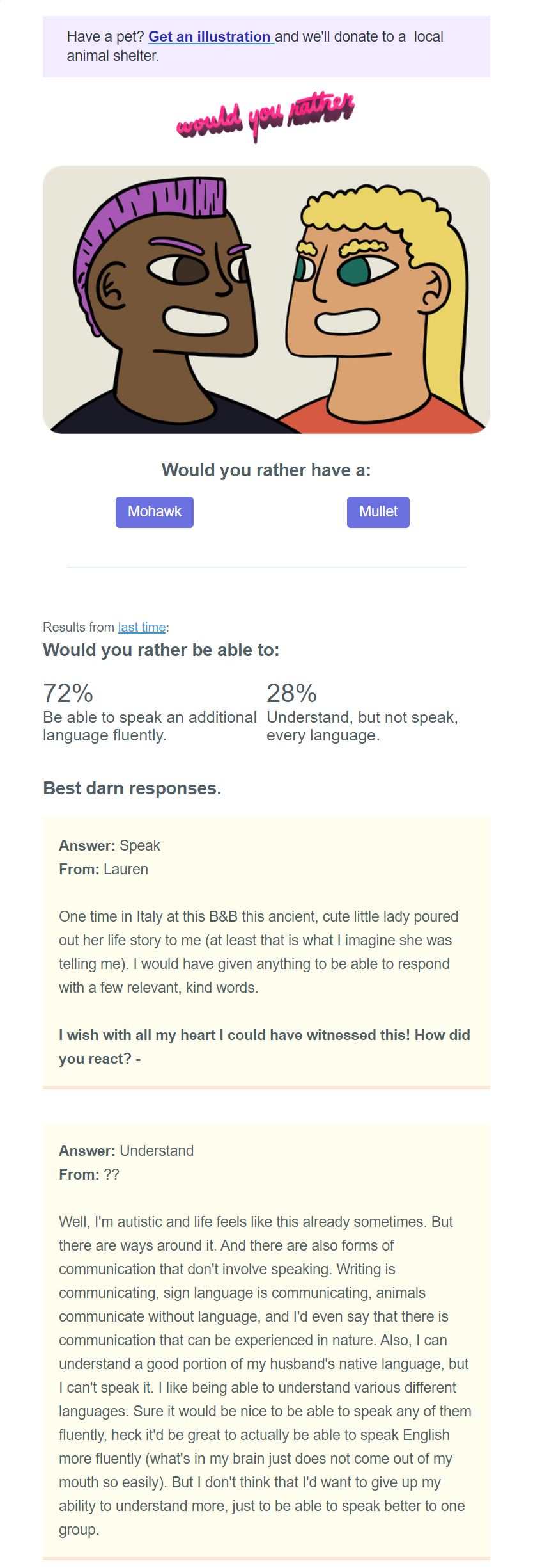
Matt Helbig: Okay, let’s jump into this first email. I think this is a really cool way to display this information.
Example 1: Turning a Newsletter into a Low-Friction Survey
https://www.youtube.com/embed/szzDTSQ8KHk
Did you design this one with AWeber?
Chris Vasquez: I did. And I used to have a template that I had hand-coded, and it had much more bespoke data visualization in it. But it was just getting to be too much for me to manage every week to do a different database and manage everything so that it worked just the way I wanted.
So I'm using - nobody gets super furious with me for this - a drag and drop template to build out this email. I've made a couple of components for things like, what does my hero section with the options look like and what do individual comments look like?
And then my footer as well. I'm hoping that you'll roast this a little bit, Matt, because I'd love some feedback. I was really kind of intentional about building it this way because of some of what we've learned about surveying through our work with the much larger lists that we email through AWeber.
Matt Helbig: I’m a big fan. I feel like this is a nice step up from just a plain text email. It kind of sits just a little bit ahead versus a fully-designed template. So, are you ready for the roast?
Chris Vasquez: Yeah, go for it.
Matt Helbig: I’m just kidding. No, I think this is a great template. I think the only thing that would be cool is maybe some little hover effects, that could be a nice touch.
I'm always a fan of animation. I think it could be a cool way to maybe display this information a little bit clearer with a bar graph or something dynamic. That could be like a fun little challenge to maybe do, keep people a little bit engaged, but I think these cards are a nice, cool way to do that.
So, is there anything that you've learned from this template or has it kind of stayed the same since you started doing it?
Chris Vasquez: One of the biggest things I learned and something that I think other folks could adopt when they're sharing UGC like this because these comments are user-generated content, it's the community leaving their answer and why they left it.
I found that people got really stoked when I would include their comment and a link to their Twitter profile or Instagram. So you'll see there's an opportunity in the survey that people click through to leave a contact, either Instagram handle or a Twitter handle or something, and folks get really excited.
They'll oftentimes send me direct replies when they are featured in the newsletter. So I think it's just kind of a neat way to make your audience feel like your email isn't just something that they're receiving. It's something that they're a part of. It's not so much a visual design thing, as much as it is an experience design to give your community a piece of your newsletter or your email.
Matt Helbig: So let’s talk about how this works. If I hit mullet...
The One-Click Survey Trick That Boosts Completion Rates
Chris Vasquez: Think of it this way. It's essentially a simple survey, those options. And we usually do just an either-or scenario, but in a couple of cases, we've done multiples around the holidays.
We ask people who they'd rather meet, and it was Santa or the Belsnickel or the Yule log. There were just a bunch of things. And these buttons are the first question in the survey. So when you click through, you'll see that there's a URL parameter that captures people's choice and that's stored in the survey.
And then we ask for a free response piece of feedback. And we just ask why did you make this choice? And we're able to see all of that through the survey and that's how we get our performance numbers, through our survey, and also where we grab our feedback from people. And I could not recommend that approach to surveying heavily enough.
Almost every survey email I see from companies is somebody sending me an email, asking me to take a survey. And it's like, there's a button to take the survey, and that's easy to do, so I get why a lot of people do it. But if you have a survey tool where you can link to the first answer in a question and pre-fill it in a survey, I would really recommend that you do that.
We do that as kind of our standard practice at AWeber. And we've tested that a number of times, both with our normal surveys, as well as how did you feel about this email survey widget at the bottom of every email we send.
We've seen higher participation rates and higher completion rates. So more people start the survey than just the button, and more people complete the survey for us.
I think it's because the initial friction of making that first choice of clicking a button is so much lighter than deciding like, okay, I'm going to take this survey, which could be two minutes or five minutes or 15 minutes. So you're giving people an easier pathway into answering your survey for you.
And then at the point that they've already made that answer, they're already at least a little bit invested in the survey, and we found there'll be more likely to complete it, which is super cool. More feedback from more people.
Matt Helbig: Yeah. I like the simplicity of it. I think you're right. Just pressing a button is the right way to go and ask any additional questions.
That's kind of why I am hesitant to always recommend people trying to bring survey questions into an email and using some interactive form. I think that's another cool way to maybe stand out in the inbox and maybe there's some additional information on that if you test it, but I think a follow-up page is good as well, just to be able to capture that stuff right away.
Do you have any thoughts on that?
Chris Vasquez: I tend to agree with you there. The full survey in an email is super cool conceptually, but it's kind of hard to do. I wonder if it would be as effective. I love testing. We split-test a ton, and I test a ton in Would You Rather.
I'd be really interested to know, are people more likely to take the survey if they can see all of it laid out in front of them, or would they still be more likely if you can get them to just answer one question first? I don't know the answer to that, but I'd really love to.
Matt Helbig: You had some other survey kind of quiz emails that we could also talk through that can inspire some other email marketers.
More Survey Email Examples: NPS, Quizzes, and Interactive Formats
So this one is from Tailor Brands. It's a pretty short and sweet email, which I tend to like for surveys, just a pretty dedicated email with a catchy subject line, triggered maybe post-purchase or depending on maybe some action to get people to fill out a survey, to learn a little bit about their audience.

Chris Vasquez: When I saw this, I'm just trying to look for an example of what I think of as a traditional survey email done really well. And I thought this did a traditional survey email really well. They're really clear about the fact that they care about your opinion in that headline.
They're also really clear about the fact that they value it so much, that they want to give you something in return for sharing it, which I think is really important. If you have some sort of benefit you can give back to your audience for taking the time to share their opinion, I think that's good.
And it will generally increase your participation. Visually, I thought it looked really fun and striking like the hero imagery is pretty rad without being overwhelming. I share this to say that I think this is a really great example of one of these survey emails, but I think it can be even better if you include that first question in the email.
Matt Helbig: I think you're right. It could be hard depending on exactly what that first question is. But I do think some of the emails that we've seen where that first one is just a very simple star rating or up or down them or something like that. It definitely catches your responses.
And once people are on that landing page, they might be more interested in answering a few more questions. But I think you're right, that the simplicity of this one stands out.
Chris Vasquez: I know there are strong opinions on either side of this, but I think that most surveys could probably stand to be a little bit more fun.
And interesting because I think sometimes when it comes to email and when it comes to surveys, we have this idea that people stop being people when they're reading our emails or participating in surveys. They become like commerce bots that we're trying to get to perform the act of commerce or survey participant bots who are trying to get to complete a survey when that's not the case.
There's still people who just happened to be checking their email or taking a survey and people like being entertained. They like having to think and play small games and have fun. I think that there are some opportunities for us to increase our engagement with our users through surveys, by just making the entry point to it a little bit more fun, like asking them something unexpected, say like, I care about your opinion.
And then the first thing that you ask them about their opinion is something unexpected, like a simple either-or choice or something like that.
Matt Helbig: Yeah, I think to that point, I think it shows that email is more of a relationship and in a relationship, you might check in from time to time and try to get some feedback on, is our communication relevant, were you happy with that product?
So I think anything fun that you can bring in and make it a little less formal, less that you're just a number, try and optimize that they're trying to get like a sales goal. And I think with this messaging too, it's pretty clear that there's an incentive for you to fill out the form and that they're interested in learning more, to better serve you as a customer. So that's cool to see.
This next one is pretty simple, kind of a how satisfied were you email from Dropbox. And I like that they are sort of having the score laid out. Like you said, I'm really just letting you pick a specific answer right away, rather than putting you on another landing page.
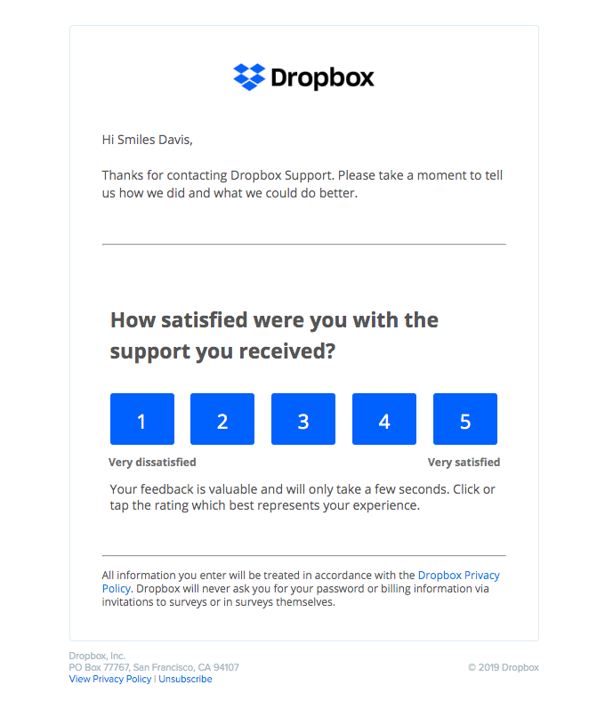
Chris Vasquez: I was looking for NPS (Net Promoter Score) and satisfaction emails. And this is an area where, like you mentioned, this is the perfect opportunity for you to include your first question in the email. And I think Dropbox did a really good job at it here. The email has one goal. It's trying to get you to rate your experience and there's not other stuff to confuse or distract you.
They have a slimmed-down five-point scale. So they don't have a 10-point scale like NPS normally is where you have to worry about how it behaves on mobile screens. And it turns into this really long stack list. It's just something and there are these big buttons that you can interact with, without having to worry about what you're actually selecting.
The coolest thing about this is, again, and I'll speak to NPS specifically, when you ask the first question of an NPS score of how likely are you to recommend us to a friend or in this case, how satisfied were you with the support you received.
That first score is somewhat helpful as a benchmark or to look at over time, but when you click through this in surveys like this, it normally brings you to the second question, which is a free-response input where they ask you, well, why did you select that text? Because that's something that I can actually try and fix.
Matt Helbig: In building these in the past, usually you're trying to tailor each of these numbers to a specific landing page and hopefully provide some additional support or something like that. Hopefully, people are looking at this stuff.
I feel I've seen people set these up because they think they should have them, but rarely look at their responses. So, I think it's nice, especially if you can actually have a feedback loop with these types of customers and either connect them with a customer support person or even if it’s a 5-star rating, I'm passing that information back to our team, like I'm so excited to share that or something.
Chris Vasquez: Yeah. That's a great idea. When people fill out NPS at AWeber, it adds a comment to a Slack channel. So we see them come in, in real-time and can be like, Oh wow, that's cool. I think I can fix that. Or, we don't do enough of what you just suggested, but that's a really good idea to look at the people who are all about your stuff.
And just take a moment to thank them for caring. That's a great reminder, Matt.
Matt Helbig: That's what I'm here for.
I looked at this one in a previous Feedback Friday. Me and Mike broke this one down, but it's really cool to revisit because I have never seen anything like this. I think Harry's killed it with this one, which is a whole survey in an email, really simplistic.

Chris Vasquez: I was blown away by this. Everything about this works for me, at least in the desktop view, like it fits the character of the brand. As far as I know, it looks beautiful. I love the illustrations and the palette that they chose, the execution of the quiz, like the different states of the answers are just, it feels like a web app in the best possible way.
Matt Helbig: I think it's one of the best uses of interactive email that I've seen. It's not too complicated to replicate, but there are multiple end states where the survey, if it's mostly green, will show you the green answer. If it's mixed results, it'll show you a generic answer.
I think one of my favorite things is if you scroll down to the bottom, if you haven't filled out the quiz, it will prompt you here as well to fill out the quiz first. I think there's just a lot of different cases within this and the fallback is a pretty nice marketing email.
So definitely take a look at this one. Maybe it’ll inspire something on your brand, but there's a lot of different lessons to learn with this one outside of it being a survey. I guess if maybe there's a way to improve, there might be a cool, fun way to capture this or share your results potentially depending on the brand that we're doing.
But I think this is a cool way to show this information and hopefully, maybe on some of the AMP stuff that's coming out, we see some more interactive stuff.
Chris Vasquez: Yeah. Actually, Matt, when you finished filling it out, can you show me that end state again?
Matt Helbig: Sure. We can get a rich and exotic feel.
Chris Vasquez: Yeah, I like that. My suggestion, they've already done, which is categorize what that says about you and that you like rich and exotic. I think that's pretty cool. Anything that can make you feel special and good about yourself as part of the choice like that, I think that's a win.
Matt Helbig: Yeah. And I like how they sort of color code these answers as well. I think it's just a really great email example. Lots of cool things to learn from this one.
Road Scholar is another cool, interesting brand that has really stepped up their email game. I think we met them at a Litmus Live conference and we did a little live feedback.
They really impressed me with all the different emails that they've been sending. They have really great, polished graphics. They're using a lot of live text whenever possible. So I think their email communications have really been on point. So what stood out to you on this one?
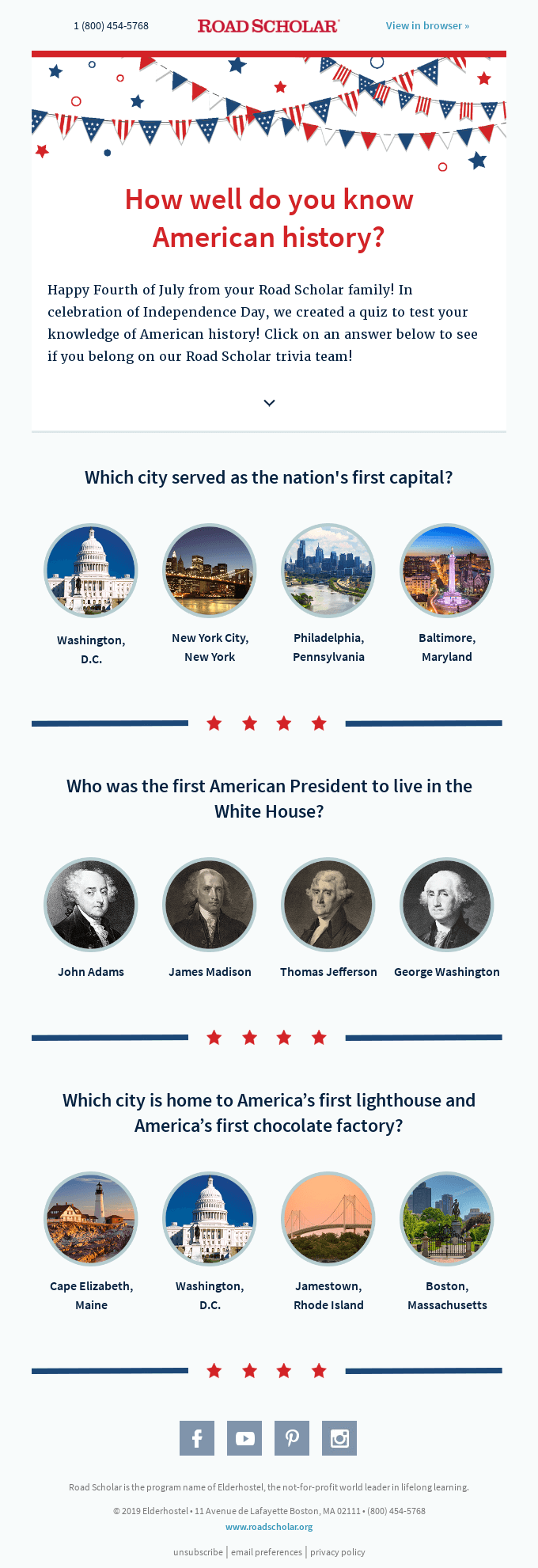
Chris Vasquez: I was worried about it feeling really weird on small screens, but it doesn't. It reflows and basically drops the last item in the list to directly below and centered.
Matt Helbig: Yeah. I think for me, this one is pretty cool as a way to add something like this to an email. I'm not sure if it maybe deserves its whole dedicated email. It's still pretty cool, though. I liked the hover effects.
I almost wish that would go onto the images as well. Just to show that it's a little bit more interactive, but this is a fun little way. QZ is another one that they sort of do a survey and they try to give you the right answers at the bottom of the page or something.
This is a cool way to maybe do this as a brand, even be like, what's our top-selling item for this month or something like that, which is bringing in some different information.
I think these all go to the same page. So I think this is a fun way to get someone to a blog post to see if they were right or a way to interact with content.
Chris Vasquez: It looks cool too. It has just the right amount of cheese. I say that as the highest compliment. It feels so 4th of July, and I think that they executed that really well.
It almost feels like a school event or a competitive quiz or something like that, that you would do in elementary school. Which again, I say it as high praise because it elicits all those like fun memories of being a kid and learning, that at least I have.
Matt Helbig: If they could figure out the whole interactive piece or try to do something with AMP, picking the right solution, maybe has confetti or something interactive.
And maybe these links do link out a little differently, depending on if you get the right answer or not. But hopefully, if you've got the right answer, maybe they could make that landing page do something cool. If you landed on it, just to make that feel a little bit special.
Chris Vasquez: In talking about AMP, it's no secret that we're really hyped on AMP. I personally believe a lot in its future to improve the email experience and improve email or people's lives by not forcing them to go to the web where they don't need to go to websites. But one neat, interesting thing that we've been finding is people just don't have an expectation that this sort of stuff, that AMP-enabled stuff can happen in email.
AMP and Interactive Surveys: Set Expectations (and Add Cues)
We test a lot of AMPpolls in things in our blog newsletter. And oftentimes people either won't interact with a survey or something. One of our assumptions is that they don't want to deal with the redirect. Or they won't interact with the interactive stuff that happens as a result of them interacting with the AMP element because it's just not clear that anything is even happening.
‘Cause people aren't used to AMP in email yet. I think folks who are experimenting with AMP, at least right now, you might want to explicitly call out in your email that something is interactive because that's not the expectation that most people have yet.
Matt Helbig: Whatever tooltips you can provide, even if they had maybe some pulsing CSS animation, either on hover or just in a sequence to show you these over time, what might be an interesting or cool way. But I think maybe to your point too, that either people don't know that it's interactive or maybe your list doesn't have a large audience that may be using an email client that may support that.
So I know we're email people, we talk about cool stuff all the time, but I think something like this, can get the job done with some smart redirects or something like that. So I think those opportunities are there for people that want to try that. I don't know if it's worth spending that much time to really do that if you're getting the same sort of result at the end of the day.
Skillshare, we're always a big fan of their emails. I love all these illustrations up here. It almost seems like your style of illustration.

Chris Vasquez: Definitely. When I was looking at the email, I was like, Oh man. I don't know if you feel this way, but oftentimes the people that I most admire and most want to work with, I'll see something from them and It'd be like, Oh, I wish I had done that! I feel like that is sort of a healthy sense of competition, but that's what I felt when I saw this email.
The style is just cool. I really like the new Skillshare branding as well, but the style of it is really cool. I like the interactivity of the actual quiz.
They do something similar to the Harry's example, where based on your answers to each of the questions, they link you to a specific results page. I don't necessarily think this is as elegant an execution as Harry's because the Harry's email had such a great unified experience.
It felt, again, like an app and this feels a little bit more like a normal quiz or a Buzzfeed quiz or something, which is great for what it does. It's just not as stylistically cohesive as the Harry's one. That being said, though, I do think it fits the Skillshare brand that you can learn all sorts of things on Skillshare. And I think it's well done.
Matt Helbig: I think you're right that in general, this is a cool way to display that and the see what your results way, individual link. I think that's a pretty nice CTA copy-wise, but maybe they could even make it a little bit more individualized. And to your point, I wonder too if they need some sort of arrow to let you know that these are clickable if they are going to be interacting.
Chris Vasquez: That is probably the best point about this is that they do look a little bit just like grids of product grids that you would see in a normal email.
Matt Helbig: Overall, I'm a big fan of this. We did an interview with Skillshare, with their teams. So definitely give that one a read. With their new branding, they're bringing a lot of cool stuff to email and using that channel really effectively to get people into their products.
Chris Vasquez: Yeah, it looks super fun. Like I said, jealous.
Matt Helbig: This last one is from Code Camp. I did not register my kid at Code Camp. I don't know exactly who submitted this email, but I don't know who Isabella is. This is a fun way to show results because I think we've seen a bunch of emails of getting actual inputs into surveys, but this is a nice little one to maybe show your results from a survey.

Chris Vasquez: I agree with you. I think it just fit the character of the school or program so much. And I love that they, presuming, these are actual survey results, just took the survey results and dropped in a really positive result as social proof. I thought it was really smart, really well done, and likely will land pretty well with parents of elementary school or middle school kids, whoever they're targeting.
I have a daughter who's 12 and, I'll admit, this landed well for me, because I'm always thinking of, what are really fun ways for her to learn something that's also going to set her up for success. I'm talking like a parent now in the future. But also I love and really believe in the power of technology to do good.
So it really spoke well to me. And if there are other people out there like me who have kids and are evaluating educational programs like this, I feel like it'd be effective, ‘cause I feel like it's fun. This girl and my daughter would be excited.
Matt Helbig: And I think this is why I'm such a big fan of your virtual pet emails is because it really takes your response and triggers another email or includes your response in the next send. I think that level of personalization is really great to see.
Maybe this is a nice way to remind people if someone's going to take the time to do your survey and you capture that information and you have their email address, use that, those results to in the next email send. Like, hey, you said that you really wanted more information about this product. Here you go. Or something. Fire something off to let them know that we're actually listening to you, that the survey that you filled out is making your experience a little bit better or something.
Maybe it's not something that you send them right away. Maybe you wait a month and say like, Hey, are you still interested in learning more about this based on the survey results? So I think there's a cool way to use that data if you have it and make sure that if someone's going to fill out a survey and take the time that you're actually using those responses.
Chris Vasquez: That is a very good point.
And I actually think it gets to a broader point about automation in general. I don't want to lay this on people, but I feel like a lot of the time as email marketers were trying to hide automation. We're trying to slip in calls to action and interactions that we can use to turn into triggers or to tag people or whatever.
I wonder if we'd be more successful if we were just more open about the fact that like, Hey, click one of these links so we can make sure that you get content you actually want. And then to your point in future emails, we could say, Hey, because you clicked that link, we're sending you this, make the person feel like they have more agency.
Matt Helbig: There's a mix with things like machine learning becoming a bigger thing with an email as well. I think with Really Good Emails where you try to be as transparent as possible that yes, we're tracking you. If you allow us to track you then we're going to try to provide the best experience with the information that we're collecting.
And obviously, we're not trying to collect more information than we need, and we are not trying to be too creepy. But to your point, I like being transparent. Whenever you can be, maybe you don't show every single thing that you know about a person. It might freak them out.
But if there's like a way to sort of nudge them in the right direction to say, yes, we're listening. We know that you like this set of products or we know that you answered this way on a survey, let us serve you a little bit better.
Thank you so much for walking through these surveys. Where can everyone subscribe to Would You Rather?
Chris Vasquez: You can go to www.wouldyourather.fun to sign up.
And I say weekly-ish on those pages ‘cause sometimes I'll go a week or a few, without sending one out, but I'm always trying to get better. And the more you email me and tell me that you want one, the more I'll do them. I almost have my next generation of inbox pet ready to go. It's gonna be cool. It was a lot of fun. I love it.

Matt Helbig: I've been thinking about my inbox pet a lot recently, like, what has it been up to, is it doing all right? I haven't fed it in a while. I hope it's doing okay. Maybe that's a thing that you'll have to add. You have to click a link each week to make sure that you're taking care of it. Otherwise you’ll send email that it passed away or something.
Chris Vasquez: I'm going to do that, man. I am going to get that in. This one has a lot more animation.
Matt Helbig: Oh, very nice. I look forward to that. Thanks so much for joining. I loved looking at these survey emails. We'll have to send some more surveys, talk to these customers a little bit more.
Thanks again for joining and have a great Friday.
Chris Vasquez: Thanks, you too.
Matt Helbig: See ya.
Subscribe to our newsletter.
Dive into the world of unmatched copywriting mastery, handpicked articles, and insider tips & tricks that elevate your writing game. Subscribe now for your weekly dose of inspiration and expertise.