
Incorporating custom illustrations and digestible onboarding content with YNAB
YNAB (You Need a Budget) is a personal budgeting software helping people take control of their finances.

This FF episode was sponsored by emfluence. Get paired with a marketer to see how your strategy will work in the emfluence Marketing Platform.
📋 TL;DR key takeaways from this episode:
1. Using simple, clear text can help you focus on the content and make your emails easy to scan. You can also incorporate colored text to make readers pay attention to specific points in the email.
2. Custom illustrations can make your email feel personal and engaging.
3. Include one clear, direct CTA to steer your audience in the right direction to your product or an onboarding demonstration.
Matthew Smith: Hey, happy Friday, everybody. It's Feedback Friday. Glad to be here with you, Matt Helbig. What's up, my man?
Matt Helbig: I'm excited to be back again, another Friday, another Feedback Friday.
Why YNAB’s onboarding emails work
Matthew Smith: Awesome. Awesome. Well, today, I've got queued up YNAB, which is a bizarre name for a brand, but it sticks. It is noticeable, and it means You Need A Budget.
https://www.youtube.com/embed/OCIAfj3G91k
I've signed up for YNAB before, but I am now cohabitating with my girlfriend, and we need a budget. WNAB. I signed up for these folks again, and lo and behold, they have a fantastic onboarding series. So it's a 14-day trial. And they started to pump me full of these how to think about budgeting, how to think about YNAB emails.
We're only going to go through three today, but they are fantastic. You should sign up for YNAB just for the onboarding series, if nothing else. It's pretty nice. Great content. Great illustrations. These illustrations just really come through. This is not in order. It doesn't do service unless you see the entire thing, but they do an excellent job making this content very easy to read.

https://reallygoodemails.com/emails/your-budget-misses-you
Simple content and clear structure
Easy to scan and follow through with straightforward text. CTA is like a looksie now, and this connection to the team, getting to know Kelly, who's a teacher at YNAB. So this is one example, very simple, right? Like, but look at how easy this is on the eyes and how consistent the typography is, et cetera.
Also, this lovely little hand-drawn signature, which I think adds a lot. But look at this, they're able using this templating sort of arrangement, whether it's a design system, an email design system, or if it is something a little more akin to just custom templates, they do an excellent job.
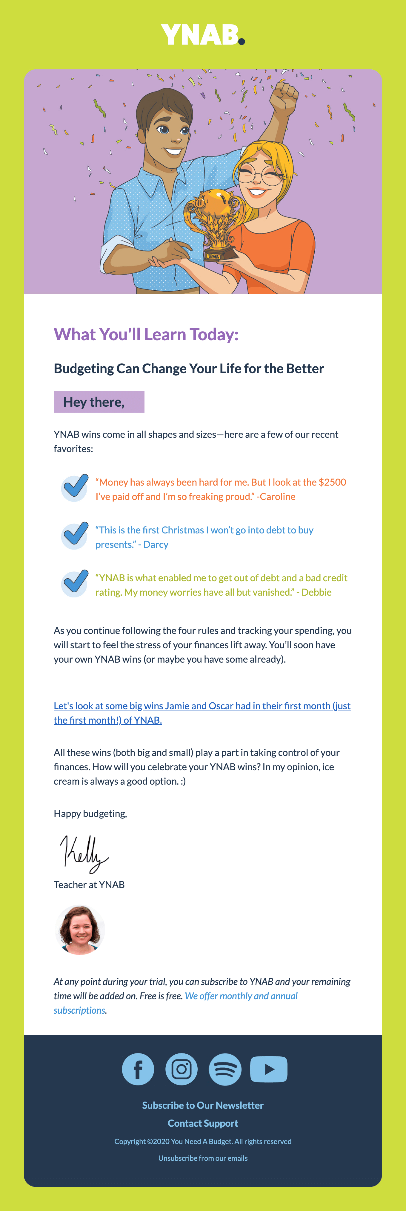
https://reallygoodemails.com/emails/two-huge-wins-for-jamie-and-oscar
Custom illustrations and brand personality
Look at the YNAB logo changes. The background color changes. The illustration style is the same. So these are custom illustrations that they've had done. You can even see this tiny little YNAB trophy. It's got that there. That's cute. It feels like something fantastic. So they tell me, you know, what am I going to learn today?
All right. Budgeting can change my life for the better. All right. Getting my attention. This is a unique sort of call out. I guess some people could confuse that as a button, but I think because they don't round the corners, so it is like, here's where we want your attention to be. Hey there. Okay.
YNAB wins come in all shapes and sizes. Sweet. And then, they use different colored text, which is unique to show this off. Usually, I wouldn't be a fan of that, but because it's so simple, otherwise, because they keep things so simple. And because the email itself is very colorful, they get me to pay attention to these checkmarks.
The color does a job. Some people will choose a color just because it's, "Oh, neat. I like the color." No, don't do that. The color here is saying, look at me now, look at me, now look at me. They do blue here, and this is blue for links, but I think that because of the lack of underline, it's called out as unique and different, and I think it works. So I'm pretty impressed. I like how this comes together. I think this is pretty tight. The mobile styles are really clean, easy to scan, easy to read. Let's look at this last one.
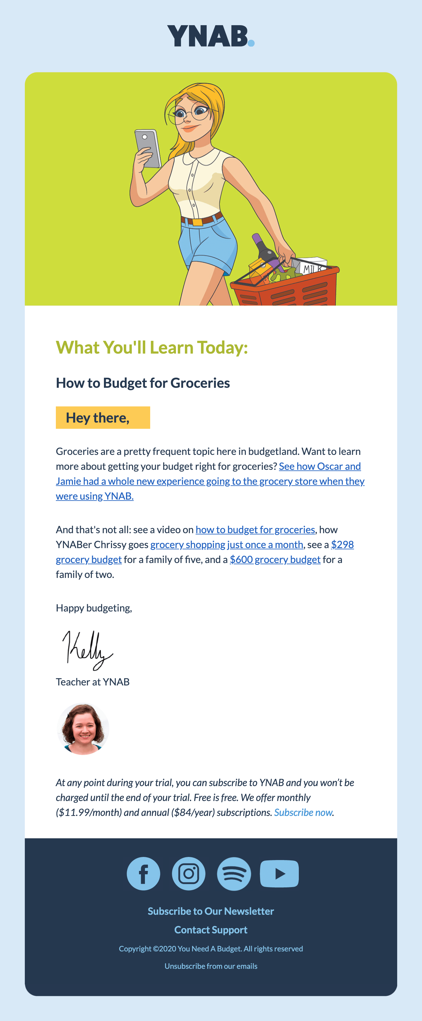
https://reallygoodemails.com/emails/lets-talk-grocery-budget
They change it up again. It's the same kind of illustrations. What you'll learn today. They keep them short too. This is not like long-form email stuff, but I can go and read another story about how Oscar and Jamie are doing grocery shopping, where they're using YNAB.
I can see a video. Okay, cool. I can dive in on these other sections, and I'm feeling guided by Kelly, which feels great. Just a little bit of product onboarding, to say, Hey, at any time, I can jump into paying for the service. I think they've done a neat job of moving between these flexible templates and displaying information in an extremely digestible way.
There's not much to these emails, and so it focuses on content, but think about like what these emails would look like without the illustrations, they'd be pretty dull. They'd still do a job, but they are more engaging with these colors and illustration changes. And then with this signature and the face. That all adds up to create a warm series the entire time. I was impressed.
You hear me talk about design golf all the time. They do an excellent job of keeping the email simple. So you've got one heading, one subheading that same subheading, but now with a yellow background and then one body text, that's just all the same, and that's consistent throughout. The only thing that they change up here is colors with the list elements.
But again, it works because everything else is different throughout. The only thing that I might do to change these, and I'm curious what you'd say, Matt, but is I think that maybe they could do a CTA at the end. That would be like, are you ready to start your trial? Let's get going. They make these emails about text and guessing maybe they've tried that.
So those are some things that I think about, and then, of course, they're showing off their social down here, and we all know how I feel about wanting to see social, which of course we need to do on our email if I'm going to be such a hardass about that.
So, anyway, what do you think, Matt, you think, think these are working?
Design choices that improve readability
Matt Helbig: There's a lot of different email trends going on. Those rounded corners. This card design is one of my favorite ways to read an email. I think it adds an extra touch and makes it feel like a engaging. The "Hey there" across all of these is nice.
Checkmarks, layout, and scannable design
I wonder if they meant to say your name, like, "Hey Matthew," or something, and maybe this is a fallback? It seems set up to highlight your name. So I'm interested in that. I think this one is probably my favorite example with the checkmarks. We love to see checkmarks. It lets you scan information when there are many testimonials or things that you need to get done.
Then I think with the doubles, the signature and the photo on every email is maybe a little too much. I think perhaps the first couple of ones, but I do agree with your guiding principle. So perhaps that's something that they've tested. Sometimes we only see one or the other, but having both in place, maybe that makes it feel a little bit more personal and guides you along this journey.
Matthew Smith: Right. Right. What would you change or what you think might be something that they could test?
Matt Helbig: I think I do agree with your CTA example. These look similar to some other educational apps that I've gotten, and they have that clear CTA of the one action they want you to do next. I think these onboarding emails are pretty nice, but maybe that call to action could be a little more direct. Get back into the product or start setting your budget or something like that is a little bit more of a clear direction.
Sometimes, if you're going to tell me someone's name, like, can I get in contact with them? How can they help me if I'm struggling with the product? I know they have that contact support link in the footer, which is nice, but maybe there's like some other email, where are if you are having trouble getting started or something, how can we help you?
Final thoughts on the YNAB email series
Matthew Smith: Good ideas as always. Well, thank you, YNAB. Good work. I appreciate it. If you're interested or anybody knows anybody at YNAB and would like to tell us more about how these emails perform, we would love to know. We'd love to share that. We'd love to get more people exposed to YNAB. It's a cool brand. Cool stuff as usual. Leave comments in the YouTube thread, subscribe to our YouTube channel so that we can continue to provide you with updated good content, even really good content. We'll be back next Friday.
Matt Helbig: Sounds good. See ya.
Matthew Smith: Awesome. Bye-bye.
Subscribe to our newsletter.
Dive into the world of unmatched copywriting mastery, handpicked articles, and insider tips & tricks that elevate your writing game. Subscribe now for your weekly dose of inspiration and expertise.