

Images in Email — Creating BFFs
So, if a picture is worth a thousand words, why does Instagram have captions?! Seriously.

So, if a picture is worth a thousand words, why does Instagram have captions?! Seriously.
Sure, images can make you feel all the feels. They can serve as evidence (or blackmail). They can make you regret ever teaching a kid how to use your smartphone and having to delete hundreds of useless pictures… But they aren’t language. And that’s okay!
We’re not going to bore you with a philosophical essay on the way your brain processes images and digests the written word. And we aren’t going to offer you a course on photography. Nah. We just want to talk about how words and images work in tandem to create a narrative. And, of course, how that relates to emails — so that you can make sure your images and words make the best possible impression! 🖼
Opening an email isn’t like standing in front of a piece of art at the MOMA and slowly letting it sink in. Email, on average, gets between three and eight seconds of view time and is (usually) not accompanied by a glass of champaign and a friend. Three seconds is about all the time a reader will take to decide if they’re compelled enough to stay and read or to click on to the next one. So, a catchy image is the hook, but it’s also much more than that.
When an image is used correctly in an email, it’s the focal point. It sets the mood but also creates curiosity. It highlights a common connection to the viewer. And, most of all, it supports the message and the call to action.
Supporting Images with Text

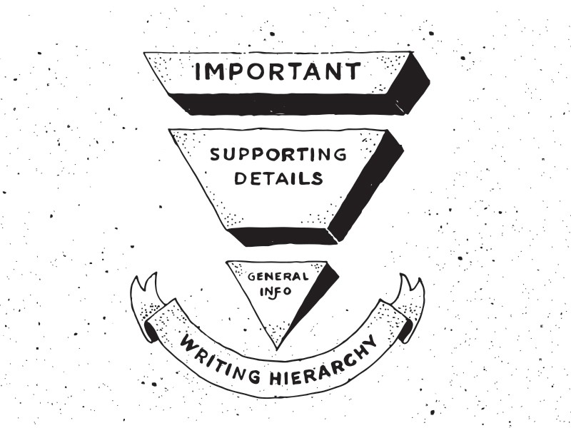
Inverted Pyramid by 𝔐𝔞𝔤𝔞𝔡𝔢𝔱𝔥
Basic design principles teach you about the inverted pyramid (see above). With the most important information at the top, engaged viewers will learn more as they continue to read — thus clarifying and defining the experience in a descending order of importance.
In journalism, the salient information is called the lede. It contains the 4 Ws (who, what, where, when) followed by supporting paragraphs, which are typically easy to scan. Similarly, in design, the items with the most visual weight are the lede and create dominance and focal points.
Let’s take an email from Vimeo as an example:

Despite the logo as the first element on this email, did your eye go straight to the black space and then to the man holding the flashlight? Through the image, we see that Vimeo is positioning itself as a tool which unveils a world of possibilities in video. That’s the visual hook, but there’s no context without supporting text.
Here are a slew of examples of great looking emails to get your heart beating and push the point even further:

On the other hand, an image can help support the text (not the other way around as we have been describing). This still falls in our inverted pyramid scheme, where the most important elements are followed by supporting elements. In the case of a demonstration or how-to series of images, you need to give the reason first before showing off the illustration.

The Beauty of Live Images
Who says an image has to be a dead thing? We live in the future now. Our images can move! They can even tell stories with live updates.
When you give your image timely relevance, it gets way more compelling to your reader. They’re like, “whoa! How did they know?!” They might even open the email again to see what’s changed. With the magic of modern technology, emails can deliver a targeted image based on when someone opens that email — no more falling behind the times.

Shameless plug for emails we’ve created that update when you open them. Dig them out of your archive and look again!
While our examples above use text inside the image to show timely relevance, images can also change based on location, time of day, inventory, or any other kind of behavior that your recipient has made between the time of delivery and opening the email.
The Magic of Motion — GIFs & Cinemagraphs
Since we’re all fighting for attention in the inbox, one more trick is to give a visual cue with movement. Our lizard brains are trained to track things in motion, and designers (and banner advertisers) have been using this tactic for ages.
We love this example from Venmo — the bright colors are inviting and fun, definitely eye-catching:

Animations are also a great opportunity to quickly communicate context for your email while livening things up. The image in this email augments the content (about anonymity) while catching attention through movement.

Creating a personalized GIF will also create a stronger bond with the viewer. For example, this recent example from Airbnb points to the exact location of the Superhost who received it:

Airbnb has some next level gif game
The Pitfalls of Image-Heavy Emails
Just because an image can do wonders in your email doesn’t mean that it’s always the right approach. It’s like any tool — used incorrectly can hurt the effectiveness of your email. We’ve long argued for the importance of live-text in images (get ready for a rant below), because a lot can go wrong when an email is 100% image. Here are a few common scenarios where image-reliant emails fall short:
Your image file-size is too big.
In places where internet connections are fast, we generally don’t consider the impact that file size can have on download time for people off WiFi. But so many of us are reading emails on the go, and huge files can take eons to load when we’re relying on cell networks rather than WiFi.
Your image dimension size is too small.
An image can look great on a desktop when it’s big and beautiful and sprawling, but the details become indistinguishable on a much smaller phone (looking at you iPhone SE).
Your image focus is too broad.
National Geographic photographer, Jim Richardson, explains that taking a photo of a waterfall is easy, but zooming in on the pine tree at the base of the falls is a much more captivating scene. There’s just one thing to take in, not the entire vista. Find the story and make simplicity key.
Your image count is too high.
This happens when your team can’t decide on the image or what to cut out, so they just keep filling it up with what they have been told to include. We’ve seen too many emails image-stuff, which also increases the load time as each image request is triggered upon opening.
Why All-Image Emails Are The Worst
The WORST. Seriously. All-image emails and text-in image emails are on our hit list, even if we get why/how they happen.
We’ve probably all done it at some point in our email careers. You take the photoshop image that your designer gave you, slice it up in a few chunks, and then add links to those images and call it good.
Here are all the reasons why doing that is the wrong way to do email (in alphabetical order because they’re all bad):
Accessibility: all-image emails rarely have descriptive alt-text enough for visually impaired individuals to grasp what the email is about.
Clarity of text in images: JPGs aren’t good at rendering text. It doesn’t handle sharp changes in contrast. That’s simply how the format was designed. Likely better usage would be a PNG-8, but even then, you’re looking at a lossless format. Also, when an image scales for different devices, it can become pixelated or be unreadable if it has small text.
Data: consider how much images bloat data usage — as an HTML request is made for every image in the email. This means that image loading lags on poor connections, or doesn’t appear at all. Additionally, images mean more memory on the CPU, which contributes to slow responsiveness on devices.
Images turned off: not that many clients still make this the default, but for unknown senders it’s the status quo. If the email is all-image, nothing will show except for the alt-text. This is especially bad when you have CTA buttons that can’t be seen or everything that makes the buttons relevant disappears.
Language: by having text in images, recipients can’t use a text translator to find out what the email is about when it isn’t sent in their native language.
Search: by having all-image emails, someone who is looking for a specific keyword in your email can’t find it. So there goes your “useful” how-to instructions for new users!
Spam Trap: this may not be as common as it used to be (because clients are smarter than they used to be), but email clients still like to scan the content of an email. If the IP trust is low from a sender, it may automatically be sent to a spam folder because the client can’t determine what the email is about.
Stacked images: not all clients or devices stack images correctly — especially if the coding is off. So, if you are doing a lot of slicing, the images may come in weird places.

Basically, images are awesome. They do a lot to make emails really good. But only when used responsibly! And well. If you want to know more about why meaning in an image is more important than bright and shiny objects, read this article by Stephen Johnson. In the meantime, just don’t send all-image emails and be thoughtful about how you pair your images and text. The world will thank you for sending better emails as a result.
We’re the epicenter of the email earthquake, but in a good and happy-shakey kind of way.
Thanks to Cate Blouke.
Articles to whet your whistle


Subscribe to our newsletter.
Dive into the world of unmatched copywriting mastery, handpicked articles, and insider tips & tricks that elevate your writing game. Subscribe now for your weekly dose of inspiration and expertise.