So we're going to talk about why humor affects us and where it works in your brain, both cognitively and emotionally. We will discuss where it works best in your marketing program, specifically in your emails. We will look at ways you can pretend to be funnier, even if you're not. Some people are like, you can't learn to be funny. While I have met people for whom that is true, most people can learn to be at least a little bit funny or fake it on paper or an email.
Why does humor affect us the way that it does? Why do we see so many funny emails and brands trying to be funny? And why do we feel this pull to do it? And the fear of doing it wrong?
Because making jokes is vulnerable. I'm feeling that way right now. Luckily they gave me this giant sweatshirt to hide inside. I'm also very filled with mac and cheese. And like I said, whiskey.
We are vulnerable for a good reason. We've made jokes in the past and said something wrong, and people have just met us with like silence or crickets, which sucks.
Work is serious for most of us. If we don't work for ourselves, we answer to someone, and they are very concerned with not coming off as too goofy or too jokey because there is revenue tied to the email. All of these are great reasons.
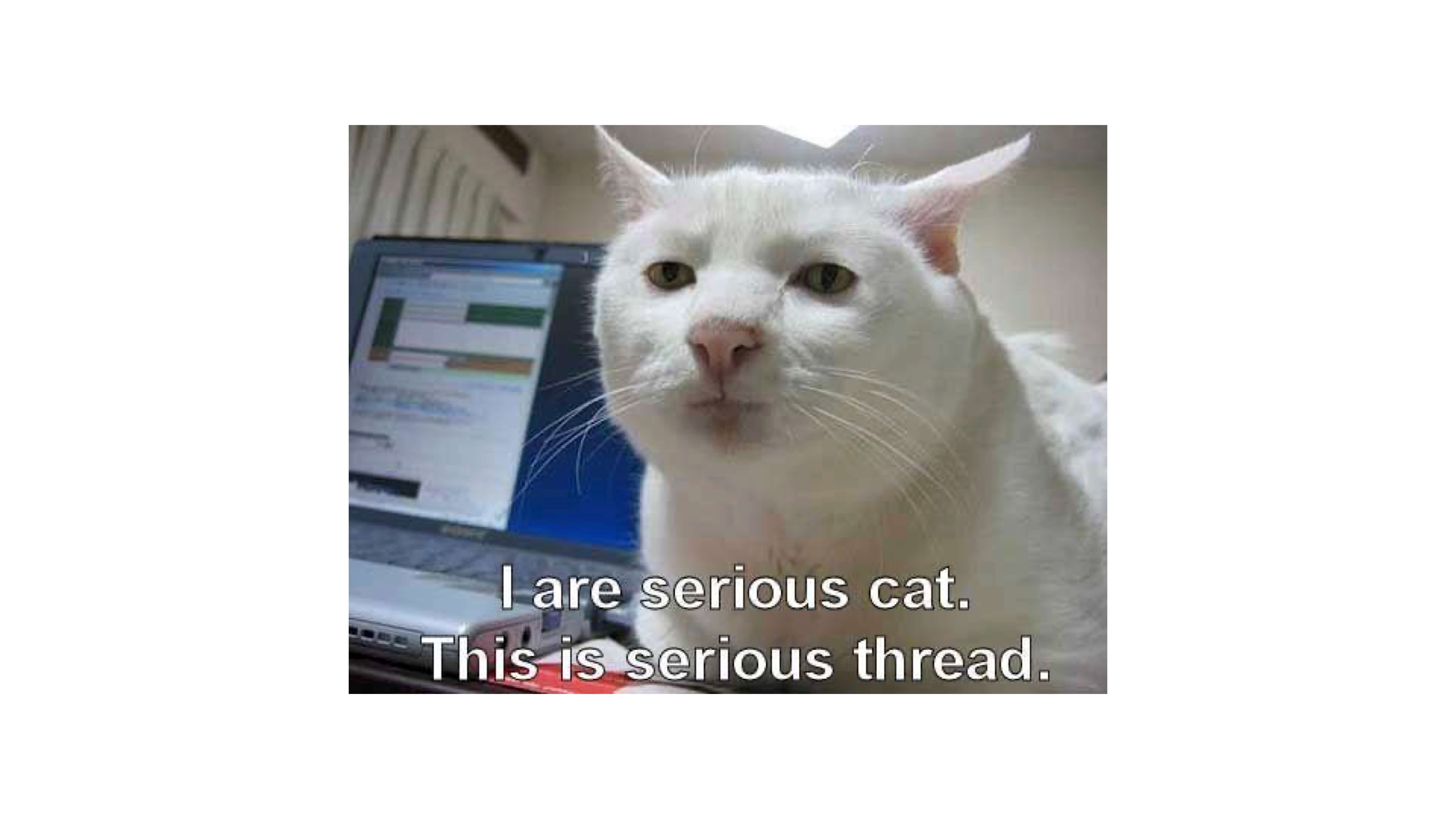
This is a cat with a human face. His work is serious.
The most important reason is we don't want to offend. We respect our customers. We respect our readers. We don't want them to open an email and get upset with us or have them think that we don't value them.
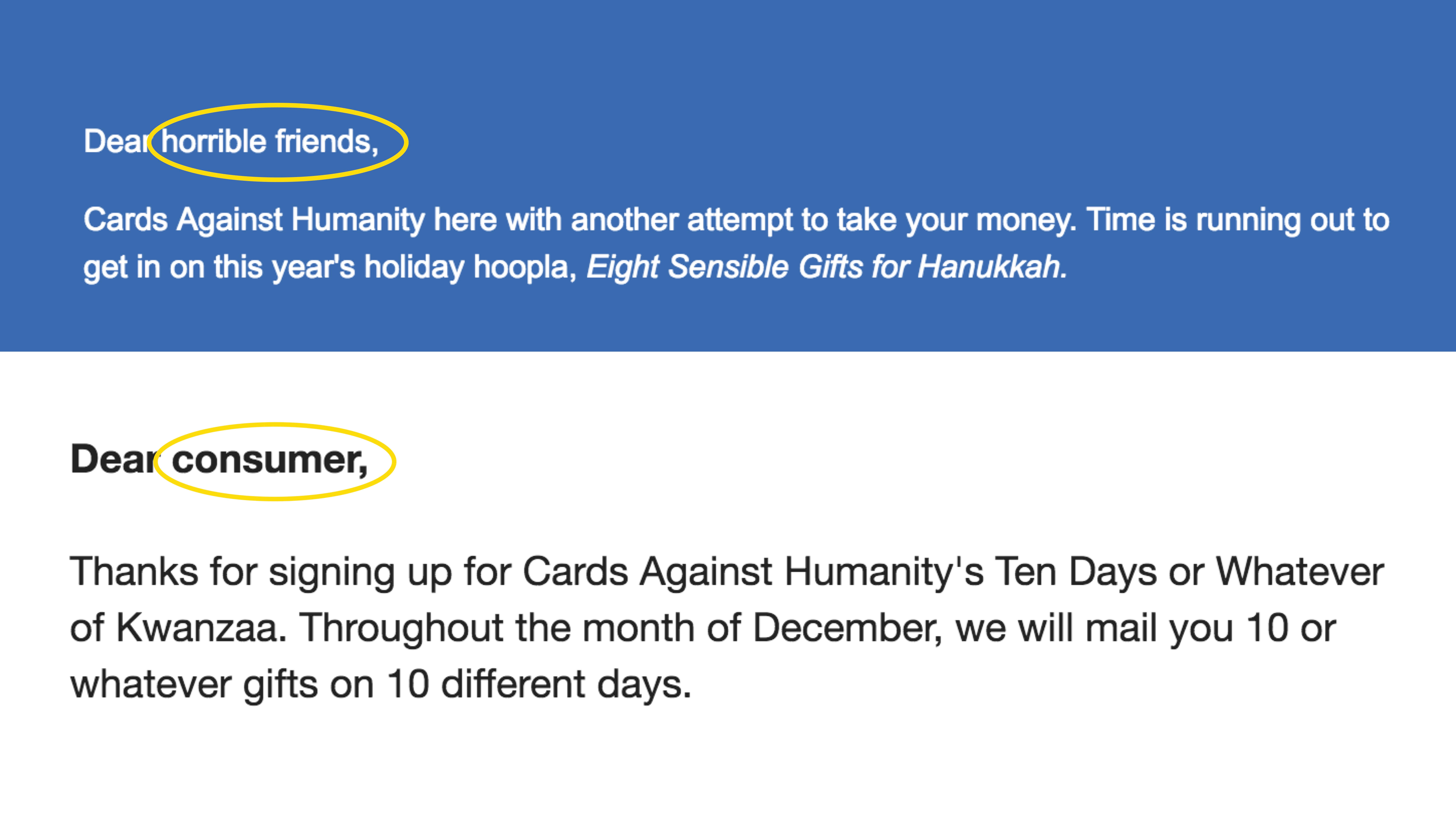
I am telling you that we don't all have to be Cards Against Humanity. They can get away with it. We can't all call our readers horrible friends. We can't all call them consumers. That's their brand. That's not ours.
And often, the resistance that I get to being funny is like, we can't just turn that on. But you don't turn it on. It's not a binary. It's not an on/off switch. It's a spectrum. You can be a little funnier. You can be a little warmer and not even funny necessarily.
So here's an example, scale of humor on all the way to the left. We have Brooklinen. Maybe some of y'all have bought their very fancy expensive sheets that are kind of like just regular sheets. Okay. I bought them too. I can say that. They have a book pun here. Diving under the covers was like reading books and being in bed. Ha, double entendre, very harmless.
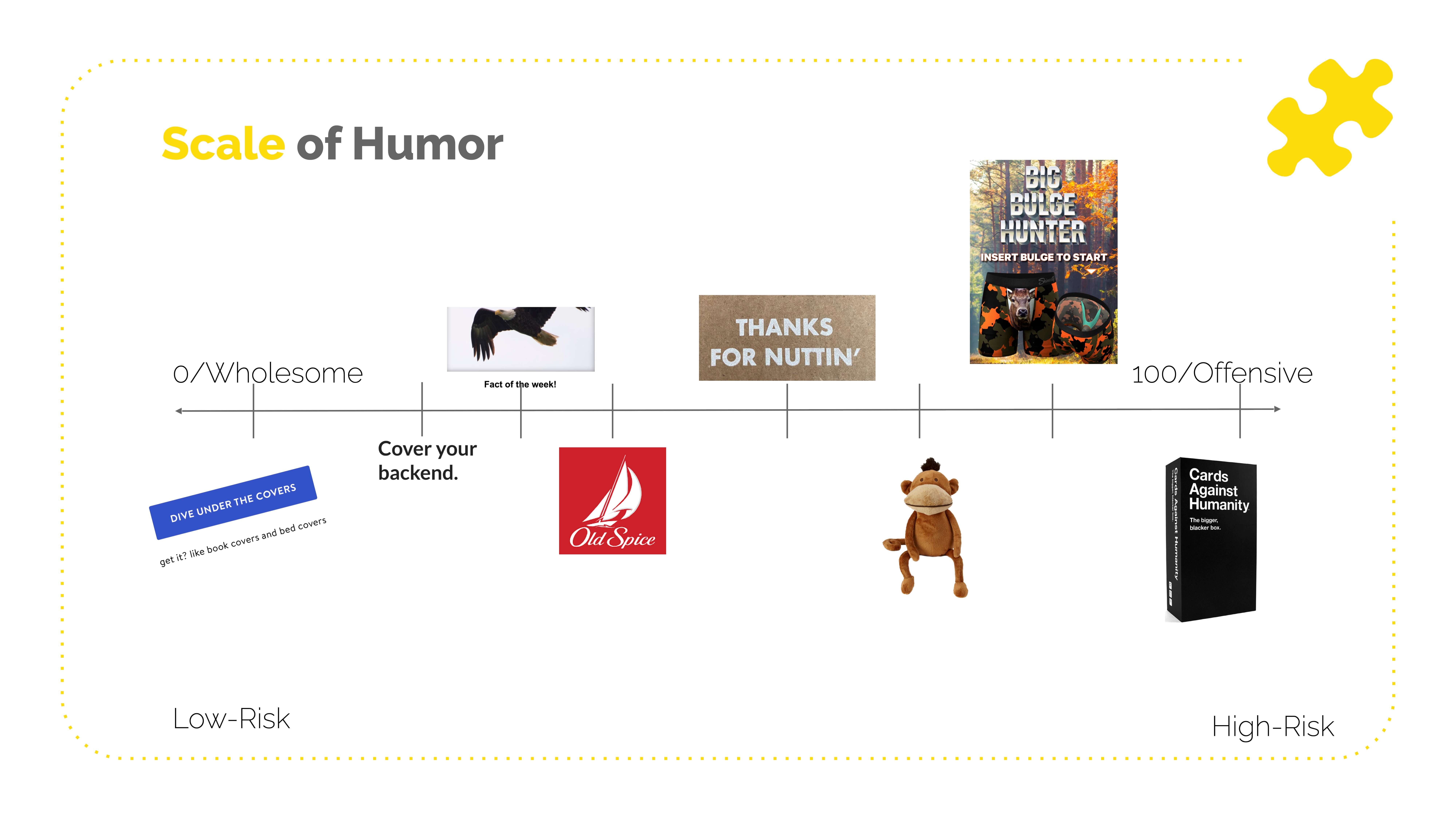
We have a SASS here saying cover your back. Also, very tongue and cheek. The people who get it appreciate it. The people who don't aren't harmed by it.
And then we get up to like Shinesty. If you're not subscribed to their emails, please do that. Where big, bulge hunter is, they're advertising like boxers with deer on the crotch. They're like balls to the wall, literally and figuratively. You can figure out where on the scale your brand belongs. You don't have to just be like from here to here. This is me trying to convince you that humor is good. Let's be funny.
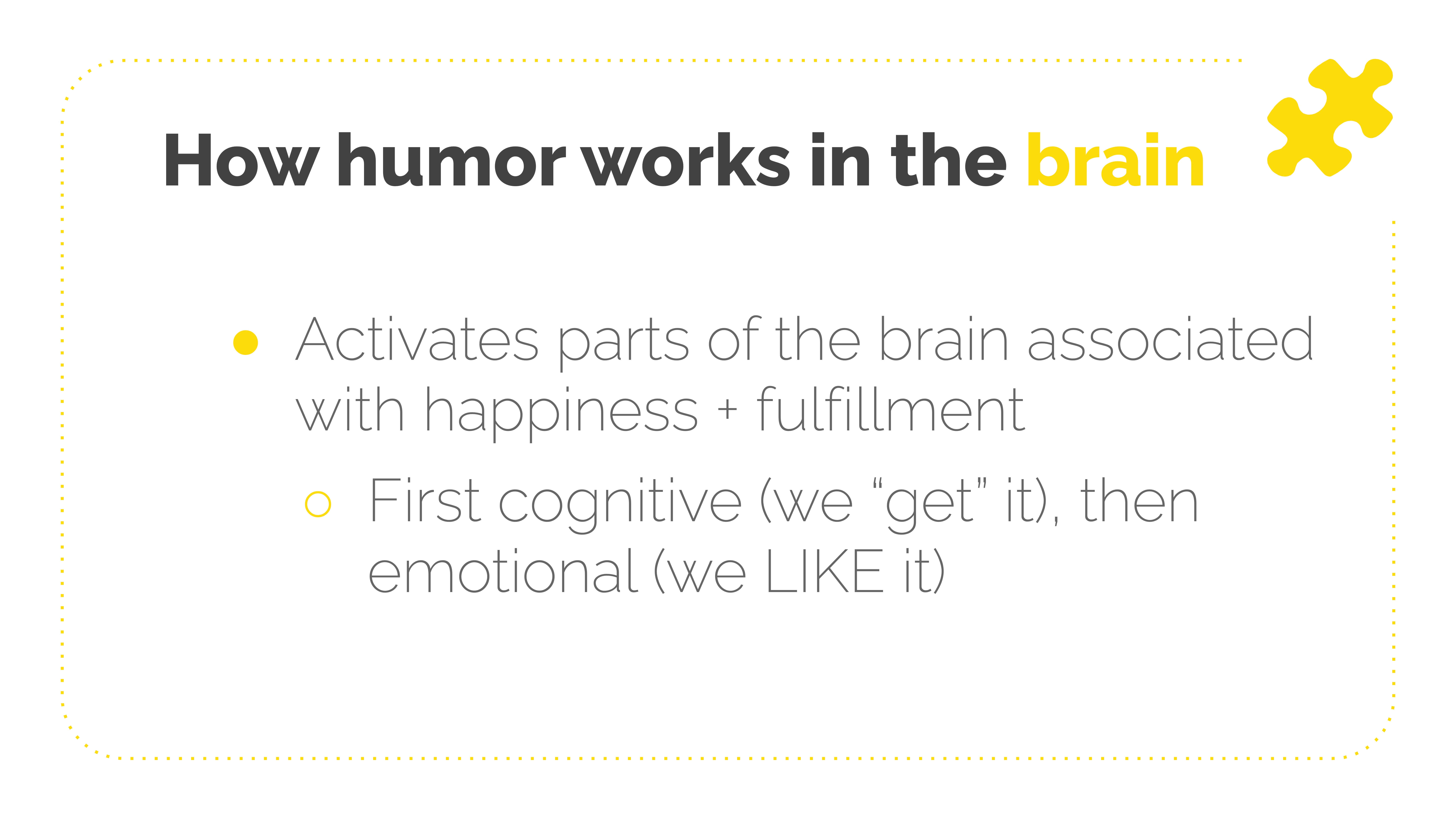
How does humor work in the brain? The same parts of your brain light up when you eat pizza or chocolate or have sex or when your boss says you're doing a great job. Those parts light up when we get or make a joke. And actually, I just learned this the other day. This is a simplified way of looking at it, but the cognitive parts of your brain, like the processing parts, get the joke, and then it sort of sifts down into the emotional parts, and we're like, ooh, like that, that feels good.
We want to make our readers feel good. There are so many reasons to do that because we're helping build a mutually rewarding relationship. So when they see your name in the inbox, they're like, I can't wait to read that. Not like, oh, these people again, automatically mark as spam, archive without reading, stay on the list for 500 years until you've finally purged it.
When you send an email that says asses instead of assets, you get like that leeway because they think, oh, there are people behind this. They've made me laugh. I like them. And there are also some studies showing that laughing boosts information recall. If you make somebody laugh and say something, they're more likely to remember what you said after they laughed. I'll try to demonstrate that at some point, but no guarantees.
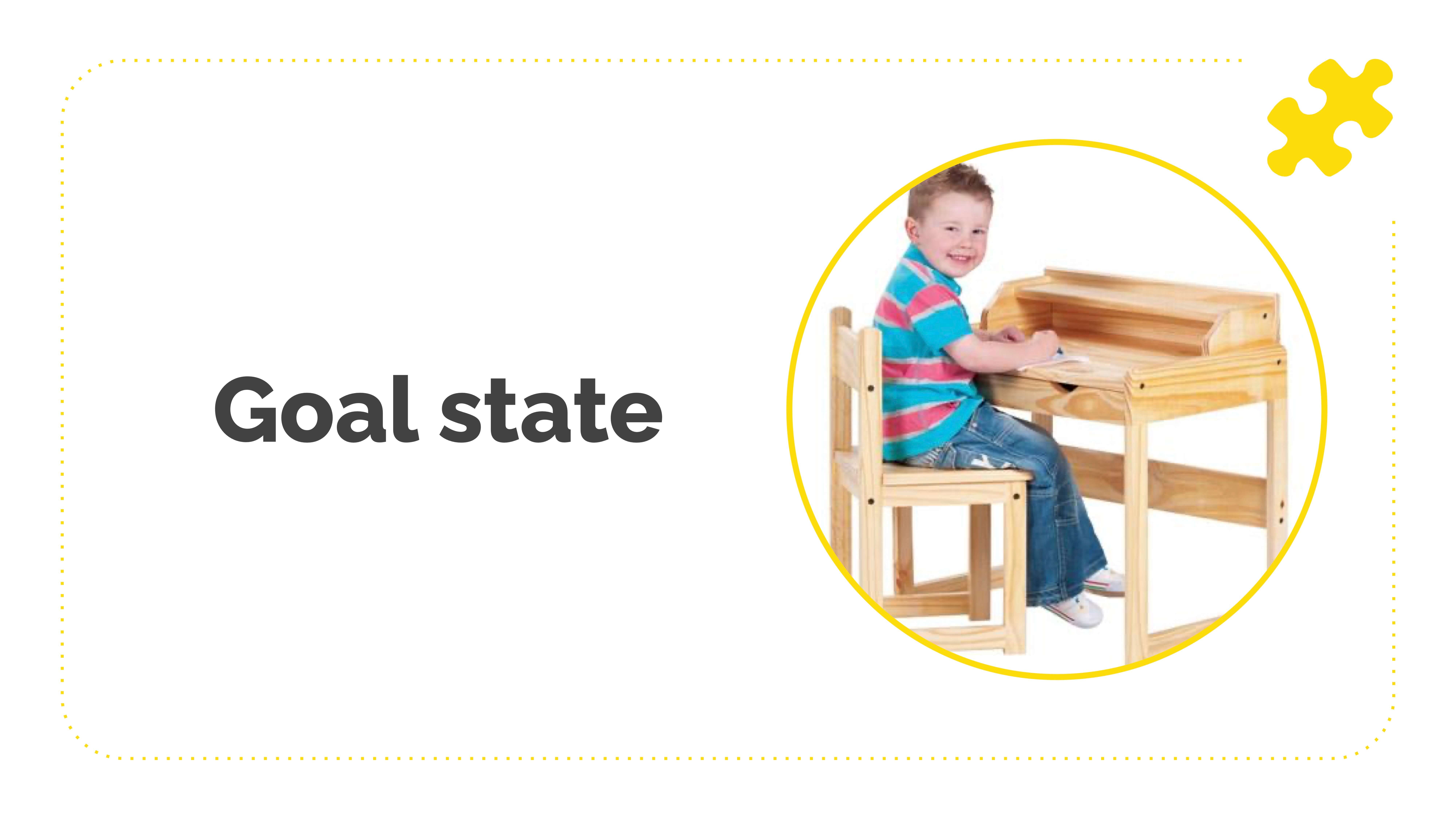
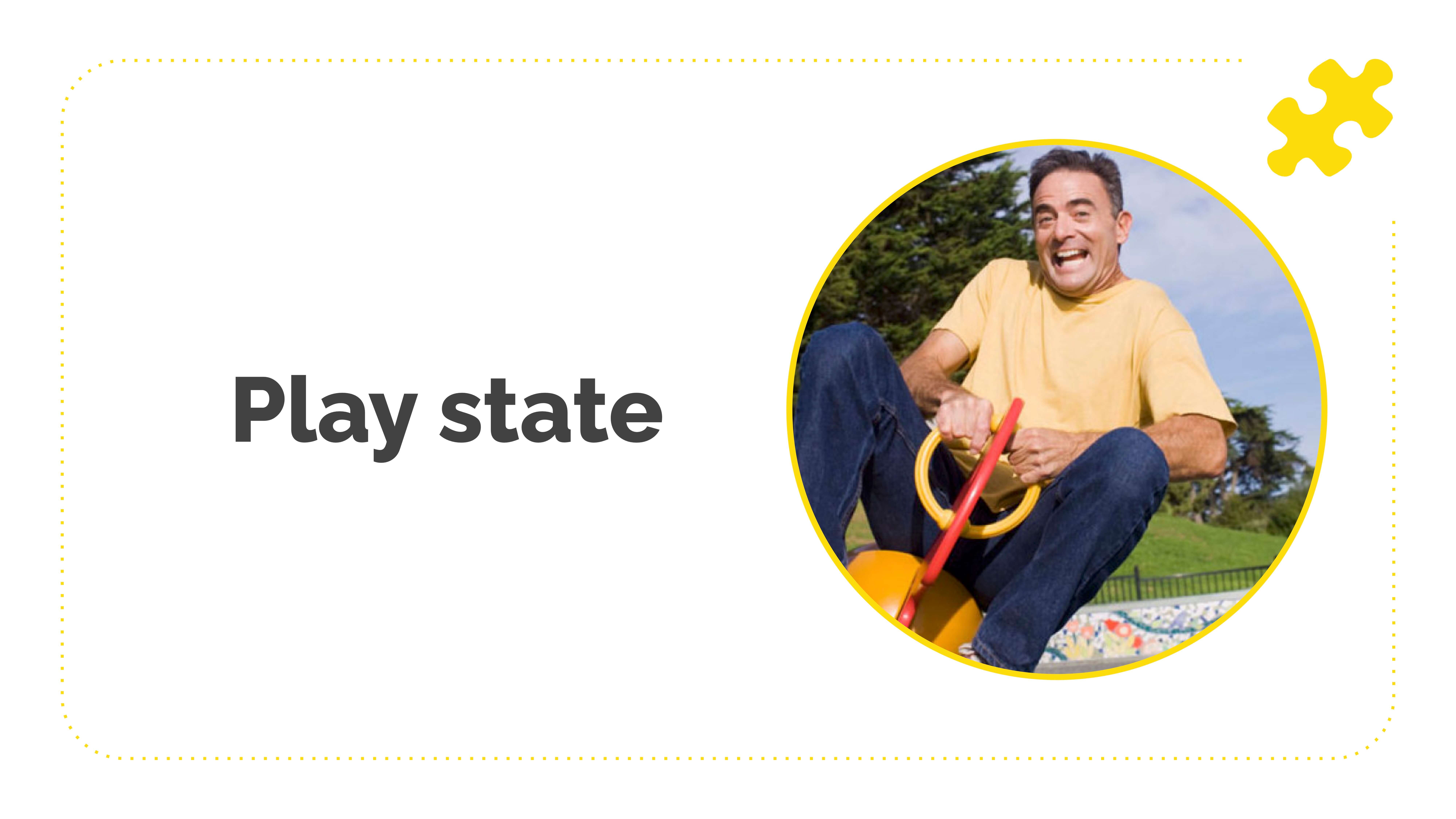
Then finally, I think this is where I'm most interested. This goes along with building a relationship between your brand and the reader. Humans are constantly going through life, like, am I working or playing? The telic state and a paratelic state.
We don't know that we're doing this consciously. But when we're in the telic state, we're working hard. We're not open to humor, right? You've constantly been plugging away on a deadline, and somebody is like, look at this teacup pig, pushing a shopping cart full of beer. You're like not right now, Suzan. I'm in the zone.
And then there's the paratelic state when you're like, I'm going to spend five hours on Reddit looking at teacup pig memes. There is that subreddit. I promise you. We want to help people consciously differentiate between when they're working and when they're playing, and we want to be part of that play state. It's not complicated.
We don't want to make people feel like this is homework every time they see our brand name in their inbox. So that's a huge reason to use humor here and there and in your emails.
So now you're like, all right, I'm sold. How do I pick what to joke about? And that's where people get stuck. They're like, I'd like to be funnier in our emails. I don't know what to say. I don't know what to joke about. It is the same kind of customer research you should already be doing to figure out your messaging, like the gentleman earlier said about Lucidcharts' use case emails. They figured out how people were using the product.
So you're doing that kind of like an open mic: "Hey, what are you using us for?" to your customers. You can also say, "Hey, what are you watching? What are you reading? What are you listening to? What podcasts are your favorite? What cartoons did you grow up with?" And then you ask your team the same thing.
What's happening in Slack. What memes are people passing around? What's the go-to? Somebody earlier used Friends, right? Cause they were like immediately pulling from that goodwill, that shared goodwill that we all have, like watching Friends. Personally, I hate Friends, but that really alienates everyone. I clearly do hate friends. Ask your people what they like, ask your customers, what they think is funny, and then look for the patterns and preferences.
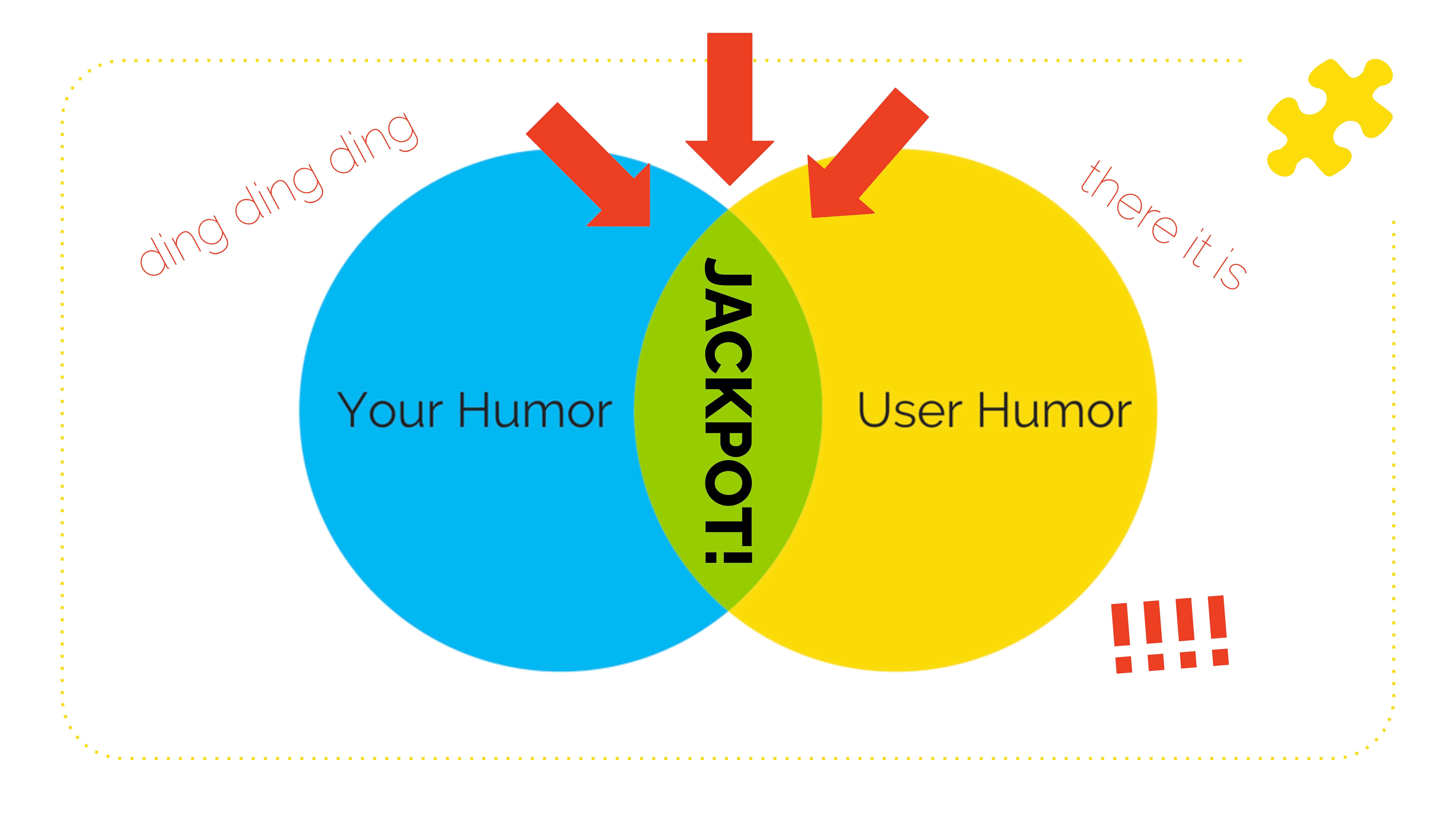
For example, do people kind of like affiliative buddy comedy stuff? Do they like more dark, morbid humor? Are they crass? Are they high brow and witty? What kind of stuff gets the biggest bang for your buck humor-wise for you and your team. See where those things overlap. What's everybody watching? What's everybody joking about in Slack. Oh my God. That's what you should joke about. Honestly, those things will get you the most return on using humor in your copy and all of your marketing, but we're talking about emails today.
Once you figure out what to joke about, you have to figure out how to deliver jokes. I don't mean necessarily like jokey jokes where a guy walks into a bar and has some whiskey and then goes to speak at an email conference. Anything can be a joke, right? Anything designed to give us that moment of fun can be a joke. So don't restrict yourself to like, I'm writing a subject line, and it's "haha" funny. It doesn't have to be like that. It can be a GIF. It could be whatever. How do you deliver jokes about your topics?
I think there are two really safe ways to go. There's observational humor. When we're talking about something that we can both see and observe in the environment that's funny or weird. And then there's self-deprecation. People can't get mad at you for making fun of yourself. They can leave you. Totally not speaking from experience. But they can't really get angry.
So as an example, Jerry Seinfeld's a great representation of observational humor. He's like, "What's the deal with airplane food?" So he's talking about something that we haven't necessarily thought of before, but once he calls attention to it and says, here's why this is weird and funny. We're like, that's safe to laugh at. It's not you. It's not me. It's that.
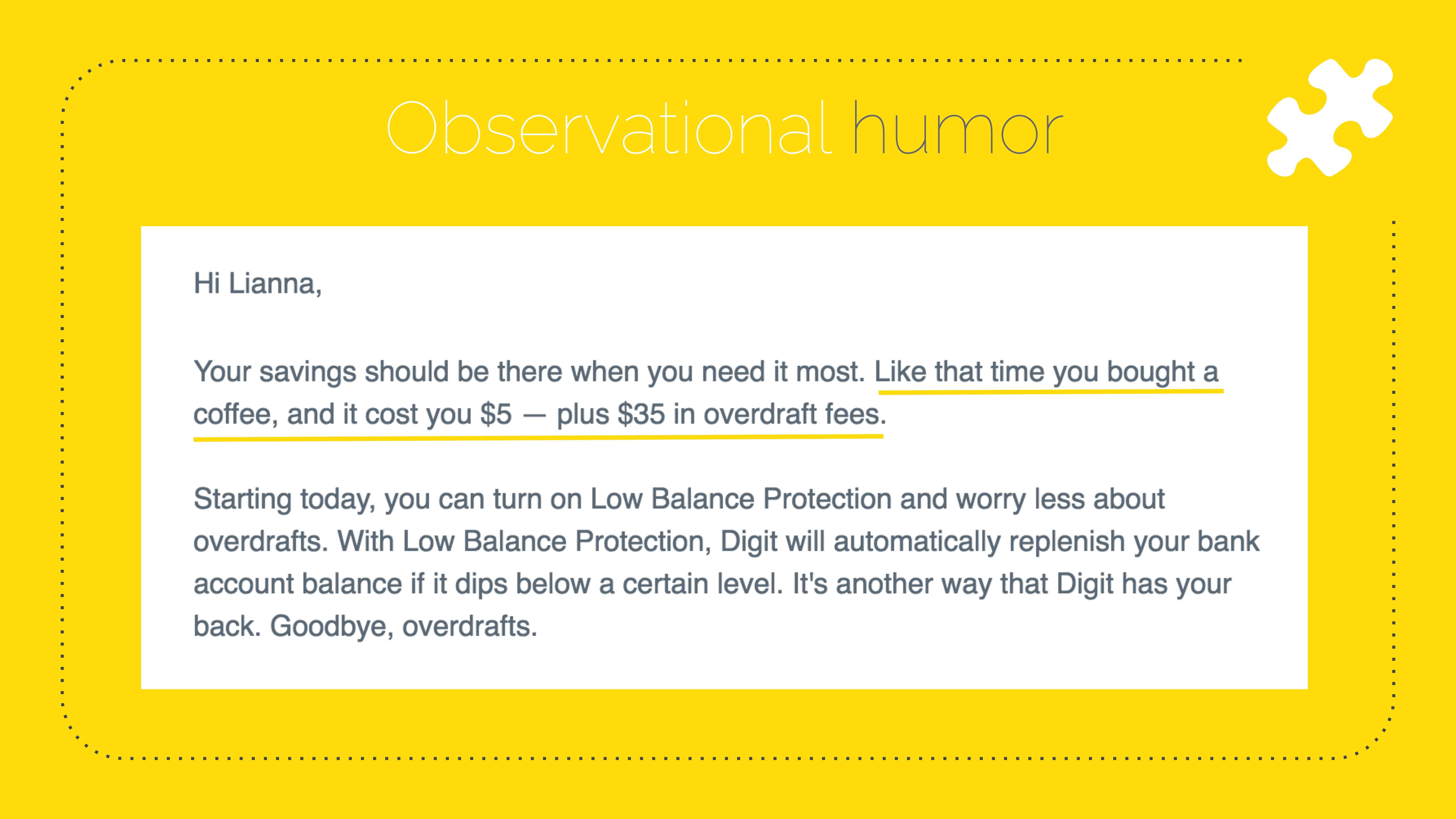
How does that look in copy? Here is Digit. Digit like steals money from you when you spend money, and it saves it for you. It's kind of awesome. I made it sound bad, but they're like, "Hey, Lianna, Your savings should be there when you need it most. Like that time you bought a coffee, and it cost you $5 — plus $35 in overdraft fees." Oh my God. Yes. That's happened to me when I accidentally over-drafted my checking account and got socked with another fee because the bank's like, that's what she needs right now. And Digit is, like, here's the thing that's happening in the world. It sucks. We have this new feature, low balance protection when you overdraft. Oh my God, what a great segue, right? You made me laugh, and then you told me a cool thing. It doesn't have to be more complicated than that.
Here's me on stage doing a talk a while back. As I walked on stage, I realized I had dressed exactly like Link from Legend of Zelda. And I said that, and that was like the biggest laugh I got the whole time. So that's me being self-deprecating. You have to have the stomach for it. You don't want to go too far. You start to erode trust if you constantly make fun of yourself or your brand. Use it sparingly, but do use it. It's funny when brands have a sense of humor about themselves.
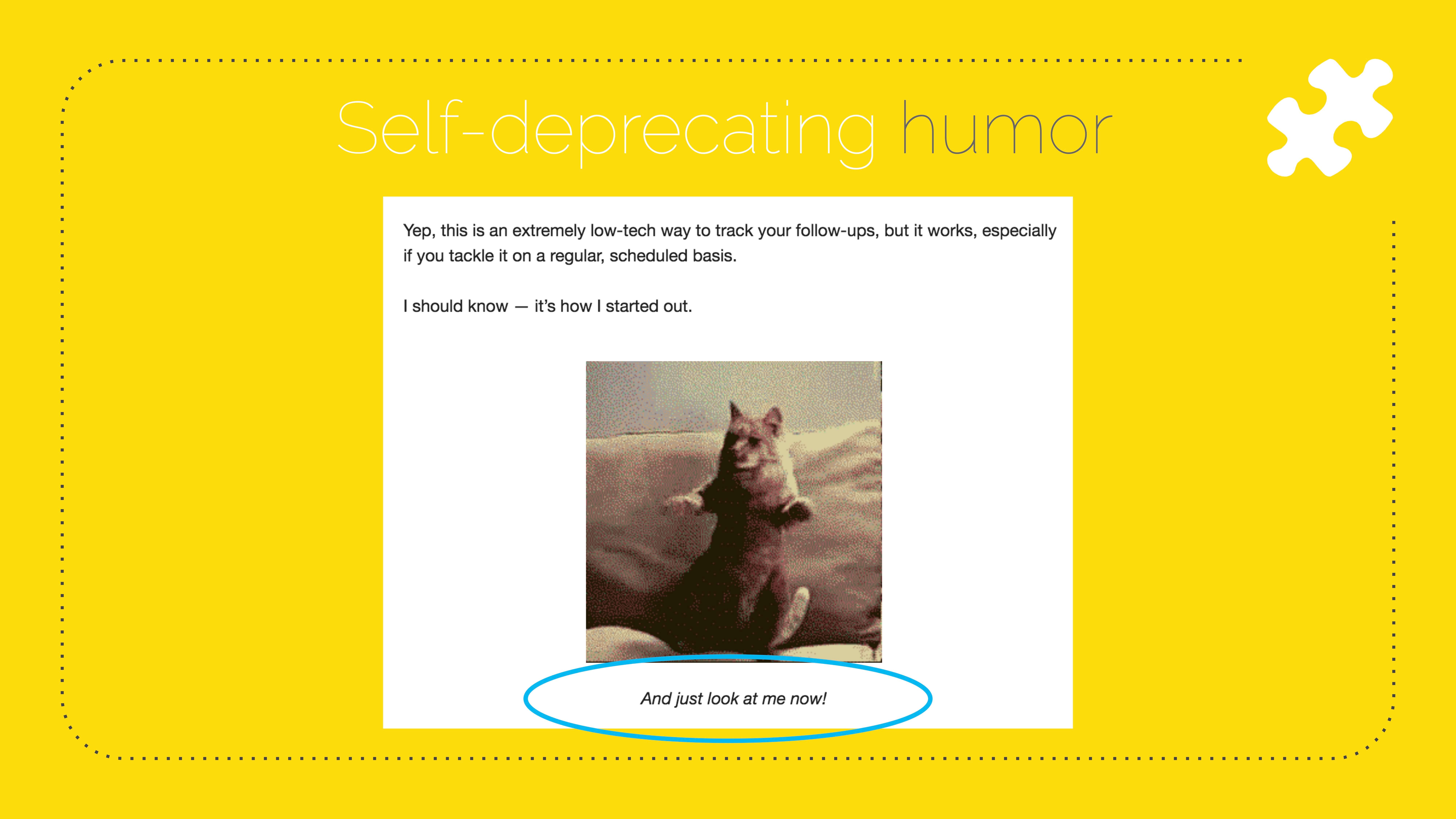
How does this look in copy? Here is an example from a software onboarding series I wrote. He is talking about like how to track your follow-up emails. That's a dancing cat GIF, and the caption is, "And just look at me now!" The joke is that the founder of the SASS is a dancing cat. Again, not a jokey joke, not that funny, but like in the B2B SASS world. Hilarious. It doesn't have to be like really thought out.
My friend designed my slides, and I was like, can you have two baseball caps for the recap slide? She was like, no, that's really dumb. So I was like, do it, Julia. I'm still pleased with it. I love it.

I talked about why humor is essential and if you need to convince anybody upstairs that it's a good idea to start being funnier in your emails. You know that it has cognitive, emotional, and social benefits. We've talked about how to choose your humor topic. Figure out what's funny to you. Figure out what's funny to your readers. Pick from those topical cultural things. Also, if you're at a loss, go to Reddit, it is a cesspool, but they do know what's happening. Some parts of Reddit are so bad.
Now we're going to talk about where to use humor. When I'm talking about this stuff, I'm talking to people who are not just focusing on email, and I have to convince them, like, if we think about marketing as a funnel, should we use humor up here? Should we use it here? Should we use it here? Where do you all think we should use it most?
There are many schools of thought. Two, at least. I'm going to give you mine. You probably don't want to use it on your homepage. Especially if you're B2B and you're not sure about it. That's a risky play: here's what we do and who we do it for and why you should care, and also, we're funny. Most people can't nail even two out of the first three. So don't add humor there. But if people are clicking around inside your site, maybe you want to reward them here and there with like, headers, subheaders, funny photo captions and asides, body copy parentheticals as they're reading to be like, oh yeah, someone human wrote this. Oh, I do like this. I'll keep reading. And then always, always use it in your emails. Why not? You have this one-on-one connection with people. That's where you would be funny to your friends, hopefully, and then they would laugh, and you would feel good.
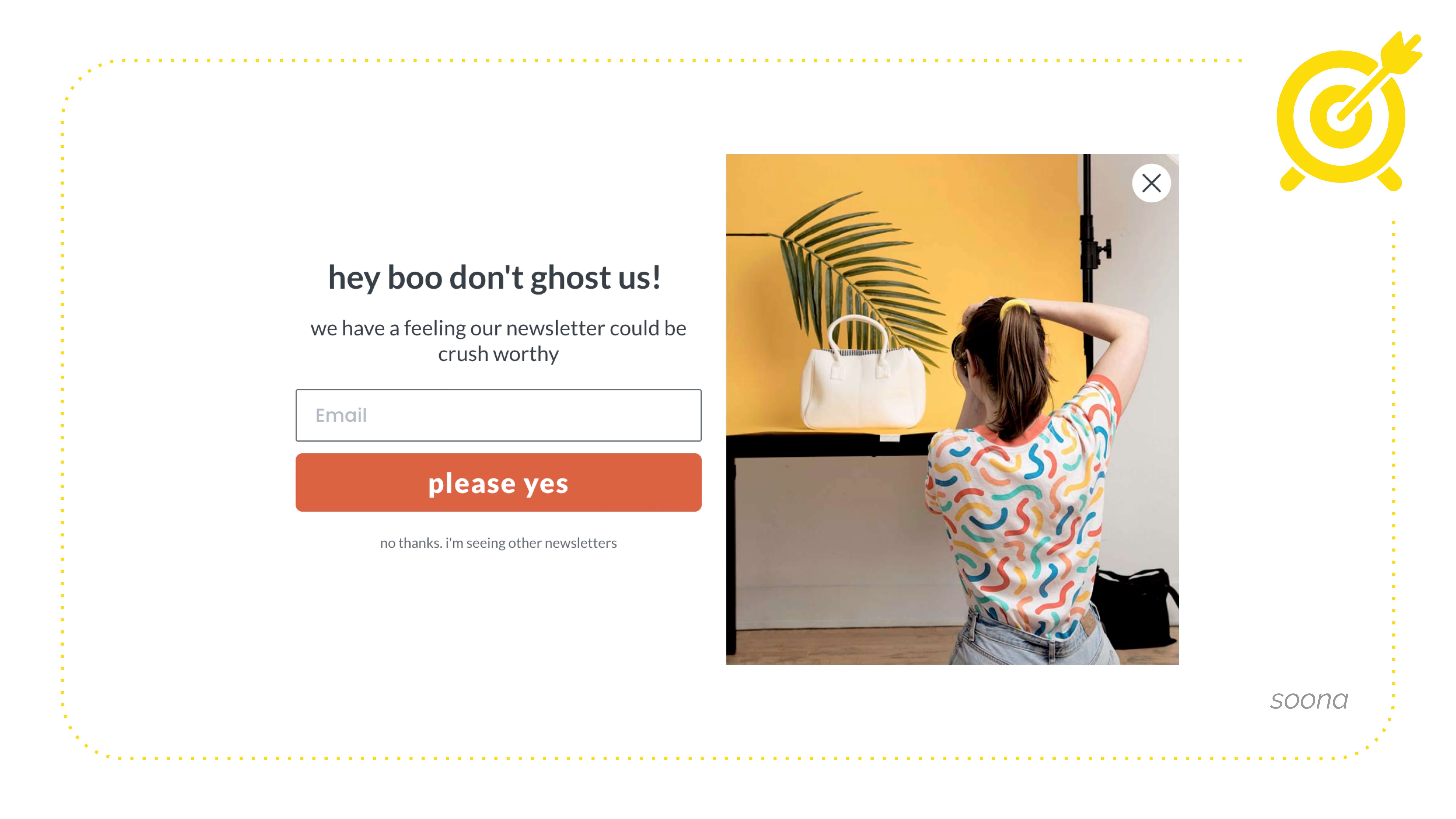
Where inside your email program should you use humor? Use humor to get people on your list because we're so tired of bad popups. Are we not? Why would you not use humor to disarm people at a moment when they're likely to be annoyed with you? You'll get more people on your list.
Here's Suna. They do product photography, and their popup says, "hey boo don't ghost us! we have a feeling our newsletter could be crush worthy." I love this CTA, "please yes." Even just that reversal of like the standard syntax is funny. My favorite part here is what I would call click trigger copy. Or the opt-out copy, "no thanks. i'm seeing other newsletters." Now compare this to, "No thanks, I hate saving money." None of us are doing that. You don't want to make somebody feel like a turd for exercising agency. They just got to your website. They don't want to opt-in right now. That's okay. You don't have to be like, "no, I'm an asshole who hates money." Don't do that.
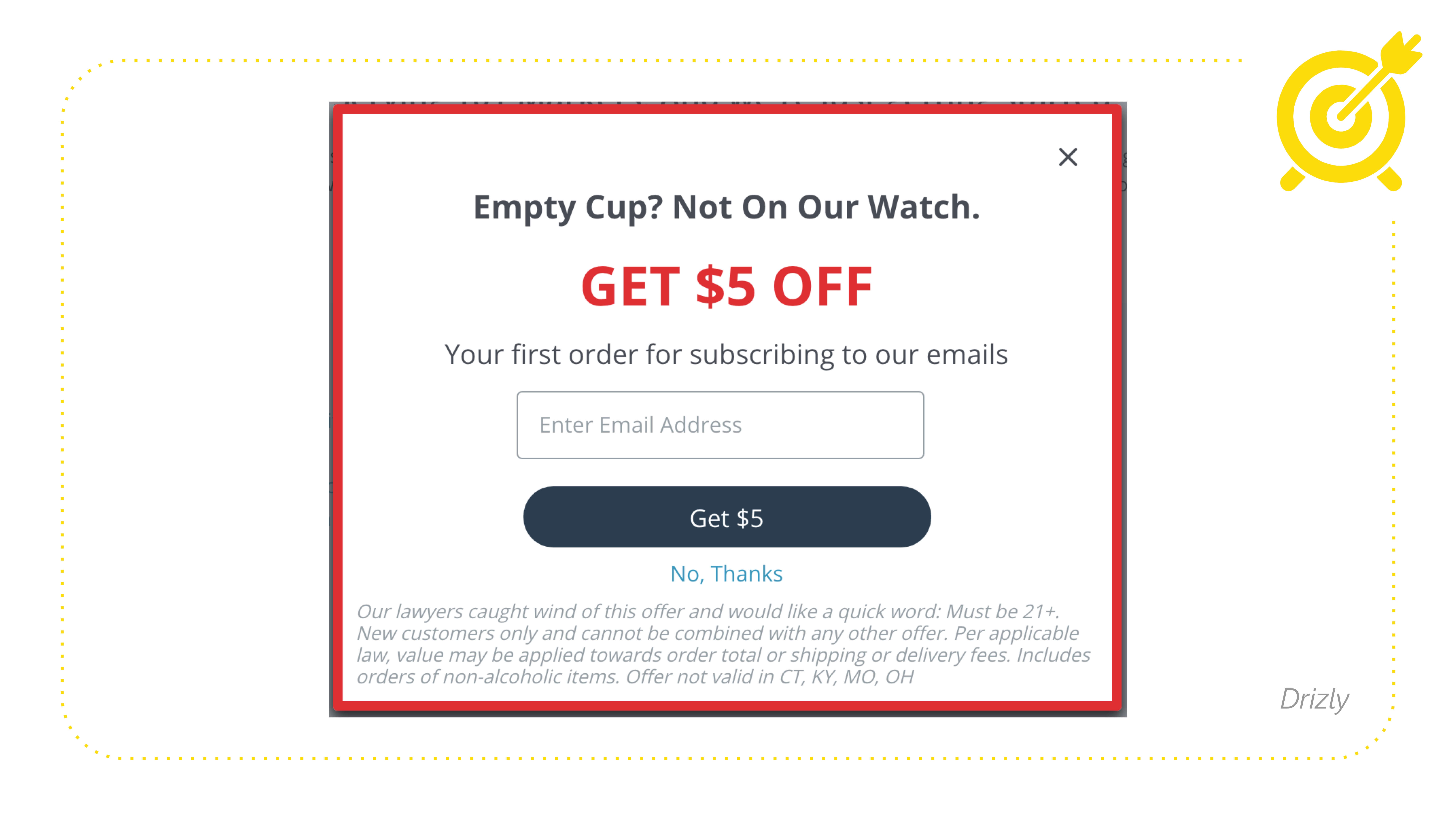
Is anyone subscribed to Drizzly emails? They're so funny, "Empty cup? Not On Our Aatch. Get $5 off. Get $5." Simple. Then down here, you're like, what is this? Are they going to sell my email address to Serbian hackers? "Our lawyers caught wind of this offer and would like a quick word. Must be 21+. New customers only and cannot be combined, blah, blah, blah." Okay. But that first entry sentence tells you, oh, somebody's human paid attention to this. I trust you now, right?
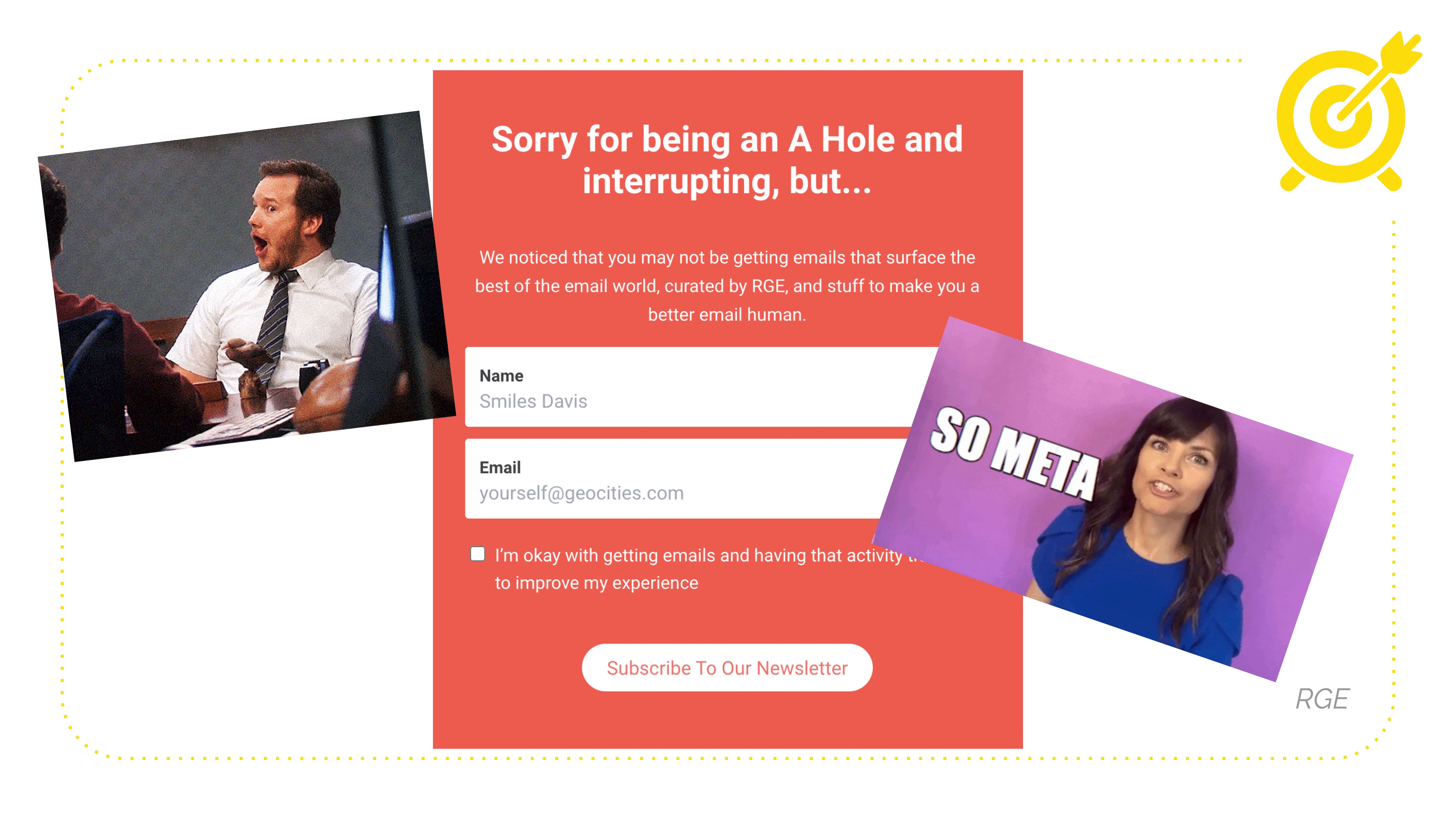
Another example. Oh my God. It's Really Good Emails. How did that get in there? So meta. This is one of the first examples that I screenshotted when talking about this: "Sorry for being an A Hole and interrupting." Boom right there, where the person is emotionally in their life. Hopefully, they're not feeling even worse than that. "We noticed that you may not be getting emails." Also, look at the gentle language. "You may not be getting emails that give you all this cool stuff." Like you are, maybe, or the popup is firing wrong. And that's okay too. And then "I'm okay with getting emails and having that activity tracked to improve my experience." Awesome. Maybe I would make this a bit more fun, but they didn't ask me, and now they won't ever.
So use humor in your opt-in to get people on your list. Obviously, use it in your subject lines. We're all searching for the best subject line for the best open rate because, as we all know, the subject line has one job. Get the email opened. Everything else in the email has its own job. The subject line has nothing to do with click-through rates. I want to say it many times, but you already know this. So how do you use humor in your subject lines? It doesn't have to be a "haha" joke. It can be warm and friendly and pique curiosity somewhere on that spectrum. In copywriting, we say open a loop with your subject line. Just make sure that you close it in the email. Otherwise, people are going to be annoyed. You're like, "You won't believe what this soccer mom did with her belly fat and teeth whitening." I don't know. Don't do that.
So here are some examples of what I think are funny subject lines. They're not necessarily like, "haha" funny, "your dog wants you to open this email." "Owls can swim?" "Here Comes Another Holiday Stunt." That was Cards Against Humanity. "SHHHHH JUST FOR YOU." Creepy. "So, I was in the fetal position..." "OMG! There's a Dog!!!!" And then the preview text, "Doggo Inside, Click to See!" Guess what? I love Recess. And we will talk about them a little bit more. They are a DTC darling that's doing everything right with email. "Important note about bones. there are none in Recess", so that's a fun thing to do.
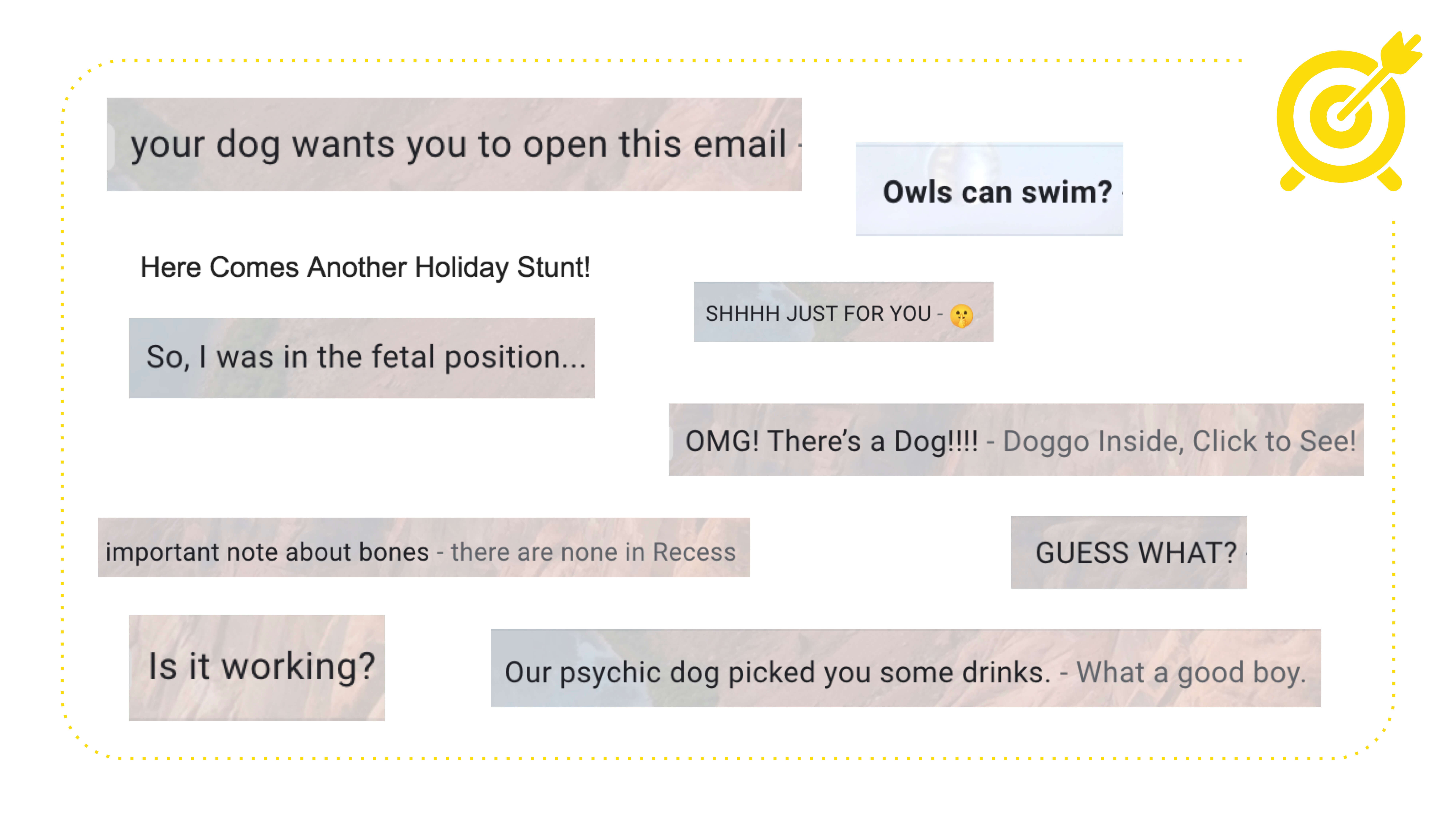
Open your curiosity loop in the subject line. Answer it in the preview text, but give them a reason to open the email. I opened it looking for bones. Is it working? "Our psychic dog picked you some drinks. What a good boy." That's Drizzly again. You may notice a lot of dogs. So what I took away from that is when in doubt, add a dog. Honestly, it never, ever, ever hurts. So I went ahead and did it. Here you go. I didn't know how to make him transparent cause I'm not a designer.
So now we're getting into your emails, right? We've got people on your list. We've got them opening the emails. We are in your automated flows. Should you bring in more humor? I get so much ROI from working with e-commerce brands and adding funny stuff to the details or the things that come preloaded in Shopify and Klayvio that no one thinks to change because it's so easy to just turn them on and leave them alone. Especially like post-purchase or post sign up or post, whatever. You're like, all right, we already got their money, you know, send them the default Shopify order confirmation. That sucks. I don't know if y'all have ever bought from a brand that's like really fun and cute. And then you buy, and they're like, okay fuck off forever. Thanks for buying. And you feel bad, right? I'm so sorry for cursing. I don't know, is that a problem? Not for me.
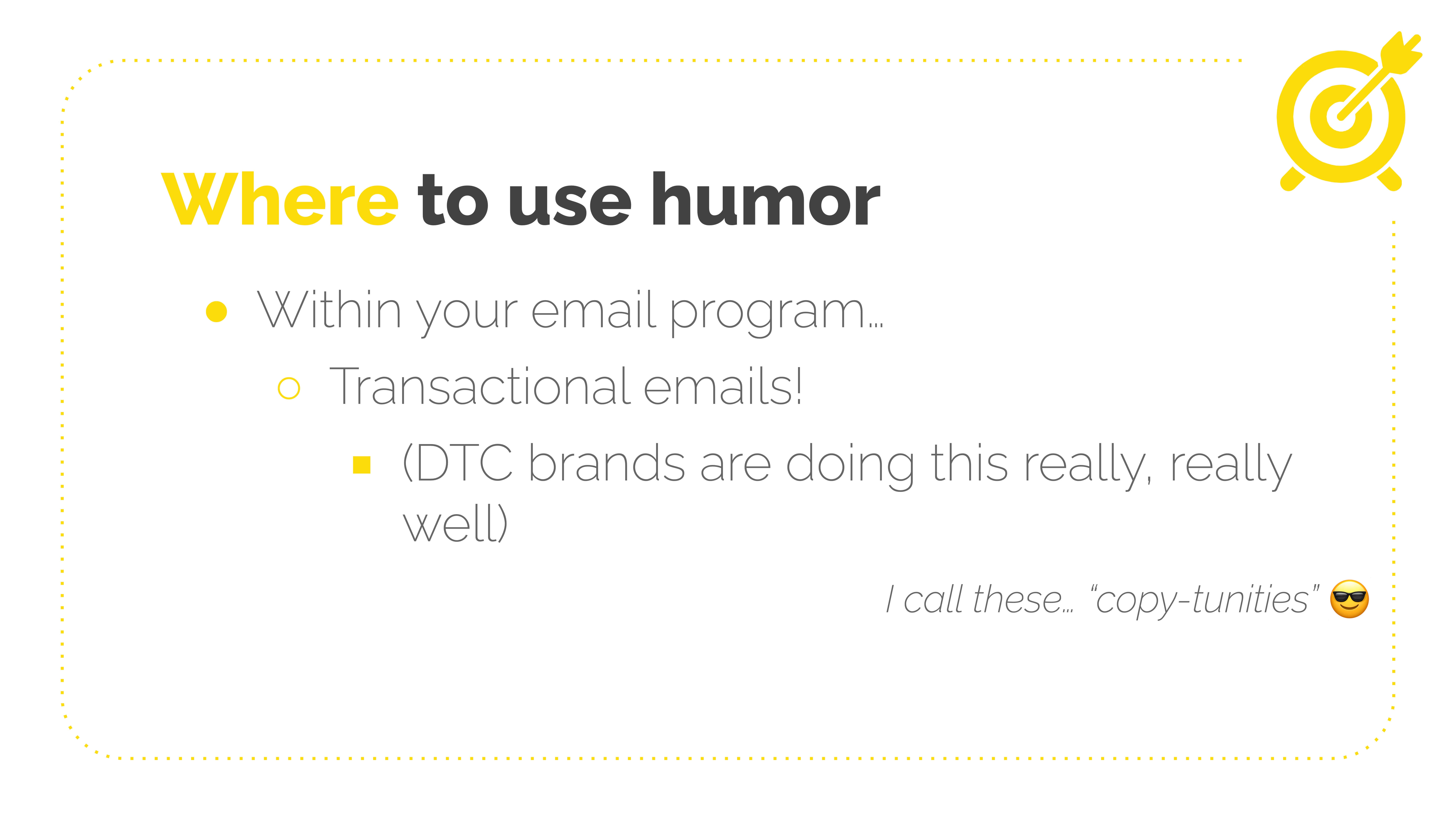
DTC brands are paying attention here because they're usually in such crowded markets that they have to stand out. So they're paying attention to the tiny little spots where other brands maybe aren't. So we're going to look at some examples, and yes, I call these little spots. "copy-tunities". Thank you for laughing. I really needed that.
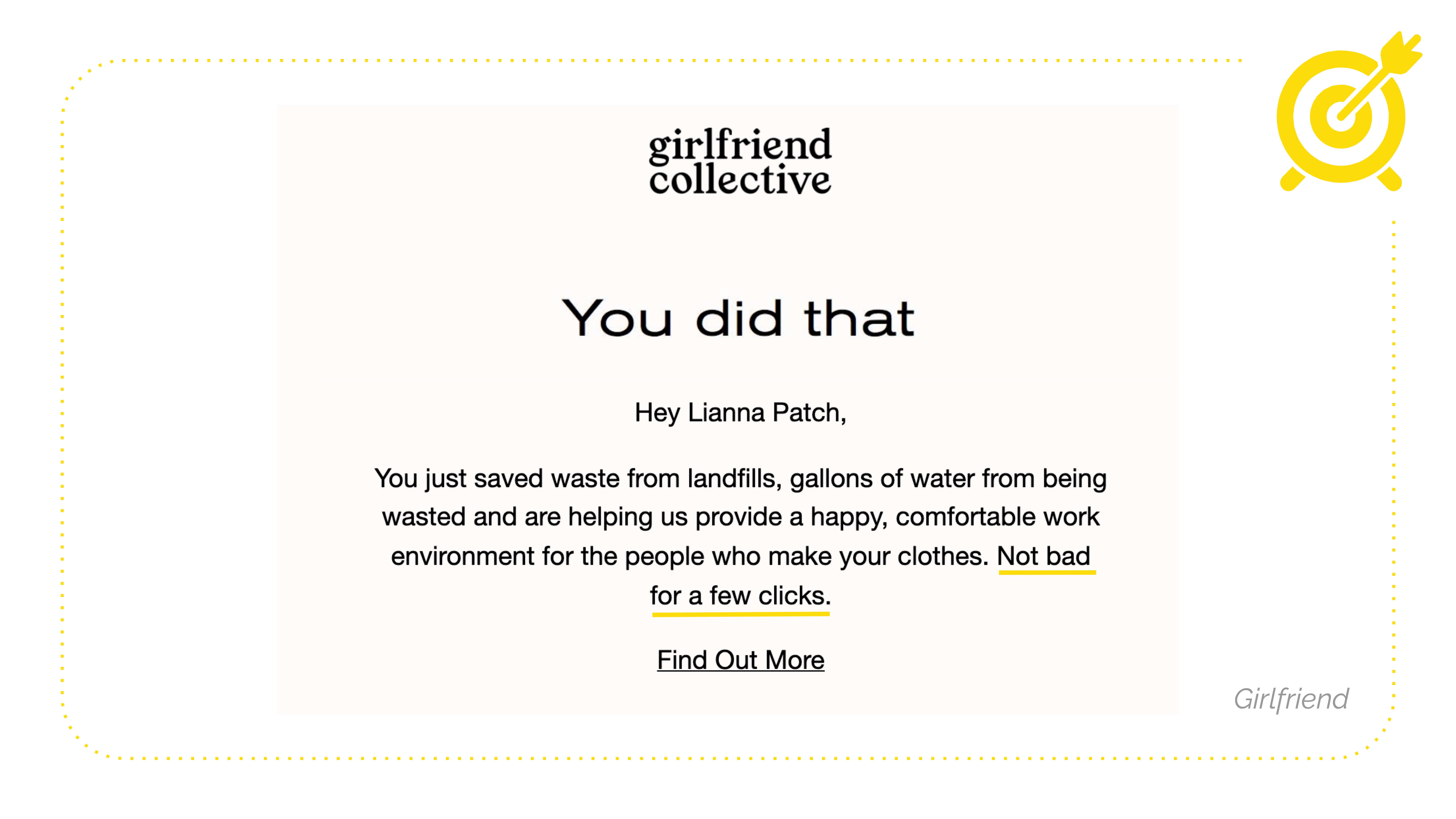
Here's the girlfriend collective. They have a great email program. Instead of the default Shopify thing, they say, "You did that" when you place an order. "Hey, you just did all these things." like reaffirming your great choice. After your customer makes a decision that benefits you, remind them precisely what's happening now that they've given you their money.
They say, "Not bad for a few clicks." It underscores how easy it was for you to buy new clothes and save the world. I buy from them way too much.
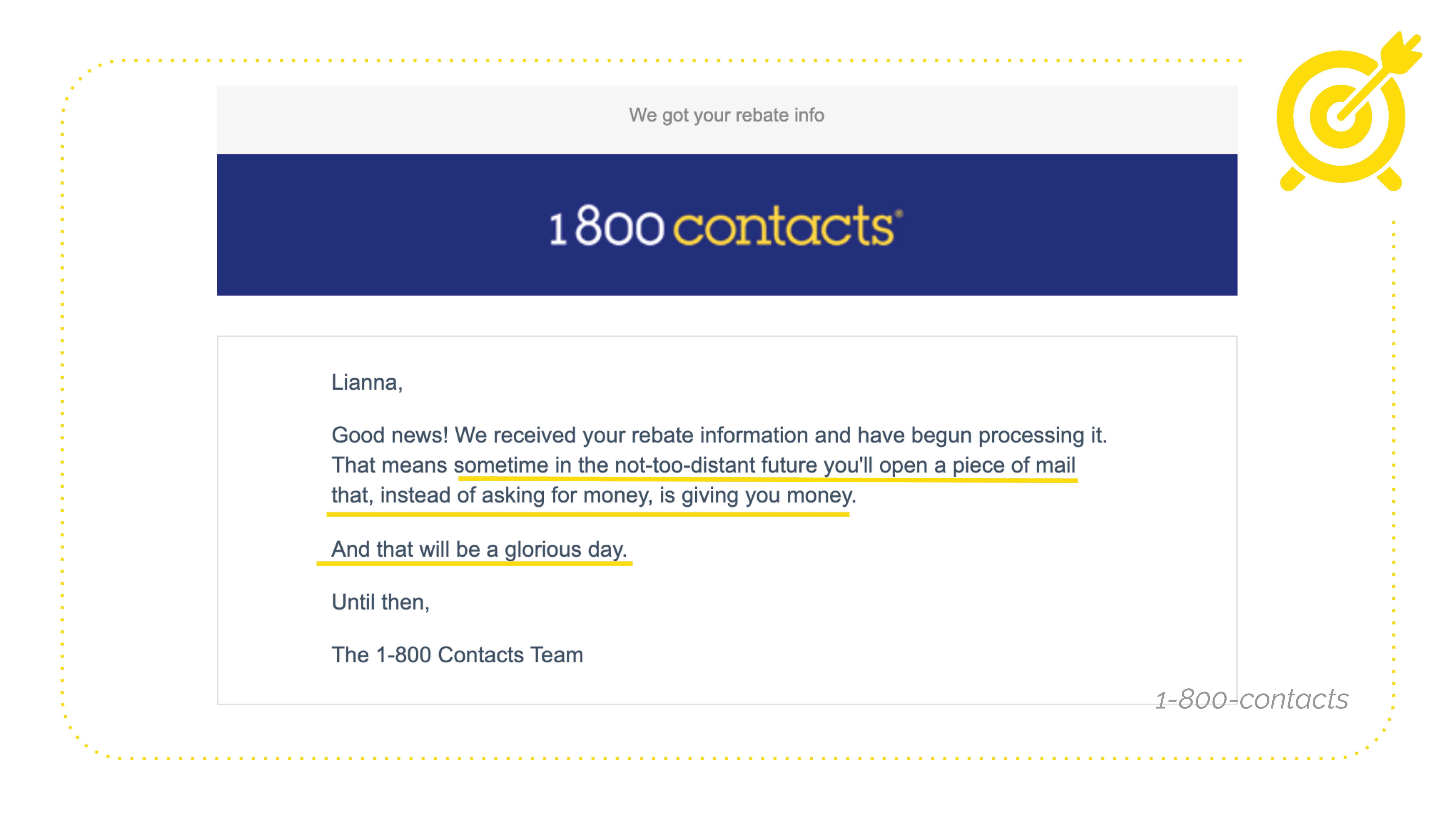
1-800 Contacts. So I was just talking about earlier, you would not expect them to have such excellent and funny emails, but they do. They have this automated email if you send in a paper rebate, "Good news! We received your rebate information and have begun processing it. That means sometime in the not-too-distant-future you'll open a piece of mail that, instead of asking for money, is giving you money. And that will be a glorious day. Until then, The 1-800 Contacts Team." Like what, who wrote this? I love them. Are they single? Give them my number.
And because we have so many designers here, I didn't want to like leave without talking about visuals. Don't worry. I'm not leaving. There's so much more. I'm so sorry. I'd like to think about every email as a bit of stage. Or canvas or whatever you grew up being told you were good at. It's a tiny stage. What are you going to do with it? It doesn't have to be just text. It doesn't have to be photos and text. It could be anything. As we saw yesterday, Sticker Mule's good at sending those weird one-line sale emails. They're amazing. You don't have to be a great designer.
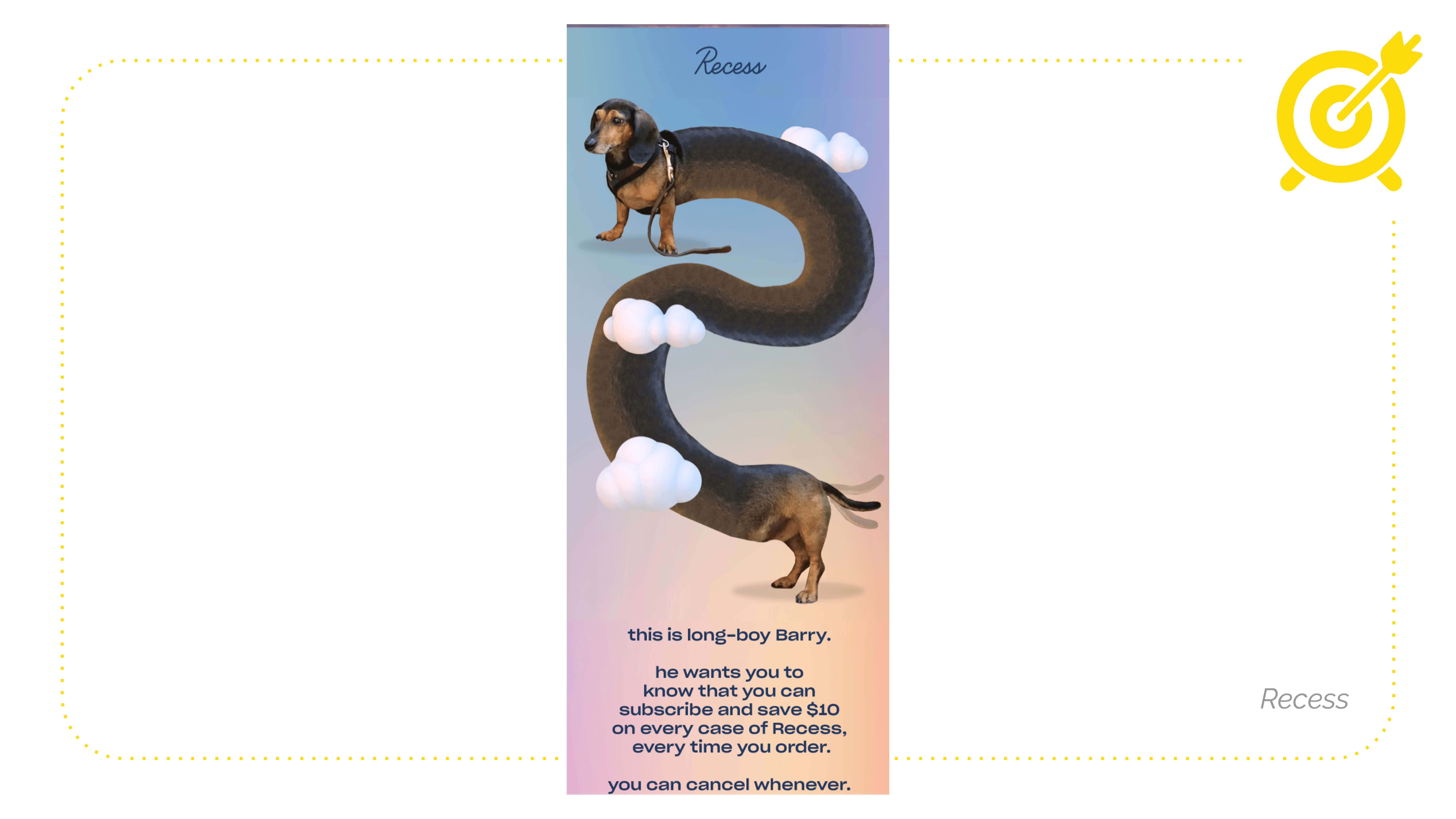
Here's Recess again. One of my favorite brands to be on the email list. It's a long dog. Longdog elongated made longer lengthed. And they say, "this is long-boy Barry. he wants you to know that you can subscribe and save $10." They could've just said subscribe and save $10. But instead, they treated us to this, which on mobile is so fun. How can you use the space more interestingly and creatively visually? It doesn't have to be designed. It can be text.
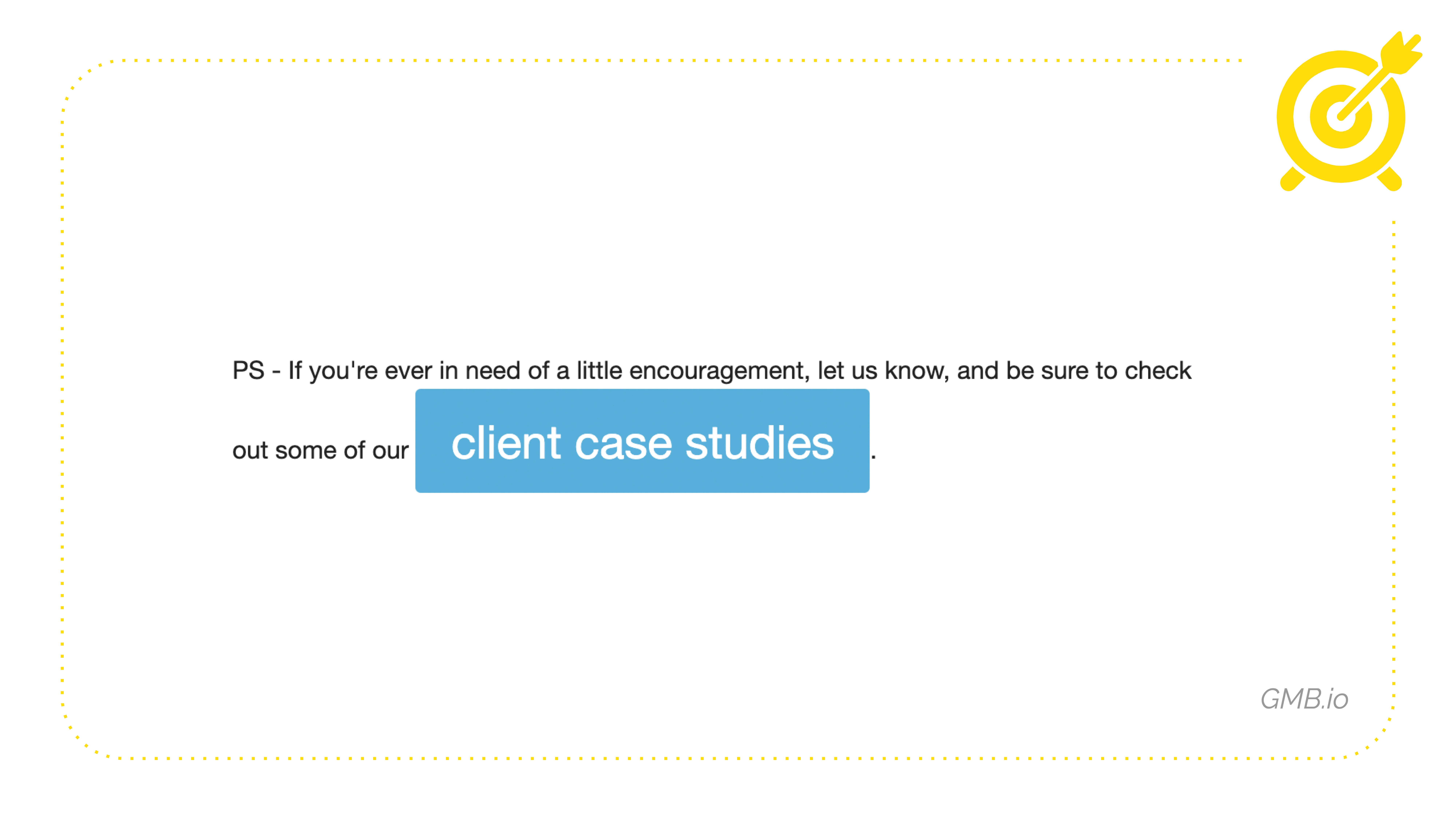
I think this is a hilarious text-based email, but they want you to click on this. So instead of a link, they're like, here's a big honking button that's breaking the formatting of the line above it. I think that's hilarious.
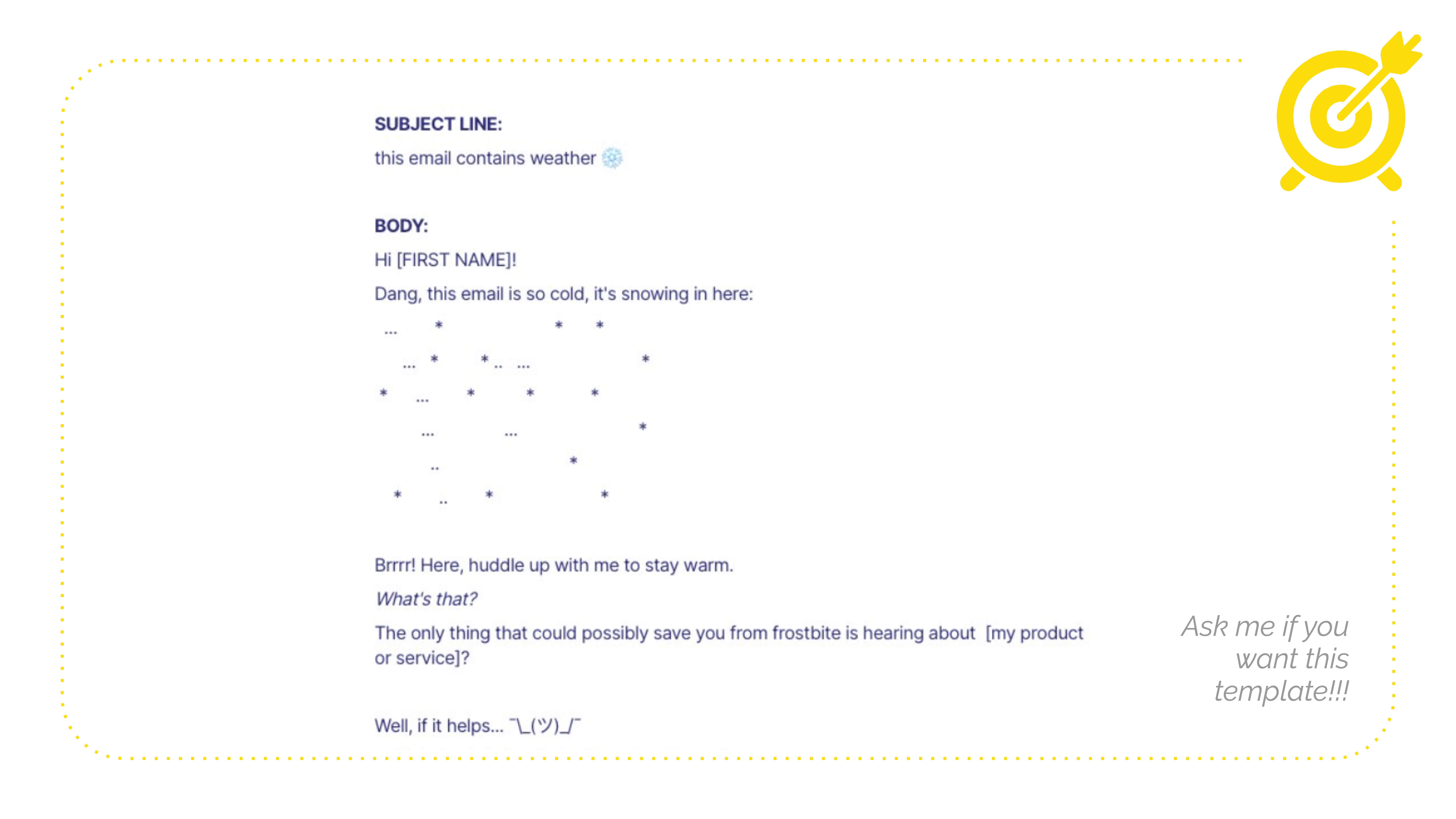
I wrote this as a cold email template that I challenge any of you to use. If you have to do cold email because I get so many bad cold email pitches. So this would be the subject line, "This email contains weather." "Hey, [FIRST NAME]! Dang, this email is so cold. It's snowing in here:" Then we have some snow, "Brrrr! Here, huddle up with me to stay warm. What's that? The only thing that could possibly save you from frostbite is hearing about [my product or service]?" and it goes on. So far, no one has sent this. As far as I know, yeah, I don't cold email, but I would with this. If you use this, will you tell me? Someone said yes. Okay, great. But yeah, I just used a bunch of asterisks and dots. I didn't design that. I don't know how to design anything.
Another place we kind of touched on this before was where to use funny copy to add a touch of fun and humanity: footer copy and P.S.es. Everybody reads the P.S. People scroll to the email, they see the P.S. are like, oh, this is important. This is drilled into me from decades of reading letters where they're like a postscript, "I'm on a ship sailing from England. I may not arrive for 17 weeks." No, just me. Okay. I date old people. In the unsubscribe language, that's your opportunity to keep someone with you, right? So don't make them angry. And then they scroll to the bottom to unsubscribe, and you're like, "All right, get out of here, bye. You can go."
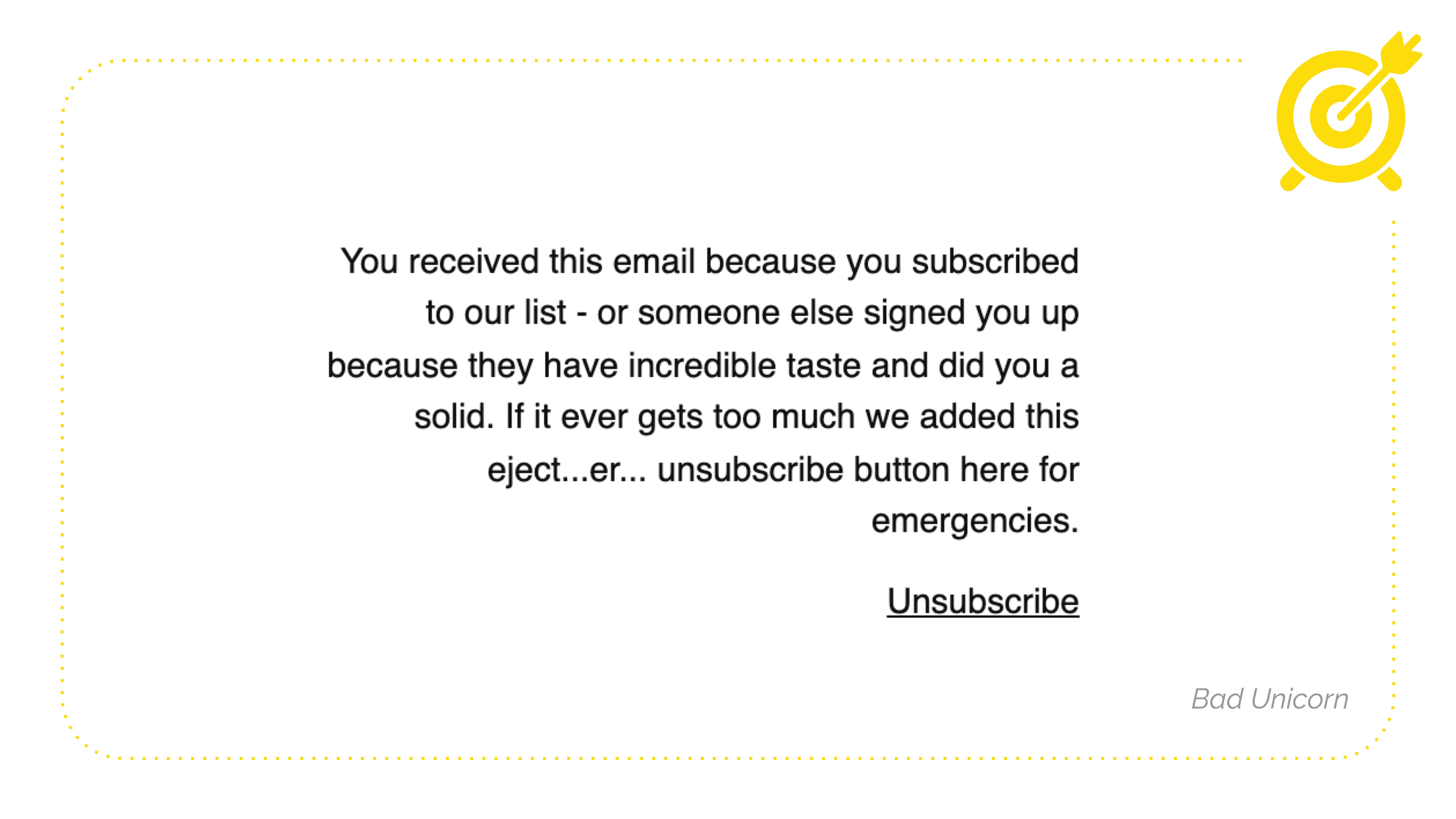
Bad unicorn is a fun list to be on. But, honestly, I don't even know if they're a real company. I think they're like a V.C. fund. They invest in bad ideas, maybe. But they say, "You received this email because to our list - or someone else signed you up because they have incredible taste and did you a solid." So again, this reaffirms the greatness of staying on the list. "If it ever gets too much we added this eject...er... unsubscribe button here for emergencies." So like cute. You might get down there and be like, I'll stay. I think the footer in my email list says, "You received this because you were a part of a very fun and cool Punchline copy club.
If you have to leave, I'll cry forever." Which is becoming a theme with me today. I cry a lot. It's fine.
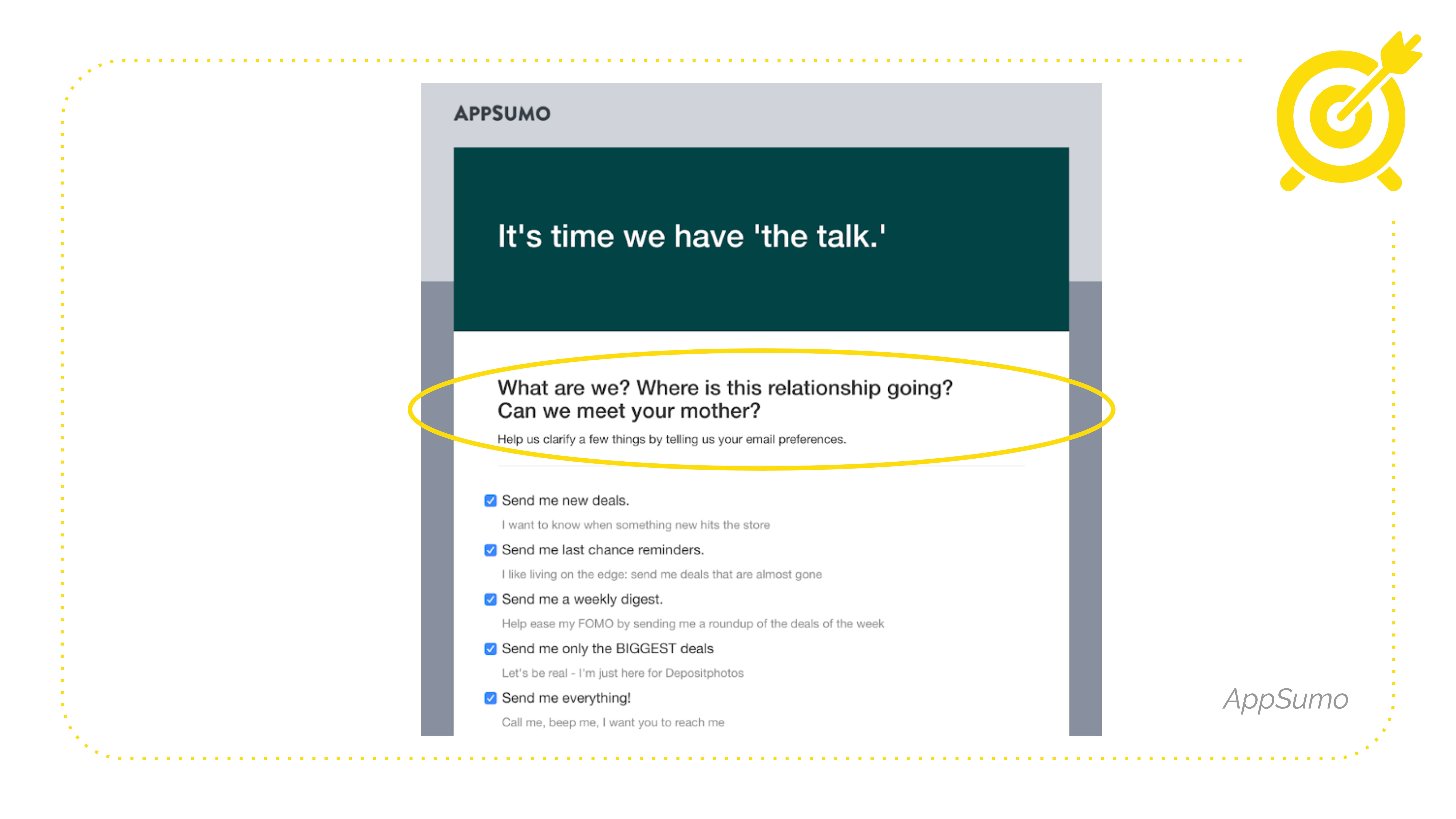
Even when they click through to update preferences, cause maybe they don't want to leave. We all know that if you have different segments, don't let someone just unsubscribe because you forgot to add a link to the preference center. So nobody ever updates the copy in the preference center. Here's AppSumo, "It's time we have 'the talk'. What are we? Where is this relationship going? Can we meet your mother?" They're also doing a fun thing here with the rule of three, which I don't have time to talk about today, but the rule of three is vital in both copy and comedy.
We're going to look at ways to edit your existing copy to feel friendlier and warmer even if you are having a terrible day or you don't feel funny, or you're not funny.
I've helpfully divided these punch-ups into three categories. So when you're writing your copy, you want to show your emotions, piss off your grammar teacher, and lead the way.
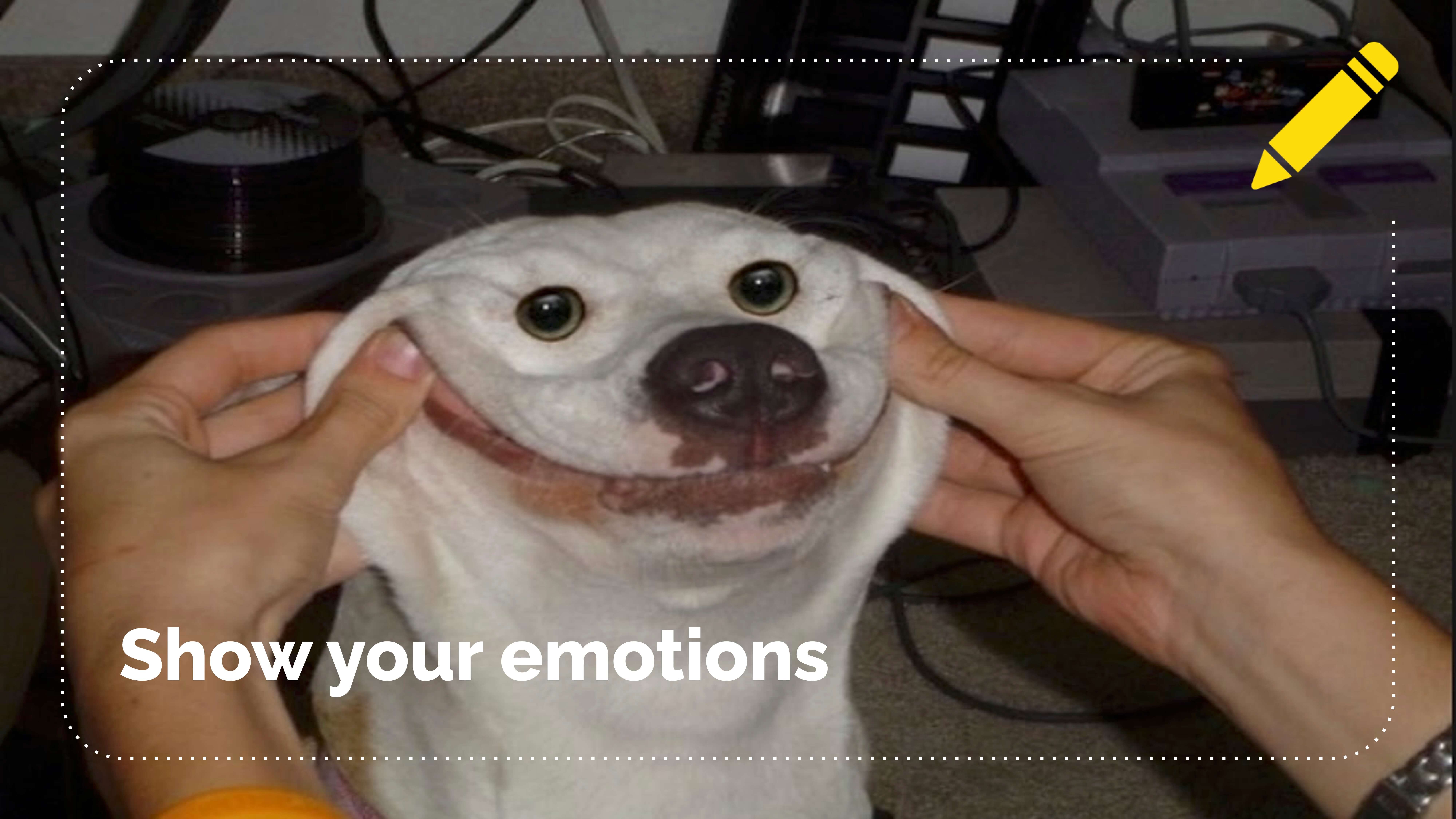
I put a dog on it. Judging by the stack of CD ROMs in the background, this dog has been dead for decades. This dog is just dust. He is no longer. He was haunted before he left this plane.
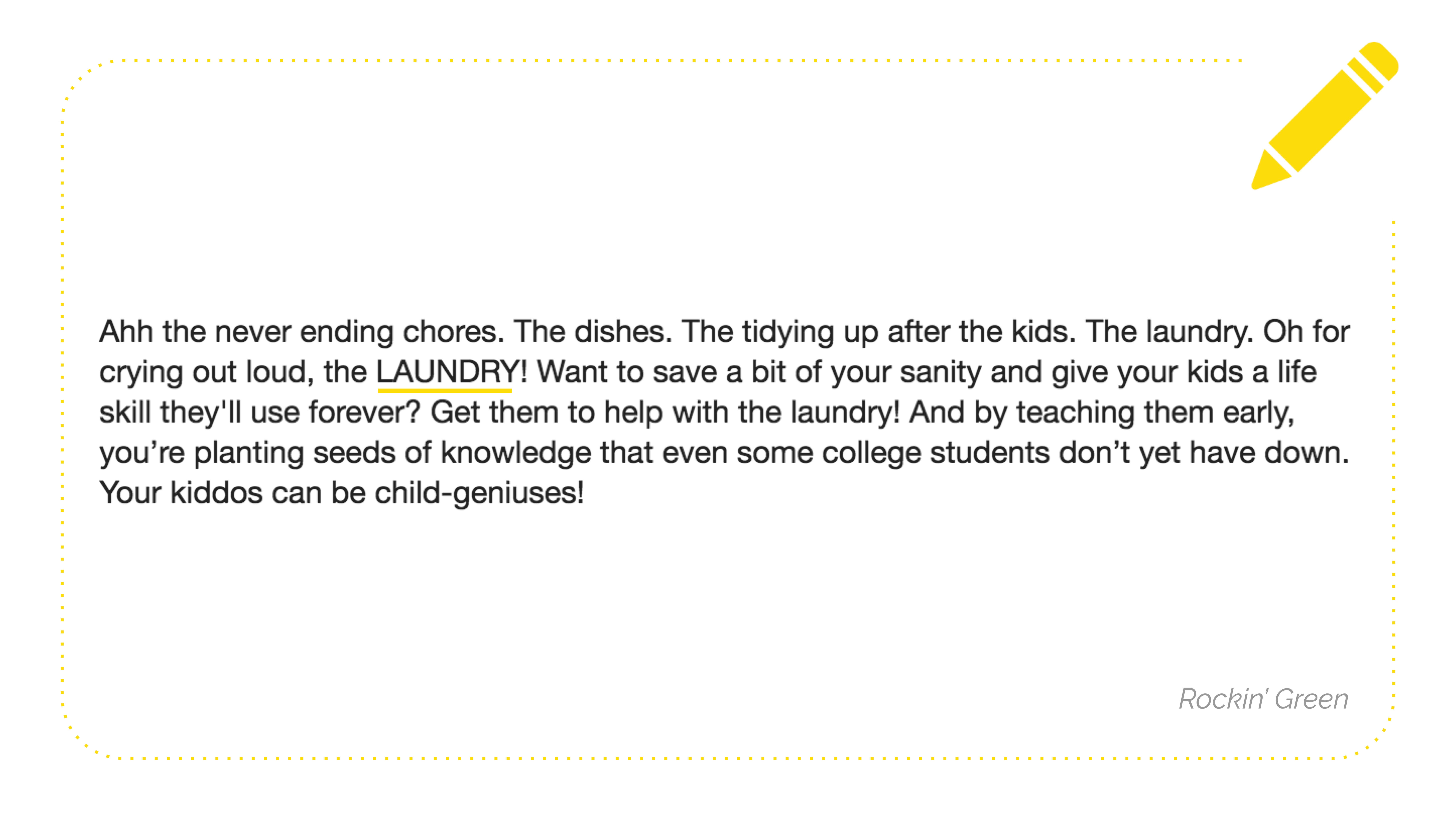
What's an easy way to show your emotions in copy? Write in all caps as if you're yelling. Do it sparingly. Choose one word or a short phrase because you don't want to be like your grandma texting.
So here's an example. Rockin green sells laundry detergent. They say, "Ahh the never ending chores. The dishes. The tidying up after the kids. The laundry. Oh for crying out loud, the LAUNDRY!" We all heard it that way. Right? Like when reading it. That's how you add more emotional cadence to your emails. You can also do it in italics. That's fine. I like caps.
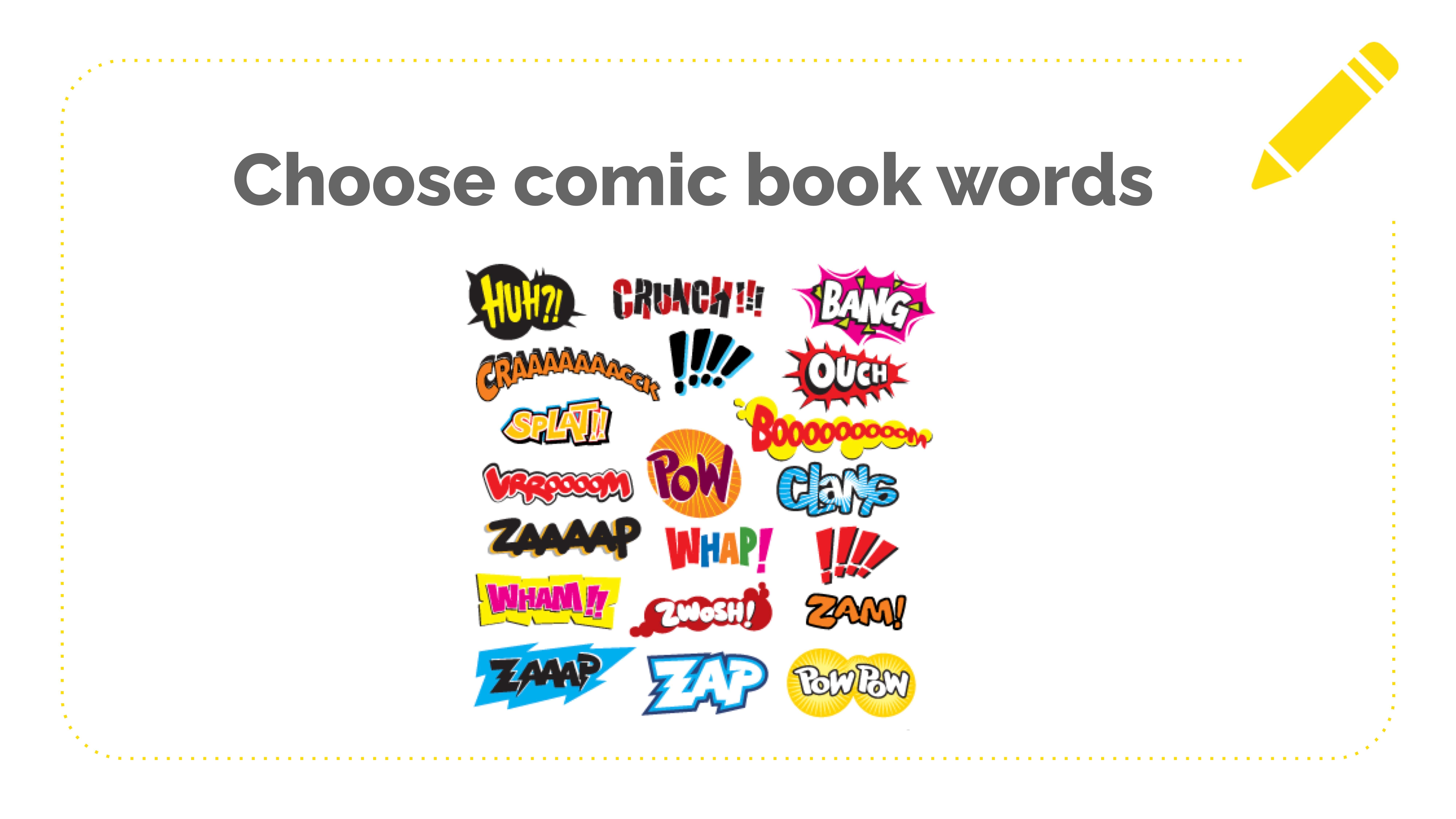
Describe a sound. When you read a description of a sound, your brain actually is like, I hear that sound. So choose comic book words or onomatopoeia, like bang, boom, crash, pow, zap, and wap. I'm just reading off the graphic now. Or describe the sound.
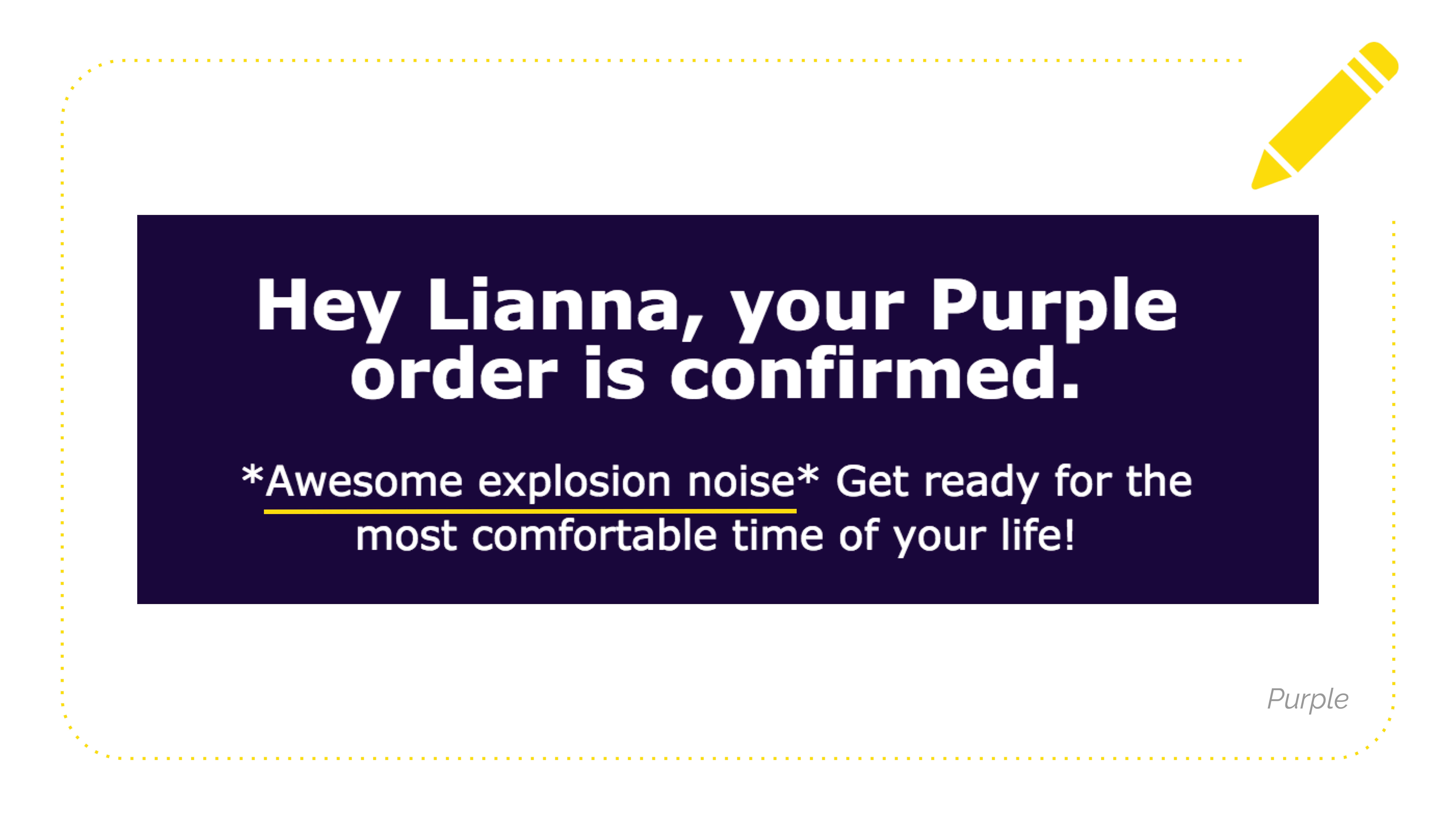
So Purple. I love their emails. I love all their copy. "*Awesome explosion noise." It's lazy, but the fun is that it's lazy, right? Like what would an incredible explosion noise sound like? You get to decide yourself. None of this is rocket science.
Make "asides." So an aside is as if you were whispering into your reader's ear in a parenthetical, usually like here's where we're going to tell you a joke or like we're best friends now.
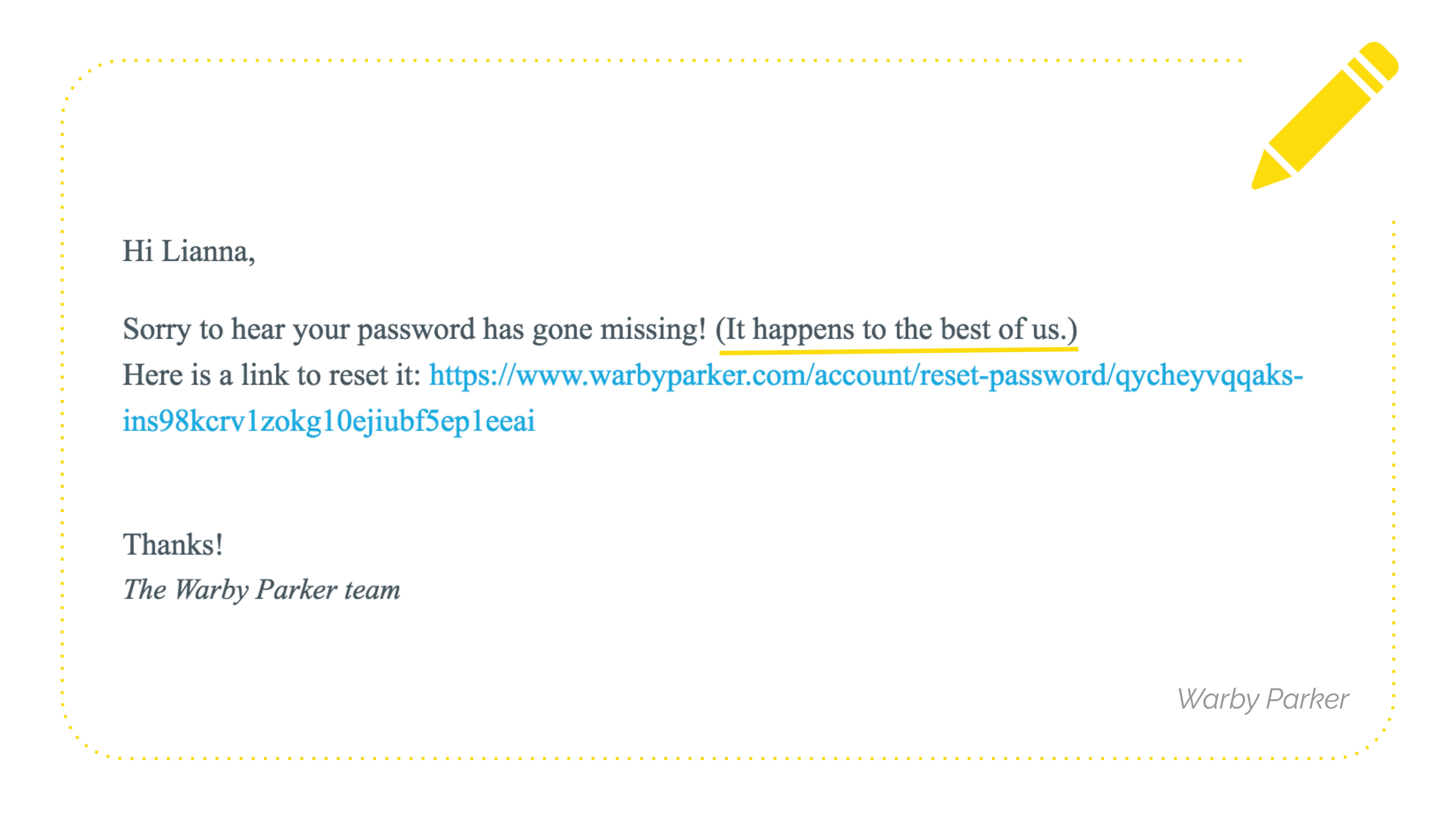
So here's Warby Parker's transactional email could have just, "Hey dummy, you lost your password. Sucks for you. Here's the link." Instead, they say, "Sorry to hear your password has gone missing! (It happens to the best of us.)" Oh my God. Thank you. Warby Parker. I don't feel like such a dumb ass. I'm picking the little pieces that nobody thinks about enough.
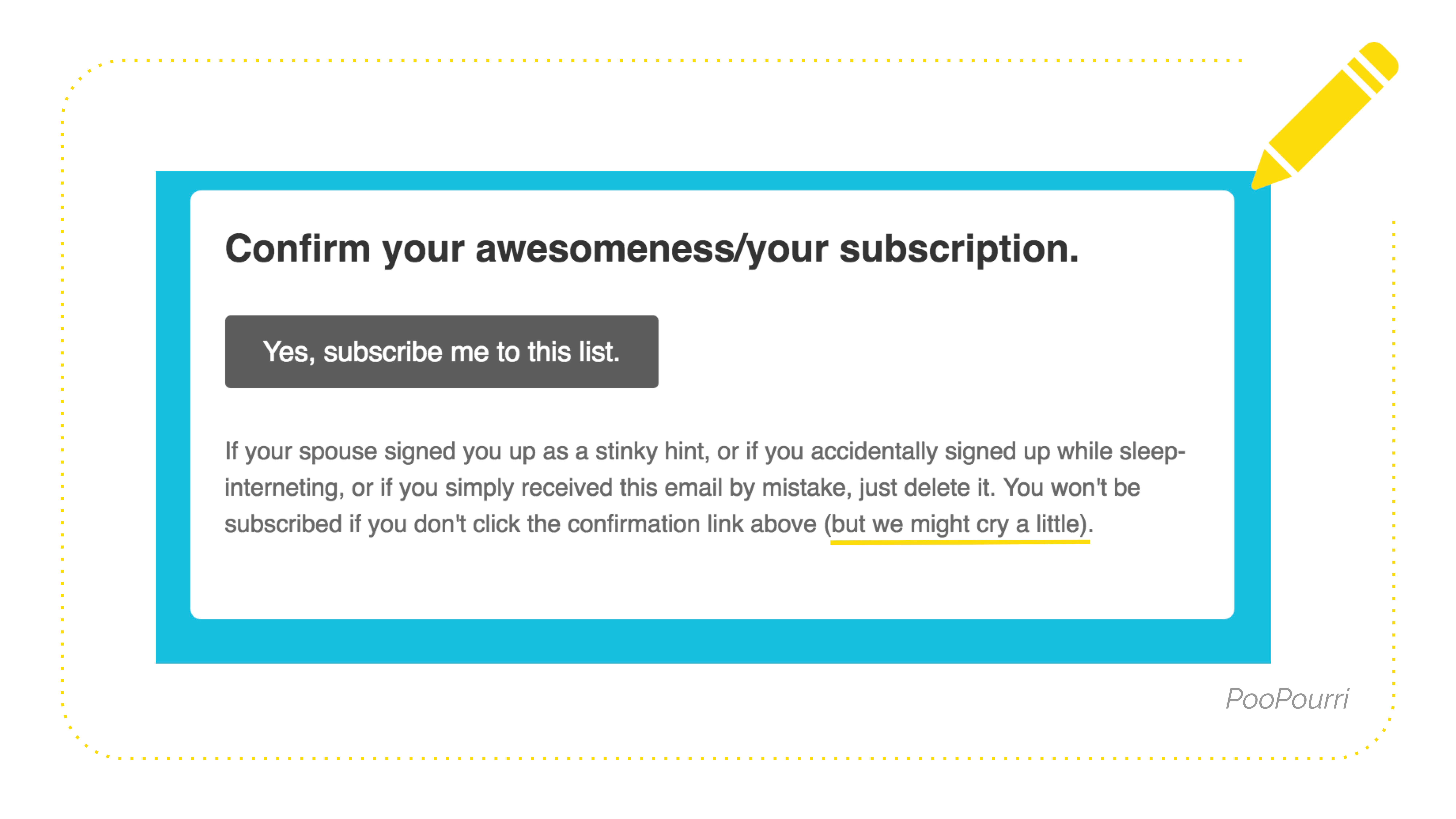
They say, "Confirm your awesomeness/your subscription. If your spouse signed you up as a stinky hint, or if you accidentally signed up during sleep-internetting, or if you simply received this email by mistake, just delete it. You won't be subscribed if you don't click the confirmation link above (but we might cry a little)." And I was like, oh, fellow criers, my people, I found them.
Another way to add emotion, fun, and visual interest to your text-based emails is if you're like me and mostly write text-based, use GIFs and emojis.
Here is a fun way to use an emoji. What emotion is the person feeling as their read this? And then pick the emoji that's that emotion. It's like easy. It draws your eye around the email. Can I do this? I don't know.
Here are MeUndies using a fun GIF in their order confirmation email. It's pretty simple, but that's fine because it's a short email. You're gonna open it and be like a celebration visual celebration here. My order details. I'm done.
Here is how not to use a GIF. And I think Megan kind of touched on this from the accessibility standpoint. They can get really distracting. They can be kind of weird. They can be irrelevant if you haven't done that customer research to know what kind of things people think are funny.
So here's an email from a SASS. Allie helpfully forwarded me a reminder to add your sink today. This is a reminder to add your sink to the product name. You can change the time of this reminder, and then there's like this really long, weird, small anime GIF, and there's making out in it, and it takes like, you know, a few full seconds, and then it's above the button for what you want somebody to do. It's like, they just get stuck on that. So I like to say, even if it's not a reference, your reader will get it. Make sure it's like universal anyway. So like a cute animal, cute baby. Even if I don't get what show it's from, it's still going to play. Maybe no kissing, perhaps nothing that lasts a really long time.
Another section of punch ups: piss off your grammar teacher. I feel like we're all millennial gen X. We grew up learning that good writing had an intro sentence, three body sentences, and a conclusion. We've learned in an email a little bit of one-sentence paragraphs are okay because they're easier to skim. But, you can take it further than that.
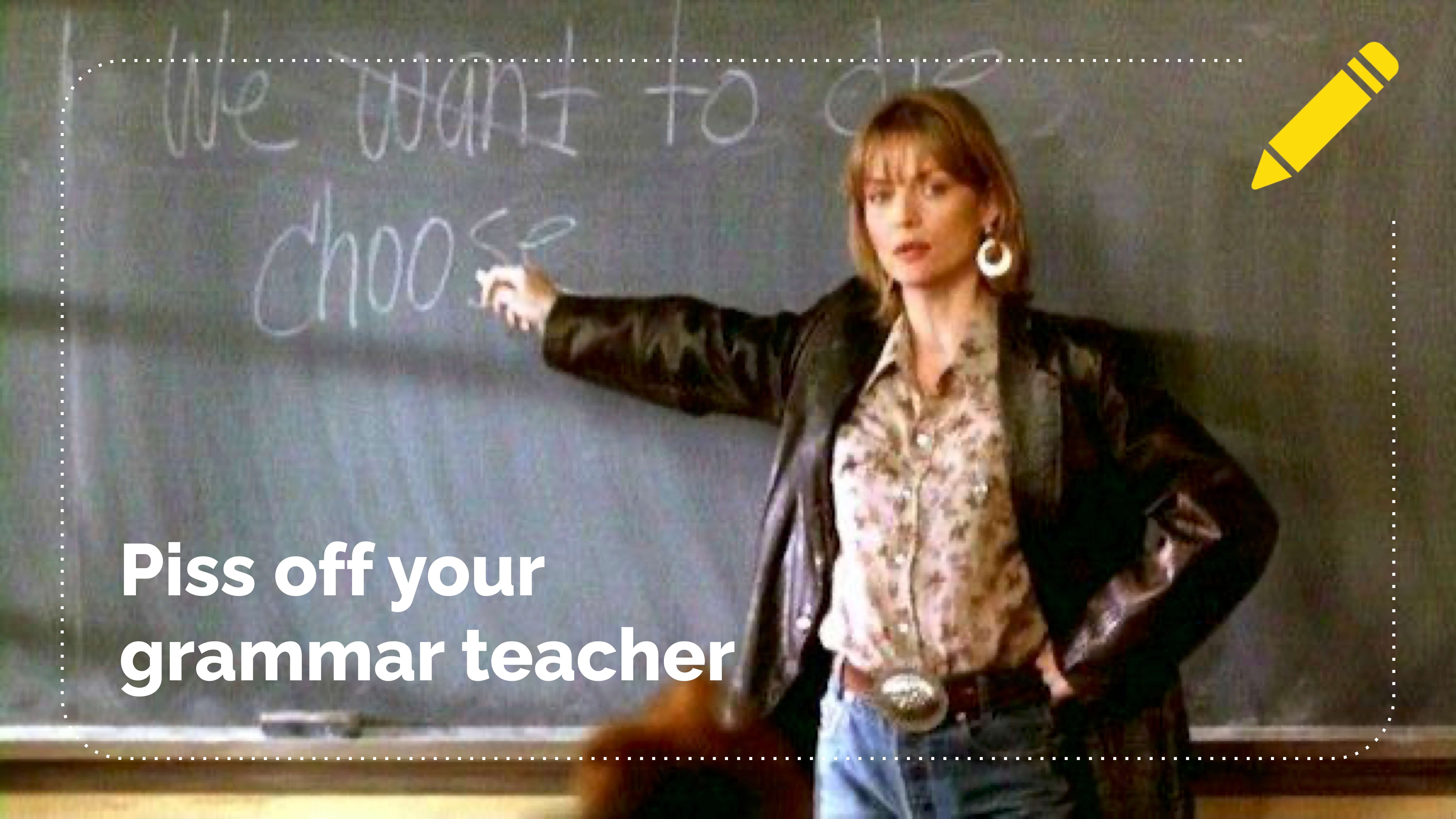
Oh, that's the acronym for piss off your grammar teacher. Super memorable.
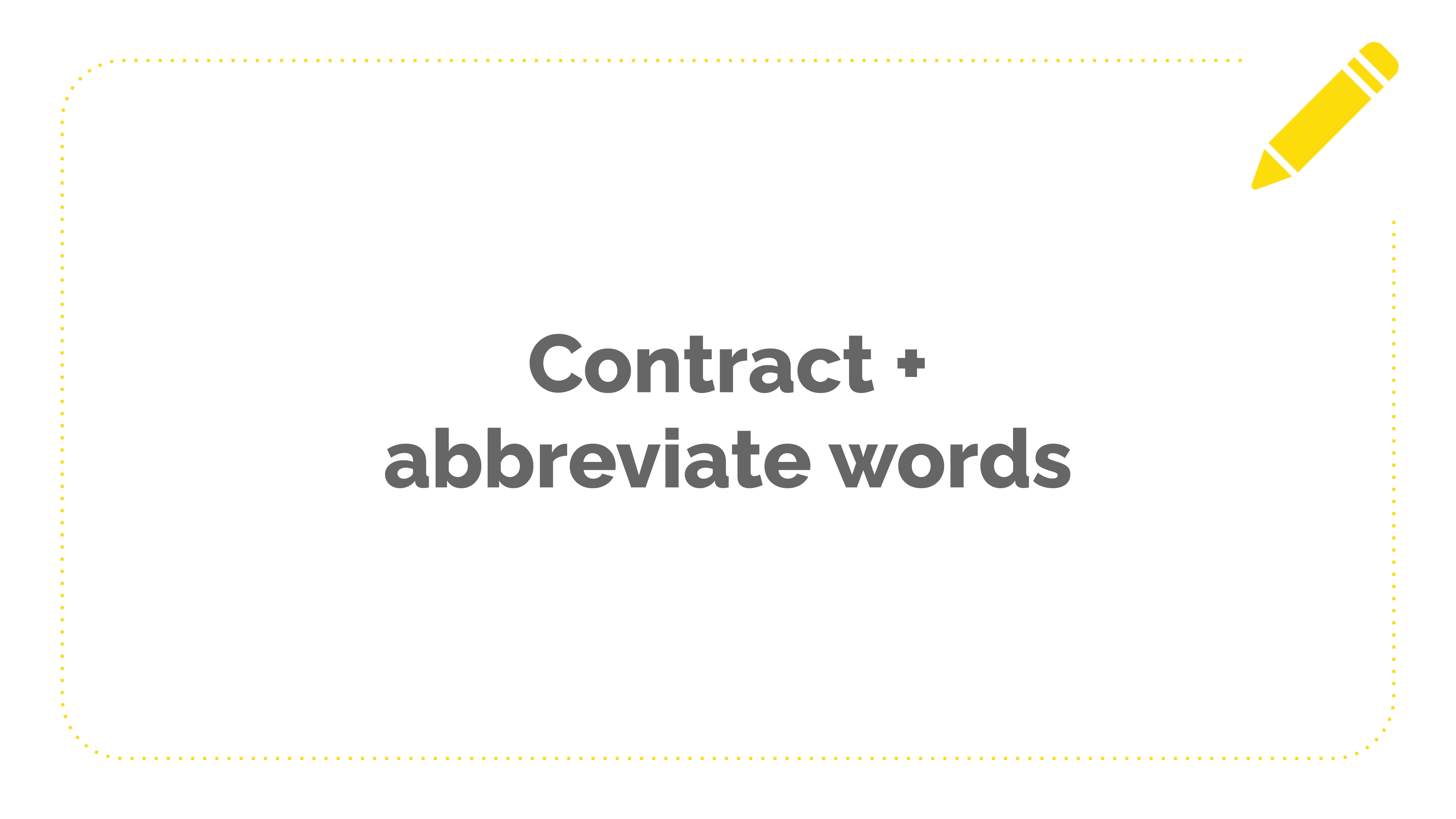
Contract and abbreviate your words. This is, again, an easy edit you can do with your existing copy.
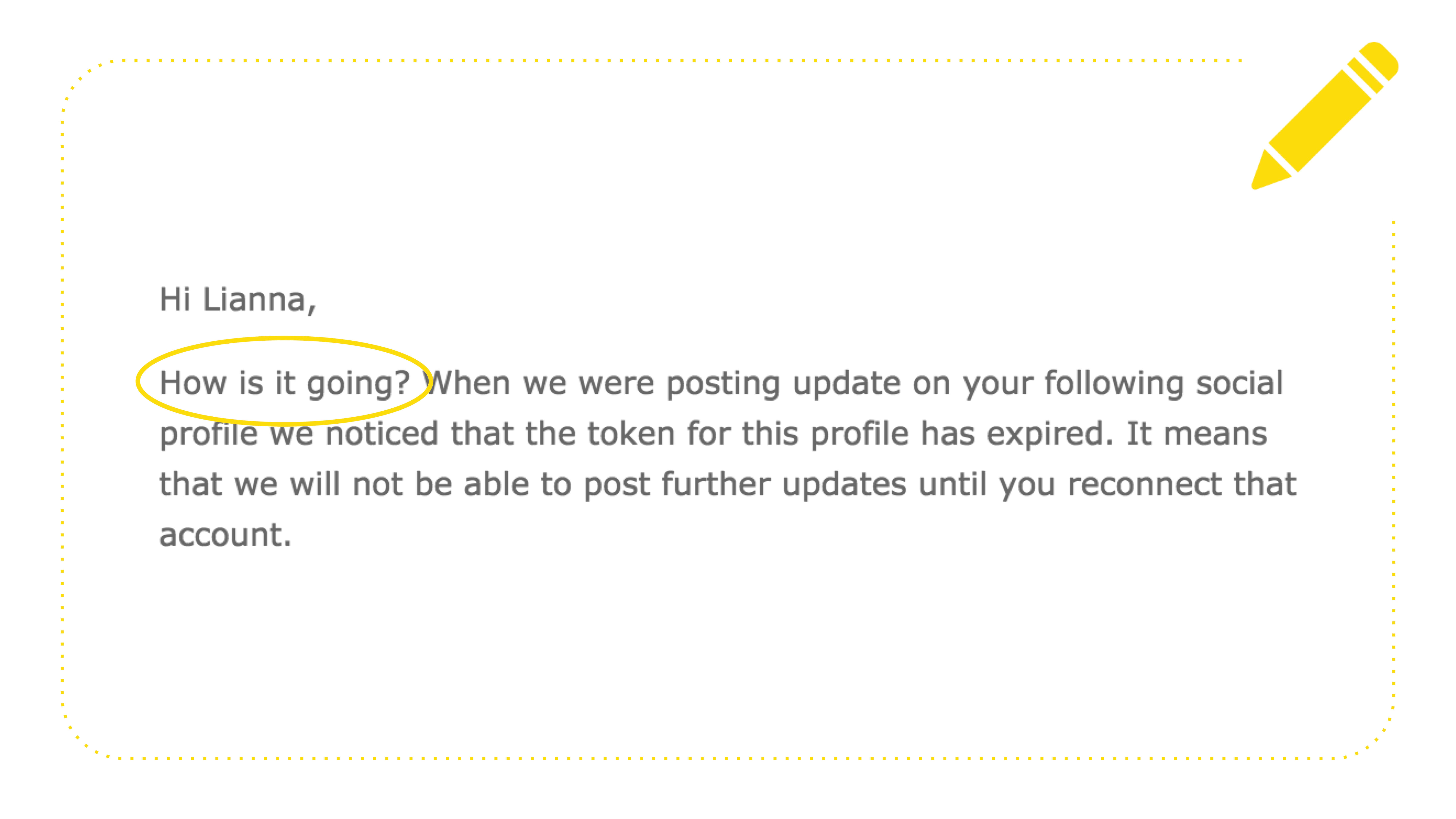
Here's an example of a thing that I'm trying to explain right now. Here's a SASS. They send me a check-in email trying to be conversational and fun, and they say, "Hi, Leanna, How is it going?" Which automatically made me think a human didn't write this. How's it going? It's the way that we talk like humans. It's okay to speak human. Even the stodgiest CEOs at the most giant B2B corporations are humans. To put it another way, everybody poops.
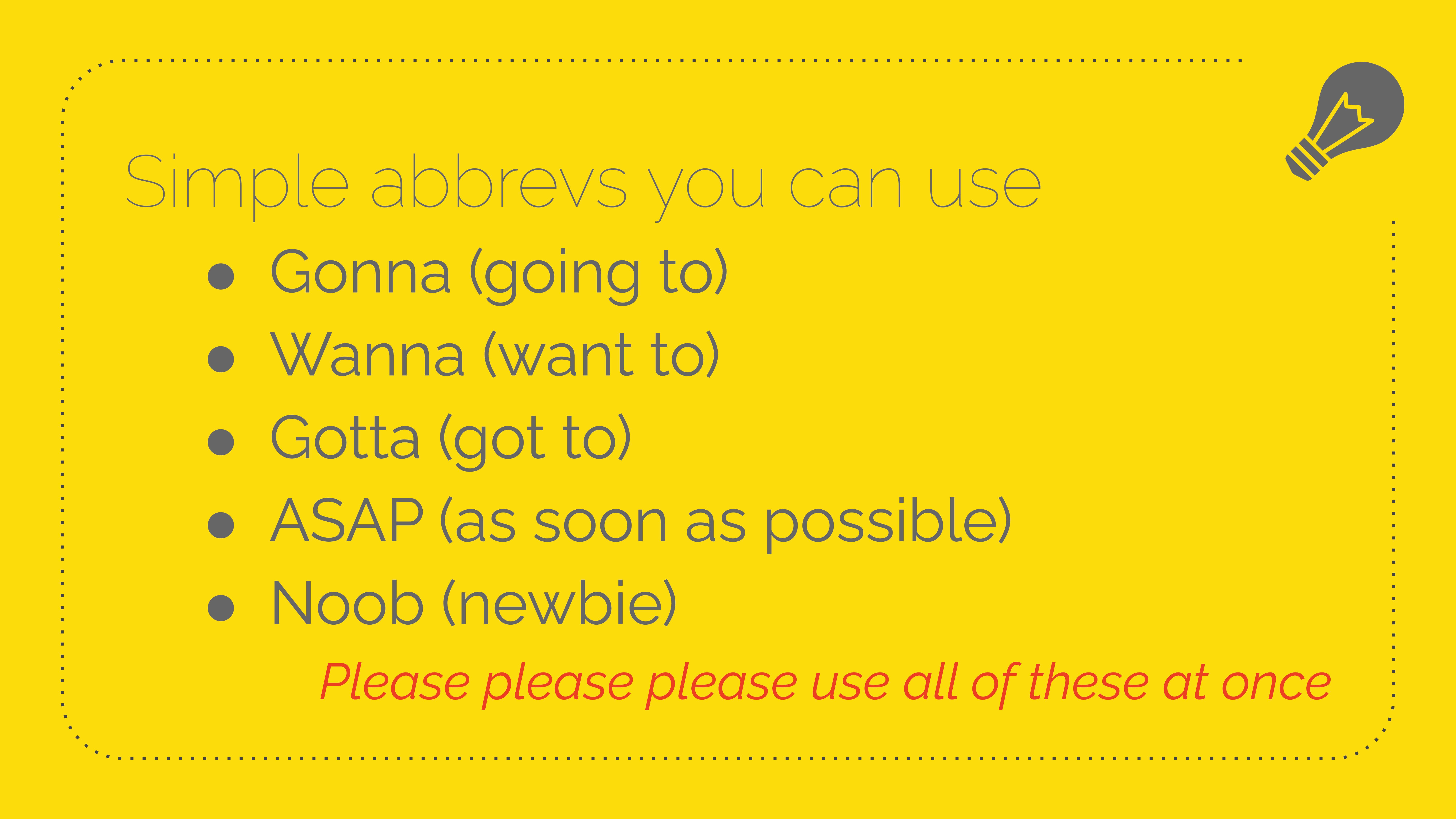
Here are some more examples, gonna, wanna, gotta, ASAP, newb. And I really want somebody to use all of these in the same email and then send it to me. I'll give you something cool. I don't know. We won't agree on what the something cool is.
Chop up your sentences. We all learned that a sentence has a subject, a verb, and a direct object. But, no, it doesn't. That's not the way we speak.
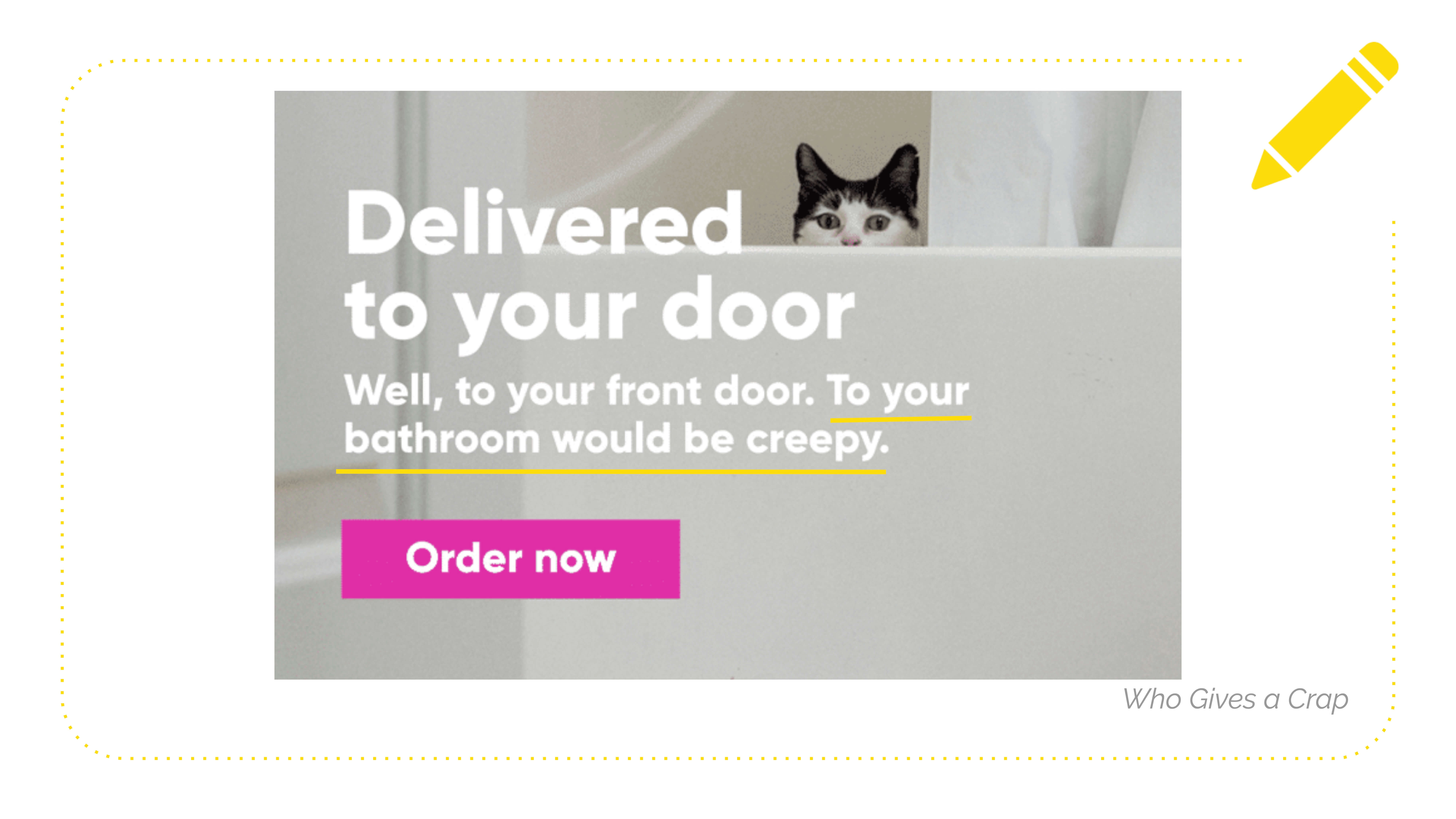
This is Who Gives a Crap, and they say, "Delivered to your door. Well, to your front door. To your bathroom would be creepy." "To your bathroom would be creepy" is not a full sentence, but we know what they're talking about. Feel free to do more of this kind of fragmenting agent copy because it gets you where you're going faster, and it is more conversational.
Here are some cliches to cut that I see all the time.
Everybody wants to save time and energy. That's like literally what we're on the planet. So maybe stop promising that as a benefit. Cause it's like, what does that actually look like? How much time? What kind of energy is it like? Stay in and Netflix energy or go out and meet somebody new energy? Not the second one. I can tell you that.
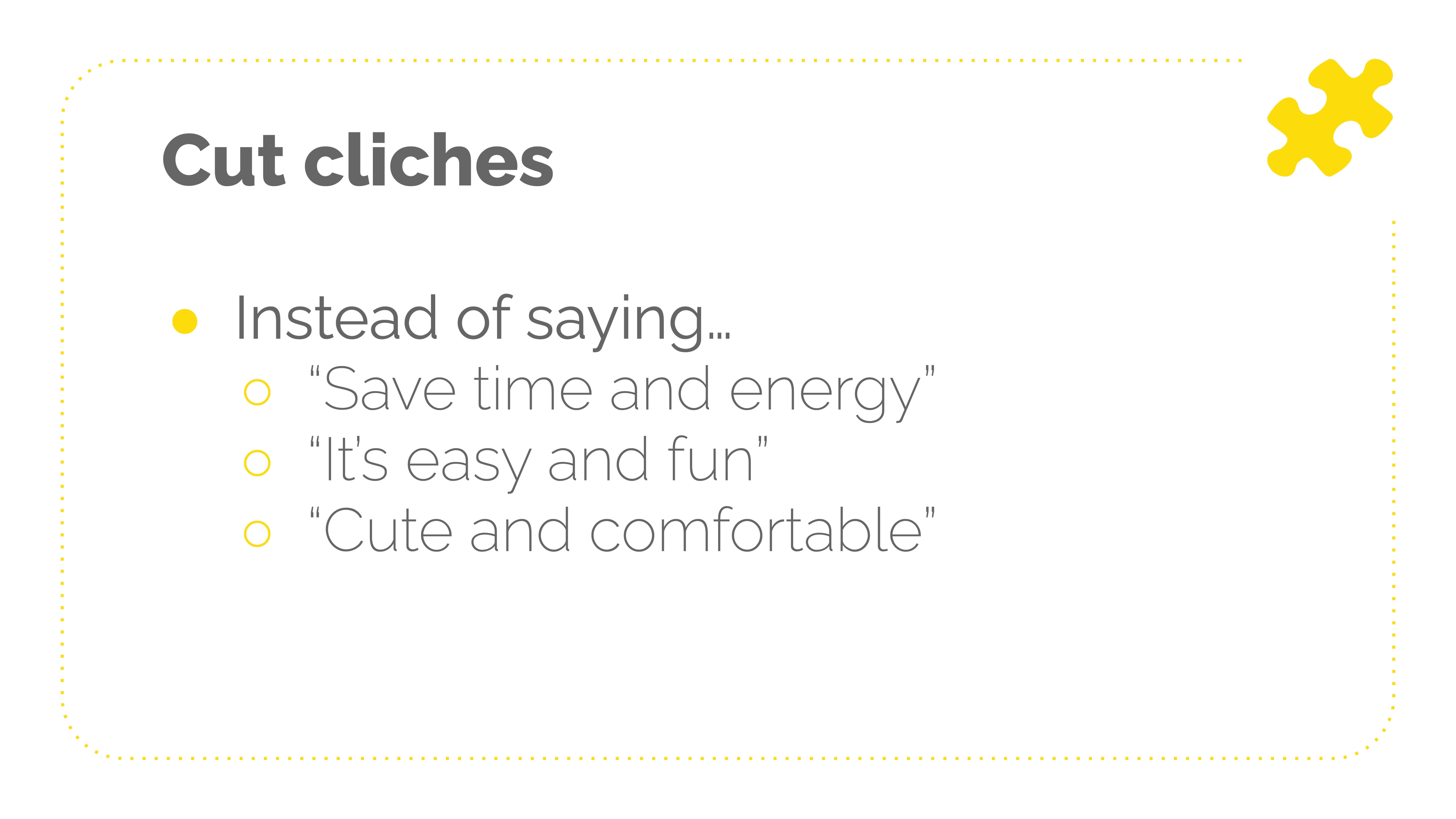
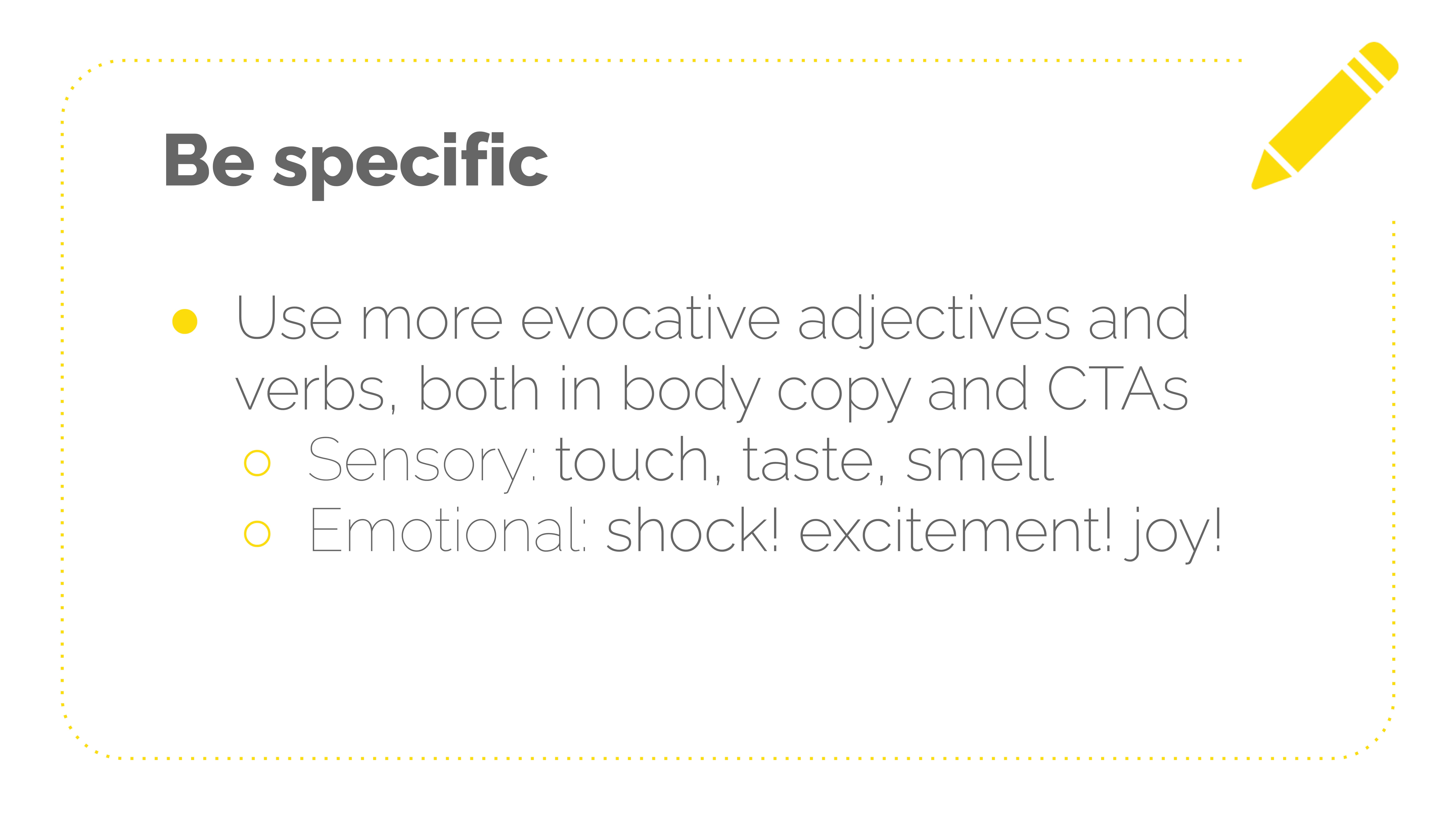
Yeah, "It's easy and fun." "Cute and comfortable." If it comes to mind very quickly, it might sneak into your copy and be like a nothing phrase. So when in doubt, try to be more specific. Go through and look at your verbs and adjectives and see where you can replace them with something that you could see, smell, or hopefully not taste.
So sensory words touch, taste, smell, and then emotional words, like, how do you feel about this thing we've already talked about using GIFs and emojis and all the other good stuff to add emotion to your copy? It specificity helps with that.
So this is a client of mine. They are a consulting company for SASS, and I wrote, "We don't think it should take a cereal-box decoder, Rosetta Stone, or black-magic goat sacrifice just to get more insight into the AWS services you're paying for." Previously, it said, "We don't think it should be so hard to understand your AWS bill." So more people will remember the black-magic goat sacrifice and maybe reply and be like, "Hey, that's weird. I just sacrificed and goat this morning and still don't get my AWS bill."

Oh, and in CTAs. This is the best place, to be specific. You're going to preview what's coming after the jump. You're going to make them excited. You're going to deal with any doubts or objections they might have about clicking. And then, I don't know, make it funny. So instead of "Shop Now," try something like "Launch Me Into the Shop-O-Sphere."
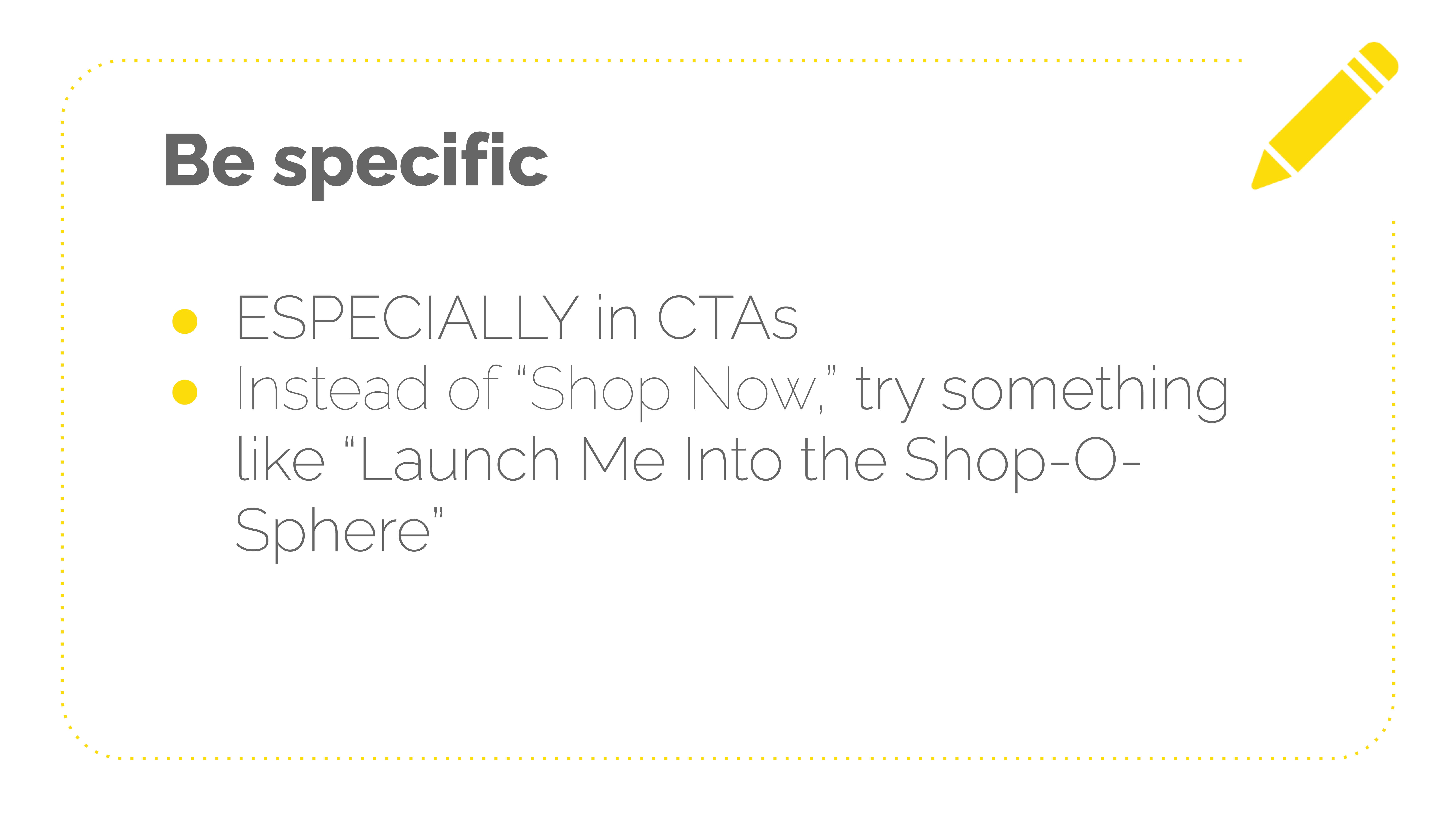
Was it Chubbies that sent the abandoned cart email? That was like, "Whisk me back to my cart, James." Or like, "Teleport me back to my cart." Like it's fun, right? When you're shopping for swimsuits and shorts, like have a good time. You can still do this. If you're not in a fun industry, I promise you will get more clicks.
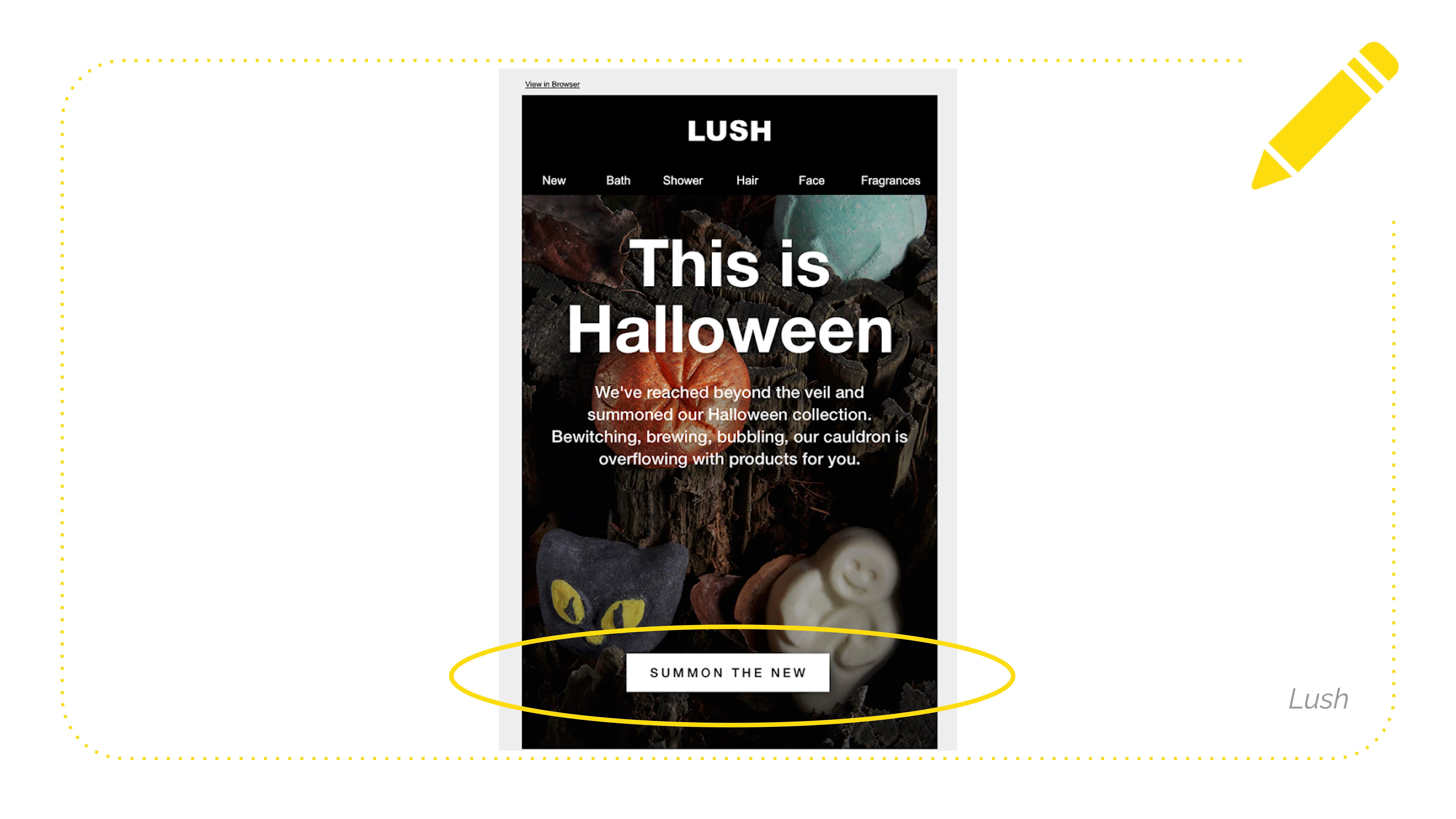
So here's Lush saying instead of "shop now" or "shop Halloween" or "shop new in-store," they use "SUMMON THE NEW." Spooky. This isn't like "haha" funny, right? This is just like having more fun.
Ooh, here's one of my favorite tips and tricks. Sometimes people who are getting started with humor and copy are like, I want to exaggerate, but I don't want to lie about what we do or can do. So instead of using exaggerated funny language around yourself or your product, use it with what your people are facing and what problems they're having.
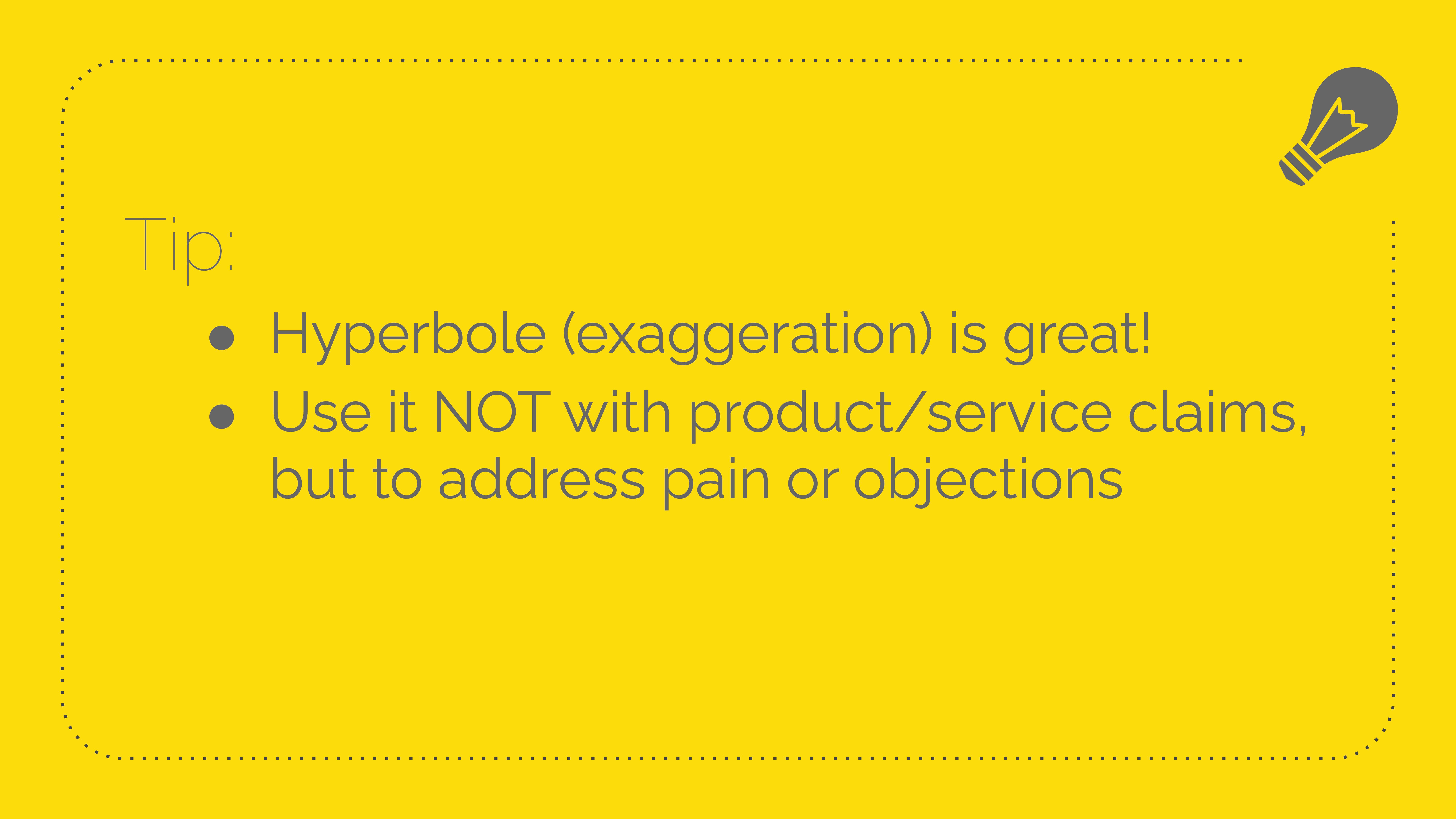
So here's how that might look. You're not making claims. You can't turn people into six-foot, four astronauts, but you are saying when you wake up in the morning feeling like you got hit by a dump truck, right? No one feels that way. Everyone here sleeps terrific. It must be nice.
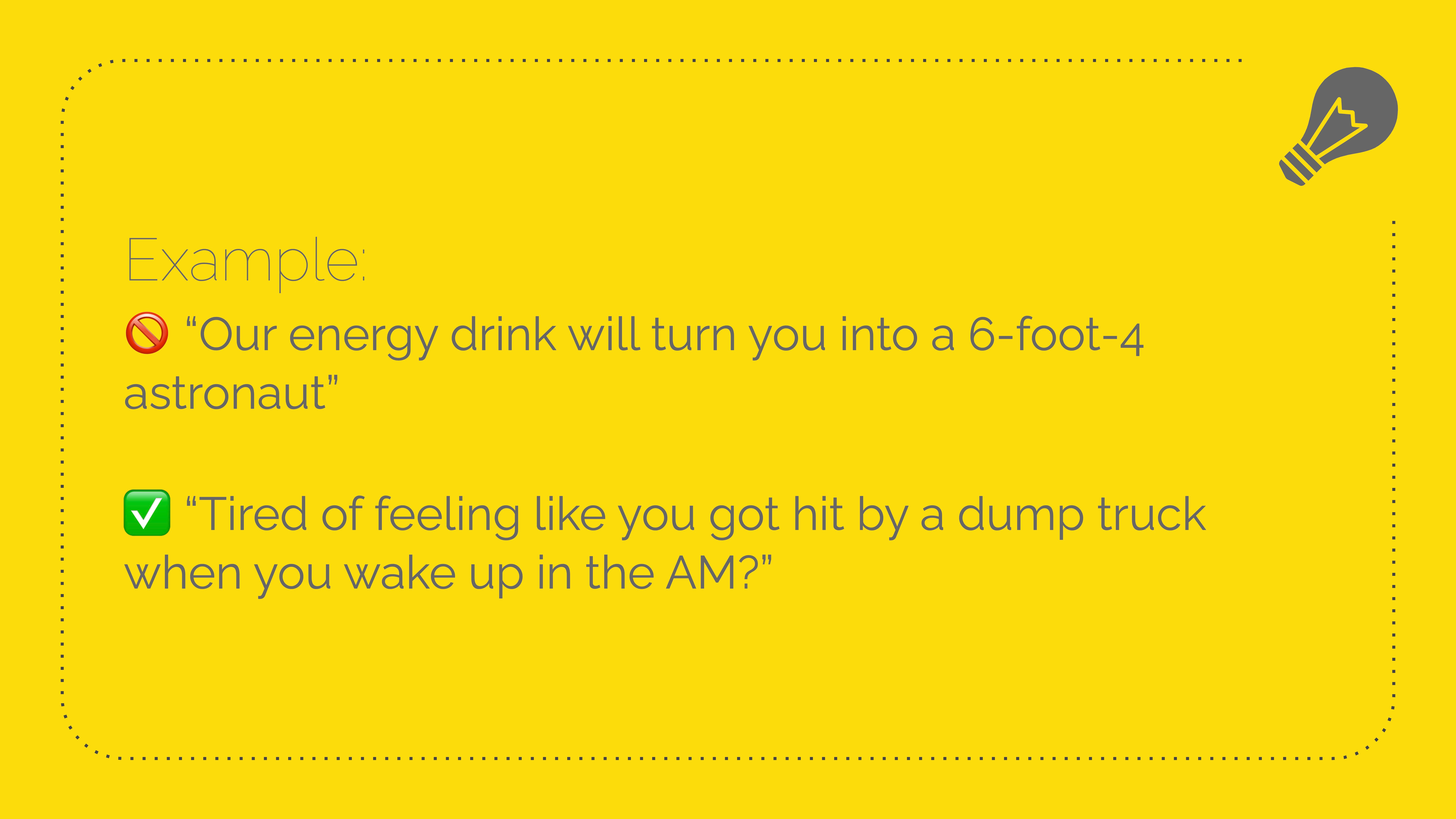
So we talked about showing your emotions in fun ways using visuals, we talked about shortening your sentences to get to the point faster using hyperbole. Now we'll talk about the most essential part of every email, the CTA.
So what is the best way to get somebody to click, to go where you want them to go from the email? Cause that's the point of sending an email, right? To get them to go somewhere.

Ask and answer questions. Cause that's how people talk. So it helps set you up for the copy point you want to make.
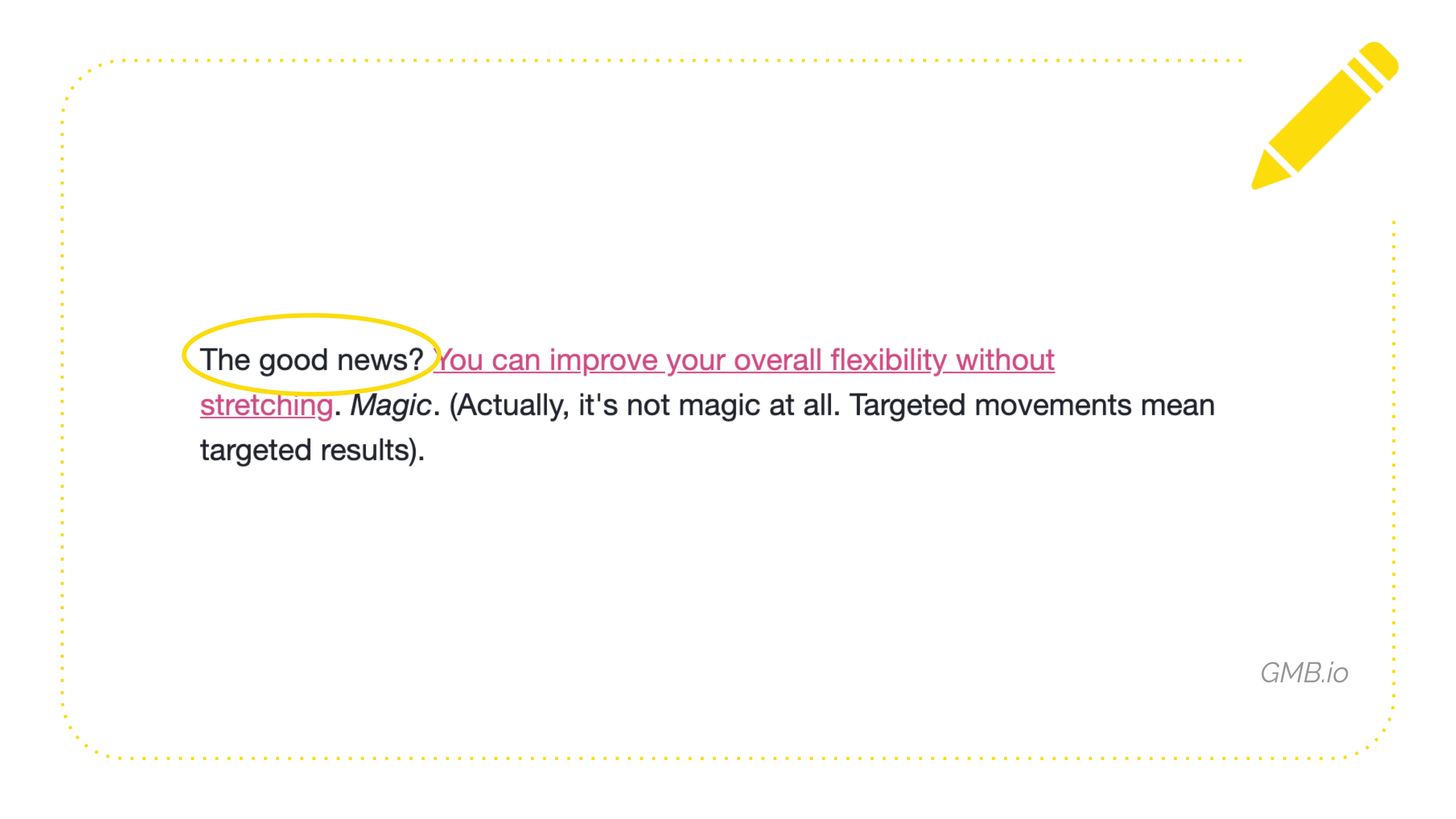
So "The good news? You can improve your overall flexibility without stretching." I especially love this as a text-based CTA because it's super long, clickable, and readable. When you skim the email, you see it stand out, right? So it's not just like, "improve your flexibility." Three words. Like someone's looking at their phone. Like, I can't click this. And he set himself up for the CTA. It's great.
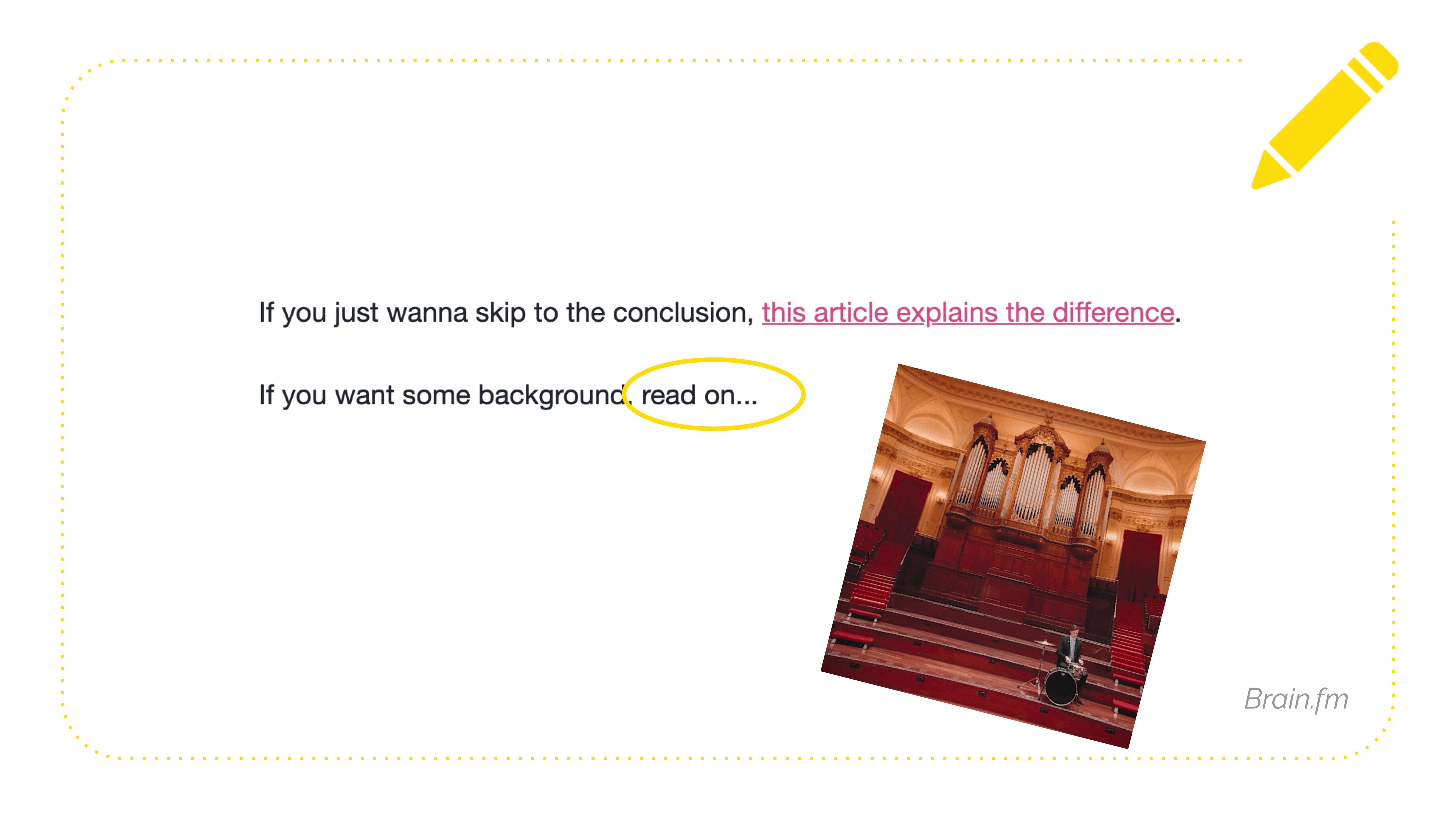
Another way to set yourself up for the click-through is to trail off with an ellipsis. We're copywriters. We don't have fun drum rolls. This is the best we can do is the dot dot dot.
Ooh, something exciting is going to happen. But also notice the second sentence here is shorter. So when your eye gets done with that first sentence, you kind of move down to the end of that second line, and you see the dot dot dot, and that cues you like, oh, something important is below this. I should look at that. Look at the shape of your copy while you're writing it. Not just the words. We're not even gonna get into that because that's a whole thing. But look up the iceberg layout.
I had to say it. I still get emails from established brands like, "Hey, here's a photo, alight, bye." And it's like, I feel angry that you stole my time from me. I don't even know what I'm supposed to do. So yes, please include a call to action. It can be a button. It can be a button and linked images. It can be linked text. It can be whatever. I don't care. Just tell people what to do next.

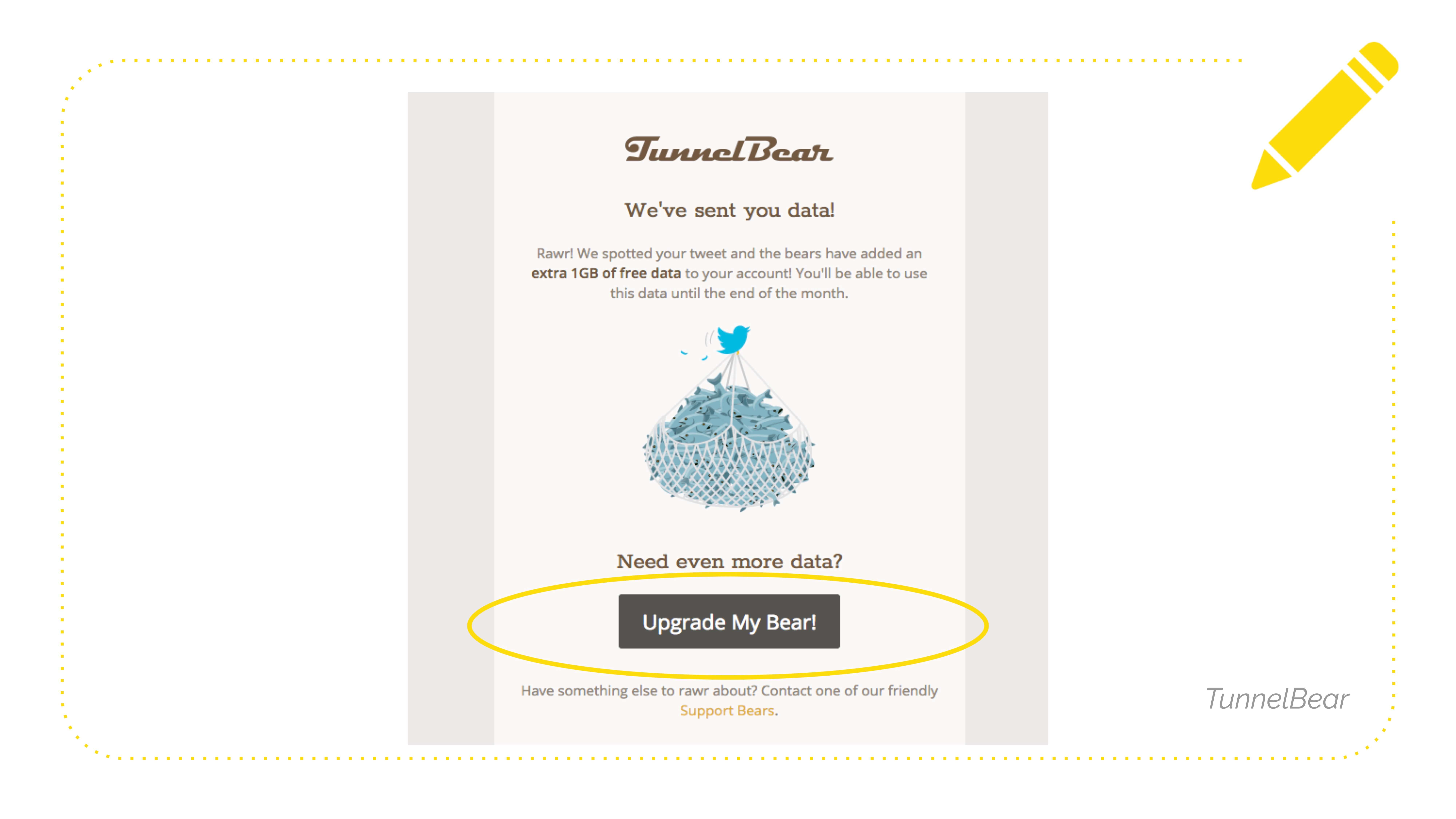
Here's a fun example from TunnelBear. They're a VPN service. They're doing so many things right with this CTA section. Notice how they're setting you up with a question, "Need even more data?" And they say, "Upgrade My Bear!". It's super-specific. I know what's going to happen. It's written in the first person, so it's easy for me to parse. And then underneath it, it says, "Have something else to rawr about? Contact one of our friendly Support Bears." Well, that is just so, gosh, darn cute. I love them. I don't even use a VPN. I don't know why I got this email. I bet they get a higher click-through rate on that than a, you know, test variant that says like "Add More."
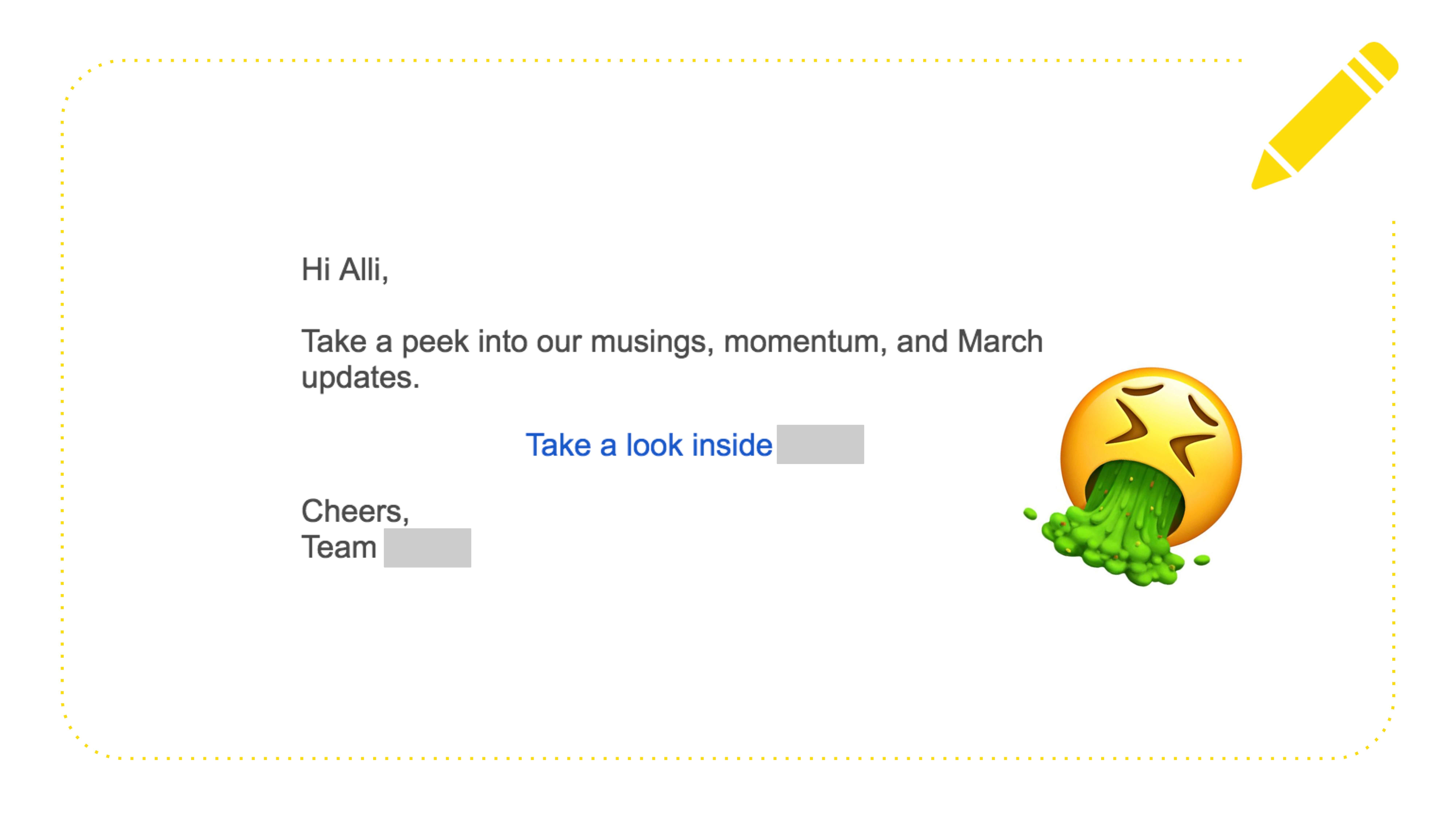
Here is an example sent to me by my friend, Allie, bless her heart, who gets bad emails and sends them to me. A bad call to action. It's on its own line. It's centered, not underlined. It's a link, right? It's like, "Take a look inside brand name." Oh, I added the vomit face in case that wasn't clear. That's me. That's me barfing on this email. There was no reason for me to click this. I don't know what's going to happen when I click through. There's no urgency. Also, the copy that precedes it. Somebody was like, I don't know. What are some words that start with M? "Take a peek into our musings." It's like, I'm at a slam poetry event. I don't know what that means. Okay. So that's bad. Don't do that. Be specific.
I will leave you with this. Sending an email without a call to action is like sending a pregnancy announcement featuring a bazooka. You can, but you shouldn't.

To sum it up, everything we talked about today using humor is a scientifically proven way to build a better, more rewarding, and longer-lasting relationship with your email audience.
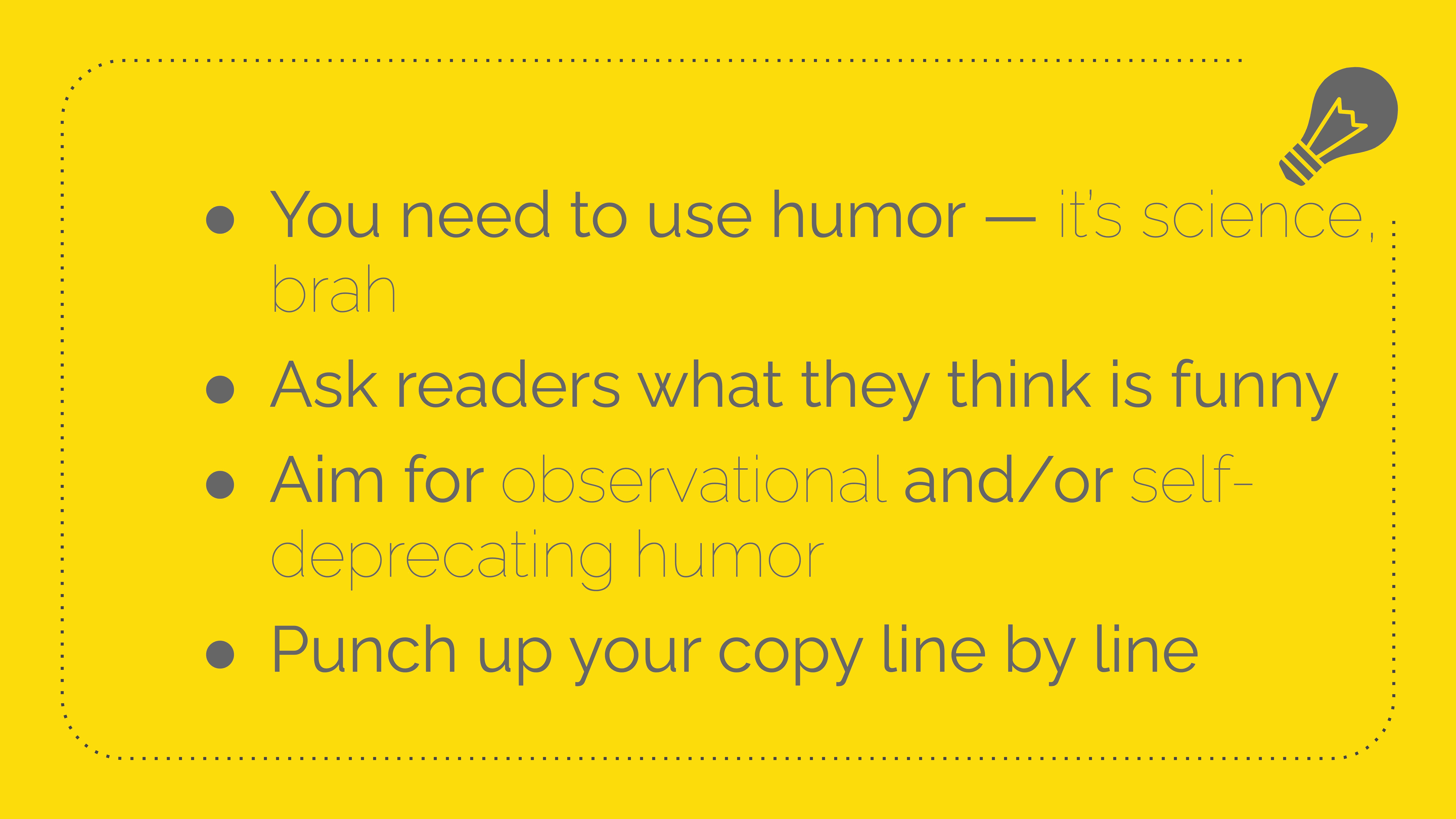
You'll figure it out by asking people what they think is funny. That includes your team. Make jokes about what's around you or yourself to avoid offending people, and then go through your existing copy line by line and punch it up, using the techniques I just showed you. And that's it.
I'm on the internet. Oh, and I teach a course about this. If you want to get real deep in the weeds about comedy. Thank you so much. punchlinecopy.com/course-prelaunch
