9 of the Biggest Email Design Trends From the Past Year
From blobs to transparent illustrations, Tattly's Design Director explores the top email design trends from 2019.

Cristina Gomez: I'm Cristina, or @OHCRISTINA, if you want to tag me in anything while I'm up here.
I'm very excited to talk to you about emails today. I'm also very excited to be in Greenville because I'm originally from Knoxville, even though I'm living in New York City, and it's like three hours that way. So while I may not be in my hometown, it's nice to be close by. There's also something about being a lot closer to a Cracker Barrel that does a lot to put me at ease. So now that you know where I'm from, let me tell you a little bit about what I do. For the past four years, I've been working as the design director of Tattly temporary tattoos.
From Side Project to Strategic Email Design
And then before that I was the art director of Kikkerland Design for about four and a half years. But I'm not going to focus on that. That is just to say that I have a lot of experience working in-house and getting my hands on literally every aspect of a brand. For those of you that may not know what Tattly is, we are a designy temporary tattoo company founded by Tina Roth Eisenberg, AKA @swissmiss. We work with professional artists and designers from all over the world to build our collection. And then with every Tattly you buy, the artist gets a portion of that sale. We're a small company, so as the design director, I get to be involved in all sorts of things, such as art directing our photography...designing our wholesale catalog... designing all of our packaging... redesigning our website.. hand modeling... I did have to hide under our couch to do that. And designing our newsletter.
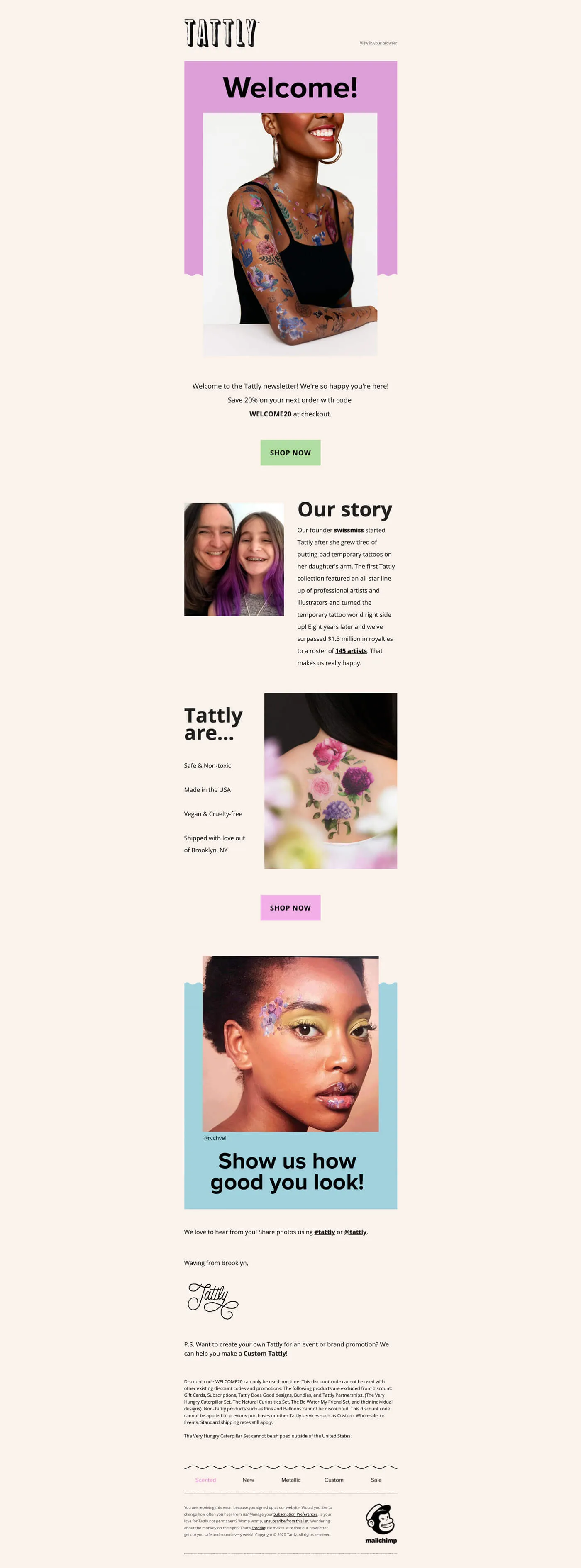
We send at least one newsletter a week, sometimes more, depending on if we're having a sale or we're just really excited about something.
Since I started at Tattly four years ago, I've either been the one designing the newsletter, or at the very least art directing it. We're also really big MailChimp people, so you'll probably see Freddy pop up at the bottom of these a lot.
The newsletter's changed a lot over the years.
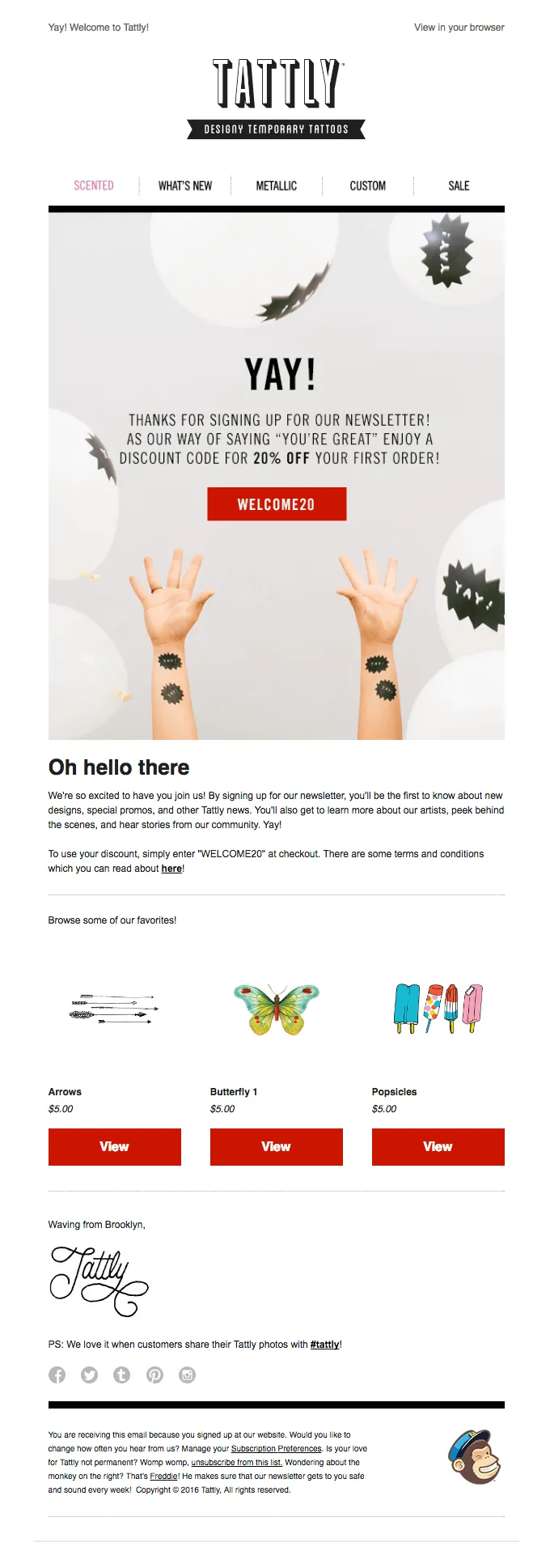
This is our welcome email from 2016, which as you can see, is very different from the 2019 version I just showed.
When Tina started Tattly in 2011 she didn't plan on it becoming a real company. It was just this like a fun side project. So the emails were more about surprising and delighting. We didn't pay that much attention to what was being clicked on or what our open rates were. We just wanted to have fun with it.
But we've grown up and we've learned it's probably a good idea to keep track of those things. So we've gotten a little smarter and we start paying attention. We A/B test now. See what works, and then we've adjusted our emails over time. So I'm going to briefly walk you through a few of our emails from over the years.
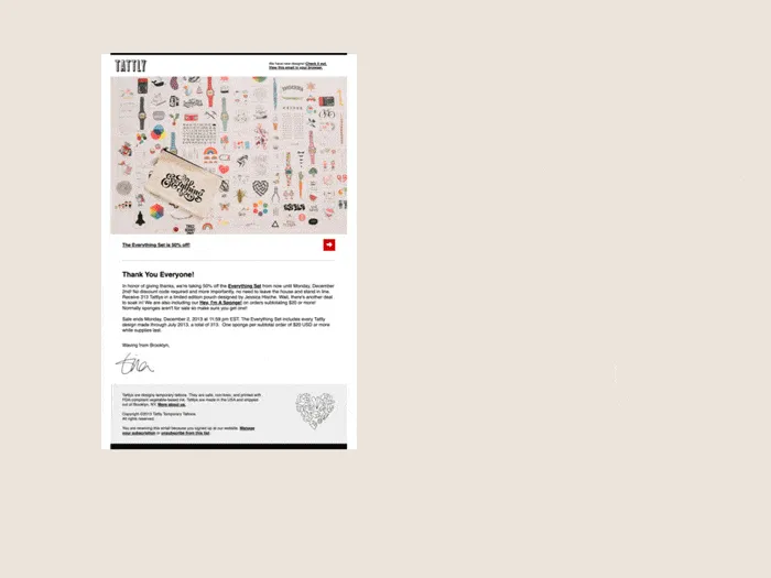
This is from 2012 and then this one you can see Tattly's really into puns. This is from our birthday sale in 2015. Again, more puns. I was not there for that one, but I cannot imagine how long it took to tattoo that guy. This is from the year that I started.
One of my first tasks was to redesign the newsletter template that we used, and then I just kept making changes to it over time.
So I think this was probably from 2017, changing it some more, and then this is from when we redesigned the website in 2018. So it's changed a lot. And at this point is when I decided to just like take the newsletter template and just run with it. So I mess with it all the time now.
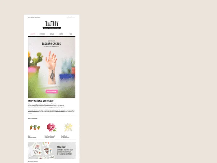
Even as we change things, one of the main things we try to hold on to is the sense of joy that we've become so well known for. One of my favorite ways that we do that is that we include a bunch of fun links to click on at the bottom of our emails.
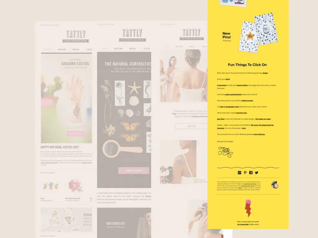
We had taken them out for a little while because we were worried about it hurting the click-throughs to our site. But we realized that it was kind of like taking away some of the brand heart. So we just brought them back a little while ago, which makes me very happy.
Our current newsletter template, like I said, really gives me a lot of room to play around with it. And I'm very lucky that we're encouraged to experiment and play with the design of it.
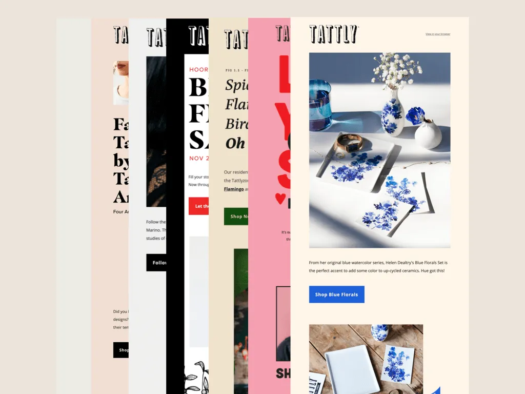
So I'm always looking at the trends to see how I can keep pushing our newsletter design while also trying to use as much live text as possible.
Email Design Trends to Experiment With
So... using some data from Really Good Emails along with my research. I'm going to walk you through nine of the biggest email design trends from the past year.
I'm going to tell you some of the pros and cons of each, and I'm also going to show you how I've used them in the Tattly newsletter.
Breaking Out of the 600px Box
So first up, wiggly blobs.
Or as I like to refer to it, the Chobani effect.
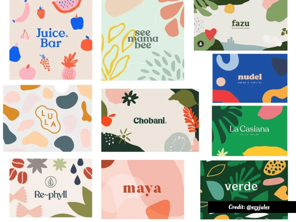
Blobs are kind of a big deal in design right now. So of course they're working their way into emails as well. And I can't blame people for that. I think they're a great way to bring a lot of fun, color and playfulness into a newsletter.
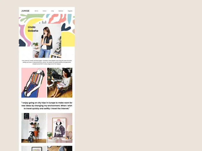
Plus as a border, it like kind of helps break things up a bit out of the traditional grid or column. I love how they kind of box the text in the little shapes and then also use this little zigzag to kind of keep it from being just like a straight line divider.
Or in this one by MindNode that illustration could have just been in a rectangle, but they put it in a blob, which in addition to making that image look like a thought bubble, adds some overall playfulness to the email while still looking like clean and professional. In general, I think there's like a really big overall shift in emails, trying to not feel like they're trapped in this 600-pixel wide rectangle. So details like that help.
I've also used blobs. This is a recent favorite of mine which I made for the launch of our new artist, Amber Vittoria.

I normally put our images in rectangles, but I've secretly been waiting for the right moment to put our images in blobs.
I'm not kidding. I wanted to do an email like this. Amber's work is very blobby, so it seemed like the right time to pull that out.
So in conclusion, the pros of blobs is that they're fun, trendy way to make your email more fun and playful. They can work well as dividers or frames for images and break your emails out of the box quite literally.
The downside is that it can feel very much like you're just jumping on a trend and can make your emails look like everything else out there as a result. And then maybe depending on your brand, they are too fun? This is not a problem for me personally, but maybe it is for you. I don't know.
Color Trends: Beige, Dark Mode and Mood Setting
Number two, beige.
Beige is everywhere. It does seem like more and more brands are incorporating it into their branding and their marketing. I feel like this one also goes a little hand in hand with the blobs because again, I feel like Chobani is a little bit to blame here.
Here's an example of them bringing that beige into their newsletter.
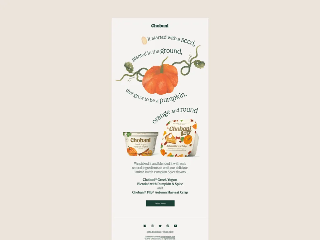
How nice. And again, also another example of an email not trying to feel very rectangular. But back to beige. I feel like beige historically has a bad reputation for being a boring color, but I feel like that's not the case anymore. I think it works well for a couple of reasons.
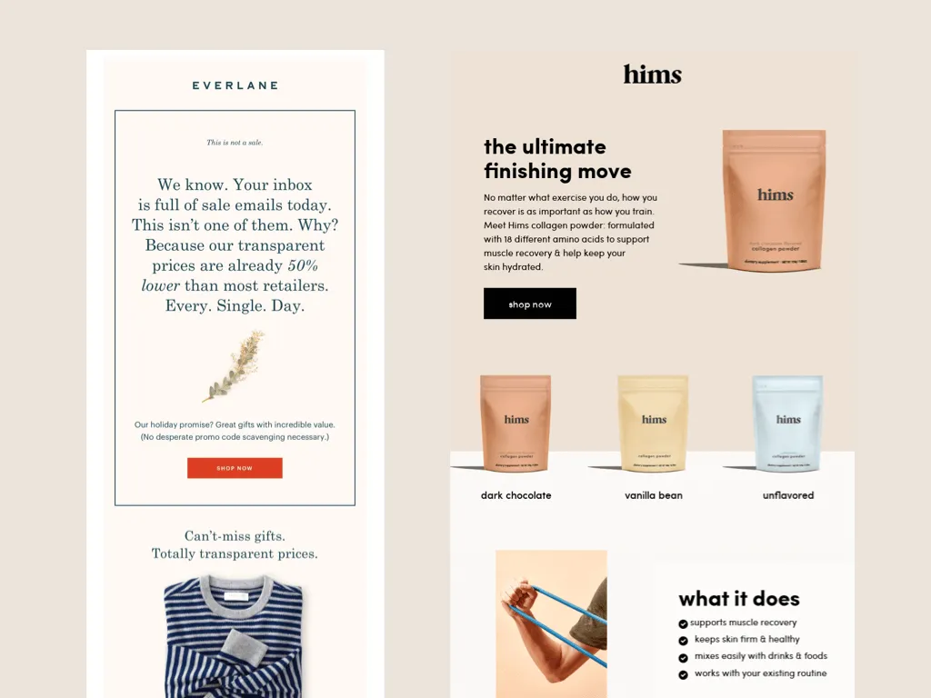
I think it feels modern and clean. I feel like a lot less techie startup brands seem to be using it lately. It works because it's not as stiff as an all-white email, but also not as like wild and crazy as a brightly colored background might be. It's like the perfect middle ground. It's fancy, yet approachable.
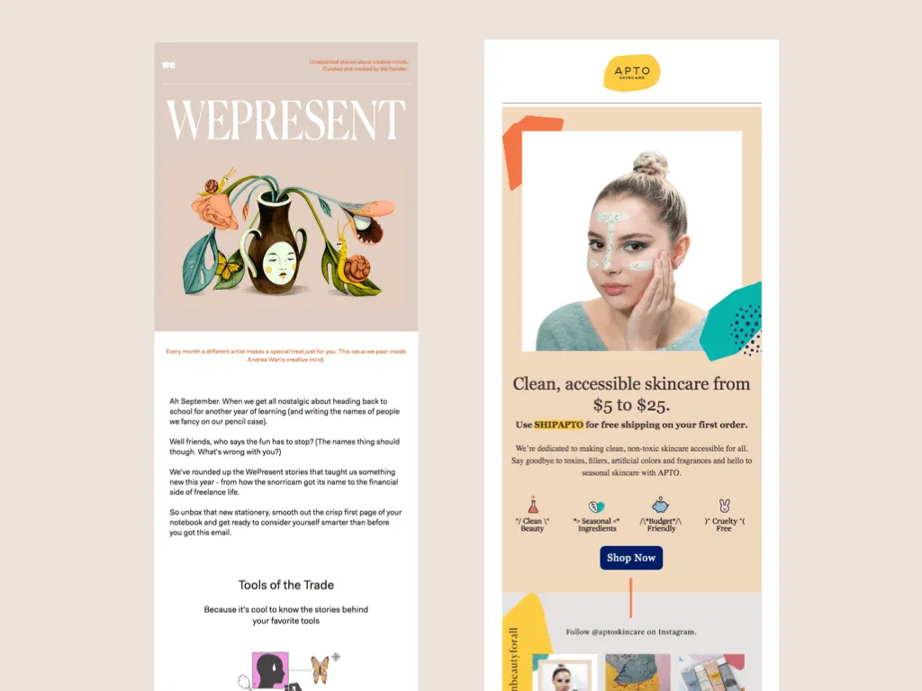
I also really like beige because it works nicely as a canvas for other bright colors. So you know how much designers love being told to make things pop. So the next time someone tells you that, consider putting it on beige. I use beige a lot, mostly because of this specific reason. It just really works well with a lot of different colors.Also, more blobs.
I use beige a lot also. in this newsletter we were featuring new designs by Kelsey Osei. We wanted to give the campaign the feeling of an old textbook. So we use beige as the background for the diorama inspired photos that we took.

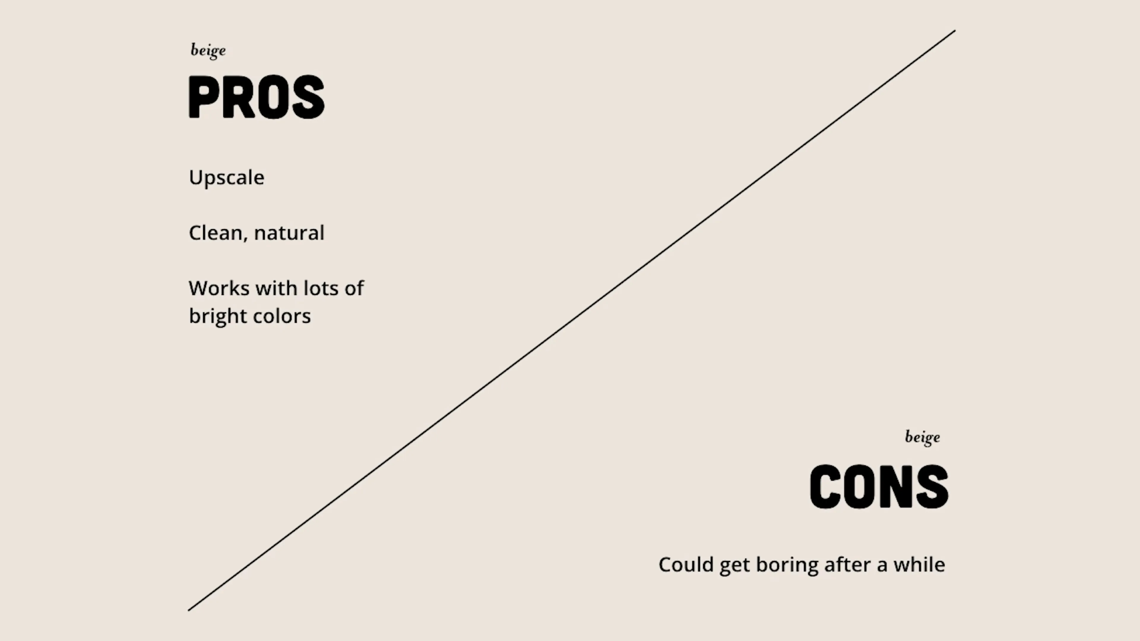
The pros of beige. It can feel upscale, but approachable as well as having a nice, clean, natural feel. And it also works as a great canvas for bright colors. On the downside, I know I said earlier that beige isn't boring, but if it's the only color you use, it definitely can start to feel that way. So consider mixing it up every once in a while. Maybe try tan or olive. You choose.
Bold Typography and Visual Hierarchy
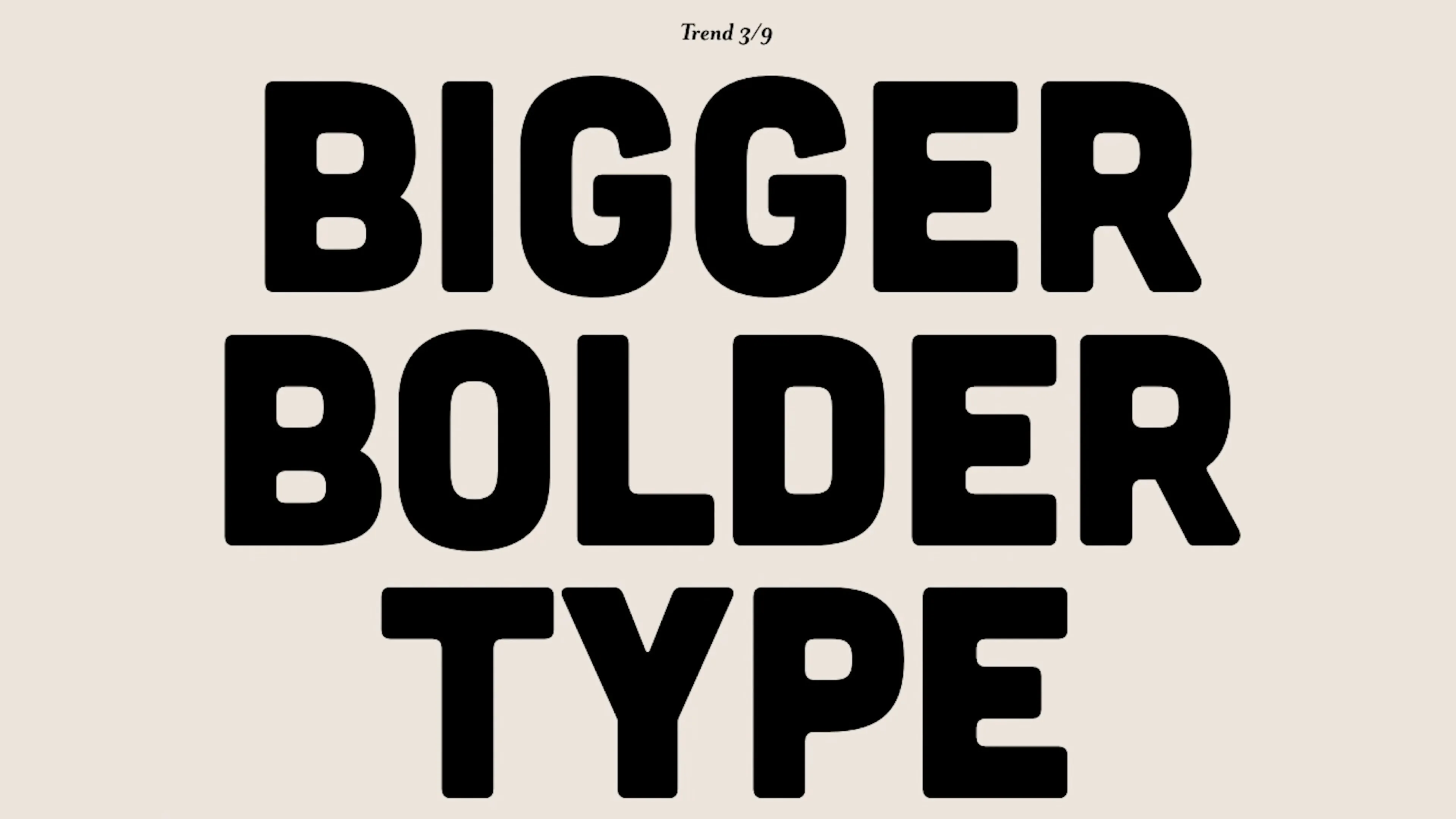
Number three, bigger, bolder type. They say bigger is better. Well, that's not always the case. A lot of emails have been using like really big attention-grabbing type at the top of their emails. And while it's eye-catching, depending on what you write, it could maybe be confusing.
I feel like both of these emails are good examples of that. Like, I don't know what "Modern heist." means or "Say bye. Get pie.", but then I like, look down here, I'm like, Oh, $25 and delivery fee credit. No code required. Like, that's much more valuable to me.
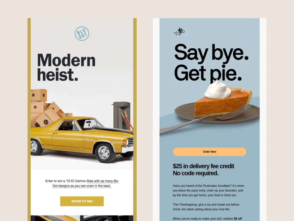
Why didn't you tell me that sooner? It leaves me feeling a little bit like this.
In these examples, the type is large, but also is communicating something of a little more substance.
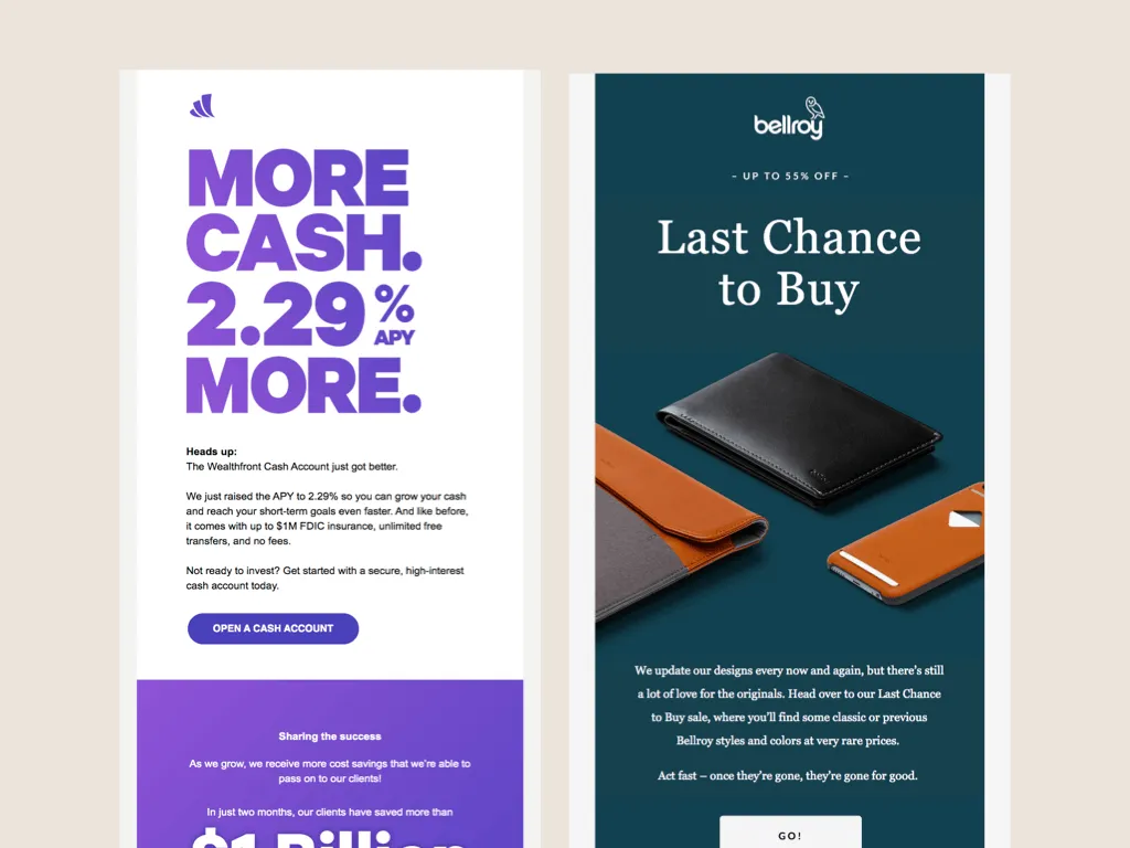
I am not a finance person, but I assume the example on the left is telling me something I would want to hear right at the top. And then on the right, it's communicating to me a sense of urgency. "Last Chance to Buy" is the kind of thing that will make me click on an email.
We've also been using big type at Tattly, especially when we have a sale. One of the things that we've learned through all of our tracking is that we've seen more success when we get straight to business with our sales emails.
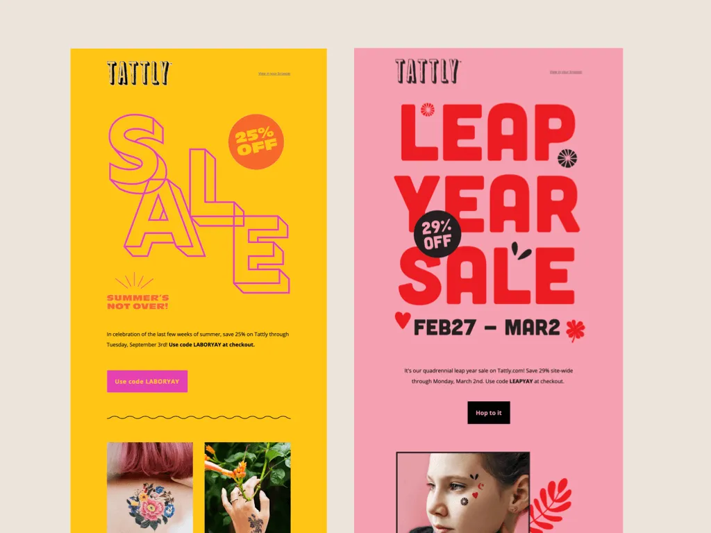
We usually show a nice photo at the top, instead of text. So we try to put all of the pertinent info right at the top of the email, very attention-grabbing. So the word "sale". What the discount is, how long it lasts, et cetera.
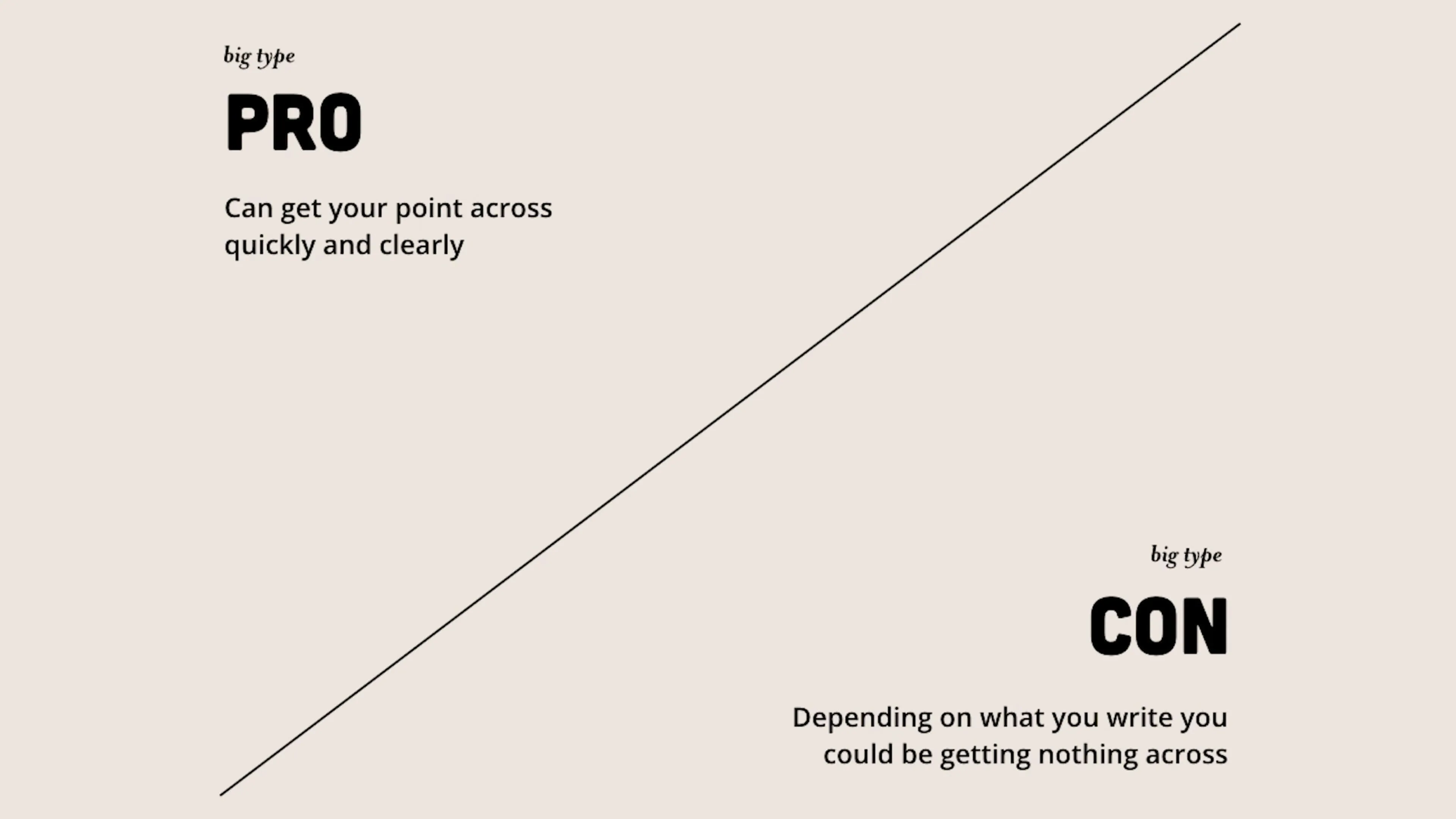
The pro of big type, can get your point across very quickly and clearly, whether it's a sense of urgency or some very important financial information that you might understand if you're into that kind of thing. The downside is depending on what you write, it could be confusing. So just consider what words you're putting up there to make sure that it's saying something.
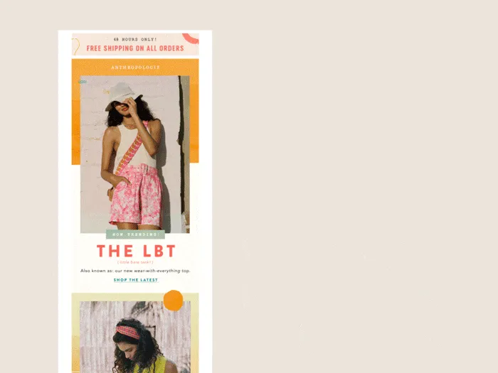
Overlapping blocks. This one I've seen everywhere lately. What I mean when I say overlapping blocks is when there's a rectangle, and then on top of it you put another rectangle. The most common use of it is in this email where the background rectangle has some text on it and the foreground rectangle is a photo.
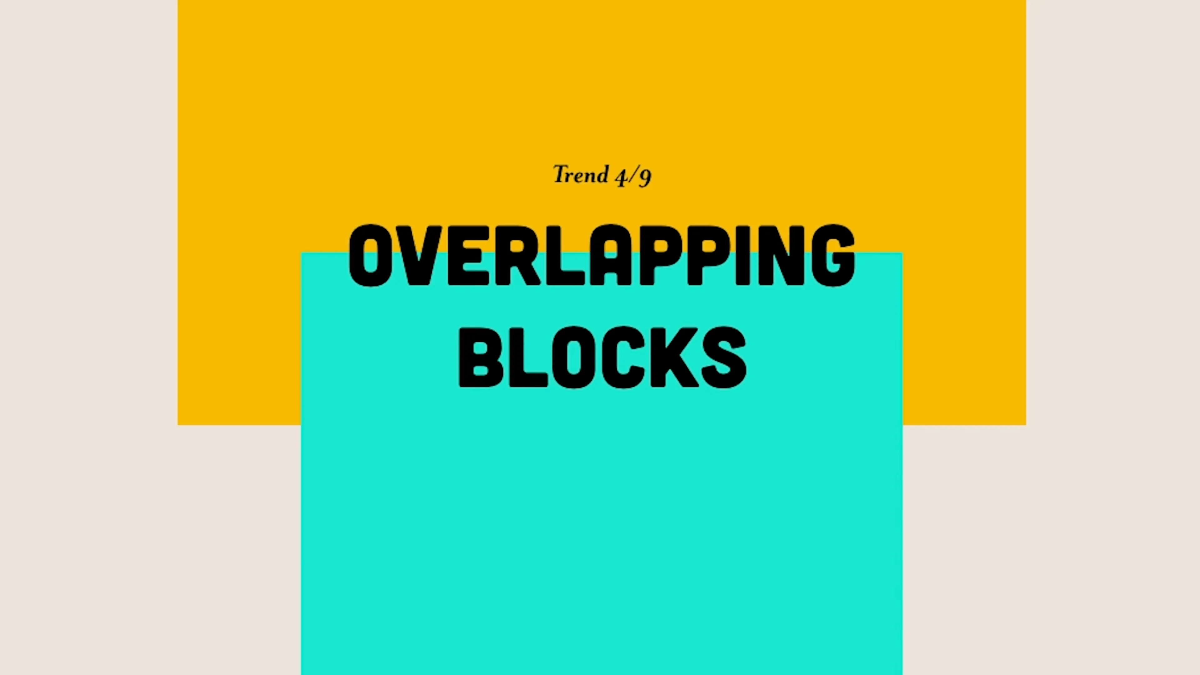
As a design element, I find it to be really useful actually. It's really helpful when you want to like put some text ahead of an image, or like near an image, but you can't put the text on top of the image. So it kind of lets you combine them in like a nice pleasing design-y way. It also can again, help break things out of the box.
I know that that's not two rectangles, but work with me. It works well I think. That looks like a very fun Frappuccino on its extremely trendy blob background. Also side note, I worked at Starbucks for a few years. Frappuccinos are the least fun thing to make in that store.
Again people are trying to avoid having their emails feel too rigid or rectangular lately. So I find it a little funny that one of the ways we're trying to make things feel like less of a rectangle is by adding another rectangle.
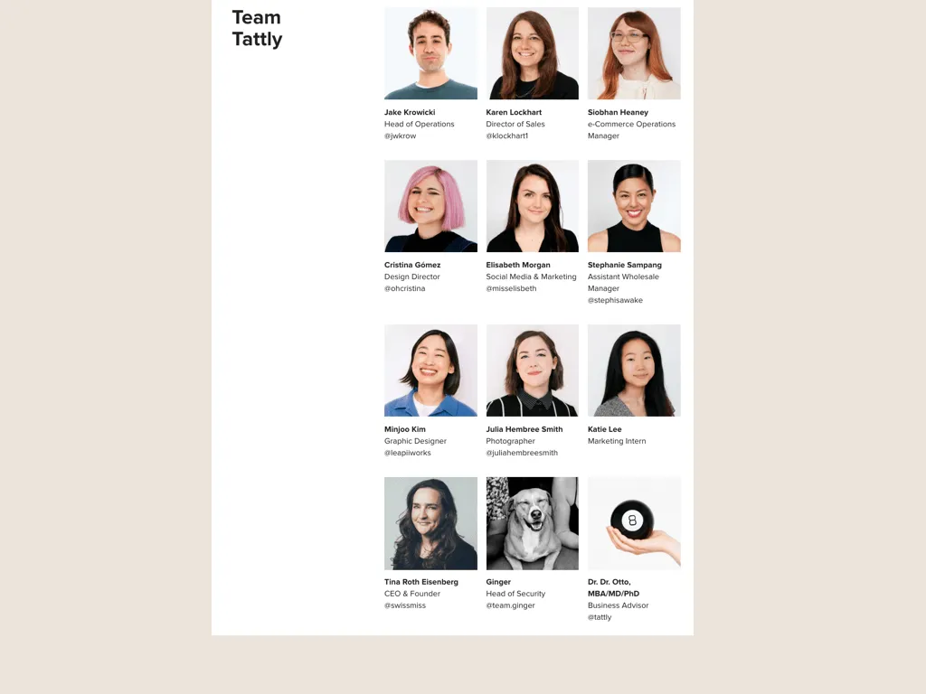
I finally used this at Tattly when we were getting ready for our eighth birthday sale last year. The biggest sale we have every year. For the theme, we were playing with the idea of using a magic eight ball as our business consultant. To make the imagery work, we had to be able to put like a question ahead of the image.

Adding the rectangle helped kind of bring those elements together in a design-y way. And then to keep things consistent, I use that visual element throughout the rest of the email. And fun fact, Dr. Otto still lives on my desk and as a beloved member of team Tattly, or Dr Rr Otto MBA, MD, PhD business advisor at Tattly.
So in conclusion, the pros of overlapping blocks are that it can break up the space. It's also a good way of bringing type and images together. The downside is that it could maybe make things too busy if you go overboard with it. I didn't show any examples of that happening, but I'm sure it's out there.
Transparent illustrations. These are also definitely popping up a lot more. Again, it ties into that overall trend of emails, trying to feel less rectangular and grid-like and opening them up. We don't want to be in a box.
I'm a fan because I like good illustrations in general. I think these illustrations also make things feel editorial and like in these examples, you see them being used in emails that are more about brand storytelling rather than trying to sell you something.
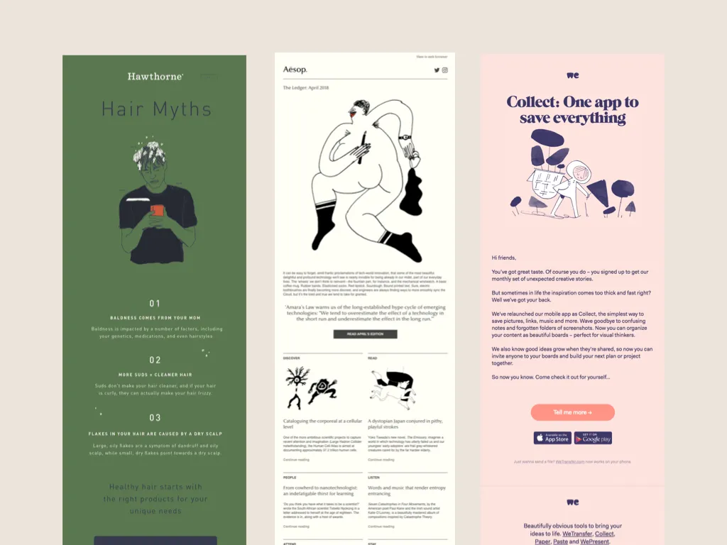
I also keep imagining how different that Hawthorne email would feel if it was like a photo of a guy with a head full of shampoo checking his phone rather than an illustration. And I'd say that that illustration was the right move here.
I also want to take a brief moment to call Aesop if you're not familiar with them. They are a very fancy skincare brand. Looking at this email made me realize, I don't think I've ever seen a real person in any of their marketing photography. It's just illustrations like this, or photos of their nice packaging just lounging about in different environments. Like these are all different header images from like the last month or two of emails.

Just kind of weird. We're a much more photo-heavy brand at Tattly, so I don't do too much with this specific trend, but I try to use the illustrations we have in conjunction with our photos to, again, break things out of the box and make them more playful.

So in conclusion, the benefit of a transparent illustration is that it can feel very, editorial. Also breaks emails out of the box. The downside could be if your illustrations are bad, maybe this isn't for you.
High-Impact Visuals: 3D, GIFs and Plants
On the opposite end of those nice transparent images, we have 3D images and GIFs. This is a product of our time. 3D animation is more and more common.
So of course 3D images are showing up more as well, and of course they are. 3D images can be incredibly eye-catching and impressive, and it feels very modern and cool.
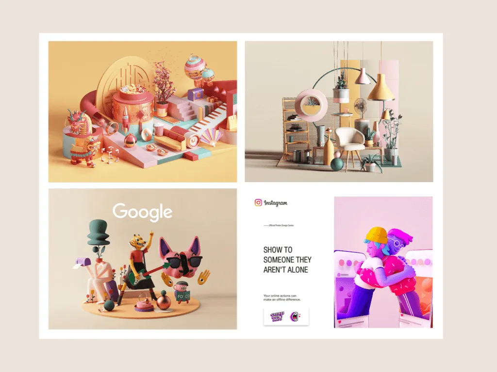
It's like going from Mewtwo Strikes Back to Mewtwo Strikes Back: Evolution. Although I'm pretty nostalgic for the first version, so I'm a little evenly split on this one.

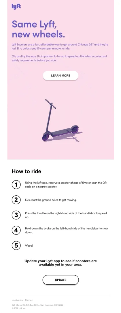
3D GIFs are also popping up a lot more as well. I like how this one blends like a flat illustration, but with the 3d feel and it does a great job of capturing the chaotic essence of those little scooters. I'm forever grateful that we don't have them in New York, cause that would be a nightmare.
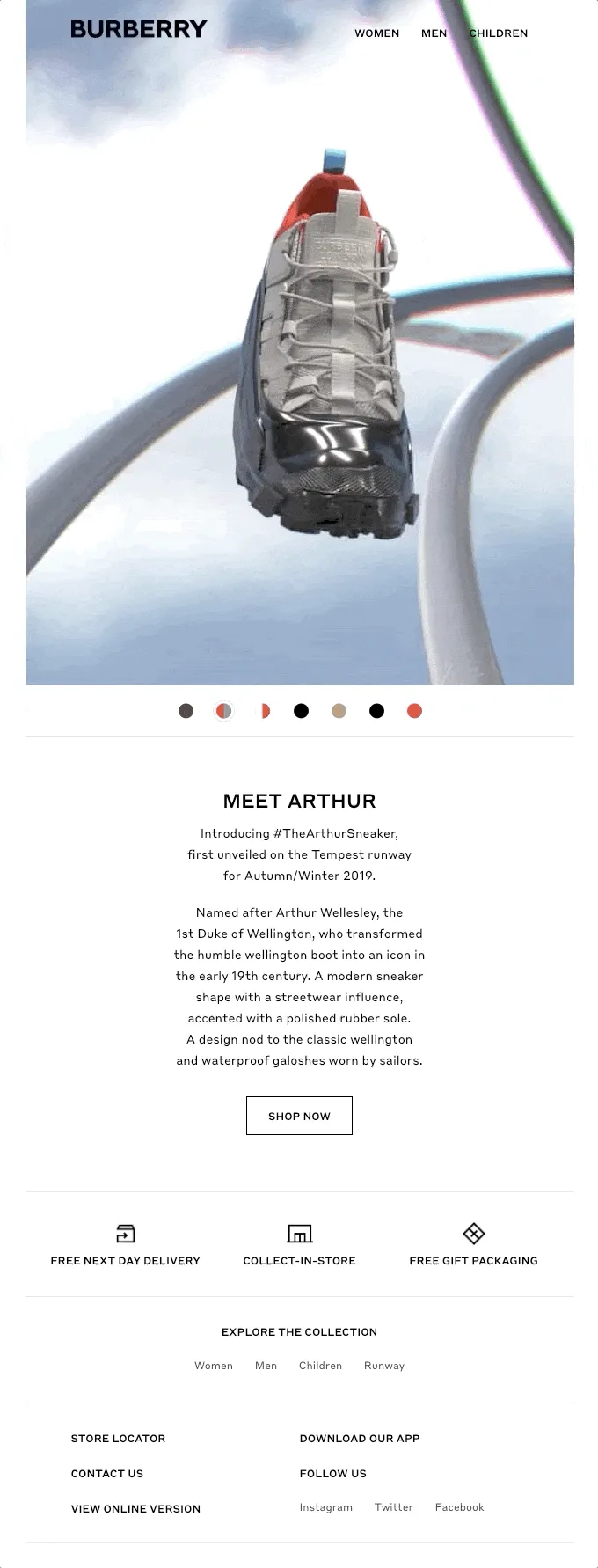
This is a nice execution using photographs, but you may have noticed that it's only really big brands that are using this right now, since it's a lot more time consuming and expensive to create 3D images.
So actually I have no examples of our emails to share. We run into this issue a lot at Tattly where people think we're a big company, but we're just nine people in a room trying our best.
So 3D images aren't really in our budget. So instead, here's a photo of some custom Tattly of 3D illustrations that we printed for The Wall Street Journal, a much bigger company than us, that could afford these images. And also a good time to mention that we do make custom tattoos. So talk to me.
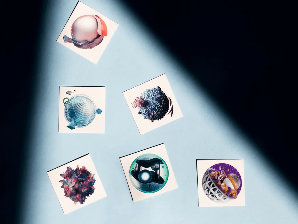
The pro. Looks very modern. They're impressive. They make you look like you have a lot of money. On the downside, they're expensive. So it might not be a practical approach for a lot of brands.
Number seven, circle bullet points, circular bullet points.
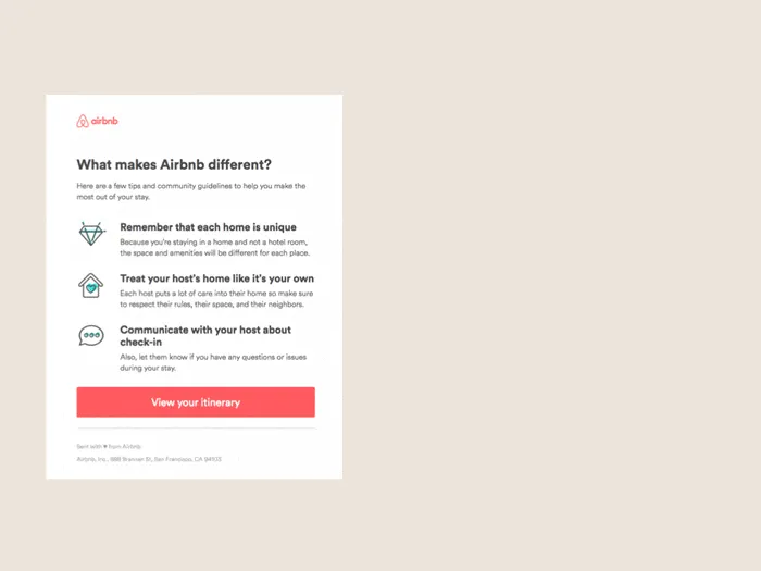
It seems like brands are taking little icons that were trending before and putting them in circles. Ooh. This is pretty nice actually, because it can bring some unity to illustrative bullet points that might have looked a little more cluttered otherwise.
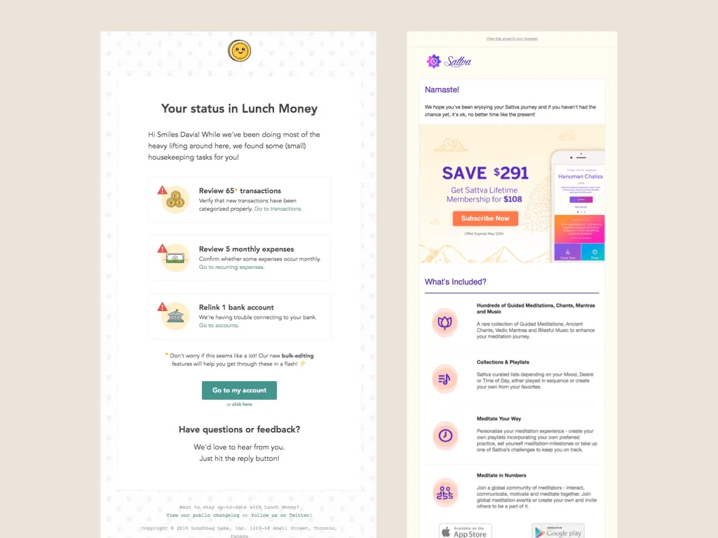
I think it's also a nice way to take what might've been a very unexciting bulleted list and making it a little more approachable. This email is giving me a list of things to do and it feels somehow less stressful because of the little icons, although I think the little red triangle always stresses me out.
It doesn't just have to be spot illustrations. This is an email I just got from Prose over the weekend, and they use photos instead. And I thought it looked nice. The rest of the email also has like a ton of these other trends, but I just wanted to focus on that.
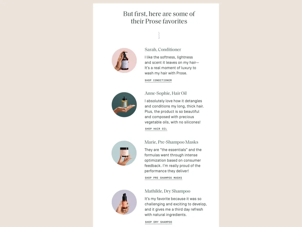
Although. Tread with caution. I feel like sometimes bullet points can feel more cluttered. For example, in this email, I think the bulleted list is kind of hard to follow just in general.
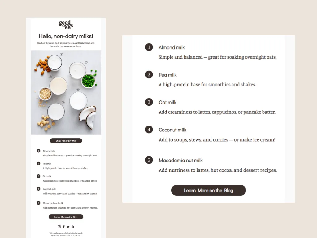
I just don't think it's laid out super nicely. and then the numbers there also relate to the photo at the top. So like, depending on how you're looking at it, you have to scroll, like back and forth to know what's going on.
Which is kind of the opposite of how a bulleted list should make me feel? They could have like taken example from Prose and put the photos in the bullet points instead.
We don't use bullet points a lot, but in this email we kind of use them to help communicate a tiered discount that we were offering to our wholesale customers. And then also shout out to beige, blobs, and large type again.
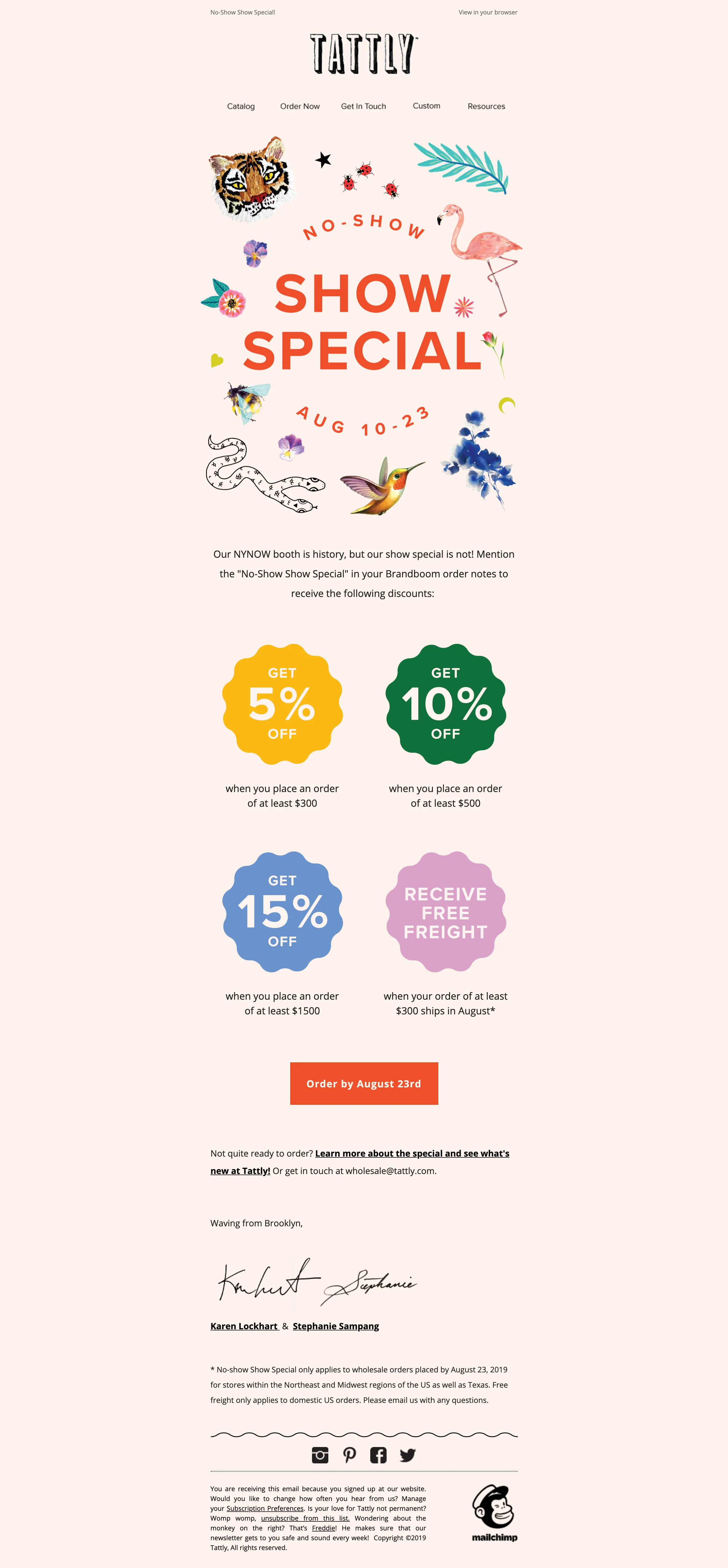
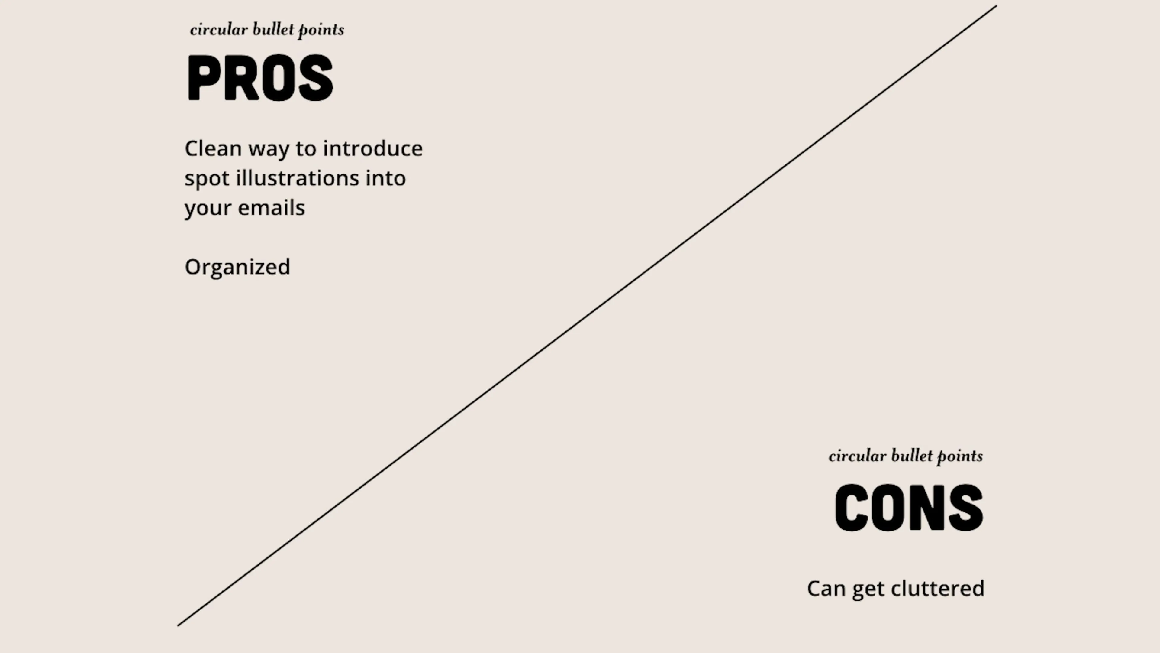
So pros. It's a clean way to introduce spot illustrations into your emails, and it's organized usually. And then on the downside, it can make your email look more cluttered, which is again, the literal opposite of what we're trying to achieve with these, so please proceed with caution.
Night mode. This is a big one. It just keeps getting bigger.
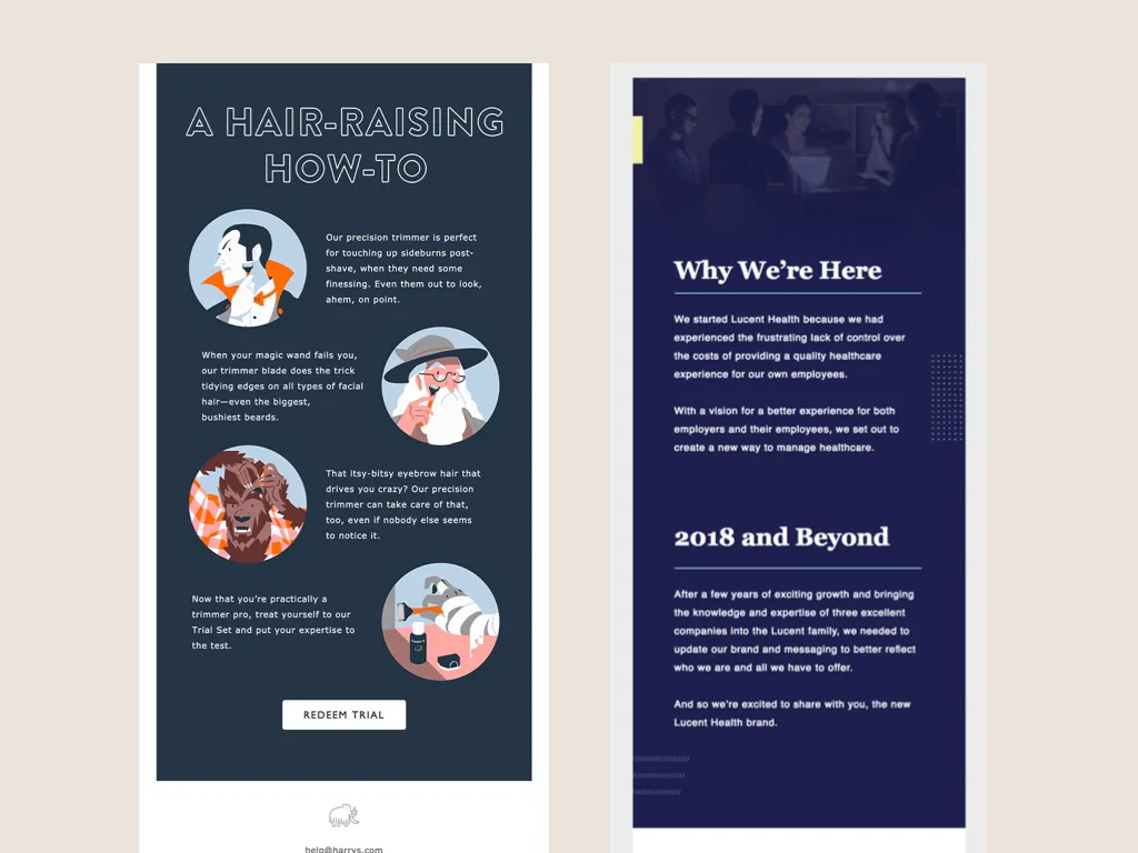
Black and green were trending before, but ever since Gmail started supporting night mode, dark emails are popping up even more and in a lot of different ways. For example, so many brands use this in their Black Friday promos, which is a great play on words, and also a great way to make an email look very different from the rest.
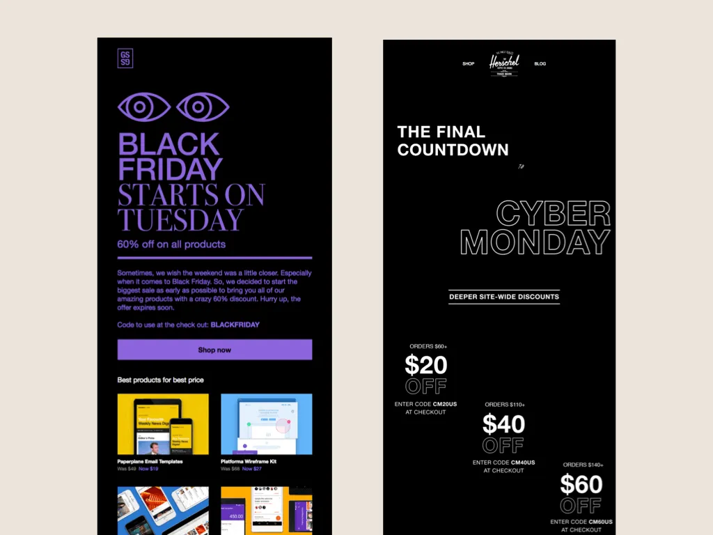
So like, imagine only getting emails with a light background from a brand, and then suddenly the black one appears and you're like, Whoa, must be a sale. Better get on that.
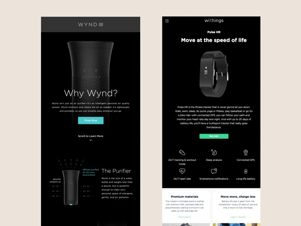
Of course, black still feels very techie and expensive, so you still see it with a lot of brands when they're showcasing their latest gadgets. Like I immediately feel like these products are going to cost me hundreds of dollars just based on the visuals here.
It also works great for communicating literal nighttime, like on the email, on the left. And then I also really like the one on the right for showing off new black and white colorways for their product. And I feel like black emails can look serious, but this one manages to feel a lot more playful than in the previous examples.
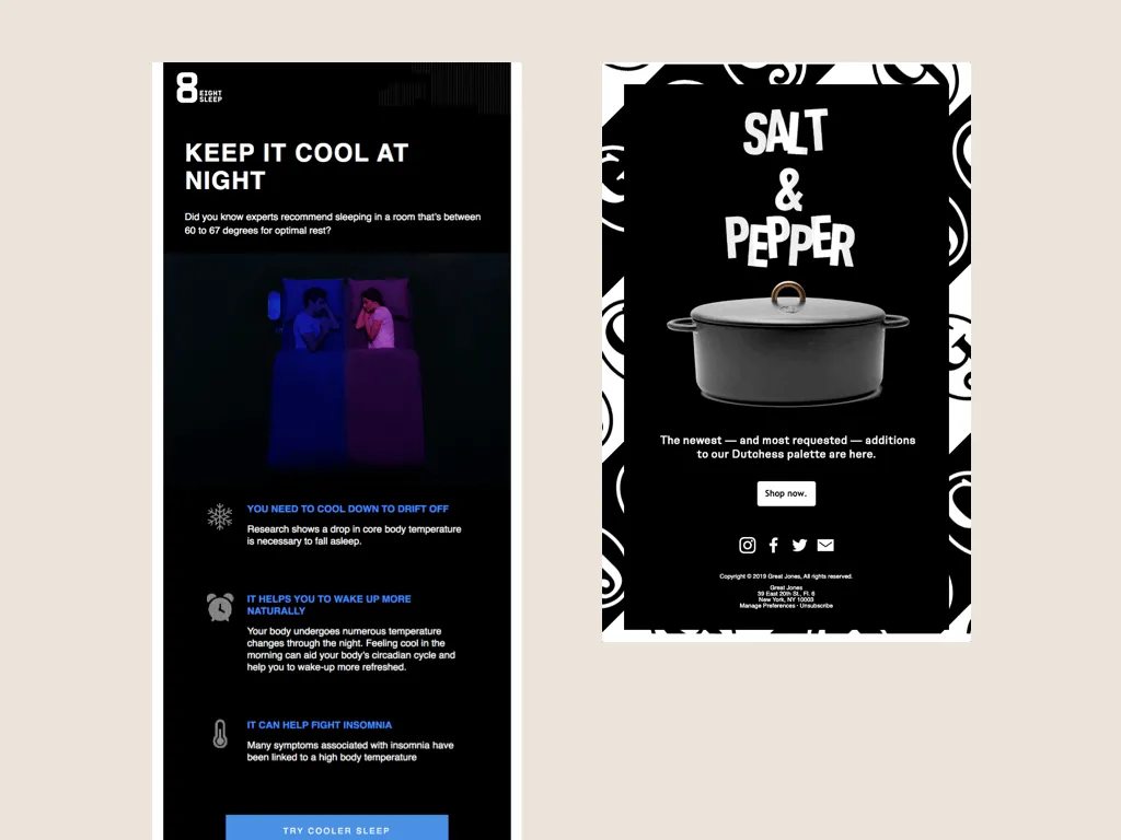
And there's also a lot of emails showing up using not just black, but other dark colors such as navy and green, and also spot illustrations in bullet points. Very trendy.
We've also embraced night mode. This is from when we launched our glow in the dark designs last year.

So obviously this was to give the whole newsletter a very nighttime feel and also make it feel different from our other launches. Cause it was like the first time we were doing glow in the dark. So I want it to be like, surprise, here's something new. and then I also had a lot of fun with this GIF of the photos changing from light to dark. And that is my hand in all of those pictures.
This newsletter is from last year's Tattly-wean campaign, which is when we use Tattly to make a ton of Halloween costumes and then force everyone in the office to take photos.
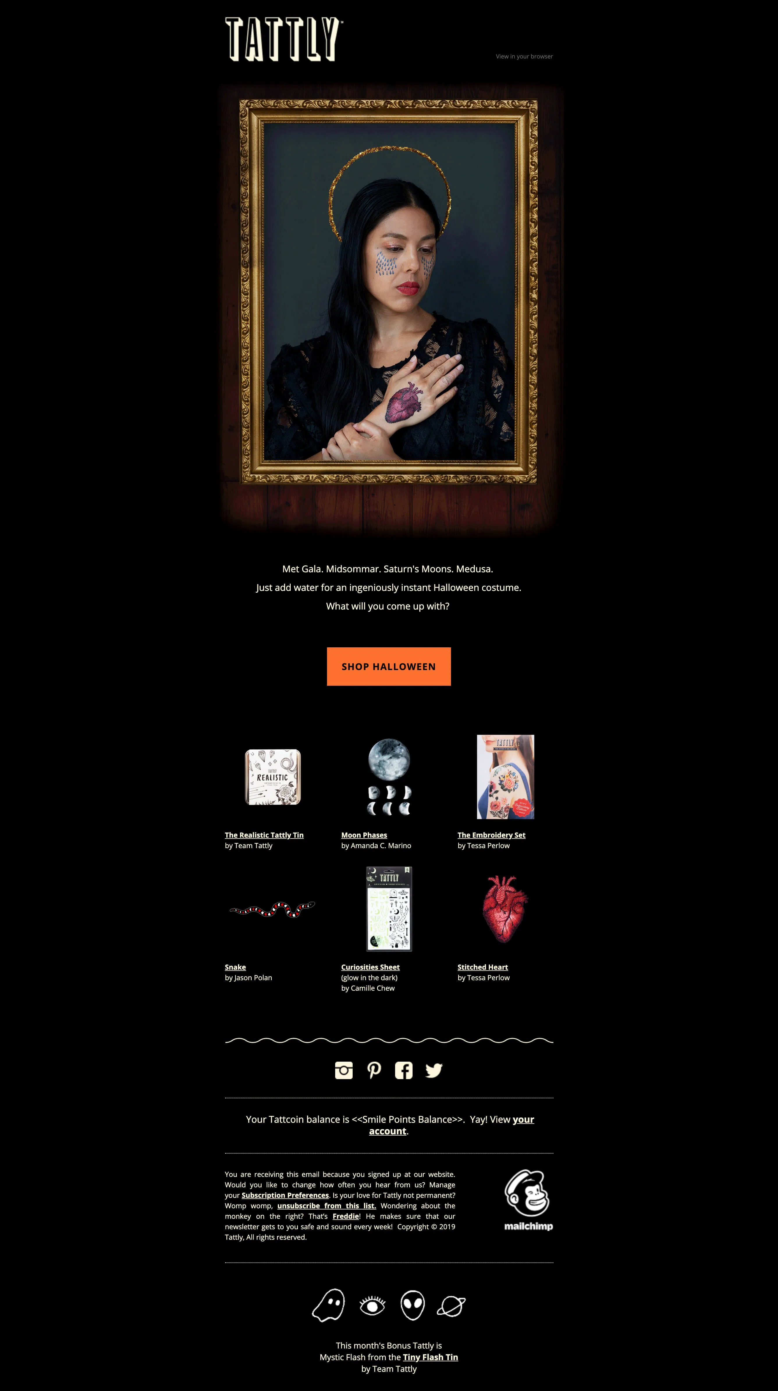
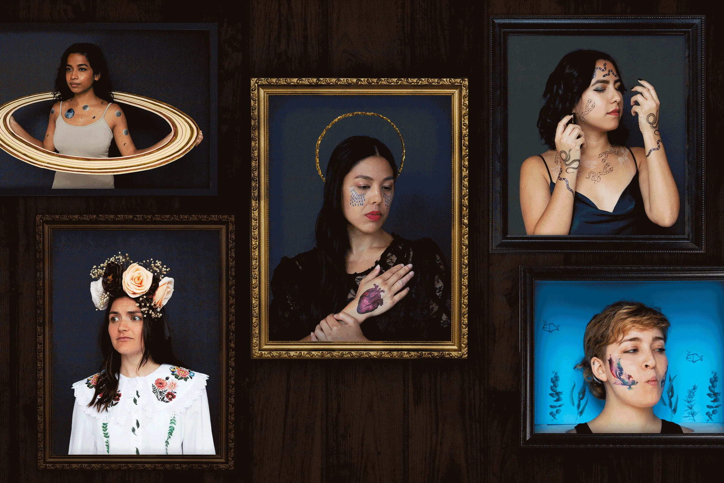
I was going with kind of a haunted portrait vibe, so I made the newsletter dark to give it a spooky feel. And I'm just putting this GIF in here because I love it. And also fun fact, this girl here in the Midsommar costume is Elizabeth. She writes all of our newsletters. So, hi Elizabeth. I was dressed as a Sharknado, but I'm not showing you that.
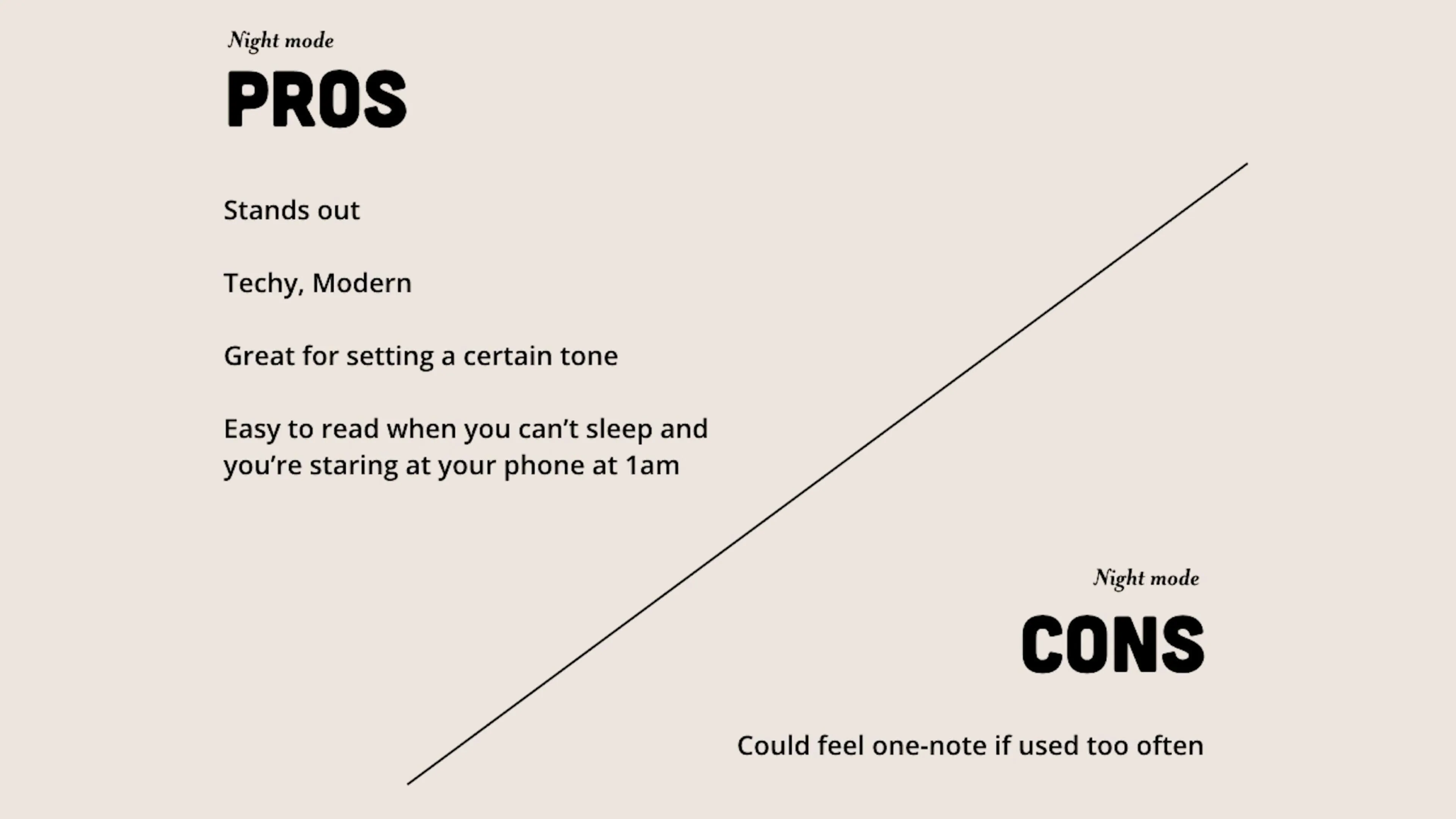
Pros of night mode, it can be a really good way to make a specific campaign feel very different from the rest of your emails. It can feel very techie and expensive, and it can also set a specific mood in a very effective way. And it's also easy on the eyes when you can't sleep and you're staring at your phone at 1:00 AM. On the downside, like beige, it can feel one-note if you use it too often. So think of this trend like a little black dress. You only save it for special occasions.
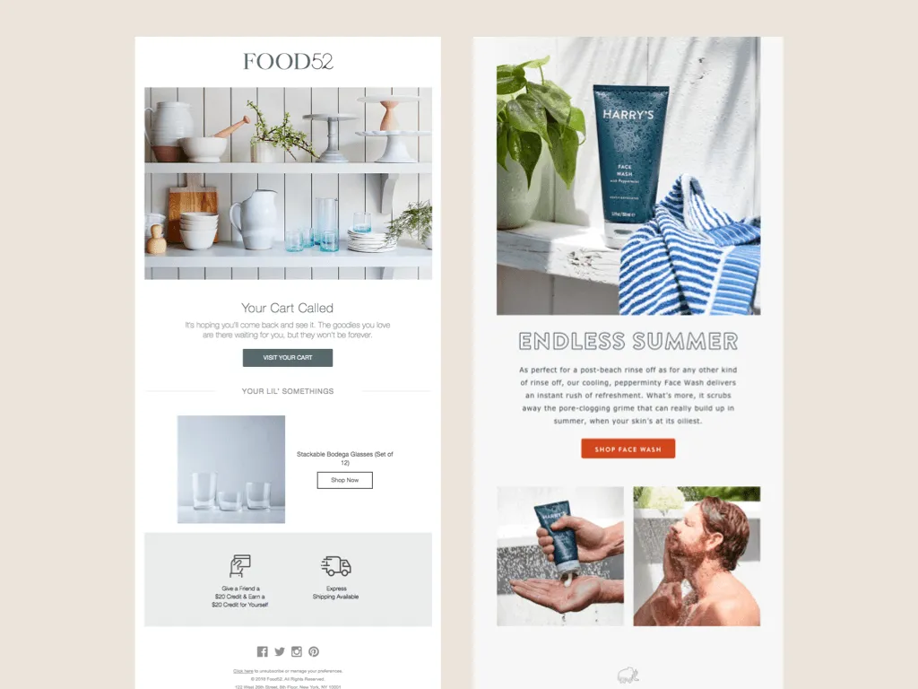
Number nine, plant accents or plantcents. Plants are a huge trend, not just in emails, but everywhere. So of course, that trend is making its way into emails, especially in the photography realm.
So like having the added plants in these images, I feel like immediately makes these shots a lot more aspirational.
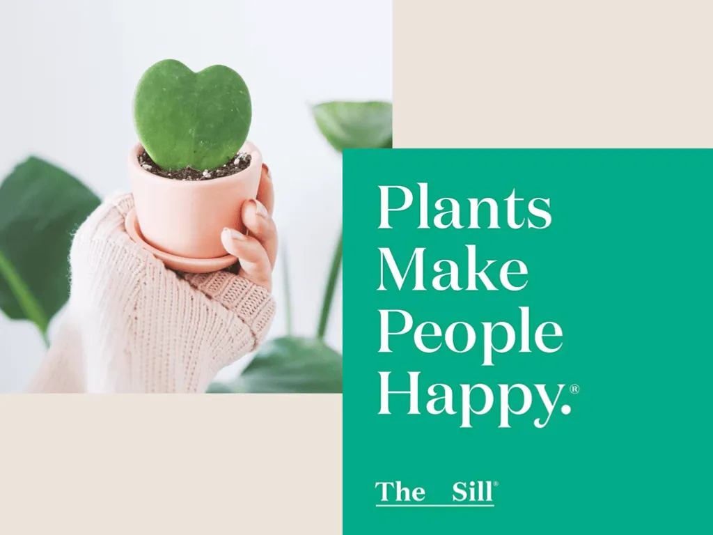
And dare I say, a little happier. I don't know if you're familiar with The Sill, but you might know their motto. It's "Plants Make People Happy®". If you're not familiar with them, you should. They will ship plants to your door.
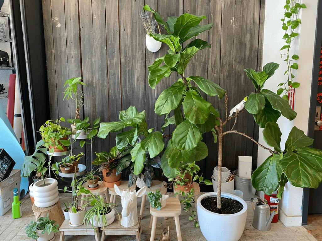
And it's true. Plants do make people happy. We even have a plant shrine in our office. It makes us very happy and we use it a lot for photos.
Plants can also help communicate a very, natural, sustainable feel. For example, nothing in this email says anything about what this product is, but because of the added plant imagery, I can probably assume that this is some very nice eco-friendly toilet paper that Smiles Davis just ordered. Although I hope he ordered more than one roll, cause that would be silly.
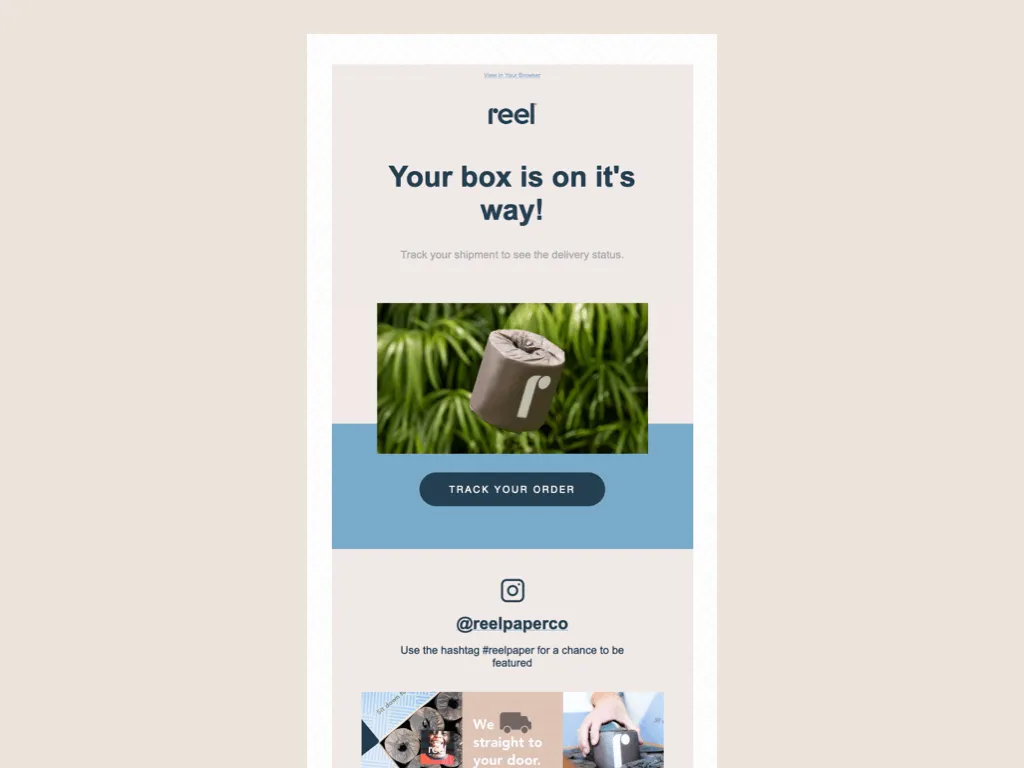
Naturally we use plants in our photography all the time. That's the plant shrine again. This year we even launched some new plant Tattly with illustrator, Claudia Pearson. So of course we included a lot of plant imagery in the campaign.

We even featured the founder of The Sill, Eliza Blank in our email series, highlighting small businesses that we love.
So the pros of plants, it can make you happier because plants make people happy. Plants can also make your photos look more aspirational or bring in a nice element of color, and they can also help communicate sustainability. On the downside, maybe plants don't make you happy, but also I would maybe ask yourself to examine why you feel that way.
Should You Follow Email Design Trends?
Before we move on, you're probably like, wow, that was sure a lot of like nice, trendy emails. But should I try to use any of these in my marketing?
And to that I say, sure. If you have a very rigid newsletter template, see if you can try incorporating some of these trends in a small way. Maybe throw in a blob, maybe try a plant. And of course, I think the most important takeaway is that you make sure you actually have a reason to use a trend and you're not just using it to be trendy.
So don't force something if it's not working. Make sure it fits your brand or what you're trying to communicate. And you too will have a Really Good Email.
Trends We’ve Left Behind
And then of course, in memoriam, I'd like to take a moment to remember a few of the trends we've lost along the way.
I was going to play some music here, but I found out that Keynote won't let you play a song across multiple slides. So just pick your favorite sappy song and like imagine it running through your head right now.
Adiós gradients. We will miss your smooth transition from one color to another.
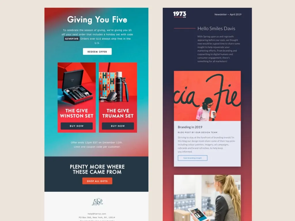
Goodbye diagonals. Hello, wavy blobs. Straight lines are for squares.
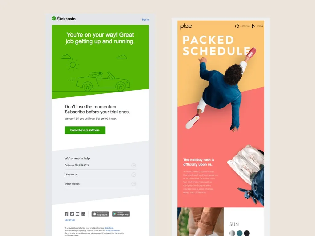
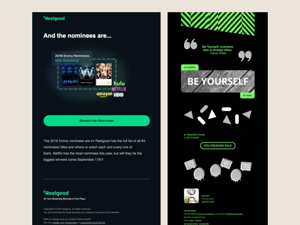
A light goodbye to neon green as we learned that other colors can exist on a black background.
That's all. If you want to keep up with Tattly's emails, you can sign up on our website tattly.com when this pop up appears or there's a spot to sign up in the footer as well, and you get a discount when you sign up as it very clearly states.
If you want to follow me, I'm on most social media platforms AKA Twitter and Instagram at @OHCRISTINA, although it's mostly just stuff relating to my hobbies and not my design work, just FYI. Also if you want to ask me any questions or just say hi, don't hesitate to come up and talk to me. I'm nice. I like making friends and that's all.
Thank you and enjoy the rest of the conference.
Subscribe to our newsletter.
Dive into the world of unmatched copywriting mastery, handpicked articles, and insider tips & tricks that elevate your writing game. Subscribe now for your weekly dose of inspiration and expertise.


