

Accessible Email Matters with Timothy Buck
How to make email that your recipients can access and understand regardless of disabilities.

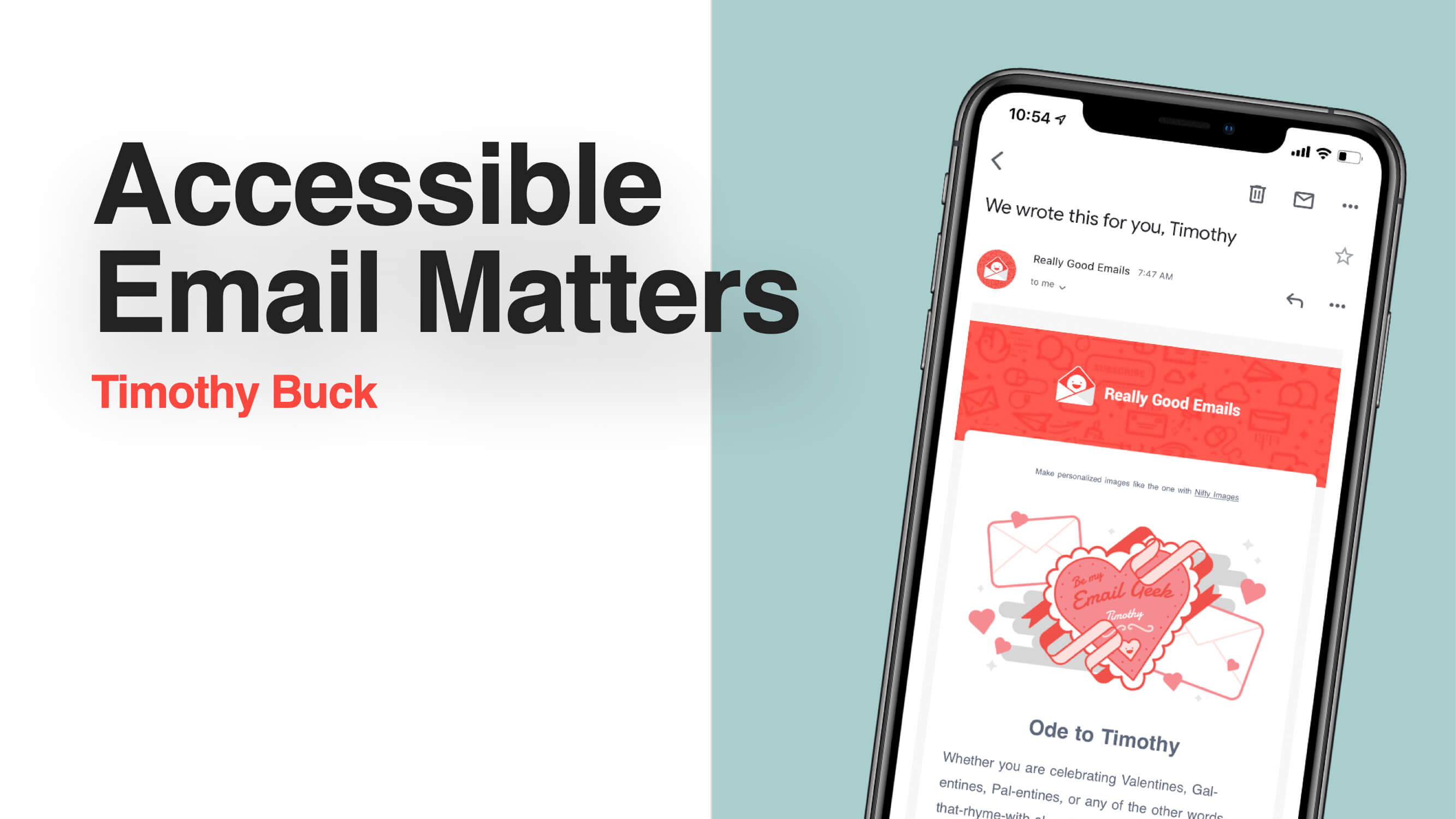

Timothy: Hi, I'm Timothy Buck talking about why accessible email matters. A little bit about me - This is me and my wife, Alyssa, she's an artist in San Francisco.

I'm a product manager, as my day job, also a podcaster and writer, and you can find my podcast at accessible.fm if you're interested.
What is accessible email?
With that, let's jump into what is accessible email. Can I get a couple of people to raise your hands and share what you think accessible email is? Anybody?

Audience: Email that can be used by people who need to use a screen reader.
Timothy: That's right. I think there was another hand behind her.
Audience: People who are colorblind. People who have situational reasons for why they may need accessibility.
Timothy: Right, yeah, that's good. I'm going to share my definition of it. This is a combination from a bunch of different things, so I can't claim this as purely mine, but I've just pulled it together from different definitions that I found over the years. Accessible email is an email that your recipients can access and understand.

That sounds super broad, but it's true. Accessible email is an email that your recipients can access and understand, and that is foundational for whatever you're trying to do. Whether you're trying to sell something, or you need them to know something for a legal reason, or whatever you're doing, you need them to be able to access it and understand it, whomever your recipient happens to be. If you don't get that right, you're not going to have success. I'm going to add one more bit to this, which is, regardless of disabilities.
So, accessible email is an email that your recipients can access and understand, regardless of disabilities. This is where most people focus, as you can see since many of the answers were around specific disabilities. That is a really important part of making email accessible, but accessible email is broader than that. It's more foundational than that. It is making sure your email works for every person and in every situation that they may be in. If you can do that, then you will find more success.
Accessibility matters more than you think
So, how many people need accessible emails? Here are some stats, although these are ten years old from the Census Bureau. This will get updated when the next census happens. However, there were 8 million Americans with vision impairment, 15 million with cognitive impairment, and 7 million with some hearing impairment. The World Health Organization recently studied how many people in the world have vision impairment. I don't understand how they came up with this number, that seems high to me, but that's what they came up with, that 2.2 billion people have some vision impairment in the world. That's a fourth of the world. If that's true, we should be taking that into account when sending emails to people. However, to answer my main question, how many people need accessible email, the answer is 100% of the recipients.
That may sound sort of flippant to an extent, but it's true. All of them need accessible email because when we go back to that definition, accessible email is an email that your recipients can access and understand. Without that, the purpose of your email is gone. Whatever you're trying to do becomes useless if they can't access and understand it.

I wanted to add this note here, that designing for everyone, actually makes your email better for everyone. You'll see that as a trend in the things that I explain throughout the rest of this presentation. I'm going to give a lot of concrete examples of what you can do to make your email more accessible, and for many of those, there will be other impacts. Doing this good thing for a smaller population of your recipients is good for them, but it also ends up being good for everybody. Making your email accessible is good design; it's just a well-designed email.
Practical ways to make email more accessible
So, what can you do about it? What can you do to make your email accessible? You can do many things, and I'm going to talk about those in just one second. However, I think there's one more point I want to make before that, which will help you understand how I've structured how I'm talking through the different things you can do. We need to talk about the categories of different types of impairments that people may have.
They have visual impairments. We saw that in the numbers. Many people have different types of visual impairments, and that's a spectrum. Some people are fully blind, some people are colorblind, some wear glasses, and there are people in all these different parts of the spectrum. There are many kinds of visual impairments, and all of them matter. We have the same thing with cognitive impairment. This could be very young users, this could be very old users, this could be people who have some mental illness, but they still need to use email. Then we have people with motor impairments who have difficulty with the ability to move their hands, their body, or whatever they're doing to control the computer that you're using.
Sometimes it can be more challenging for individual users to do certain things with their email, and we should keep that in mind. Lastly, hearing, much like visual, there is a spectrum of people with different hearing abilities, and all of them matter. Like the woman mentioned in the back, when we think of accessibility, we often think of these types of impairments, and that's how I'm going to talk through it because it's real, and it's the best way to categorize this type of work. However, there are also situational impairments, so there may be, let's say motor, there may not be that many people in your user base who have that specific impairment, but, if somebody has a broken arm, or they're holding their child, or whatever it may be, it can be more difficult for them to use their phone or their computer. They also may be in a noisy room, and hearing the audio in your email can be difficult for each of these situational reasons. A person who may be fully capable would need a more accessible email in these situations.

So, again, many people make decisions about investing in accessibility, based on the percentage of their population they think has each of these impairments, but it's much broader than that.
Designing for visual impairments
Now, I'm going to go through them in that order, and we will talk first about visual impairments. What specific things can you do with your email to make it more accessible to people with visual impairments?

One is to start with a clear hierarchy. This is basic design, you all know this, but it's important for people with visual impairments. Here's an email I got from the Really Good Email site, which gives an example. I think this is from Bureau. At the top, the first thing you're supposed to read is the part in big black letters. The next thing you see is that it has a yellow background with a larger font size. If you go to the paragraph, it is in smaller text, but the most important information in that paragraph is bolded. This is a way, with clear hierarchy, to understand what you're supposed to look at.
From a technical perspective, I'm going to talk about the code for just one second here. Some things are really important for people who use screen readers, and that is using semantic elements. I know some people out here are probably still using tables to lay things out, but if you can switch to using semantic elements like an H1 for the header, an H2 for the secondary header, and a P for the paragraph. This makes it much easier for people who use screen readers to understand what's in your email. For some of you, you may not know what a screen reader is, but it just does what it sounds like. It reads the screen for people who are completely blind or almost completely blind. They use a screen reader that reads what's on the screen to them, and they can hear it, they can click forward, and it will first read them the header, in this case, "Here's some need to know information." Then, they hit next, and it'll say that next piece of information. However, if you use a table or don't have it organized in a hierarchically correct way, it'll read them out of order, and that will make absolutely no sense to that user. They will be completely confused because your email is not communicating with them.
So not only is using a clear hierarchy good for everybody, it's good for people who use screen readers, and that's important. Another thing you can do if you are using tables is that you can use this roll presentation, and it tells the screen reader, "Hey, this isn't an actual table that's being used to display tabular information. Instead, it's being used to lay something out". It tells the screen reader that it is a presentation table, and the screen reader will do its best to read it in the way that it thinks is correct. That makes it a lot better for those users, so if you are still using tables, please use role presentation as it is better for people using screen readers.

Next for people with visual impairments, check contrast, and size. Again, this is good for everybody. If you have clear contrast it's good for everybody, it's easier to read, and it's easier to understand. Using font sizes under 14 px is not good. The average phone user out there moves their font size up on their phone because it's easier to read and understand. We should be using larger font sizes so those people can understand and can actually access the emails that you're making. The same thing with contrast, contrast is the color difference between the foreground and background. Right here, we have black text on a white background, which is very contrasting. If you look over to the visual impairments part of the slide, that's black text on a blue background, which provides less contrast making it harder for certain people to read.
There are excellent tools to check this, so you don't have to know what this is, you can go to Web Accessibility in Mind. They have a free contrast checker and a bunch of information here. You can also Google free contrast checker, there are hundreds of them, and they give you a grade ranking of like, A, B, so on, so you'll know how much contrast you have.
Next, this is for the colorblind users out there: don't use color as the only way to communicate, as that is something colorblind users won't understand. They won't see it. There's a bunch of different types of colorblindness. It's not just red and green, so you can't decide if it's red and green. Yes, color is essential for communicating to a large portion of your audience, but if, for example, you have a paragraph of text and it has a link in it, don't only have the link be a different color, because some users may not see. The link has to be underlined or have some other indication that it's a link. You should also take that same concept and apply it to anything you're communicating. If you're communicating only through color, then part of your audience won't know what you're trying to say.

Next, provide alt text (alt tags) for important images. Alt text stands for alternative text. For people who are blind, they're using a screen reader. This used to be a huge problem as the screen reader would only read the file's name. For example, it would say, "IMG underscore 1234 dot JPG," which communicates nothing to the users. Since then, in email, in particular, screen readers skip images. They don't say anything about it. If something in your image is important for the user to know, you need to have alt text. Alt-text is a little tag that describes what's in the picture. You can put whatever text you want in there, but what's important is that you don't say "person" because that still communicates nothing. You have to describe what the image is supposed to be communicating to the user so that they understand it. It can be a sentence. It can be three words, as long as whatever the image is supposed to be is communicated to the user.

Next, always use clear link text. Again, this is true for every user product. If it says "click here," that is bad for screen reader users as they don't know where they're going. The way it's described with the screen reader makes this a little bit confusing to them. So, instead, tell them what you're trying to get them to do. This is, again, good for every user but particularly good for screen reader users.

Then, I'm going to say this after each section, but you need to test your emails. When you're going to send an email, you QA the email so that it is doing what it's supposed to be doing, and the people see it the way you want it to look for your different email clients. However, if you are implementing accessibility, you should check-in and make sure that it's working. You can't just do it once and forget about it. You need to make sure it's continuing to work for those users.
My last point here is to ask for feedback. Again, you know this, because feedback is how you become better. It's important to ask for feedback. If you can find users of yours that have a visual impairment, ask them how you're doing. In your general feedback form, you can also make an option to give feedback on accessibility, so that those people can provide feedback and you can organize it, so you know why they were providing that specific type of feedback.
Designing for cognitive, motor, and hearing impairments
Next, we'll talk about cognitive impairment. The rest of these are going to be a little bit shorter because in email, maybe not with AMP because once AMP comes around, there will be more that you need to keep in mind. However, with regular HTML email, you can do fewer things for these other people groups.

For cognitive impairment, check their reading level of what you've written. You can write something in a way that is confusing to users who are not like you. For instance, you understand your product well and what you're working on well, but you're on the inside so that is super clear to you. However, if you can check the reading level and make sure that it's written in a clear, easy to understand way, it will be better for all of your users, but it will especially be better for users who have cognitive impairments.
There are things like readable.com, which I think is paid. There are probably others, and you can Google "reading level checker." They grade the reading level and tell you if this is a master's level, college level, high school level, eighth-grade level, fifth-grade level. It's common practice to assume that if you're under eighth-grade level or around that, then you're probably okay. This is especially important if you work in something like finance or something like that, as the topic is more complicated. It may be harder for you to write in a way that can be understood.
I think it's important to at least check. If you can look at it and use one of these checkers to see "oh, I'm writing at a Ph.D. level." That is not good because many of your users do not understand what you're trying to say. Again, this is also bad for everybody. This is bad for all of your users because it's harder for them to understand what you're trying to communicate, and they're less likely to read it. They're less likely to pay attention to it because it takes more work. So, if you can simplify your language, it's better for everybody.

You also need a clear call to action in your email. Again, this is basic email design. You all know this, but I'm repeating it because it's particularly important for people with cognitive impairments. If you have a call to action that is very, very clear, it tells them what you want them to do and how to do it, then they're more likely to use it. They're more likely to understand it, and your email is going to be more successful.

Lastly, make sure you continue to test. You need to use those reading level checkers on every email you write to see what your scores are and make sure that your call to actions are good on every email you write. It would be best if you also asked people for feedback. Cognitive impairment sometimes gets a bad name, and people feel like it's demeaning somehow, but there are people all along the spectrum that need to use your emails.

Again, the cognitive impairment doesn't have to be a mental illness of any sort; there are many different reasons why they may not understand what you're saying. It's great to talk to really new email users who are young or speak to the oldest users of your products, who aren't as used to using technology. Those are really important people groups to make sure they understand it because if you write it in a way that works for them, it will be a better email for everybody.

Moving on to motor impairments. Firstly, build a large button and link tap areas. Again, examples of motor impairments can be if you're holding a kid, you have a broken arm, or you're holding your phone, and you're trying to do this, but the tap area is a tiny button, you're going to miss it. You're going to get annoyed, and you're going to give up. You're going to try to hit it and hit the wrong thing. It's going to be frustrating. It's terrible for users no matter what, especially if this is an impairment that they have all the time.
It can also affect somebody who has a situational impairment, and it's better if you have big, easy-to-click buttons. Links are an example where often people will put links in a paragraph, it'll be a word, and the next word is a different link, but they're right beside each other. That makes it hard to tap the correct link, and you could easily click the wrong one.

Again, if there's anything you can do not to do that, avoid it. Please don't do it, so it's clear where they have to click, and then they don't tap or click the wrong area. Again, and I'm repeating this because it's important.

Lastly, you need to test these things and ask people for feedback.
Moving on to hearing impairment. This one may be a little bit less applicable for many of you, but there are videos and audio sent over email, as well as links in your emails. Keep them in mind because if your call to action is to watch this video and click the link and they can't hear the video, that is not good for your user. It's bad user experience.

To help with this, provide audio transcription. If you have audio-only content, you need to give a transcription under it. This is basic. You can use something like Descript, which is what I use for my podcast. One option is for you to use their auto transcriber, and the computer tries to transcribe it and gets it 90% correct. Some parts of it are going to be way off and funny.
Ideally, you'll go through and fix that in their tool, which they give you the ability to do. That's a cheap option, something like a penny per minute. You can also pay about $1 per minute (that seems to be the average) on all the different sites out there to transcribe whatever your audio is. If you have a 5-minute video, that's nothing, and if you have an hour-long video, that's still only $60. Your company can spend 60 bucks on transcribing audio.

Another important thing is captions for your videos and captions are good for everybody. People like watching Netflix with captions, I know I do. It's nice because if something happens and it's loud, it's nice to be able to continue to understand what's going on. They're just a nice additional affordance for people to consume that content. Descript can also be used to create captions for your videos.
The way this works is that once you have a transcription of the video, pretty much every video player can upload a transcription file. I know YouTube and Vimeo do; basically, everybody has this option. You upload the file, and that file says "at this second in the video, this is the text that should be on the screen," and so it will put the text up there if they turn on closed captioning. Again, the expense for this is about $1 per minute and that dollar per minute is paying somebody there to listen to it and make sure the transcription is correct. That transcription will be very accurate, about 99% accurate, and it will be an excellent experience for those users.


Lastly, you need to make sure you test and then ask for feedback.

The call to action is for everybody here, in all the millions and millions of emails that you all are sending, is that you make them in a way that your recipients can access and understand,
regardless of any disabilities, they may have.

You can find me, say hi afterward. That's it. Any questions?
Audience: If there's an image and text, what's the best way to do the alt tag?
Timothy: I would say I don't add an alt tag if the image isn't providing new information. If the alt text would be a repeat of the header, then that's a waste because now the person listening to it will hear, for example, 'we have 10% off", but that's just duplicating, so it's not useful. It would be best if you didn't use an alt tag in that situation. However, if it is separate information that will be different and interesting to the listener, then describe it.
Audience: Is it OK to put alt tags on design elements like horizontal rules?
Timothy: I don't think that's incredibly valuable. You could use it as a way to say there's a new section. That can be valuable, and I guess it depends on the situation.
Audience: Should we use non-printing spaces to prevent widows? Does that impact screen readers?
Timothy: I don't believe it does. I think screen readers are not going to mention spaces, so I think that should be fine.
Articles to whet your whistle


Subscribe to our newsletter.
Dive into the world of unmatched copywriting mastery, handpicked articles, and insider tips & tricks that elevate your writing game. Subscribe now for your weekly dose of inspiration and expertise.