One year ago I entered the wild world of email. I was confident in my HTML/CSS skills and ready to rock it.
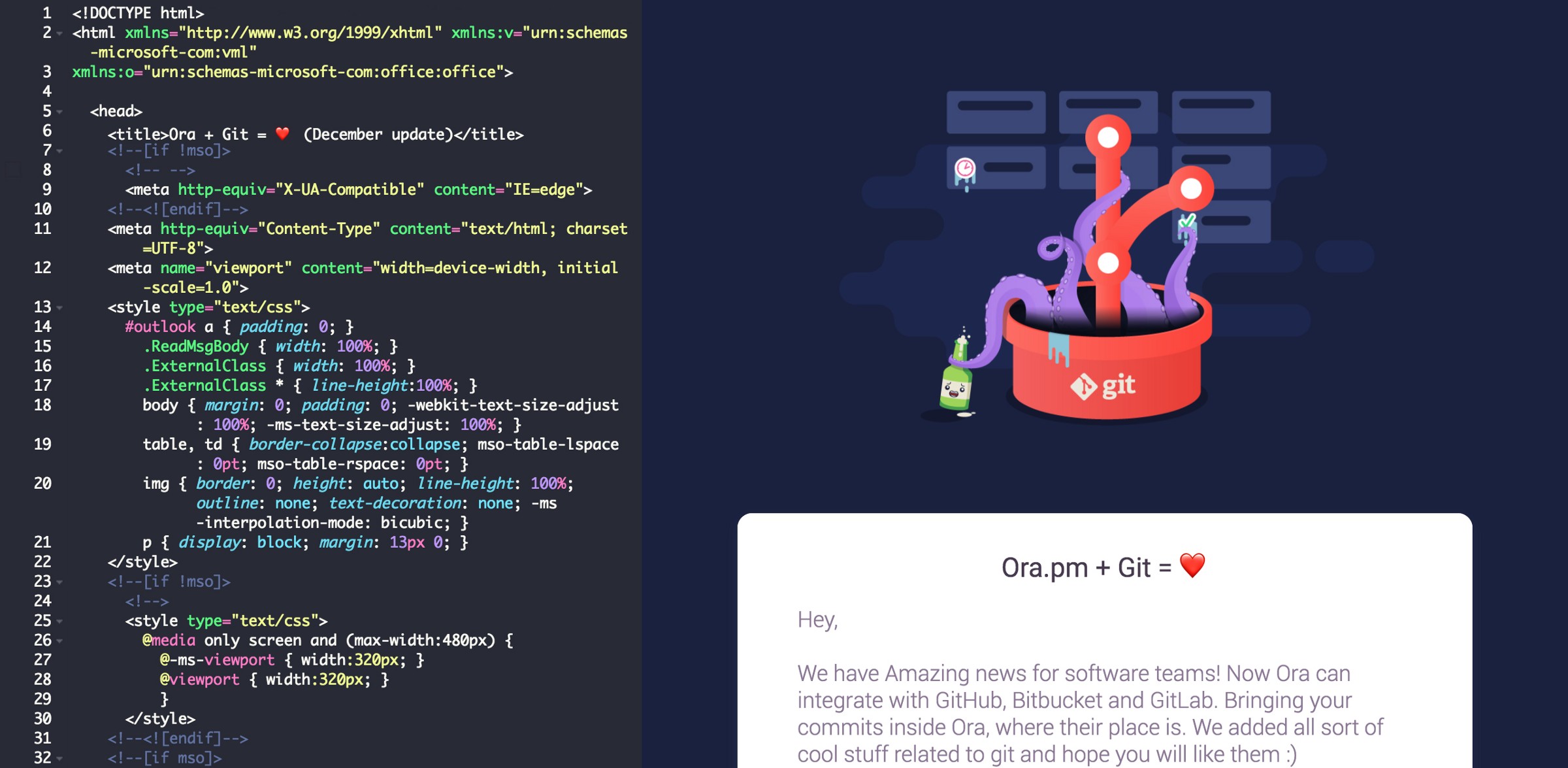
But then… tables(!) and inline CSS(!!) and Microsoft Word as a rendering engine(!!!)… I quickly realized the intricacies of email coding were way beyond my expectations, and consequently the past year has involved a steep learning curve.
If this sounds familiar, welcome to the club! With the clarity of hindsight (but also as someone still fairly new to this), here is the humble advice I would give to anyone new to email coding:
The sooner you stop fighting the quirks of email, the sooner you can use them to your advantage.
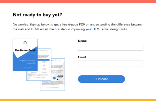
I highly recommend checking out The Better Email by Jason Rodriguez. Even if you can’t pay for the book and/or video courses, at least download the free PDF.

It contains six pages of tips for transitioning from web to email that will save you weeks of trial and error. It’s also good for throwing at your friends when they make fun of you for coding like it’s 1999.
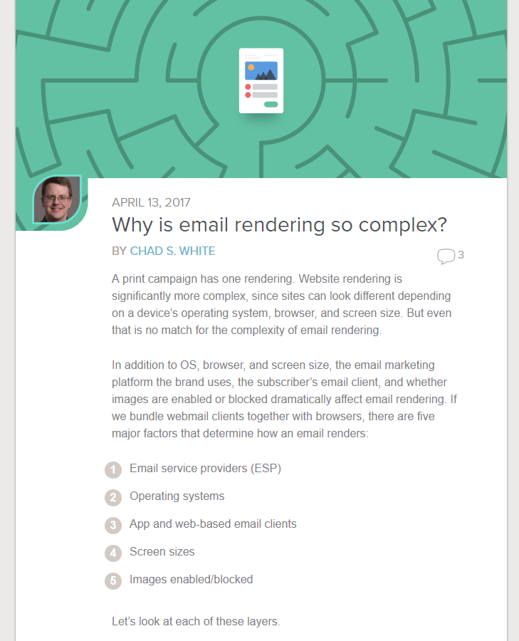
Another must-read on this topic is Chad White’s article “Why is email rendering so complex.”

Short answer: 15,000 possible renderings.
Email can seem like a tangled mess, and you will deal with some crazy parameters. But once you learn to embrace the peculiarities, beautiful things begin to happen.
Ready to dig in? Here are some tutorials that will help set you up for success.
I used the tutorial “Build an HTML Email Template from Scratch” by Nicole Merlin when I started out. It’s a few years old, but it still gets the job done.

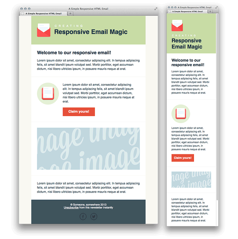
Another helpful tutorial from the same series is “Creating a Simple Responsive HTML Email.”

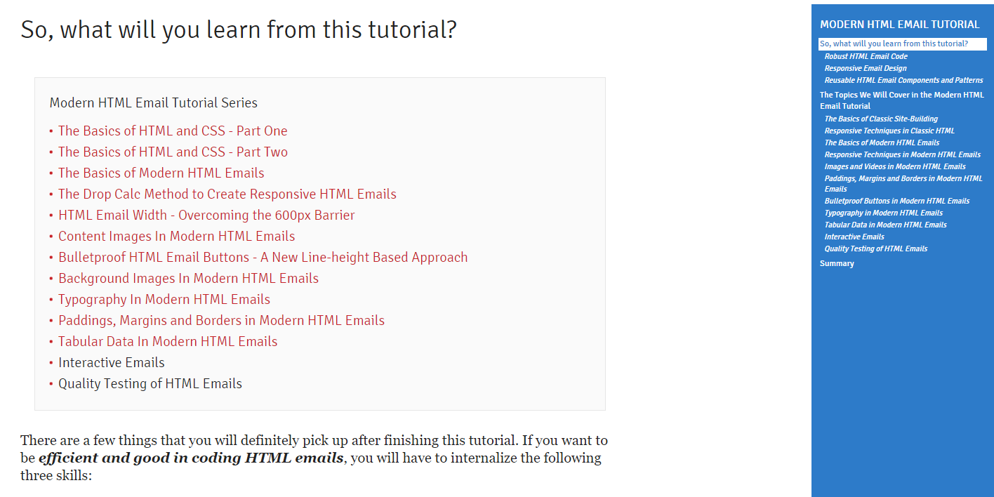
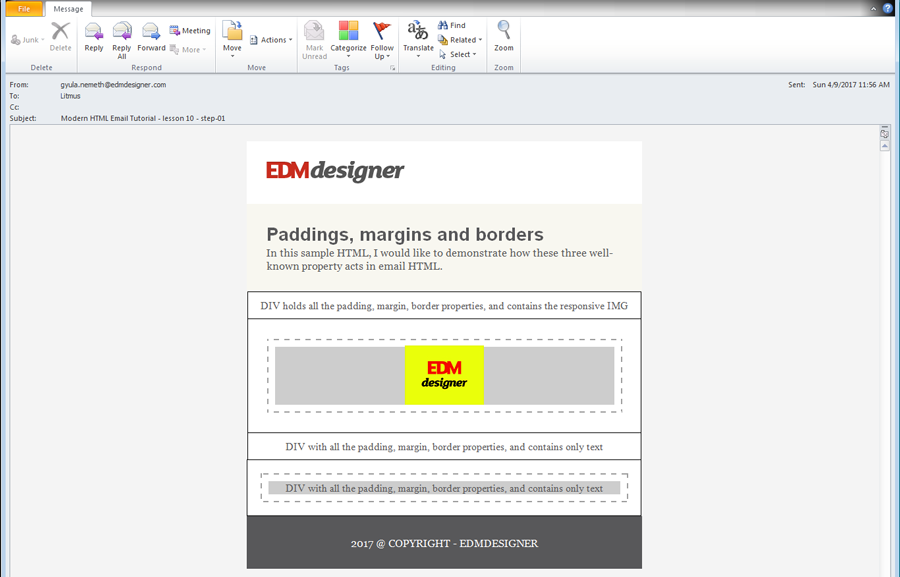
When you’re ready to dive deep, EDMdesigner’s “Modern HTML Tutorial” is a great resource.

They take an element-by-element approach to building emails and share the results of their tests for each method on all major clients.
Of course, what worked for me may not work for you. I haven’t tried the following courses and tutorials, but they come highly recommended by other email geeks:
Take advantage of available tools. Here are a few your future self will thank you for bookmarking.
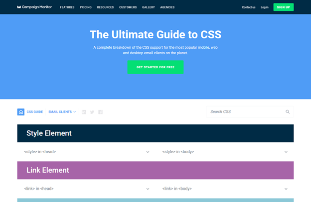
Campaign Monitor’s Ultimate Guide to CSS (recently updated)

This searchable database breaks down which CSS properties are supported in which email clients, and it is invaluable when you are coding emails and figuring out where fallback options are needed.
Buttons.cm
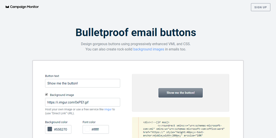
I virtually always use Stig Morten Myre’s bulletproof email button tool (hosted by Campaign Monitor) to create calls to action.

It generates code for buttons that are bulletproof in Outlook as well as all other major email clients. There are other options for creating buttons in email, but in my opinion, this generator is the best way to go for beginners.
EDMdesigner on background images
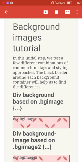
Background images in email are difficult, but this guide from EDMdesigner takes out the guesswork.

They have tested various methods so you don’t have to. If you find yourself needing to code background images in an email, check it out.
Inliner tools
Most clients now support embedded CSS. However, if you are sending to international webmail addresses, or for some edge cases such as non-Gmail accounts opened in the Gmail app, your emails may not render properly without inline CSS.
Litmus started testing non-inlined CSS in its newsletters this year, but until this is tested more widely, most developers will likely continue to play it safe with inlined CSS.
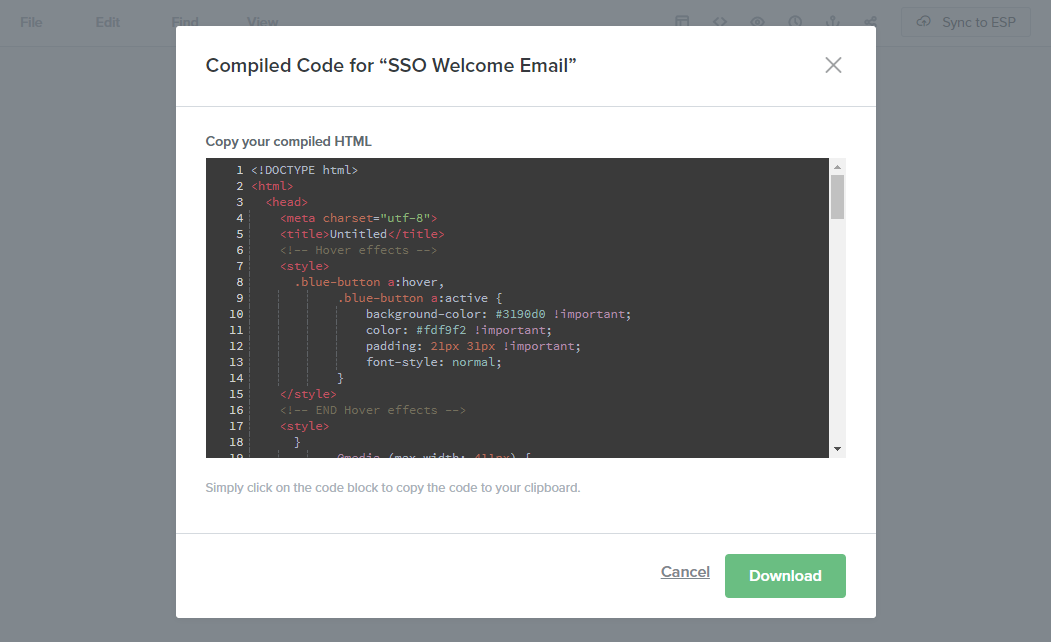
Fortunately, you can save time by coding with embedded CSS and then using a tool to automatically inline it. I currently use the built-in inliner tool in Litmus Builder.

If that’s not for you, there are some other free options available. (This list is from a Litmus article on the subject):
Or, if you’re into task runners like Grunt or Gulp, you can incorporate an open source inliner tool within these frameworks.
Email Check’s Knowledge Base
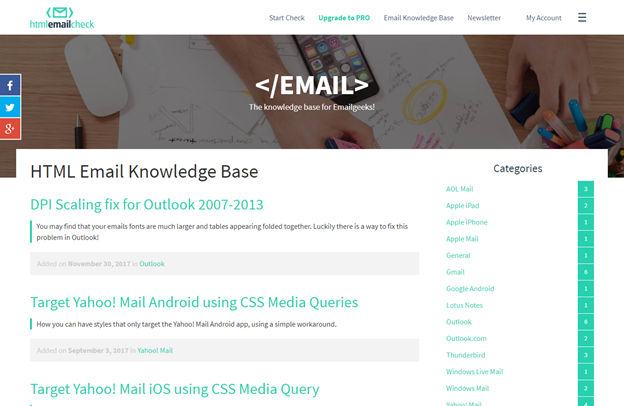
A go-to resource when trying to target specific email clients is HTML Email Check’s Knowledge Base.

The directory in the sidebar leads to specific, to-the-point directions for targeting each client in your code.
(Googling phrases like “target gmail app html email” also works!)
Email Design Workshop’s Glossary
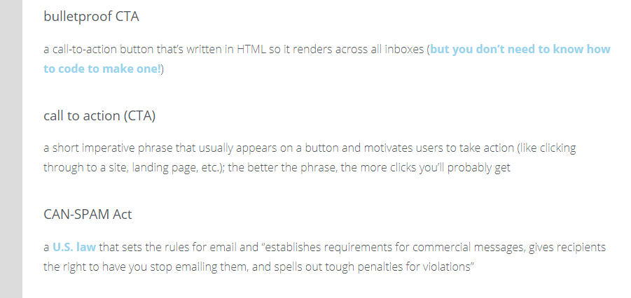
For anyone new to the industry, this glossary is a helpful place to brush up on your email vocabulary.

Microsoft Outlook gets its own section. Because Microsoft Outlook.
Email on Acid has a great PDF that explains why the phrase “because Outlook” is part of every email developer’s vernacular. In addition, here is my list of top things to know when coding emails that may be viewed in desktop versions of Microsoft Outlook:
Outlook comment tags
Wrap anything you want to show only in Outlook desktop in these comment tags:
<!--[if (gte mso 9)|(IE)]>
<![endif]-->
Wrap anything you want to show in all clients except Outlook desktop in these comment tags:
<!--[if !mso]><!-- -->
<!--<![endif]-->
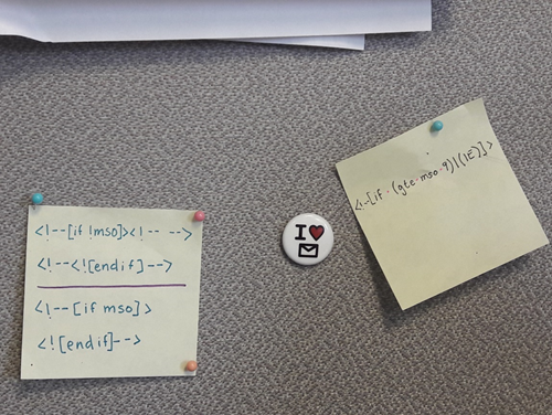
Memorize those. Tattoo them on your hand. Or, if you’re cooler than me, make a snippet. (I wrote them on a Post-it and pinned it to my cubicle wall. Old school, yo).

When starting out, you will most likely use this tactic for GIFs. Outlook does not support animation, so it will only show the first frame of your GIF.
If your first frame isn’t great, wrap a nice static image in <!--if (gte mso 9)|(IE)]><!-- --> <![endif] -->
and the animated gif in <!--[if !mso]><!-- --> <! — <![endif]-->
For example:
<!--[if !mso]><!-- -->
<img src="http://image.member-email.com/lib/fe961570756600747c/m/1/em746-tech.gif" alt="Animated image in the style of an 8-bit video game of knight upgrading his or her cell phone from an old to new model" width="600" style="display:block; font-family:'Open Sans', 'Arial', 'Helvetica', sans-serif; font-size:16px; line-height:24px; color:#4a4a4a; mso-line-height-alt:exactly;" />
<!--<![endif]-->
<!--[if (gte mso 9)|(IE)]>
<img src="http://image.member-email.com/lib/fe961570756600747c/m/1/em746-mso.jpg" alt="Animated image in the style of an 8-bit video game of knight upgrading his or her cell phone from an old to new model" width="600" style="display:block; font-family:'Open Sans', 'Arial', 'Helvetica', sans-serif; font-size:16px; line-height:24px; color:#4a4a4a; mso-line-height-alt:exactly;" />
<![endif]-->
Spacing
A rule to keep in mind for spacing is that Outlook only honors margins (not padding) on <p> and <h> tags, and only honors padding (not margins) on <td> and <table> tags.
(And its interpretation of padding on <table> tags is sometimes sketchy, so to be safe, put your padding on <td> tags only).

EDMdesigner explores this in depth in their Modern HTML Tutorial.
Line-heights
Set line-heights for all of your text AND use CSS property mso-line-height-alt: exactly. Otherwise Outlook may surprise you with its own interpretation.
Images
If you are having trouble with images in Outlook, try setting a pixel width directly in the <img> tag. Outlook struggles with percentages and undeclared widths. You can always change an image’s width to a percentage with media queries. (Note: Outlook desktop sometimes ignores properties with !important attached. Fun!)
Also, if you use a width or height HTML attribute, don’t use “px” after pixel widths or Outlook may not honor it. (For example, width="300", not width="300px").
Responsive Frameworks. Templates are your new BFF.
All of that said, fortunately you don’t need to start from scratch. There are plenty of responsive frameworks and templates to get you started. (I so wish someone had told me this a year ago!)
Templates
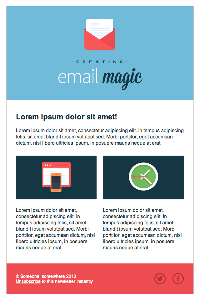
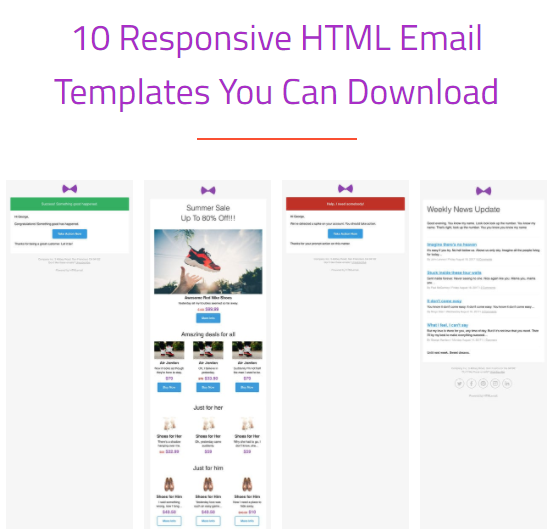
Litmus and HTML Email have free templates you can use as a starting point.

From HTML Email
Or you can check out templates by companies like Paper Plane or Mailto.
Frameworks
I haven’t used these much (recall my Post-it notes featured above), but I know they are commonly used in the industry:
Testing, testing… 1. 2. 3.
Once you’ve built your email, it’s crucial to test it before sending. If you’re lucky, you have a QA specialist on your team to make sure all links are going to the right landing pages and that you don’t have any extra “r”s in the word “cart.”
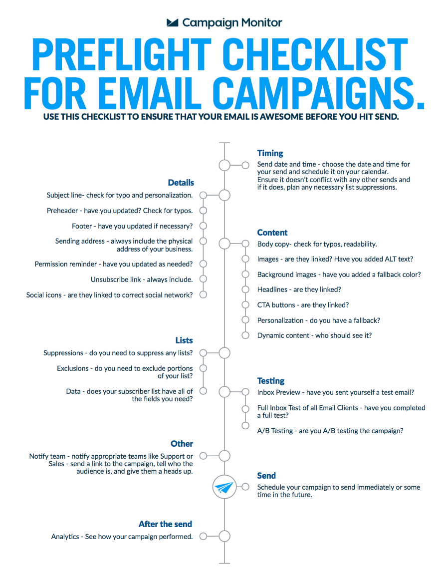
If not, you just have to be extra vigilant when checking your email. A preflight checklist like this one from Campaign Monitor is a good way to make sure you don’t miss anything.

Send test emails
With upwards of 15,000 possible renderings, it’s important to check an email on as many platforms as possible before sending the real thing. Viewing the HTML file in your browser or editor works during initial development, but you can’t be sure how it will appear to your users without test sends.
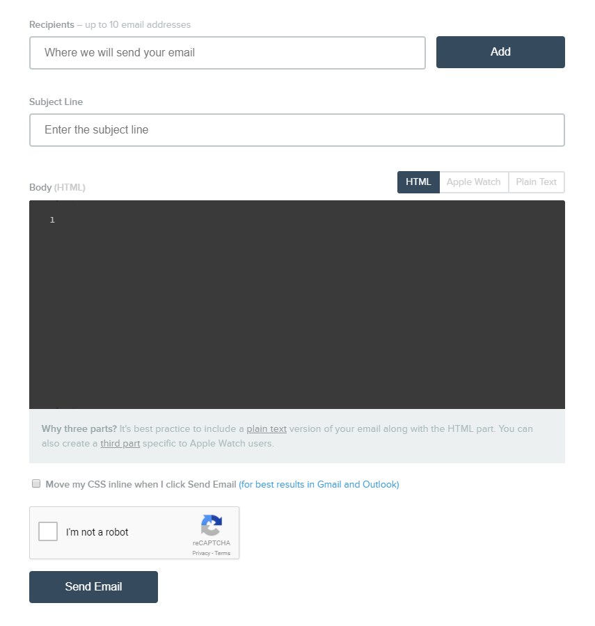
If you don’t have the option to send preview emails through your ESP, you can use a service such as PutsMail to send test emails.

PutsMail platform
When I started, I set up a new email account on Yahoo, Outlook, Gmail, Apple Mail, and AOL just for testing (yes, even AOL), and made sure to check each account in the corresponding desktop, webmail, and mobile app versions. (Please note: There are more efficient ways to do this. See next section).
Preview tools
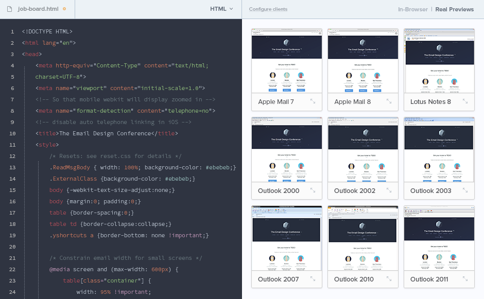
A preview tool such as Litmus or Email on Acid saves you the hassle of sending and checking a million emails.

While you may still want to test the final version email with a few real clients and devices, a preview tool is far more efficient during the build process. It’s also more comprehensive, since it would be virtually impossible to send and view test emails on every available client, operating system, and device that your readers will use.
Which email clients to test
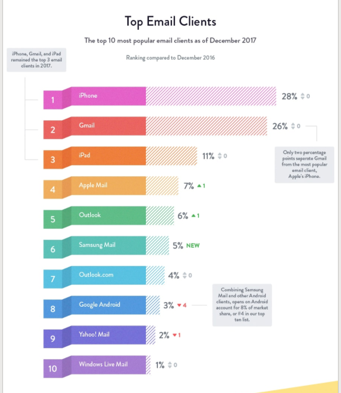
When deciding how much effort to put into coding for any particular client, it’s helpful to know what percentage of your audience is using which clients. Every audience is different, so if you have access to this data, definitely take advantage of it.
If not, Litmus puts out a list of the overall market share for email clients each year, so you can at least have a general idea of where your priorities should be.

From the 2017 Email Client Market Share infographic by Litmus
It’s dangerous to go alone! Connect with other email developers.
At some point, after hours of testing and retesting, you will finally scream out to the universe “why isn’t this working?!?!” And, fortunately, a fellow email geek will come to the rescue with the fact that Yahoo Mail sometimes ignores !important if it’s preceded by a space. (Seriously, that’s a thing).
I may be biased, but email geeks comprise the most amazing community in the world.

Join #emailgeeks on Slack, or Women of Email on Facebook. Participate in discussions on the Litmus community boards. Search #emailgeek or #emailgeeks on Twitter and connect with folks there.
Also subscribe to email-related blogs and newsletters to stay in the loop. Here are just a few I recommend, especially with coding in mind:
Webdesigner Depot, Web Designer News and Hey Designer Weekly also occasionally feature articles related to email.
Last but not least, check out the Email Design Podcast.

It’s about a half-hour each week and will keep you up to date with changes in the email world.
Accessibility matters. And, surprise! It’s a little different for email than web.
I promise your email lists include users who rely on assistive technology. Fortunately, it’s not hard to make sure their experience with your email is as frictionless as possible. Here are some best practices:
ARIA role attribute
Tables are necessary for emails, but also problematic for users who rely on screen readers. So be sure to add role="presentation" in all <table> tags that are purely for formatting. This attribute tells screen readers to simply read the contents of the table, rather than describing the positioning of contents within a table and then reading them. The impact of this tactic is powerfully illustrated in this 30-second demonstration from Mark Robbins.
Use the alt attribute on all images, and please actually describe the image with your alt text. Don’t be that guy and use this space to say “turn on your images.” It is lazy, dismissive, and annoying. (Styling alt text is a good practice as well).
If an image is purely decorative and does not add to the content of the page, be sure to still add the alt attribute but use alt="". Otherwise screen readers may read out the full URL of the image source.
Semantic tags
Use <p> and <h> to add semantic hierarchy to your email. While other semantic tags are not supported across the board, paragraph and header tags are now supported by all major email clients. Use them. (Just make sure to assign a margin value or you’ll get inconsistent results in…you guessed it…Outlook).
And more accessibility
There are endless resources when it comes to accessibility in emails. Wilbert Heinen has made a list that, if not comprehensive, is pretty close. If that seems overwhelming, I recommend starting with this video.
Good luck!
Every email journey will have its own twists and turns, but hopefully these tips give you a head start. What would you add to this list?
