

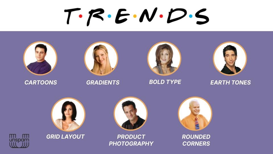
Seven 2026 email design trends walk into a coffee shop. A Friends reference for every one of them.
At Unspam 2026, Meghan Sokolnicki compared seven email design trends to seven Friends characters. The analogy holds better than it should.

Every year, Really Good Emails drops a trend list, and something happens in inboxes across the industry: designers open it, pull out a highlighter (metaphorically), and start treating it like a campaign brief. Cartoons? Check. Earth tones? Check. Gradients? Throw one in. How many can we fit before the send date?
Meghan Sokolnicki, Principal Email Designer/Developer at Marigold (parent company of Emma and Campaign Monitor), has seen enough of this to have opinions. Twelve years in email design. Days spent working directly with customers across both ESPs, helping teams translate what they actually want to say into an email that actually works. She sees the inbox of hundreds of brands. Not just her own.
At Unspam 2026, she walked through all seven trends on the list. But first, a confession: she had been rewatching Friends as a background comfort show while building the deck. A simpler time, she said. Before the dumpster fire of a world we live in now.
It bled in. She apologized in advance. Seven trends. Seven characters. Here is what she found, and why it all points to the same thing.
A trend is not a checklist
Before the Friends analogies, Sokolnicki made one point that set the frame for everything else.
Trends are patterns. They show what we are all collectively gravitating toward right now. That does not make them automatically good or automatically right for your brand. The instinct to treat a trend list like a to-do list is exactly the wrong move.
The better question: what does it say about us, as an industry, that we are all drawn to the same things at the same time? What is the inbox asking for right now? And does this trend actually help you answer that for your specific audience?
With that framing in place, she went through each one. She also admitted, unprompted, that she had spent too much time thinking about the Friends component. It shows. That is not a criticism.
Cartoons as hero (Joey)
Cartoons have appeared in email before, mostly as decorative squiggles or marginal notes. What is different in 2026 is placement. Illustration is now taking the hero space, the focal point that used to belong to photography.
What Sokolnicki likes about it is the range. Brands that use cartoon-style illustration end up visually in completely different places. The technique is the same, but the output is not. That makes it one of the more flexible tools for expressing brand personality without looking like everyone else.
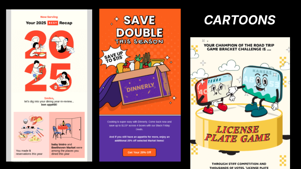
Her caveat was direct: it is a playful style, so it is not right for every context. "If you are getting an eviction notice, maybe you do not want a little smiling broom kicking you out." If the visual is doing personality work, the copy should follow suit. A headline that sounds like a press release will kill the energy. And the rest of the design should be restrained enough to let the illustration breathe.
Friends assignment: Joey. Silly and lovable, but with more range than he gets credit for. Dr. Drake Ramoray is still a career. He can draw a crowd.
Grid layouts (Monica)
Email is already built on grids. Designers spend their days putting boxes inside boxes. This trend is not about doing something structurally new. It is about leaning into that structure intentionally rather than fighting against it.
What it is
What Sokolnicki described is card-based layouts where multiple pieces of content sit together and read as a unified grouping rather than separate elements competing for attention. Visual rhythm, clear hierarchy, and thematic consistency are what make it work. A grid of nine recipe images reads fine because they all belong to the same category. A grid of nine unrelated promotions is a problem entirely different from the one.
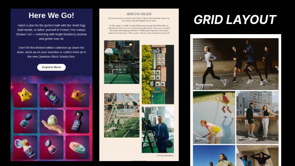
Why it matters
She was direct about a pattern she sees often with newsletter clients, especially: brands using columns to cram more content in, assuming more surface area means more engagement. "Let's just cram it all in. If we do columns, we can fit so much and really get everybody's attention." What actually happens is the opposite. Too many unrelated things side by side create visual fatigue, and people drop out.
How to use it
A well-executed grid layout is not about volume. It is about helping the reader scan once and understand the structure before diving in. Navigation headers or color blocking that signals topic shifts can help with that. And this is not a trend reserved for big retail brands with large photography budgets. A nonprofit can do this. A newsletter can do this.
Friends assignment: Monica. Organized, structured, the glue between all the other moving parts. The rent-controlled apartment holds everyone together.
Bold typography (Rachel)
The mood here: editorial. Large, expressive, high-contrast type is taking over the hero space that photography once owned.
What it is
The core idea is legibility as a deliberate design choice, not just a baseline requirement. Type does the visual heavy lifting. The composition is built around the headline, not around an image.
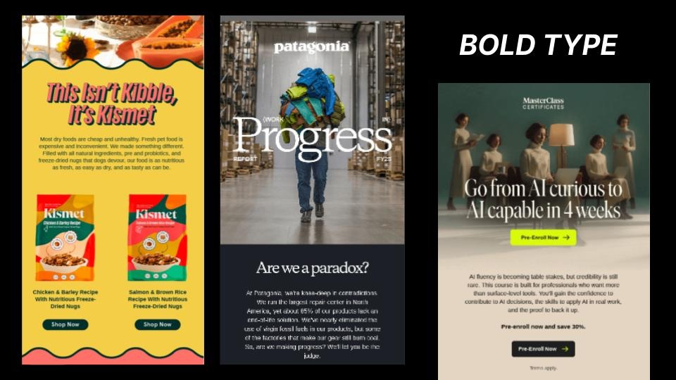
How to use it
Sokolnicki noted that this does not require a full design team or a custom art build. Extreme contrast in font sizing, a very large display heading paired with small body copy, creates the same visual tension with live text. Which also means it is more accessible than a hero image, and easier to render consistently across clients.
One thing she was clear about for the recording: this does not mean turning your headline into a graphic and uploading it as an image. Live text. Actual type. The kind that renders, scales, and gets picked up by screen readers.
The trade-off
Bold typography takes up most of the room. It is, as she put it, "main character energy." Everything else in the email needs to know that and step back accordingly. One strong focal point restrained everything else.
Friends assignment: Rachel. Stylish, main character energy, a haircut with its own cultural moment. The ultimate trendsetter of the group, and she knows it.
Earth tones (Ross)
Warm beige, muted blue, dusty neutrals. This palette has replaced the harsh white-background default that email has relied on for years, and right now it is everywhere.
Why it works
Sokolnicki described it as creating a warmer, more inviting environment. Less contrast, more intention. The effect signals refinement in a way that neon palettes or bright pastels do not. She has a whole theory about why, she said. It involves the Kardashians. That is a separate talk.
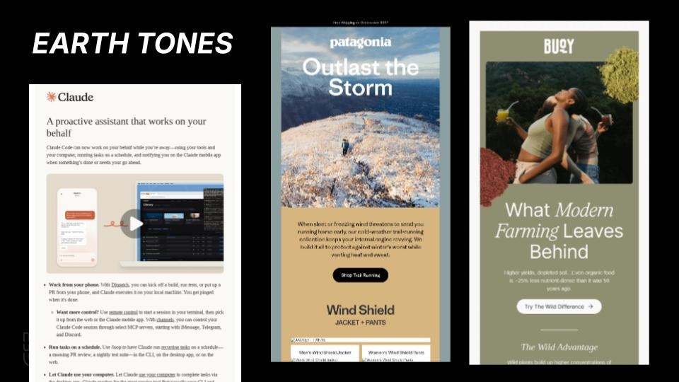
The AI caveat
She also flagged something worth watching: AI design tools are picking this up and outputting it by default. If the algorithm is generating earth tones with little prompting, the palette could become oversaturated faster than a trend typically would. Worth keeping an eye on.
How to pair it
Her design pairing: negative space. Earth tones and breathing room work together. Packing an earth-toned email with competing elements undercuts the quality signal the palette is trying to convey. Storytelling copy plays well here, too. The mood is not "sale ends Sunday." It is "let us tell you something." Earth tones and bold typography also pair naturally. The muted background lets the type do its work without fighting back.
Friends assignment: Ross. "Paleontologist, rocks, dirt, done." Not the flashiest. Always there. Landed the dream girl. He is fine.
Rounded Corners (Gunther)
Rounded corners on images. On sections. On buttons, which are now more likely to be pill-shaped than rectangular. This is less of a deliberate design trend and more of a UI default that has migrated into email from broader product and app design, and from AI-generated templates that are starting to treat it as a baseline.
Why it keeps working
Sokolnicki acknowledged it is probably being overdone. But she also explained why it keeps working: rounded edges feel tactile and soft. People are conditioned to click on them. The visual environment is approachable and calm. She pointed to one example she liked, an Apollo email that used rounded corners on the outer containers but hard-edged borders inside, creating a kind of visual tension that inverted the usual logic.
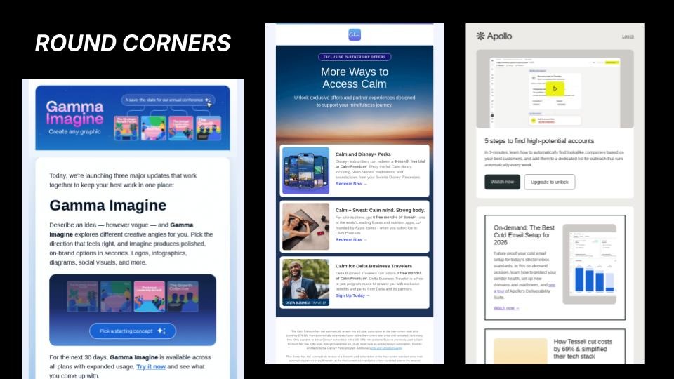
Where it is going
One note on trajectory: trends tend to be reactions to what came before. "In a couple of years, we will probably see all hard edges, diagonal lines." These things build on each other. For now, rounded corners are the default. Use them with intention, or they disappear into the background.
Friends assignment: Gunther. "Always there. You do not always realize it, but he is holding Central Perk together. Rachel's not working; she's sitting on the couch." The place does not function without him.
Product Photography (Chandler)
This one is specifically for brands that sell physical products, but the reasoning behind it is worth understanding regardless.
The shift is away from lifestyle imagery and toward the product itself, front and center, with no ambiguity about what the email is selling. Sokolnicki connected this directly to the current moment around AI-generated imagery. As audiences have become more aware of artificial visuals, direct product photography reads as proof. This is real. This is what you are going to get. It is, in her words, "being respectful of our time."
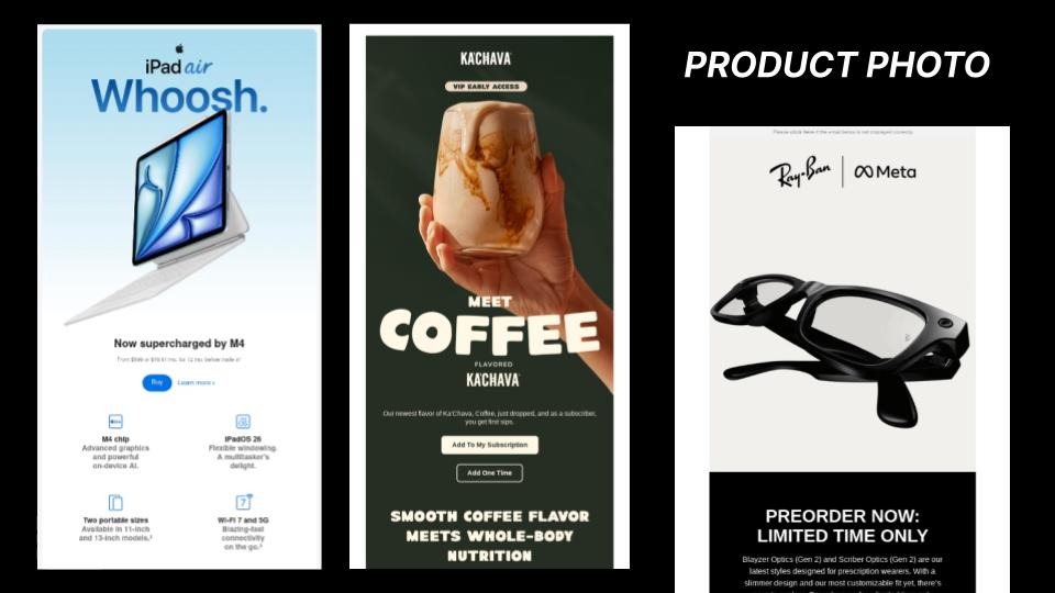
The execution requires discipline. A large product image does not coexist well with a busy layout. This is a single-message technique. High-contrast typography and a clear call to action can reinforce impact, but only if the rest of the email gets out of the way. If the email has three products, a brand update, and a survey link, this approach will not work. The discipline is to commit to one thing and not hedge.
Friends assignment: Chandler. "Average dude, not the obvious standout, but he is going to make himself known before he leaves a scene without a quick-witted remark. Could it be any more obvious?"
Gradients (Phoebe)
Gradients add visual depth and personality without requiring photography or custom illustration. They work as backgrounds, layered elements, and a way to push color into categories like B2B that tend to default to flat, neutral tones. For a brand without a strong photography library, this is one of the fastest ways to add a distinct visual identity to an email.
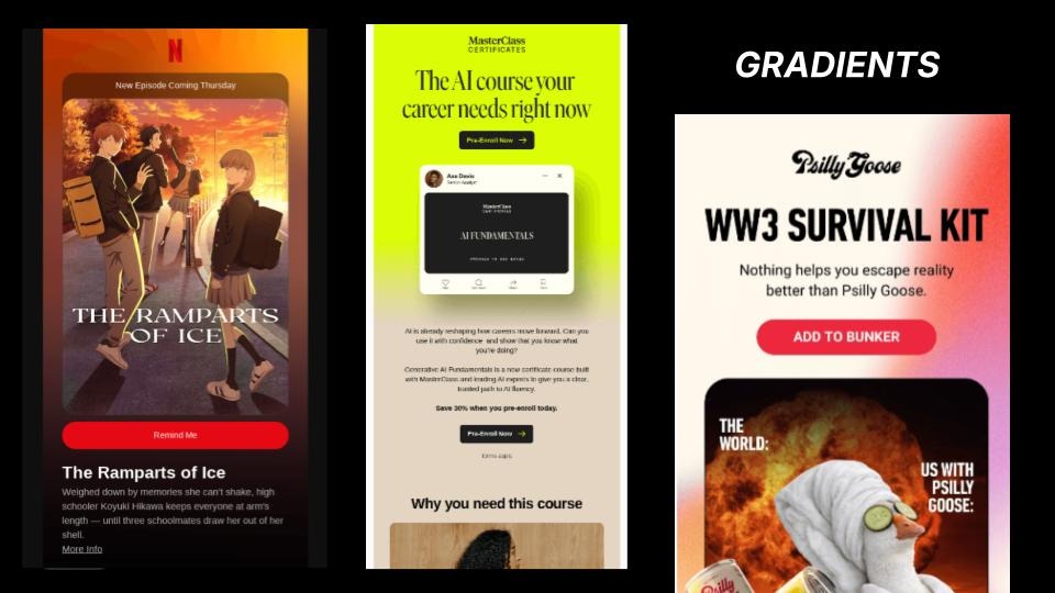
The AI caveat
The combinations showing up most are purples and blues, particularly in SaaS. Sokolnicki flagged this as another trend to watch through the lens of AI. Purple-to-blue gradients are a common output from AI design tools, which could accelerate saturation. If the algorithm defaults to it, it stops feeling distinctive faster than it otherwise would. Worth paying attention to what AI is outputting by default and asking whether you are making a choice or just accepting a suggestion.
Technical note
Dark mode. Gradients can look very different depending on the rendering environment. Testing image-off and dark mode before sending is worth the step. For brands that want to push further, glassmorphism, card overlays, and opacity-based elements pair naturally with gradients to create additional depth.
Friends assignment: Phoebe. "Goes from one idea to the next in a way that maybe does not make sense, but somehow she makes it work."
What they are all actually solving
Seven trends. Visually very different from each other. Not all of them pair well together. But Sokolnicki concluded that they are all solving the same three problems.
Every one of them is doing at least one of these things: leaning into a brand's personality, providing visual proof of authenticity, or making comprehension easier for the reader. "I like all of these because they're curating a thoughtful experience that's prioritizing the recipient."
The principles that make any of them work are the same ones that have always mattered: strong hierarchy, generous negative space, and design decisions made in service of the person opening the email. A gradient does not make an email better on its own. Neither does a rounded corner nor a cartoon illustration.
Any lone email wolves in the room? Sokolnicki asked that question at the start of her session. A lot of hands went up. No one to bounce ideas off of. No one to say "hey, maybe reconsider that." Just you, a trend list, and the temptation to check every box. The trends are not the answer to that. Thinking about the recipient first is.
"I think designing first with that human experience in mind is what's gonna help set you up."
Articles to whet your whistle


Subscribe to our newsletter.
Dive into the world of unmatched copywriting mastery, handpicked articles, and insider tips & tricks that elevate your writing game. Subscribe now for your weekly dose of inspiration and expertise.