

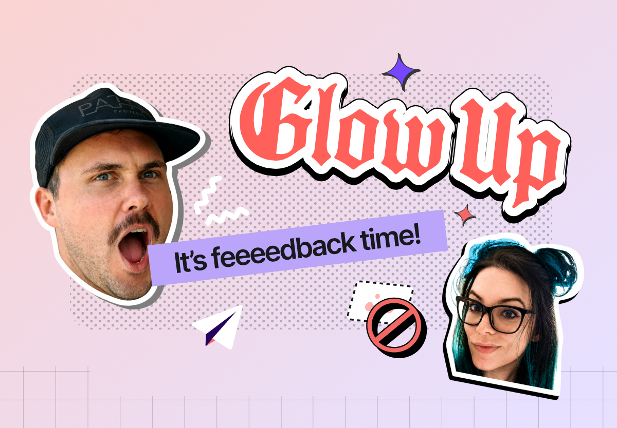
Email glow up: from all-image to high-impact
A recap of our latest webinar with Matt Helbig and Yuliana Pandelieva, featuring two real brands, one fake university, and a healthy disrespect for Outlook.

Here's a fun party trick: take a beautiful email, screenshot the whole thing, slice it into pieces, and ship it. Looks perfect. Pixel for pixel, exactly like the Figma file.
Then turn off images in Outlook and watch it become a stack of broken nothing.
That's the all-image email. And on this webinar, Yuli and I did something about it.
I teamed up with Yuli, our senior designer, and we took three real brands and rebuilt their all-image sends as live text inside RGE Studio. Same look. Better everything else.
Here's what went down.
First, the villain of the story
An all-image email is one big picture, sliced up and dropped into your ESP. Looks great in the preview. The problem is everything else.
The headline, the body, the CTA: all locked inside the image. Your promo code? Trapped. Nobody's copy-pasting SAVE20 out of a JPEG. Yuli put it best: they give her the ick.
A few more reasons they're a bad time:
- They pixelate. High-res screens, mobile, retina displays. Sliced images rarely look crisp everywhere.
- They break. Images off in Outlook means your reader sees a slice-and-dice of nothing.
- AI can't read them. With AI inboxes now writing summaries of your emails, a wall of image gets a shrug.
- They erode trust. Lock up your legal disclaimers in an image where nobody can read them and you're quietly telling people you'd rather they didn't.
I'm not here to shame anyone. Most marketers send all-image emails because of real constraints: no dev time, no designer on call, a fear that the ESP can't match the brand. Fair. But there's a better balance, and Yuli and I spent the hour proving it.

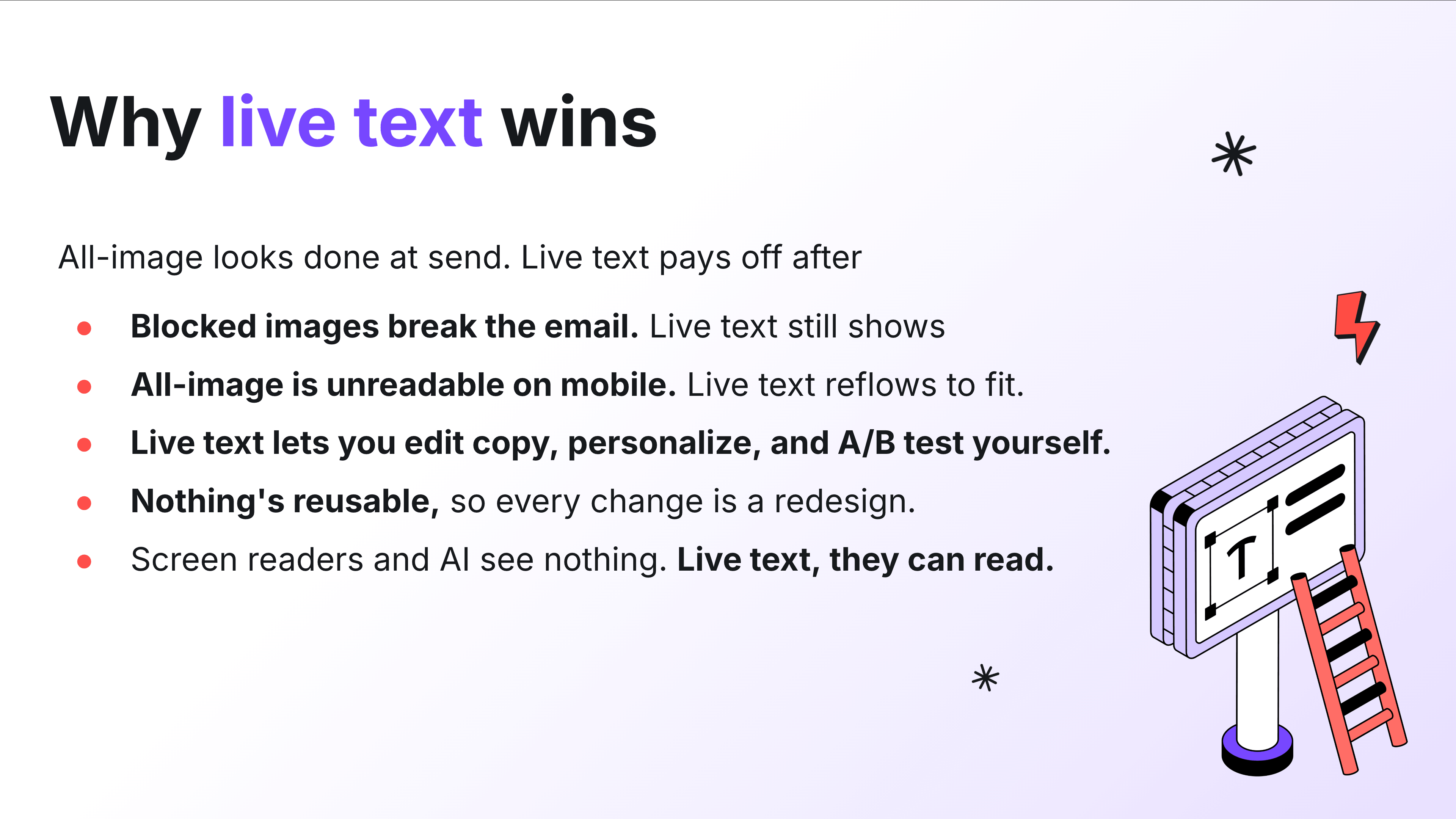
Why live text wins
Live text reflows. It scales to any screen. It survives images-off. It can be translated, A/B tested, and actually read by a human (or a robot writing a summary).
And here's the reframe: accessibility is just good design. When anyone can read your email on any screen, everybody wins. The whole point of an email is to get someone to the next click. Hard to do that when your message is a screenshot. (Want to go deeper here? There's a whole Email Accessibility 101 course on the RGE Academy.)
The other thing nobody tells you about all-image emails: they're slow to change. Every tweak means waiting on a designer to re-slice. A live, modular template means anyone on the team can swap copy and ship. That's the real glow up. Not the pixels, the workflow.
The glow ups
We picked emails that already looked great, so we could focus on how they're built instead of arguing about design taste. (Want to see the originals we started from? Every all-image "before" lives in this Figma file.)
Seed: it's secretly a design system
Seed is a DTC supplement brand with gorgeous branding done by Mouthwash Studio. Clean, modern, lots of white space, the works.
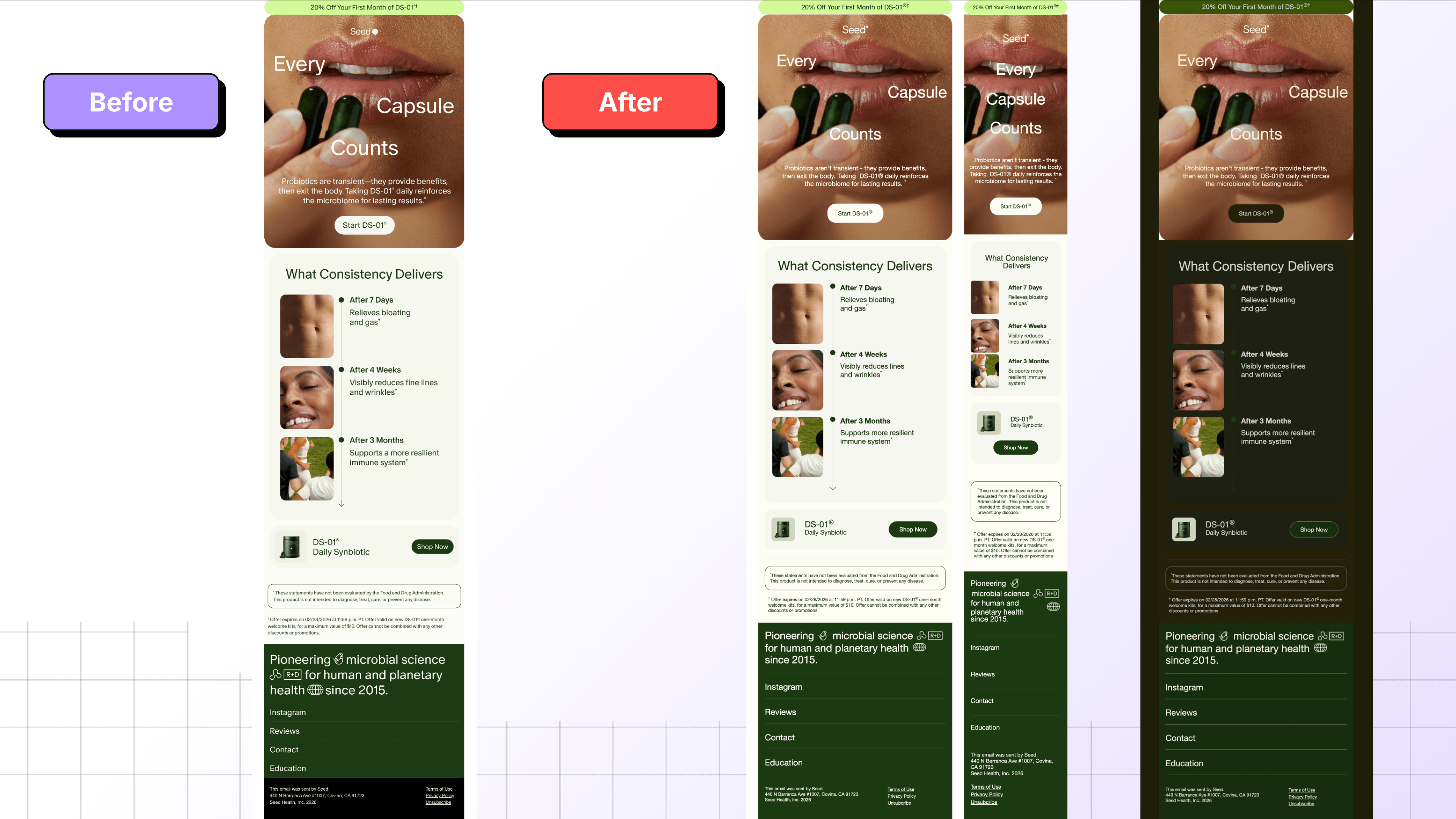
What I love about this one is that it's secretly a design system. All the emails are built from a handful of repeatable parts: a claim, a scannable timeline, some social proof, a product block. Once those exist as live, modular rows instead of one flat picture, the email basically builds itself.
Case in point: the testimonial section. I added that one myself, working straight from the before images, and I didn't design anything new. I duplicated an existing module, swapped the colors and the copy, and it was done in a couple of minutes. When a section is a reusable block instead of a sliced image, anyone on the team can spin up a new variation without pinging a designer.
The timeline works the same way. Every entry shares one structure, so you can duplicate a row to make it longer or reuse the whole thing in next month's send. And with synced rows, you change a link or a footer detail in one place and it updates everywhere that row appears. Build once, reuse forever.
We also kept the disclaimer text as legible live type instead of burying it in a graphic, since fine print locked in an image is exactly the kind of thing that quietly erodes trust.
Before and after? Honestly, nearly identical. That's the point.
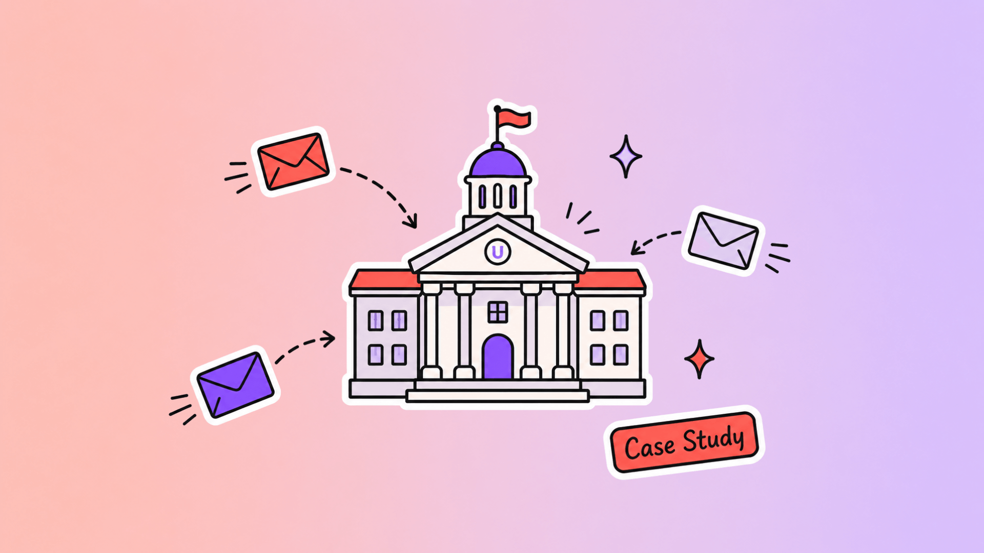
Higher Ed: the bulletin board problem
People have been asking us for higher ed templates for ages, so I signed up for 100 US college email lists. (I also attended all four years. Don't fact-check that.)
My verdict: most higher ed newsletters have a bulletin board problem. Everything gets equal weight. A dozen "Read More" links that don't tell you what you're reading more about. A press-release voice. A stock photo of people having suspiciously good times in front of laptops. Nothing tells you what actually matters.
Out of 100 schools, exactly one nailed it: shout out to ASU.
Since none of the others were glow-up-able as-is, Yuli built a fresh fictional template from scratch. One topic. One hero. One clear thing to do. Everything else is supporting content that knows its place.

The principle I keep coming back to: you're basically guaranteed one click. So decide what that click should be, and stop letting six other links fight it. Give sections breathing room. Write for humans. And design mobile-first, because students live on their phones.
This template is now live as the Campus Chronicle newsletter, so you can poke around and steal the bones of it.
Hanni: keeping the fun fonts without going all-image
Hanni is a DTC beauty brand with branding so distinct you'd know it with the logo covered. Fun fonts, playful angles, the personality cranked up.
Beauty brands love an all-image excuse. Yuli picked this Hanni email as a flex: the tilted, playful, custom-looking type is exactly the stuff people swear has to be an image, and she rebuilt every bit of it as live text.
Here's the thing about Hanni's branding: cover the logo and you'd still know it's them. That's the bar. And the personality doesn't actually live in the image file. It lives in the spacing, the rhythm, the product photography, and that playful type, all of which you can keep while still making the words real, selectable text.

The move here: you don't have to choose between "fun custom font" and "live text." Lock the decorative hero headline in an image if you must, then layer it over a live-text foreground so the body copy and CTAs stay accessible. Best of both. The only thing she couldn't perfectly recreate was a product image overlapping a CTA, and that tiny detail is not worth turning the whole email into a picture.
Tools that did the heavy lifting
A few RGE Studio features that came up:
- Smart Check. Flags issues before you hit send: oversized images, missing links, and emails heavy enough to get clipped in Gmail. (Quick note: image file size doesn't count toward Gmail's clipping limit, that's about HTML weight.)
- Advanced style guide. Set brand fonts and lock down styles with permissions, so nobody's turning your CTAs neon green.
- Hover effects. Work in Gmail, Android, and Apple Mail. The lone holdout is, predictably, Outlook. The fallback is just the base color, so you lose nothing by adding them.
- Export anywhere. Build the creative once, then copy the HTML or export into Slate, Klaviyo, or whatever ESP you live in. You're not married to one platform.
One honest caveat on dark mode: every device and OS forces dark mode differently. The previews you saw are a machine's best guess, not gospel. Always test in real inboxes.
My takeaways
All-image emails look fast up front. You pay for it later: in broken renders, pixelated heroes, dead promo codes, and a designer bottleneck every time you need one word changed.
Live text beats a pretty screenshot. You wouldn't use a website made entirely of images. If your bank emailed you one, you'd be nervous.
I'm not anti-image. Images are great. The skill is knowing which parts of your email should be an image and which parts should be live text.

Your questions, answered
More good questions came in than Yuli and I could get to live, so here's the follow-up round. A quick note: a bunch of you asked product-specific "can RGE Studio do X" questions (exporting to specific ESPs, custom connectors, font settings, and so on). Those have real answers in the Help Center and Academy, and our team dropped links to most of them in the live chat. Below I'm tackling the bigger strategy questions, the ones that apply no matter which tool you use.
"What's the actual uplift? Any metrics for live text vs. all-image?"
Honest answer: there's no clean universal number, and anyone who hands you one ("live text converts 23% better!") is selling something.
Here's why. The damage from an all-image email mostly happens to people you never measure: the ones who got a blank rectangle because images were off, the screen-reader users who heard nothing, the folks whose preview text was empty so they never opened. Those aren't in your "before" numbers. They're just quietly gone.
So instead of chasing a benchmark, measure your own. Pick one campaign. Send the all-image version to half your list and the live-text version to the other half. Watch open rate, click rate, and conversion. That's your number, on your audience, which beats anyone else's case study.
The thing live text reliably wins on isn't a single metric anyway. It's everything downstream: faster edits, easier A/B tests, working dark mode, translatable copy, and an email AI inboxes can actually summarize.
"We're text-heavy and don't have a big photo library. How do we stay engaging without leaning on images?"
Good news: you're already ahead of the brands drowning in stock photos of people high-fiving near a laptop.
A few ways to make text-forward emails sing:
- Typography is your design. Strong headlines, clear hierarchy, and generous spacing do most of the heavy lifting. A bold title carries more weight than a filler image ever will.
- Use color and shape, not photos. Background colors, dividers, rounded cards, and simple icons add visual interest without a single photoshoot.
- Make it scannable. Short paragraphs. One idea each. Subheads that tell the story even if someone only reads those.
- Pick one hero. Lead with your most important thing, give it room, and let everything else support it.
You don't need a photo library. You need a point of view and some breathing room.
"How often should we give our emails a glow up? Does newness keep people engaged?"
There's no calendar rule, and please don't redesign for the sake of redesigning. Your readers don't notice a new button radius, but they do notice when you break the muscle memory of how your email works.
Glow up when something's actually off: your template breaks on mobile, your edits require a designer every time, your brand evolved and the email didn't, or your numbers are sliding. The best move is usually one solid, modular rebuild that lasts, not constant tinkering. Novelty isn't what keeps people engaged. Consistently useful, readable emails are.
"What about alt text on a locked-up image? Does that cover it, or is it sub-par?"
Alt text is good practice and you should always include it, but it's a safety net, not a substitute.
Alt text helps when images fail to load and it gives screen readers something to announce. What it doesn't do: render nicely in the inbox, reflow on mobile, let people copy your promo code, or match your brand styling. It also gets ignored or truncated by plenty of clients. And as accessibility expert Sarah Gallardo points out, plenty of assistive tech (zoom tools, dyslexia-friendly font plugins, colorblind adjusters, speech-to-text) has nothing to do with alt text at all.
So yes, add alt text to every image that isn't decorative. But don't use "we have alt text" as the reason to lock your whole email in a picture. Alt text describes the content. Live text is the content.
"We use Movable Ink for personalized image generation, with alt text on everything. Still go live text?"
Great setup, and personalized imagery is genuinely powerful. This isn't an either/or.
Use dynamic images for the things that have to be images: personalized product shots, countdown timers, location-based creative. That's exactly what tools like that are for. But your core message (headline, body, CTA, the stuff that carries meaning) is still better as live text underneath and around those images.
The rule I'd offer: if the information must be readable to work (a price, a code, a deadline, your main pitch), it should be live text. If it's a visual that enhances the message, an image is fine. Personalization tools don't change that line. They just make the image side smarter.
"Hero image dimensions and file size, especially for retina screens?"
Rules of thumb:
- Width: design to a 600 to 640px email body, and export hero images at roughly 2x (so about 1200 to 1280px wide) so they stay crisp on retina displays, then let them scale down.
- File size: keep heroes well under a few hundred KB. Compress everything. A 1.3MB hero (like the one I caught live with Smart Check) is a download tax on your reader.
- Watch total weight: image file size doesn't count toward Gmail's ~102KB clipping limit (that's HTML weight), but big images still slow load times and annoy people on mobile data.
Design it big, ship it small. A hero should look sharp on a retina Mac and still load fast for someone on a subway with one bar.
"Do you have stats on how many people can't load all-image emails or need accessibility?"
We do, and they're bigger than most people expect. Per accessibility expert Sarah Gallardo's breakdown on the RGE blog, 28% of U.S. adults live with some kind of disability. That's more than one in four, roughly 72 million people in the US alone, and the numbers hold worldwide.
Here's the part that reframes everything: only about 5.5% of people have low or no vision and use a screen reader. So if you think accessibility is just "write alt text for blind users," you're solving for a fifth of the actual audience. The rest are people using zoom, larger default text, dyslexia-friendly fonts, colorblind plugins, and speech-to-text, most of which depend on live text, not alt text.
As Sarah puts it: if 28% of your emails went to spam, you'd fix it before you slept. Right now, that's roughly the share of your audience an inaccessible email leaves behind. You can't see exactly who, because a broken email doesn't report back. The downside is real and invisible, and the cost of doing it right is basically zero. Accessible design is just good design that happens to work for more people.
Try it yourself
Got an ugly email that deserves a glow up? Submit it on Really Good Emails. Financial, insurance, healthcare, casino, MLM: I want the underserved, unglamorous categories. The boring stuff is the most fun to fix.
See you at the next one.
Grab the links
Everything from the session in one place:
- The slide deck
- The "before" all-image examples in Figma
- Campus Chronicle higher ed template
- Email Accessibility 101: Designing for Everyone (RGE Academy course)
- "28% of your audience can't read your emails" by Sarah Gallardo
- Smart Check and Advanced Style Kit help docs
Articles to whet your whistle

Subscribe to our newsletter.
Dive into the world of unmatched copywriting mastery, handpicked articles, and insider tips & tricks that elevate your writing game. Subscribe now for your weekly dose of inspiration and expertise.