

The last thing they see: How to design an email footer people might actually remember
We spent an unreasonable amount of time thinking about the bottom of an email so you don’t have to.

What you’ll learn
- Why the final section of an email can shape the impression readers leave with.
- Which details may need to appear in a commercial email footer, including sender information, a physical address, and a clear unsubscribe option.
- How to organize required links and disclosures without creating a tiny gray-text landfill.
- How brands like Lovable, Rapha, Claude, and Sundays use footers for branding, feedback, reassurance, and one final useful interaction.
- How to separate the creative ending from the compliance layer so both can do their jobs.
- Why specific RGE tools can help you save footer ideas and avoid rebuilding the bottom of every email while emotionally exhausted.
Remember Lost, the TV show about people getting stranded on an island after a plane crash? At its peak, it had everything going for it: a brilliant cast, eerie cinematography, and a plot that felt like it was building toward something genuinely meaningful. Entire online forums existed to map out theories, connect symbols, and convince themselves that every polar bear, hatch, and smoke monster in the jungle was part of a master plan. You could feel that optimism in the cultural conversation, the kind where no one admits they’re confused because everyone is convinced the payoff is going to justify the obsession.
And then the ending happened.
It didn’t so much resolve as it did simply drift into a vague spiritual group hug that answered almost none of the questions the show had spent years carefully stacking like narrative dominoes. I remember thinking: so that’s it? That’s what we were building toward?
Most email footers have that same energy. They aren't credits. They aren't disclaimers (though many of them have them). They are just a cliff into the afterthoughts, hoping to add in some stuff that the legal team required before sending.
You may be thinking that footers don't matter. Well, footers matter. This is an unreasonable amount of attention to give the bottom of an email, but unreasonable amounts of attention are why Really Good Emails exists.
Endings matter
Psychologists have studied how the final moments of an experience affect the way people remember the whole thing. According to the peak-end rule, our "retrospective evaluation" of an experience can be influenced heavily by its most intense moment... and its ending.

Now, we should be careful about applying that consumer psychology too literally. Nobody who studies the peak-end rule has asked people to review the footer of a Valentine's mattress email featuring a countdown clock and a GIF of a mattress wearing a robe. A good footer cannot rescue an irrelevant offer, broken layout, or subject line that says “FINAL HOURS” for the third consecutive day. But a bad ending can definitely break the "vibe," especially if the footer is just a wall of legal text.
Still, the general principle makes sense. A footer gives an email visual closure. It tells the reader that the campaign has reached its destination instead of being abandoned beside an unsubscribe link.
First, satisfy the regulatory gods
Before we start turning the footer into an artistic statement, it has some grown-up responsibilities.
For commercial email in the United States, the CAN-SPAM Act requires a valid physical postal address and a clear way for recipients to opt out of future marketing. In the European Union, people must be able to withdraw consent when consent is the basis for processing their information. The European Commission specifically gives an unsubscribe link at the end of a newsletter as one way to provide that ability. In other words, requirements vary based on the message, recipient, sender, and jurisdiction. (Please consult someone qualified before telling your compliance team that an article about footers gave you permission to remove the company address.)
But internationally, the footer has grown into something with commonalities that appease the regulators. Common footer elements include:
- An unsubscribe link
- A physical mailing address
- Sender or company identification
- A preference center
- A privacy policy
- Contact information
- Terms, restrictions, or offer details
- An explanation of why the person received the email
Some of these are legal requirements in certain situations. Others are trust-building or usability practices. All of them tend to gather at the bottom like parents waiting outside a middle school dance.
The design challenge is to include what the message requires without making the footer unreadable, hostile, or suspiciously close in color to the background.
(And while we're on the topic of design and obligations, U.S. Web Design System recommends using footer links to answer visitors’ remaining questions while minimizing what it wonderfully calls “disclaimer bloat.” That advice was written for websites, but email footers could use the same intervention in my opinion.)
But to keep things short, here are some rules:
- Keep required information visible.
- Give links enough space to be clicked or tapped.
- Use readable contrast.
- Group related items.
- Avoid shrinking everything into an unreadable tic-tac-sized font.
Once those responsibilities are handled, the footer can have another job.
Job 1: Leave one final brand impression
Brand impressions matter most at the end of an email because this is the moment when attention is no longer divided by headlines, product details, or calls to action. A strong final visual cue helps anchor memory and reinforces who the message came from after the reader has finished scanning the content.
If you've been browsing RGE lately, you'll see how Lovable, Rapha, Merrell, Gamma, Netflix, Feeld, Newlab, Ayoh!, Olaplex, Lacoste, and so many others both use their footers to reassert the brand with enormous logos. These logos are not timid signatures hiding beneath the company address. They take over the width of the email and create a clear visual full stop.
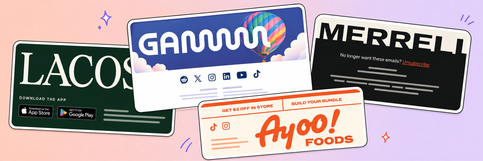
By the time readers reach this point, the logo is no longer competing with a headline, product photography, promotional details, and a button demanding immediate action. It gets the stage to itself. The result feels less like a template running out of modules and more like the closing frame of an advertisement.
But I know... A giant logo will not work for everyone. Plenty of brands already put their logo in enough places to qualify as an invasive species. The broader lesson is to choose what should own the final visual moment.
It could be a logo, tagline, photograph, illustration, mascot, pattern, or sentence. Give the reader something deliberate to see before entering the thicket of preference links and copyright dates.
For more examples, check these out:
- Cotopaxi’s emails emphasizes their brand mission to do good with how many people they’ve impacted.
- Small’s emails remind the names of pets and the product’s ingredients.
- Huckberry’s emails that end with a customer’s photo and tagline.
- Gen See’s emails always include a happiness guarantee block.
- Flamingo Estate’s emails that finish with a product placed randomly in a photo.
Job 2: Ask one final question
Claude's emails frequently end by asking whether the message was useful. Readers can respond with a prominent thumbs-up or thumbs-down.
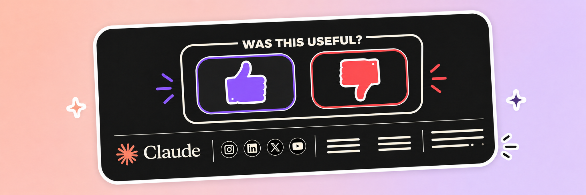
It is a tiny interaction placed at exactly the right point. The recipient has finished reading, so they are finally qualified to answer the question.
Claude does not send them to a 14-question survey asking how likely they are to recommend the email to a colleague. There is no required comment field. Nobody needs to remember a password. One thumb goes up. One thumb goes down. Humanity continues.
This turns the footer into a feedback loop. It also gives the ending a small moment of agency. The reader gets to react instead of merely being informed where the company receives mail.
A footer can be a natural home for quick feedback, especially in newsletters, educational messages, onboarding emails, product updates, and support content.
Keep the request proportionate. Asking whether a guide was useful makes sense. Asking recipients to complete a detailed brand-perception study after reading a password-reset email may suggest that your research team has escaped containment.
Some other examples include:
- Mindbloom’s email that points you to their outcomes page
- Visit Utah’s emails that ask you to subscribe to another newsletter
Job 3: Address the last bit of hesitation
By the time someone reaches the bottom of a promotional email, they may understand the product and still have questions. How does shipping work? Are returns difficult? Is the product assembled by me, a person who once installed a shelf at a visible angle? What happens if I hate it?
Sundays uses illustrated footer content to address common purchase concerns. It's cute and fun and stands out right as you may click away.
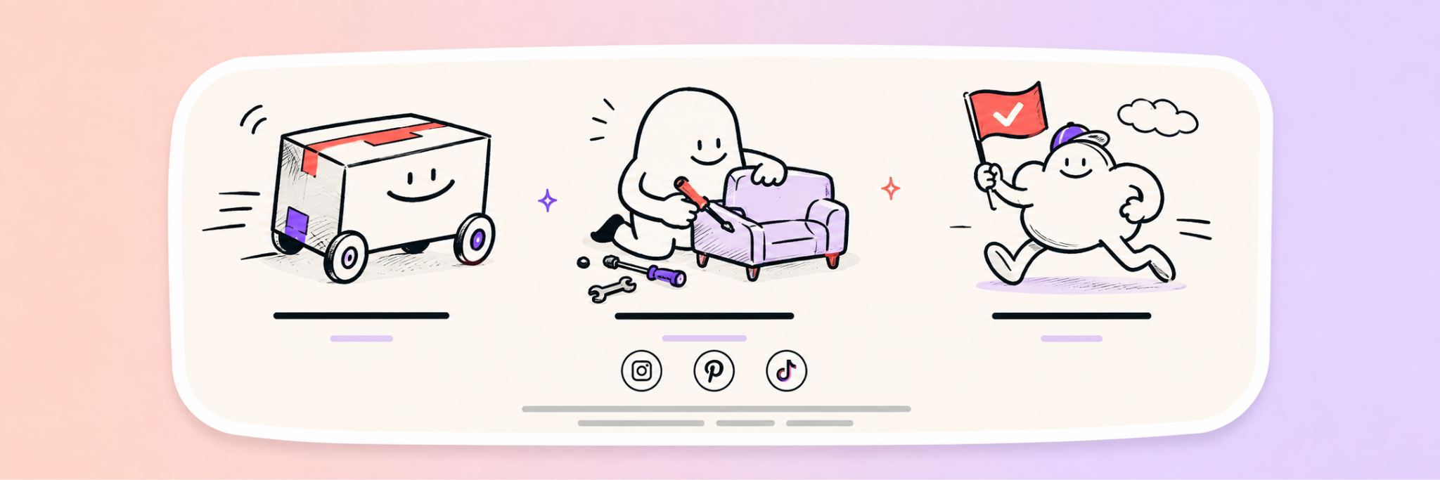
And that's why the footer offers a final opportunity to answer those questions without adding another sales paragraph to the body.
Think about what a customer may still need before leaving:
- Shipping and delivery information
- Returns or guarantees
- Customer support
- Sizing help
- Subscription management
- Product care
- Payment options
- Assembly or setup details
Sundays presents this information with clear illustrations, making the section feel like part of the brand rather than a nervous list of conditions.
This also raises an oddly compelling question: where does the footer actually begin?
Some endings contain reassurance modules, navigation, loyalty information, app promotion, or customer support before reaching the legal details. The boundary between the final content module and the footer has become pleasantly blurry.
One useful definition is that the footer begins when the email stops advancing its main message and starts completing the experience around it.
We have now attempted to define an email footer philosophically. This article has gone too far to turn back.
Some other examples:
- Who Gives a Crap’s emails that reinforces what makes them special
- Psilly Goose’s emails reassure you of what isn’t in their products
- Really Good Emails’ emails (that’s us!) include our tagline and a little bit of humor in the address line.
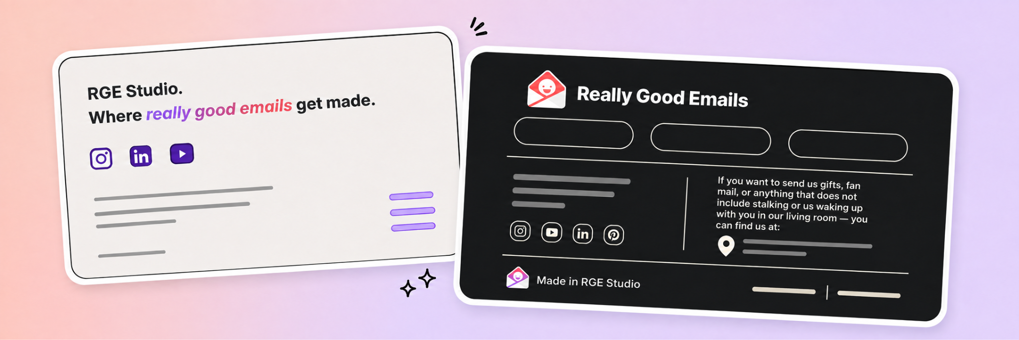
Separate the expressive ending from the compliance
One way to improve a footer is to think of it as two connected sections.
The expressive ending creates the final impression. It might feature a large logo, feedback prompt, illustration, sign-off, reassurance message, or useful next step.
The compliance layer contains the address, unsubscribe option, privacy information, preferences, and any required restrictions.
These sections can look related without giving every element the same visual weight. The unsubscribe link should remain readable and easy to find. It does not need to be the emotional climax of the campaign.
This structure gives the brand room to end intentionally while keeping the necessary information accessible.
Lovable and Rapha use branding. Claude uses feedback. Sundays uses reassurance. Each footer has a final assignment beyond proving the sender possesses a mailing address.
Choose one assignment. The footer does not need to include a survey, manifesto, referral program, support center, full website navigation, six social networks, three app stores, and a small drawing of a delivery truck.
The footer has already carried enough.
No need to reinvent the ending wheel
Once you’ve landed on a footer that works, there’s no need to rebuild it from scratch every time. The best footers are the ones that become part of your system, not a last-minute design decision you revisit at 11:58pm before a send.
This is where RGE Studio comes in handy. You can save your footer as a Saved Row, then drop it into any future email in just a few clicks. Even better, if you ever need to update it (whether that’s a legal tweak, a design refresh, or a new social link), you can push that change across every email using that Saved Row. One update, everywhere it lives.
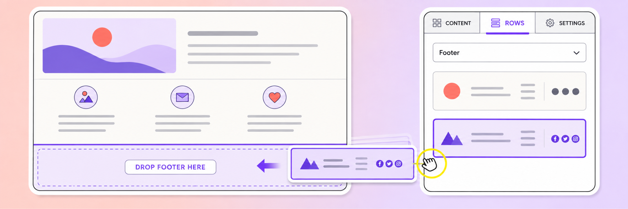
It’s a simple way to make sure the “last thing they see” is always consistent, intentional, and never an afterthought.
Start collecting the good ones
Several RGE community members have started building collections specifically around footer design. You can too. Just start a collection and add emails to it.
Vivek has a collection of email footer examples. Scott has gathered header and footer inspiration. Dean has another dedicated footer collection. Amber has collected examples exploring the deeply important constitutional issue of footer vs. module.
This is one of the best ways to use collections on RGE. A folder called “Inspiration” may contain hundreds of beautiful emails and become about as navigable as a warehouse after a tornado.
A specific collection helps solve a future problem.
Create collections for giant-logo footers, feedback prompts, preference centers, illustrated guarantees, unsubscribe treatments, product grids, pricing tables, buttons, or any other detail you regularly need to design.
Then, the next time you reach the bottom of an email with no ideas and even less emotional stability, you will have somewhere useful to look.
Footer trends disappear, footer trends reappear
We’ve already covered the jobs that the footer does above (outside of the regulatory lens), along with some examples. And once you set up collections on RGE for footers, you may start to see that footers will continue to change. If you look at footers from years back, you see:
- Links to “Add us to your address book”
- Links to “View the plain text version”
- Links to the “Browser Version”
- Every social icon (not just their most important ones)
That’s okay. Here at RGE, we removed our “View in Browser” link for an entire year, only to bring it back by readers who asked for it. We also hid easter eggs in our footer for a while (because we saw other brands doing the same), but found that it was a lot of work just for the few people who found it. And even those people stopped clicking in after a while after the novelty wore off.
I guess my point here is this: do what makes sense for your email. You don’t need the same footer for every email either. Maybe you are a not-so-serious brand like RGE with a joke in the footer, but maybe that’s not the best to include when you send out a payment failure email.
What you should remember is that the hero may get most of the attention, but the footer gets the last word. And if that’s the case, it should probably be something better than "© [year] | Unsubscribe."
And it should definitely be better than the ending to Lost.
Key takeaways for designing an effective email footer
- Start with the information you are required to include, then carefully evaluate everything else trying to sneak in.
- Decide what final action you want readers to take. This will help you choose which links, messages, and calls to action deserve the space.
- When in doubt, include less. The footer should complete the email, not open a small shopping mall beneath it.
- Create a clear hierarchy, beginning with the most important message or action and ending with the quieter compliance details.
- Organize related information into distinct sections. Use headings, background colors, buttons, and enough spacing to keep the footer from becoming one enormous clump of links.
- Visually separate the footer from the body of the email. A new background color can signal that the main message has ended while strong contrast keeps everything readable.
- Let the information breathe. More padding can make even a complicated footer feel deliberate rather than crowded.
- Finish with something thoughtful. A logo, sign-off, illustration, question, or statement of values can reinforce the brand before the reader reaches the address and unsubscribe link.
- Save the finished footer as a reusable module or Saved Row so nobody has to rebuild the regulatory basement at 11:58 p.m. before every send.
P.S. If you are looking for a simple way to end your personal emails (like in gmail, hotmail, outlook, etc), we built a free email signature builder tool. While it isn't the same thing as what we discussed above, it's still a nice way to show off to colleagues and clients.
Articles to wet your whistle

.png)
Subscribe to our newsletter.
Dive into the world of unmatched copywriting mastery, handpicked articles, and insider tips & tricks that elevate your writing game. Subscribe now for your weekly dose of inspiration and expertise.