Email design trends · 2026 edition
Email design trends 2026, and why they actually work
We took the seven trends on the Really Good Emails 2026 list, first presented at Unspam, then asked the people who actually build this stuff why they work. Borrow the principle, skip the copycat look, and make it work for your brand.
The working numbers, before you scroll
Every trend on this page comes back to how people actually read email: fast, distracted, and mostly on a phone. If you only steal five numbers from this report, make them these.
- 16px
- Body copy minimum. 18px is even nicer to your eyeballs.
- 1.5
- Line height for body text, up from a cramped 1.2.
- 2 lines
- Anything longer than that gets left-aligned.
- 1 focus
- Give people one main thing to do. Repeat that CTA before inventing another one.
- 0
- Pure blacks: skip #000000 and #FFFFFF. Mid-tones survive dark mode better.
Recommendations from the Design Trends 2026 panel, not survey data.
What makes email design effective
Email design is information design, and information design has one job: comprehension. Art is allowed to leave you confused. An email that leaves you confused has failed. Every email has to pass three tests.
01
It's comprehensible.
The reader gets the point on the first pass.
02
It's accessible.
It stays comprehensible for everyone, everywhere: on a screen reader, and on a packed train with a coffee in one hand.
03
It leads to a clear action.
Design is problem-solving, so every email points to a next step.
Trends are a lot like viral recipes. Copy one and you'll get something close to the picture. But without the fundamentals, you can't tell why it works or adjust it to your own taste. A design trend is a look that spreads. A design principle is the reason that look works. So for each trend below, we name the principle underneath and show how to use it without copying the look.
“You're never going to set trends by following somebody else's trends.”
What all seven trends have in common
At Unspam 2026, Meghan Sokolnicki, Lead Designer at Marigold, walked through all seven trends on this year's list and found that every trend does at least one of three jobs: shows personality, proves the product is real, or makes the email easier to understand. That makes a handy test before you borrow any of them. If you can't say which job a trend is doing for your audience, it's just decoration.
“I like all of these because they're curating a thoughtful experience that's prioritizing the recipient.”
Chapter 01 · Trend: illustrations
Illustrations, and the principle of visual hierarchy
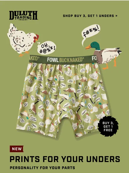
Bold, playful, sometimes anime-flavored illustrations were all over the gallery this year. They work because they grab the eye before anything else does. That's visual hierarchy: arranging elements so the reader knows what matters first, second, and last.
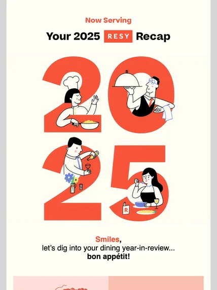 Resy
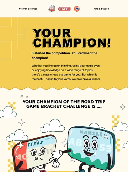 Phillips 66
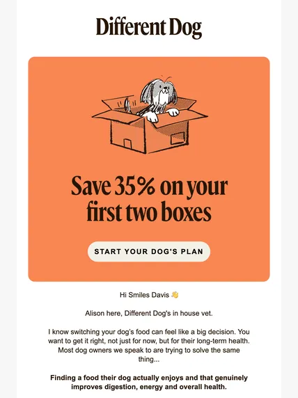 Different Dog
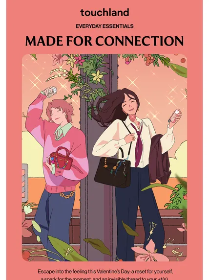 Touchland
- See more in the gallery of illustration emails on Really Good Emails
The principle
Illustration might be optional, but hierarchy isn't. You can get the same focal point with size and consistency alone.
“AI needs structure.”
Build hierarchy without an illustrator
- Make your H1 the biggest thing in the email, and make it say the main point.
- Use accessible color contrast to pull attention toward the thing you want clicked: usually the CTA.
- Keep sizes consistent: every H1 the same size, every H2 the same size, in every send.
- Code headings as real headings (semantic HTML). Screen readers and other machines read that structure to work out what matters.
- Treat images as a bonus, not the message. If the image doesn't load on dodgy coffee shop wifi, the email still has to make sense.
- Write alt text that describes what the image actually shows. (More on that in email accessibility made practical.)
Why this matters for AI summaries
Inbox AI summaries lean on the same structure a skimming human does. Nobody knows exactly what they look at, but strong headlines and conclusive copy give them something to work with.
“If you have established patterns, like all of my H1s look like this, my H2s look like this, you don't have to set that up every single time.”
Front and center, with a caveat
What changed in 2026 is placement: illustration moved out of the margins and into the hero spot that used to belong to photography. It's also playful, so it doesn't suit every message. When the art is doing personality work, the copy has to keep up, because a press-release headline under a cheerful drawing kills the mood. Keep everything else quiet and let the illustration earn its giant hero spot.
“If you are getting an eviction notice, maybe you do not want a little smiling broom kicking you out.”

Chapter 02 · Trend: bold typography
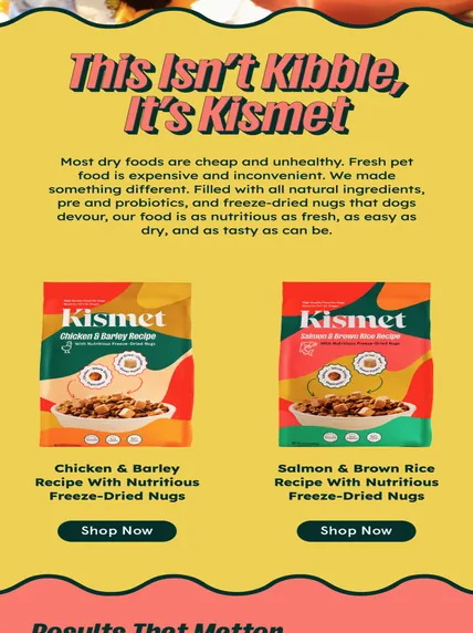
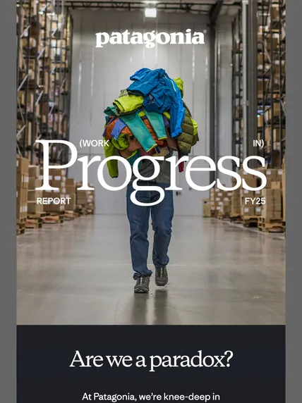
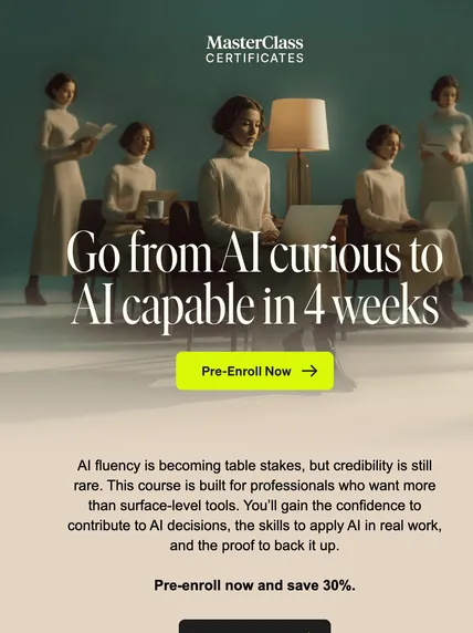
Bold typography, and the principles of scannability and choice reduction
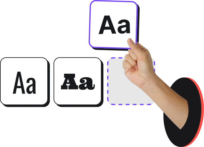
Oversized type took over hero sections this year. It gives the same instant focal point as an illustration, with fewer moving parts. Two principles sit behind it: make the email easy to skim, and make the ask easy to choose.

Principle 1
Scannability
Nobody is reading your email with a glass of wine and the door closed. They're skimming it on a phone, between two other things. Write for the skim.
- Set body copy at 16px minimum, 18px if you can.
- Make headlines noticeably larger than body copy, and keep them the same size every time.
- Break copy into short chunks and bold only the parts that matter.
- Once copy runs past two or three lines, left-align it. Every centered line starts somewhere new, which makes your eyeballs work overtime, and it's even harder going for readers with dyslexia.
- Keep text as live text. Copy baked into an image can read fine on desktop and turn illegible once it shrinks on a phone.
- Check big headlines on mobile. A word that breaks across two lines can turn into a different word.
“If you've got text, let it be live text.”
Principle 2
Choice reduction
You know the feeling: end of a long day, someone asks what you want for dinner, and your brain quits. Good friends don't ask. They offer two or three options that work for everyone, or just book the table. Your email should do the same.
- Pick the one action you want. Strip everything else out, then add back only the context someone needs to make that decision.
- Repeat a CTA instead of adding a different one. A webinar invite can put the RSVP up top for people who just want in, and again after the details for people who need convincing.
- Newsletters and recipe roundups can carry several CTAs. Just don't use more than you need.
- Test to find your audience's appetite. Give people too much and they're more likely to do nothing, or unsubscribe.
As Alex put it: if you're not in the mood to decide, you don't go somewhere that hands you a binder-sized menu. You go where the chef has already done the thinking.
Let the headline lead
Big, high-contrast type has what Meghan called “main character energy,” so everything else in the email needs to step back. You don't need a custom art build for it: you can get the same effect with live text — and it’ll render more reliably and play nicer with screen readers.
Chapter 03 · Trend: earth tones
Earth tones, and the principle of softness
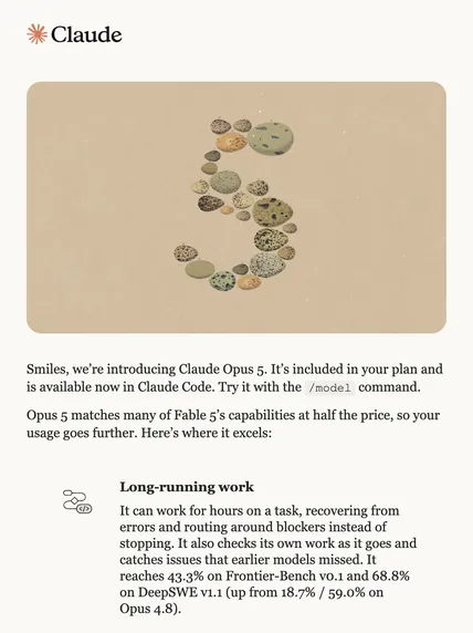
Mossy greens, warm neutrals, a lot of beige. If you've had an email from Claude lately, you've seen the palette. The principle underneath is softness: making the inbox feel a little less like work. Design people call some of this biophilic design, which basically means borrowing from nature so everything feels a little less fluorescent office lighting. Touch grass, but in the inbox.
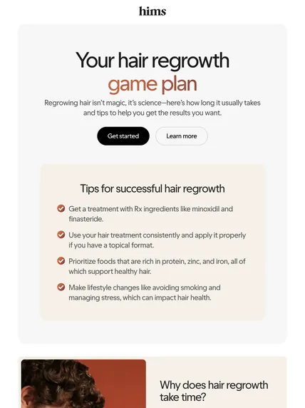
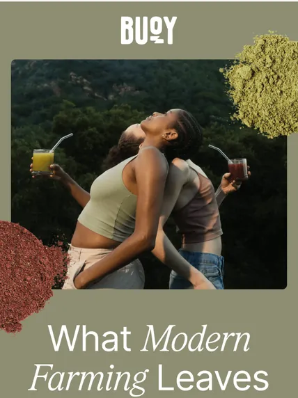
Does softness work in B2B?
Yep. B2B readers are still humans. Allegedly. The easiest version is simply sending from an actual person instead of making your logo do all the talking.
“The person who's receiving your message is a human.”
Softness without repainting your brand
- Try muted versions of your brand colors, and keep contrast accessible.
- Use curved shapes wherever your brand allows them.
- Send from a person: a real name, a photo, a sign-off. The note from Mike at the end of every Really Good Emails newsletter is a good example.
- Write like a human. Warmth, a little playfulness, and owning your mistakes (“we sent the wrong promo code, our bad”) all count as softness.
- Bring it to transactional email too. In her fintech days, Abby used bold, clear headlines to walk applicants through each step.
Watch the AI default
AI tools can spit out a warm, muted palette with barely any prompting, which means this trend could get tired fast. What keeps earth tones feeling considered is what you pair them with: plenty of negative space, a bold headline, and copy that tells a story. The mood is closer to “let us tell you something” than “sale ends Sunday.”
Chapter 04 · Trend: rounded corners
Rounded corners, and the principle of negative space
Rounded buttons and cards are everywhere, close to peak trend. We read sharp corners as danger and round ones as safe, which is why we baby-proof furniture. The less obvious benefit: rounded corners push content inward, away from the edges, and that creates negative space.
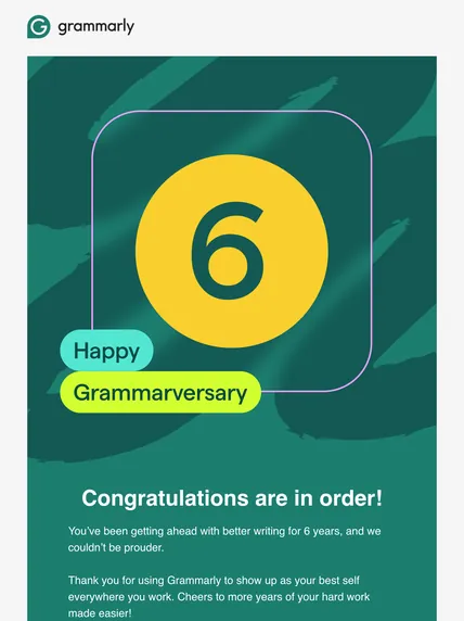
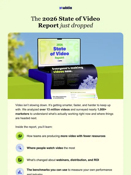
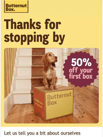
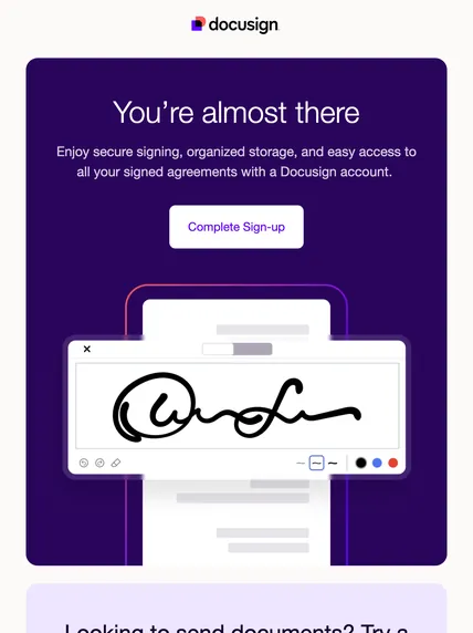
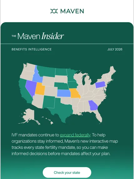
Get the breathing room, curves optional
- Add padding around callouts and buttons. In a live fix during the session, Logan took cramped padding up to 20px top and bottom.
- Raise body line height to 1.5.
- Leave real space between sections, like the pause between courses at a good dinner.
Where it’s heading
Rounded corners are probably being overdone, helped along by AI templates that now treat them as the default. They keep working because they feel soft, familiar, and obviously interactive. Trends swing back eventually, so don’t be shocked if hard edges and diagonals start sneaking back in. Until then, use them on purpose. Meghan's favorite example, an Apollo email, wrapped rounded outer containers around hard-edged borders inside, and the contrast made both feel deliberate.
Chapter 05 · Trend: grid layouts
Grid layouts, and the principle of grouping
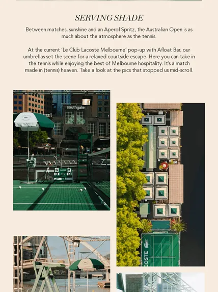
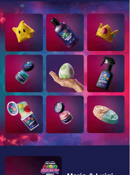
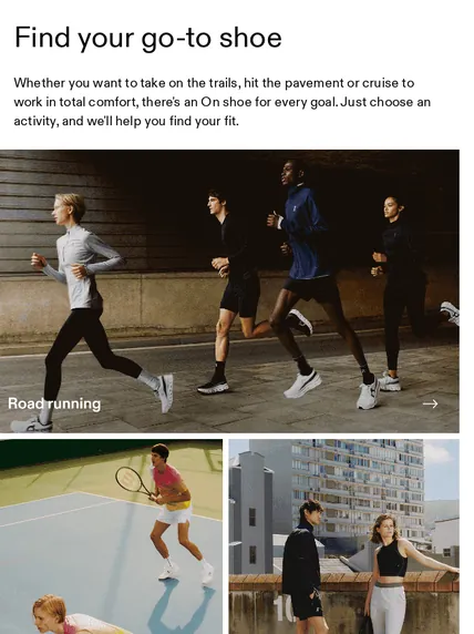
Email has always been boxes inside boxes. This year, designers stopped hiding the grid and started showing it off: card layouts where several pieces of content sit together and read as one set. The principle is grouping. Things that sit next to each other should belong together, so the reader can scan once, get the structure, and pick where to dive in.
The principle
A grid is for organizing. Fitting more stuff in is a different (and worse) plan.
Do you need a big photo budget?
Nope. Grids care about structure, not your photography budget. A nonprofit update can use one just as well as a retailer with a studio full of product shots.
Build a grid that helps the reader
- Group content that shares a theme. Nine recipe photos read as one set. Nine unrelated promos read as homework.
- Resist adding columns just to cram more in. More boxes usually means more visual work. Give readers too much to process and they’ll bail.
- Signal topic shifts with a navigation header or a block of color, so readers can see where one group ends and the next begins.
- Keep the rhythm consistent: same card size, same image ratio, same spacing.
- Check how the cards stack on a phone, where your tidy grid turns into one long column.

Chapter 06 · Trend: product photography
Product photography, and the principle of proof
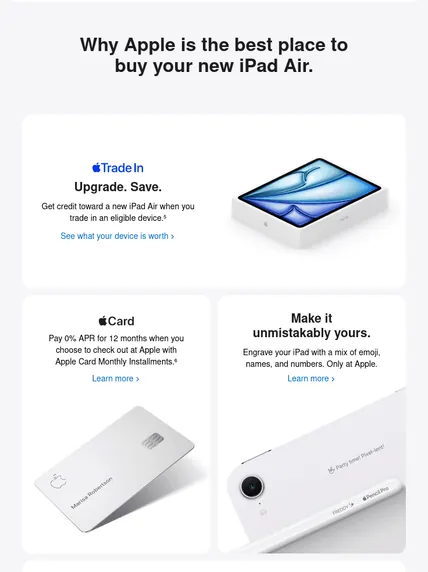
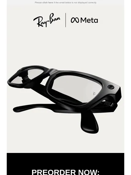
For brands that sell physical things, lifestyle shots are giving way to the product itself, front and center. Part of the reason is AI. Now that everyone has seen a few too many generated images, a plain photo of the actual product reads as proof: this is real, and this is what shows up at your door.

The principle
Show the real thing, then get out of its way.
No physical product?
The principle still travels. Show the actual thing: for software, that means a real screenshot of the feature instead of a stock photo of someone smiling at a laptop.
Make the product the whole point
- Pick one product and one message. Three products, a brand update, and a survey link will sink this layout.
- Let the photo be big, and keep everything around it quiet.
- Back it up with high-contrast type and one clear CTA.
- Commit to the product-first layout. The minute you pile on three promos, a survey, and a company update, the whole idea falls apart.
Chapter 07 · Trend: gradients
Gradients, and the principle of intentional color
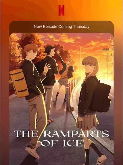
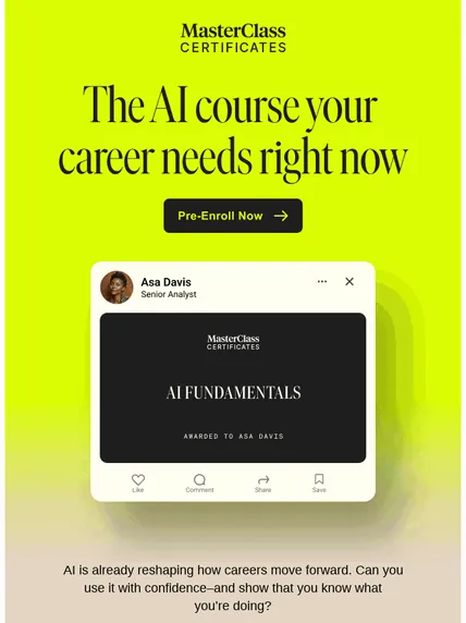
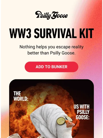
Gradients add depth and personality without a photo shoot or an illustrator, which makes them one of the quickest ways to give an email a look of its own. They also sneak color into places that usually play it flat and neutral, B2B especially.
The principle
A gradient is a choice. Make sure it’s yours.
The AI catch
The combo showing up most is purple into blue, especially in SaaS, and it’s also what AI design tools tend to produce by default. Once AI starts reaching for something by default, it stops feeling distinctive pretty quickly. Before you ship a gradient, check whether you picked it or just accepted a suggestion.
Use gradients well
- Use them for backgrounds, layered elements, or one standout block.
- Build them from your own brand colors rather than the default purple and blue.
- Test with images off and in dark mode, where a gradient can look like a completely different email.
- Want more depth? Try translucent cards, layered blocks, or semi-transparent overlays.
Email design best practices people actually ask about

What are the biggest email design trends in 2026?
In the Really Good Emails gallery, seven made the 2026 list: illustrations, grid layouts, bold typography, earth tones, rounded corners, product photography, and gradients. Each one works because of a principle underneath it, from visual hierarchy and grouping to softness, proof, and negative space. Those principles apply to any brand, even when the look doesn't fit. Some trends stick around: beige backgrounds were already on RGE's trend list back in 2021.
Which 2026 email design trends are overdone?
Rounded corners are close to peak trend, partly because many AI templates now use them by default. Earth tones and purple-to-blue gradients are at risk for the same reason: AI design tools produce them with little prompting, so they can stop feeling distinctive quickly. None of them is off-limits. Use them because they fit your brand, not because a tool suggested them.
What's the best font size for email?
At least 16px, and 18px is better. Pair it with a line height of around 1.5 and headlines that are noticeably larger than body copy. Most people read email on a phone while doing something else, so bigger, airier text is easier to skim.
Should email text be centered or left-aligned?
Left-align anything longer than two lines (some designers say three). Centered text gives every line a different starting point, which makes it harder to read, especially for people with dyslexia. Short headlines and single lines can stay centered.
Does the image-to-text ratio still affect deliverability?
Not directly. Spam filters stopped treating image-heavy emails as a red flag years ago. Sender reputation matters far more: a consistent from name, real engagement, and honoring unsubscribes. The ratio still affects engagement, though, because AI summaries don't read alt text and screen readers depend on live text.
Do rounded corners work in Outlook?
Newer versions of Outlook support CSS rounded corners. Older Word-based versions ignore the border-radius property and show square corners instead. To keep them round there, you need VML code. RGE Studio adds it automatically.
How do I design emails for dark mode?
Add an outline or glow to your logo, avoid pure black and pure white, use mid-tone colors, and test in Outlook, Gmail, and Apple Mail. Some clients override your code no matter what, so aim for readable everywhere rather than pixel-perfect.
What alt text should I use for decorative or background images?
Describe what the image shows, for example, “a person holding a drink on a beach.” If the image contains real information, like sale copy, the alt text should carry that copy. And before fighting a blocked background image, ask what it adds that a standard image couldn't.
Are open rates still a reliable email metric?
Not on their own, but they're useful directionally over time. Prioritize click-through rate, then click-to-open, unsubscribe, and bounce rates.
If you remember seven things, make them these
Make it understandable, accessible, and obvious what happens next.
Illustrations are optional. Hierarchy isn't, and size & consistency get you most of the way there.
Write for the skim: 16px body copy or bigger, 1.5 line height, left-aligned paragraphs, live text.
Give readers one focus. Repeat the CTA before you add a new one.
Softness is as much about who signs the email as what color it is.
Give everything room to breathe. Rounded corners optional.
Before you borrow a trend, ask what job it’s doing: personality, proof, or clarity.
The principles are free. The fiddly code can be someone else's problem.
RGE Studio handles the annoying bits: its AI Assistant can write alt text while you build, dark mode preview gives you an approximation of the inevitable color chaos, and the Outlook code keeps rounded buttons from suddenly becoming rectangles.