
How we build (and rebuild) RGE Studio’s onboarding emails
We put our own onboarding emails on trial. Objection handling, loss aversion, and what happens when you speak your reader’s language.

Onboarding emails are a lot like dating, which is probably why so many of them are bad. You want to show someone what’s great about you without sounding desperate, and learn a little about them without turning it into an interrogation. Reveal too little and you’re a mystery in the bad way; reveal too much and you’re the person who gets into your ex, your childhood, and the full feature roadmap before the drinks even land.
I sat down with Kelsey Yen, who runs lifecycle email for RGE and RGE Studio, to talk through five emails from our own onboarding program. We built them in Studio, and each takes a different approach to helping someone get comfortable, try something useful, or decide what comes next.
We get into the weeds on all five: why each one arrives when it does, how a signup answer changes the message, and what you can borrow for your own program. Expect a choose-your-own-adventure export email and some shared frustration with Outlook. Underneath all of them are the same three questions. Why should I care, what do I do next, and how hard is this going to be?
Let’s break it down.
Start with a question your reader is already asking
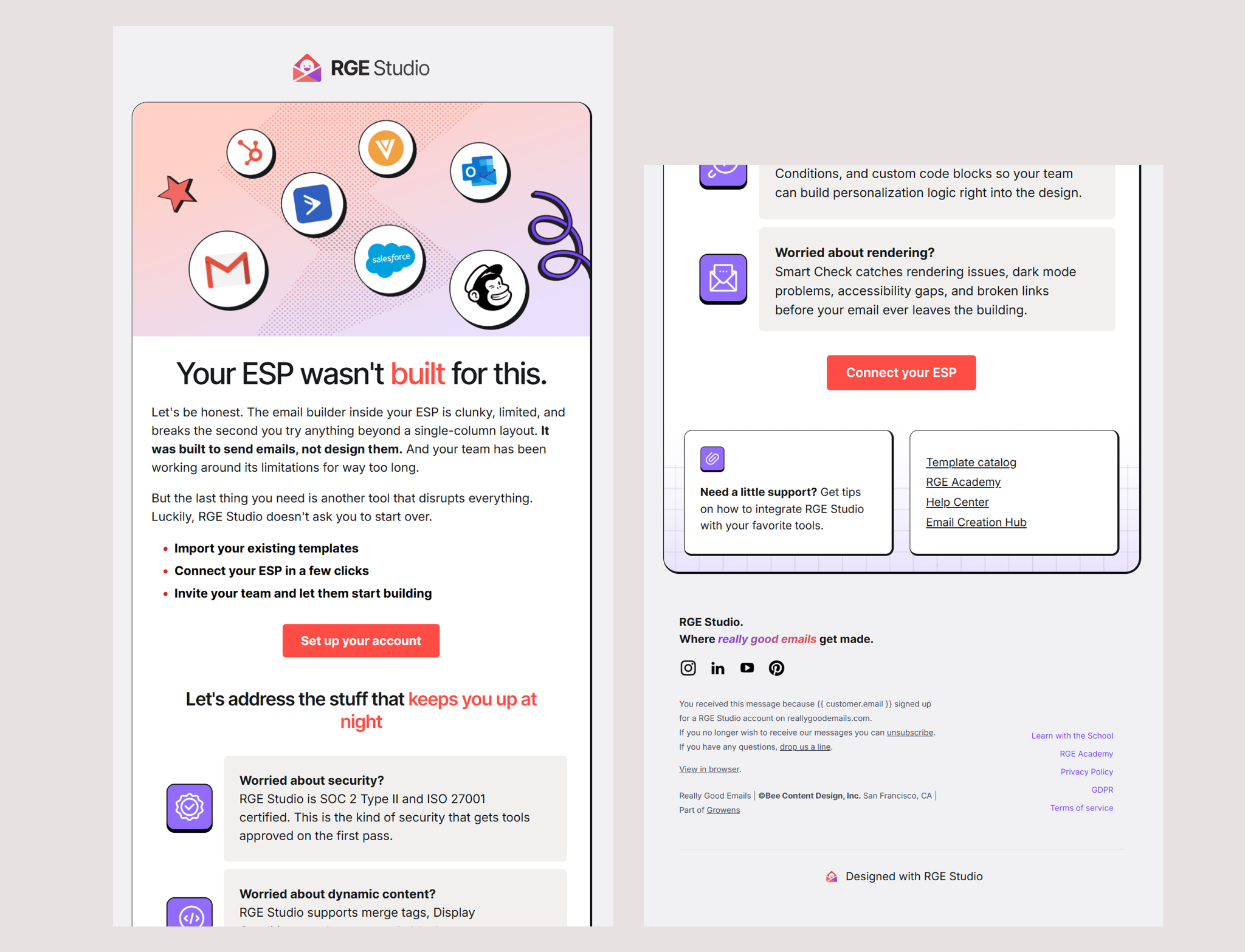
“Why would I need another email builder?”
Fair question. If your ESP already has a place to build emails, you probably want a pretty good reason to add another tool to your day. “Why change what we’re already doing?” is the real objection, and it’s a fair one when the current process technically works, even if nobody enjoys it.
Our first example takes that question seriously. It addresses concerns about how Studio fits into an existing workflow, including security, dynamic content, and rendering. Kelsey explained that this message reaches people who haven’t created or exported an email yet, so there’s a real opportunity to help them feel comfortable taking that first step.
Kelsey put the premise plainly: “We were built to build emails. Your ESP wasn’t built to build emails, more to send emails.”
The design lets you find the part you care about. Color-blocked sections give each concern its own space, so someone thinking about dynamic content can head straight there. You don’t have to read every word for the email to do its job.
Kelsey described the same thing from the reader’s side. “Maybe I don’t care about security, but maybe I do care about dynamic content. Having those sections, I can quickly scan and see which one actually resonates with me.” That’s a good way to think about scanning. We often talk about making emails shorter, but clear organization can make a longer email feel manageable. Keep the information that helps someone make a decision, and give it enough structure that they can choose where to spend their attention.
We also got into how the design was built. The depth around the cards comes from thicker borders on the right and bottom, with the top corners rounded and a gradient sitting on the row behind them. It’s a small trick that gives the layout some personality, no image slicing required, and we could adjust it directly in Studio. Duplicating rows made it easy to try another arrangement without rebuilding the whole thing.
Those details make experimenting more practical. When changing the layout is easy, you have more room to consider how the reader will move through it. Kelsey also talked about a next step for this message: using the ESP someone selects at signup to make the answer more specific. Someone using Salesforce Marketing Cloud may have a different concern than someone using another platform.
Her reasoning goes further than swapping in a logo. “We’re email people. We’ve probably used your ESP at some point, so we understand the limitations and the pains. This is where we can get more specific about how we solve them.” That’s the kind of personalization we want to see more of. If we ask someone a question, their answer should help us send something better.
Help people see where they fit
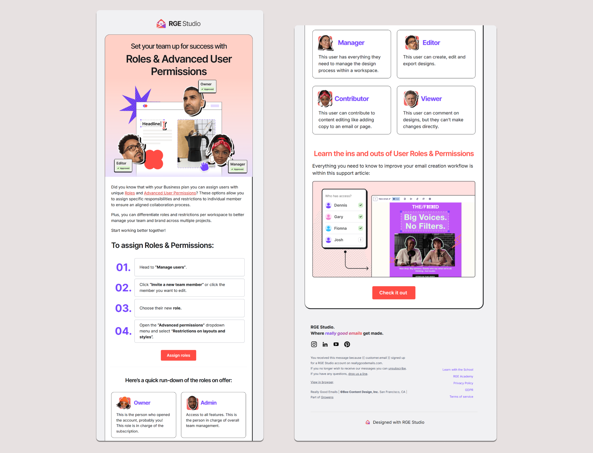
The person who creates an account isn’t always the person who will build the emails. Sometimes they’re setting things up for a designer, a copywriter, or the person who needs to approve everything before it goes out. Kelsey sees it constantly. “What we end up seeing is the owner of the account isn’t necessarily the one in there day-to-day building the emails.”
This roles and permissions email recognizes that onboarding can involve a whole team. The version we reviewed was for the Business plan, with content tailored to the collaboration options available to that customer.
What stood out to me was how approachable it made the setup. The numbered steps give you a clear way through, and the role descriptions explain what different people can actually do. That matters because words like “admin,” “editor,” and “viewer” don’t mean exactly the same thing in every product. As Kelsey put it, “everybody has different names for permission levels. You’re the contributor, you’re the this, you’re the that, and it’s like, what does that actually mean?”
For a team, understanding who belongs where is part of getting started. A designer needs to know how to get into the work. An approver needs to understand how they’ll participate. The person setting up the account needs enough context to invite the right people with the right access. The setup emails that work best tend to show you where you are, keep the steps to around three, and include a real view of the product. This one has the product visual and a clear numbered path. Four steps plus six roles is where it starts asking a lot of a single message.
This email also led us into a good conversation about CTAs. Supporting links can earn their place when they help someone complete the main task. A setup guide gives a reader another way forward, especially if they need more detail or want to send the instructions to a colleague. The important decision is what gets the most attention. Kelsey said it best: “Every email should have a purpose, and for this one, our main purpose is the first CTA. This is all supporting content.” Make the main action obvious, then consider which supporting resources help someone follow through.
I’d apply all of that to any onboarding program with multiple people involved: write for the person receiving the email, while recognizing that the next step might belong to someone else. Sometimes the most helpful thing your email can do is make that handoff easier.
Make the next step feel familiar
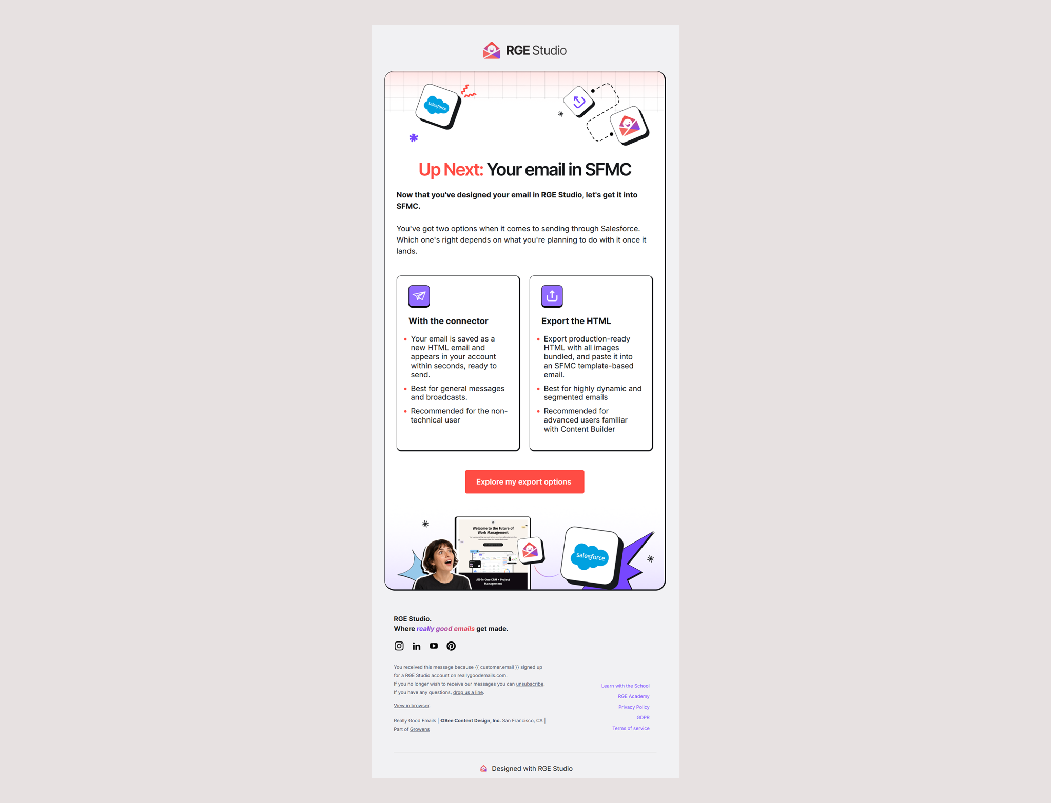
The Salesforce Marketing Cloud export email is where a signup answer becomes especially valuable. We know which platform someone uses, so we can show them how to get their design into that platform. The Salesforce branding makes the relevance clear before you get very far into the copy. Then the email presents two export routes, giving each its own card and explanation. Kelsey described this message as arriving about a day after someone creates an email if they still haven’t exported it. That timing gives the guidance a purpose: they have something to work with, and we can help them take it to the next stage.
The best part of this section was the two paths. Kelsey called it a choose your own adventure, and she wasn’t trying to steer everyone toward the same option. She wanted the descriptions to help people choose based on what they were making, and she worked out the labels for it on the spot: “best for general messages and broadcasts, and then best for highly dynamic, segmented emails.” That’s a helpful distinction when you’re writing instructions for experienced marketers. “Which route fits this campaign?” gives someone more to work with than a label about how advanced they are.
There’s a real workflow difference here, too. The Studio connector creates an HTML email in Salesforce Marketing Cloud. Teams that need an editable template with dynamic content regions have a separate template workflow. Explaining the output helps someone choose with confidence. Our Salesforce integration page walks through those options. The CTA, “Explore my export options,” fits that moment. A focused guide is a good destination because the reader has a choice to make. In another email, where the choice is already clear, I’d take them straight to the relevant action in the product.
The destination should deliver on the button’s promise. If the next step is to build, open the place where they can build. If it’s to choose an export method, give them the information to choose without making them search a whole help center. We even walked through Kelsey’s own handoff during the episode: building in Studio, copying the HTML, and pasting it into Customer.io. About fifteen seconds, start to finish. That’s the practical question this email answers for a new user: how does the thing I just made become part of the way I already work?
Help people make the next decision
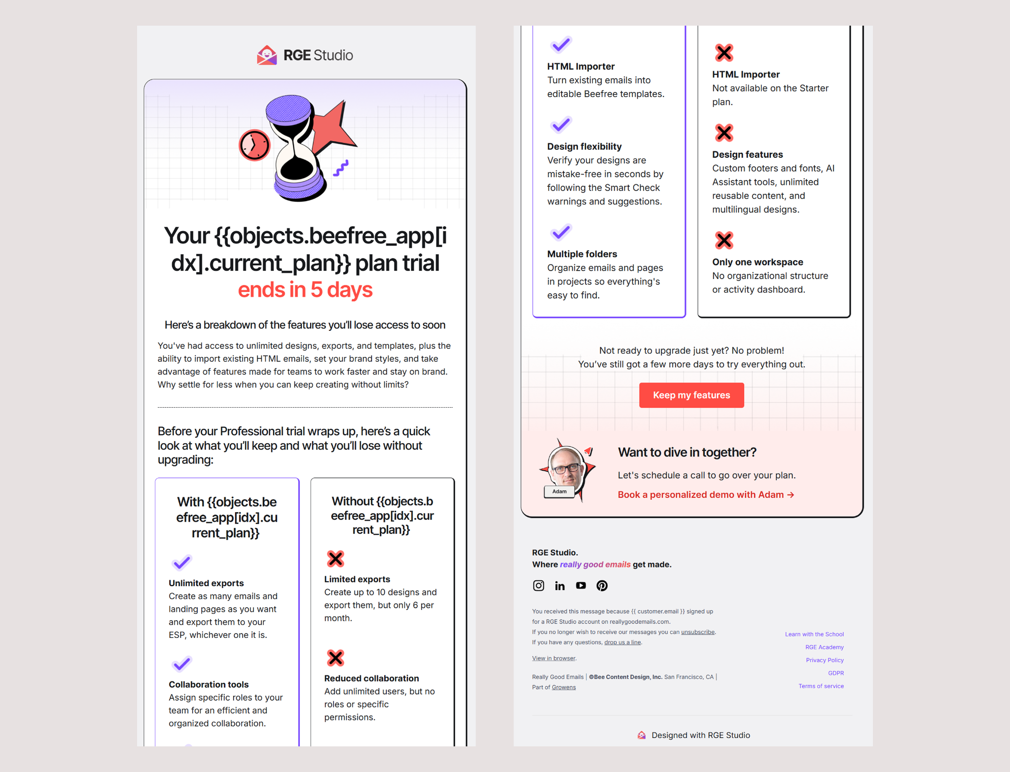
The trial expiration email has a different job. By this point, someone needs to understand their options and what those options mean for their work. Kelsey showed how the message changes with the plan someone is trying. It compares what’s available with and without that plan, so the decision has something concrete behind it. Specific numbers help here more than adjectives do: ten saved designs and six exports a month tells you more than “fewer designs.” Different trials can also lead back to different plans, which makes that context especially valuable.
That’s what I want from a trial reminder: tell me when the trial ends, what happens next, and how I can keep the capabilities I’ve found useful. If I still have questions, make it easy to get an answer. The email includes Adam’s photo and a way to book a conversation with him. That human detail matters. For someone figuring out how a plan fits their team, talking through the decision may be more helpful than reading another feature list. Then there’s the hourglass. Kelsey pointed out that the sand changes as the trial progresses, which I hadn’t caught at first. It’s a thoughtful way to make the series feel connected and give the passage of time a visual cue. She also floated flipping it over for a win-back message, which I would very much like to see.
This part of the conversation brought us back to how much to share during onboarding. Kelsey knows that pressure better than anyone. “They only got 15 days, I got a lot to show them. I want to highlight all the cool features. How do you pick and choose?” Then she answered her own question. “How do you get them to feel like they made the right choice, more so than feature, feature, feature.”
It also helps to question the premise a little. Fifteen days is the length of the trial, not the length of the decision. Most people don’t spend two weeks evaluating anything. They spend one session, maybe two, and they’ve largely made up their mind by the end of it. Which means the job isn’t filling fifteen days with fifteen days of material. It’s engineering one good session early, then getting out of the way. Tighter is usually better here. Give someone a wide-open window and a pile of options and a lot of them will wander around and log off without doing anything memorable. Give them a short path and a couple of specific things to try, and more of them arrive somewhere worth arriving. The people who don’t convert often aren’t the ones who evaluated and passed. They’re the ones who never quite got started.
There’s always a temptation to introduce every feature while you have someone’s attention. I compared it to bringing your entire rock collection on a second date. You’re excited! There’s a lot to show! We may still need to pace ourselves. Kelsey’s response: “They’re not ready for your rock collection.” Most of the value in any product comes from a small slice of it, and that slice is different for every customer. Show someone the whole thing and you’re not just asking for more of their time, you’re showing them a pile of features they know they’ll never touch. That’s how a reasonable price starts to feel unreasonable. Nobody wants to pay full freight for half a tool.
So the features you lead with should be the ones that carry the weight for this particular person, and a signup answer or a plan level usually tells you which those are. Each feature needs a reason to appear in that particular email. Does it answer a question the reader is likely to have? Help them understand their options? Give them enough confidence to take the next step?
One more test we landed on while looking at the comparison: Kelsey noticed the “without your plan” column was doing more work than the “with your plan” side, which is a good prompt to ask whether both halves of a comparison are earning their space. You can save a good feature story for the moment when someone is ready to use it.
Speak fluent email geek
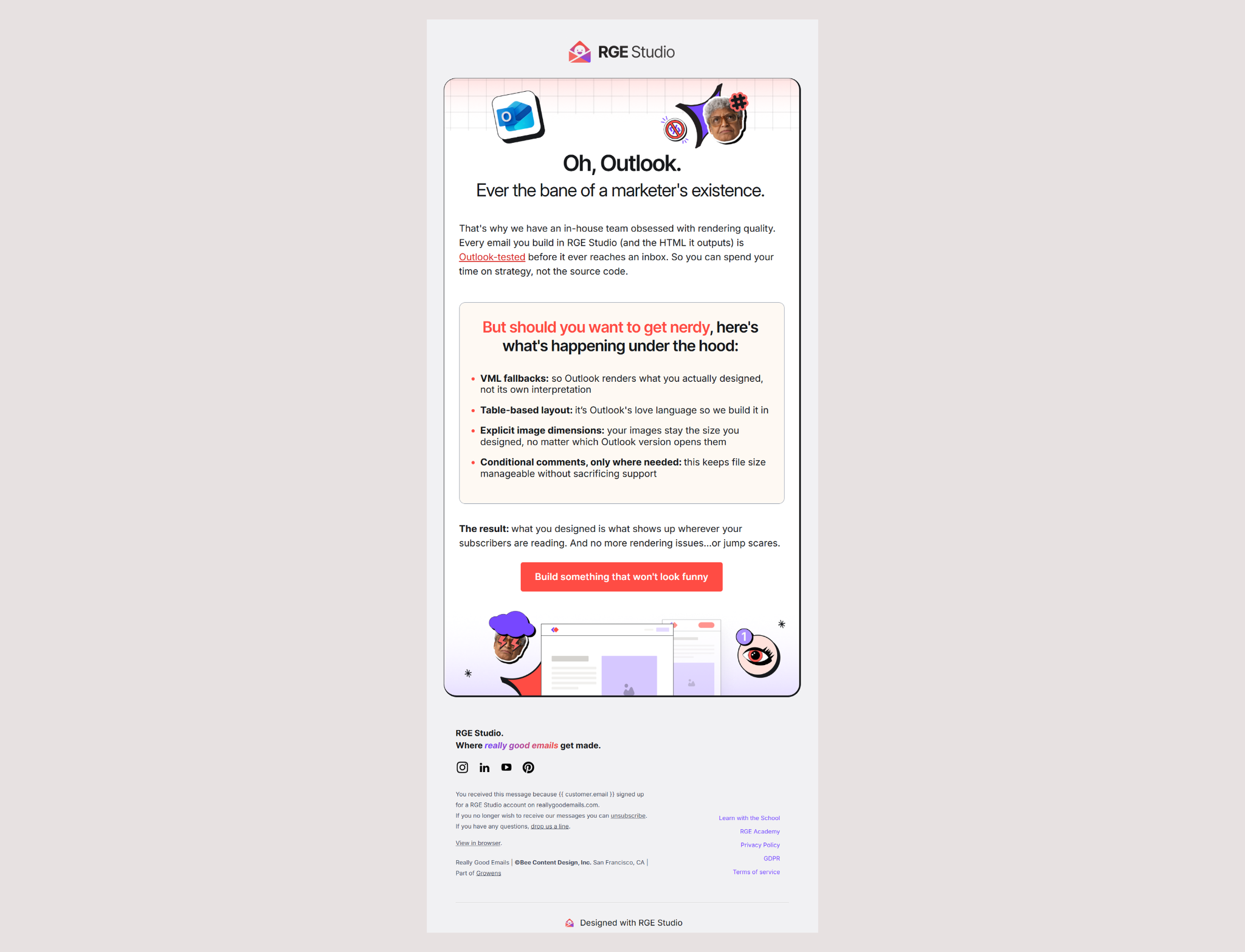
The Outlook email opens with a feeling a lot of email people know very well: you’ve made something you like, and then you see what Outlook has decided to do with it. There’s an immediate sense that the person writing this email has been there. For an audience that spends time worrying about rendering, that shared experience gives the educational content a natural place to start. It’s also the direction Kelsey wants more of the program to take. “Email geek to email geek. We get what you’re going through. We’ve been there.” So the email opens conversationally and then moves into the details that support it. The technical detail earns its place, but never as a bare list of specs. Name a thing, then say what it does for the reader, in language that means something to them. The result reads less like a walkthrough and more like a conversation with someone who has hit the same problem.
Classic Outlook, for example, needs particular attention because of its rendering engine. Table-based layouts, conditional code, and VML for certain visual elements are part of how Studio handles that environment. Those technical details help explain what’s happening when a design leaves the builder. There’s more in our Outlook rendering guide. The button brings it back to the reader’s goal: “Build something that won’t look funny.” It sounds like something an email person might actually say, which is a big part of why it fits. That button works because it isn’t selling anything, it names the thing you were already worried about.
Email production can also be an isolating job. You’re often the only person at your company who knows why the thing broke in Outlook, and nobody else is going to find that interesting at lunch. An email that says we’ve been there does something a feature list can’t. The trick is doing it without implying the reader is behind. Nobody needs another message suggesting they should have figured this out already. That’s a good lesson for bringing personality into onboarding. Start with how your customers describe their work, including the parts that make them sigh. Then follow the sympathy with something substantial, because recognition on its own doesn’t fix anybody’s Monday. The voice and the explanation can support each other throughout the message. At the time we recorded, this email was still too new to draw conclusions about its performance. What we could discuss was the thinking behind it: recognize a familiar problem, explain how the product approaches it, and help someone feel ready to try.
Wrapping up
One of Kelsey’s closing pieces of advice was, “Don’t worry so much.” I took that as permission to keep learning. You can put real care into an email and still discover a better way to write it, time it, or explain the next step once people start using the product. That’s why we keep building and rebuilding these messages. Every signup answer, support conversation, and completed action can help us make the next email a little better.
Onboarding is easy to treat as plumbing. Triggers, states, suppression rules, the background machinery nobody gets excited about while the big campaigns get the attention and the applause. But it’s also the first few things you ever say to somebody who decided to take a chance on your product. Which brings us back to dating, since that’s where we started. Nobody is impressed by how much you have to show them. They’re impressed that you were paying attention.
If you want to try some of these ideas in your own emails, start building in RGE Studio. There are plenty more onboarding email examples in the gallery if you want a head start. We’d love to see what you make.
Subscribe to our newsletter.
Dive into the world of unmatched copywriting mastery, handpicked articles, and insider tips & tricks that elevate your writing game. Subscribe now for your weekly dose of inspiration and expertise.