

How to Create Unique Content Dividers in Email
Improve your email sign-up form design with expert tips for better conversions and subscriber growth!


The layout of an email is every bit as important as the message it contains. When your email is well organized with an effective layout, you can better communicate your message. A great example of how a modular, or grid-based, design improves readability with clearly defined sections comes from BarkBox.
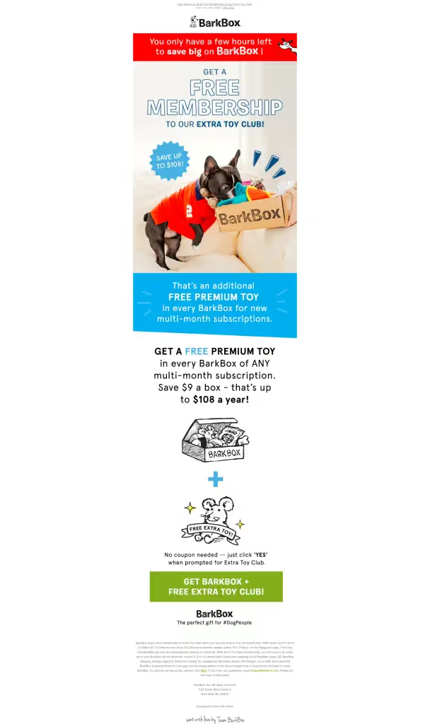
High-contrasting background colors distinguish each module, giving a clear order to the information and allowing the viewer's eye to take in one message at a time. It's a great way to create division of content and help readers quickly understand how the content is organized. Any email with enough information to require scrolling likely uses some form of content dividers. Dividers section off content within an email, typically with a horizontal line or with white space that visually groups and separates content without distraction. Here's an example of full-bleed black and gray dividers typical in emails:

While most email editors allow you to adjust the color, width, and padding around dividers, the look can still get tiresome. In the case of BarkBox's email, however, an asymmetrical content block in the central module caught our attention:

It's an eye-catching variation compared to standard horizontal divider lines we're used to seeing. The off-beat shape creates a sense of playfulness that's in sync with the BarkBox brand, and it's a simple tactic you can use when dividing the content blocks in your next email.
How to create an asymmetrical content divider
Let's create a blue content block like BarkBox's that can be used as a module in any email.
Getting started
Starting with a basic one-column email template, set up the overall look and feel of your email by adjusting the general options in the body settings. BarkBox's email is 640 pixels wide with a white background. Lucida Sans Unicode is the email-safe font most similar to the branded BarkBox font used in their email.
Setting the HTML background color
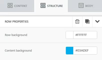
The BarkBox email is comprised of all images, which isn't a design best practice, so instead of uploading images, use HTML to create the vibrant blue background of this module. Simply select the row structure, then adjust the content background in the structure menu. The row background can remain white.
Text formatting
Update the text, then format it by center-aligning it, adding line breaks, and making key phrases bold. Then use the content properties menu to make the font color white and increase the line height so there's more breathability between the rows of text.
Creating the asymmetrical content structure
Now for the fun part. To change the shape of the content block, simply add a triangular image beneath it. Beneath the text block, drag and drop an image placeholder, then pull in the triangle image. If you ever need to detect the HTML color used in an image, you can use an online color-picker tool to get the exact code so your shape and text block match perfectly. Now, adjust the padding to eliminate the white space between these structures and make them appear to be one seamless section of the email. The default top and bottom padding is usually 5px — simply reduce the top padding to 0, and instantly the content blocks come together!
It's that simple! Any shape can be added above or below a content structure to seamlessly adjust the look of its shape, making your module design unique. And since every responsive email will always look great on mobile too.
Articles to wet your whistle



.png)
Subscribe to our newsletter.
Dive into the world of unmatched copywriting mastery, handpicked articles, and insider tips & tricks that elevate your writing game. Subscribe now for your weekly dose of inspiration and expertise.