

Patriotic Ideas for 4th of July Email Designs
Explore patriotic ideas for 4th of July email designs. Celebrate with engaging and festive campaigns!

The 4th of July means barbecues, fireworks, parades, and, yes, patriotic email campaigns. But when it comes to sending 4th of July email designs, there's more to a successful campaign than a red-white-and-blue color scheme. Here are some excellent email examples that go beyond the colors of the flag, plus tips for making your 4th of July email designs stand out from the rest.
Dress up your header design
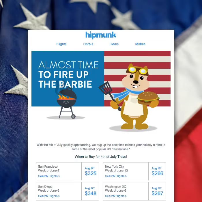
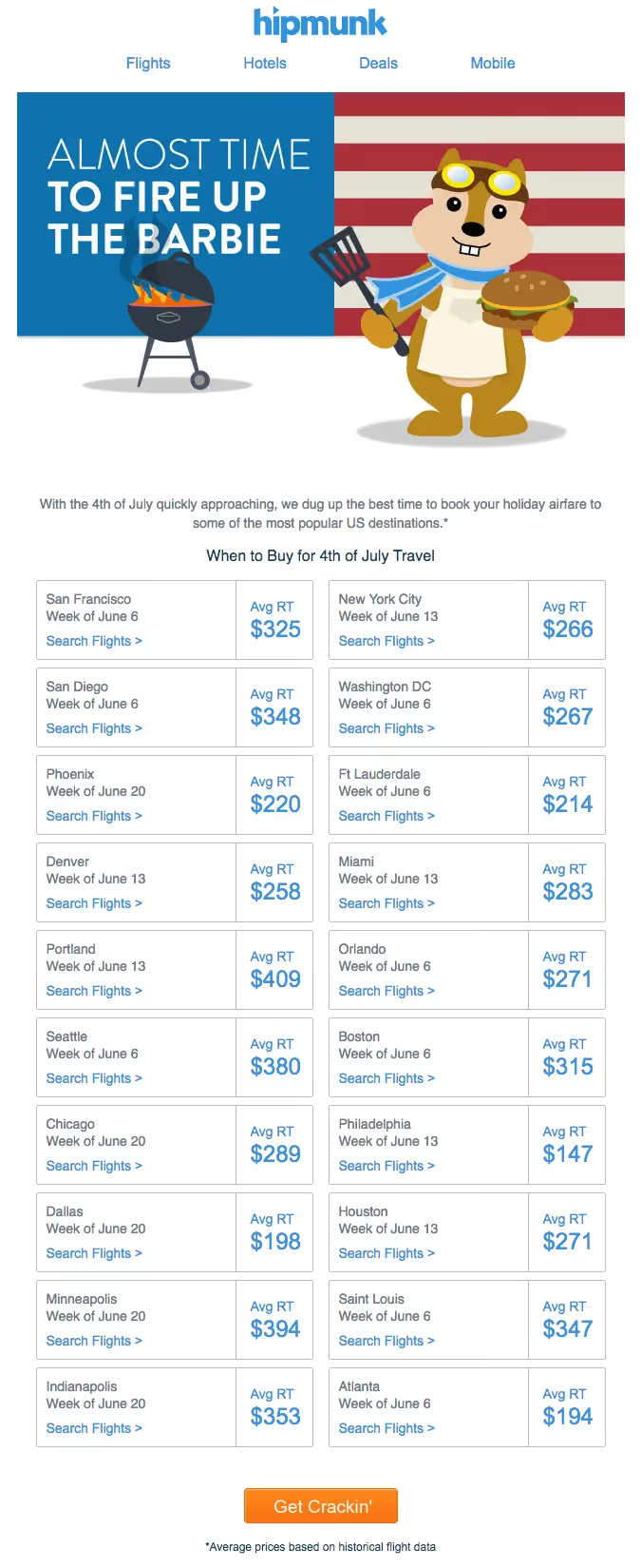
Step one in email design best practices is optimizing your subject line and pre-header text, and step two is grabbing readers' attention immediately with an effective header. It's a simple rule of thumb, but it's an important one, and holidays are a perfect time to experiment with your header. Hipmunk, the travel company, uses an illustrated chipmunk as its cute and fuzzy brand ambassador, and he's ready to "fire up the barbie" in the brand's kitschy header. The email body is incredibly succinct, factual, and well-organized in two clear columns, without illustration or design elements. Plus, the unique CTA ("Get Crackin'") serves as a reminder of barbecues and as a prompt for readers to get started on their vacation search.
What works:
- On-brand, festive header illustration
- Simple two-column design optimized to deliver information
- Easy-to-spot CTA button with unique text
Get animated with a GIF
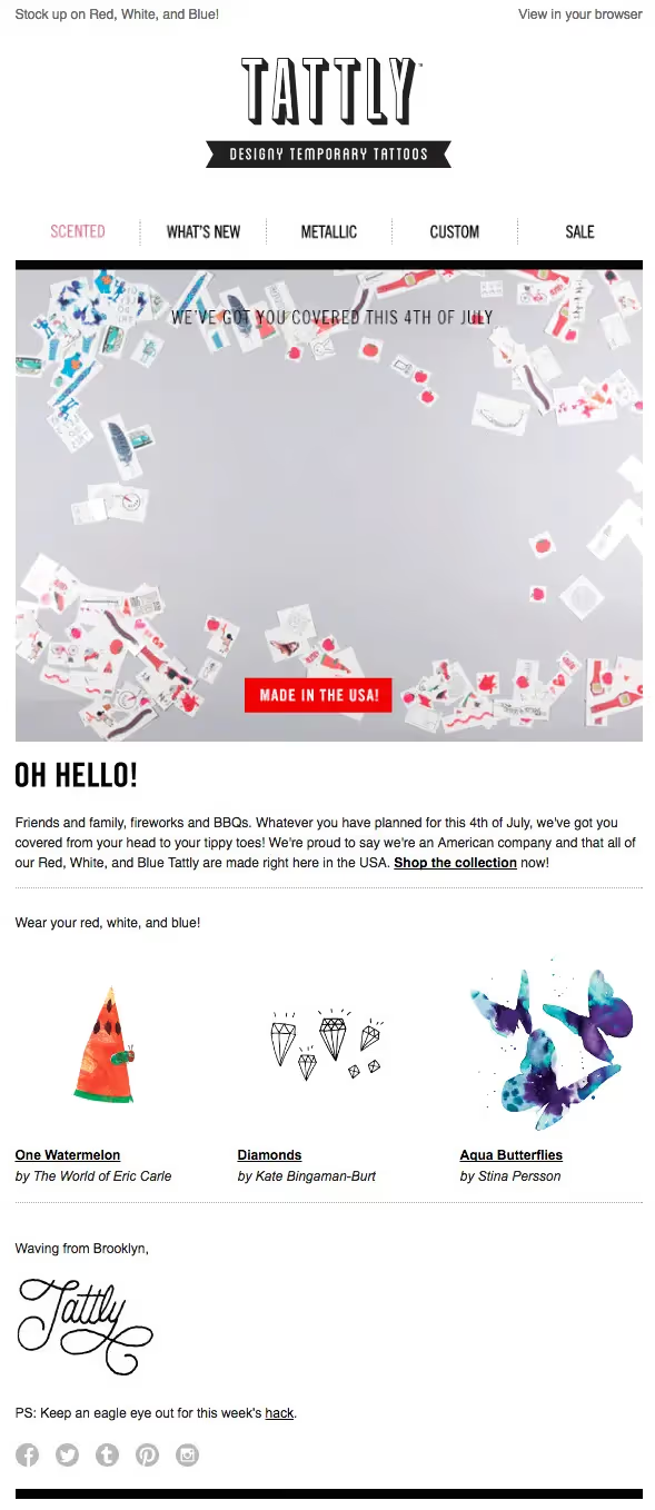
Tattly sells temporary tattoos designed by professional artists and designers. Even though they aren't marketing any tattoos specially designed for the holiday, they highlighted all available red, white, and blue tattoos. By creating a clever animated GIF of red, white, and blue tattoos becoming an American flag and adding clever copy ("We've got you covered this 4th of July"), the brand sends a message that stands out.
What works:
- Optimized pre-header text ("Stock up on Red, White, and Blue!")
- Eye-catching and festive animated GIF
- High-contrast CTA button (the red color and "Made in the USA!" slogan reinforces the patriotism)
- Short and clear body text
- On-brand design and messaging
Simplify your color scheme
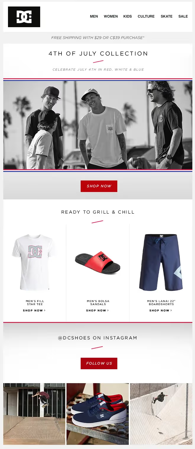
With so many brands incorporating a red-white-and-blue color scheme for the holiday, it might seem appealing to avoid creating 4th of July email designs that look like all the others. But DC Shoes proves that with smart design, the red-white-blue look can be subtle but still stand out. To make the colors pop, DC Shoes kept the email mainly in black and white, emphasizing the thin, horizontal red and blue lines that frame the main image.
What works:
- Black and white color scheme makes the red, white, and blue stand out
- On-point copy that acknowledges aspects of Independence Day
- CTA buttons in contrasting colors
- Hybrid layout to organize a product showcase
Offer meaning and inspiration
Sometimes, seeing a product and reading its product story can make it seem more unique. This email from Martha Stewart highlights products only made in America and digs deeper than a typical product marketing campaign to give some background about what makes each item patriotic.
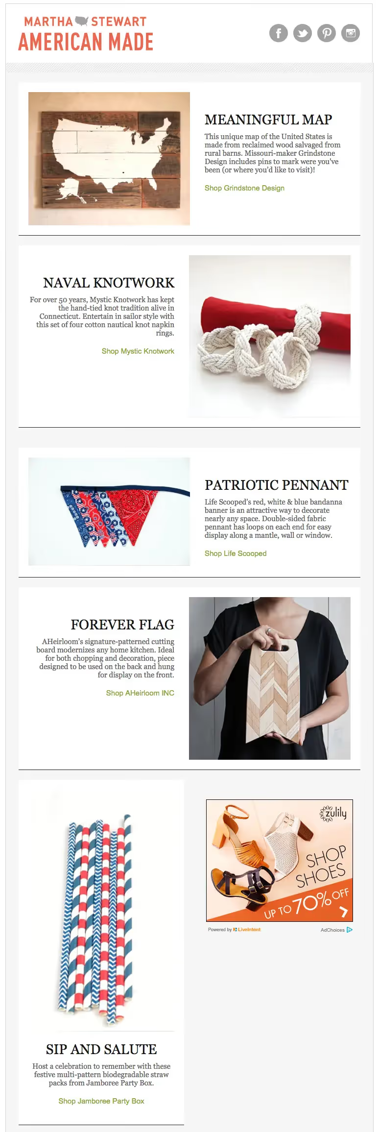
What works:
- Images are paired with short descriptions of inspirational text
- Curated selection of five images
- No complicated header navigation
- Link color is on-brand and stands out
- Gray background color makes white modules more obvious
Give away relevant content
What's your audience likely to be doing over the 4th of July holiday weekend? Going to the beach, spending time with family, or firing up the grill? You know your audience better than anyone. Consider how they'll be spending the holiday weekend and offer content that will add value to your readers' lives. That's what Oh Joy!, the lifestyle blog, did with their Independence Day email — providing readers with a how-to video on making a bean bag toss game that works for any family gathering.
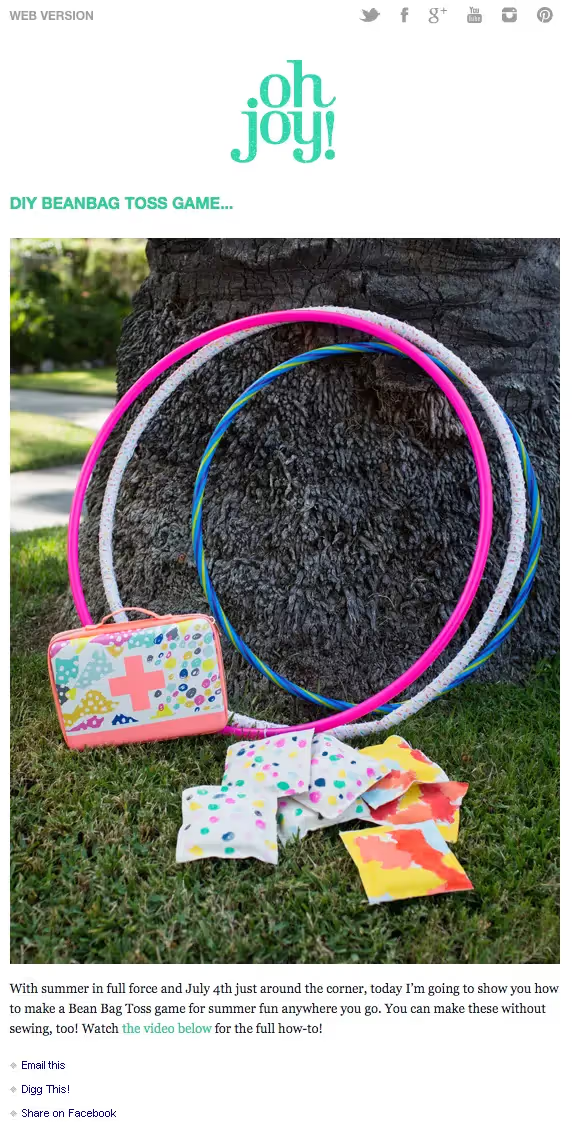
What works:
- Free content (how-to video) relevant to the holiday, audience, and brand
- Cute and simple email design
- No complicated header navigation
- Link color that's on-brand and visually striking against the white and black
Wrap Up: Tips for your 4th of July email designs
- Add visual interest right away, with an eye-grabbing illustrated header or animated GIF.
- Simplify or remove your navigation menu and focus readers' attention on your primary CTA at the top.
- Consider content that would be valuable for your audience and send it in a straightforward way.
- When using red and blue as bold colors, consider keeping the other email colors in simple black and white.
- Don't be afraid of text! But keep it short (two sentences) when including fun copy of your products.
Articles to wet your whistle




.png)
Subscribe to our newsletter.
Dive into the world of unmatched copywriting mastery, handpicked articles, and insider tips & tricks that elevate your writing game. Subscribe now for your weekly dose of inspiration and expertise.