

Tutorial: How to Begin A/B Testing Email Designs
Begin A/B testing email designs with our tutorial. Optimize your email performance for better results!


Want to know which email campaigns catch your readers' eyes? Try this easy solution: A/B testing. A/B testing compares two versions of the same thing (subject headlines, email design layouts, CTA buttons, etc.) until you narrow down results for comparison. Not surprisingly, the data that results from A/B testing is powerful, from open rates to click-through rates to conversions, and reveals how your audience responds to changing variables.
How to decide what to test
Before designing your A/B campaign, determine what you want to test. To start, choose just one variable so your results are clear. Here are some examples of commonly tested variables:
Design
- CTA size and style. Full-width button or smaller? Green or red? Tall or short?
- Layout. Single column or multiple?
- Color scheme. White or gray background? Blue or green header text?
- Image size or variety. Two product images or four? Still image or animated GIF?
- Information amount. Include secondary content or not? Social media buttons or not? Nav menu or not?
- Information placement. Social buttons at the top or bottom? CTA button mid-way through or at the end?
Content and Time
- From line. Your business name or the name of an individual?
- Subject line. Shorter or longer? Emoji or no emoji?
- CTA language. "Claim your ebook now" or "Claim your free ebook"?
- Body text. "Pushy" language or more subtle? Six sentences or three?
- Send time. Will there be more opens at 8:00 AM or at 4:00 PM?
Best practices for A/B testing
- Determine your success metric first. Open rates will make sense if you're testing subject lines; click-through or conversion rates for design changes. Know what you're evaluating in advance.
- Test only one thing at a time. If you change more than one variable, you won't be able to tell what caused the change in response.
- Test a big sample size. Understand how many responses you need to show statistical significance.
- Send A and B versions at the same time. Time is a variable, so be consistent by having both campaigns be sent at the same time (to different groups) — unless send time IS your variable.
How to A/B test email design changes
Let's walk through how to A/B test design using this email example from Verywell, a site that provides health advice and resources.
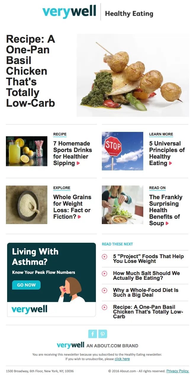
A/B Design Test 1: CTA button
Verywell's current version of the email has no call-to-action button. What if we added one in the first module to see how it changed the click-through rate? For the "A" version, recreate the original email as-is. For the "B" version, add a CTA button that matches the header color, is nearly the width of the email, and uses some urgency in the text, like "Check out the recipe now." Will this CTA increase clicks? You'll need to send the A/B test emails to find out.
A/B Design Test 2: Layout
How would Verywell's email perform if a version included the first module as a single column instead of side-by-side? Try rearranging the header text and image so the image appears above the text instead of beside it — the text re-flows and the image resizes so the email is automatically formatted nicely.
A/B Design Test 3: Background color
Even though Verywell's email has a clean, all-white background, how would readers react if the first module had a bright background color that matched the brand's teal color? Try updating the content background color of the top row, then adjust the text color from black to white to keep it readable.
Running any A/B tests?
It's easy to create different versions of an email and test which one performs best. Just remember to stick to one variable at a time in order to understand what your subscribers are reacting to at specific moments.
Articles to wet your whistle




.png)
Subscribe to our newsletter.
Dive into the world of unmatched copywriting mastery, handpicked articles, and insider tips & tricks that elevate your writing game. Subscribe now for your weekly dose of inspiration and expertise.