

Back-to-school emails that earn the click
Eight back-to-school campaigns, and one thing worth remembering: a great idea still has to survive Outlook, dark mode, and a blocked-image inbox.

Back-to-school shopping happens in a short window, mostly July and August, and that's it. There's no slower season later in the year to catch what a brand misses in those few weeks. Every one of those weeks, the inbox turns into a war zone of backpacks, dorm bins, and "20% off everything" banners, and most of it gets deleted before the image even loads, assuming the image loads at all.
The emails that survive tend to do one of a few things really well. Some give the reader something useful before asking for anything back. In others, a voice or a design choice carries the whole message. And a few just remove a decision the reader would otherwise have to make on their own. Getting that part right feels like the whole win, until the same brilliant idea shows up broken in half the inboxes it reaches, a GIF frozen mid-animation, a black background gone strange in dark mode, an infographic nobody can see.
Nailing the idea is only half of it. The brands below also made sure that idea survived the trip.
Let a mechanic, a voice, or a color do the convincing
Some of the best emails this season win by being the most interesting thing in an otherwise beige inbox, whether that comes from an interactive trick, a distinctive voice, or one bold design choice.
Everyday Dose
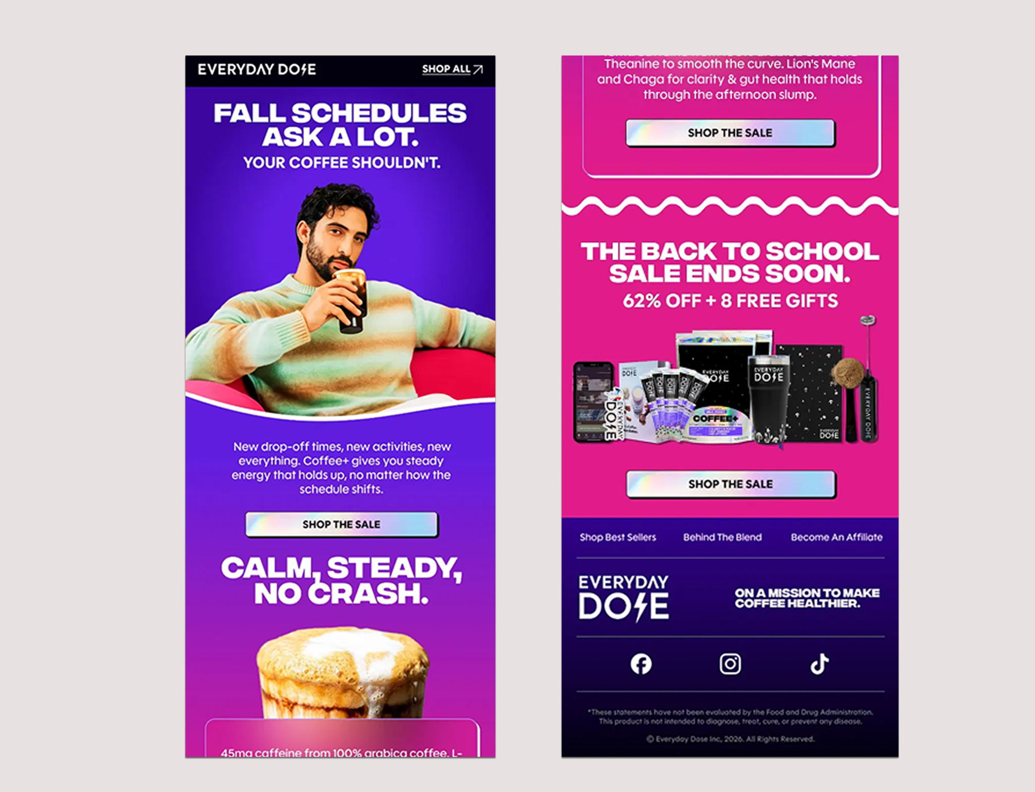
Everyday Dose opens on a single line, "your coffee shouldn't," over a gradient that shifts from deep purple into hot pink, paired with a relaxed product shot and a straightforward ingredient breakdown (45mg caffeine, L-theanine, Lion's Mane, and Chaga). One confident visual choice carries the whole email, rather than splitting attention across a product grid. Given how saturated that gradient is, it's worth a dark mode check before sending, since different clients invert colors differently.
Line Friends
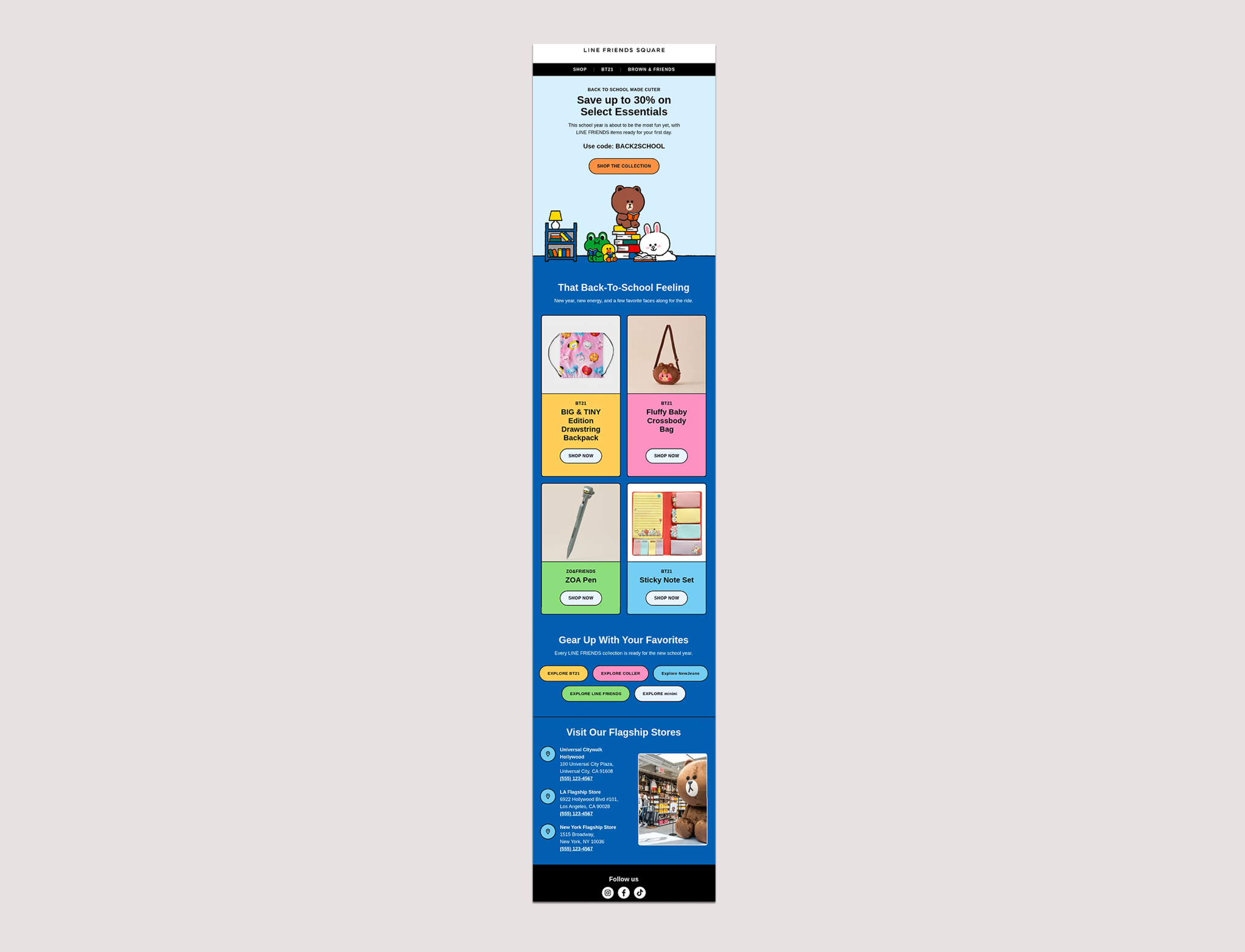
Line Friends used its own characters instead of a discount as the hook, placing Brown and friends in a cozy illustrated bedroom scene, complete with a bookshelf and stacked books, with the sale code tucked underneath. The illustration carries the emotional pull that a countdown clock usually handles elsewhere.
Fleet Feet
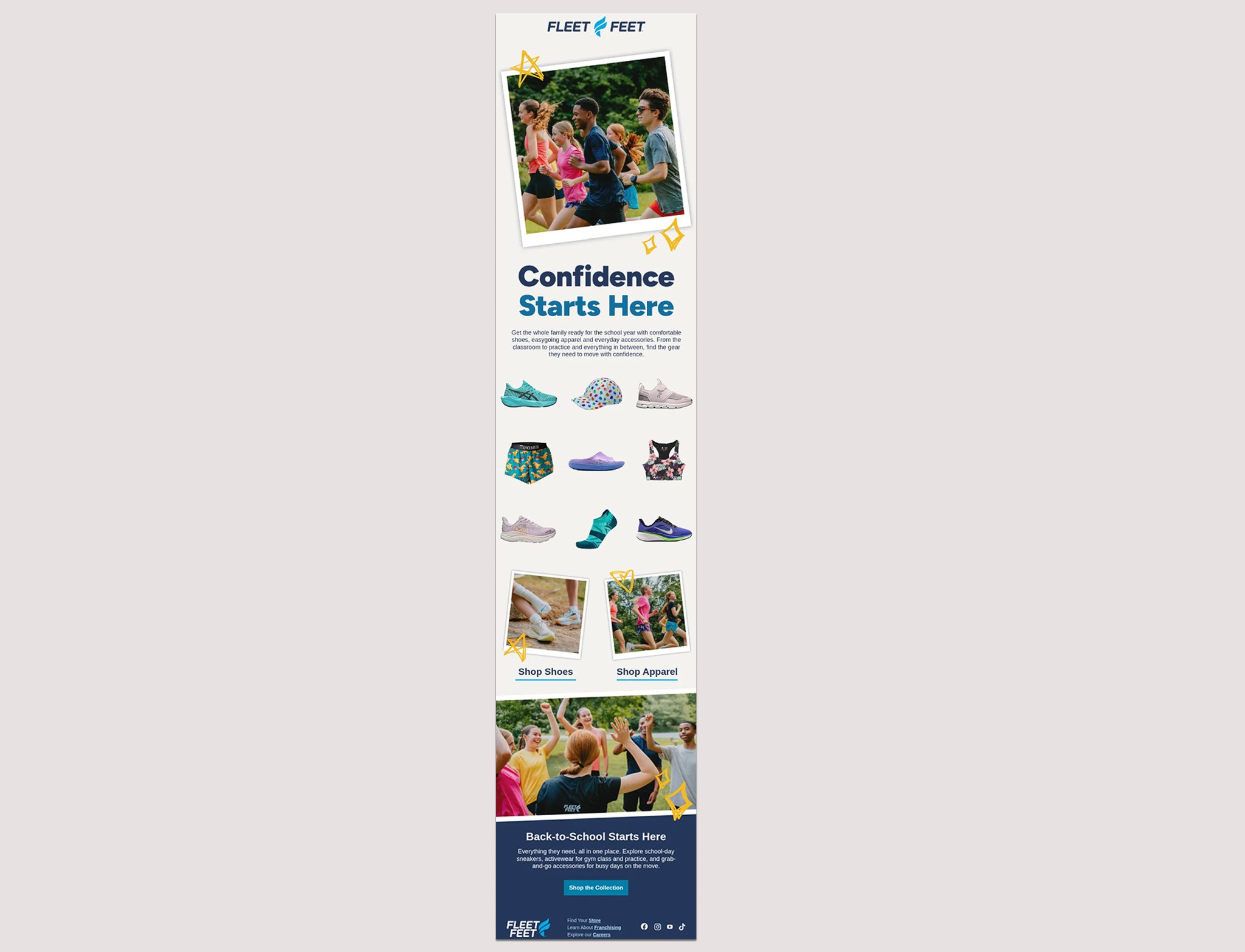
Fleet Feet built its hero around a photo collage, scrapbook-style layout, with a Polaroid frame and hand-drawn stars standing in for the product grid most back-to-school sends default to. Layouts that stack several separate images like this are worth a second look at alt text, unless finding out half your collage never loaded is a surprise you enjoy.
Remove the ambiguity instead of leaving it to the reader
Some of the best emails this season won by being clear rather than generous or funny. They made a choice for the reader so the reader didn't have to guess what applied to them or where to look first.
Zappos
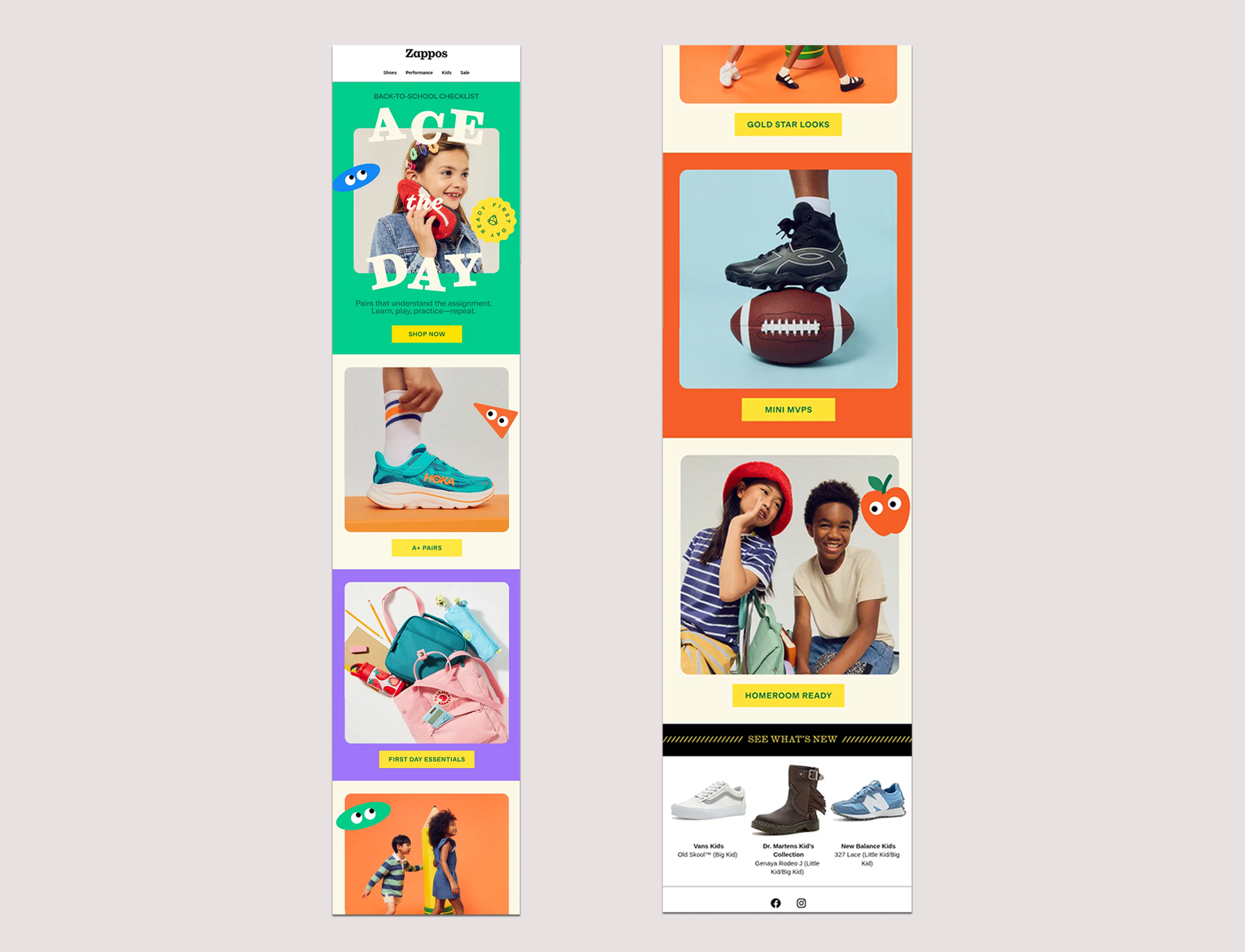
Zappos skipped a single hero image in favor of a full checklist, splitting the email into five color-blocked categories, from A+ Pairs to Homeroom Ready, each with its own color and its own CTA, so nobody has to guess which section covers shoes versus backpacks versus outfits.
The North Face
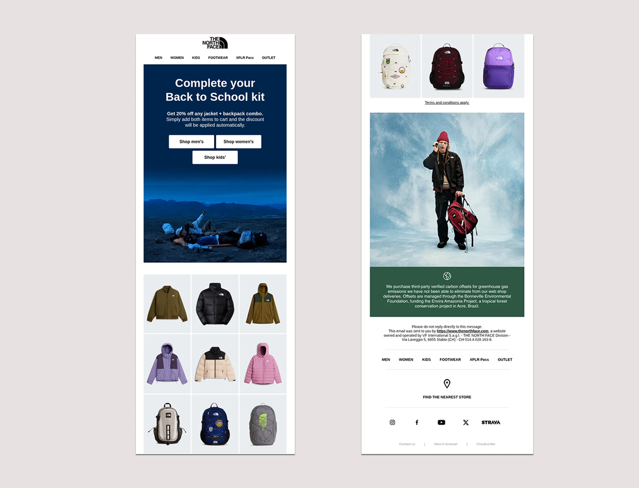
The North Face built the whole email around one bundle logic, 20 percent off any jacket and backpack combo, then split the call to action into three clearly labeled paths for men's, women's, and kids' shopping, so nobody has to guess which section applies to them.
Understood for Educators
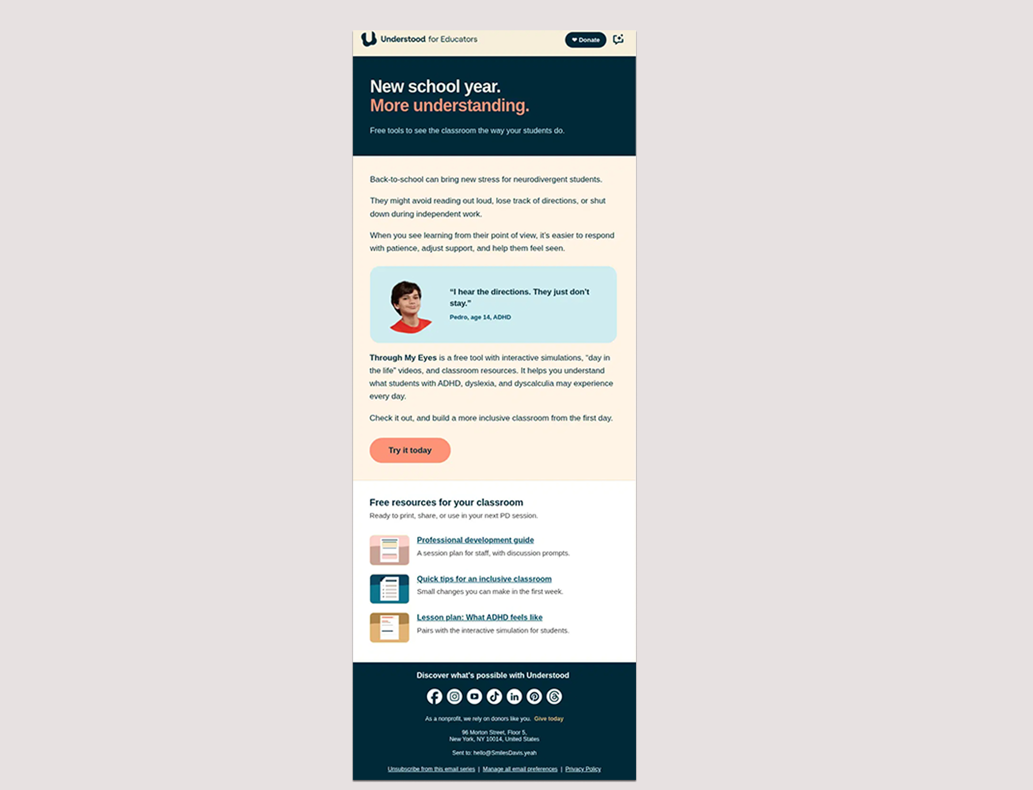
Understood for Educators skipped the "shop now" instinct completely and sent a free tool to support neurodivergent students, illustrated with a quote from a real student explaining that hearing directions once isn't the same as remembering them. Below it, a short list of downloadable resources, a PD session guide, quick classroom tips, and a lesson plan on what ADHD feels like, gives the email a second useful layer beyond the main tool. That kind of specificity names exactly who the email is for and what they will get, instead of leaving a broad audience to guess whether it applies to them.
Give something before you ask for anything
The easiest way to earn attention in a crowded inbox is to hand over something useful first and let the ask come second, or not at all.
KiwiCo
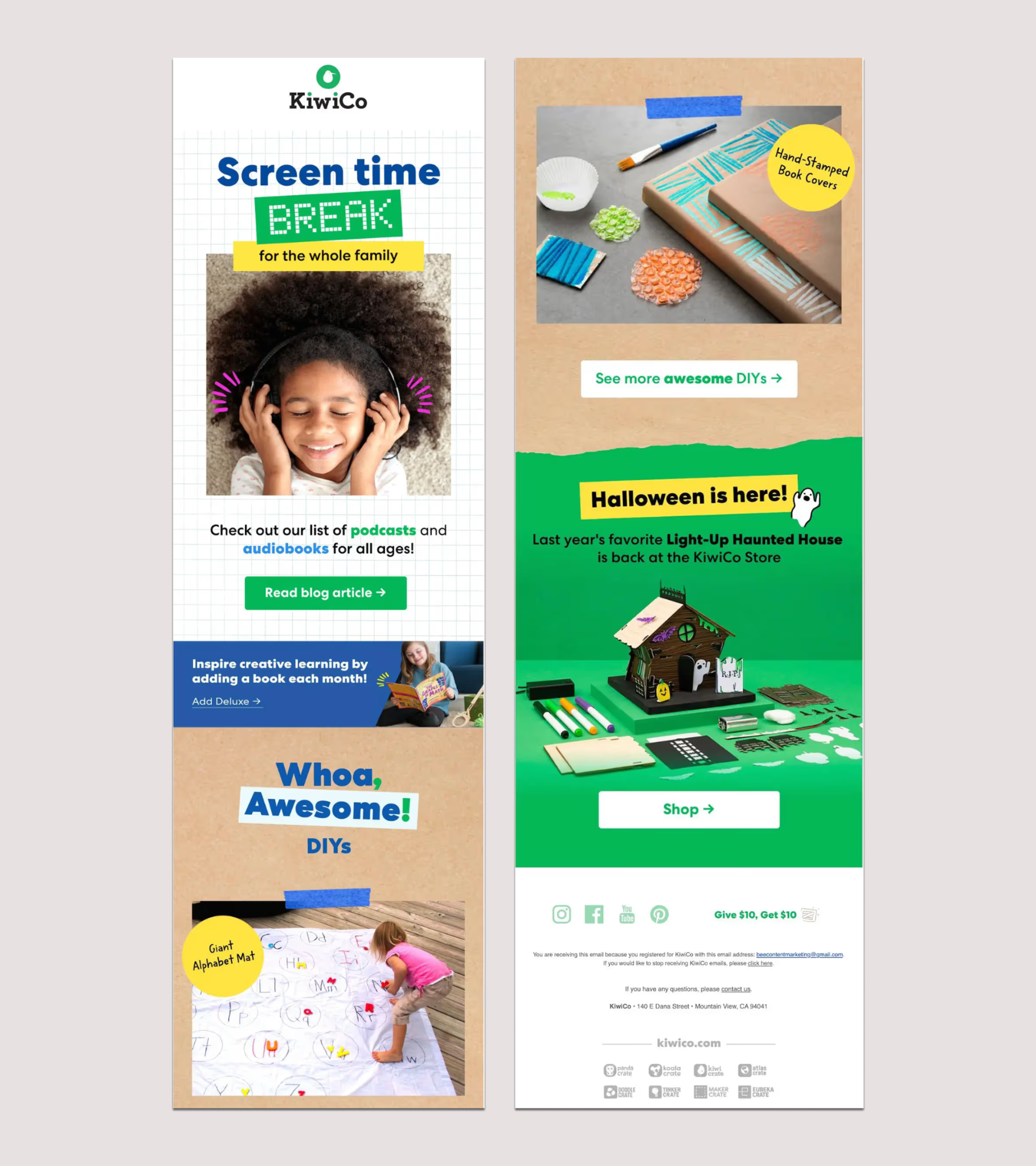
KiwiCo skipped the sales pitch entirely and sent a curated list of kid-friendly podcasts and audiobooks, something a stretched-thin parent could use that same afternoon with zero purchase required. There is a kind of patience in that decision that most brands lack during a sales season, showing up useful first and trusting the sale to follow later, rather than forcing it into the same email.
Tattly
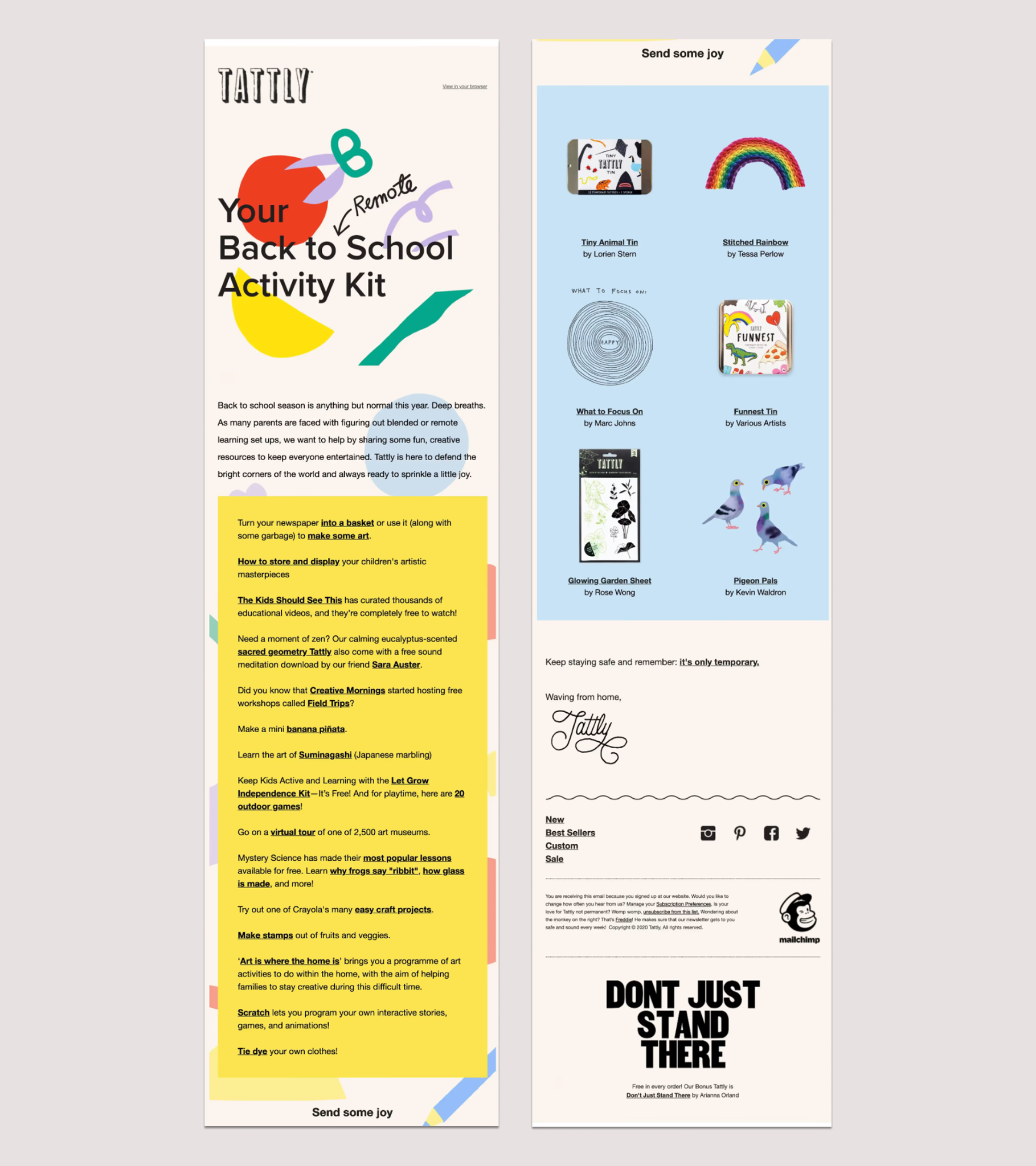
Tattly took a similar approach but found a cleverer way to close the loop. The email offered family activity ideas, then used its call to action to link straight to a video showing how to remove one of its temporary tattoos. The CTA became a brief demonstration of the product itself rather than a generic shop-now button, answering a question before the reader even had to ask. It also sidesteps a real technical limit almost by accident, since most inboxes, Gmail and Outlook included, don't play video inline anyway, so linking out was the safer bet for most of the list regardless.
What ties these together
None of these eight emails leaned on urgency to make their case. No ticking countdown, no "today only," no discount stacked on top of another discount. Everyday Dose got there with a color choice. Line Friends built the whole hook around a character instead. KiwiCo skipped the pitch entirely for that first send. Even the two built to move product outright, Zappos and The North Face, won by laying the information out clearly.
A color that carries a whole email, a character people already trust, a checklist that matches how a family actually shops, none of that gets figured out the week a campaign goes out. It's decided months earlier, in a brand's design system, long before back-to-school shows up on a calendar.
RGE Studio's Smart Check flags the same issues that broke half the emails in this piece before they ever reach an inbox: missing alt text, weak color contrast, and images that push a send past the clipping limit.
Articles to wet your whistle

.png)
Subscribe to our newsletter.
Dive into the world of unmatched copywriting mastery, handpicked articles, and insider tips & tricks that elevate your writing game. Subscribe now for your weekly dose of inspiration and expertise.