

5 Ideas for the Best Email Newsletter Design
Discover 5 ideas for the best email newsletter design. Elevate your email campaigns with creative insights!

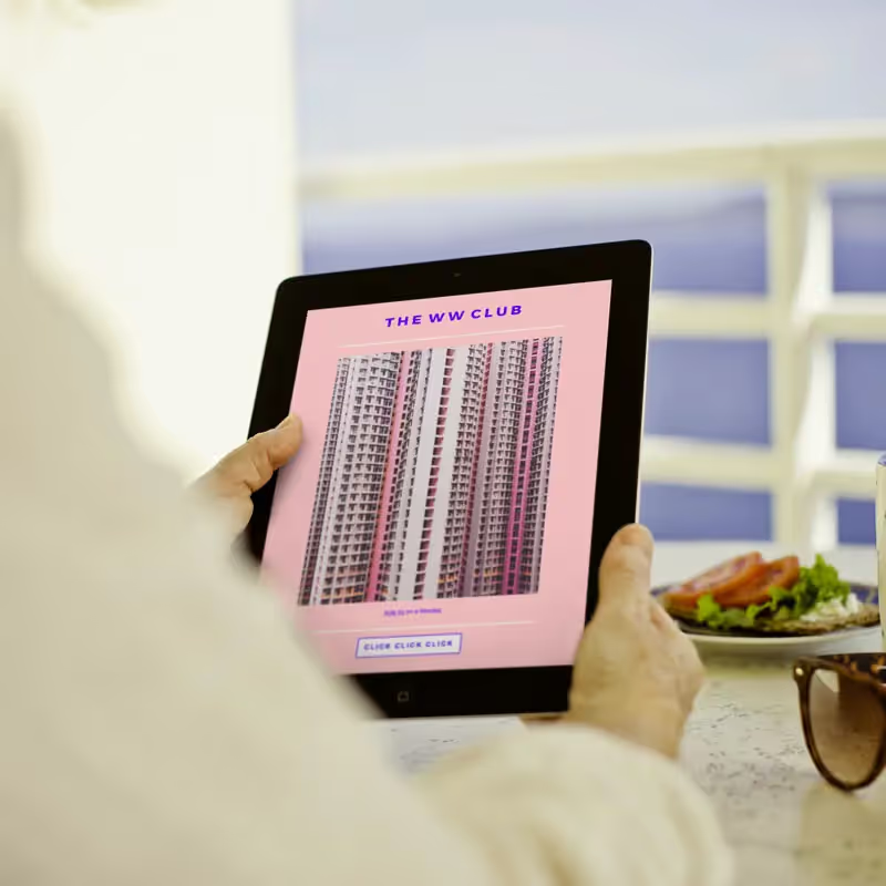
Email newsletters are typically a bit longer than your average promo campaign. They might contain a company update, round-up list, digest, or a story. In short: there's a lot of content. So how do you get people to actually read and scroll? Great design, of course! Read on for our essential email newsletter design ideas.
#1. Think of your newsletter as a series of micro-content.
If you're familiar with modular design, this will be intuitive for you. The idea is to separate your content into bite-sized pieces. Each module contains, say, three sentences and an image. The idea is not to get too long-winded, but if you do need to say a lot, break down what you want to say into segments for easier reading and skimming. Use the newsletter design layout to signal transitions, like dividers, module borders, headers, images or design elements, and extra padding.
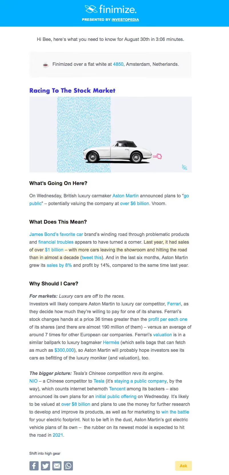
Each section gets progressively more detailed for those who want to keep reading. Otherwise, you still get the lede in the first section. This means the email is easy to scan, and with headers breaking up the information, no section contains more than a few sentences.
TIP: For emails with a lot of text, be sure to increase your margins to maintain readability. You'll probably want a max width of about 500px.
On the flip side, you can also take an approach that uses lines, borders, and colors to separate one piece of newsletter content from the next.
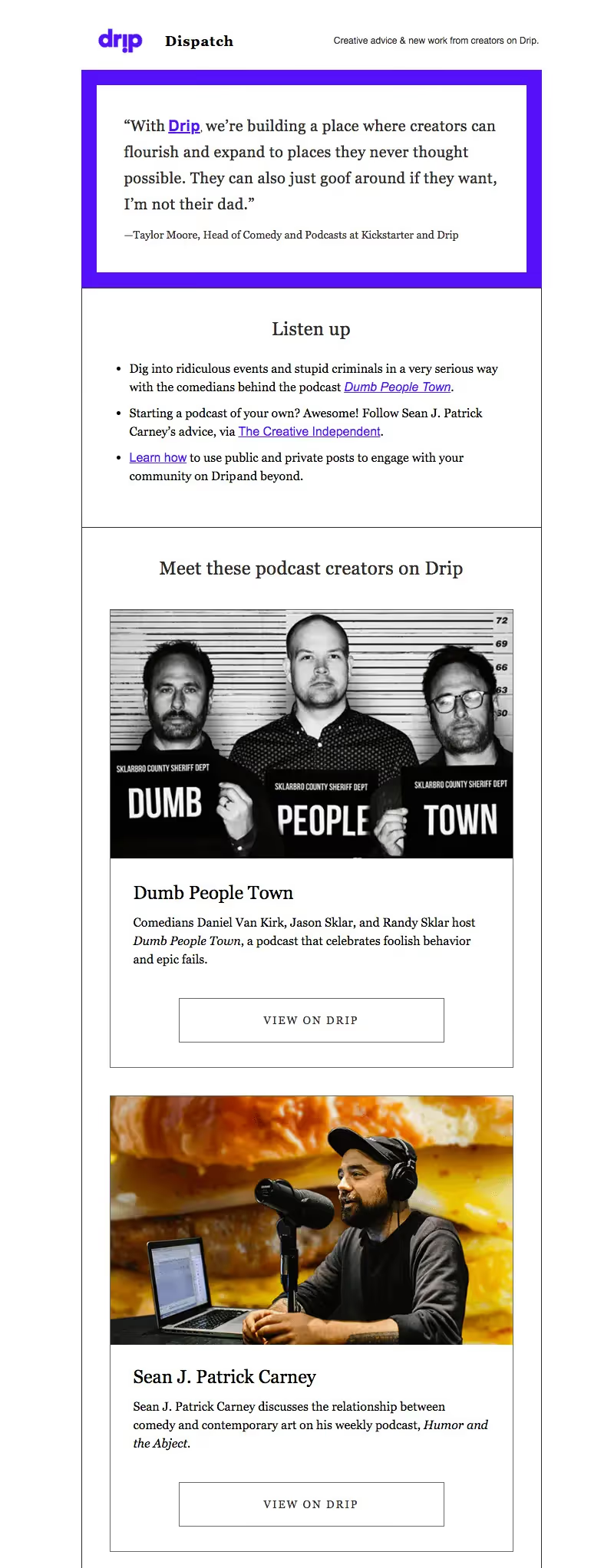
Both approaches are effective. The key is to measure out your content in small pieces. Aim for 3 sentences max in each section or paragraph.
#2. Include visuals that provide value.
Images serve multiple purposes in an email. They convey information visually, break up the flow of text and create structure, and add a way for readers to click through. But if you're just adding images to your newsletter without much thought, they probably aren't engaging to your readers. So choose and design art that adds value to your newsletter.
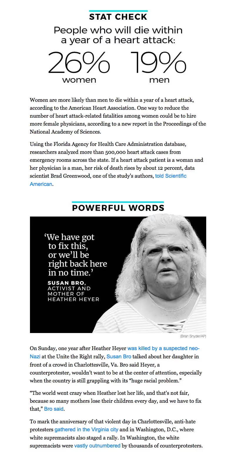
These infographic-like images are almost like bonus content. They're providing real information — streamlined, well-designed, sharp-looking — instead of just taking up space.
#3. Cut your intro.
Got a lot to say? Then cut right to the chase. If your newsletter is a daily or weekly digest, chances are, your readers know what to expect. So you don't need a long-winded introduction to set up each email. Instead, dive right into the content you know readers want.
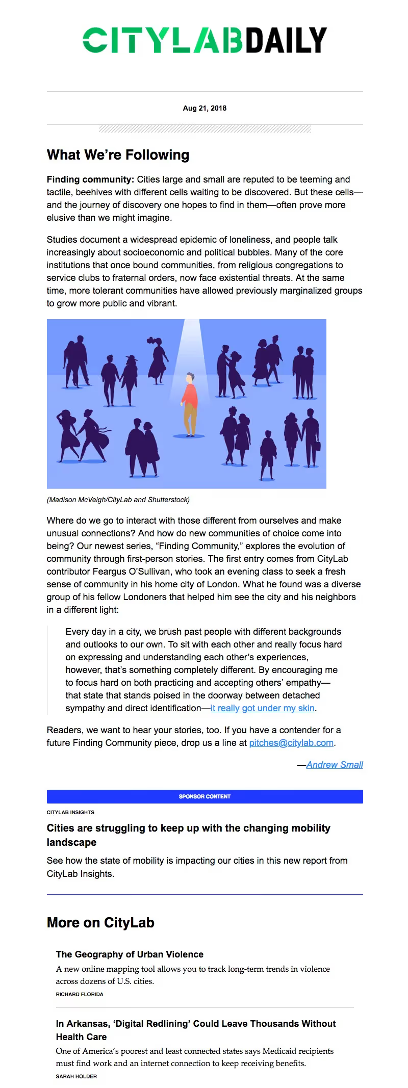
#4. Make it a list.
A great "trick" for email newsletter design is to put your content in a list. Just organizing information in a numbered list is soothing on the brain, isn't it? Suddenly, what you have to say seems more ordered. So many newsletters are formatted this way, especially round-up lists.
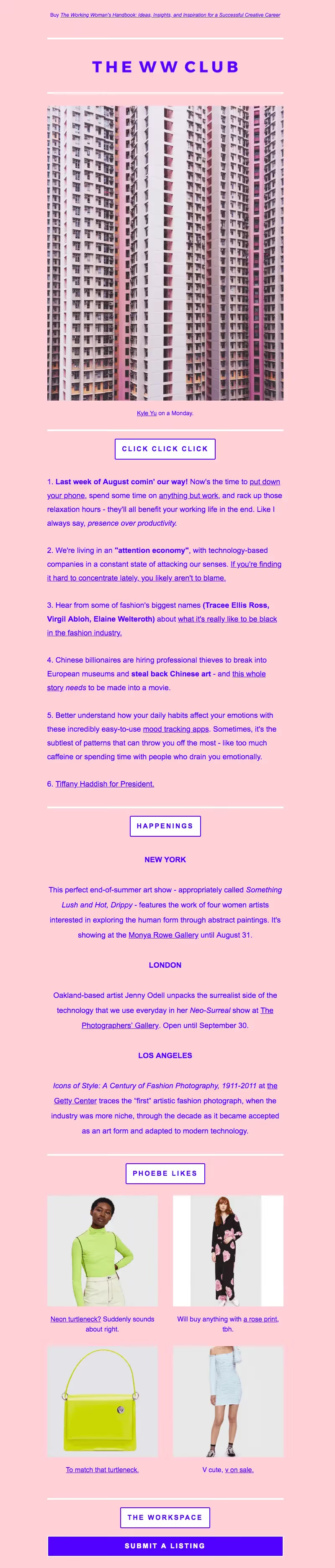
What's also great about this approach is that each module offers different content, or at least organizes the content in a different way: a numbered list, then a center-aligned list, then a photo grid. The variety makes for a more visually interesting newsletter.
#5. Get personal.
If you've collected any amount of data on your subscriber list, you probably have folks' first names. If that's the case, use 'em! Drawing readers in by addressing them by name is a perfect opportunity to level-up your email newsletter and get readers invested in your content right off the bat. But if you don't have names, you can still create a personal tone in your email with your greeting and sign-off.
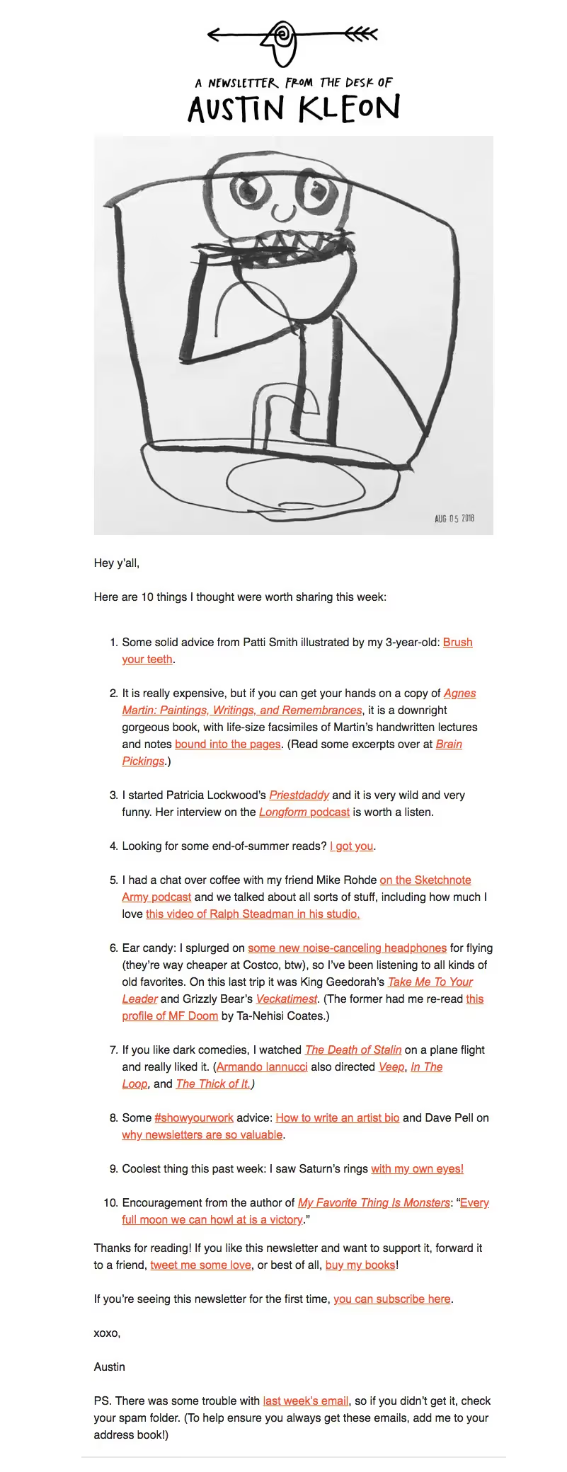
There's a lot here to like. Even though it's not "personalized," the tone is still personal. You have a friendly greeting and a warm sign-off. This cheeky tone won't work for everyone, but for the right brand, it's very on-brand. Plus, there's no time wasted on an intro and the email is formatted as a list. This is all simple and effective, and very readable!
Articles to wet your whistle


.png)
Subscribe to our newsletter.
Dive into the world of unmatched copywriting mastery, handpicked articles, and insider tips & tricks that elevate your writing game. Subscribe now for your weekly dose of inspiration and expertise.