

Dark Mode Design Best Practices
Send special customer appreciation emails with these 7 effective strategies. Build customer loyalty and engagement!

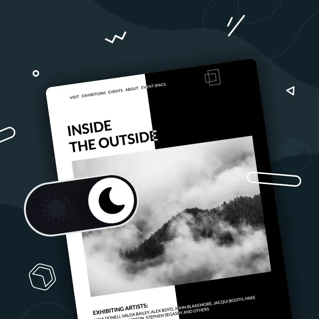
Dark mode has moved far beyond being a "trend." It's now an expectation. According to a 2020 study by Android Authority, 81.9% of participants use dark mode on their phones and 64.6% of participants expect sites and apps to automatically apply a dark theme. Popular platforms like Gmail, Outlook, and Apple Mail already support dark mode, reshaping how marketers and designers must approach email design.
What is dark mode?
By inverting light backgrounds into darker shades of gray or black, dark mode creates a new kind of user experience that:
- Enhances accessibility – reducing eye strain and supporting users with light sensitivity.
- Preserves battery life – particularly on OLED and AMOLED devices by using less energy.
- Elevates design aesthetics – many users simply prefer the sleek, modern look.
With screen time at record highs, dark mode isn't just a nice-to-have — it's become a must-have. If you're still ignoring it in your email design strategy, you're risking lower engagement, weaker brand perception, and accessibility concerns.
Dark mode email design doesn't have to be complex
A few years ago, marketers dismissed dark mode as niche. Today, ignoring it means losing touch with your audience. The good news? Tools are making it easier than ever to preview and design with dark mode in mind, toggling between light and dark mode previews to catch potential pitfalls before sending.
Dark mode considerations to keep in mind
Email clients are unpredictable. Depending on the email provider, there are three different ways that email clients might change the look of your content:
- No changes at all: In the case of Yahoo Mail and Apple Mail there is no impact on how emails are viewed.
- Partial color invert: Email clients like Outlook only detect light-colored sections and turn them into darker colors.
- Full color invert: This is where everything is inverted. All the areas with light turn dark and vice versa. This is the Gmail apps' MO.
This inconsistency means you need to design and test carefully. If your email looks broken in dark mode, readers might not recognize your brand or, worse, unsubscribe.
How to optimize emails for dark mode
1. Avoid using true black
The high contrast between true black backgrounds (#000000) and true white (#FFFFFF) will make things more difficult to read, defeating the purpose of dark mode altogether. Instead, use dark gray (#121212) as the background color to soften the contrast.
2. Adapt brand colors
While your saturated brand colors look great in light mode, these colors are too bright and will affect readability. There's no need to call your design team for reinforcement — instead, have fun and experiment with a desaturated or muted pastel version of your brand colors. Automatically evaluating the contrast ratio between text (or titles/buttons) and the background helps ensure that text remains legible when a dark background is used, and helps avoid colors that might be clear in light mode but washed out or hard-to-read when inverted.
3. Optimize images and logos
For many email marketers, this seems to be the biggest challenge when it comes to optimizing emails and landing pages for dark mode. Here are a few ways to optimize images and logos:
- Use a logo that uses a brand color that isn't black or white.
- If you have an image or element with a black background, add a white outline to improve its visibility and avoid it from fading into the background.
- Ensure images and logos are PNG format with transparent backgrounds.
- Keep things minimal. Dark backgrounds can give the illusion of limited space so keep things simple to not overwhelm the reader.
Start designing more accessible emails today
At the end of the day, the number one rule for content marketers and designers is simple: put your audience front and center. Dark mode isn't just a passing design trend — it's a real user preference that directly impacts readability, accessibility, and overall experience. By considering how your content appears in both light and dark modes, you show readers that you care about consistency, cohesion, and inclusivity. Taking the extra step to test, preview, and optimize your emails ensures that your brand is not only seen, but also trusted and remembered. Whether your subscribers open your message in light mode at the office or dark mode at night, they should enjoy a seamless experience that reflects your brand's professionalism and attention to detail.
Articles to wet your whistle



.png)
Subscribe to our newsletter.
Dive into the world of unmatched copywriting mastery, handpicked articles, and insider tips & tricks that elevate your writing game. Subscribe now for your weekly dose of inspiration and expertise.