

8 Gorgeous Email Newsletters From Design Industry Pros
Discover gorgeous email newsletters from design industry pros. Get inspired for your own newsletter designs!

When it comes to design newsletters, which ones from the design industry stand out? We rounded up eight of our favorite newsletters sent by designers, design organizations, and agencies to get a look at how the pros do email. As you might expect, the messages are beautiful to look at; each one offers unexpected design choices and fresh ideas to use in your own email marketing. So, let's evaluate the visuals!
#1: AIGA Eye on Design
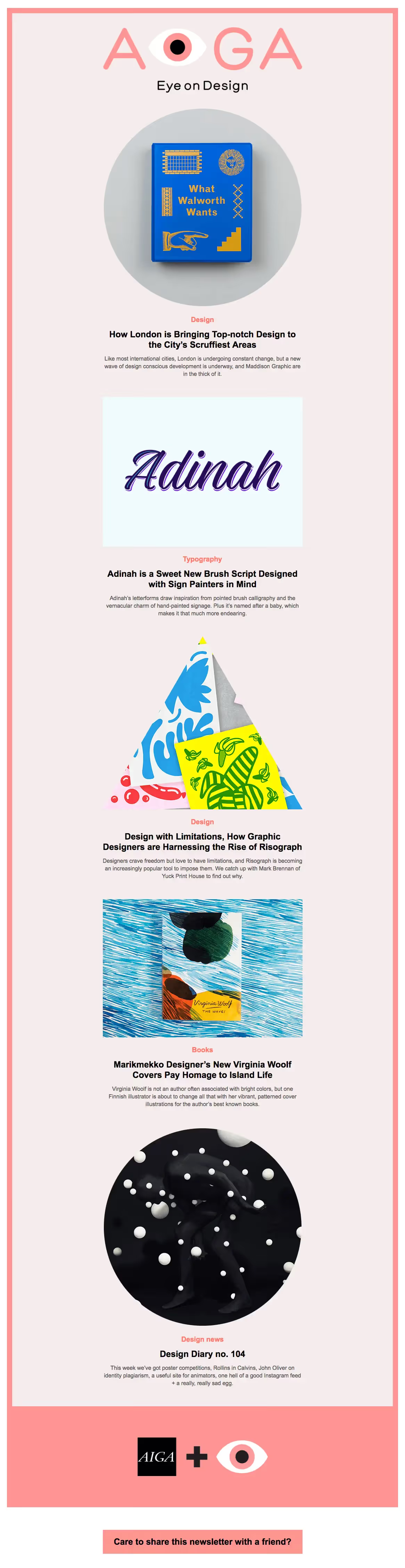
"Eye on Design" is published by AIGA, the oldest and largest nonprofit design organization in the U.S. The newsletter aims to keep subscribers up to speed on the best new work from emerging and established designers around the world.
Design Choices We Love:
- Color! In a sea of so many white emails, the classic "Eye on Design" pink can't be missed. AIGA also proves that borders can be done well — the dark pink border around each newsletter is distinct and attractive, and a fresh take on the "boxed" email look.
- Unusual image shapes. Who said every image used in your inverse pyramid layouts needs to be rectangular? AIGA's rotation of unique photo crops (triangular, circular, square) adds visual interest.
#2: It's Nice That
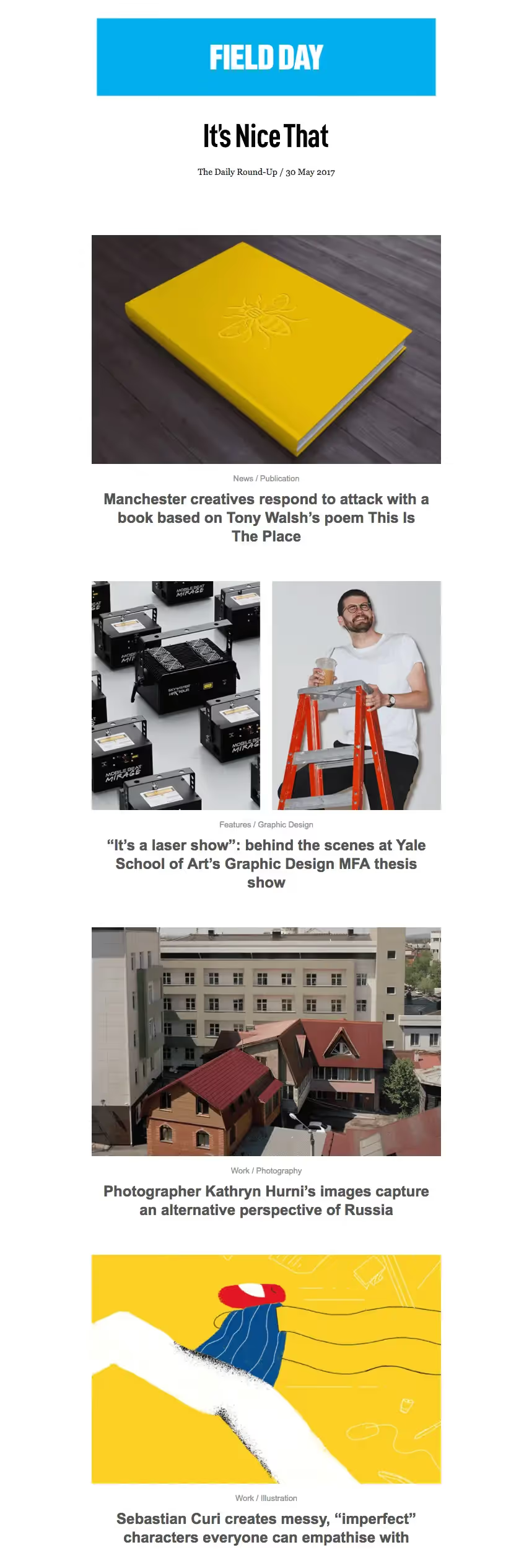
London-based It's Nice That prides itself on championing creative work, whether through its website, talk series, magazine, or daily roundup newsletter. The newsletters are straightforward and photo-focused, with less emphasis on text.
Design Choices We Love:
- Simplicity. Each email is beautifully streamlined: one column, no navigation menu, vibrant clickable images without much text.
- Use of white space. The white space used in the header and throughout the email gives it a fresh feel, and the padding between each module is just right!
#3: Design Milk
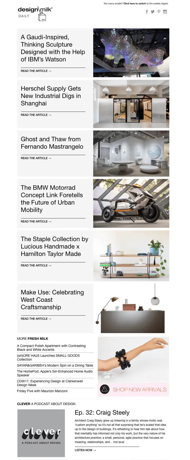
Design Milk, a blog founded by Jaime Derringer, features design inspiration across industries, from architecture to art to tech. The "Design Milk Daily" provides subscribers with a rundown of the blog's latest content in an easy-to-digest format.
Design Choices We Love:
- Content arrangement. The side-by-side text and photo modules give the email a two-column layout look, even though it's just one. It's a style we don't often see, and it stands out.
- Live text. The titles to the left of each image aren't part of the images in the module; live text is highlighted by light gray HTML background colors.
#4: Swissmiss
Swissmiss — as stated in the header of each newsletter — is a design blog/studio run by Tina Roth Eisenberg. She started Swissmiss back in 2005, and the well-known design journal now averages over a million unique visitors a month. Each weekday, Swissmiss's newsletter delivers a collection of curated design content to inboxes.
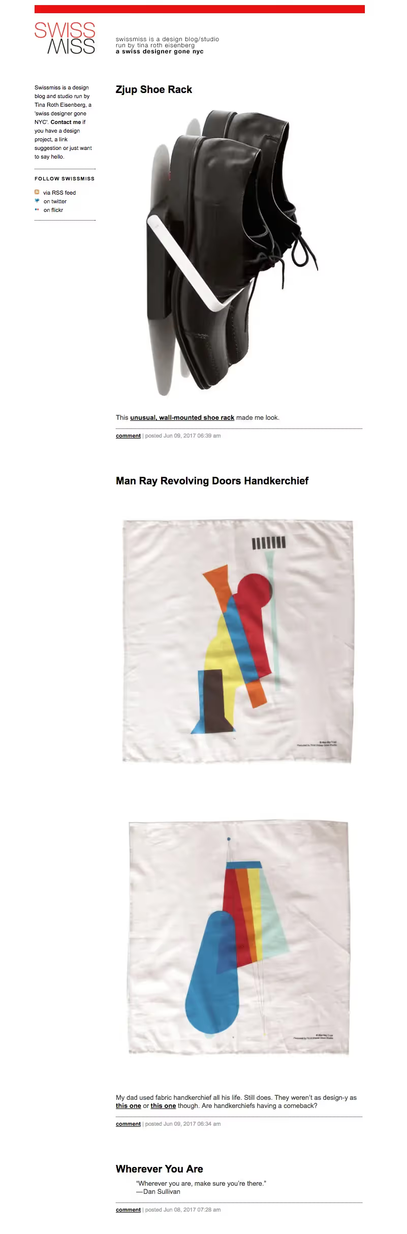
Design Choices We Love:
- A pop of color in the header. The red bar at the top isn't an image; it's a well-placed block of HTML color.
- Quotes and poems. Swissmiss's newsletters regularly include blocks of quotes, which is a nice touch and something you don't often see.
#5: InVision
InVision is a design workflow platform, and the company also sends weekly design newsletters with great content. The emails all have a beautiful, clean layout.
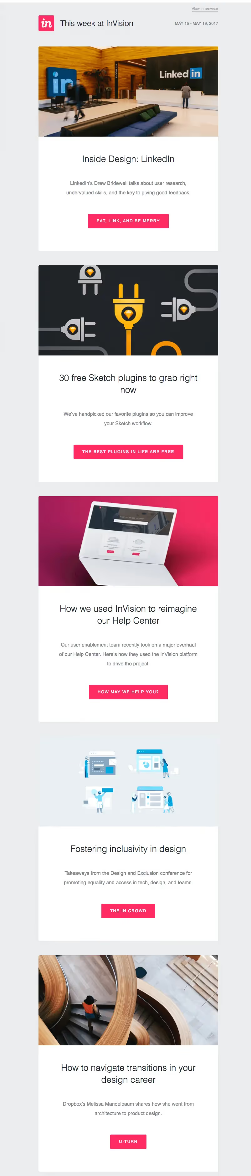
Design Choices We Love:
- Clever CTA copy. InVision maintains readers' attention with its thoughtfully-crafted CTA buttons. They're well designed, and the text makes them even more tempting to click on.
- Generous line height and padding. White space is achieved by letting each piece of content breathe. A good rule of thumb is to set your line height to be at least 1.3x the height of your letters, maintaining a comfortable distance between lines.
#6: Smashing Magazine
Smashing Magazine is a digital mag for professional web designers and developers. It's an incredible resource, with a newsletter that consistently includes more than 10 useful articles, tools, and resources for designers.
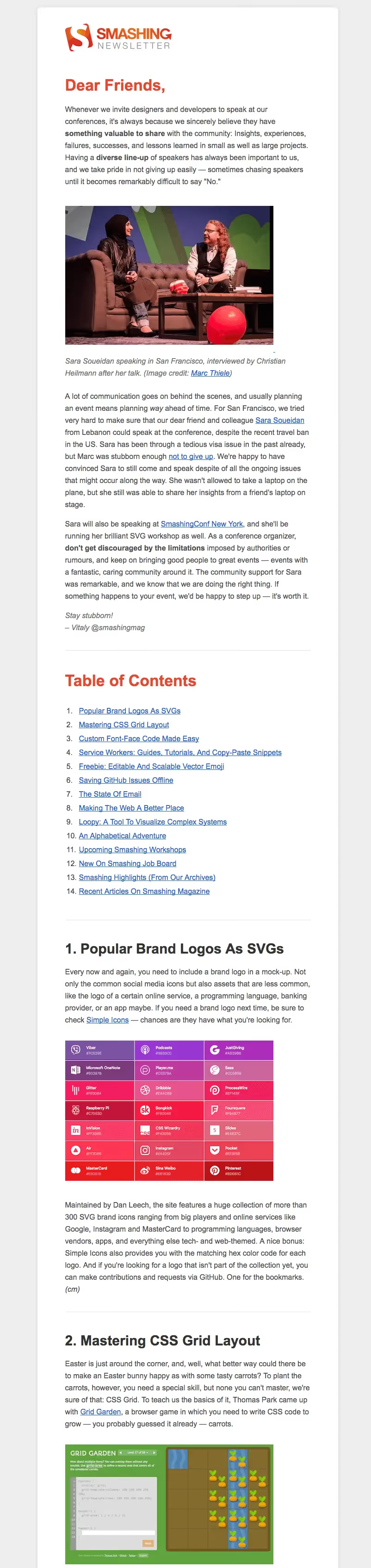
Design Choices We Love:
- Anchor links. Because emails are so long, Smashing always includes a table of contents with anchor links to each section — incredibly useful for long emails, and not difficult to implement.
- Numbered section headings with large font. Consistent formatting for section headers provides organization for long, text-heavy emails.
#7: 10 Things from Your Majesty Co.
Your Majesty Co. is a design and tech firm based in New York and Amsterdam. Their "10 Things" newsletter is sent weekly, always with a list of 10 recommendations that week. The newsletter is strikingly spare.
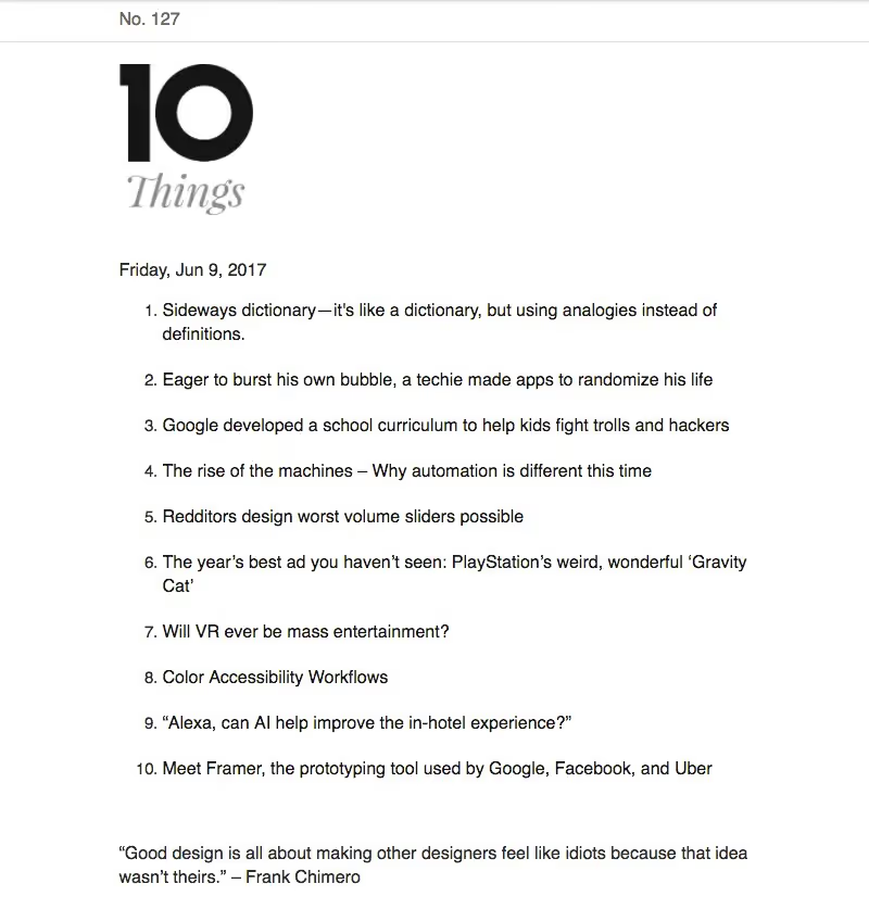
Design Choices We Love:
- "Secret" linked text. The email's content doesn't look linked, but it is — formatted as plain black text without any underlining. This unconventional technique works because recipients know what to expect, since the newsletter has the same look each week.
- Serious simplicity. No need to worry about image formatting, text-to-image ratios, or HTML background colors. Your Majesty Co. made an intentional choice to keep their newsletter stunningly simple.
#8: Shillington
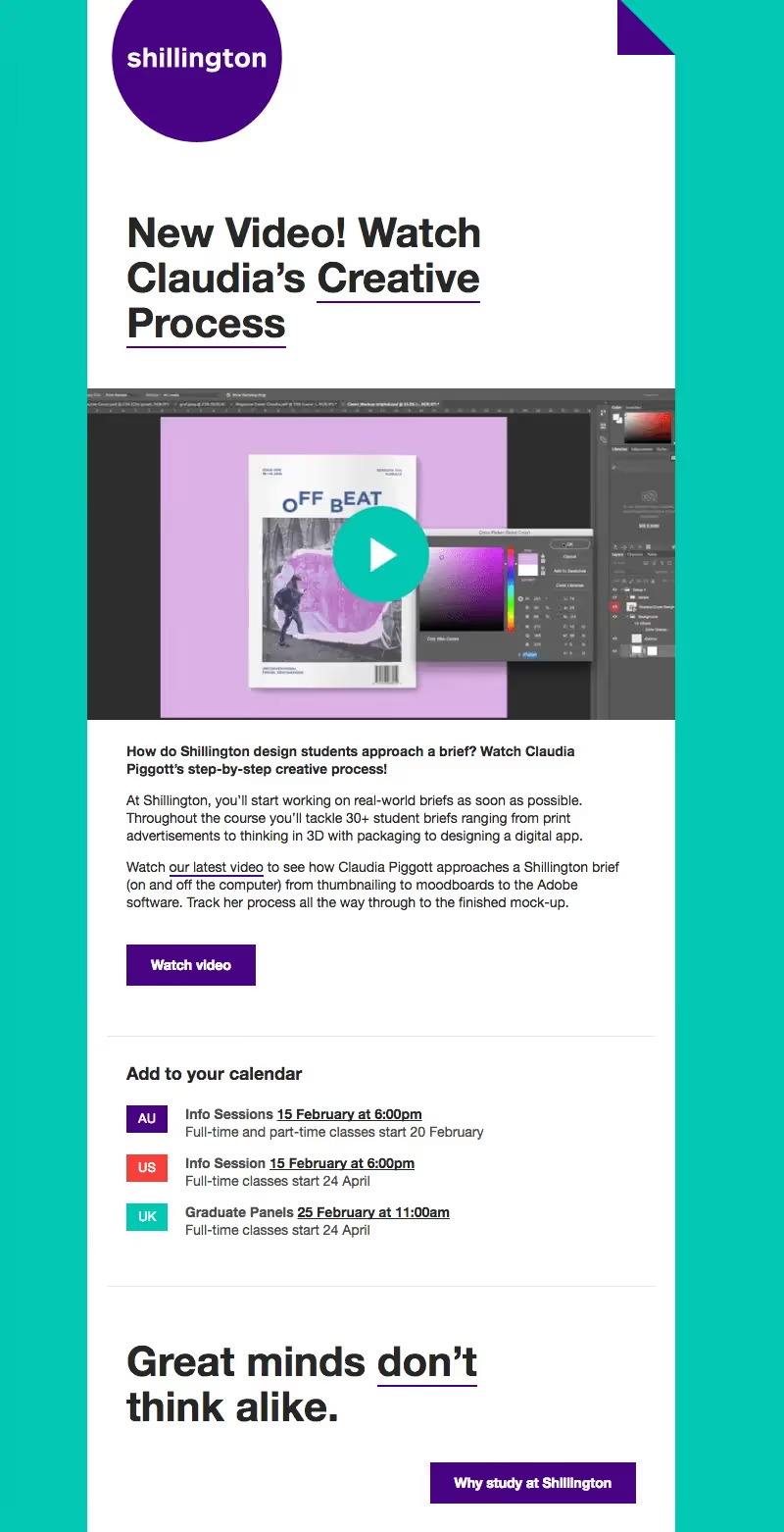
The Shillington School of Graphic Design has been around since 1997 and is known for helping designers kickstart their careers. The newsletter, sent once a week, always brings a pop of color.
Design Choices We Love:
- Alternating background colors. Each newsletter sticks with a color pairing from Shillington's brand palette. The bold colors, striking header, and consistent layout choices make the newsletter immediately recognizable, even as the colors change.
- Standout header design. The header is unique and elegant, with just a little flair that goes beyond the company logo.
Design your next email
If you've been inspired by the design pros featured here, put your new ideas to use and create your next email message. No HTML knowledge is required, and your email can be mobile responsive.
Articles to wet your whistle



.png)
Subscribe to our newsletter.
Dive into the world of unmatched copywriting mastery, handpicked articles, and insider tips & tricks that elevate your writing game. Subscribe now for your weekly dose of inspiration and expertise.