

Email A/B testing ideas: what to test and why
Real A/B tests from someone who actually runs them, on subject lines, CTAs, send timing, and design, plus what each result actually taught her about testing itself.

Picture yourself searching "A/B testing ideas" at 11 pm the night before a send, scrolling through fifty of them telling you to test the subject line and test the CTA, and closing the laptop no wiser than when you opened it, because none of it said who ran the test, on what audience, or whether it actually moved anything that mattered.
So instead of handing you list number fifty-one, we sat down with Kelsey Yen, our Lifecycle Magician, who works closely on email testing at RGE, and asked her to walk through real tests. What she tried, what actually happened, and what she'd tell someone building a testing program from scratch. Some of it confirms what you'd expect. Some of it, especially the parts about send time and design, might make you rethink advice you've been following for years.
An email A/B test, if you need the one-sentence version, sends two versions of the same email to comparable audience groups, changing one variable, to see which version performs better against a predefined metric. Everything below is what that looks like in practice.
Why testing matters in the first place
Before getting into specific tests, it's worth asking why any of this is worth the effort in the first place. Here's Kelsey's answer.
Why does testing matter so much in email marketing, in your view?
A lot of times, people say "do this, and you'll see an increase in X," but the truth is no one really knows what works 100% of the time for everyone. That's largely because you have different subject matters, different audiences, and different demographics.
A/B testing is a way to understand your audience and close the feedback loop. This is how they respond when we ask this question. This is how they like to interact with us. This is when we see the best engagement. Until you test, you never really know how your audience responds to your messaging.
The other reason it matters is that things change. Whether it's macroeconomic shifts or fatigue with a certain kind of messaging, you have to keep trying new things so the email doesn't go stale and you're not relying on results from a few years ago. You're changing along with your audience, and testing subject lines, send time, layout, CTA copy, and offer framing is still the best way to see what actually drives measurable lift.
Subject lines and preheaders: when clarity beats intrigue
Knowing what to do with preheader text can be confusing. What's the best use for that copy? For Kelsey, the preheader works as extra context for the subject line, and one of her clearest tests shows why that partnership matters more than either line on its own.
Can you walk me through a recent test on subject lines or preheaders, and what you learned?
I like to think of the preheader as a supporting character. When the subject line is being tested, it's often doing something extreme, building curiosity, being clever, leading with a stat, or something to reel people in. The preheader is where you can add any missing context.
A good example is the RGE Awards test. It ran across roughly 202,000 people, split evenly.
- Control A: "{{customer.first_name}}, you've been selected to play 🎮" — personalized, gamified
- Variant B: "The 2025 Really Good Email Awards are here!" — direct, descriptive
B won clearly. A 27.2% open rate against 16.6% for A, a 10.6 percentage point lift, with clicks also moving in B's favor by a statistically significant margin.
What makes it interesting is that A was doing two things at once, personalizing with a first name and layering on a mysterious, gamified hook. It's hard to know which one dragged it down. Was it the mystery framing? Is {{first_name}} personalization so common now that it no longer registers as special? Or did the direct, descriptive subject line simply do a better job of telling people what the email was about? My read is that clarity about what the email is wins over intrigue, at least here.
The preheaders followed the same logic. A's preheader was "The Really Good Emails Awards 2025 are now accepting submissions," while B's was "Join RGE x Beefree on Dec. 17 to celebrate the year's best inbox moments." Looking back, I'd have made A's preheader extra clear to support the vagueness in its subject line. B doubled down on clarity in both spots, and that consistency may have helped it win.
Takeaway to test. Direct and descriptive versus curiosity-driven subject lines, especially with a large or mixed audience. And if your subject line is intentionally vague, don't let the preheader be vague too.
Personality versus function in CTA copy
CTA testing gets tempting fast, because everyone wants the phrase that just converts better. Kelsey's tests were messier and more useful than that.
Can you describe a test where you tried a more playful or personality-driven CTA against a straightforward, functional one?
One that comes to mind is a trial upgrade message for Starters who'd hit their export limit. Version A simply said, "Try the Business Plan." Version B was "Claim my 15 days." The real test here wasn't playful versus functional so much as plan-first versus person-first messaging.
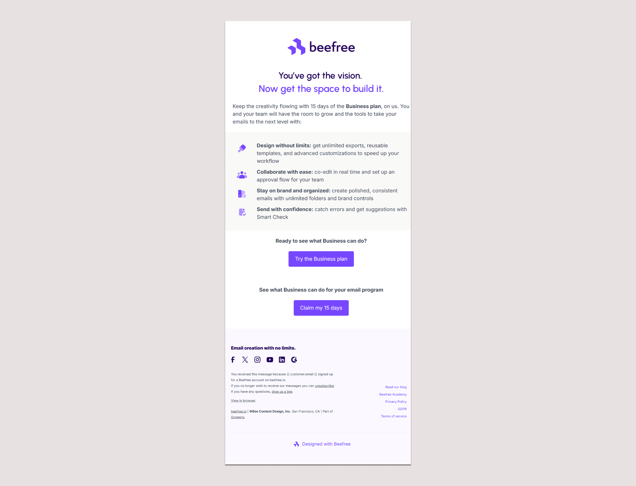
B won clearly, a 55% lift in click-through and, more importantly, a 19% lift in actual conversions to trial. That second number is the one I care about. It's easy to get a click-through rate (CTR) lift from language that just sounds more exciting without it turning into anything real, but conversions are the outcome we were actually after. "Claim" and "my" made the ask personal. The focus shifted from us to them, and that's what got people to evaluate their plans rather than us naming the plan for them.
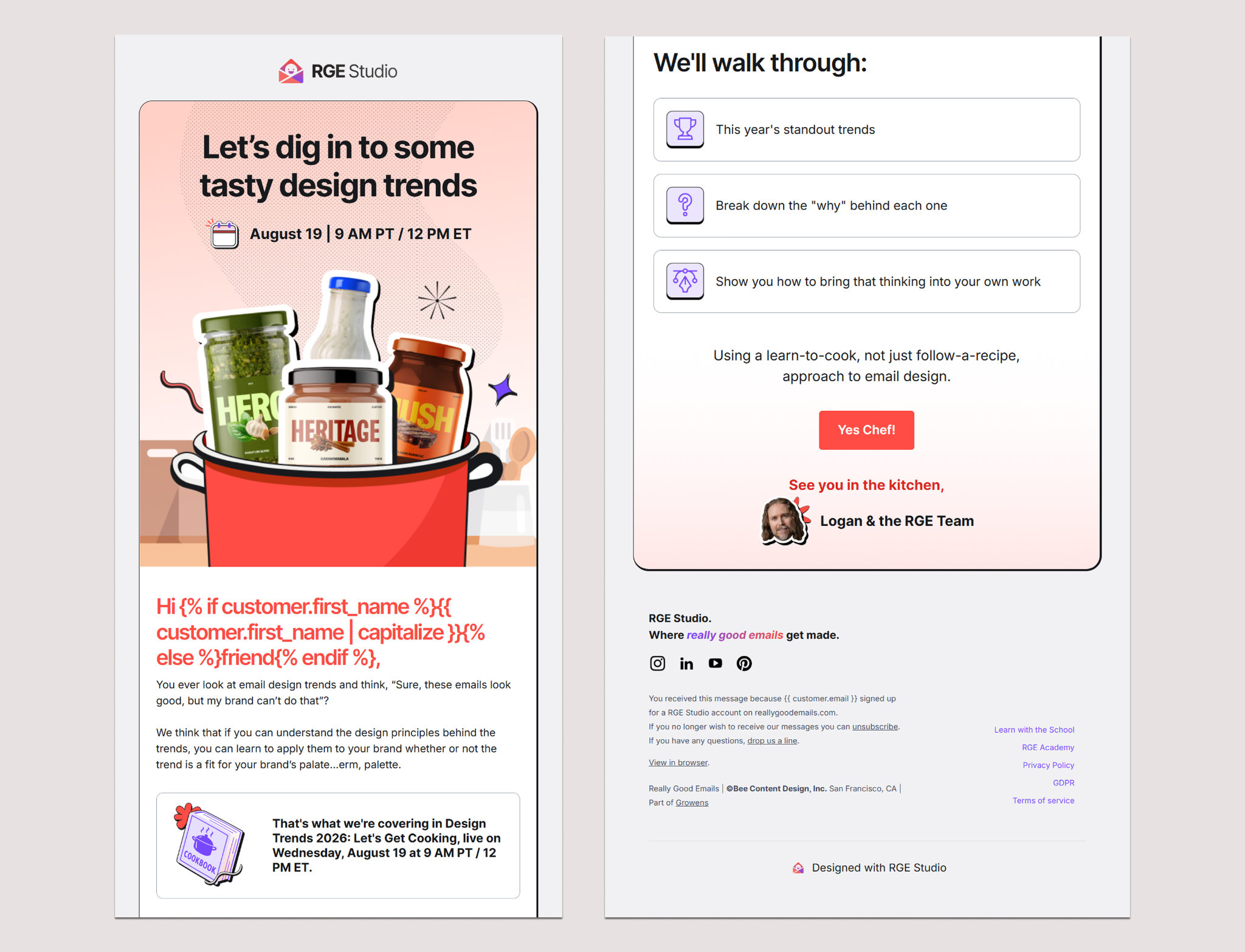
A second example came from the subject line and CTA combination used to promote our own Design Trends 2026 webinar, playful versus straightforward in both spots.
- A used the subject line "Design trends fade. Design principles don't." Preheader: "Join us August 19 to learn the 'why' behind 2026's email design trends and how to make use of them." CTA: "Save my Seat"
- B used the subject line "Learn to cook, not just follow the recipe" (webinar, Aug 19). Preheader: "Join us to learn the 'why' behind 2026's email design trends and how to make use of them." CTA: "Yes, Chef"
The preheaders were nearly identical, so the subject line and CTA carried most of the creative difference between A and B.
A focused on trends and the webinar itself, B leaned into a cooking metaphor. On opens and clicks, A won outright; more people opened it, and more people clicked. But when we looked at actual registrations, the personality-driven version brought in more total signups, 363 against 347. That's interesting because it had fewer openers and clickers, which means its click-to-conversion rate was much higher, 57.2% versus 52.1%.
What I think happened is that the cooking metaphor filtered out the merely curious. By the time someone clicked, they'd basically already decided to register. I wouldn't call it a clean win, more a signal worth continuing to test.
More broadly, how do you decide when a playful CTA risks confusing people instead of converting them?
It comes down to the body copy. Has the destination been made clear enough throughout the email? If the body copy has already told someone what happens when they click, that they're signing up for a webinar or getting a discount or an ebook, then the explaining has already happened elsewhere in the email, and the CTA's only job left is to entice.
I'd keep the playful testing to CTAs that don't need to be explained. If I already know clicking gets me to register, I can test something literal like "Register for the webinar, save my seat," which reiterates what's about to happen, or something more playful like "Yes, Chef," which pulls people into the narrative. If the clarity already lives in the messaging, that's when it's safe to test the CTA.
Takeaway to test. Person-first versus plan-first phrasing on CTAs, and playful versus literal CTA copy once your body copy is already doing the explaining.
A hot take on timing and send day
Ask around, and everyone has an opinion on the best day and hour to hit send. Kelsey has an opinion too, and it's the opposite of most of them.
Have you tested send timing, same day versus next day, or different days of the week? What did you find?
Honestly, I've never run a send time test that produced significant results. I know people swear by certain days and times, but in my experience, testing one send time against another across our list hasn't produced a statistically significant difference.
I've sent early morning, late afternoon, on weekends, and it's never really affected overall performance. I think that's because no matter when you send, the results average out over time across your list. Your audience is likely spread across time zones, and with remote work, the line between work hours and personal time barely exists anymore. People can interact with your content at any hour, so I don't see any real measurable difference tied to send time.
Takeaway to test. If you're set on testing send time, it's worth checking whether the finding holds across different content types rather than assuming a null result for one email type applies to all.
How small things do the work in design and layout
Follow enough design conversations here, and you'll notice a theme; the trend on the surface rarely explains the result underneath it. Kelsey's biggest design test makes that case with actual numbers to back it up.
Walk me through a visual or design test you've run, especially one where the result surprised you.
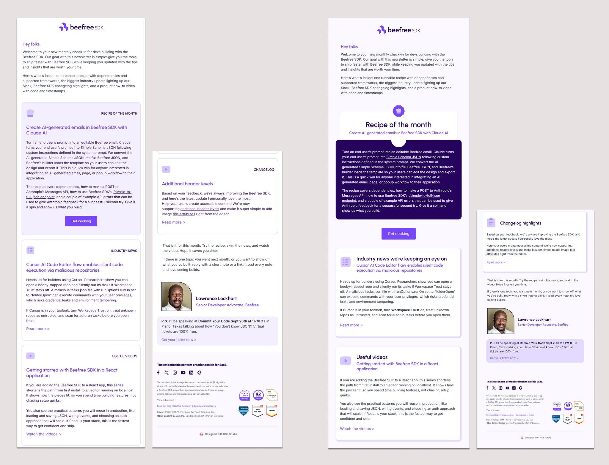
The one I talk about most is a test I ran for the developer newsletter, which I actually presented at our Unspam conference. The design team gave me two variations. One followed our typical design system, our usual background colors, and layout conventions. The other was a bit more expressive, with 3D borders, greater emphasis on the feature article, a clearer hierarchy, and a solid background color, though nothing dramatic.
Looking at the two side by side, I didn't expect much of a difference, so I figured, why not test it? The results were significant. Version B got a 21% click-through rate (CTR) against 13% for Version A, a 63% lift in CTR, and a 56% higher click-to-open rate. Within two hours of sending, the email drove 400 visitors to the GitHub library and generated 100 positive reactions on the technical documentation, which was the entire point of the newsletter.
What I took from it is that the big design swings aren't always what moves the needle. It's often the smaller things people overlook, like extra spacing between paragraphs, a clearer hierarchy of elements, giving the reader easier access to the content instead of making them work for it. That mattered more here than something like swapping a stock image for a product or human photo. You tend to see better engagement and cleaner statistical significance when the test is built around helping the reader digest the content, not just around how the email looks.
Takeaway to test. Spacing, visual hierarchy, and how much effort it takes a reader to reach your content before testing bigger stylistic swings like imagery.
What "new default" really means
But what happens after a test wins, once you've rolled that winner out for months and it stops looking like a top performer? That's the question Kelsey has actually had to sit with.
How do you know when a test has won clearly enough to become the new default, rather than something you keep testing?
This one's trickier than it looks; a winner needs to be validated across multiple sends, because anything can work once and not again. Going back to the developer newsletter, we adopted the winning template, and it performed well for the first several sends, but it didn't remain a top performer.
When I dug into it more, it turned out the story wasn't that the layout peaked and then settled into an average; the performance was inconsistent. Click rates swung from 8.6% to 1.6% to 9.3% to 2.1% across the series, while open rates had been declining steadily since early in the year, starting a few sends in. Taken together, that told me it was less about the template itself and more about the content or topic losing resonance with readers.
That's the real lesson; a winning design doesn't compensate for a topic that's running out of steam, and click swings alone don't tell you enough about a newsletter's health. You have to look at the open trend too. It's also why testing has to be ongoing rather than a one-time exercise. People change how they interact with your content over time, and testing is how you keep evolving with them instead of coasting on an old win.
Three things to know before you start testing
Before you open a single test, here's the mindset Kelsey says actually determines whether the program goes anywhere.
What are three things someone should keep in mind when starting an email testing program for the first time?
The first is to follow the experiment past the metric you set out to prove. There's a concept in science called hypothesis testing, where you start with an educated guess, but reality often reveals variables you didn't account for. A/B testing works the same way.
If you're testing a subject line, don't stop at open rate, because getting someone to open is only half the question. Did they actually engage with what was inside? Say a variant wins on open rate and even click-through, but conversions are equal. That's a draw. If you stopped at "it won" and rolled it out everywhere, would it actually move anything that matters? Probably not.
Sometimes a draw tells you something that never really mattered in the first place, like send time for us, and that's still a useful finding, even if it's not the one you went looking for.
The second is to test on your most engaged segment first, not your whole list. Your best subscribers are the ones who'll actually tell you something, because they're the ones opening, clicking, and paying enough attention for a real change to register. That's also where the best ideas tend to come from. Figure out what more you can give the people already leaning in, and you'll usually find something worth rolling out to everyone else.
The third is to get clear on what you actually want to learn or improve before you pick an email to test. Once you know that, find an email with enough volume and steady, consistent performance that an uptick will be obvious. Then change one thing at a time. Isolate the variable, or you won't actually know what caused the result you got.
And a bonus, have fun with it. Testing doesn't always have to be in service of a high-stakes program improvement. Sometimes it's just "how many more eyes can I get on this message?"
Two tests to run first
If you're staring at a blank testing calendar and don't know where to start, here are the two A/B test ideas Kelsey always comes back to, minus the hundred generic ones.
If you had to name two or three things people should test first, what would they be?
Start with what will help you understand your audience.
Test 1: direct versus intriguing subject lines. Run the same email to two equally sized audiences. One subject line states exactly what's inside. The other hints, teases, or poses a question without answering it. What you learn is how much your audience trusts you and how much they need to be sold on opening. Warm, loyal audiences tend to respond to intrigue, something like "We need to talk about your emails." Large, mixed audiences tend to respond to clarity, something like "Your August analytics report is ready." That's a hypothesis worth testing on your own list, not a rule to assume, but this test tells you which mode your audience is in.
Test 2: feature versus benefit framing. Same structure, two variants, one variable. Variant A describes what something is, "New role permissions are now available." Variant B describes what it does for the reader, "Give your team access without giving up control." What you learn is whether your audience is already bought into the category, in which case features are enough, or still needs convincing of the value, in which case benefits do the work. It's one of the most durable frameworks in copywriting, and most teams have never actually tested it against their own audience. Measure by click rate or click-to-open rate, since opens will likely be similar, and the difference shows up in who acts.
If you're more experienced, try testing your design system itself and optimizing layout for engagement. It's a bigger lift, but it's what sharpens an entire email program over time.
The bigger picture
None of this adds up to a formula, and that's kind of the point. Direct beats intrigue in one test, a cooking metaphor beats a straightforward pitch in another, and a design that wins for months can stop looking like a top performer, even when the layout itself isn't actually the problem. The pattern shows up in how you read the results, past the first metric, on the audience that actually pays attention, one variable at a time.
So if you're still the one from the opening, laptop open, staring at a subject line field at 11 pm, here's the actual difference between this and list number fifty-one. Borrow the tests, not the assumption that they'll play out the same way for your list. That part, you still have to run yourself.
Articles to wet your whistle
.jpg)



Subscribe to our newsletter.
Dive into the world of unmatched copywriting mastery, handpicked articles, and insider tips & tricks that elevate your writing game. Subscribe now for your weekly dose of inspiration and expertise.