

What 3 Food Brands Are Cooking Up In Their Email Design
Discover what 3 food brands are cooking up in their email design. Get inspired for your own campaigns!


When it comes to email marketing, the food industry takes the cake! Who's investing in email design? Food delivery services, restaurants, recipe blogs, food newsletters, and many more businesses. Let's take a look at 3 popular food brands and see what's cooking in their email design.
Blue Apron: Blues, borders & blocks sets their emails apart
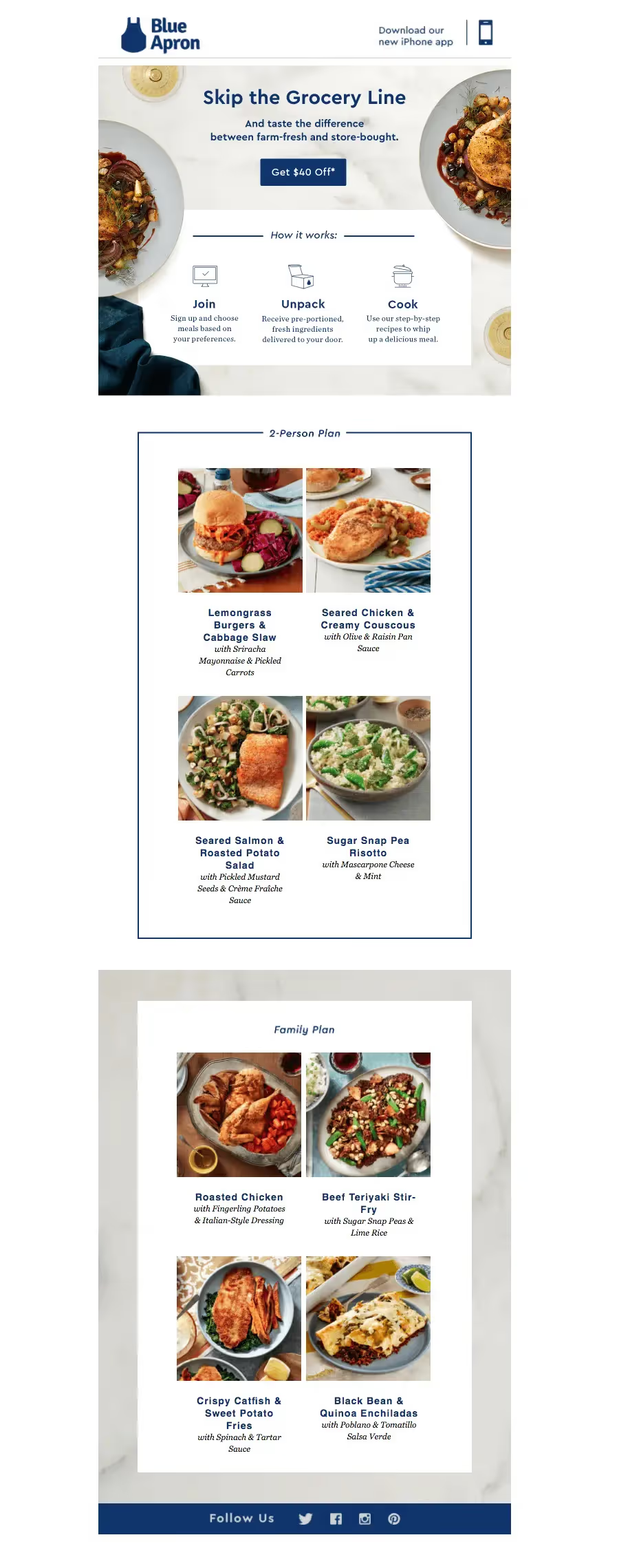
Blue Apron delivers fresh ingredients to people's doors to make cooking meals easier. A navy blue color palette reinforces the company's approachable and friendly visual identity and service. Their emails include a combination of striking food photography coupled with distinctive blue text, illustrations, and borders.
What Works
The general layout hits all the right notes. A simple header immediately leads readers' eyes to the email's central content. The email's first module has simple spot illustrations that provide a visual, easy-to-follow introduction to how the process works. The blue border used in the second module gives the email an organized, hierarchical feel, and the images really pop on the simple white background.
What Could Be Improved
Although the layout is beautiful and playful, GIFs can be problematic, and Blue Apron could improve the email by layering live text and a bulletproof button on top of the GIF. The "Download our new iPhone app" image in the header also looks a bit blurry and should be optimized, or the brand could use text instead of an image.
Bottom Line
Blue Apron's emails are recognizable and well-designed. The combination of gorgeous photography and illustration make these messages appealing and friendly, while the brand's blue reinforces a familiar look.
Chobani: Visual simplicity leads the way
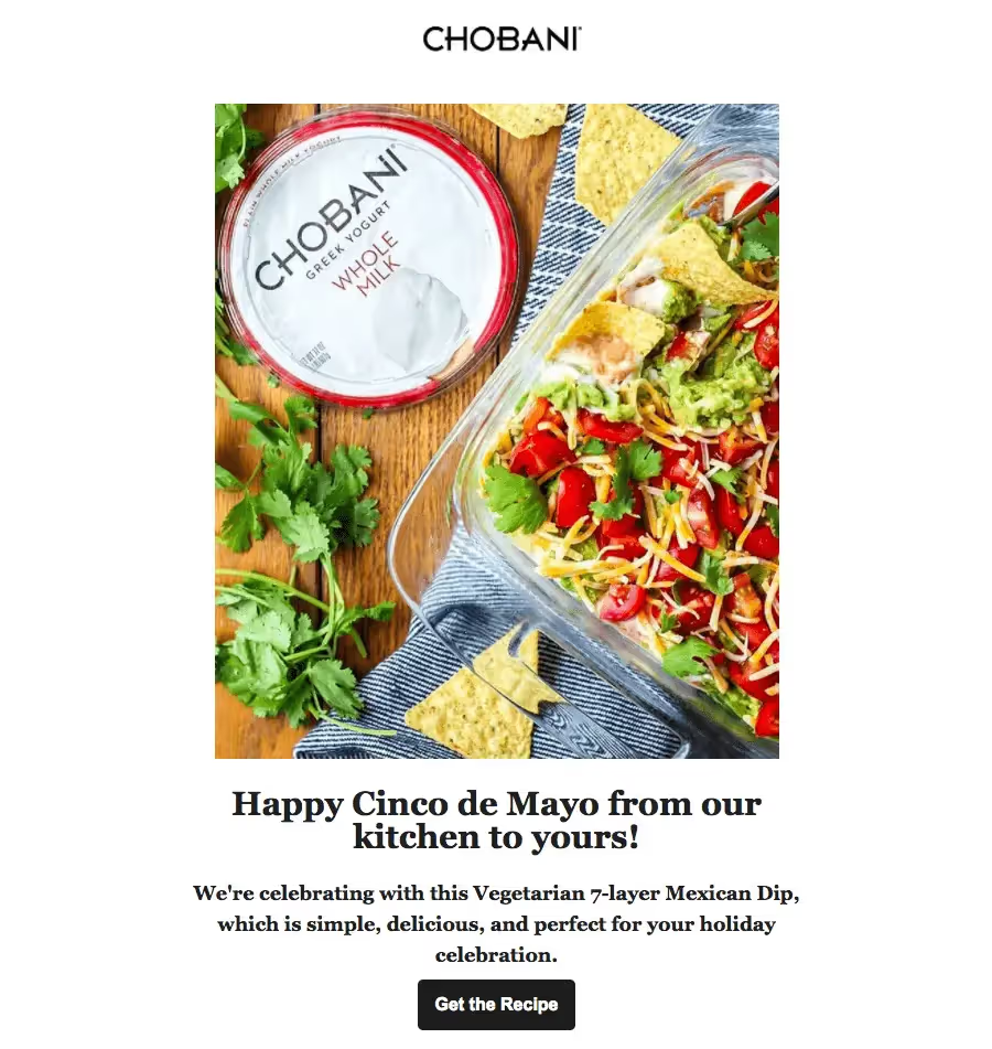
Chobani, the Greek yogurt brand, has skyrocketed to the top of the healthy eating industry. The visual brand identity is bright, cheerful, and energetic. The company's approach to email design involves letting high-quality photography lead the way.
What Works
Chobani uses an inverted pyramid approach to organize its content. The email leads with a fantastic hero image, followed by a header, body text, and a call to action. They keep their email design simple and choose to include only one image, so that their readers don't get overwhelmed or fail to take action.
What Could Be Improved
To help these emails maintain a light, playful feel, Chobani could skip the bold text. Opting for a thinner typeface, or even a more colorful CTA button, might enhance the brand's look and feel.
Bottom Line
We can't argue with simplicity! Chobani's emails are fun to look at and easy to read.
Maple Kitchen: Grid design adds to a polished look
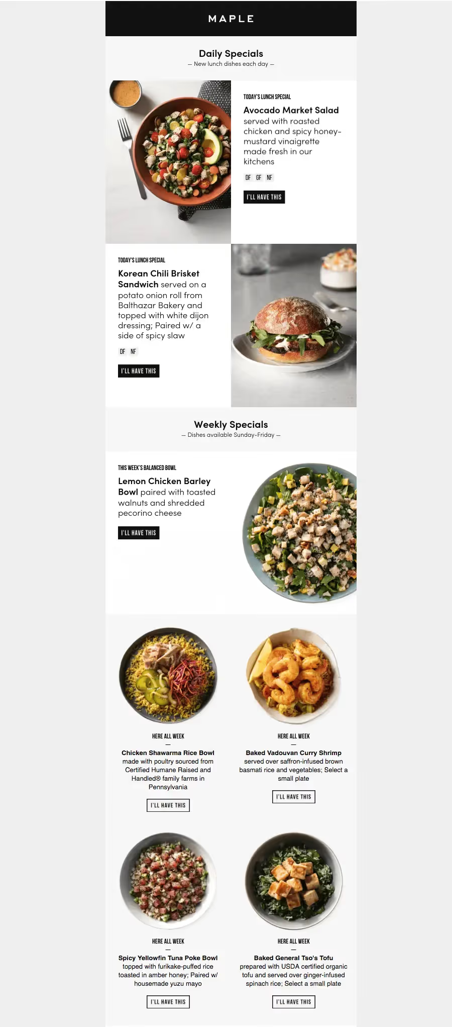
Maple Kitchen's visual brand identity was polished and clean, with a consistent black-and-white color scheme that offset colorful images.
What Works
Maple relied on a set of templates, which means the brand didn't waste time reinventing the wheel when designing each message. The brand maintained a uniform look by always employing the same header, font and image style, and HTML background color pattern. A photo collage was a smart way to display stunning images with text and avoid the pitfalls of a single-image email.
What Could Be Improved
Including live text and bulletproof buttons (instead of images) would have been better.
Bottom line
Templates are the way to go. Maple's visual identity was reinforced every time a message was sent.
Wrap-up: Takeaways for food industry email design
- Streamline your header design — keep it simple!
- Optimize images for mobile to avoid blur.
- Use borders and HTML background colors to create content organization.
- Use a background image with text and a CTA button, instead of uploading one single image section.
- Organize content with an inverted pyramid layout.
- Keep your email design focused.
- Send more animated GIFs!
- Consider using a template for design consistency.
Articles to wet your whistle




.png)
Subscribe to our newsletter.
Dive into the world of unmatched copywriting mastery, handpicked articles, and insider tips & tricks that elevate your writing game. Subscribe now for your weekly dose of inspiration and expertise.