

7 Ways to Spark Joy With Minimalist Email Design
Learn how to spark joy and create simple, yet effective emails with these 7 minimalist email designs. Plus, best practices and tips, to make these your own.

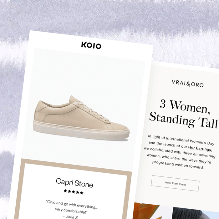
With warmer weather just around the corner, it's time for some spring cleaning. And that includes email design! Minimalism has been one of the biggest email design trends, and we're finding excellent examples of simpler, bolder, ultra-focused emails in our inbox. Minimalist email design is so effective because it communicates simply and beautifully. Design and copy work together to deliver a message that's cohesive, quickly comprehended, and enticing. So check out these seven types of minimalist emails and get ready to be inspired. Maybe they'll even spark joy!
#1. Minimalist story teaser from Organic Valley
Subject: 100% Grass-Fed. In Winter?
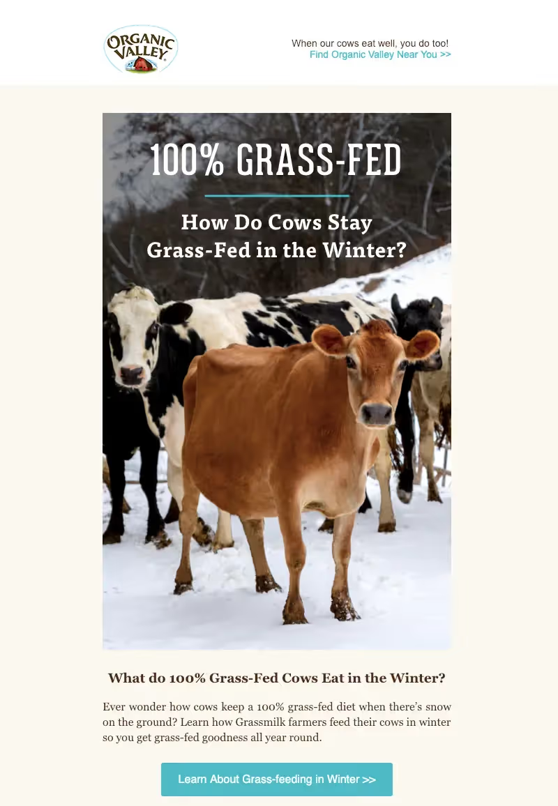
The text in this minimalist email from Organic Valley is riddled with questions, from the subject to the header. The repetition drives home the central message — how do cows eat grass in winter? — while the copy remains brief. The photo perfectly supports the content, and the call-to-action button stands out (and avoids generic language like "learn more").
The takeaway: Don't be afraid to reinforce your message with repetition (and pitch-perfect photography).
#2. Minimalist user-generated content from Koio
Subject: PRODUCT FEATURE – CAPRI STONE
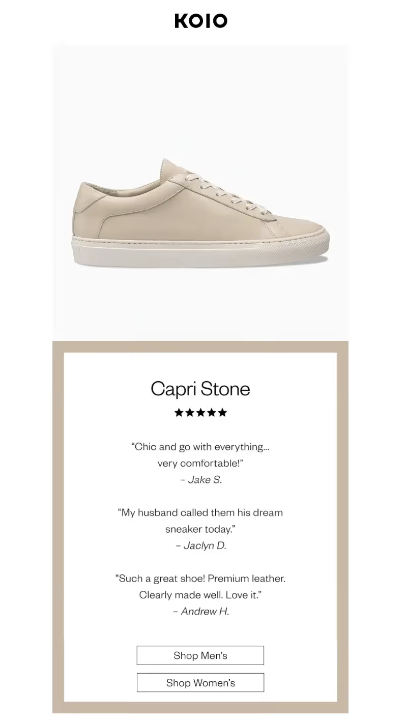
This product promotion email from Koio is ultra streamlined — and it's some of the best minimalist email design we've seen! There's no product description, no features list, no gallery of photos. Instead, user-generated content leads the way. Brief reviews do all the talking, in addition to the animated GIF that's the hero image.
The takeaway: Let your customers speak for you! Don't hide user-generated content at the bottom of your email; let it be the main dish.
#3. Minimalist product launch from Glossier
Subject: Surprise!
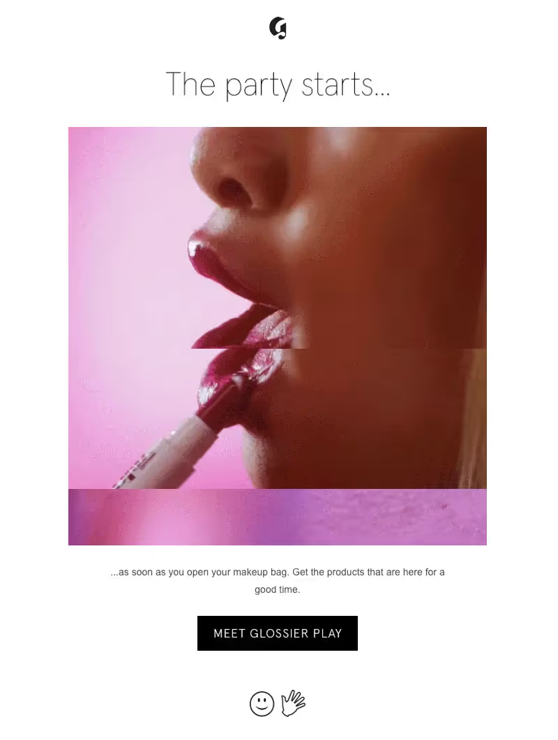
Glossier knows how to launch a new product with a splash, and this super minimalist — and intriguing — email is no exception. It's a good reminder you don't have to give it all away in an email. Instead, focus on creating a little excitement and mystery!
The takeaway: Heighten intrigue with a single GIF or image and just one line of text (and give away an exciting hint with your CTA button copy). When your minimalist email marketing also builds suspense, customers will be much more likely to engage with your CTA.
#4. Minimalist collaboration from Vrai & Oro
Subject: Forward thinkers

This is one of the longer emails in our collection, but there are still plenty of minimalist graphic design decisions at play. Each module maintains the same layout: side-by-side images followed by a quote and button against a muted pastel background. As you scroll, you know what to expect. The photos are all cropped the same way, the colors work together, and the quotes are short and legible in a large font. There's no clutter to be found here!
The takeaway: When you're creating a minimalist email newsletter, build a simple module with only the most essential content, then replicate it throughout your email.
#5. Minimalist quiz from Ritual
Subject: Consider this...
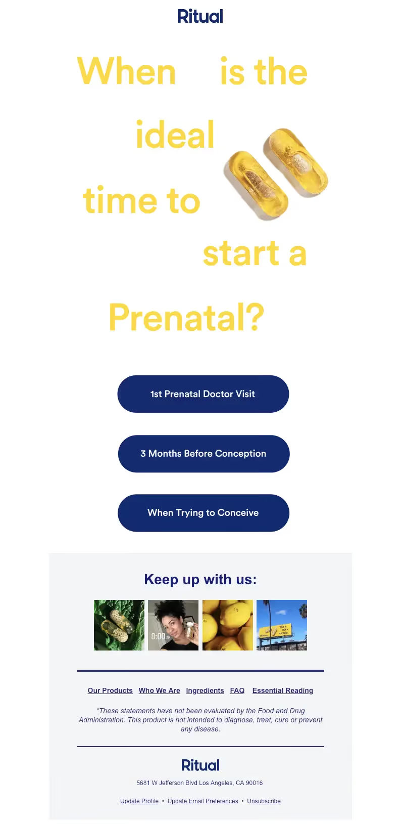
We love a good quiz or in-email survey. It's instantly engaging. But readers won't tap if the question isn't clear or interesting, if the buttons are too small or confusing, or if there are too many options. Ritual does it just right with this one, and the question is animated too.
The takeaway: Asking a question? Great! Limit your answers to two or three options (with bulletproof buttons) and don't add secondary content or clutter.
#6. Minimalist event invitation from Everlane
Subject: Brooklyn, It's Time To Choose
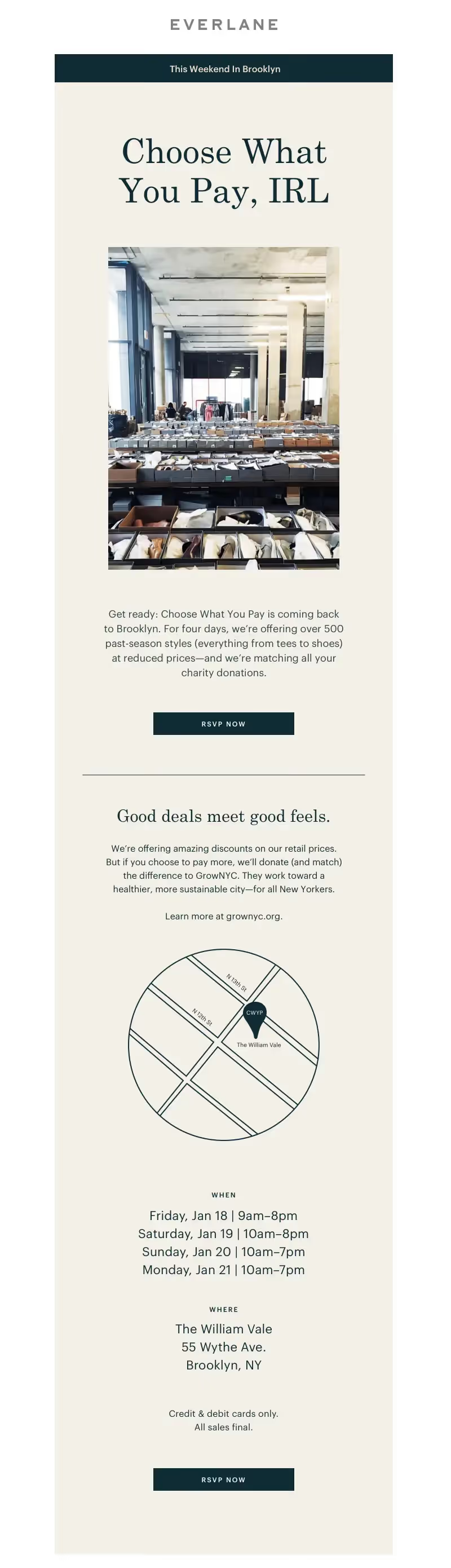
This invitation email from Everlane has a lot of content (normal for invitation emails, which must include logistical details), yet minimalist design decisions have been made. There's a large, easy-to-read header, followed by a single image that helps readers "see" the event. There's a chance to RSVP at the top with a button, then a second module with supporting information like location and timing, followed by another CTA. Between everything is ample padding.
The takeaway: Use a large font size and plenty of line breaks in your invitation email so it's scannable.
#7. Minimalist content from Thinx
Subject: Rest easy your next period week
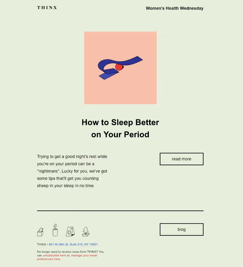
Have we mentioned minimalist emails can be colorful? This lovely green email from THINX employs a minty background color that stands out in our inbox. We love the live text used here and the stylistic choice of using a two-column layout for the body copy and CTA button. It looks different from other emails, but it's still stunningly simple. Plus, this email is about only one thing.
The takeaway: Deliver blog content with a single, simple teaser message that invites readers to click for more. And don't be afraid to go all-out with a beautiful background color!
Articles to wet your whistle


.png)
Subscribe to our newsletter.
Dive into the world of unmatched copywriting mastery, handpicked articles, and insider tips & tricks that elevate your writing game. Subscribe now for your weekly dose of inspiration and expertise.